ADLN — Earth-tone skincare hero
Rebuild
Opus 5.5Extra highfrontend-designemil-design-engtransitions-devhumanizergsapView
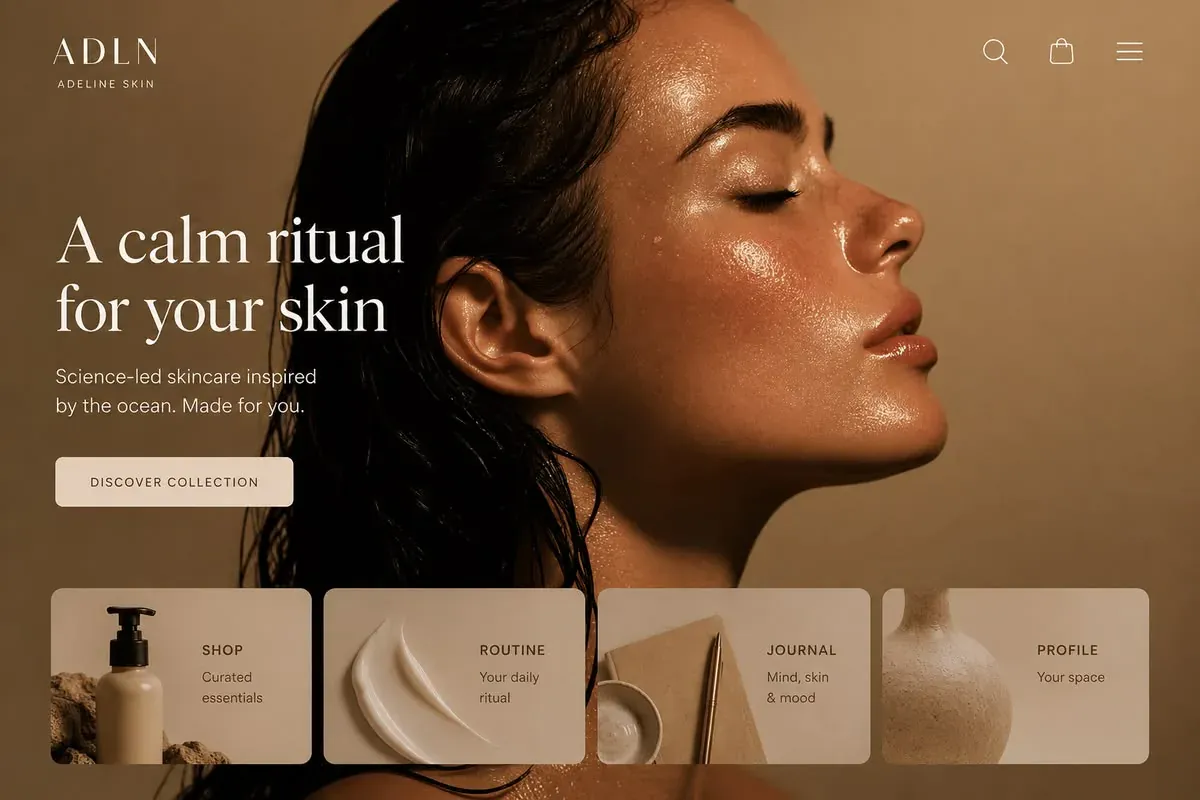
RebuildReference
Move across the image to wipe between the two. Click to lock the seam; arrow keys nudge it.
Imagery
4/4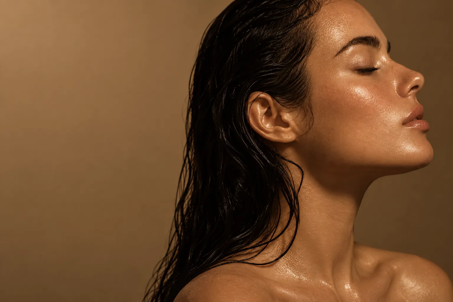
01-hero-portrait
Close profile portrait of a woman with wet dark hair swept back and glossy skin, lit against a warm brown seamless backdrop
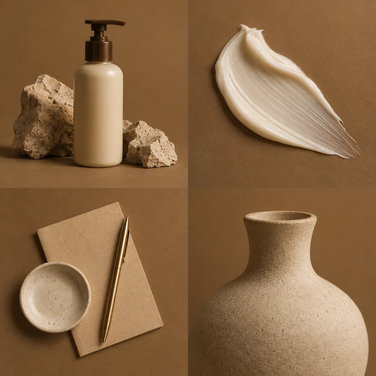
02-card-thumbnails-sheet
Four warm-toned skincare still lifes: a cream pump bottle on stone, a thick cream swatch, a paper-and-pen flat lay, and a matte ceramic vessel
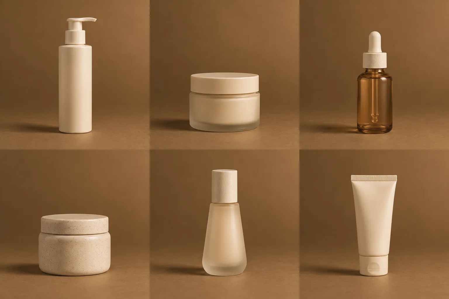
03-product-shots-sheet
Six skincare bottles and jars photographed separately on the same warm brown backdrop
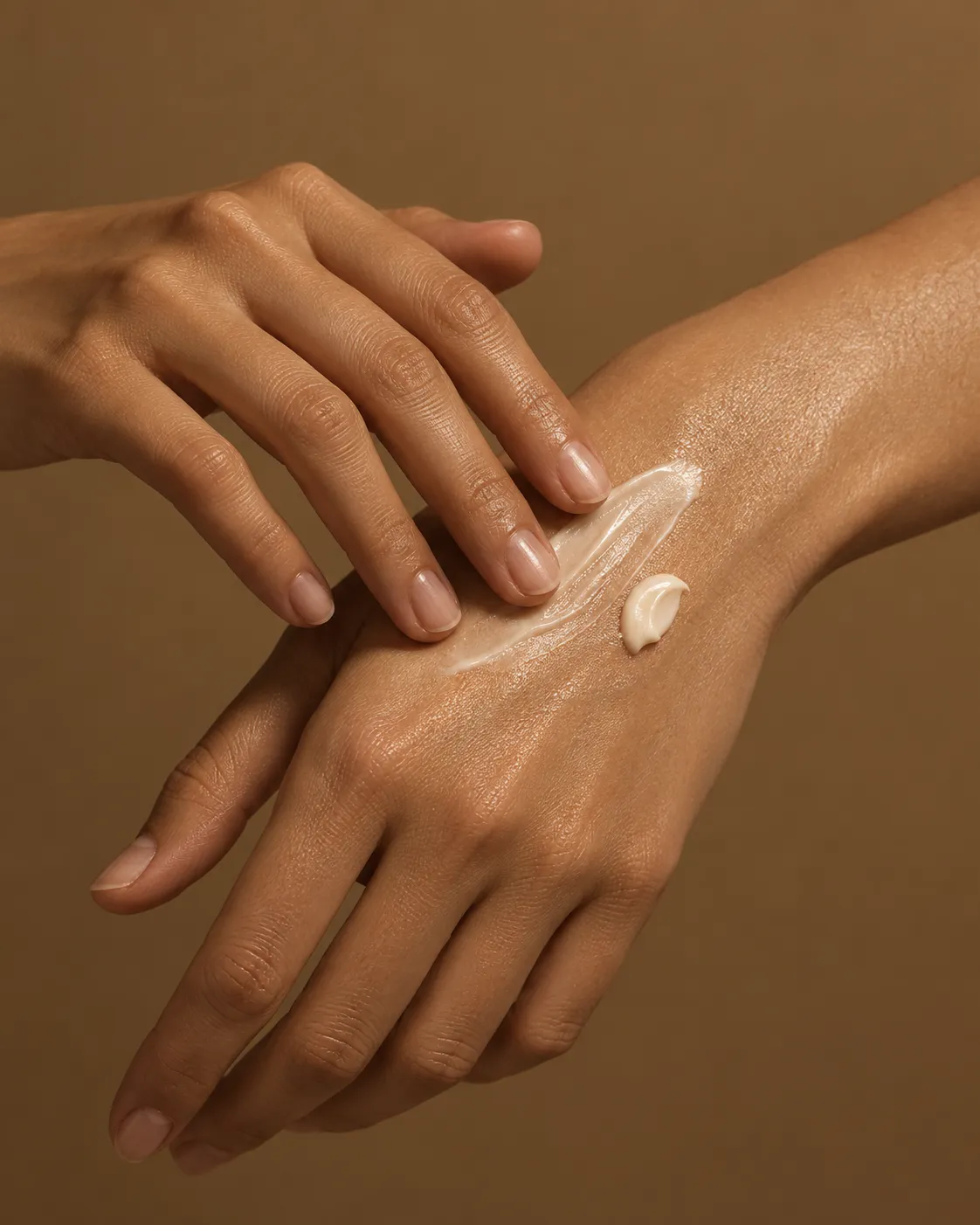
04-editorial-hands
Close crop of hands smoothing cream onto skin, warm brown light
Prompts
120,675 chars
# Earth-tone skincare landing page

A warm, monochrome-brown e-commerce landing page. One full-bleed beauty portrait fills the first viewport, cream serif type sits over its left third, and a row of four translucent "quick entry" cards floats across the bottom of the hero. Everything below continues in the same earth palette with generous white space and very restrained motion.

**No motion report was supplied with this reference, and only the first viewport was captured.** Every measurement below is read off the still at 1200×800 image px mapped to a 1440 CSS px layout (1 CSS px ≈ 0.83 image px) and is marked **(inferred)**. Sections 4–9 are not in the capture at all; they are specified as a consistent continuation of the same system and are marked **(inferred — beyond the capture)**. Build them; the page is judged at scroll positions, not just the top.

---

## Structure

Reference viewport: **1440 × 960** (inferred). Container: full-bleed page, content constrained to **1320px** with **60px** left/right gutters at 1440 (max-width 1320, centred above 1440). There is no narrower inner "reading" container in the hero — the wordmark, headline and card row all hang off the same 60px left gutter.

1. **Nav bar** — fixed overlay on the hero, 104px tall, transparent at rest. Left: wordmark lockup (4-letter uppercase mark + tiny uppercase sub-label beneath). Right: three line icons (search, bag, menu), 26px box, 1.5px stroke, 48px apart. No text links.
2. **Hero** — 960px (100vh), full-bleed photograph, square corners, bleeding edge to edge and top to bottom behind the nav. Text block on the left: eyebrow-less, headline → subhead → one solid button.
3. **Quick-entry card row** — 4 equal cards on a 4-column grid, absolutely positioned inside the hero, `bottom: 44px`, spanning the full 1320px container. Each card 318 × 210px, 16px gaps. This row belongs to the hero layer; the photo continues behind and below it.
4. **Statement band** — (inferred — beyond the capture) 520px, solid cream sheet, one centred serif sentence, max 20ch, plus a 13px uppercase eyebrow above it.
5. **Product grid** — (inferred — beyond the capture) 1080px, 3 columns × 2 rows, 4:5 product images, title / one-line descriptor / price under each.
6. **Editorial split** — (inferred — beyond the capture) 900px, 2 columns (7/5 split): 4:5 image left, a numbered 3-step ritual list right.
7. **Full-bleed quote** — (inferred — beyond the capture) 720px, dark photographic band with a centred pull quote, max 24ch.
8. **Testimonials** — (inferred — beyond the capture) 640px, 3 columns of short quotes on the cream sheet.
9. **Newsletter + footer** — (inferred — beyond the capture) 560px, dark brown, email field + 4 link columns + a bottom meta line.

---

## Scroll map

All values (inferred). Nothing pins; nothing stacks. Scroll consumed equals section height everywhere.

| # | Section | Height | Viewports | Scroll consumed | Kind |
|---|---------|--------|-----------|-----------------|------|
| 1 | Nav bar | 104px (fixed overlay) | — | 0 | scroll-linked (background only) |
| 2 | Hero | 960px | 1.00 | 960px | entrance on load + scroll-linked parallax |
| 3 | Card row | 210px (inside hero) | 0.22 | 0 (shares hero scroll) | entrance |
| 4 | Statement band | 520px | 0.54 | 520px | entrance |
| 5 | Product grid | 1080px | 1.13 | 1080px | entrance |
| 6 | Editorial split | 900px | 0.94 | 900px | entrance + scroll-linked image |
| 7 | Full-bleed quote | 720px | 0.75 | 720px | scroll-linked |
| 8 | Testimonials | 640px | 0.67 | 640px | entrance |
| 9 | Newsletter + footer | 560px | 0.58 | 560px | static |

**Total page height: 5380px ≈ 5.6 viewports.**

---

## Spacing

- Page gutters: 60px each side at 1440. Below 1200: 40px. Below 640: 24px.
- Nav: 40px padding-top, wordmark lockup and icon row optically centred on the same 104px band; sub-label sits 10px under the wordmark baseline.
- Hero text block: top edge 254px from the top of the viewport (so it reads slightly above centre, not centred). Internal rhythm — headline → **32px** → subhead → **40px** → button.
- Button: 288 × 58px, 40px horizontal padding, label optically centred.
- Button bottom → card row top: **99px**.
- Card row → viewport bottom: **44px**. Card grid gap: **16px**.
- Card internals: left thumbnail occupies 55% of card width and the full 210px height, flush to the card's left/top/bottom edges; text column gets 20px padding on all sides; title → **6px** → two-line descriptor.
- Section rhythm below the hero (inferred): **120px** top and bottom padding on cream sections (4, 5, 8), **0** on full-bleed bands (7) which use 160px internal padding, **96px** on the footer. Grid row gap in section 5: 64px; column gap 32px.

---

## Type

Two families only.

- **Display / headlines:** serif display — transitional, moderate stroke contrast, sharp bracketed serifs, round generous bowls, single weight. Free stand-in: **Instrument Serif** (400). Alternatives: EB Garamond 400, or Fraunces at `opsz 96, SOFT 0, WONK 0`.
- **Everything else:** neutral grotesk, slightly humanist, tabular-friendly. Free stand-in: **Inter** (300/400/500/600).

**Body anchor: 17px at 1440.** Every other level below is a ratio of it.

| Role | Ratio | Size / line-height | Tracking | Weight | Family |
|---|---|---|---|---|---|
| Hero headline (5–7 words, 2 lines) | 5.2× | 88px / 0.95 (84px) | −0.015em | 400 | serif |
| Hero subhead (2 lines, ~34ch) | 1.25× | 21px / 1.6 | 0 | 400 | grotesk |
| Wordmark (4 uppercase letters) | 1.9× | 32px / 1.0 | +0.16em | 300 | grotesk |
| Wordmark sub-label (2 words, uppercase) | 0.7× | 12px / 1.0 | +0.22em | 400 | grotesk |
| Button label (uppercase, 2 words) | 0.88× | 15px / 1.0 | +0.14em | 500 | grotesk |
| Card title (1 word, uppercase) | 1.05× | 18px / 1.2 | +0.06em | 600 | grotesk |
| Card descriptor (2 lines) | 0.88× | 15px / 1.5 | 0 | 400 | grotesk |
| Section eyebrow (2–3 words, uppercase) | 0.75× | 13px / 1.0 | +0.20em | 500 | grotesk |
| Section headline (4–6 words) | 2.6× | 44px / 1.1 | −0.01em | 400 | serif |
| Statement sentence (§4, ~18ch) | 2.1× | 36px / 1.25 | −0.01em | 400 | serif |
| Running body | 1.0× | 17px / 1.65 | 0 | 400 | grotesk |
| Product title | 1.15× | 20px / 1.3 | 0 | 400 | serif |
| Price / meta | 0.94× | 16px / 1.4 | +0.02em | 500 | grotesk |
| Pull quote (§7, ~24ch) | 2.1× | 36px / 1.3 | −0.005em | 400 | serif |
| Footer link | 0.94× | 16px / 1.9 | 0 | 400 | grotesk |
| Footer meta / legal | 0.76× | 13px / 1.5 | +0.04em | 400 | grotesk |

Max line length: hero headline **16ch** (hard-break it onto two lines, do not let it reflow into three at 1440); hero subhead **max-width 380px** (~34ch, two lines); running body **62ch / 620px**; card descriptor **14ch** so it wraps to exactly two lines; pull quote **24ch**.

Never go below 12px (labels/meta) or 14px (nav, buttons).

---

## Colour

The page is a single warm brown family. Nothing is neutral grey, nothing is pure white, nothing is pure black.

| Hex | Role |
|---|---|
| `#65492B` | **Dominant surface.** The photographic backdrop tone and the base of every dark band (§7, §9). Reads as the page's "background" even though most of it is photograph. |
| `#B4967B` | Second-largest area: the lighter half of the hero backdrop gradient and the mid-tone of the skin/light falloff. Also the resting colour of dividers and disabled states. |
| `#E3CDB7` | **Cream.** All type over the photograph, the fill of the quick-entry cards and the button, and the sheet colour of sections 4, 5 and 8. |
| `#A96439` | **The single accent** — a warmer, more saturated clay. Allowed only on: the price figure, the numbered step markers in §6, the active nav/underline state, focus rings, and the newsletter submit button. Never as a large fill, never behind type, never more than ~2% of any viewport. |
| `#040202` | Near-black, present only inside the photography (hair, shadow cores). Use it for text **only** inside the cream cards and cream sections, mixed up to `#3A2A1B` — never as flat `#000`. |

Derived tokens: card fill `rgba(227,205,183,0.85)` with `backdrop-filter: blur(14px)`; card title text `#3A2A1B`, card descriptor `#65492B`; button fill `rgba(227,205,183,0.92)`, button label `#3A2A1B`; hero headline `#F2E6D8` (cream lifted for legibility), hero subhead `#E3CDB7`. Hero legibility scrim: `linear-gradient(90deg, rgba(20,12,6,0.50) 0%, rgba(20,12,6,0.18) 38%, transparent 58%)` over the photo — it must stay invisible as a shape.

---

## Surface

- **Borders:** effectively none. The only hairline is `1px solid rgba(242,230,216,0.18)` on the quick-entry cards, present just to hold their edge against the photo. No borders on the button, no dividers in the hero. Below the hero, section dividers are `1px solid rgba(101,73,43,0.14)` and used sparingly.
- **Radii:** cards **12px**; button **8px**; product images and editorial images **8px**; input fields **8px**; icons unrounded. The hero photo itself has **square corners and bleeds** — no rounding anywhere on a full-bleed element.
- **Shadows:** none. Depth comes entirely from the backdrop blur and the photograph's own falloff. If you must separate the card row from a busy part of the photo, deepen the scrim, don't add a box-shadow.

---

## Imagery

All photography is shot on the same warm seamless backdrop under one soft directional key from the upper right, so the whole library shares the `#65492B → #B4967B` gradient. Warm highlights, deep but coloured shadows, visible skin and material texture. No cool tones, no clinical white, no cut-outs on white.

1. **Hero portrait** (§2) — a close three-quarter/profile portrait of a person, eyes closed, chin lifted, wet dark hair swept back, skin glossy with visible sheen along cheekbone, nose bridge and collarbone. Framed so the face occupies the right two-thirds and the empty lit backdrop fills the left third, leaving a clean area for type. Aspect **3:2**, `object-fit: cover`, `object-position: 62% center` so the face stays intact as the viewport narrows. Bleeds full width, full height of the hero.
2. **Card thumbnail — Shop** (§3) — a pump bottle in cream-coloured glass standing against rough, pale stone. Aspect roughly **4:5**, cropped to fill the card's left 55%.
3. **Card thumbnail — Routine** (§3) — extreme macro of a thick white cream swatch smeared once across the brown backdrop, showing the ridge and drag marks. Same crop.
4. **Card thumbnail — Journal** (§3) — a flat-lay from above: a folded paper card, a small shallow ceramic dish, and a slim pen laid diagonally. Same crop.
5. **Card thumbnail — Profile** (§3) — the neck and shoulder of an unglazed matte ceramic vessel, lit so the curve reads as a single soft gradient. Same crop.
6. **Product shots** (§5, inferred) — six bottles and jars, each standing alone, one per frame, same backdrop and key light, **4:5**, product occupying ~60% of frame height.
7. **Editorial image** (§6, inferred) — hands applying product, cropped tight, **4:5**, sits in the left column.
8. **Quote band image** (§7, inferred) — a darker, more shadowed frame of the same portrait session, **16:6**, full bleed, darkened to ~35% luminance behind the quote.

---

## Motion

Restrained is the brief: nothing bounces, nothing slides more than 32px, nothing spins. All values below are **(inferred)** — no live measurement was available. Durations and easings are given as ranges where the exact value cannot be known.

### 1 — Nav bar
- **kind** — scroll-linked (background only); the content is static.
- **what moves** — nav background plate and its bottom hairline.
- **from → to** — background `transparent` → `rgba(101,73,43,0.80)` with `backdrop-filter: blur(12px)`; hairline opacity 0 → 1. Wordmark, sub-label and icons do not move, resize, or change colour.
- **range** — from scroll 0 to scroll 120px; reverses on the way back up.
- **reduced motion** — same, but switch at 120px with no transition.

### 2 — Hero
- **kind** — entrance on load, then scroll-linked parallax.
- **what moves** — (a) headline lines, subhead, button on load; (b) the photograph on scroll.
- **from → to** — entrance: each element `opacity 0 → 1`, `translateY 24px → 0`. Parallax: photo `translateY 0 → −80px` and `scale 1.0 → 1.04` while the hero scrolls out.
- **range** — entrance fires once, on load, after fonts resolve; duration 700–900ms, easing `cubic-bezier(0.22, 1, 0.36, 1)`, stagger 90ms in order headline line 1 → headline line 2 → subhead → button. Parallax is scroll-linked from scroll 0 until the hero's bottom reaches the top of the viewport, and reverses on the way back up.
- **reduced motion** — no entrance translate, elements render at final position with a 200ms opacity fade; parallax disabled, photo fixed.

### 3 — Card row
- **kind** — entrance, once.
- **what moves** — the four cards as units (thumbnail and text move together).
- **from → to** — `opacity 0 → 1`, `translateY 32px → 0`. No scale, no blur reveal.
- **range** — fires once, on load, beginning 400ms after the hero entrance starts; duration 600–800ms, easing `cubic-bezier(0.22, 1, 0.36, 1)`, stagger 80ms left to right.
- **reduced motion** — opacity only, 200ms, no stagger.

### 4 — Statement band *(inferred — beyond the capture)*
- **kind** — entrance, once.
- **what moves** — eyebrow, then the serif sentence.
- **from → to** — `opacity 0 → 1`, `translateY 20px → 0`.
- **range** — once, when the section's top reaches 80% of the viewport; duration 600ms, easing `cubic-bezier(0.22, 1, 0.36, 1)`, stagger 120ms (eyebrow first).
- **reduced motion** — opacity only, 200ms.

### 5 — Product grid *(inferred — beyond the capture)*
- **kind** — entrance, once, per card.
- **what moves** — each product cell (image + its text block as one unit).
- **from → to** — `opacity 0 → 1`, `translateY 28px → 0`.
- **range** — each cell fires once when its own top reaches 85% of the viewport; duration 600ms, easing `cubic-bezier(0.22, 1, 0.36, 1)`, stagger 70ms across a row, rows independent.
- **reduced motion** — opacity only, 200ms, no stagger.

### 6 — Editorial split *(inferred — beyond the capture)*
- **kind** — entrance (text) + scroll-linked (image).
- **what moves** — the left image inside its 8px-radius frame; the three numbered steps on the right.
- **from → to** — image `translateY +40px → −40px` inside an `overflow: hidden` frame (the frame itself does not move). Steps `opacity 0 → 1`, `translateY 20px → 0`.
- **range** — image is scroll-linked from the section's top entering the viewport until its bottom leaves, and reverses upward. Steps fire once, when each step's top reaches 85% of the viewport; duration 500ms, stagger 100ms.
- **reduced motion** — image static and centred; steps fade only.

### 7 — Full-bleed quote *(inferred — beyond the capture)*
- **kind** — scroll-linked.
- **what moves** — the background photograph and the quote's opacity.
- **from → to** — photo `scale 1.06 → 1.0`; quote `opacity 0.15 → 1` reaching full opacity when the section is centred, then holding.
- **range** — from the section's top entering the viewport until the section is centred in the viewport; reverses on the way back up. The section never pins.
- **reduced motion** — photo fixed at `scale 1.0`, quote at full opacity.

### 8 — Testimonials *(inferred — beyond the capture)*
- **kind** — entrance, once.
- **what moves** — the three quote blocks.
- **from → to** — `opacity 0 → 1`, `translateY 24px → 0`.
- **range** — once, when the section's top reaches 80% of the viewport; duration 600ms, stagger 90ms left to right.
- **reduced motion** — opacity only, 200ms.

### 9 — Newsletter + footer *(inferred — beyond the capture)*
- **kind** — static. Nothing animates on scroll or on arrival; the footer is simply there when you reach it.
- **reduced motion** — unchanged.

### Interaction transitions (not part of the scroll choreography)
- **Quick-entry card hover** — thumbnail `scale 1.0 → 1.03` inside its clip; card fill `0.85 → 0.93` alpha. 240ms, `ease-out`. The card itself does not lift or translate.
- **Quick-entry card press** — card `scale 1.0 → 0.995`, 90ms.
- **Button hover** — fill `rgba(227,205,183,0.92) → #E3CDB7`, label stays `#3A2A1B`. 200ms `ease-out`. No shadow, no growth, no arrow slide.
- **Button press** — `scale 0.99`, 80ms.
- **Nav icon hover** — stroke `#E3CDB7 → #FFFFFF` at 0.9 alpha, 160ms. No rotation, no background circle.
- **Product card hover** — image crossfades to a second frame over 300ms; price shifts to `#A96439`.
- **Menu open/close** — full-height right panel, 420px wide, slides `translateX 100% → 0` over 380ms `cubic-bezier(0.22, 1, 0.36, 1)`; scrim `rgba(4,2,2,0)` → `rgba(4,2,2,0.5)`. Close reverses at 280ms.
- **Focus-visible** — 2px `#A96439` outline at 3px offset, no animation.

---

## Responsive

- **1200–1440**: gutters 40px, hero headline scales to 72px, card row stays four across with 12px gaps.
- **900–1200**: card row becomes 2 × 2, still absolutely positioned but the hero grows to `min-height: 1040px` to hold it; headline 60px.
- **640–900**: hero text block full width under the nav; card row leaves the hero and becomes a normal 2 × 2 block on the cream sheet below it; product grid to 2 columns; editorial split stacks image over text.
- **Below 640**:
  - Container gutters 24px. Hero becomes `100svh`, minimum 620px.
  - Headline drops to **40px** (2.35× a 17px body) / 1.05, hard-broken to three lines. Subhead 18px / 1.55, full width.
  - Button goes full width (max 340px), height 54px, label stays 15px.
  - Card row: **horizontal scroll strip**, one-and-a-bit cards visible, each 240 × 180px, 12px gaps, 24px scroll padding, snap to start. Do not stack them vertically — four stacked cards destroy the hero.
  - Nav: wordmark + hamburger only; the search and bag icons move into the menu panel.
  - Product grid 1 column; editorial steps become a plain numbered list; testimonials become a 1-column stack (drop the third).
  - Section padding 120px → 72px. Statement sentence 28px.
  - Parallax (§2, §6) and the §7 scale are disabled on touch; keep only the fades.

---

## Don'ts

- **Don't centre the hero text.** It hangs off the 60px left gutter, top at 254px, with the face occupying the right two-thirds. A centred headline over a face is a different, worse design.
- **Don't set the headline in a grotesk.** The whole tension of the page is serif display over photography against grotesk UI. And don't reach for Playfair Display — it is too high-contrast and too ubiquitous; use Instrument Serif or EB Garamond.
- **Don't let the headline line-height exceed 1.0.** It is set tight at 0.95; loosening it to a default 1.2 immediately makes the page look like a template.
- **Don't add a dark overlay across the whole photo.** The scrim is a left-to-right gradient that dies by 58% width. A flat `rgba(0,0,0,0.4)` over everything kills the skin luminance the design is built on.
- **Don't use grey or pure white anywhere.** No `#FFF` text, no `#F5F5F5` sections, no grey borders. Every neutral is warmed toward `#E3CDB7` or `#65492B`.
- **Don't put shadows on the cards.** They sit on a photograph and rely on backdrop blur plus a 0.18-alpha cream hairline. A drop shadow reads as a Material card pasted on top.
- **Don't make the cards opaque.** The photo must be faintly visible through them; that translucency is the single most characteristic detail of the hero.
- **Don't stack the card thumbnail above the card text.** The image is on the left, edge-to-edge in the card, at 55% width, with text right. Vertical card layouts change the whole rhythm of the row.
- **Don't add text nav links.** The nav is a wordmark lockup and three icons. Adding "Shop / About / Contact" fills the space the design deliberately leaves empty.
- **Don't round the hero photo's corners or inset it.** It bleeds to all four edges and behind the nav.
- **Don't animate on every scroll.** Sections 4, 5 and 8 play once and stay; only the hero photo, §6's image and §7 are scroll-linked. Re-triggering entrances on scroll-up makes a "restrained motion" page feel twitchy.
- **Don't exceed 32px of travel on any entrance,** and never use spring/bounce easing. The easing is a single decelerating curve everywhere.
- **Don't spread the accent `#A96439` around.** It is a price, a step number, a focus ring and a submit button. The moment it becomes a section background or a large button fill, the palette collapses into generic "autumn".
- **Don't let the subhead run wider than 380px.** Two lines is the design; three or one both break the block's proportion against the button below it.
- **Don't add a scroll-progress bar, a cursor follower, or a marquee of logos.** None of them belong to this system.
Versions
1Each rebuild is kept. The live one is what the comparison shows. LiveOpus 5.5Extra highfrontend-designemil-design-engtransitions-devhumanizergsaplast month · 234s · 4 images · 20260920T010112ZOpen