Anchor — AI Revenue Platform
Landing page15 Sep 2026, 13:53
Rebuild
Opus 5.5Extra highfrontend-designemil-design-engtransitions-devhumanizergsapView
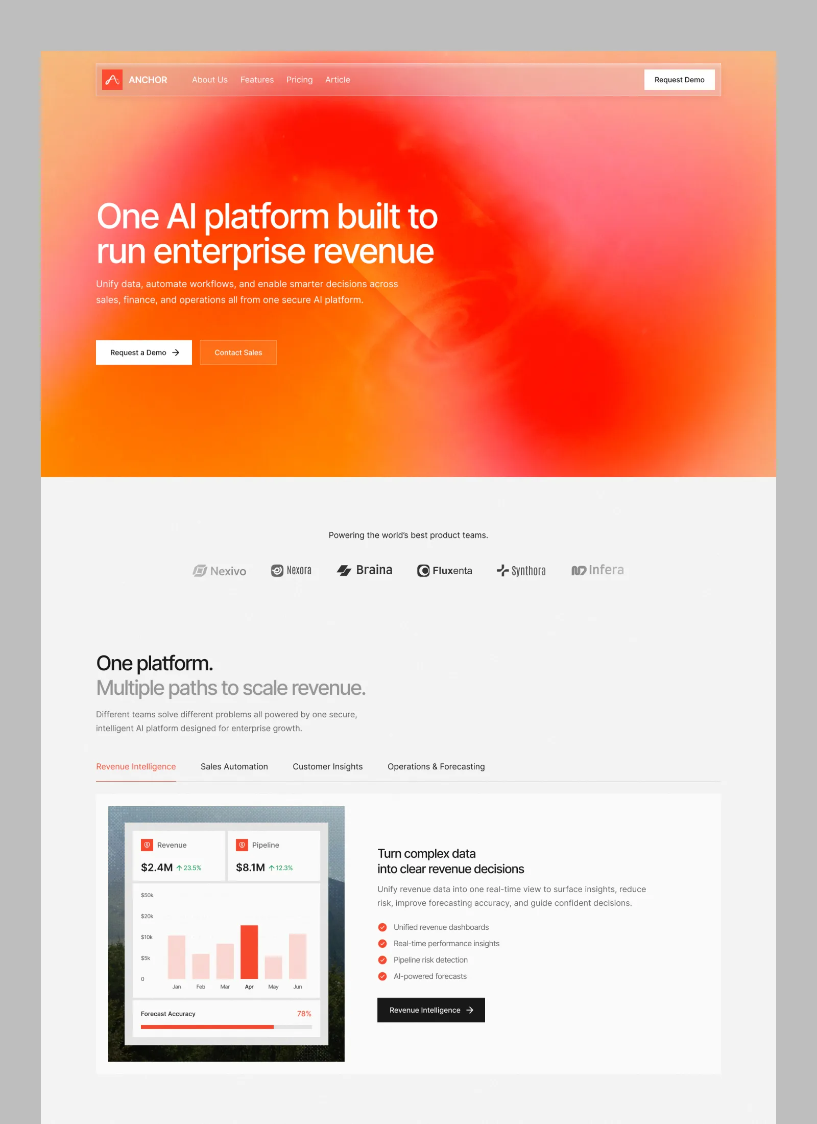
RebuildReference
Move across the image to wipe between the two. Click to lock the seam; arrow keys nudge it.
Imagery
2/2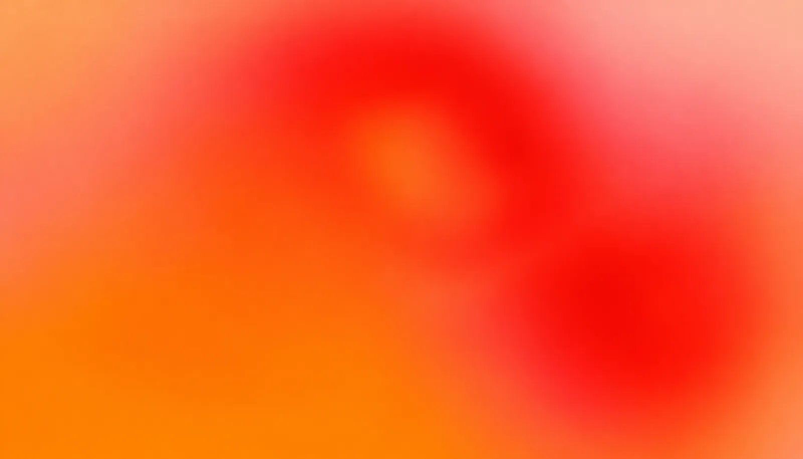
01-hero-gradient-field
Blurred red-to-orange gradient field with a deep red vortex in the upper right, used as the full-bleed hero background
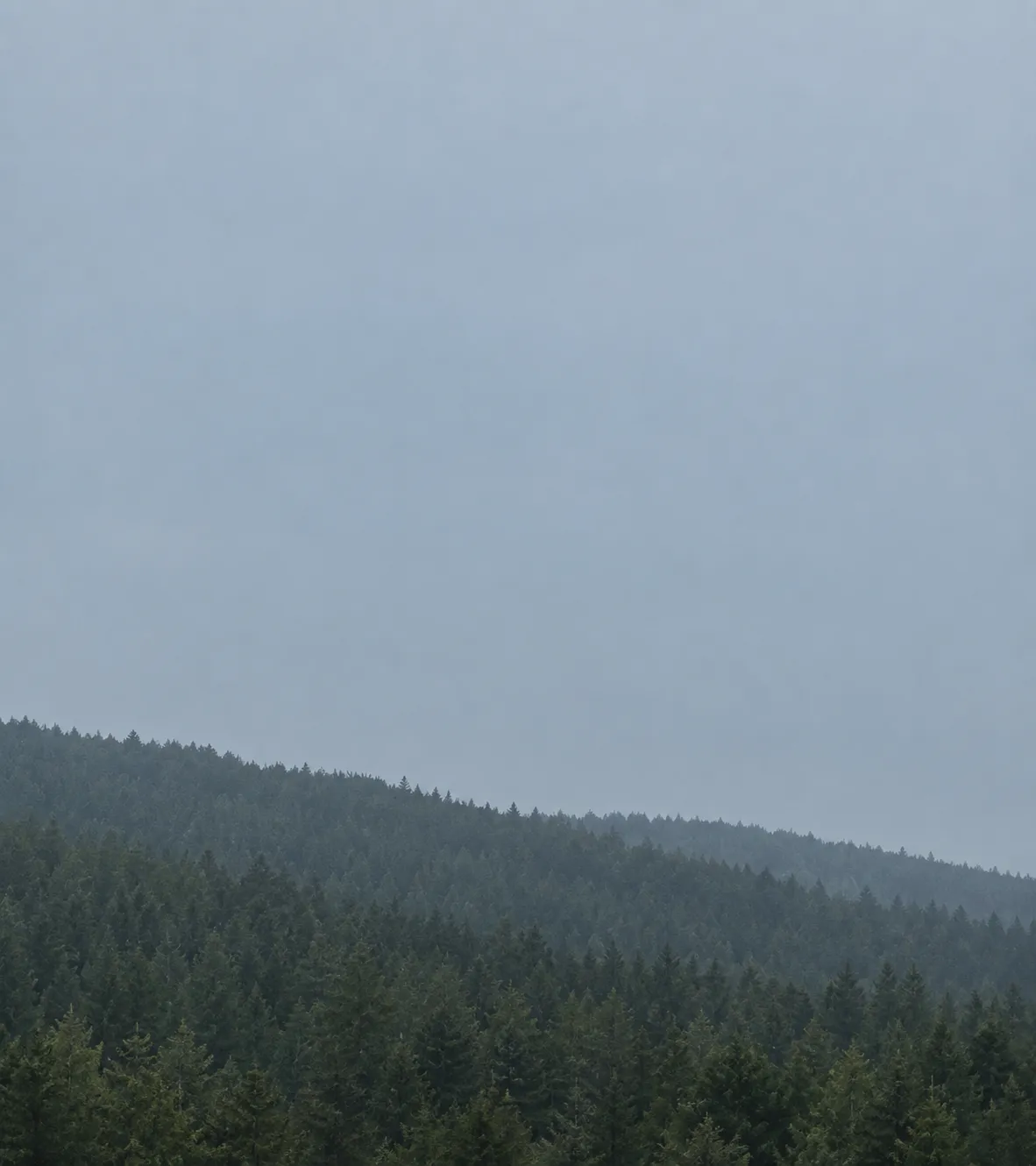
02-product-plate-dusk-ridge
Quiet dusk photograph of a forested ridge under flat cool blue-grey light, used as a backdrop plate behind a product UI card
Prompts
122,809 chars
# Reusable build prompt — light SaaS landing page with a blurred red-orange gradient hero and a tabbed product panel

Reference viewport: **1440 × 900**. All px values below are at that width. The page is **full-bleed**: no outer margin, no rounded page corners, nothing behind it. No motion report was supplied for this reference — every timing, trigger and easing in the Motion section is marked **(inferred)** and given as a range rather than a measured number.

---

## 1. Structure

- **Page width:** full-bleed. **Content container:** 1224px max-width, centred → 108px gutters at 1440. 12 columns, 24px gutter.
- **Column structure:** the hero, the intro and the tab bar are all **left-aligned to the container edge** (x = 108), not centred. The logo wall is the one centred block. The product panel is a 2-column split: 462px media / 64px gap / 650px text.
- Sections 1–4 are what the captured crop covers, described from measurement. Sections 5–12 continue the page below the crop and are marked **(inferred — below the captured crop)**; build them, they are what the page is judged on at lower scroll positions.

Sections, top to bottom:

1. **Hero** — full-bleed blurred gradient panel with a floating nav bar inside it.
2. **Logo wall** — one centred line of type over six greyed wordmarks.
3. **Platform intro + tab bar** — two-tone heading, short paragraph, 4 underlined tabs.
4. **Tab panel** — white panel: composited product still on the left, heading + copy + checklist + dark CTA on the right.
5. **Metrics band** — four large figures in a row. *(inferred)*
6. **Feature bento** — 2 + 3 card grid. *(inferred)*
7. **How it works** — three numbered steps on a hairline. *(inferred)*
8. **Testimonial** — single large quote, small portrait. *(inferred)*
9. **Pricing** — three plans, middle one emphasised. *(inferred)*
10. **FAQ** — six-row accordion. *(inferred)*
11. **Closing CTA** — second full-bleed gradient panel, reprising the hero field. *(inferred)*
12. **Footer** — four link columns on ink. *(inferred)*

Sections 2–10 sit on one continuous **#F5F5F5** surface. There are no band colour changes between them; the rhythm comes entirely from padding. Only sections 1 and 11 break the surface, and only 12 goes dark.

---

## 2. Scroll map

| # | Section | Height | Viewports | Scroll consumed | Kind |
|---|---|---|---|---|---|
| 1 | Hero | 840px | 0.93 | 840px | static bed + entrance |
| 2 | Logo wall | 344px | 0.38 | 344px | entrance |
| 3 | Platform intro + tabs | 280px | 0.31 | 280px | entrance |
| 4 | Tab panel | 705px | 0.78 | 705px | entrance |
| 5 | Metrics band | 380px | 0.42 | 380px | entrance *(inferred)* |
| 6 | Feature bento | 880px | 0.98 | 880px | entrance *(inferred)* |
| 7 | How it works | 760px | 0.84 | 760px | entrance *(inferred)* |
| 8 | Testimonial | 520px | 0.58 | 520px | entrance *(inferred)* |
| 9 | Pricing | 980px | 1.09 | 980px | entrance *(inferred)* |
| 10 | FAQ | 700px | 0.78 | 700px | entrance *(inferred)* |
| 11 | Closing CTA | 640px | 0.71 | 640px | scroll-linked *(inferred)* |
| 12 | Footer | 420px | 0.47 | 420px | static *(inferred)* |

**Total page height: 7449px ≈ 8.28 viewports.** Nothing pins. Nothing stacks. No section consumes more scroll than its own height — this page scrolls at 1:1 the whole way down, and that is a deliberate property of it.

---

## 3. Spacing

- **Hero (1):** nav sits 28px from the page top, 64px tall. Headline top is 298px from the page top. Headline → sub-paragraph 28px. Sub → button row 72px. Button row → hero bottom edge 219px. Hero total 840px.
- **Logo wall (2):** 104px top padding → eyebrow line → 44px → logo row (26px tall marks) → 144px to the next heading. Logo row is 847px wide, centred, 55px between marks.
- **Intro (3):** heading (2 lines) → 28px → paragraph (2 lines) → 56px → tab labels → 20px → 1px full-container rule → 24px → panel.
- **Tab panel (4):** panel padding 24px on all four sides. Internal column gap 64px. Right column: heading → 28px → paragraph → 40px → checklist (28px row gap, 10px icon-to-text) → 40px → CTA button. Panel bottom → next section: 128px.
- **Section rhythm below (inferred):** 128px top padding / 128px bottom padding is the default for sections 5–10; 144px where a section opens with a large two-line heading. Inside a section, heading block → content is 56px, content row gap is 24px.
- Vertical rhythm is coarse and consistent: the only values used are **24 / 28 / 40 / 44 / 56 / 64 / 104 / 128 / 144**. Do not introduce intermediate values.

---

## 4. Type

One family throughout. **Class: neo-grotesk with slightly geometric, wide lowercase and flat horizontal terminals** — the `t` has an angled cut, `a` is double-storey, `G` has no spur. Free stand-ins, in order of preference: **Geist**, **Inter Tight**, **Instrument Sans**. If you fall back to plain Inter, tighten display tracking to compensate. No second family anywhere, including the mono-looking chart labels.

| Role | Size | Line-height | Tracking | Weight | Colour | Max measure |
|---|---|---|---|---|---|---|
| Hero headline (1) | 72px | 1.05 | −0.02em | 600 | #FFFFFF | 700px / ~24ch per line, breaks to 2 lines |
| Hero sub (1) | 18px | 1.6 | 0 | 400 | #FFFFFF @ 92% | 600px / ~62ch, 2 lines |
| Wordmark (1) | 17px | 1.0 | +0.08em | 700, uppercase | #FFFFFF | — |
| Nav link (1) | 15px | 1.0 | 0 | 450 | #FFFFFF @ 88% | — |
| Button label (all) | 15px | 1.0 | 0 | 500 | context | — |
| Eyebrow line (2) | 16px | 1.5 | 0 | 400 | #1A1A1A | centred, one line |
| Section heading (3) | 48px | 1.06 | −0.02em | 500 | line 1 #111111, line 2 #9E9E9E | 700px, 2 lines |
| Body paragraph (3, 4) | 17px | 1.6 | 0 | 400 | #5A5A5A | 520–530px / ~64ch |
| Tab label (3) | 16px | 1.4 | 0 | 500 | active #FE4738, idle #3A3A3A | — |
| Panel heading (4) | 26px | 1.35 | −0.01em | 500 | #111111 | 2 lines, hard break |
| Checklist item (4) | 16px | 1.5 | 0 | 400 | #2A2A2A | — |
| Mock UI label (4) | 12px | 1.3 | 0 | 500 | #8A8A8A | — |
| Mock UI figure (4) | 22px | 1.2 | −0.01em | 600 | #111111 | — |
| Mock UI micro (4) | 11px | 1.3 | 0 | 500 | delta green / grey | — |
| Footer link (12) | 15px | 1.9 | 0 | 400 | #FFFFFF @ 70% | — |

The hero headline's leading is genuinely tight — the two lines nearly touch. Do not let it open up to 1.2.

---

## 5. Colour

| Hex | Role |
|---|---|
| **#F5F5F5** | **Dominant surface.** Everything from section 2 to section 10 sits on it — roughly 70% of the page's area. Never substitute pure white for it. |
| **#FFFFFF** | Panel and card fill (section 4 panel, pricing cards, the composited UI card), the nav's demo button, and all type inside the hero. |
| **#FE7701** | Hero gradient's outer field — the orange that owns the bottom-left and bottom edge of the hero. Background only; never type, never a button. |
| **#FE1501** | Hero gradient's hot core — the deepest red inside the vortex, upper-centre-right. Background only. |
| **#FC9777** | Pastel salmon falloff — top-right corner of the hero and the translucent nav bar's tint. Also the pale bar-chart fill, lightened to #FBD9CF. |
| **#FE4738** | **The single UI accent.** Allowed in exactly five places: the logo mark's square, the active tab label and its 2px underline, the checklist check circles, the one highlighted chart bar and the progress-bar fill, and the inline `78%` figure. Nowhere else. |
| **#111111 / #141414** | Ink — headings, the dark CTA button fill, the footer field. |
| **#5A5A5A** | Body copy. |
| **#9E9E9E** | Second heading line, logo-wall marks, chart axis labels. |
| **#E4E4E4** | Hairlines: the tab rule, panel dividers, card borders. |
| **#1FA85C** | Reserved for the two `↑ %` deltas inside the product mock. It exists only there. |

The accent red must never cover a large area outside the two gradient panels. If a fill is bigger than a button, it is ink or white, not red.

---

## 6. Surface

- **Borders:** 1px, #E4E4E4. On the gradient, borders are `rgba(255,255,255,0.35)` instead (nav bar outline, secondary button outline).
- **Radii:** nav bar 10px · buttons 6px · logo mark 8px · the section-4 white panel **0px (square corners)** · cards inside the product mock 8px · icon chips 6px · check circles fully round. Nothing on this page uses a 16–24px radius.
- **Shadows:** the flat page has **none** — no card shadow, no nav shadow, no button shadow. The single exception is the UI card composited over the photograph in section 4: `0 24px 60px rgba(0,0,0,0.18)`, because it is floating above a photo, not above the page.
- The nav bar is a translucent glass strip over the gradient: `rgba(255,255,255,0.14)` fill, `backdrop-filter: blur(20px)`, 1px white-35% outline, plus a 1px vertical divider at white-25% separating the wordmark from the link list.

---

## 7. Imagery

1. **Hero gradient field (1)** — 1440 × 840, ~1.71:1, full-bleed behind the nav and headline. Not a photograph and not a mesh you can see the vertices of: a single enormous out-of-focus bloom. A deep red torus/vortex sits upper-centre-right with a darker crimson eye at its middle; the red falls off into saturated orange that sinks toward the bottom-left and floods the bottom edge; a pale salmon haze lifts the top-right corner. Blurred far past the point where any stop is identifiable — no bands, no visible edges, no hard boundary anywhere. Add 2–3% film grain over the whole field. Ship it as a raster (WebP) rather than layered CSS gradients; CSS will band.
2. **Product still (4)** — 462 × 519, ~8:9 portrait, inset 24px from the panel's left and vertical edges. A dusk landscape photograph used as a backdrop plate — a forested ridge under cool blue-grey light, low contrast, deliberately quiet and slightly desaturated so it reads as a surface, not a subject. A white product UI card is composited over it, centred, occupying ~73% of the plate's width and ~79% of its height, with the soft shadow above.
3. **The UI card's contents are DOM, not an image:** a top row of two stat tiles side by side, each with a 16px red icon chip, a 12px grey label, a 22px figure, and a small green `↑ %` delta. Below that, a column chart — axis labels `$50k / $20k / $10k / $5k / 0` on the left, six months across the bottom, five bars in pale pink and exactly one bar in accent red with its month label bolded to black. Below that, separated by a hairline, a footer row: a 12px label on the left, the accent-red percentage on the right, and a 4px progress track under both filled to 78% in accent red.
4. **Logo wall marks (2)** — six wordmarks, each with a small glyph to the left of the name, all flattened to a single grey (#9E9E9E), all optically normalised to ~26px height. Varying widths, not a fixed grid.
5. **Portrait (8, inferred)** — 1:1, 56px, circular, a plain head-and-shoulders crop on a neutral ground.

---

## 8. Motion

No motion was measured for this reference. Every block below is **(inferred)** from the stills and from the page's construction; durations are given as ranges, and no lerp, stiffness or spring parameter is specified because none was measured. The page's character is restraint — short, quiet entrances, one slow scroll-linked gradient, and nothing that pins.

**Section 1 — Hero**
- **kind:** static bed carrying a one-time entrance *(inferred)*
- **what moves:** nav bar; headline lines; sub-paragraph; button row. The gradient field itself does not move.
- **from → to:** nav `opacity 0 → 1`, `translateY −12px → 0`. Headline lines `opacity 0 → 1`, `translateY 24px → 0`, each line as its own element. Sub and button row the same at 16px.
- **range:** entrance, fires once on load, not on scroll. Duration 500–700ms, ease-out (a cubic like `cubic-bezier(0.22, 1, 0.36, 1)` fits the feel). Stagger 60–90ms in order nav → line 1 → line 2 → sub → buttons.
- **reduced motion:** everything renders at final opacity and position; no translate, no fade.

**Section 2 — Logo wall**
- **kind:** entrance *(inferred)*
- **what moves:** the eyebrow line, then the six marks.
- **from → to:** `opacity 0 → 1`, `translateY 16px → 0`.
- **range:** plays once, triggered when the section's top reaches 85% of the viewport. 400–600ms, ease-out, 40–60ms stagger across the marks left to right.
- **reduced motion:** static, fully visible.

**Section 3 — Platform intro + tabs**
- **kind:** entrance *(inferred)*
- **what moves:** heading line 1, heading line 2, paragraph, tab row, hairline rule.
- **from → to:** text `opacity 0 → 1`, `translateY 20px → 0`. The hairline rule scales from its left edge: `scaleX 0 → 1`, `transform-origin: left`.
- **range:** once, when the heading's top reaches 80% of the viewport. 500–650ms, ease-out, 70ms stagger; the rule runs last and slower (700–900ms).
- **reduced motion:** all static; the rule is drawn at full width immediately.

**Section 4 — Tab panel**
- **kind:** entrance *(inferred)*
- **what moves:** the white panel as a block, then its right-column children.
- **from → to:** panel `opacity 0 → 1`, `translateY 28px → 0`. Inside it, heading / paragraph / each checklist row / CTA `opacity 0 → 1`, `translateY 14px → 0`. The composited product still additionally lifts `scale 0.985 → 1`.
- **range:** once, when the panel's top reaches 82% of the viewport. Panel 600–750ms; children start at +150ms with a 50–70ms stagger down the checklist. Not scroll-linked — it does not reverse on the way back up.
- **reduced motion:** panel and contents appear at rest; no scale on the still.

**Section 5 — Metrics band** *(inferred)*
- **kind:** entrance
- **what moves:** the four figures and their captions.
- **from → to:** `opacity 0 → 1`, `translateY 18px → 0`. Optionally the numerals count up from 0 to value.
- **range:** once, at 80% of the viewport. 500–700ms, 80ms stagger left to right; count-up 900–1200ms, ease-out.
- **reduced motion:** final values printed immediately, no count-up.

**Section 6 — Feature bento** *(inferred)*
- **kind:** entrance
- **what moves:** each card.
- **from → to:** `opacity 0 → 1`, `translateY 24px → 0`.
- **range:** once, per card, when that card's top reaches 85% of the viewport. 450–600ms, ease-out, 60ms stagger within a row.
- **reduced motion:** static.

**Section 7 — How it works** *(inferred)*
- **kind:** entrance
- **what moves:** the connecting hairline, then the three step blocks.
- **from → to:** hairline `scaleX 0 → 1` from the left; steps `opacity 0 → 1`, `translateY 20px → 0`.
- **range:** once, at 80% of the viewport. Hairline 800–1000ms; steps follow with a 120ms stagger.
- **reduced motion:** hairline full, steps static.

**Section 8 — Testimonial** *(inferred)*
- **kind:** entrance
- **what moves:** the quote and the attribution row.
- **from → to:** `opacity 0 → 1`, `translateY 16px → 0`.
- **range:** once, at 80% of the viewport. 600–800ms, quote first, attribution +100ms.
- **reduced motion:** static.

**Section 9 — Pricing** *(inferred)*
- **kind:** entrance
- **what moves:** the three plan cards.
- **from → to:** `opacity 0 → 1`, `translateY 24px → 0`; the emphasised middle card also `scale 0.98 → 1`.
- **range:** once, at 85% of the viewport, 500–650ms, 70ms stagger outward from the middle card.
- **reduced motion:** static, middle card at full scale.

**Section 10 — FAQ** *(inferred)*
- **kind:** entrance
- **what moves:** each closed row.
- **from → to:** `opacity 0 → 1`, `translateY 12px → 0`.
- **range:** once, at 88% of the viewport, 350–500ms, 40ms stagger down the list. The open/close itself is an interaction, not scroll.
- **reduced motion:** static.

**Section 11 — Closing CTA** *(inferred)*
- **kind:** scroll-linked
- **what moves:** the gradient field behind the CTA copy. The copy itself is an entrance.
- **from → to:** gradient `translateY −6% → +6%` and `scale 1.08 → 1.0` as a function of scroll position — it reverses when you scroll back up. Copy: `opacity 0 → 1`, `translateY 20px → 0`, entrance only, plays once.
- **range:** scroll-linked from the moment the section's top enters the viewport until its bottom leaves it. Copy entrance triggers at 75% of the viewport, 600–800ms, 80ms stagger.
- **reduced motion:** gradient locked at its midpoint, no scroll link; copy static.

**Section 12 — Footer** *(inferred)*
- **kind:** static
- **what moves:** nothing. The footer has no entrance and no scroll link — it is simply there when you reach it.
- **from → to:** n/a
- **range:** n/a
- **reduced motion:** identical.

### Interaction transitions (not part of the scroll choreography)

- **Nav link hover:** colour white-88% → white-100%, 150ms.
- **White button hover:** background #FFFFFF → #F0F0F0, arrow glyph `translateX 0 → 3px`, 180ms ease-out. Press: `scale 0.985`, 80ms.
- **Outlined button on gradient hover:** fill `rgba(255,255,255,0.12) → rgba(255,255,255,0.22)`, 180ms.
- **Dark CTA hover:** background #141414 → #2A2A2A, arrow `translateX 3px`, 180ms.
- **Tab click:** idle label colour → #FE4738 over 180ms; the 2px underline segment slides horizontally to the new tab's width and position over 260–320ms with an ease-in-out; the panel contents crossfade `opacity 1 → 0 → 1` over 2 × 160ms with a 6px `translateY` on the incoming side. The panel's height animates to the new content height rather than jumping.
- **Feature / pricing card hover:** border #E4E4E4 → #D2D2D2, `translateY −2px`, 200ms. No shadow appears on hover.
- **FAQ open/close:** row height animates 280–360ms ease-in-out; the `+` glyph rotates 0 → 45°, 200ms; answer text fades in over the last 60% of the expansion.
- **Logo wall marks:** no hover state.

---

## 9. Responsive (below 640px)

- Container padding drops to 20px; the 1224px container becomes fluid.
- **Nav:** the pill stays, 56px tall, 16px from the top, inset 16px from the edges. The link list is dropped into a hamburger; the demo button stays visible but shrinks to a 36px-tall label. Wordmark stays.
- **Hero:** height goes auto with `min-height: 620px`. Headline 36px / 1.1, allowed to run 3–4 lines. Sub 16px / 1.6, full width. The two buttons stack full-width with a 12px gap; the outlined one keeps its outline. The gradient image re-crops to portrait, keeping the red core visible in the upper third — do not letterbox it.
- **Logo wall (2):** eyebrow 15px; the six marks become a 3 × 2 grid, 32px column gap, 28px row gap, marks reduced to 20px tall.
- **Intro (3):** heading 30px / 1.1, still two-tone across two lines. Paragraph 16px, full width.
- **Tabs (3):** the row becomes a horizontally scrollable strip with the hairline rule still running full-bleed under it; overflow scrolls, labels do not wrap, the active tab scrolls into view on selection. Do not convert the tabs to a dropdown or an accordion.
- **Tab panel (4):** stacks — media above text. The product still re-crops from 8:9 portrait to a 16:11 landscape, full panel width, with the UI card scaled to ~88% of it. Panel padding 16px. Heading 22px. Checklist keeps its icons and row rhythm. CTA button goes full-width.
- **Sections 5–10 (inferred):** all grids collapse to one column; metrics become a 2 × 2 grid; pricing cards stack with the emphasised card first; section padding drops to 80px top and bottom.
- **Closing CTA (11):** the scroll-linked gradient drift is disabled on touch — the field is static.
- **Footer (12):** four columns become two, then a single stacked list.

---

## 10. Don'ts

- **Don't let the gradient leak.** It appears exactly twice — hero and closing CTA. It is not a body background, not a section tint, not a blurred blob behind the pricing cards, and not a glow under the nav. Everything between is flat #F5F5F5.
- **Don't build the gradient in CSS.** `radial-gradient` stacks band visibly at this size and scale. Ship a blurred raster with grain. If you must use CSS, blur it to 120px+ and overlay noise.
- **Don't make it a purple-to-blue "AI" gradient,** and don't add a second hue. It is red into orange into salmon, nothing else — no magenta, no yellow, no teal.
- **Don't give the gradient a visible shape.** No readable torus edge, no lens flare, no sharp highlight, no mesh vertices. It should look like a photograph of a light source through frosted glass.
- **Don't round the page or inset it.** The hero touches all four edges of the viewport. Any rounded corner or coloured margin around the page is the mockup's presentation mat, not the design.
- **Don't add shadows to the flat page.** The white panel in section 4 has square corners and no shadow — that flatness is the whole look. The only shadow on the page is under the UI card floating on the photograph.
- **Don't reach for 16–24px card radii.** The panel is 0px. Buttons are 6px. The nav is 10px. That is the entire radius vocabulary.
- **Don't centre the hero.** Headline, sub and buttons are hard-left at the container edge, and the headline occupies only the left ~48% of the viewport — the right half is deliberately empty gradient. Don't fill it with a product shot.
- **Don't colour the second heading line red.** In section 3 the first line is near-black and the second is mid-grey #9E9E9E. Using the accent there destroys the restraint the accent depends on.
- **Don't turn the active tab into a pill.** It is a coloured label with a 2px rule under the label's own width, sitting on a 1px full-container hairline. No background fill, no box, no rounded chip.
- **Don't spend the accent.** #FE4738 appears on a 36px logo mark, one tab label + its 2px rule, four 18px check circles, one chart bar, one progress fill, one percentage. If your rebuild has red buttons, red headings, or a red section, it is wrong — the primary CTA inside the page body is **black**.
- **Don't use emoji or outline ticks for the checklist.** Filled accent-red circles with a white checkmark, 18px.
- **Don't make the chart colourful.** Five bars in one pale pink tint, one bar in accent red, its month label bolded. No gridlines beyond the implicit axis labels, no legend, no tooltip.
- **Don't set the headline in a serif, and don't go to 700+.** 600 weight, −0.02em tracking, ~1.05 leading. And don't open the leading up — the two lines nearly touch, on purpose.
- **Don't pin anything.** No sticky section, no horizontal scroll hijack, no scroll-driven counter on the hero. This page scrolls 1:1 top to bottom; the only scroll-linked value on it is the closing gradient's slow drift.
- **Don't add the usual scroll furniture:** no progress bar, no custom cursor blob, no logo marquee (the logo wall is a static centred row), no parallax on the hero headline, no text-reveal-by-character.
- **Don't use pure white as the page background.** #F5F5F5 against #FFFFFF panels is what makes the panels read as panels; on white they vanish.
- **Don't let the nav go opaque or sticky-solid on scroll.** It's a translucent glass strip that lives inside the hero. If you make it sticky, keep the blur and the white-35% outline, and never fill it solid white.
Captures
1Versions
1Each rebuild is kept. The live one is what the comparison shows. LiveOpus 5.5Extra highfrontend-designemil-design-engtransitions-devhumanizergsaplast month · 90s · 2 images · 20260917T184926ZOpen