BridgeAI — Full-bleed landscape hero
Section13 Sep 2026, 16:58
Rebuild
Opus 5.5Extra highfrontend-designemil-design-engtransitions-devhumanizergsapView

RebuildReference
Move across the image to wipe between the two. Click to lock the seam; arrow keys nudge it.
Imagery
1/1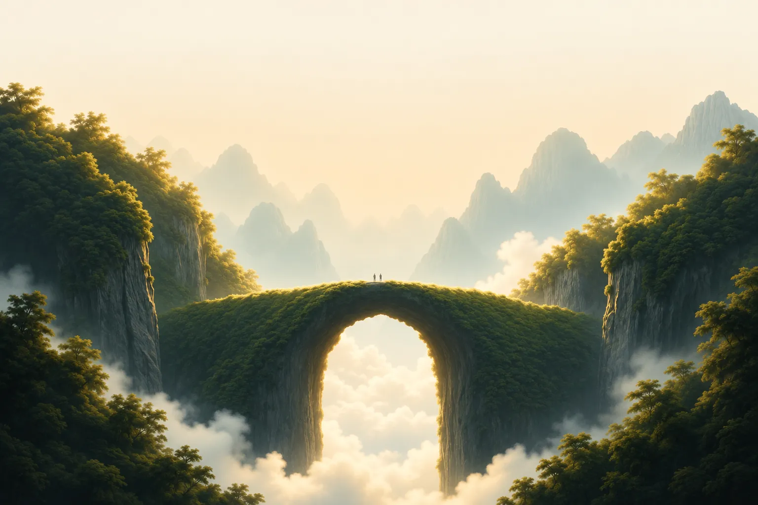
01-hero-landscape
Moss-covered natural rock arch spanning a cloud-filled gorge, with hazy karst peaks receding behind it and two tiny figures standing on the span
Prompts
118,210 chars
# Full-bleed landscape hero — section build prompt

A single full-bleed hero **section**, one viewport tall, built on one large photograph that runs edge to edge with no container, no mat and no rounded page corners. All UI floats directly on the photo: a pill nav at the top, a two-line green headline in the optical centre, and two corner blocks at the bottom (a text callout left, a video affordance right). There is no card, panel or scrim behind any of it — legibility comes from the photograph itself being bleached pale at the top and dark in the lower corners.

Reference viewport for every number below: **1440 × 900**. (Numbers derive from a 1200 × 750 still scaled ×1.2; treat them as the design's own values and scale fluidly.)

---

## 1. Structure

- **Container:** none for the section itself — it is `100vw × 100vh` (`min-height: 760px`), `overflow: hidden`, photo as the base layer with `object-fit: cover`.
- **Content inset:** 48px left and right, 48px bottom. The top bar's optical centre sits 64px from the top.
- **Column structure:** not a 12-column grid — three anchored zones on the vertical axis, each independently placed:
  - top bar: `display: flex; justify-content: space-between`, three groups (left wordmark / centre pill / right utility links), the centre pill optically centred on the viewport, not on the remaining space
  - centre stack: centred block, headline `max-width: 1000px`, subhead `max-width: 460px`
  - bottom row: two blocks pinned to opposite bottom corners, left `width: 315px`, right `width: 270px`, nothing between them

Sections, top to bottom (all five share the same single viewport — they are layers of one section, numbered for reference below):

1. **Photographic canvas** — the full-bleed landscape, behind everything.
2. **Floating top bar** — wordmark left, translucent pill nav centre, two utility links right.
3. **Centre headline stack** — two-line headline + two-line subhead, centred.
4. **Bottom-left feature callout** — icon + label, 3-line paragraph, primary pill button + text link.
5. **Bottom-right video affordance** — small feathered video plate with play button, caption row beneath.

---

## 2. Scroll map

No motion report accompanied this reference. **Every value in this section and in Motion is (inferred) from the still; no timing, easing or scroll range was measured.**

| # | Section | Height | Viewports | Scroll consumed | Kind |
|---|---------|--------|-----------|-----------------|------|
| 1 | Photographic canvas | 900px | 1.0 | 900px | scroll-linked (parallax) (inferred) |
| 2 | Floating top bar | 128px band, inside section 1 | 0.14 | 0 (shares section 1) | entrance, then static (inferred) |
| 3 | Centre headline stack | 260px block, inside section 1 | 0.29 | 0 (shares section 1) | entrance, then scroll-linked drift (inferred) |
| 4 | Bottom-left callout | 194px block, inside section 1 | 0.22 | 0 (shares section 1) | entrance (inferred) |
| 5 | Bottom-right video affordance | 168px block, inside section 1 | 0.19 | 0 (shares section 1) | entrance (inferred) |

**Total section height: 900px (1.0 viewport).** Nothing pins, nothing stacks. If the section is placed alone on a page, give the page ~1.6 viewports of scroll so the parallax in section 1 has somewhere to travel.

---

## 3. Spacing

- Section padding: `48px` left/right, `48px` bottom; top bar centred at `64px` from the top edge.
- **2 — top bar:** pill is `53px` tall, `padding: 6px 6px 6px 24px` (asymmetric: the dark button sits flush to the right inside it). Gap between nav links: `28px`. Gap between the last link and the dark button: `24px`. Right utility links: `24px` apart; the icon before the second link sits `6px` from its label.
- **3 — centre stack:** headline block top at `205px` from the section top (≈23% of the viewport). Headline line gap is the line-height only (96px). Headline → subhead: `48px`. Subhead lines: line-height only (32px).
- **4 — callout:** icon → label `10px` (horizontal, same baseline row). Label → paragraph `22px`. Paragraph → button row `44px`. Button → text link `26px` horizontal.
- **5 — video:** plate bottom → caption row `26px`. Inside the caption row, glyph → label `8px`, label → duration `14px`.
- **Rhythm:** the section has no internal section rhythm — it is one held frame. The rhythm that matters is the *vertical air*: ~205px above the headline, ~290px of empty photograph between the subhead and the bottom row. Do not fill that gap. It is where the photograph does its work.

---

## 4. Type

One family throughout. **Class: neo-grotesk display** — tight apertures, double-storey `a`, flat-terminal `e`, near-vertical stress, and a display optical size on the headline (noticeably tighter joins and thinner hairlines than the body cut). Free stand-in: **General Sans** (Fontshare) or **Inter** with `font-optical-sizing: auto` for the headline. Numerals lining, tabular in the duration.

| Role | Size | Line-height | Tracking | Weight |
|---|---|---|---|---|
| Wordmark (2) | 22px | 1.1 | −0.01em | 600 |
| Nav link, active (2) | 16px | 1.2 | 0 | 500 |
| Nav link, rest (2) | 16px | 1.2 | 0 | 400 |
| Nav button label (2) | 16px | 1.0 | 0 | 500 |
| Utility link (2) | 16px | 1.2 | 0 | 400 |
| H1 (3) | 100px | 0.96 (96px) | −0.025em | 500 |
| Subhead (3) | 20px | 1.6 (32px) | −0.005em | 400 |
| Callout label (4) | 16px | 1.2 | 0 | 500 |
| Callout body (4) | 15px | 1.5 (22px) | 0 | 400 |
| Button label (4) | 16px | 1.0 | 0 | 500 |
| Text link (4) | 16px | 1.0 | 0 | 500 |
| Caption + duration (5) | 14px | 1.2 | 0 | 400 |

Max line length: headline **≈26ch per line** (2 lines, hard-broken, line 2 shorter than line 1); subhead **≈46ch** (2 lines, second line shorter); callout body **≈40ch** (3 lines). Superscript trademark-style marks after the wordmark and the callout label are set at `0.45em`, baseline-shifted up ~`0.55em` — keep them, they are part of the texture.

Placeholder copy by role: wordmark 1 word; nav links 3 items of 1–2 words; nav button 2–3 words; utility links 2 words and 1 word; **headline 6 words on two lines** (4 on the first, 3 on the second); subhead 12–14 words on two lines; callout label 1 compound word; callout body 18–22 words; primary button 2–3 words; text link 2 words; caption 3 words plus a `M:SS` duration.

---

## 5. Colour

Most of the surface is **the photograph**, not a flat fill — roughly 70% of the frame is image, and the UI palette is only what floats on it.

| Hex | Role |
|---|---|
| `#F7EDD8` | Dominant. The bleached cream sky occupying the top third of the photograph, and the fill of the nav pill and the primary button. This is what "the page colour" reads as. |
| `#E6C987` | Secondary image tone — the warm sun haze in the upper-middle band. Never used as a UI fill. |
| `#786829` | Sunlit foliage mid-tone in the photograph. Image only. |
| `#142828` | Ink. The dark nav button fill, the label on the light primary button, and the darkest UI text. |
| `#040B0C` | Deepest shadow in the gorge and lower-left foliage — the value that makes white text in the bottom corners legible. Image only; do not use it as a UI fill. |
| `#2F6A47` (inferred) | **The single accent.** Forest green. |
| `#FFFFFF` / `rgba(255,255,255,0.85)` | Text in the lower two corners (4 and 5) only. |
| `rgba(74,83,72,1)` (inferred) | Subhead and inactive nav links — a desaturated olive-grey read off the photo, not neutral grey. |

**Where the accent is allowed:** the headline, and nowhere else. No green buttons, no green icons, no green underlines. Within the headline it appears twice at two strengths — the first ~55% of the text at full `#2F6A47`, the remainder at **the same green at 45% opacity**, which resolves to a sage ≈`#9DB297` over the cream haze. Set it as opacity, not as a second hex, so it stays keyed to the photograph behind it.

---

## 6. Surface

- **Borders:** effectively none. The only rules are `1px solid rgba(255,255,255,0.45)` hairlines on the nav pill and the play button — visible only where they cross darker photo, which is the point.
- **Radii:** nav pill `999px` (53px tall); dark nav button `999px` (41px tall, `padding: 0 22px`); primary button `999px` (41px tall, `padding: 0 20px`); video inner frame `12px`; play button a `40px` circle.
- **Frosted surfaces:** nav pill `background: rgba(247,237,216,0.72)` + `backdrop-filter: blur(18px) saturate(1.1)`. Play button `rgba(255,255,255,0.28)` + `blur(10px)`.
- **The video plate (5) has no hard edge.** It is a `270 × 132px` lightly frosted rectangle whose edges are feathered out — a mask with ~24px of blur on all four sides, so it dissolves into the photograph rather than sitting on top of it. Inside it, a small portrait video frame (2:3, ~62 × 92px) at 12px radius, with the play button overlapping its right edge.
- **Shadows:** none. No `box-shadow` on the buttons, the pill or the plate. Depth is entirely photographic.
- **Scrims:** one, and it is not a full-frame overlay. A soft radial darkening in the bottom-left quadrant, `radial-gradient(ellipse 620px 420px at 6% 104%, rgba(4,11,12,0.38), transparent 70%)`, purely to hold the white callout text. Optionally a mirrored, weaker version bottom-right at 0.22.

---

## 7. Imagery

**One photograph, plus one video still.**

1. **Hero landscape (section 1)** — 16:10 as delivered (e.g. 2880 × 1800), rendered full-bleed with `object-fit: cover`, focal point centred on the arch. Subject: a natural land bridge — a moss- and tree-covered rock arch spanning a deep gorge — seen head-on and symmetrical, with karst peaks receding behind it and cloud pooling in the valley under the arch. Two tiny human silhouettes stand on top of the span, dead centre, no more than 10px tall at 1440. Treatment: shot into a low sun, so haze bleaches the top third almost to flat `#F7EDD8` and contrast falls away toward the horizon, while the near foliage on the left and right edges stays dense and dark. Greens are desaturated and warm-shifted, never emerald. The image must read as *depth*, not as a texture: three clear planes (near foliage, arch, distant peaks).
2. **Video still (section 5)** — a 2:3 portrait crop of the same landscape, tighter on the arch, sitting inside the feathered plate at the bottom right. It should look like a frame from the same shoot, not a different photograph.

If the arch is not available, the substitution rule is: a single natural formation that spans a gap, centred, with atmospheric haze behind it. Do not substitute an abstract gradient, a product shot, or a city.

---

## 8. Motion

No motion report was measured for this reference. Every block below is **(inferred)** from the still; durations and ranges are given as ranges, and no library parameters are specified because none were measured.

### 1 — Photographic canvas
- **kind:** scroll-linked (inferred)
- **what moves:** the photograph only.
- **from → to:** `scale(1.06) translateY(0)` → `scale(1.06) translateY(-60px)`. The 1.06 base scale exists purely to give the translate headroom so no edge is exposed.
- **range:** from the section top at the top of the viewport until the section has scrolled one full viewport. Reverses on the way back up.
- **reduced motion:** no translate, `scale(1)`, static image.

### 2 — Floating top bar
- **kind:** entrance, then static (inferred)
- **what moves:** the three top-bar groups (wordmark, pill, utility links).
- **from → to:** `opacity 0 → 1`, `translateY(-12px → 0)`.
- **range:** plays once on load, not on scroll. Duration 400–560ms, standard ease-out (`cubic-bezier(0.22, 1, 0.36, 1)`), 60–90ms stagger left → centre → right. The bar does not hide, shrink, or gain a background on scroll — it is static after arrival.
- **reduced motion:** appears at final state, no translate.

### 3 — Centre headline stack
- **kind:** entrance on arrival, then a scroll-linked drift (inferred)
- **what moves:** headline line 1, headline line 2, subhead — as three whole lines, never as individual words or characters.
- **from → to:** entrance `opacity 0 → 1`, `translateY(20px → 0)`, optional `clip-path: inset(0 0 100% 0) → inset(0 0 0% 0)` per line if you want the lines to rise out of their own box. Drift: `translateY(0 → -30px)` and `opacity 1 → 0.85`.
- **range:** entrance plays **once**, on load (this section is above the fold), duration 640–800ms, ease-out, 90–120ms stagger between the two headline lines and 140ms before the subhead. The drift is **scroll-linked** and reverses: from the section top at the top of the viewport until one viewport of scroll. The drift must be slower than the photograph's parallax in the same range — 30px against 60px — so the headline appears to hold while the land moves.
- **reduced motion:** entrance becomes an opacity fade only (240ms); drift is removed entirely.

### 4 — Bottom-left feature callout
- **kind:** entrance (inferred)
- **what moves:** the icon+label row, the paragraph, and the button row.
- **from → to:** `opacity 0 → 1`, `translateY(16px → 0)`.
- **range:** once, on load, starting 200–320ms after the headline begins. Duration 520–640ms, ease-out, 70–90ms stagger down the three rows. Does not react to scroll.
- **reduced motion:** fade only, no translate.

### 5 — Bottom-right video affordance
- **kind:** entrance (inferred)
- **what moves:** the feathered plate (with its inner frame) and the caption row.
- **from → to:** plate `opacity 0 → 1`, `scale(0.96 → 1)`, `translateY(12px → 0)`; caption row `opacity 0 → 1` with no transform.
- **range:** once, on load, last in the sequence — 380–500ms after the headline begins. Duration 560–700ms, ease-out, 100ms between plate and caption. Does not react to scroll.
- **reduced motion:** fade only, no scale, no translate.

### Interaction transitions (not part of the scroll choreography)

- Nav link hover: colour `rgba(74,83,72,1)` → `#142828`, 160ms ease. No underline, no background pill on hover.
- Dark nav button hover: background `#142828` → `#0B1A18`, 160ms. Press: `scale(0.98)`, 90ms.
- Primary light button hover: background `#F7EDD8` → `#FFFFFF`, 160ms. Press: `scale(0.98)`, 90ms.
- Text link ("Learn More") hover: a 1px underline grows from left to right over 200ms; colour unchanged.
- Utility links hover: opacity `0.8 → 1`, 140ms.
- Video plate hover: play button background `0.28 → 0.4` alpha and `scale(1.06)`, 200ms ease-out; the inner frame does not move and the plate does not lift.
- Play button press: `scale(0.94)`, 90ms.
- All interaction transitions are disabled to instant state changes under `prefers-reduced-motion`.

---

## 9. Responsive (below 640px)

- Section becomes `min-height: 100svh`, padding `20px` left/right, `28px` bottom, top bar centred at `36px`.
- **2:** the centre pill collapses — the three nav links are dropped, leaving the wordmark on the left and the dark "Book a Demo" button on the right (still `999px`, 38px tall). The frosted pill container is removed, not shrunk. Utility links are dropped entirely; put them behind a menu if navigation is required.
- **3:** headline drops to `42px / 1.02 / −0.02em`, still two lines, still colour-split at the same word. Subhead `16px / 1.55`, `max-width: 300px`. Headline block top moves to `18%` of the viewport.
- **4:** callout keeps the label and the button row; the 3-line paragraph is dropped (it is the first thing to go — it cannot survive at 40ch on a phone). Primary button and text link stay side by side, 18px gap.
- **5:** the video plate is dropped. The caption row survives, moved to sit directly beneath the button row in section 4, left-aligned.
- **1:** switch the photograph to a portrait crop (3:4 or 4:5) centred on the arch so the two planes and the arch all remain visible; do not letterbox or scale the landscape crop.

---

## 10. Don'ts

- **Don't put a dark overlay over the photograph.** The instinct is a `rgba(0,0,0,0.4)` scrim for legibility — it destroys this design. The top third must stay bleached to near-`#F7EDD8`, and the headline must sit on light haze. Only the bottom-left radial scrim exists.
- **Don't make the headline white.** Dark-green-on-light-photo is the entire idea. White text here reads like every other hero.
- **Don't use two different green hues in the headline.** One green, one at 100% and one at 45% opacity, so both stay keyed to the photograph behind them.
- **Don't split the headline colour at the line break.** The split falls mid-line — roughly 55% through line 1 — so the sage carries across the break into line 2. That asymmetry is the move.
- **Don't put a card, glass panel, or blurred box behind the headline or the subhead.**
- **Don't inset the design on a coloured sheet or round the page corners.** Full bleed, hard edges, no mat.
- **Don't set the headline in a geometric sans** (Poppins, Montserrat, Circular). Wrong skeleton — you need a neo-grotesk display cut. And don't leave tracking at default: `−0.025em` and `line-height: 0.96`, never ≥1.1.
- **Don't build the nav as a full-width bar with a background and a bottom border.** It is a floating, translucent, centred pill with the CTA nested inside it, flush to its right edge, with 6px of padding around that button — not 24px.
- **Don't centre the bottom content or turn it into a three-column row.** Two corner blocks, ~700px of empty photograph between them.
- **Don't give the video plate a hard white card, a border, or a drop shadow.** Its edges feather out into the image. If you can't do a blurred mask, use a soft alpha gradient — but never a crisp rectangle.
- **Don't add shadows anywhere.** No elevated buttons, no lifted pill.
- **Don't animate the headline word-by-word or character-by-character**, and don't use a bouncy spring. Whole lines, ease-out, once.
- **Don't parallax the photo far enough to expose an edge** — hence the `scale(1.06)` base. And don't parallax the headline faster than the photo; the relationship (30px vs 60px) is what sells the depth.
- **Don't add a scroll-down chevron, mouse-wheel icon, or "scroll" label.** The bottom corners are already occupied.
- **Don't reach for a saturated, HDR, emerald-green landscape.** Desaturated, warm-shifted, hazy, low local contrast in the upper half. The photograph should look slightly overexposed at the top, and that is correct.
Captures
1Versions
1Each rebuild is kept. The live one is what the comparison shows. LiveOpus 5.5Extra highfrontend-designemil-design-engtransitions-devhumanizergsaplast month · 122s · 1 image · 20260917T184012ZOpen