Cinematic agency landscape hero
Rebuild
Opus 5.5Highfrontend-designemil-design-engtransitions-devgsaphumanizerView
RebuildReference
Move across the image to wipe between the two. Click to lock the seam; arrow keys nudge it.
Imagery
3/3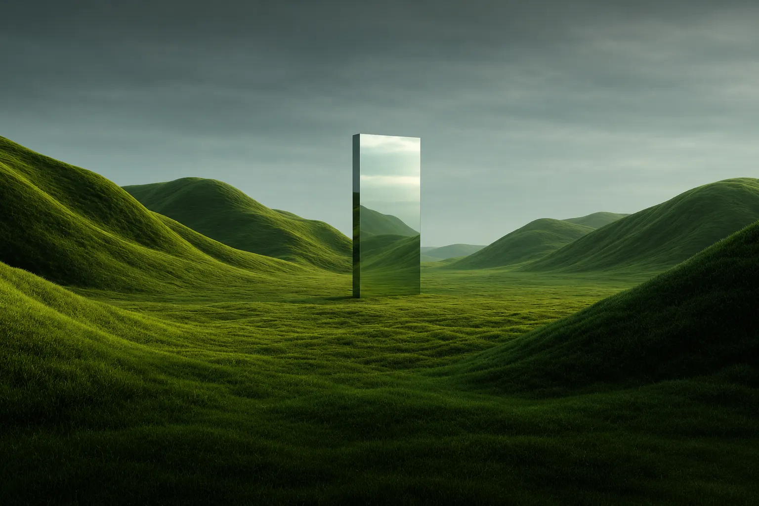
01-hero-meadow-monolith
Rolling green hills under an overcast sage-grey sky, with a tall mirrored monolith standing in the valley
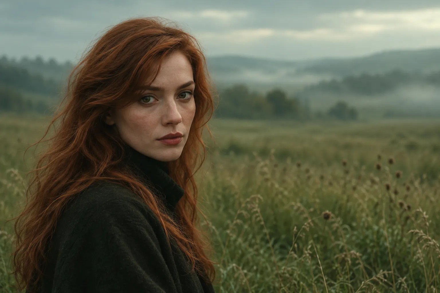
02-card-thumb-portrait
Moody portrait of a woman with auburn hair in dark clothing against a muted green-brown field
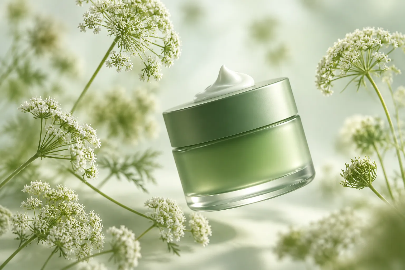
03-card-thumb-product
Green cosmetic jar among pale wildflowers in airy high-key light
Prompts
113,521 chars
# Meadow monolith agency hero

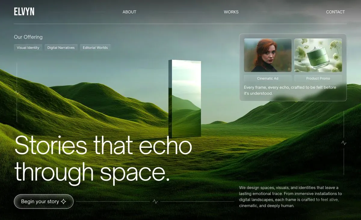
A single full-viewport hero for a creative studio. One cinematic photograph fills the whole frame: rolling green hills under an overcast sky, with a mirrored monolith standing in the meadow. A thin, quiet UI layer floats on top of it. It has a hairline nav, a small "offering" cluster at top left, a frosted-glass work-preview card at top right, a huge light-weight two-line headline at bottom left, a pill CTA and a short paragraph at bottom right. Hairline rules marked with small "pulse" glyphs hold the composition together. The look comes from the image and the restraint: thin type, thin lines, translucent surfaces and no coloured buttons.

All measurements are CSS px at a 1440 × ~880 viewport.

## Structure

- **Frame:** full bleed, `100vw × 100vh` (min-height 820px, max-height 1000px). Background image covers the whole frame.
- **Container:** full width with 56px side margins, so content is 1328px wide. Use a 12-column grid with 24px gutters (each column ≈ 88.7px).
- **Columns:** the left group (offering, headline, CTA) uses columns 1–6. The right group (glass card, paragraph) uses columns 9–12, from x≈954 to x≈1384, about 428px wide. Columns 7–8 stay empty, and the monolith in the photo stands there (x≈672–802).
- **Layout is asymmetric and anchored to the corners.** Nav and offering/card hang from the top. Headline, CTA and paragraph sit on the bottom. The middle of the frame is left open for the photograph.

Sections, top to bottom:

1. **Hero.** It's the only section and holds these layers, back to front:
   - 1a. Background photograph plus gradient overlays.
   - 1b. Nav bar: wordmark, three links and a full-width hairline underneath.
   - 1c. Offering cluster at top left: a label and three tag chips.
   - 1d. Glass preview card at top right: two thumbnails, two tab labels and a two-line caption.
   - 1e. Decorative hairlines with pulse glyphs: one vertical on the left, one vertical on the right, one horizontal at the bottom.
   - 1f. Headline at bottom left.
   - 1g. CTA pill at bottom left, and the horizontal hairline running from it.
   - 1h. Body paragraph at bottom right.

## Scroll map

- **1. Hero:** ~880px, 1.0 viewport, consumes 1.0 viewport of scroll. Kind: entrance on load, plus an optional scroll-linked background drift as it exits (inferred).
- **Total page height:** ~880px (1 viewport). This reference is a single section. Don't invent further sections.

## Spacing

Vertical positions are measured from the top of the frame at 880px tall. Bottom-anchored items are measured from the bottom.

- **Side margins:** 56px left and right. Everything aligns to these edges.
- **Nav:**
  - Row centre at y=47. Wordmark and links share one baseline.
  - Hairline at y=94, spanning the full 1328px content width.
- **Offering cluster (1c):**
  - Label top at y≈136, 40px below the nav rule.
  - Chips start 16px below the label (y≈176). Chips are 28px tall with 12px between them.
- **Glass card (1d):**
  - Top at y≈134, aligned with the offering label. Spans x 954–1384 (≈428 × 268).
  - Inner padding 16–18px.
  - Two thumbnails side by side with a 10px gap.
  - Tab labels 8px under the thumbnails, also with a 10px gap between them.
  - Caption 12px under the tabs.
- **Left vertical hairline:** x=67 (11px inside the margin), y≈250–486. Pulse glyph at y≈368.
- **Right vertical hairline:** x≈1372, y≈444–696. Pulse glyph at y≈570.
- **Bottom of the frame:**
  - CTA bottom sits 48px above the frame bottom.
  - Headline last line sits 32–40px above the CTA top.
  - Paragraph bottom aligns with the CTA bottom.
- **Bottom horizontal hairline:** sits on the CTA's vertical centre (y≈803). Runs from the CTA's right edge +12px to x≈934, so it stops 20px short of the paragraph column. Pulse glyph at about its midpoint (x≈618).
- **Rhythm:** there's no stacked section rhythm. The composition works as four corner masses with a large empty centre. Keep the centre band (roughly y 220–520, x 400–950) free of UI.

## Type

Two families:
- **Wordmark:** a condensed bold grotesk. Free stand-in: Barlow Condensed 600 or Oswald 500.
- **Everything else:** a light neo-grotesk with an open, slightly geometric feel and a single-storey "g". Free stand-ins: Inter Tight or Inter (weight 300 for display), or Instrument Sans.

The body anchor is 16px.

| Level | Size | Line-height | Letter-spacing | Weight | Notes |
|---|---|---|---|---|---|
| Headline | 6.4× = 102px | 1.08 | −0.025em | 300 | 2 lines, sentence case, ends with a period. Each line ≤ ~17 characters, block ≤ ~720px wide |
| Wordmark | 1.9× ≈ 30px | 1.0 | 0.02em | 600 | Uppercase, 4–6 letters, condensed |
| Offering label | 1.25× = 20px | 1.3 | 0 | 300 | 2 words, sentence case |
| CTA text | 1.2× ≈ 19px | 1.0 | 0 | 400 | 3 words, sentence case, with a sparkle icon after it |
| Body paragraph | 1× = 16px | 1.5 | 0.005em | 400 | 3–4 lines, max ~54ch (428px column) |
| Card caption | 1× = 16px | 1.45 | 0 | 400 | 1 sentence wrapping to 2 lines |
| Nav links | 0.94× = 15px | 1.0 | 0.04em | 400 | UPPERCASE, single word each |
| Chips / card tabs | 0.875× = 14px | 1.0 | 0.01em | 400 | 2 words each, title case |

**Placeholder copy roles:**
- Headline: 5–6 words about stories, space or feeling, split as 3 words over 2 words, ending with a period.
- Offering label: 2 words, like "Our offering".
- Chips: three 2-word service names.
- Card tabs: two 2-word format names.
- Caption: one poetic sentence, about 12 words.
- Paragraph: two sentences, about 40 words, describing the studio's work.
- CTA: 3-word invitation.

## Colour

| Hex | Role |
|---|---|
| `#273707` deep moss | Dominant surface. The mid-ground grass covers ~45% of the frame. Comes from the photo only. |
| `#7A9796` sage-grey | Overcast sky, the top ~35% of the frame. Comes from the photo only. |
| `#040903` near-black green | Shadows and the bottom/corner vignette in overlays. Also the tint inside the CTA glass (`rgba(4,9,3,0.35)`). |
| `#DBF7E7` pale mint-white | All UI ink: text, hairlines and glass tints. Use it at varied opacities, never as a solid fill. |
| `#687607` olive | The single accent. It appears in the sunlit grass. In the UI it may appear only as the CTA hover glow and as the pulse glyph colour on hover/active. Nowhere else. |

UI opacity steps on `#DBF7E7`:
- 100%: headline, nav and CTA text.
- 85%: paragraph and caption.
- 25%: hairlines and the nav rule.
- 12%: chip and tab fills.
- 10%: card fill.

**Overlays on the photo:**
- Bottom: `linear-gradient(to top, rgba(4,9,3,0.6) 0%, rgba(4,9,3,0) 45%)`.
- Top: a soft `rgba(4,9,3,0.25)` → transparent over the top 20%, so the nav reads.
- Optional radial darkening behind the headline.

Never flatten the whole image with one tint.

## Surface

- **Hairlines:** 1px, `rgba(219,247,231,0.25)`. Applies to the nav rule, the three decorative lines and the card border (the card border goes up to 0.3).
- **Pulse glyph:** a tiny ECG/heartbeat zig-zag, ~16 × 12px, 1.25px stroke, 60% mint. It breaks the line it sits on, leaving an 8px gap on each side.
- **Glass card:**
  - Fill `rgba(219,247,231,0.10)` with `backdrop-filter: blur(14px) saturate(1.1)`.
  - 1px border at 30%.
  - Radius 12px.
- **Thumbnails:** radius 6px.
- **Card tabs and offering chips:** fill at 12%, radius 4px, no border, 24–28px tall, 10–12px horizontal padding.
- **CTA pill:**
  - ≈236 × 56px, radius 999px.
  - Border 1.5px at 70% mint.
  - Fill `rgba(4,9,3,0.35)` with blur(10px).
  - Faint inner top highlight: `inset 0 1px 0 rgba(255,255,255,0.15)`.
  - Padding 0 22px with a 10px gap before the 18px outline four-point sparkle icon.
- **Corners:** small radii (4px) on chips and tabs against the full pill on the CTA. That contrast is deliberate.
- **Shadows:** no drop shadows anywhere.

## Imagery

1. **Background (1a).** One full-bleed photoreal render, landscape, at least 2400 × 1460 (~16:10). Cover the frame with `object-position ~50% 55%`.
   - Endless soft, rolling hills covered in dense, velvety green grass.
   - Hills rise steeply on the left and right edges and dip into a flat valley in the centre.
   - Low, even, overcast sage-grey sky with soft cloud texture.
   - Diffuse light with gentle sun patches making olive highlights on the grass.
   - A tall, thin mirrored monolith stands upright in the valley just right of centre. Its footprint is ~130 × 310px on screen, centred near x≈737, y≈236–546. It reflects the sky and hills, with one slightly darker side face.
   - Mood: surreal, calm, editorial. No people, buildings or text.
2. **Card thumbnail A.** ~190 × 132 (≈ 3:2). A moody cinematic portrait: a woman with auburn hair, dark clothing and a soft, desaturated green-brown field behind her. Shallow depth of field.
3. **Card thumbnail B.** Same size. A product still life: a green cosmetic jar among pale wildflowers and soft botanical blur, lit in airy, high-key light.

Both thumbnails should share the background's green and olive grade, so the card feels cut from the same world.

## Motion

None of the motion below was measured. All of it is inferred, and the description calls for restrained motion.

**1. Hero**
- **kind:** entrance (on load), plus one optional scroll-linked layer.
- **what moves:**
  - Background photo.
  - Nav row.
  - Offering cluster.
  - Glass card.
  - Headline lines, as two separate line masks.
  - CTA and bottom hairline.
  - Paragraph.
  - Vertical hairlines.
- **from → to:**
  - Background: scale 1.06 → 1.0 and opacity 0 → 1 (inferred).
  - Nav, offering, card, paragraph: opacity 0 → 1 and translateY 12px → 0 (inferred).
  - Headline lines: each line in an `overflow: hidden` mask, translateY 100% → 0 (inferred).
  - Hairlines: drawn in with scaleY/scaleX 0 → 1 from their top/left origin (inferred).
  - CTA: opacity 0 → 1 (inferred).
  - Optional scroll-linked layer, reverses on scroll up: background translateY 0 → ~8% of the frame height, and the headline group opacity 1 → 0.6.
- **range:**
  - Entrance plays once on page load. Durations are not measured; use about 900–1400ms for the background and 600–900ms for the UI, with a soft ease-out such as `cubic-bezier(0.22,1,0.36,1)`.
  - Order: background first. Then nav at about +200ms, then the headline lines staggered 80–120ms apart. Card, offering and paragraph follow 60–100ms apart, and hairlines draw last.
  - The optional scroll-linked layer runs from scroll 0 until the hero's bottom reaches the viewport top.
- **reduced motion:** everything renders in its final state with no transforms. At most a 200ms opacity fade on the whole UI layer. No scroll-linked drift.

**Interaction transitions** (not part of the scroll choreography). All run 200–300ms with ease-out:
- **CTA hover:** border goes to 100%, a soft `#687607` glow appears (`0 0 24px rgba(104,118,7,0.35)`), and the sparkle rotates 45°.
- **CTA press:** scale 0.98.
- **Nav link hover:** opacity 0.7 → 1 and a 1px underline grows from the left.
- **Chips and card tabs on hover:** fill 12% → 20%.
- **Card thumbnail hover:** image scale 1.0 → 1.04 inside its clipped radius. The matching tab brightens.
- **Pulse glyph:** tints olive while its nearest interactive element is hovered.

## Responsive (below 640px)

- **Margins:** 20px. The frame stays 100svh (min 680px).
- **Nav:** the wordmark stays. The three links collapse into a single uppercase "MENU" text button (15px). The hairline stays.
- **Offering cluster:** stays at top left, and the chips wrap onto two rows.
- **Glass card:** dropped from the hero. If you want to keep it, move it below the hero as a full-width block.
- **Decorative hairlines:** drop both verticals and the bottom horizontal. Keep the nav rule.
- **Headline:** 2.75× ≈ 44px, line-height 1.05. Allowed to wrap to 3–4 lines.
- **Bottom stack:** headline → paragraph (full width, 16px) → CTA, with 20px gaps. The CTA stays an auto-width pill, not full width.
- **Background:** set `object-position: 58% 50%` so the monolith stays visible between the headline and the nav.

## Don'ts

- **No bold or heavy headline.** It must stay light (300) and large. A 600–700 weight turns it into a generic SaaS hero.
- **No solid coloured buttons.** That includes green, white-filled and gradient. The CTA is an outlined glass pill.
- **Don't centre the layout.** No centred headline over the image. The asymmetry and the empty centre are the design.
- **Don't cover the monolith or the valley** with text, cards or a play button.
- **Don't darken the whole photo with a flat 40–60% black overlay.** Use directional gradients only, so the sky stays luminous.
- **No drop shadows**, no neumorphism, no thick borders. Hairlines are 1px only.
- **Don't push glassmorphism too far.** No heavy blur over 20px, no rainbow borders, no glossy highlights. The card stays faint.
- **Don't give the chips pill radius.** They're 4px rectangles, and only the CTA is a pill.
- **No accent colour on text, links or headings.** Olive appears only on hover states.
- **No extra sections, stats rows, logo walls or scroll-down arrows** under the hero. This reference is one frame.
- **No hamburger icon on desktop.** Nav links spread with space-between across the full width: wordmark left, two links at about the one-third and two-thirds points, the last link flush right.
- **No bouncy, springy or looping animations.** No marquee and no typing effect. Motion is a single calm settle on load.
- **Don't swap the photo for a generic nature stock shot.** It needs to be a surreal, art-directed render with a single strange object in it.
Versions
1Each rebuild is kept. The live one is what the comparison shows. LiveOpus 5.5Highfrontend-designemil-design-engtransitions-devgsaphumanizerlast week · 210s · 3 images · 20261011T220551ZOpen