Cinematic AI agent hero
Section13 Sep 2026
Rebuild
Opus 5.5Extra highfrontend-designemil-design-engtransitions-devhumanizergsapView
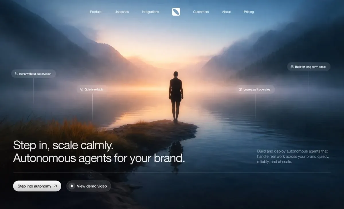
RebuildReference
Move across the image to wipe between the two. Click to lock the seam; arrow keys nudge it.
Imagery
1/1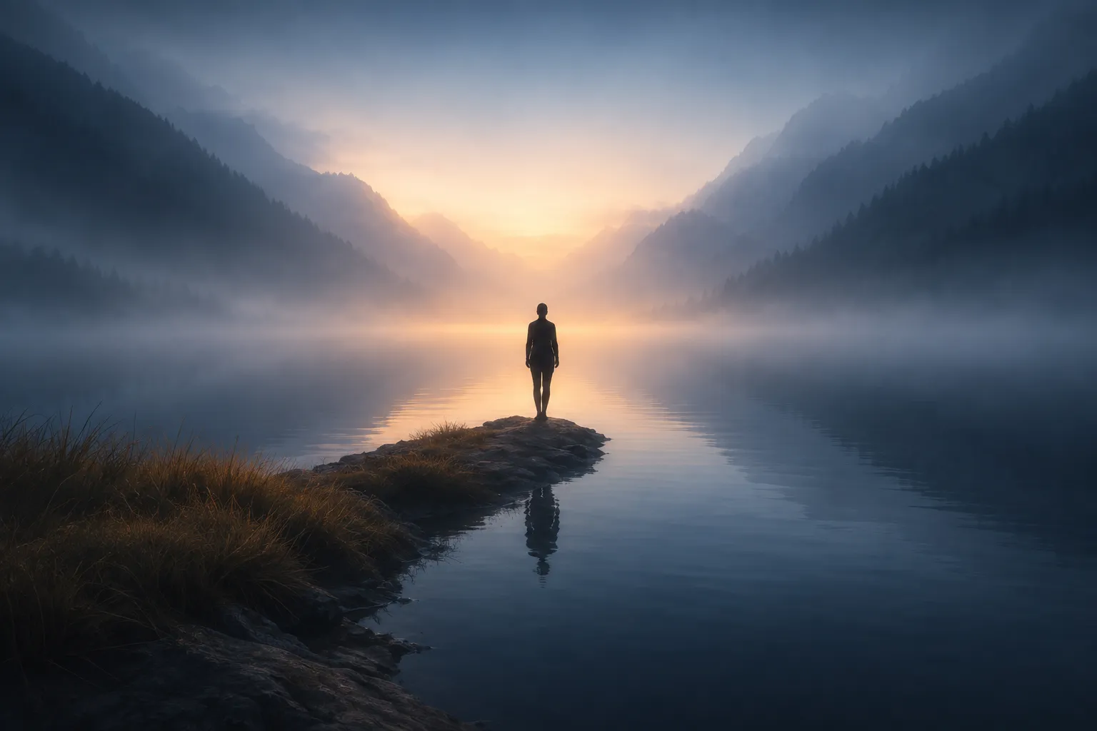
01-dawn-lake-silhouette
Lone figure silhouetted at the tip of a low rocky spit on a glass-still dawn lake, layered fog ridges converging on a warm sun in a distant valley gap
Prompts
117,396 chars
# Annotated dawn landscape hero — reusable build prompt

A single full-bleed section: one atmospheric dawn photograph running edge to edge, a centred nav split around a logo mark, four glass annotation pills pinned over the image with hairline leader lines dropping from them, and a bottom-left headline block with a hairline rule and two pill buttons. Near-monochrome cool blue with one warm light source inside the photograph. Nothing is inset, carded or shadowed.

**Reference frame: 1200 × 731 px.** Every px below is at that width. Scale linearly by `viewport / 1200` between 900px and 1600px; below 900px use the Responsive section.

---

## 1. Structure

- **Section box**: full-bleed, `width: 100vw`, `height: 100vh` clamped to `min 640px / max 900px`. No max-width wrapper on the section, no rounded corners, no margin. The photograph is a `position: absolute; inset: 0; object-fit: cover` layer; everything else is a sibling above it.
- **Content container**: 48px inset left and right (content width 1104px at the reference frame). 12-column grid, 24px gutters, used only by band 3.
- **Vertical padding**: 26px top (to nav cap-line), 60px bottom (to button bottom edge).

Sections (bands), top to bottom:

1. **Nav row** — one horizontal row, centred as a whole on the viewport's horizontal centre, not justified to the container edges. Left group: 3 links. Centre: logo mark. Right group: 3 links. Spans x 313→885 in the reference frame.
2. **Image stage + annotation pills** — the photograph plus four floating labels and their leader lines, occupying the middle ~60% of the section height.
3. **Headline band** — bottom-anchored. Headline (columns 1–7, 2 lines) and caption paragraph (columns 9–12) share one baseline-bottom; below them a full-container hairline rule; below that a row of two buttons.

---

## 2. Scroll map

No live-page motion report was supplied with this reference; the whole scroll map is read off the single still and is therefore **(inferred)**.

| # | Section | Height | Viewports | Scroll consumed | Kind |
|---|---------|--------|-----------|-----------------|------|
| 1 | Nav row | 34px (inside section 2's box) | 0.05 | 0 (rides the section) | entrance, once |
| 2 | Image stage + pills | 731px | 1.0 | 1.0 vh | entrance on load, then scroll-linked parallax on exit |
| 3 | Headline band | 243px (inside section 2's box) | 0.33 | 0 (rides the section) | entrance, once |

**Total section height: 731px = 1.0 viewport.** It pins nothing and stacks nothing; scroll distance equals height. This is a Section artifact — whatever page it lands in continues below at normal document flow.

---

## 3. Spacing

- Container inset: **48px** left and right. Not 24, not 80.
- Nav: top padding **26px** to the link cap-line; **44px** gap between every nav item; **42px** from the last left link to the logo and from the logo to the first right link (so the logo reads as part of the same rhythm).
- Logo mark: **34 × 34px**, centred on the viewport's horizontal centre.
- Pills: internal padding **6px 12px 6px 10px**, icon-to-label gap **6px**, pill height **28px**.
- Leader line: starts **4px** below the pill's bottom edge, at the pill's horizontal centre.
- Headline band internals: headline line pitch **45px**; headline/caption block bottom → hairline rule **31px**; rule → button top **26px**; button bottom → section bottom **60px**.
- Button row gap: **16px**.
- Caption block width: **256px** (≈ 40ch), its left edge at x 895 and its right edge flush with the container's right edge.
- Rhythm: the band is built bottom-up — fix the 60px bottom padding first, then stack buttons, 26px, rule, 31px, text block. The headline's distance from the nav is whatever is left over; never set it directly.

---

## 4. Type

One family throughout. Class: **neo-grotesk** — tight apertures, horizontal terminals, double-storey `a`, straight-tailed `y`, no humanist flare. Free stand-in: **Inter** (or **Geist**) with `font-optical-sizing: auto`. A single family, three weights: 300 / 400 / 450.

| Level | Size | Line-height | Letter-spacing | Weight | Colour |
|---|---|---|---|---|---|
| Nav link | 13.5px | 1.2 | 0 | 400 | `rgba(249,232,215,0.82)` |
| Pill label | 12px | 1.2 | 0.005em | 450 | `rgba(255,255,255,0.92)` |
| Headline | 46px | **1.06** | **−0.02em** | **300** | `#F9E8D7` |
| Caption | 15px | 1.55 | 0 | 400 | `rgba(249,232,215,0.78)` |
| Button label | 14px | 1.0 | 0 | 450 | inherits from button |

- Max line length: headline **≈ 34 characters per line, hard-wrapped to exactly 2 lines**; caption **≈ 40 characters**, running to 3 lines.
- Headline is set at a line-height *below* its own em box relative to cap height — lines almost touch. This tightness is the whole look; do not relax it to 1.2.
- Placeholder copy by role: nav links — 6 items, one word each (3 left, 3 right). Pills — 4 labels, **3–4 words each**, sentence case, no period. Headline — **7–9 words on exactly two lines**, line 1 short (≈ 22 chars), line 2 long (≈ 33 chars), both ending in a period. Caption — **18–24 words**. Buttons — primary **2–3 words**, secondary **3 words**.

---

## 5. Colour

| Hex | Role |
|---|---|
| `#0D1B28` | **Surface majority.** The deepest value in the photograph: ridge silhouettes, the vignette at all four edges, the bottom scrim, and the page background behind the image while it loads. Roughly half the pixel area. |
| `#253749` | Mid slate. The fog-and-water midtone that fills the frame's middle distance; also the tint base of the dark glass pill button. |
| `#475568` | Haze grey-blue. Upper-atmosphere fog, the softest ridge edges, and the value that hairlines and inactive strokes read as once they're laid over the image. |
| `#FBC699` | **The single accent — warm peach.** It exists *only as light inside the photograph*: the sun core in the valley V, its mirror on the water, and the rim-light on the foreground grass. It is never a fill, never a border, never text, never a hover state, never a focus ring. Nothing in the UI layer is peach. |
| `#F9E8D7` | Warm off-white. Headline text, the primary button's fill, the logo tile's fill. Use this instead of `#FFFFFF` everywhere text or a light fill appears — the page has no pure white. |

UI layers are made from translucent white and translucent `#0D1B28` over the photograph, not from opaque swatches.

---

## 6. Surface

- **Borders**: 1px only, `rgba(255,255,255,0.18)` on annotation pills and on the dark glass button. No border anywhere else.
- **Hairline rule** in band 3: 1px, `rgba(249,232,215,0.14)`, full container width (48px → 1152px).
- **Leader lines**: 1px vertical, a top-to-bottom gradient from `rgba(255,255,255,0.20)` to `transparent`.
- **Radii**: pills and buttons `border-radius: 999px`; logo tile `10px`; the play badge is a circle. The section itself has **no radius**.
- **Shadows**: none. Not on pills, not on buttons, not on the logo. Separation comes entirely from backdrop blur and the scrim.
- **Glass recipe** — annotation pills: `background: rgba(255,255,255,0.14); backdrop-filter: blur(12px) saturate(1.1)`. Dark glass button: `background: rgba(13,27,40,0.42); backdrop-filter: blur(14px)`.
- **Scrims on the image** (both required, both radial/linear — never a flat overlay):
  - bottom: `linear-gradient(to top, rgba(13,27,40,0.72) 0%, rgba(13,27,40,0.32) 26%, transparent 46%)`
  - edges: `radial-gradient(120% 90% at 50% 42%, transparent 40%, rgba(13,27,40,0.45) 100%)` — a vignette that leaves the centre untouched.

---

## 7. Imagery

**One image. Aspect ratio ≈ 16:10 at the reference frame, but authored at 3:2 or wider and cropped by `object-fit: cover` with `object-position: 50% 45%`.** It is the entire section background; nothing else in the design is a picture.

- **Subject**: a lone standing figure, seen from behind in full silhouette, at the very tip of a low rock-and-grass spit that pushes into glass-still water. The figure is small — about **11% of the frame height** — and sits on the horizontal centre line, at roughly 48% of frame width, with its feet at ~57% of frame height. It is a shape, not a portrait: no readable face, clothing or detail.
- **Setting**: three or four layers of mountain ridge receding into fog on both sides, each layer lighter and lower in contrast than the one in front, converging on a V-shaped gap in the far distance. In that gap sits the sun, just above the horizon, as a diffuse warm core rather than a disc. The lake mirrors the whole valley with only faint disturbance around the spit.
- **Foreground**: a wedge of dry, backlit grass tufts entering from the lower-left corner and occupying the bottom-left eighth of the frame, its blade tips catching a thin warm rim.
- **Treatment**: high dynamic range compressed to a low-contrast, high-key centre and deep, detail-free edges. Heavy atmospheric perspective — the haze is the subject as much as the landscape. Near-monochrome cool blue everywhere except the warm core and its reflection; do not let the warmth spill past the middle third. Soft focus falls off toward the edges. No visible grain, no lens flare, no bloom stars, no colour fringing, no HDR halos around the ridge lines.
- **If a photograph isn't available**: any image with this *tonal structure* works — dark bottom, luminous centre, foggy layered midground, one warm core. The structure carries the section; the location doesn't.

---

## 8. Motion

All motion below is **(inferred)** from a single still; no live-page measurement exists for this reference. Durations and easings are therefore given as ranges, and no spring, lerp or stiffness values are specified because none were measured.

### Section 1 — Nav row
- **kind**: entrance (plays once on load; does not reverse)
- **what moves**: the six nav links and the logo tile, independently
- **from → to**: opacity 0 → 1; translateY +8px → 0. Logo tile additionally scale 0.94 → 1.
- **range**: trigger is page load, after fonts resolve. Duration **400–600ms** per item, easing a standard decelerate (`cubic-bezier(0.2, 0.0, 0.0, 1)`), stagger **40–60ms** running outward from the logo to both edges (logo first, then the links adjacent to it, then the outermost).
- **reduced motion**: opacity 0 → 1 over 150ms, no translate, no stagger.

### Section 2 — Image stage + annotation pills
- **kind**: entrance on load, then **scroll-linked** on exit
- **what moves**: (a) the photograph layer; (b) the four pills; (c) the four leader lines
- **from → to**:
  - Photograph, entrance: scale 1.06 → 1.00 and opacity 0 → 1.
  - Photograph, scroll-linked: translateY 0 → **−48px** and the bottom scrim's peak alpha 0.72 → 0.86, both a direct function of scroll position, both reversing exactly on the way back up.
  - Pills, entrance: opacity 0 → 1, translateY +10px → 0, `filter: blur(6px) → blur(0)`.
  - Leader lines, entrance: `scaleY(0) → scaleY(1)` with `transform-origin: top`, so each line draws downward out of its pill.
- **range**: photograph entrance **900–1200ms** on load, easing a long decelerate, no stagger. Pills begin **150–250ms** after the photograph starts, **500–700ms** each, stagger **80–120ms** in reading order (far-left → near-left → near-right → far-right); each line draws **300–400ms** after its own pill lands. The scroll-linked parallax runs **from the section top at the top of the viewport until the section bottom reaches the top of the viewport** — one viewport of travel, mapped linearly.
- **reduced motion**: all entrances become a 150ms opacity fade with no translate, blur or scale; the leader lines appear at full height; the scroll-linked parallax is disabled entirely and the photograph holds `translateY(0)`.

### Section 3 — Headline band
- **kind**: entrance (plays once; does not reverse)
- **what moves**: headline line 1, headline line 2, caption paragraph, hairline rule, the two buttons
- **from → to**:
  - Headline lines, each wrapped in `overflow: hidden`: `clip-path: inset(0 0 100% 0) → inset(0 0 0 0)` with the inner span translateY +100% → 0. Opacity stays at 1 — it is a masked reveal, not a fade.
  - Caption: opacity 0 → 1, translateY +12px → 0.
  - Hairline rule: `scaleX(0) → scaleX(1)`, `transform-origin: left`.
  - Buttons: opacity 0 → 1, translateY +10px → 0.
- **range**: triggered once on load, **250–400ms** after the photograph begins. Headline lines **700–900ms**, easing a strong decelerate, **90–120ms** stagger between line 1 and line 2; caption starts with line 2; rule **500–700ms** starting as line 2 finishes; buttons last, **400–600ms**, **60–80ms** apart.
- **reduced motion**: headline lines fade in over 150ms with no clip and no translate; the rule appears at full width; caption and buttons fade only.

### Interaction transitions (not part of the scroll choreography)

- **Nav link hover** — colour `rgba(249,232,215,0.82)` → `#F9E8D7` over 160ms ease-out. No underline, no translate, no scale.
- **Primary button hover** — fill `#F9E8D7` → `#FFF6EC` over 160ms; the arrow glyph translates +2px x and −2px y over 200ms. The button itself does not scale.
- **Secondary button hover** — fill `rgba(13,27,40,0.42)` → `rgba(13,27,40,0.58)`, border `0.18` → `0.28` alpha, 160ms. The play badge fills from `rgba(255,255,255,0.16)` → `rgba(255,255,255,0.28)`.
- **Press (both buttons)** — `scale(0.985)` over 90ms, released on pointerup.
- **Pill hover** — background alpha `0.14` → `0.20` over 200ms, and the leader line's top alpha `0.20` → `0.32`. The pill does not move, lift or scale.
- **Focus-visible** — 2px outline in `rgba(249,232,215,0.9)` at 2px offset. Never peach.

---

## 9. Responsive (below 640px)

- Container inset drops **48px → 20px**; bottom padding **60px → 32px**; nav top padding **26px → 18px**.
- Nav collapses: the six links are dropped and replaced by the logo tile pinned left and a 24px two-line menu glyph pinned right. The centred-split arrangement does not survive; do not try to wrap it to two rows.
- Image `object-position` shifts to `50% 40%` and the crop becomes ~3:4, keeping the figure and the sun gap in frame. If the figure would fall below 60% of frame height, zoom rather than letterbox.
- Annotation pills: keep **two** (the far-left and the far-right), repositioned to `left: 20px / top: 26%` and `right: 20px / top: 38%`; drop the other two and their leader lines. Leader lines shorten to 48px. Pill labels drop to 11px.
- Headline: 46px → **30px**, line-height 1.1, still exactly two lines — rewrite the placeholder to ≈ 18 chars per line rather than letting it wrap to three.
- Caption moves out of the right column to sit **below** the headline, full container width, 14px / 1.5, with a 16px gap above it. It no longer shares a baseline with the headline.
- Hairline rule stays, full container width.
- Buttons stay on one row, height 40px, both shrinking to fit; if they can't, the secondary button drops its label and becomes a 40px circular play badge. Never stack them full-width.

---

## 10. Don'ts

- **Don't flatten the image with a uniform overlay.** A single `rgba(0,0,0,0.5)` across the photo kills the whole design — the centre must stay luminous. Only the bottom scrim and the edge vignette touch it, and both leave the middle third untouched.
- **Don't blur the photograph behind the text.** The text is legible because of the bottom gradient, not because the image was softened.
- **Don't centre the headline.** It is bottom-left, and the caption is bottom-right. Centring turns this into a generic stock hero.
- **Don't reach for weight 600/700 on the headline.** It is **300**. A bold headline at 46px over this photograph looks like an ad. Likewise, don't add positive letter-spacing to it; it's −0.02em.
- **Don't let the peach `#FBC699` into the UI.** No peach buttons, no peach eyebrow, no peach hover, no peach underline, no peach gradient text. The accent is light inside the photograph and nowhere else. This is the single easiest way to ruin the reference.
- **Don't use pure white or pure black.** Text and light fills are `#F9E8D7`; shadows and scrims are `#0D1B28`.
- **Don't add an eyebrow, pill badge or "New →" chip above the headline.** There is nothing between the top of the headline and the photograph.
- **Don't add a scroll-cue chevron, mouse glyph or "scroll" label.** The section has none.
- **Don't inset the hero in a rounded card with page margin.** It is full-bleed, square-cornered, edge to edge.
- **Don't give the pills solid fills, coloured icons or drop shadows.** Translucent white + blur + 1px hairline, monochrome 1.25px-stroke line icons at 12px. And don't float them on a looping bob — they land once and hold still.
- **Don't drop the leader lines.** The 1px lines hanging out of each pill are what make the labels read as annotations of the scene rather than floating chips; without them the composition reads as clutter.
- **Don't justify the nav to the container edges.** The left group / logo / right group row is centred as a single unit on the viewport centre, with equal 44px gaps throughout.
- **Don't set the headline in a serif or a geometric sans.** Geometric circles (Poppins, Montserrat) break the cinematic register; a serif breaks it harder.
- **Don't animate on scroll what the design reveals on load.** The headline, pills and rule play once and stay; only the photograph's parallax is a function of scroll and reverses.
- **Don't use a gradient or mix-blend-mode on the type.** Solid `#F9E8D7`, one value.
Captures
1Versions
1Each rebuild is kept. The live one is what the comparison shows. LiveOpus 5.5Extra highfrontend-designemil-design-engtransitions-devhumanizergsaplast month · 151s · 1 image · 20260917T185115ZOpen