Cinematic night-sky landing hero
Rebuild
Opus 5.5Extra highfrontend-designemil-design-engtransitions-devhumanizergsapView
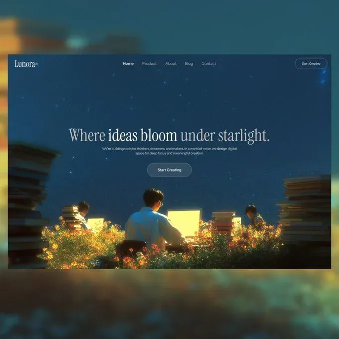
RebuildReference
Move across the image to wipe between the two. Click to lock the seam; arrow keys nudge it.
Imagery
1/1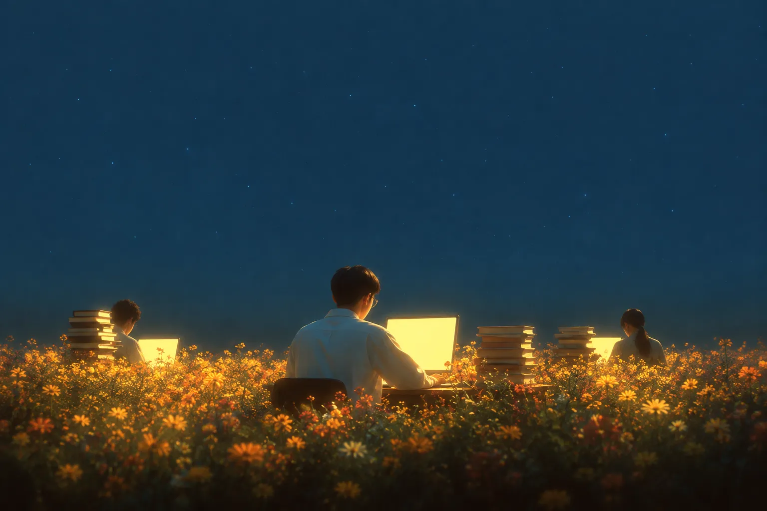
01-hero-night-meadow
Three people sitting at small desks in a night meadow of wildflowers, lit only by the pale yellow glow of their screens, under a deep teal star-scattered sky
Prompts
117,663 chars
# Cinematic night-sky landing hero

A single full-bleed hero section: one photographic night scene edge to edge, an overlaid transparent nav, and a centred serif headline sitting in the upper third so the lower 40% of the frame stays pure photograph. Everything is restrained — the image does the work, the interface is four translucent elements floating on top of it.

> Note on the source: the reference capture shows this design inset on a blurred mat with its own corners rounded. That mat is the photograph's framing, not part of the design. Build this as a full-bleed page: no outer rounded card, no margin, no visible page border, corners square.
>
> No live-page motion report was available for this reference. Every motion value below is marked **(inferred)** and given as a range where it is a duration or an easing. Do not invent exact spring/lerp parameters.

## 1. Structure

Layout grid at 1440 CSS px:

- **Page container:** full-bleed, no max-width. The background photograph bleeds to all four edges.
- **Nav container:** full-bleed with 40px left/right gutters (inferred). Three zones — wordmark left, links centred, CTA right — laid out as a flex row with `justify-content: space-between` and the link group absolutely centred to the viewport, not to the space between the two outer items.
- **Hero copy column:** centred, `max-width: 920px`, all content centre-aligned. The paragraph inside it is capped tighter at 600px.
- **Column structure:** single column throughout. No grid, no sidebar, no cards.

Sections top to bottom:

1. **Top nav** — overlay bar, ~100px tall, transparent, sits on top of section 2 and scrolls away with the page.
2. **Hero** — 100vh (960px at a 1440×960 viewport), full-bleed photograph, centred copy block in the upper third.
3. **Continuation sentinel** — a plain 600px block in the base sky colour below the hero. It carries no content; it exists so the hero's scroll-linked behaviour and the nav's exit can be judged at scroll positions past the fold. If the hero is being dropped into an existing page, replace this with the real next section.

## 2. Scroll map

| # | Section | Height | In viewports | Scroll consumed | Kind |
|---|---------|--------|--------------|-----------------|------|
| 1 | Top nav | 100px (overlay) | 0.10vh | 0px — overlays section 2 | entrance (on load), then static |
| 2 | Hero | 960px | 1.00vh | 960px | entrance (on load) + scroll-linked (background parallax, copy fade-out) |
| 3 | Continuation sentinel | 600px | 0.63vh | 600px | static |

**Total page height: 1560px (1.63 viewports).** Nothing pins, nothing stacks, nothing consumes more scroll than its own height. If the sentinel is dropped, total page height is 960px (1.00vh).

## 3. Spacing

Base unit 4px. Used steps: 8 / 12 / 16 / 24 / 28 / 36 / 40 / 48 / 64 / 100.

- **Nav:** 28px padding-top, 40px left/right gutters, nav row is 48px tall (set by the CTA pill), so the nav band measures 100px from the page top to the pill's bottom edge. No bottom border, no bottom padding — the nav does not reserve space, it floats.
- **Nav link group:** 36px gap between links. The links sit on the same optical centreline as the wordmark and the pill.
- **Hero copy block:** top edge of the headline's cap height at **320px** from the top of the hero — that is 33% of hero height, deliberately above optical centre. Implement as `justify-content: flex-start; padding-top: 296px` on the hero flex column (296px + headline's half-leading ≈ 320px cap-top) rather than centring and nudging.
- **Inside the copy block:** headline → paragraph **28px**; paragraph → button **36px**.
- **Below the block:** the copy block bottom lands at ~568px, leaving **392px (41% of the hero)** of uninterrupted photograph before the bottom edge. Protect this. It is the composition.
- **Rhythm:** there is only one internal rhythm here — 28 / 36 between the three copy elements, widening downward. The section-to-section rhythm is a hard cut: the hero ends at 960px with no padding, and section 3 begins immediately in a flat colour.

## 4. Type

Two families.

- **Display:** high-contrast transitional serif with sharp bracketed serifs and a vertical stress — the kind that looks engraved rather than calligraphic. Free stand-in: **Playfair Display** (alt: Instrument Serif for a tighter, more modern cut).
- **UI / running text:** neutral grotesk, low contrast, normal width. Free stand-in: **Inter**.

Body anchor: **17px at 1440**. Everything else is a multiple of it.

| Level | Ratio | Size | Line-height | Letter-spacing | Weight | Family |
|---|---|---|---|---|---|---|
| H1 headline | 3.8× | **64px** | 1.12 (72px) | -0.01em | mixed: **400** for the outer words, **700** for the emphasised middle phrase, same size and same baseline | Display serif |
| Paragraph / subhead | 1.0× | **17px** | 1.55 (26px) | 0em | 400 | Grotesk |
| Wordmark | 1.2× | **20px** | 1.0 | 0.01em | 400 | Display serif |
| Nav link | 0.88× | **15px** | 1.0 | 0.01em | 400 | Grotesk |
| Nav CTA label | 0.82× | **14px** | 1.0 | 0.02em | 500 | Grotesk |
| Primary button label | 0.94× | **16px** | 1.0 | 0.02em | 500 | Grotesk |
| Meta / caption (if needed) | 0.76× | **13px** | 1.4 | 0.06em, uppercase | 500 | Grotesk |

- The headline's weight mix is the single typographic idea of the page: one line of text where two or three consecutive words are bold and the rest is regular. No colour change, no italic, no size change — weight only.
- The ® or trademark mark beside the wordmark is a superscript glyph at 0.45em, baseline-shifted up ~0.5em. It is a symbol, not type, and is exempt from the 12px floor.
- **Max line length:** headline sits on one line up to 920px (5–7 words); below ~1100px viewport it wraps to two lines, balanced (`text-wrap: balance`). Paragraph capped at **600px ≈ 58–62 characters**, two lines at 1440.

Placeholder copy by role:

- Wordmark: 1 word, 6–7 characters.
- Nav links: 5 items, 1 word each (4–7 characters).
- Nav CTA: 2 words.
- H1: 5–7 words on one line, with words 2–3 set bold.
- Paragraph: 2 lines, 22–28 words total, describing who the product is for and what it protects.
- Primary button: 2 words, same label as the nav CTA.

## 5. Colour

| Hex | Role | Share of surface |
|---|---|---|
| **#1A3A54** | Deep teal-blue. The dominant field — the night sky across the top two thirds, and the page's base `background-color` behind the image so any load gap or letterbox matches. | ~55% |
| **#272925** | Near-black olive-charcoal. The lower mass: horizon, foliage in shade, and the base of the vignette. | ~25% |
| **#140D08** | Near-black warm brown. Deepest shadow — bottom edge, silhouetted figures, the ground under the flowers. Also the darkening used under translucent controls when pressed. | ~12% |
| **#FDFC8B** | Pale warm yellow. **The single accent.** | ~5% |
| **#D4C659** | Muted gold. The accent's falloff — warm rim light on the figures, flower mid-tones. Never used on its own. | ~3% |

Text and UI colour, sampled off the headline and hairlines (inferred): ivory **#F3EFE4**. Headline and active nav link at 100%; paragraph at 78%; inactive nav links at 62%; hairlines at 22%.

**Where the accent is allowed:** inside the photograph only — the emitted light of the small glowing screens, and the brightest flower highlights. Plus one exception: a radial glow of #FDFC8B at ≤12% opacity behind the primary button on hover. It is never a text colour, never a solid fill, never a link colour, never an underline, never a focus ring tint.

## 6. Surface

- **Borders:** 1px hairline, `rgba(243, 239, 228, 0.22)`. Only on the two pill buttons. No divider under the nav, no section rules.
- **Radii:** buttons fully rounded, `border-radius: 999px`. Nothing else in the design has a radius — no cards, no image corners, no container corners.
- **Fills:** both buttons are translucent — `rgba(26, 58, 84, 0.35)` with `backdrop-filter: blur(12px) saturate(1.1)`. They read as tinted glass over the photograph, not as solid chips.
- **Sizes:** nav CTA pill 150×48px, label centred, 24px horizontal padding. Primary hero button 190×60px, 40px horizontal padding.
- **Shadows:** none. No drop shadows, no box-shadows, no text-shadows. Contrast between the type and the photograph is bought with the vignette (see Imagery), not with a shadow.
- **Vignette:** a single overlay on the hero — radial, from `transparent` at 45% of the radius to `rgba(20, 13, 8, 0.45)` at the corners, plus a linear top-down `rgba(20, 13, 8, 0.35) → transparent` over the first 220px to seat the nav. Nothing heavier.

## 7. Imagery

One image. There are no icons, no logos beyond the wordmark, no illustrations.

**Hero background — 3:2, full-bleed, 1440×960, `object-fit: cover`, focal point centre-bottom.**

A night meadow, shot at blue hour with a long exposure feel. The top two thirds are open sky in deep teal-blue with faint scattered stars — visible but not graphic, no constellation shapes, no lens flares. The bottom third is a dense band of wildflowers lit warm from within the frame. Three figures sit at small desks set directly in the flowers, backs to the camera, each in front of a small screen that emits pale yellow light; the centre figure is closest and largest, the outer two are smaller and further back, creating depth. The warm screen light is the only light source below the horizon — it rims the figures' shoulders and picks out the flower heads nearest each desk, falling off to near-black between them.

Treatment: cinematic and soft. Low micro-contrast in the sky, gentle bloom around the light sources, fine film grain across the whole frame, slight lens softening at the edges. Colour graded cool overall with the warm sources left saturated — the tension between #1A3A54 and #FDFC8B is the entire image. Not a crisp product photo, not HDR, no clarity slider.

Composition constraint: the horizon and the figures' heads must fall below 62% of the frame height so the copy block at 320–568px sits entirely against open sky. If the supplied image does not allow this, shift the `object-position` up rather than moving the copy down.

## 8. Motion

Restrained by intent. Two gestures total: one entrance on load, one slow scroll link. Nothing bounces, nothing springs, nothing pins.

### Section 1 — Top nav

- **kind:** entrance (on load), then static; scrolls away with the page (not sticky, not fixed) (inferred)
- **what moves:** the wordmark, the link group as one unit, the CTA pill
- **from → to:** opacity 0 → 1; translateY -8px → 0
- **range:** fires once on page load, immediately, before the hero copy. Duration 500–700ms (inferred), ease-out. Stagger 60–80ms across the three zones, left to right (inferred).
- **reduced motion:** all three appear at opacity 1, translateY 0, no transition.

### Section 2 — Hero

Two independent behaviours on the same section.

**2a — copy entrance**

- **kind:** entrance — plays once on arrival, does not reverse
- **what moves:** headline, paragraph, primary button
- **from → to:** opacity 0 → 1; translateY 24px → 0. The headline additionally goes `filter: blur(6px) → blur(0)` (inferred) — this is what makes it read as emerging from the photograph rather than sliding onto it.
- **range:** fires once on page load, 150–250ms after the nav begins (inferred). Duration 900–1100ms per element (inferred), long ease-out — slow start of deceleration, very long tail. Stagger 120–160ms in DOM order: headline → paragraph → button.
- **reduced motion:** all three render at opacity 1, translateY 0, blur 0, no transition.

**2b — background parallax and copy fade-out**

- **kind:** scroll-linked — a direct function of scroll position, fully reversible on the way back up
- **what moves:** the hero background image; separately, the copy block as one unit
- **from → to:** background `translateY: 0 → -120px` and `scale: 1.06 → 1.10` (the image starts at 1.06 so the translate never exposes an edge). Copy block `opacity: 1 → 0` and `translateY: 0 → -40px`.
- **range:** from scroll position 0 until the hero's bottom edge reaches the top of the viewport (0 → 960px of scroll). The copy fade runs on a shorter window inside that — 0 → 60% of the hero's scroll (0 → 576px) — so the text is gone before the photograph is.
- **reduced motion:** no parallax, no fade. The image holds `scale: 1.06, translateY: 0` and the copy stays at opacity 1 for the whole scroll.

### Section 3 — Continuation sentinel

- **kind:** static
- **what moves:** nothing
- **from → to:** n/a
- **range:** n/a
- **reduced motion:** identical — it is already static.

### Interaction transitions

Separate from the scroll choreography above. All are state changes on input, not scroll.

- **Nav link hover:** opacity 62% → 100%, 160ms ease-out. No underline, no colour shift, no movement.
- **Nav link active state:** held at 100% opacity permanently; it is not a hover state and has no indicator dot or underline.
- **Pill button hover (both):** border opacity 0.22 → 0.40, fill `rgba(26,58,84,0.35) → rgba(26,58,84,0.50)`, and a radial #FDFC8B glow fading in behind the pill at 0 → 12% opacity, 90px radius. 200ms ease-out. No scale, no lift.
- **Pill button press:** fill darkens toward `rgba(20,13,8,0.45)`, scale 1 → 0.985, 90ms. Releases over 140ms.
- **Focus-visible:** 2px ivory `#F3EFE4` outline at 60% opacity, 3px offset, square-cornered against the pill. Never tinted with the accent.
- **Wordmark hover:** no change.

## 9. Responsive

Below 640px (design at 390px wide):

- **Hero height:** `100svh`, not `100vh`, so mobile browser chrome does not clip the composition. Minimum 640px.
- **Nav:** gutters drop 40px → 20px, padding-top 28px → 20px. The centred link group is **dropped** and replaced with a text menu trigger ("Menu", 14px grotesk) on the right. The nav CTA pill is **dropped** on mobile — the hero button is the only call to action. Layout becomes wordmark left, menu trigger right.
- **Copy block:** top of headline moves from 33% to **26%** of hero height (~180px at 700px). Max-width 100% minus 24px gutters.
- **Headline:** 64px → **41px** (2.4× body), line-height 1.12 → 1.18, wraps to three lines. The bold/regular weight mix survives — do not flatten it to one weight.
- **Paragraph:** stays 17px, line-height 1.55, max-width 88vw, wraps to 4 lines. Gap headline → paragraph 28px → 20px; paragraph → button 36px → 28px.
- **Button:** 190×60 → 100% width capped at 260px, height 56px, label stays 16px.
- **Image:** `object-position` shifts to 55% vertical so the centre figure and the flower band stay in frame as the aspect narrows toward portrait. The two outer figures will crop out; that is correct.
- **Motion:** the entrance stagger tightens to 80–100ms. The scroll-linked parallax range shrinks to `translateY: 0 → -60px` — keep it, do not disable it.
- **Vignette:** top linear gradient extends from 220px → 160px; radial vignette unchanged.

## 10. Don'ts

- **Don't build the mat.** No rounded outer container, no coloured sheet behind the page, no inset shadow, no blurred duplicate of the hero image around the edges. The page is full-bleed and its corners are square.
- **Don't darken the photograph with a flat overlay.** The instinct is `rgba(0,0,0,0.5)` under the text — it kills the image and turns teal-blue into grey. Use the specified radial vignette at 45% maximum and nothing else. If the headline still lacks contrast, move the copy up, don't dim the picture.
- **Don't centre the copy block vertically.** It sits at 33% from the top. Vertically centring it drops the text onto the figures' heads and destroys the 392px of clean photograph at the bottom, which is the whole composition.
- **Don't set the headline in a geometric sans or a slab.** It is a high-contrast transitional serif. Also don't reach for a script or a display slab — the contrast between an engraved serif headline and a plain grotesk paragraph is the typographic idea.
- **Don't letterspace the serif headline.** No `letter-spacing: 0.05em`, no small caps, no uppercase. It is sentence case, tight (-0.01em).
- **Don't colour the emphasised words.** The middle phrase differs by weight only — same ivory, same size, same baseline. Making it yellow or gradient-filled breaks the accent rule.
- **Don't let the accent yellow out of the photograph.** No yellow buttons, no yellow links, no yellow focus ring, no yellow underline, no yellow eyebrow label. Its only life outside the image is a ≤12% glow on button hover.
- **Don't use pure black or pure white.** Text is #F3EFE4, the darkest value is #140D08. `#000` and `#fff` will both look wrong against the graded image.
- **Don't make the nav sticky with a blurred bar.** It scrolls away with the page. A frosted sticky header that appears on scroll-up is the default move here and it is wrong for a one-section hero.
- **Don't add a scroll indicator.** No bouncing chevron, no "scroll" label, no animated mouse outline in the bottom centre — that area is reserved for the photograph.
- **Don't animate the stars.** No twinkle, no particle canvas, no CSS keyframe sparkle. The sky is a still photograph.
- **Don't parallax the copy against the image in opposite directions.** Both move up; the copy simply moves faster and fades out first.
- **Don't add shadows to the buttons.** They are glass on an image. A drop shadow makes them look pasted on.
- **Don't constrain the nav to the copy column's max-width.** The nav runs edge to edge at 40px gutters while the copy is capped at 920px — that width difference is deliberate.
- **Don't add a second CTA, a trust bar, a logo strip, or a stat row.** The section is four elements on a photograph. Anything added to fill the lower 40% is a regression.
Versions
1Each rebuild is kept. The live one is what the comparison shows. LiveOpus 5.5Extra highfrontend-designemil-design-engtransitions-devhumanizergsaplast month · 70s · 1 image · 20260919T183011ZOpen