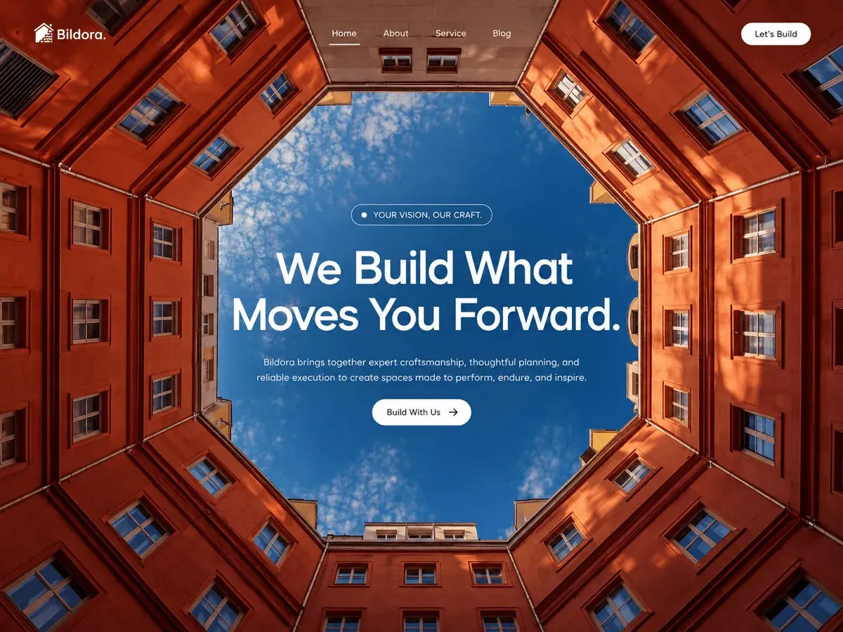
Construction firm photo hero
Rebuild
Opus 5.5Extra highfrontend-designemil-design-engtransitions-devgsaphumanizerView
RebuildReference
Move across the image to wipe between the two. Click to lock the seam; arrow keys nudge it.
Imagery
1/1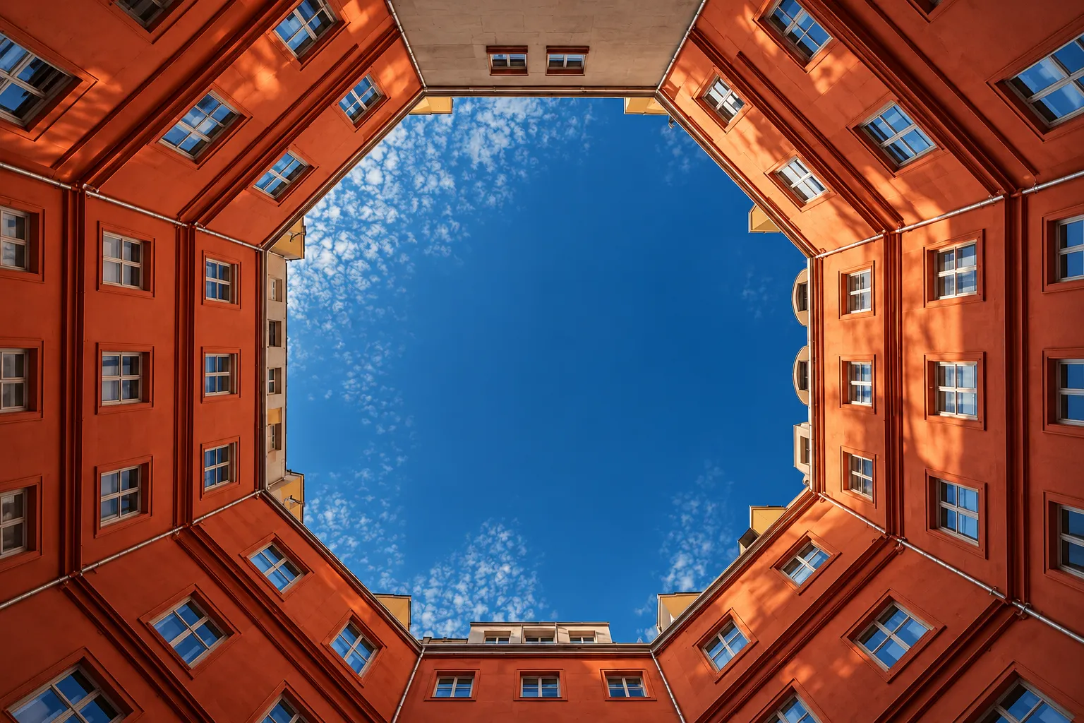
01-courtyard-sky-hero
Looking straight up from the floor of an octagonal courtyard: sunlit terracotta facades with white-framed windows surround an opening of deep blue sky
Prompts
113,528 chars
# Sky-aperture photo hero: full-bleed architectural photo with centred copy

A single full-viewport hero section with a transparent nav laid over it. The whole design rests on one photograph. The camera looks straight up from the floor of an enclosed eight-sided courtyard: terracotta facades close in from every edge, and an opening of deep blue sky sits in the middle. All the hero copy sits inside that sky opening, so the sky serves as the background behind the text. The UI layer is white and sparse: one eyebrow pill, a two-line headline, one sentence of body text and one solid white button. There is no scrim, no card and no second colour in the UI. The tags call it "neon accent" and "dark mode". That impression comes from the saturated orange-against-blue contrast in the photo, not from any glowing UI.

## Structure

- **Reference frame:** 1440 × 1080 CSS px (4:3). The section is full-bleed edge to edge with no max-width on the photo.
- **Gutters:** 56px left and right for the nav row.
- **Columns:** there is no grid. The nav is a three-zone row (`1fr auto 1fr`): logo on the left, link group exactly centred on the page, CTA on the right. The hero copy is one centred column, max-width 720px, text-align center.
- **Sections, top to bottom:**
  1. **Nav bar.** Absolutely positioned over the top of section 2, with a transparent background and no border.
     - Logo: a 28px square mark plus a one-word wordmark ending in a period.
     - Link group: 4 single-word links, the first one active.
     - CTA: a 2-word pill button.
  2. **Hero.** Full-bleed photo with `object-fit: cover`. The copy block is centred both vertically and horizontally on the full section height, not on the space below the nav. Top to bottom:
     - Eyebrow pill: a dot plus 3–4 uppercase words, written as a comma-separated two-part phrase ending in a period.
     - Headline: 6–7 words in Title Case on exactly two lines, ending in a period. Line 1 (≈3 words) is visibly shorter than line 2 (≈4 words).
     - Body: one sentence of 22–26 words on two lines of nearly equal length.
     - Primary button: a 3-word label plus a right-arrow icon.

## Scroll map

There is no Motion report for this reference, so the numbers below come from the still image (inferred).

1. **Nav bar:** a 112px band laid over section 2. Adds 0px of height and consumes 0px of scroll. Kind: entrance. It is not sticky and scrolls away with the hero (inferred).
2. **Hero:** 1080px at the 1440 × 1080 reference = 1.0 viewport (`height: 100svh; min-height: 720px`). Consumes 1080px of scroll, which is just its own height (no pinning). Kind: entrance.

**Total page height:** 1080px (1.0 viewport). This reference is a single section.

## Spacing

**Nav (section 1)**
- Padding: 36px top, 56px left and right. The row is 40px tall, so its centre line is 56px from the top of the page.
- Logo mark to wordmark gap: 8px.
- Link gap: 48px between words. The group is centred on the page's centre line, not between the logo and the CTA.
- Active-link underline: 2px thick, sitting 12px below the text baseline. It extends 4px past the text on each side.
- Nav CTA: 38px tall, about 120px wide, padding 0 22px.

**Hero copy stack (section 2)**, outer edge to outer edge:
- Eyebrow pill: 36px tall, about 240px wide, padding 0 18px. The 8px dot sits 12px before the text.
- Pill → headline: 32px.
- Headline → body: 28px.
- Body → button: 32px.
- Button: 44px tall, padding 0 22px 0 24px. The 16px arrow icon sits 12px after the label.
- The whole stack is about 380px tall. Its vertical centre lands on the section's centre: at 1080px, the pill top is at about 350px and the button bottom at about 726px.
- Rhythm: tight, even 28–32px steps. Nothing in the stack is spaced more than 32px apart. All the empty space belongs to the photo around it.

## Type

**Family class:** geometric sans with round "o", single-storey "g" and pointed "W"/"V" vertices. Use **Outfit** (Google Fonts) as the free stand-in; Plus Jakarta Sans is the second choice. Use one family for everything.

The body anchor is **17px**. Every other level is a multiple of it.

| Level | Size | Line-height | Letter-spacing | Weight | Notes |
|---|---|---|---|---|---|
| Headline (H1) | 4.5× → 76px | 1.08 | −0.02em | 500 | Title Case, max-width 680px, exactly 2 lines |
| Logo wordmark | 1.3× → 22px | 1 | −0.01em | 600 | One word plus a period |
| Body (hero sub) | 1× → 17px | 1.55 (26px) | 0 | 400 | Max-width 580px, ≈ 68–72 characters per line |
| Nav links | 0.88× → 15px | 1 | 0 | 400 (active 500) | — |
| Buttons (nav and hero) | 0.88× → 15px | 1 | 0 | 500 | Dark text on white |
| Eyebrow pill | 0.82× → 14px | 1 | +0.02em | 500 | Uppercase |

At 1440 the headline's line 2 is about 660px wide and line 1 about 500px. Force the break with `<br>` or balanced wrapping. Never let it run to one line or three.

## Colour

The sampled hexes are photo colours. The UI layer itself uses only white and near-black.

**Photo colours and their roles**

| Hex | Role |
|---|---|
| `#A5381C` | Terracotta mid-tone. The dominant surface: the sunlit-to-shaded facades, about 45% of the frame |
| `#16538B` | Sky blue. The second large field and the ground under all the copy, about 30% of the frame |
| `#66170B` | Deep rust shadow on the facades. Use it as the section's `background-color` while the photo loads |
| `#380603` | Darkest brown in the shadowed corners. Use it for any solid dark UI surface (the mobile menu panel) |
| `#FBA767` | Sun-peach highlights where low sun rakes the upper-right walls. UI use is limited to keyboard focus rings |

**UI colours and their roles**

| Colour | Role |
|---|---|
| `#FFFFFF` | Headline, logo, active nav link, active underline, pill dot, button fills |
| `rgba(255,255,255,0.86)` | Body text and inactive nav links |
| `rgba(255,255,255,0.65)` | Eyebrow pill border |
| `#141414` | Button label and arrow (inferred, neutral near-black) |

**Accent rule:** the solid white button is the single accent and should be the only filled shape on the page. No orange or blue fills, text or borders appear anywhere in the UI.

## Surface

- **Borders:** only the eyebrow pill has one: 1px `rgba(255,255,255,0.65)`. Its fill is transparent, or at most `rgba(255,255,255,0.06)`. Use no backdrop blur.
- **Radii:** every interactive or chip element is a full pill (`border-radius: 999px`). Nothing else has a radius. The section itself has square corners and runs edge to edge.
- **Shadows:** none, including on the buttons and the text. Use no text-shadow and no glow.
- **Overlays:** none over the photo. Optionally add a top-only gradient, `rgba(20,6,3,0.30) → transparent` over the first 180px, if your photo's top edge is bright behind the nav links (inferred, optional).

## Imagery

One photograph, full-bleed behind the whole section, 4:3 at the reference size, `object-fit: cover`, `object-position: 50% 50%`.

**Subject:** a straight-up worm's-eye view from the floor of an enclosed octagonal courtyard.
- Five or six storeys of terracotta and rust-red rendered walls fill the frame from every edge.
- The walls carry regular rows of white-framed casement windows, plus cornices and thin drainpipes, all converging in strong one-point perspective toward the centre.
- A sliver of a paler beige building closes the top edge of the frame. Thin bands of pale building also appear along the bottom edge.

**The aperture:** a central eight-sided opening of deep blue sky, broken by fine scattered high cloud (altocumulus texture, white, never dense).
- It spans roughly 26%–76% of the frame width and 14%–86% of its height.
- The entire copy stack must sit inside this opening: the headline, the widest element, uses about 46% of the frame width, and the opening is about 50% wide.

**Light:** warm low sun hits the upper-right walls (peach highlights) while the left and lower walls fall into deep rust shadow, giving a strong warm/cool complementary contrast.

**Treatment:** rich and saturated, straight from the camera. No duotone, no blur, no darkening scrim, no grain.

## Motion

There is no Motion report for this reference, so every value below is (inferred). Durations and easings are not measured; ranges are given instead.

**1. Nav bar**
- **kind:** entrance
- **what moves:** the logo, the link group and the CTA as three items
- **from → to:** opacity 0 → 1, translateY −12px → 0
- **range:** plays once on page load, starting at 0ms. Duration not measured (500–700ms). Easing: a soft ease-out such as `cubic-bezier(0.22, 1, 0.36, 1)`. Stagger 40–80ms, left to right. It does not react to scroll.
- **reduced motion:** visible at its final state immediately, with no translate.

**2. Hero**
- **kind:** entrance
- **what moves:**
  - the background photo
  - the eyebrow pill
  - headline line 1
  - headline line 2
  - the body text
  - the button
- **from → to:**
  - Photo: opacity 0 → 1 and scale 1.06 → 1.0.
  - Each copy item: opacity 0 → 1 and translateY 20px → 0.
- **range:** plays once on page load.
  - Photo: starts at 0ms. Duration not measured (1.2–1.8s), slow ease-out.
  - Copy items: start 200–300ms after the photo, in the order pill → H1 line 1 → H1 line 2 → body → button. Each runs 600–900ms (not measured) with the same ease-out, staggered 80–120ms.
  - Nothing is tied to scroll position. When the user scrolls, the hero simply moves up with the page and nothing reverses.
- **reduced motion:** all elements are present at their final state. At most there is a single 200ms opacity fade on the copy, with no scale and no translate.

**Interaction transitions** (separate from the load choreography):
- **Nav link hover:** colour goes from 86% to 100% white, and a 2px white underline grows from the centre (`scaleX` 0 → 1). 200–250ms ease-out.
- **Active nav link:** the underline is permanently shown at full width (text width + 4px on each side).
- **Button hover** (nav and hero): the background shifts from `#FFFFFF` to `#EFEBE6`, and the hero button's arrow moves translateX 0 → 4px. 200ms ease-out.
- **Button press:** scale 0.98 for the duration of the press, 100ms.
- **Focus-visible:** a 2px `#FBA767` ring with a 3px offset, on every link and button.
- **Mobile menu open/close:** the panel fades 0 → 1 and slides translateY −8px → 0 over 250ms, and reverses on close. The menu icon changes to a close icon with a 200ms cross-fade.

## Responsive

- **640–1024px:**
  - Link gap drops to 32px and gutters to 32px.
  - Headline 3.6× → about 60px.
  - Below about 900px, collapse the links into a menu toggle.
- **Below 640px:**
  - **Nav:** gutters 20px, top padding 20px. Keep the logo (wordmark 20px) on the left and a 40px circular menu toggle on the right (1px border at 65% white, white icon). Drop the four links and the nav CTA into the menu panel: a full-screen `#380603` panel with stacked 24px links and the CTA at the bottom.
  - **Hero height:** `100svh`, min 640px.
  - **Headline:** 2.5× of a 16px body → 40px, line-height 1.1, −0.02em. Three lines are acceptable here.
  - **Body:** 16px / 1.55, max-width 32ch.
  - **Eyebrow:** 12px text, 32px pill height.
  - **Button:** stays auto-width and 44px tall, not full-width.
  - **Stack gaps:** pill → headline 24px, headline → body 20px, body → button 28px.
  - **Photo:** serve an art-directed portrait crop through `<picture>`, zoomed out so the octagonal ring of facades still frames the screen and the sky opening sits behind the copy. If no portrait crop exists, keep `object-position: 50% 50%` so the sky stays centred.

## Don'ts

- **No dark overlay over the whole photo.** Don't add a "for legibility" scrim and don't darken it to 40%. The sky is the scrim, and the saturated terracotta-against-blue contrast is the entire design.
- **No container behind the copy.** No card, glass panel, blurred box or frosted chip. The copy sits directly on the sky.
- **Keep the copy centred and inside the aperture.** Don't left-align it or push it into a split layout. If any line runs out over the facades, the composition is broken. Shorten the copy or tighten the max-widths.
- **Get the headline weight and case right.** Weight 500 in Title Case. Don't use a heavy 700–900 weight, all caps or wide tracking.
- **Don't fall back to a system font.** Don't use Inter, Helvetica or system-ui. The round geometric letterforms are part of the calm, corporate tone.
- **One button only.** Don't add a secondary ghost button next to the CTA.
- **Keep the CTA white.** Don't colour it orange or blue.
- **No neon.** Don't add glows, gradient text, coloured underlines or neon tints. The "accent" is solid white.
- **Keep the nav bare.** No background bar, bottom border, blur strip or sticky shrink effect. It is text floating on the photo.
- **Don't add hero clutter.** No stats row, client-logo strip, scroll-down chevron, social icons, badges or a second eyebrow.
- **Use the right kind of photo.** Don't use a generic construction-site shot (cranes, hard hats, blueprints, scaffolding). Don't use a straight-on building facade either. It must be an upward courtyard view with a central sky opening.
- **No photo grading.** Don't tint, desaturate or duotone the photo, and don't add grain or vignettes.
- **Keep the hero full-bleed and full height.** Don't shrink it below the viewport, inset it, round its corners or put it on a coloured mat.
- **Keep motion restrained.** No looping Ken Burns zoom, no parallax drift, no per-letter or typewriter headline animation, and no scroll-scrubbed effects. One quiet load-in, then the page holds still.
Versions
1Each rebuild is kept. The live one is what the comparison shows. LiveOpus 5.5Extra highfrontend-designemil-design-engtransitions-devgsaphumanizer2 weeks ago · 290s · 1 image · 20261008T201219ZOpen