Dark developer ecosystem landing page
Rebuild
Opus 5.5Highfrontend-designemil-design-engtransitions-devgsaphumanizerView
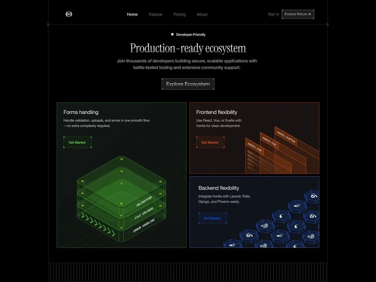
RebuildReference
Move across the image to wipe between the two. Click to lock the seam; arrow keys nudge it.
Imagery
3/3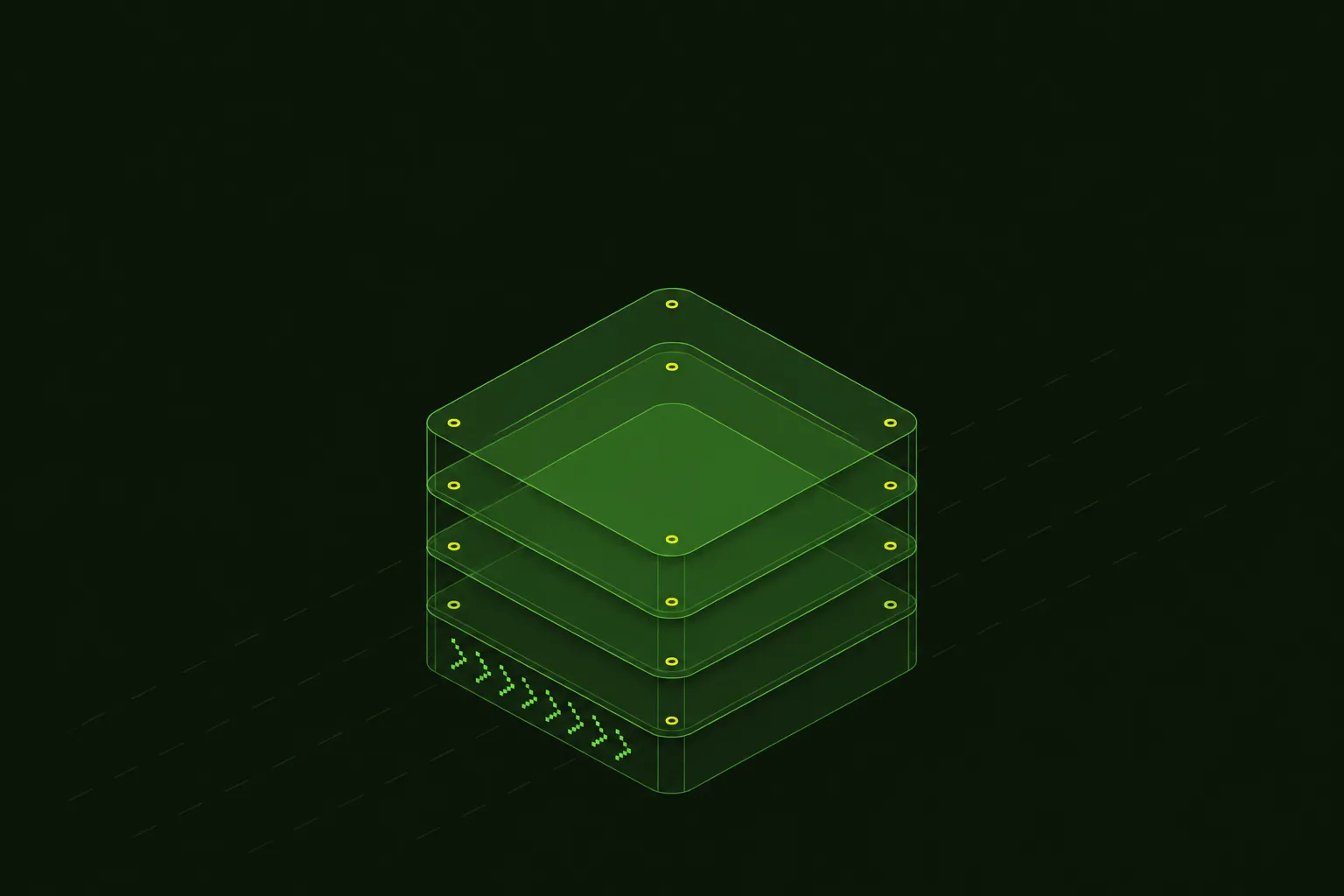
01-forms-slab-stack
Glowing green isometric stack of translucent glass slabs with rivet dots and dotted chevrons
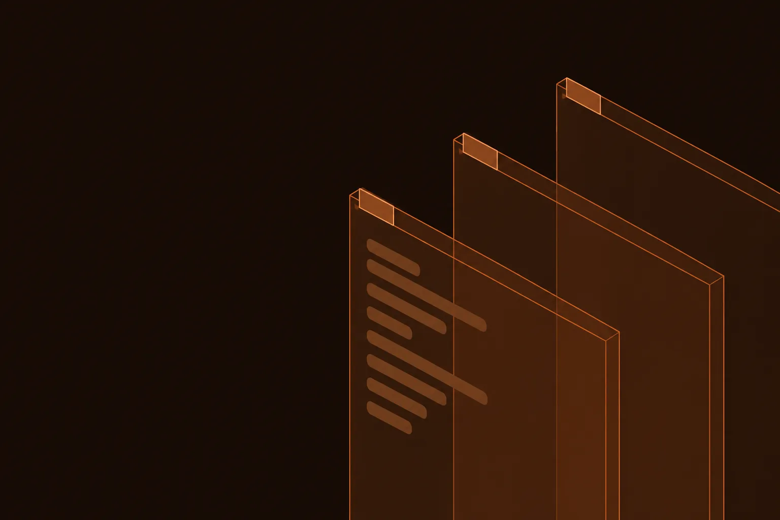
02-frontend-editor-windows
Three translucent orange code-editor windows receding diagonally in isometric view

03-backend-hex-honeycomb
Isometric honeycomb of blue-outlined hexagonal tiles with abstract white glyphs
Prompts
114,531 chars
# Dark bento developer landing page — build prompt

A near-black landing page for a developer framework. A thin structural frame runs around the page: 1px vertical rails, a hairline under the nav, and small square nodes where lines meet. Under the nav sits a centred hero with a condensed serif headline. Below it is a three-card bento grid. Each card has its own hue (green, orange, blue) and a glowing isometric wireframe illustration. Treat everything as one full-bleed 1440px viewport with no outer margin and no page-level rounding. All neutral tones should feel deliberate, and the only colour on the page sits inside the cards.

No motion report was supplied. Every motion value and every height below the first viewport is **(inferred)**.

## Structure

- **Frame:** the page is a 1440px column with a 1px vertical rail (`#1C1C1C`) on its left and right edges. At 1440 the rails sit exactly on the viewport edges. On wider screens the column is centred, the rails stay on its edges and the background continues outside.
- **Nav inner width:** 1264px, centred (88px side inset).
- **Bento inner width:** 1360px, centred (40px side inset). It is deliberately wider than the nav.
- **Hero text column:** max 720px, centred.

Sections, top to bottom:

1. **Nav bar.** The bar has three zones:
   - logo mark on the left;
   - four text links centred on the page, with the first one active;
   - a quiet "Sign in" text link and a small glass button with a right arrow on the right.

   Under the bar a full-width 1px hairline runs rail to rail, with an 8×8px square node where it meets each rail.
2. **Hero:** centred stack, top to bottom:
   - an eyebrow pill (radio-dot icon plus a 2-word label);
   - a serif headline of 2–3 words on one line, with a hyphenated compound allowed;
   - a two-line lead paragraph of about 20–24 words;
   - one large glass button with a 2-word label.
3. **Bento feature grid:** two equal columns, 16px gap.
   - **Left (green, "forms"):** one tall card spanning both rows.
   - **Right top (orange, "frontend"):** a short card.
   - **Right bottom (blue, "backend"):** a short card.
   - **Card content:** each card has a title (2 words), a 2-line description (about 12–16 words) and a "Get Started" corner-bracket button. An isometric illustration fills the remaining area and bleeds to the card's bottom or right edge.
4. **Hairline barcode band.** A 1px horizontal line rail to rail, then a band filled with vertical 1px hairlines every 8px. It works as a textured section break.
5. **Footer (inferred).** The capture ends inside section 4. Close the page with a minimal footer:
   - left: the logo mark, plus a 1-line muted caption;
   - right: 3–4 small muted link columns;
   - bottom: a closing hairline, then a copyright line in 13px muted text.

   Use the same rails and nodes. No colour.

## Scroll map

Viewport is 1440×900. All values are inferred from the still. There is no pinning or stacking anywhere.

1. Nav: 126px, 0.14vh, consumes 126px. Static, not sticky (inferred).
2. Hero: 403px (126 → 529), 0.45vh, consumes 403px. Entrance.
3. Bento: 827px (529 → 1356, including 78px bottom padding), 0.92vh, consumes 827px. Entrance.
4. Barcode band: about 160px, 0.18vh, consumes 160px. Static.
5. Footer: about 240px, 0.27vh, consumes 240px. Static.

Total page height is about 1756px (about 1.95 viewports).

## Spacing

**Nav (section 1)**
- Height 126px, content vertically centred.
- Links are spaced 40px apart.
- "Sign in" sits 16px from the button.
- The logo mark is 32px.

**Hero (section 2)**
- Padding-top: 40px from the nav hairline to the eyebrow.
- Eyebrow → headline: 32px.
- Headline → lead: 24px.
- Lead → button: 44px.
- Button → bento top: 64px.

**Bento (section 3)**
- Grid 1360px wide, gap 16px. Columns are 672px each.
- Left card: 672×750. Right cards: 672×367 each.
- Card padding: 36px on top and left. The right and bottom edges have no padding because the illustrations bleed there.
- Inside a card:
  - title → description: 16px;
  - description → button: 40px;
  - button → illustration top: about 40px in the tall card. In the short cards the illustration sits beside or under the text block at the right.
- Section bottom padding: 78px down to the band's top line.

**Band (section 4):** about 160px tall, hairlines at an 8px pitch.

**Rhythm:** sections are separated by full-width hairlines, not by big empty gaps. Vertical spacing stays tight (40–80px), and the rails keep the page feeling engineered.

## Type

Body anchor is **17px**.

Families:
- **Display:** a condensed, high-contrast serif in a light weight, used only for the hero headline. Free stand-in: **Instrument Serif** 400.
- **UI and body:** a neutral grotesk. Free stand-in: **Inter**.
- **Mono:** a monospace for labels inside illustrations. Free stand-in: **JetBrains Mono** or **Geist Mono**.

| Level | Ratio | Size | Line-height | Tracking | Weight | Colour |
|---|---|---|---|---|---|---|
| Hero headline (serif) | 3.8× | 64px | 1.1 | -0.01em | 400 | `#EDEDED` |
| Card title | 1.4× | 24px | 1.3 | -0.01em | 400 | `#F2F2F2` |
| Hero lead | 1.18× | 20px | 1.6 | 0 | 400 | `#A6A6A6` |
| Card description / body | 1× | 17px | 1.6 | 0 | 400 | `#C4C4C4` |
| Hero button label | 1.12× | 19px | 1 | 0 | 400 | `#E6E6E6` |
| Nav links | 0.94× | 16px | 1 | 0 | 400 | active `#F5F5F5`, others `#7E7E7E` |
| Nav button / Sign in | 0.88× | 15px | 1 | 0 | 400 | `#E6E6E6` / `#7E7E7E` |
| Eyebrow label | 0.88× | 15px | 1 | 0 | 500 | `#F0F0F0` |
| Card button label | 0.88× | 15px | 1 | 0 | 500 | card hue, bright |
| Illustration mono labels | 0.82× | 14px | 1 | 0.06em, uppercase or lowercase filenames | 500 | card hue, light |
| Footer caption | 0.76× | 13px | 1.5 | 0 | 400 | `#6A6A6A` |

**Line length:**
- The headline stays on one line (about 22 characters).
- The hero lead is capped at 620px, which gives about 60 characters per line and exactly 2 lines.
- Card descriptions are capped at 300px, about 36 characters per line, in 2–3 lines.

## Colour

**Neutrals**
- `#020202`: page background. It covers about 85% of the surface.
- `#1C1C1C`: rails, the nav hairline, the band's hairlines and the square nodes (nodes are filled `#262626`).
- Text greys run `#F5F5F5` → `#C4C4C4` → `#A6A6A6` → `#7E7E7E`.

Card hues, each confined strictly to its own card:

| Card | Card background | Card border | Bright tone |
|---|---|---|---|
| Green (forms) | `#1B3517` at a low-opacity gradient over black, roughly `#0C160A` → `#132611` | 1px `#2D6722` | `#5BD13A` for the button text, corner brackets, glowing illustration edges and chevrons; `#C9E83A` for the tiny rivet dots |
| Orange (frontend) | roughly `#1A0E08` → `#120A06` | 1px `#693214`, brighter at `#A24A1E` along the lit edges | `#F06A24` for the button text and outlines; `#F59A5C` for the filename tabs |
| Blue (backend) | roughly `#0A0F1F` → `#070A14` | 1px `#193267`, lit to `#2E55C8` | `#2F6BFF` for the button text and hex outlines; white for the framework glyphs |

**Rule:** there is no global accent. Hue appears only inside its card: the border, the tinted fill, the button and the illustration. The nav, the hero and everything below the bento stay pure neutral.

## Surface

**Cards**
- 1px solid borders in the card's hue.
- Corner radius 0–2px.
- No drop shadows.
- A faint inner glow (`inset 0 0 80px` at the hue's colour, about 6% alpha) is allowed.

**Card background texture, at 4–8% opacity**
- Green: diagonal dashed isometric floor lines.
- Blue: a faint dot grid.
- Orange: plain.

**Glass buttons (nav and hero)**
- Fill: a vertical gradient from `#3A3A3A` to `#1A1A1A`.
- Border: 1px `#5A5A5A`, with a 1px inner top highlight (`inset 0 1px 0 rgba(255,255,255,.18)`).
- Radius 3px.
- Size: the hero button is 270×56. The nav button is 165×44 and has a trailing → arrow.

**Card buttons (corner-bracket style)**
- Size 144×56, radius 2px.
- Fill: the hue at about 10% alpha.
- Border: 1px in the hue at about 40%.
- At each corner, a bright 6px L-shaped bracket drawn in the full bright hue.

**Eyebrow:** a 14px circle (1px white ring with a 6px white dot inside), then the label. No pill background.

**Frame details**
- 8×8px square nodes at rail/hairline intersections.
- No other shadows anywhere.

## Imagery

All three illustrations are line-art isometric renders of translucent glass slabs. Each uses a thin 1–1.5px bright edge in the card hue, a semi-transparent tinted face (10–30% alpha) and a soft glow on the edges. Build them as SVG. There are no photos.

**Green card (tall)**
- **Subject:** a stack of 3–4 rounded-corner square slabs in isometric view, seen from above at 30°.
- **Faces:** the top face has a bright translucent green fill.
- **Rivets:** small yellow-green rivet dots at the corners and edge midpoints.
- **Labels:** three mono labels run along the front-right edges of the layers, one per layer (validation / file uploads / error handling style, rotated to the isometric angle).
- **Chevrons:** a row of pixel-dotted `>>>>>` chevrons on the front-left face.
- **Floor:** faint dashed diagonal lines.
- **Placement:** about 1:1, centred horizontally in the lower 60% of the card, about 300px wide.

**Orange card (short)**
- **Subject:** three code-editor "window" panels, receding diagonally from the upper right toward the lower left, each offset 50px.
- **Tabs:** each window has a tab carrying a mono filename (a component file in three framework extensions).
- **Window content:** rounded grey-orange skeleton bars, like code lines, in the front window.
- **Placement:** anchored to the right half of the card, cropped by the card's right and bottom edges, about 4:3.

**Blue card (short)**
- **Subject:** a honeycomb of 3D hexagonal tiles in isometric view, about 12 visible.
- **Tiles:** each has a blue outline, a dark face and a white framework-style glyph in the centre. Use generic abstract glyphs, not real logos.
- **Detail:** tiny blue sparkle dots between the tiles.
- **Placement:** fills the right 55% and bleeds off the right and bottom edges.

## Motion

Motion is restrained throughout and all of it is **(inferred)**. Nothing is scroll-linked or pinned.

**1. Nav**
- kind: static
- what moves: nothing
- from → to: n/a
- range: n/a
- reduced motion: identical

**2. Hero**
- kind: entrance
- what moves: the eyebrow, headline, lead and button
- from → to: opacity 0 → 1, translateY 12px → 0
- range: plays once on page load. About 600ms each (not measured, 500–800ms range), ease-out, staggered 80ms in DOM order.
- reduced motion: render at the end state with no fade

**3. Bento**
- kind: entrance
- what moves: the three cards, then each card's illustration
- from → to:
  - cards: opacity 0 → 1, translateY 24px → 0
  - illustrations: opacity 0 → 1, translateY 16px → 0, starting 150ms after their card
- range: plays once, when the grid's top reaches 80% of the viewport. About 700ms (not measured, 600–900ms range), ease-out. Cards are staggered 100ms in the order left, right-top, right-bottom.
- An optional idle loop: the glow on the green slab edges pulses in opacity between 0.6 and 1 over 3s. Keep it subtle or omit it.
- reduced motion: render at the end state, with no idle loop

**4. Barcode band**
- kind: static
- what moves: nothing
- from → to: n/a
- range: n/a
- reduced motion: identical

**5. Footer**
- kind: static
- what moves: nothing
- from → to: n/a
- range: n/a
- reduced motion: identical

**Interaction transitions**

All of these run over 150–200ms with ease-out.

- **Nav links:** hover changes the colour from `#7E7E7E` to `#F5F5F5`.
- **Glass buttons:**
  - hover: the border lightens to `#7A7A7A` and the top highlight rises to 0.28 alpha;
  - press: translateY 1px and the gradient darkens.
- **Card buttons:**
  - hover: the fill goes from 10% to 18% alpha and the corner brackets extend from 6px to 10px;
  - press: the fill goes to 24%.
- **Cards:** on hover the border brightens to the lit tone of the hue. There is no lift, no scale and no shadow.

## Responsive (<640px)

- **Rails:** move inward to a 16px inset, and the nodes are kept.
- **Nav:** the links and "Sign in" are dropped. The logo stays on the left, and the right side shows the glass button plus a 44px square hamburger made of hairline strokes. Nav height becomes 72px.
- **Hero:**
  - headline 40px (it may wrap to 2 lines, line-height 1.1);
  - lead 18px;
  - the button goes full width up to 320px;
  - padding-top 32px.
- **Bento:**
  - stacks to one column with a 12px gap and 16px side inset;
  - the green card becomes about 560px tall and its illustration scales to 240px wide;
  - the orange and blue cards become about 380px tall, with the illustrations moved below the text and still bleeding off the bottom-right;
  - card padding becomes 24px.
- **Band:** 96px tall.
- **Footer:** the link columns stack into a 2-column grid.

## Don'ts

- **Mat:** don't render the presentation mat. No outer margin, no rounded page corners, and no `#000` frame around the page. The rails are the page's own edges.
- **Hue placement:** don't let green, orange or blue leak outside their cards. No coloured headline, no gradient text, no coloured hero glow, and no aurora blobs behind the hero.
- **Headline font:** don't set the headline in the grotesk or in bold. It must be a light, condensed serif at about 64px on one line. That contrast with the plain grotesk is the whole personality.
- **Card corners:** don't round the cards to 16–24px. They are square-cornered technical panels.
- **Effects:** no drop shadows, no backdrop-blur frosted cards and no noise overlays. The "glass" lives in the illustrations and the button sheen only.
- **Pill buttons:** don't use filled pill CTAs or a bright primary button. The hero CTA is a dim chrome-grey rectangle. The card buttons are tinted rectangles with bright corner brackets.
- **Illustrations:** don't use stock 3D blobs, gradient meshes or emoji icons. They are thin-line isometric SVG with mono labels and must bleed off the card edges, not float centred with padding all around.
- **Real logos:** don't use real framework logos or brand names. Use abstract glyphs.
- **Section spacing:** don't add 160px section paddings. The page is dense and framed: hairlines, nodes and the barcode band do the separating.
- **Background:** don't make the page `#111` or `#0A0A0A` grey. It is `#020202`, effectively black, so the hued cards glow against it.
- **Motion:** don't add parallax, scroll-scrubbed transforms, tilt-on-hover or glow-following cursors. Motion stops at one gentle entrance.
Versions
1Each rebuild is kept. The live one is what the comparison shows. LiveOpus 5.5Highfrontend-designemil-design-engtransitions-devgsaphumanizer4 days ago · 200s · 3 images · 20261016T145236ZOpen