DeepSeek — Dark AI Model Landing
Landing pagedribbble.com/shots/25881029-Landing-Page-Design-for-DeepSeek-AI-Company18 Sep 2026, 15:06
Rebuild
Opus 5.5Extra highfrontend-designemil-design-engtransitions-devhumanizergsapView
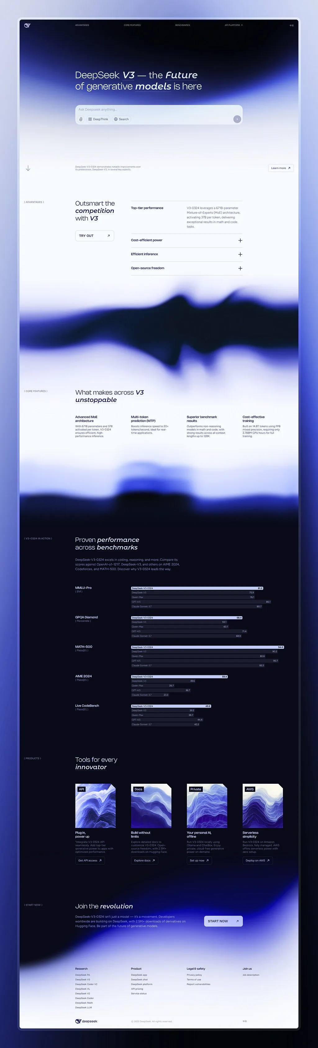
RebuildReference
Move across the image to wipe between the two. Click to lock the seam; arrow keys nudge it.
Imagery
4/4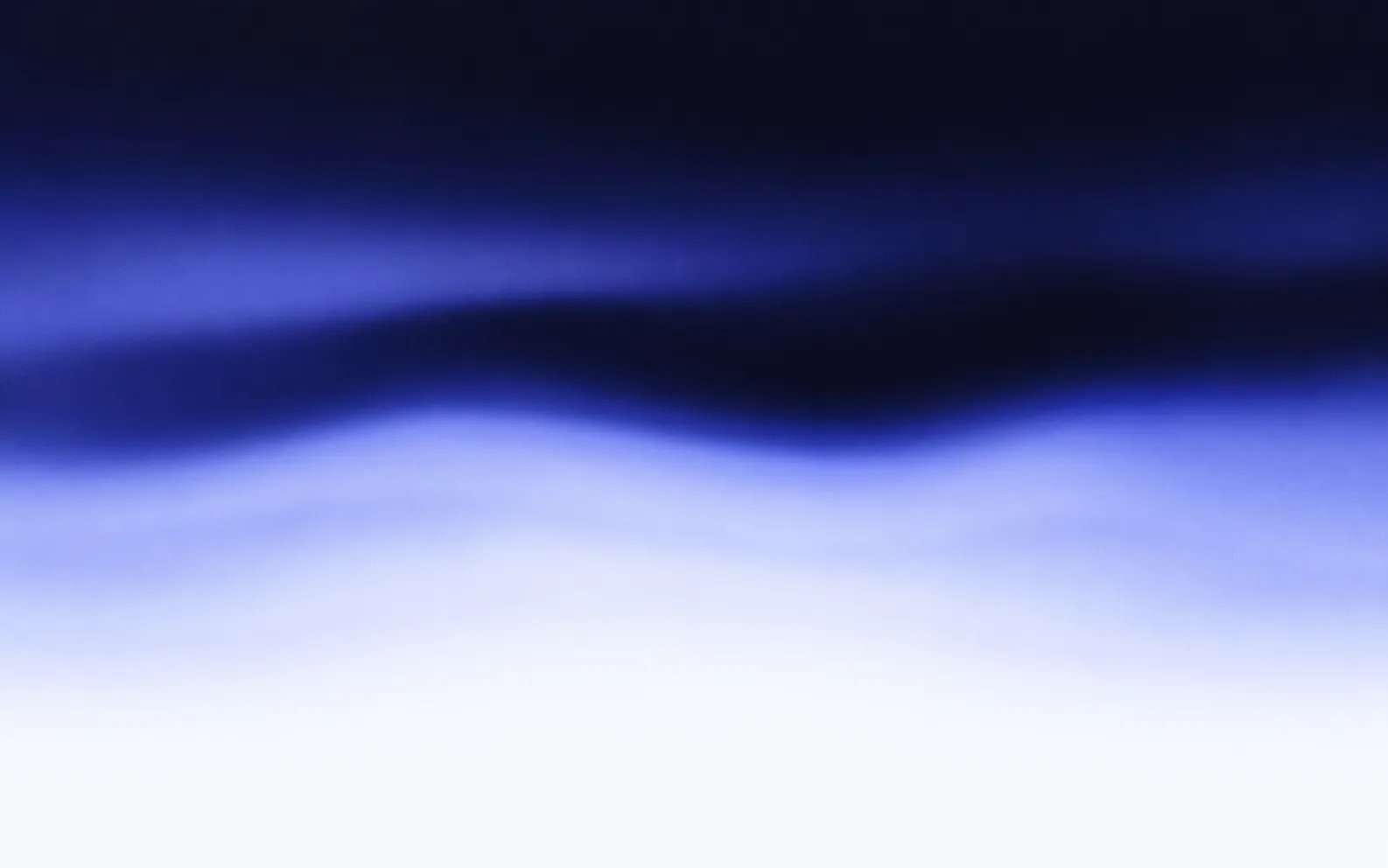
01-hero-liquid-light
Blurred periwinkle and navy liquid light field rising from dark to white
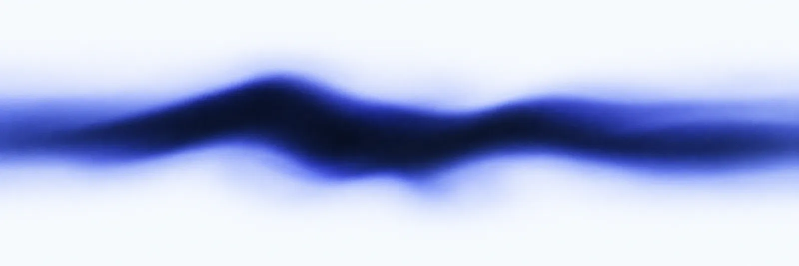
02-fluid-band-a
Blurred dark navy ridge with periwinkle and white bands flowing across it, fading to white top and bottom
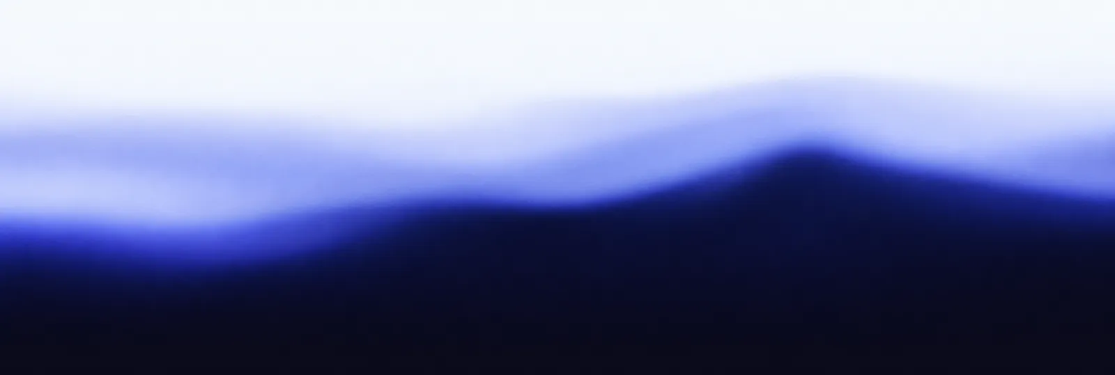
03-fluid-band-b
Blurred periwinkle field dissolving from white at the top into solid navy black at the bottom
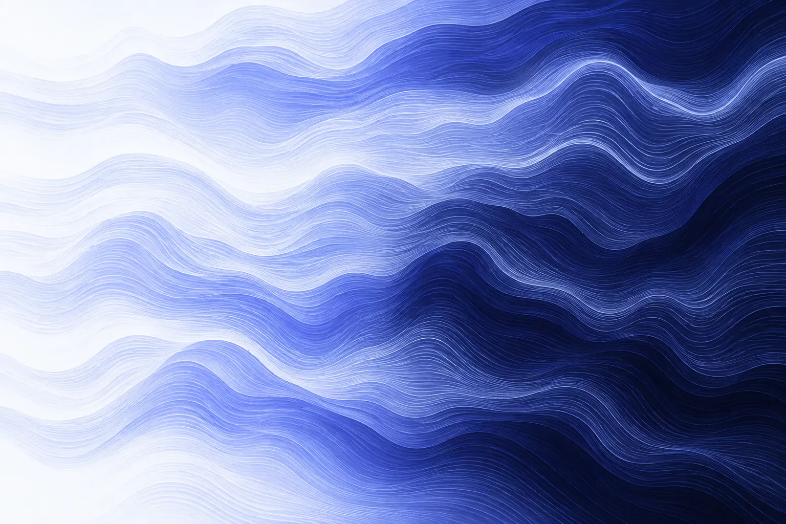
04-contour-terrain-sheet
Dense wavy contour striations in violet, lilac and white, shading from light at the left to dark at the right
Prompts
123,784 chars
# Dark AI Model Landing Page — Rebuild Prompt

A full-bleed marketing page for a technical/AI product. Dark at the top, light through the middle, dark again from the halfway point down, with two full-width abstract "liquid light" plates doing the handoffs. Everything is left-aligned against a strict grid; the only decoration is the gradient artwork and a headline system that alternates roman and italic words.

Reference viewport for all numbers: **1440 × 900 CSS px**.

---

## 1. Structure

**Grid.** Full-bleed page, no centred max-width wrapper. 12 columns, 40px outer page margins (1360px usable), 24px gutters → column width 91px.

- **Column 1** is a dedicated *label rail*. It holds only the section eyebrows and the nav/footer logo mark. Nothing else ever enters it.
- **Column 2** is always empty — it is the breathing space between rail and content.
- **Content starts at column 3** (x ≈ 271px). Every headline, paragraph, grid and chart begins on this line. This single alignment is what holds the page together.
- Content blocks end on different columns by design (accordion stops at col 10, cards run to col 12). Do not normalise them to one right edge — the ragged right margin is intentional.

**Sections, top to bottom:**

1. **Nav bar** — fixed overlay, 88px tall, transparent over the hero.
2. **Hero** — dark→light gradient field, headline, prompt-composer mock, bottom rail.
3. **Advantages accordion** — two-up: headline + button left, expandable list right. Light surface.
4. **Fluid plate A** — full-bleed abstract band, light edges.
5. **Core features** — headline + 4-up text columns. Light surface.
6. **Fluid plate B** — full-bleed abstract band; light at its top edge, solid near-black at its bottom edge. This is where the page flips to dark.
7. **Benchmarks** — headline, intro paragraph, 5 stacked bar-chart groups. Dark surface.
8. **Tools row** — headline + 4 image/text columns. Dark surface.
9. **CTA band** — headline, paragraph, one filled button, indigo bloom behind. Dark surface.
10. **Footer** — 4 link columns, hairline, bottom bar. Dark surface.

There are no horizontal rules between sections. The two fluid plates are the only dividers.

---

## 2. Scroll map

Viewport = 900px. Nothing pins; nothing stacks. Scroll consumed equals height for every section.

| # | Section | Height | Viewports | Scroll consumed | Kind |
|---|---|---|---|---|---|
| 1 | Nav bar | 88px (overlay) | — | 0 (fixed) | scroll-linked (tint only) |
| 2 | Hero | 980px | 1.09 | 980px | entrance on load + scroll-linked |
| 3 | Advantages accordion | 560px | 0.62 | 560px | entrance |
| 4 | Fluid plate A | 520px | 0.58 | 520px | scroll-linked |
| 5 | Core features | 480px | 0.53 | 480px | entrance |
| 6 | Fluid plate B | 440px | 0.49 | 440px | scroll-linked |
| 7 | Benchmarks | 1300px | 1.44 | 1300px | entrance (per group) |
| 8 | Tools row | 800px | 0.89 | 800px | entrance |
| 9 | CTA band | 420px | 0.47 | 420px | entrance + scroll-linked |
| 10 | Footer | 520px | 0.58 | 520px | static |

**Total page height: 6,020px ≈ 6.7 viewports.**

---

## 3. Spacing

**Section padding (top / bottom):**

- (2) Hero: 88 top (nav) / 220 bottom
- (3) Advantages: 120 / 120
- (4) Plate A: 0 / 0 — the plate is the section
- (5) Core features: 120 / 100
- (6) Plate B: 0 / 0
- (7) Benchmarks: 140 / 140
- (8) Tools: 140 / 140
- (9) CTA: 96 / 96
- (10) Footer: 96 / 64

**Internal:**

- Nav: link gap 48px; logo mark 24px square.
- Hero: nav bottom → headline top 112px. Headline → composer 48px. Composer → bottom rail 268px (a large deliberate void filled only by the gradient bloom). Rail sits ≈760px from the section top.
- Composer: width 864px (cols 3–10), padding 20px, internal radius stack of 44px input row + 16px gap + 36px chip row. Chip gap 8px. Send button 40px circle, right-aligned on the chip row.
- Eyebrow in the rail is **top-aligned to the cap line of the section headline**, not to the section's padding box.
- Headline → first content below it: 56px. Headline → button (section 3): 40px.
- Accordion (cols 6–10, 570px wide): row padding 26px top / 26px bottom, 1px hairline under every row including the last. Expanded row splits into a 200px title sub-column + 24px gap + body to the row's right edge.
- Core features: 4 columns of 266px, 24px gutter. Title → body 12px.
- Benchmarks: intro paragraph 56px below headline; chart 88px below paragraph. Group = 24px label-to-first-bar, bar height 24px, bar gap 8px, 5 bars per group, 48px between groups.
- Tools: image → title 20px, title → body 10px, body → button 24px. Column gap 24px.
- CTA: headline → paragraph 20px; button vertically centred against the paragraph block, right-aligned at cols 9–11.
- Footer: heading → first link 20px, link row gap 14px. Hairline 56px below the columns, bottom bar 80px tall.

**Rhythm.** Light sections breathe at 120px; dark sections at 140px. The plates have zero padding, so the page alternates *air → image → air → image → long dark run*. Do not equalise all sections to one padding value.

---

## 4. Type

**Class:** a geometric-leaning grotesk with **true italics** (not obliques). Free stand-ins: **General Sans** (Fontshare) or **Inter Tight**. Tabular lining numerals for the benchmark figures.

**The headline system is the whole identity:** every headline mixes roman and italic in the same line — roman at weight 400, emphasis words at weight 500 *italic*, identical size, identical colour. Roughly a third to a half of each headline is italic.

Body anchor: **17px** at 1440.

| Level | Ratio | Size | Line-height | Tracking | Weight |
|---|---|---|---|---|---|
| Hero headline | 3.8× | 64px | 1.12 (72px) | −0.02em | 400 / 500 italic |
| Section headline (3,5,7,8) | 2.6× | 44px | 1.15 (51px) | −0.015em | 400 / 500 italic |
| CTA headline (9) | 2.1× | 36px | 1.2 (43px) | −0.015em | 400 / 500 italic |
| Body / running text | 1× | 17px | 1.55 (26px) | 0 | 400 |
| Accordion title, feature title, card title | 1.06× | 18px | 1.3 (23px) | −0.005em | 500 |
| Benchmark group label | 0.94× | 16px | 1.3 | 0 | 500 |
| Footer column heading | 0.94× | 16px | 1.4 | 0 | 500 |
| Small body (feature columns, card body, hero rail paragraph, footer links) | 0.82× | 14px | 1.5 (21px) | 0 | 400 |
| Nav links | 0.82× | 14px | 1.2 | 0.01em | 450 |
| Buttons | 0.82× | 14px | 1.0 | 0.08em (uppercase) / 0 (sentence case) | 500 |
| Eyebrow label (in rail) | 0.76× | 13px | 1.2 | 0.12em, uppercase | 500 |
| In-bar chart text + scores | 0.7× | 12px | 1.0 | 0.01em | 450, tabular |
| Bracketed metric, badges, footer legal | 0.7× | 12px | 1.2 | 0.08em, uppercase | 450 |

**Max line length:** 60–66 characters for all running text (≈560px at 17px). Hero headline breaks at **2 lines, ~22 characters each**. Section headlines break at **2 lines**. The 14px feature/card columns run ~30 characters — narrow and dense, that is correct.

**Eyebrows are literally parenthesised:** `( ADVANTAGES )`, `( CORE FEATURES )`, `( PASS@1 )` — with a space inside each bracket.

**Placeholder copy by role:**
- Hero eyebrow: none.
- Hero headline: 9–11 words on 2 lines, 2–3 of them italic.
- Composer placeholder: 3 words, sentence case.
- Hero rail paragraph: 18–24 words, 2 lines at 14px.
- Section eyebrows: 1–3 words.
- Section headlines: 5–7 words on 2 lines.
- Accordion titles: 2–3 words. Accordion body: 25–35 words.
- Feature titles: 2–4 words. Feature body: 18–26 words.
- Card badges: 1 word. Card titles: 2–4 words on 2 lines. Card body: 18–24 words.
- CTA paragraph: 28–34 words on 2 lines.

---

## 5. Colour

| Hex | Role | Where |
|---|---|---|
| `#0A0A18` | **Dominant dark surface** — ~60% of the page | Hero top third, all of sections 7–10, plate B's bottom edge. Also the text colour on light surfaces. |
| `#F6F9FE` | **Dominant light surface** — ~40% | Sections 3 and 5, the light edges of both plates, hero's lower third. Also the primary text colour on dark, and the fill of the one solid button. |
| `#D5DBF7` | Muted / secondary text on dark, hairlines on dark, chip labels, footer links at rest, chart comparison-bar text | |
| `#1C2467` | Raised/inset surfaces and non-highlighted bar fills on dark; the mid-value inside the gradient artwork | |
| `#98A9F7` | **The single accent** | |

**The accent is allowed in exactly these places:** the highlighted (first) bar in each benchmark group; the send button fill in the composer; link and nav hover; the focus-visible ring; and as the transitional value inside the two gradient plates and the hero field. Nowhere else. It is never a page background, never a headline colour, never a large button fill, never a body text colour.

**Derived tokens (state them, don't improvise):**
- Body text on light: `#0A0A18` at 68% → `#4A4B5C`
- Muted text on dark: `#D5DBF7` at 72%
- Hairline on light: `#0A0A18` at 10%
- Hairline on dark: `#F6F9FE` at 10%
- Ghost button fill on hover: `#F6F9FE` at 6%

---

## 6. Surface

- **Borders:** 1px only. There is no 2px border anywhere. On light `#0A0A18`/10%; on dark `#F6F9FE`/10%. The composer uses `#F6F9FE`/12%.
- **Radii:** pills (all buttons, all chips, badges) = 999px. Composer = 24px. Card image frames = 16px. Benchmark bars = 6px. Nothing else is rounded — sections, plates and the page itself are square.
- **Shadows: none.** No drop shadows, no inset shadows, no glow rings on cards. Depth comes entirely from the gradient light and the 1px hairlines. The composer's apparent lift is a soft background bloom *behind* it in the hero artwork, not a `box-shadow`.
- **No glassmorphism** on cards. The composer is the only translucent element (fill `#F6F9FE` at 7%, backdrop-blur 16px), and the nav after scroll.

---

## 7. Imagery

No photographs. No people. No product UI screenshots except the composer, which is built in markup, not an image.

**IMG-1 — Hero field.** Full-bleed, 1440×980, ≈1.47:1. A vertical gradient reading near-black at the top, through deep indigo and periwinkle in the middle, to near-white by ~75% down. Superimposed: one wide, soft elliptical bloom centred behind the composer, and a faint high horizon of light. Smooth, no visible banding, no stars, no grain flecks.

**IMG-2 — Fluid plate A.** Full-bleed, 1440×520, ≈2.77:1. Abstract liquid-light: long horizontal flows of near-black ink dissolving into vapour across a white field, periwinkle only where the two values meet. It reads like a mountain ridge photographed through fog and then smeared sideways — very high frequency along the boundaries, glassy-smooth elsewhere. The top ~15% and bottom ~15% fade completely into `#F6F9FE` so the plate has no visible edge.

**IMG-3 — Fluid plate B.** Full-bleed, 1440×440, ≈3.27:1. Same family, denser and darker: heavy indigo masses with a blurred horizon. Top edge fades into `#F6F9FE`; bottom edge resolves to solid `#0A0A18`. This plate carries the page's light→dark flip, so its lower boundary must be an exact colour match with section 7's background.

**IMG-4 … IMG-7 — Four tiles in the tools row.** 266×213 each, 5:4. Dense parallel contour isolines — 1px, light periwinkle over indigo — warped into ridges, basins and folds. Each tile is a different region of the same imaginary field (one banded and flat, one peaked, one with tight nested rings, one with long sweeping curves) so they read as a set, not four unrelated graphics. Clipped to a 16px frame. Each carries one 12px uppercase pill badge in its top-left corner, 12px inset, fill `#0A0A18`/60%.

**IMG-8 — CTA bloom.** Full-bleed, 1440×420, ≈3.43:1. A single soft indigo bloom entering from the left edge and dissipating by ~60% across, over `#0A0A18`. Lowest contrast image on the page.

**Icons** (1.5px stroke, currentColor, 20px): paperclip, a "reasoning" glyph, a globe/search glyph, circled arrow-up (send), long down-arrow (hero rail), `↗` on every ghost button, `+` on collapsed accordion rows, small `⌄` on the one nav item with a menu.

---

## 8. Motion

**No live-page motion measurements were supplied for this reference.** Everything below is read from the stills and marked **(inferred)**. All durations and easings are given as ranges and are explicitly **not measured** — do not present them as exact, and do not substitute spring/lerp parameters.

### 1. Nav bar
- **kind** — scroll-linked (inferred)
- **what moves** — the bar's own background and bottom hairline. Links and logo do not move.
- **from → to** — background `transparent` → `#0A0A18` at 72% with backdrop-blur 12px; bottom hairline opacity 0 → 1; bar height stays 88px.
- **range** — scroll-linked across the first 120px of page scroll; fully reverses on the way back up.
- **reduced motion** — the tint snaps on at 120px with no blur ramp.

### 2. Hero
- **kind** — entrance on load, plus scroll-linked departure (inferred)
- **what moves** — entrance: headline line 1, headline line 2, composer, bottom rail (arrow + paragraph + button as one unit). Scroll-linked: the background bloom and the headline block.
- **from → to** — entrance: opacity 0 → 1, translateY 24px → 0. Scroll-linked: bloom translateY 0 → −120px; headline translateY 0 → −60px and opacity 1 → 0.6.
- **range** — entrance plays **once on load**, ~200ms after paint; duration 700–900ms (not measured), ease-out cubic (not measured), stagger 80–120ms in the order listed. Scroll-linked part runs from scroll 0 until the hero's bottom reaches the viewport top, and reverses upward.
- **reduced motion** — entrance becomes opacity-only over ~200ms with no translate; the bloom and headline are static.

### 3. Advantages accordion
- **kind** — entrance, plays once (inferred)
- **what moves** — eyebrow, headline, button, then each accordion row.
- **from → to** — opacity 0 → 1, translateY 20px → 0.
- **range** — triggers once when the section's top reaches 80% of the viewport; duration 500–700ms (not measured), ease-out (not measured), stagger 60–90ms, rows staggering top to bottom after the headline group.
- **reduced motion** — opacity only, no translate.

### 4. Fluid plate A
- **kind** — scroll-linked, reverses on scroll up (inferred)
- **what moves** — the plate image inside its fixed-height frame.
- **from → to** — image scale held at 1.08; translateY −40px → +40px (a slow counter-parallax against the page).
- **range** — from the plate's top entering the viewport until its bottom leaves the viewport. Continuously mapped to scroll position.
- **reduced motion** — static image at scale 1.0, no translate.

### 5. Core features
- **kind** — entrance, plays once (inferred)
- **what moves** — eyebrow, headline, then the four text columns.
- **from → to** — opacity 0 → 1, translateY 20px → 0.
- **range** — once, when the section's top reaches 80% of the viewport; 500–700ms (not measured), ease-out (not measured), stagger 60–80ms left to right across the four columns.
- **reduced motion** — opacity only.

### 6. Fluid plate B
- **kind** — scroll-linked, reverses on scroll up (inferred)
- **what moves** — the plate image, and the page background colour behind it.
- **from → to** — image translateY −40px → +40px at scale 1.08; page background `#F6F9FE` → `#0A0A18` across the plate's final 40%.
- **range** — from the plate's top entering the viewport until its bottom reaches the viewport top.
- **reduced motion** — static image; background flips at a single threshold when the plate's midpoint crosses the viewport centre.

### 7. Benchmarks
- **kind** — entrance, once, triggered **per chart group** (inferred)
- **what moves** — eyebrow, headline, intro paragraph as one group; then, independently, each of the 5 chart groups: its label, its bars, its in-bar text and scores.
- **from → to** — text: opacity 0 → 1, translateY 20px → 0. Bars: `scaleX` 0 → 1 with `transform-origin: left`, ending at each bar's own data width; in-bar labels and scores opacity 0 → 1 held until the bar reaches ~70% of its final width.
- **range** — each group triggers once when *its own* top reaches 80% of the viewport; bar duration 600–800ms (not measured), ease-out (not measured), stagger 60ms per bar within a group. Groups never re-run on scroll up.
- **reduced motion** — bars render at final width immediately; text fades over ~200ms.

### 8. Tools row
- **kind** — entrance, once (inferred)
- **what moves** — eyebrow and headline, then the four columns as units (image + badge + title + body + button).
- **from → to** — opacity 0 → 1, translateY 28px → 0; the image additionally scales 1.06 → 1.00 inside its clipped 16px frame over the same interval.
- **range** — once, when the row's top reaches 80% of the viewport; 600–800ms (not measured), ease-out (not measured), stagger 80ms left to right.
- **reduced motion** — opacity only; no translate, no scale.

### 9. CTA band
- **kind** — entrance for the content, scroll-linked for the bloom (inferred)
- **what moves** — entrance: eyebrow, headline, paragraph, button. Scroll-linked: IMG-8.
- **from → to** — entrance: opacity 0 → 1, translateY 20px → 0. Bloom: translateX −60px → +60px.
- **range** — entrance once, when the section's top reaches 80% of the viewport; 500–700ms (not measured), ease-out (not measured), stagger 70ms. Bloom is mapped to scroll across the section's full pass through the viewport and reverses.
- **reduced motion** — opacity only; bloom static.

### 10. Footer
- **kind** — **static.** Nothing enters, nothing parallaxes, nothing fades. It is simply there when you reach it.
- **what moves** — nothing.
- **from → to** — n/a.
- **range** — n/a.
- **reduced motion** — no change; already static.

### Interaction transitions (not part of the scroll choreography)

- Nav link hover: colour `#D5DBF7` → `#F6F9FE` over 120–160ms; a 1px underline wipes in from the left over ~180ms.
- Nav menu item open: panel opacity 0 → 1 and translateY −8px → 0 over 160–200ms; close over ~120ms. The `⌄` rotates 180°.
- Ghost/outline button hover: border 10% → 28% white, fill transparent → 6% white, and the `↗` shifts +2px x / −2px y, ~140ms.
- Solid button hover: fill `#F6F9FE` → `#D5DBF7`, ~120ms.
- Any button press: scale 0.985 over ~80ms, released on pointerup.
- Accordion open: the `+` rotates 45° into an `×` over ~200ms; the panel goes height 0 → measured height with opacity 0 → 1 over 260–320ms ease-out. Only one row open at a time; the previously open row closes over the same interval. One row is open by default on load.
- Composer focus: border 12% → 30% white and the background bloom brightens ~8% over ~180ms. The send button sits at 40% opacity until the field is non-empty, then 100% over ~120ms.
- Tools tile hover: image scale 1.00 → 1.03 inside the clipped frame over ~400ms ease-out; the badge does not move.
- Footer link hover: opacity 0.7 → 1 over ~120ms.
- Focus-visible, everywhere: 2px `#98A9F7` ring at 2px offset, no transition.

---

## 9. Responsive (below 640px)

- Page margins 40px → 20px. Grid collapses to one column.
- **The label rail disappears as a column.** Each eyebrow moves inline above its section headline, same 13px style, with 16px below it.
- Nav: links and the language toggle are dropped into a full-screen sheet behind a 24px hamburger; only the logo mark and the trigger stay in the 64px bar.
- Hero: 980px → 700px. Headline 64px → 34px (2× body), 3 lines. Composer full-width, its chip row wraps to two lines, send button stays on the first chip row. The 268px void shrinks to 80px. Bottom rail: down-arrow dropped, paragraph then button stacked, button full-width.
- Advantages: headline block stacks above the accordion, 48px gap. Inside an expanded row the body drops **below** the title instead of beside it.
- Plates A and B: re-crop to a 4:5 portrait framing at 320px tall — do not letterbox the desktop crop, or the forms become unreadable stripes. Keep the fading edges.
- Core features: 4 columns → 1 column, separated by 1px hairlines with 24px padding above and below each.
- Benchmarks: the group label moves above its bars (full width). Bar height 24px → 20px; in-bar model names drop to 12px and truncate with an ellipsis; scores stay right-aligned inside the bar. The bracketed metric becomes a suffix on the label. **No horizontal scrolling.**
- Tools: 4 columns → a horizontal snap carousel showing 1.15 tiles, 16px gap, 20px start inset, no visible scrollbar. Images stay 5:4.
- CTA: headline, paragraph, then a full-width button below. Bloom crops to the left third.
- Footer: 4 columns → 2 columns, 40px row gap. Bottom bar stacks to logo / legal / language on three lines, left-aligned.
- Section padding: 120/140 → 72; plates stay at 0.

---

## 10. Don'ts

- **Don't put a solid bar behind the nav at scroll position 0.** It is fully transparent over the dark hero; the tint only arrives after 120px.
- **Don't fake the fluid plates with a blurred radial gradient or a `filter: blur()` on a coloured blob.** That is the single most likely failure. The plates are organic, high-frequency ink-in-water fields with long horizontal flow and crisp value boundaries. Use layered noise-warped gradients, a displacement-mapped render, or real generated artwork — and always fade top and bottom edges into the adjacent background so the plate has no seam.
- **Don't use violet.** Not `#7C3AED`, not Tailwind `violet-500`/`indigo-500`. The accent is a desaturated periwinkle `#98A9F7` and the darks are blue-black, not purple.
- **Don't paint the accent onto buttons, headings or section backgrounds.** It appears in five named places only. A page where the accent shows up on a CTA button is the wrong page.
- **Don't substitute an oblique for the italic, or switch families for the emphasis words.** Same family, same size, weight 500, true italic. If your font has no real italic, pick a different font — the roman/italic alternation is the entire typographic idea and a slanted roman kills it.
- **Don't centre anything.** No centred headlines, no centred eyebrows, no centred CTA. Everything starts on column 3.
- **Don't normalise the right edge.** The accordion deliberately stops at column 10 with two empty columns beside it; the card row runs to column 12. That asymmetry is the composition.
- **Don't add horizontal rules or borders between sections.** The plates are the dividers.
- **Don't add drop shadows, glow borders, or glassmorphic cards.** One translucent surface (the composer) and one more after scroll (the nav). That's it.
- **Don't put the tools tiles in bordered card containers.** They are bare columns: image, then text directly on the page background.
- **Don't give each benchmark competitor its own colour.** Every comparison bar is the same `#1C2467`; only the first bar in each group is light. A rainbow chart destroys the point being made.
- **Don't count the benchmark numbers up, and don't spring/bounce the bar widths.** Linear-out width growth, numbers fade in with the bar.
- **Don't add icons above the four feature columns.** They are text only — title and paragraph, nothing else.
- **Don't pin, horizontally scroll, or scroll-jack the tools row on desktop.** Nothing on this page pins.
- **Don't use stock photography, 3D renders, mesh-gradient clip art, or people.** There is not one photograph on the page.
- **Don't put a large wordmark or logo lockup in the hero.** The only logo instances are 24px in the nav and in the footer bottom bar.
- **Don't drop body text below 16px** and don't use neutral grey `#666` for muted text — muted is always blue-tinted.
- **Don't let running text exceed ~66 characters**, and don't justify it.
- **Don't fade the entire page in on load.** Only the hero's own elements have a load entrance; every other section waits for its scroll trigger.
- **Don't make the composer functional-looking with a real cursor, autocomplete, or sample response.** It is a still, empty state: placeholder, two chips, one attachment icon, one send button at 40% opacity.
Versions
1Each rebuild is kept. The live one is what the comparison shows. LiveOpus 5.5Extra highfrontend-designemil-design-engtransitions-devhumanizergsap4 weeks ago · 326s · 4 images · 20260921T124624ZOpen