Donatia — Charity nonprofit site
Rebuild
Opus 5.5Extra highfrontend-designemil-design-engtransitions-devgsaphumanizerView

RebuildReference
Move across the image to wipe between the two. Click to lock the seam; arrow keys nudge it.
Imagery
4/4
01-cta-friends-sky
Four laughing friends with their heads together, seen from below against a clear blue sky
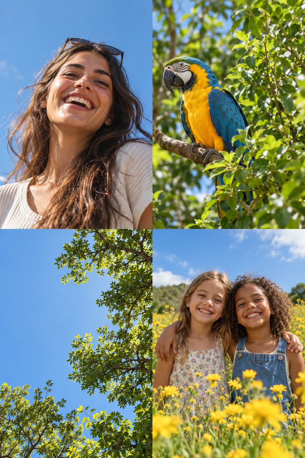
02-hero-fan-and-footer-cards· 2x2 sheet
Four warm sunlit portrait photos: a laughing woman, a macaw, a tree canopy against sky, and two girls in a flower field
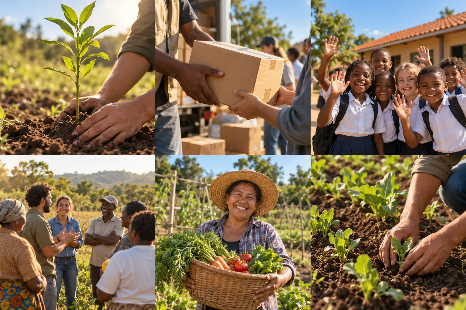
03-about-and-initiatives· 3x2 sheet
Six warm documentary photos of planting, aid parcels, schoolchildren, a community group and garden work
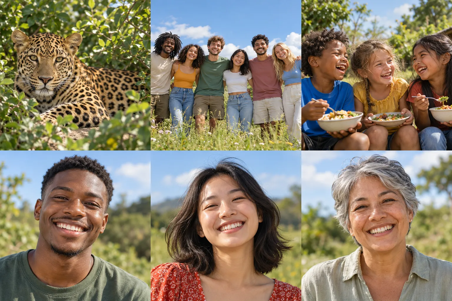
04-projects-testimonial-avatars· 3x2 sheet
A leopard in foliage, six volunteers in a meadow, children sharing a meal, and three smiling outdoor headshots
Prompts
124,511 chars
# Pastel lavender nonprofit landing page — build prompt

A light, airy single page for a charity or nonprofit. It is a white page broken up by rounded pastel bands: lavender, then pale sky blue, then a full-bleed blue sky. The type is a calm, medium-weight grotesk with tight tracking. Photos are warm and human. Hand-drawn pink and lavender doodles add a little playfulness. Frosted glass appears only on overlays sitting on photos. Motion is restrained: soft entrances only, with nothing pinned or scroll-scrubbed.

Design viewport: 1440 × 900. All sizes below are CSS px at 1440 wide.

## 1. Structure

- **Page:** full-bleed. Background is #FDFDFE from edge to edge, with no outer frame and no rounded page corners.
- **Container:** `max-width: 1176px`, centred, with 24px side padding below that width. At 1440 this leaves a ~132px gutter on each side.
- **Grid:** a 12-column grid with 24px gutters inside the container. Most two-column sections use 50/50 halves (576 + 24 + 576).
- **Inset bands:** sections 3, 5 and 7 are coloured bands inset 24px from the viewport edges, so they are wider than the container, with 32px corner radius. Their content still aligns to the 1176 container.
- **Full-bleed band:** section 9 runs edge to edge with square corners.

Sections, top to bottom:

1. **Nav bar.** 72px tall on white.
   - Left: a small pink mark (24px) and a wordmark (one word, 16px, weight 600).
   - Centre: five text links, the last being "More" with a chevron.
   - Right: a dark pill button (one word).
2. **Hero.** Everything centred.
   - Eyebrow pill (3–5 words), then a 3-line headline (2–3 words per line), then one line of subtext (~10–12 words), then a dark pill CTA with an arrow circle.
   - Below that, a fan of three photo cards: a portrait card in the centre with two tilted cards behind it.
   - Two hand-drawn doodles: a looping arrow at upper left, a heart scribble at upper right.
3. **Stats band.** Lavender inset band holding three equal columns. Each column has a large number with a "+" and a 2-word label below.
4. **About.** Two columns.
   - Left, vertically centred: eyebrow pill (2 words), 2-line headline (~4 words), a 3-line paragraph, and a dark pill button (2 words).
   - Right: a square photo with a white circular play button.
5. **How we deliver (feature grid).** Lavender inset band, centred.
   - Eyebrow pill (2 words), 1-line headline (4 words), 2-line subtext (~25 words).
   - A narrow 2×2 grid of white cards. Each has an icon tile, a 2–3 word title and a 2-line description.
   - Below the grid, a dark pill button (2 words).
6. **Initiatives carousel.** White.
   - Header row: left-aligned eyebrow pill (1 word) and a 1-line headline (3 words); on the right, two 48px circular arrow buttons.
   - Below, a horizontal track of square photo cards with text laid over the photo. It bleeds past both container edges, so partial cards peek in at the far left and far right.
7. **Testimonials.** Pale sky-blue inset band, two columns.
   - Left: eyebrow pill (1 word), 2-line headline (a 5-word question), 2-line paragraph, then a row with a 3-avatar stack and a short "+N volunteers" label.
   - Right: a white card with a group photo on top, then a quote glyph, a 3-line quote and a name.
8. **Latest projects.** White.
   - Header row: left side has an eyebrow pill (1 word), a 1-line headline (5 words) and a 1-line subtext. Right side has a small dark "view all" pill aligned to the header's bottom.
   - Below, an asymmetric grid: one large card on the left half and two narrow cards sharing the right half. Each card has a photo, a title, a description and an underlined "Donate"-style text link.
   - A pink doodle overlaps the top-right corner of the rightmost card.
9. **Closing CTA.** Full-bleed blue sky band.
   - Centred: eyebrow pill, 1-line headline (4 words) in pale lavender, 1-line subtext, and a white pill CTA.
   - Two lavender doodles: a paper plane with a looping trail at left, a heart loop at right.
   - The bottom ~55% of the band is a full-width photo of people whose sky blends into the band colour.
10. **Footer.** White.
    - Top row: a "Quick links" label over three link columns (5, 4 and 4 links) on the left. On the right, a "Join our community" label over an email field that has the subscribe pill inside it.
    - Bottom row: a giant wordmark on the left, bottom-aligned, and two overlapping tilted photo cards on the right.

## 2. Scroll map

No motion report was supplied, so every number here is inferred from the still. Heights assume a 1440 × 900 viewport. Nothing pins or stacks, so the scroll consumed equals the section height everywhere.

1. Nav: 72px, 0.08 vp, consumes 72. Static.
2. Hero: 1100px, 1.22 vp, consumes 1100. Entrance.
3. Stats band: 236px (232 band + spacing), 0.26 vp, consumes 236. Entrance.
4. About: 784px, 0.87 vp, consumes 784. Entrance.
5. How we deliver: 1046px, 1.16 vp, consumes 1046. Entrance.
6. Initiatives carousel: 1070px, 1.19 vp, consumes 1070. Entrance (plus a click-driven carousel, which is not scroll-linked).
7. Testimonials: 824px, 0.92 vp, consumes 824. Entrance.
8. Latest projects: 1122px, 1.25 vp, consumes 1122. Entrance.
9. Closing CTA: 1156px, 1.28 vp, consumes 1156. Entrance.
10. Footer: 690px, 0.77 vp, consumes 690. Static.

Total page height ≈ 8100px (≈ 9.0 viewports).

## 3. Spacing

All values below are inferred from the proportions in the still.

### Vertical rhythm
- White sections (4, 6, 8) use 120px padding top and bottom.
- Inset bands (5, 7) use 96px padding top and bottom.
- The stats band (3) has no outer padding. It sits directly under the hero cards.
- **Header stacks:**
  - eyebrow pill → headline: 16px
  - headline → subtext/paragraph: 20px
  - paragraph → button: 32px
  - section header → content grid: 56px

### Section-specific values
1. **Nav:** links are spaced 32px apart.
2. **Hero:**
   - Nav → eyebrow pill: 110px. Pill → H1: 16px. H1 → subtext: 24px. Subtext → CTA: 32px. CTA → top of the card fan: 32px.
   - The fan is ~540px tall. The centre card's bottom edge meets the top of the stats band, overlapping it by 0–24px, with the card above the band in z-order.
3. **Stats band:**
   - 232px tall, so the numbers sit centred with ~64px above and below.
   - Three equal columns across the container, each stat centred in its column.
   - Number → label: 8px.
4. **About:** columns are 540 + 96 gap + 540. The text column is capped at 520px.
5. **How we deliver:**
   - The card grid is 768px wide and centred: 2 columns of 372px with a 24px gap, and 24px row gap.
   - Each card is ~225px tall with 32px padding and centred content.
   - Icon tile → title: 16px. Title → description: 8px.
   - Grid → button: 48px.
6. **Initiatives carousel:**
   - Cards are 576 × 576 with a 24px gap. The first two cards align exactly with the container edges, and ~108px of the previous and next cards peek into each gutter.
   - Text overlay sits 24px in from the card's left, right and bottom edges.
7. **Testimonials:**
   - Left text column is ~520px wide. The right card is 552px wide, ~620px tall, with 8px inner padding around the photo.
   - The quote area has 24px padding. Avatar stack → label: 12px.
8. **Latest projects:**
   - Left card is 576 wide. The right half is 2 × 276 cards with a 24px gap.
   - Photo → title: 20px. Title → description: 8px. Description → link: 16px.
9. **Closing CTA:**
   - 120px from band top to the eyebrow pill. The text stack follows the hero spacing.
   - The photo occupies the bottom ~640px and runs edge to edge.
10. **Footer:**
    - 64px top padding. Link rows have a 20px gap. Column starts sit at container x = 0, ~190 and ~430. The newsletter block starts at x ≈ 840 and is 336px wide.
    - Top row → wordmark row: ~72px. The wordmark baseline sits ~40px above the page bottom.

## 4. Type

- **Family class:** neo-grotesk sans with tight, modern proportions.
- **Free stand-in:** Inter Tight for everything, with Inter as the fallback.
- One family throughout, with no serif and no mono.
- Headlines use weight 500, never bold.

Anchor: body = 16px. Every level below is given as a multiple of the body size.

| Level | × body | Size | Line-height | Letter-spacing | Weight | Notes |
|---|---|---|---|---|---|---|
| Hero H1 | 4.5× | 72px | 1.12 | −0.035em | 500 | ink; 3 lines; max-width 560px (~14 chars/line) |
| Section H2 | 3.5× | 56px | 1.12 | −0.03em | 500 | ink (pale lavender in section 9); about and testimonial H2s break to 2 lines at max-width 520px; other H2s stay on one line |
| Stat number | 4× | 64px | 1.0 | −0.03em | 500 | ink; the "+" is the same size, in white |
| Footer wordmark | 12× | 192px | 0.9 | −0.045em | 500 | ink; one word |
| Card title / H3 | 1.25× | 20px | 1.3 | −0.01em | 500 | ink |
| Testimonial quote | 1.25× | 20px | 1.45 | −0.01em | 500 italic (inferred) | ink; max ~42ch |
| Body / paragraph | 1× | 16px | 1.55 | 0 | 400 | grey; max ~60ch (520px) |
| Card description | 0.875× | 14px | 1.5 | 0 | 400 | grey |
| Nav link | 0.875× | 14px | 1.0 | 0 | 500 | grey-ink |
| Button label | 0.875× | 14px | 1.0 | 0 | 500 | — |
| Stat label / footer link / meta | 0.875× | 14px | 1.4 | 0 | 400 | grey |
| Eyebrow pill | 0.75× | 12px | 1.0 | 0 | 500 | sentence case; never uppercase |

## 5. Colour

### Palette and roles
- **#FDFDFE (page white):** ~65% of the surface. Used for the page, the white sections, the white feature cards and the testimonial card.
- **#DBD4FE (lavender):** the main band colour.
  - Fills: stats band (3), feature band (5), and the hero eyebrow pill (at ~60% on white).
  - Text: the closing-CTA headline (9).
- **#97B8D8 (light sky blue):**
  - Mixed 50% with white (≈ #CADAEB) for the testimonial band (7).
  - Used at full strength for the lower part of the CTA sky gradient (9).
- **#4887BC (sky blue):** the CTA band (9) only. It is a vertical gradient from #4887BC at the top to #97B8D8 where it meets the photo.
- **#583626 (earth brown):** present only inside photographs (soil, fur, skin). Never use it as a UI fill or text colour.

### Inferred support colours (not in the sampled palette)
- **Ink:** #121214. Headlines, dark pill buttons, the wordmark.
- **Body grey:** #6B6B76.
- **Hairline:** #ECECF1.
- **Field fill:** #F2F2F5.

### The single accent: soft pink #F3A6E3 (inferred)
It may appear only in:
- the circle that holds the arrow inside every pill button;
- the nav mark;
- the pink doodles.

Nowhere else: no pink text, no pink section fills.

The doodles use either this pink or a deeper lavender, #A99CF3.

### Eyebrow pill tints
- Hero: lavender #EDE9FF.
- About and Projects: mint #E2F3E0.
- Initiatives: blush #FBE3EC.
- Sections 5 and 7: white pill on the band.
- CTA: #DBD4FE.

Pill text is ink at 80% everywhere.

### Feature icon tiles
48px tiles, one tint each: mint #E2F3E0, blush #FBE3EC, sky #E1EDF9, amber #FDEFD6. The glyph inside is a saturated version of the same hue.

## 6. Surface

### Radii
- Bands (3, 5, 7): 32px.
- Photo cards, white cards, carousel cards: 20px.
- Testimonial card: 24px, with a 16px-radius photo inside.
- Icon tiles: 12px.
- Everything clickable (buttons, pills, inputs, arrow buttons, avatars): fully round.

### Borders
- Essentially none.
- Arrow buttons in section 6: 1px #ECECF1 on a #F2F2F5 fill.
- Avatars: 2px white ring.
- Glass panels: 1px rgba(255,255,255,0.35).

### Shadows
- Hero fan cards and footer tilted cards: `0 24px 48px rgba(18,18,40,0.14)`.
- Nothing else has a shadow. White feature cards sit flat on lavender.

### Glass
Used only where a panel sits on a photo:
- the quote panel inside the hero centre card;
- the small icon badges on the carousel cards.

Recipe: `background: rgba(255,255,255,0.16); backdrop-filter: blur(16px) saturate(140%)`, with the 1px white border above and 14px radius.

### Buttons
- **Dark pill:** 48px tall, #121214 fill, white 14px label. Padding is 24px on the left and 6px on the right, where a 36px pink circle holds an ink arrow (→).
- **CTA variant (section 9):** the same pill with a white fill and ink label.
- **"View all" pill:** 40px tall with no arrow circle.
- **Subscribe pill:** a 40px dark pill inset 4px inside a 48px #F2F2F5 field.

## 7. Imagery

1. **Nav mark.** Vector, 1 instance, 24px. A soft pink four-petal/blob flower glyph, placed left of the wordmark.
2. **Hero centre card.**
   - Photo, 1 instance, 3:4 (~400 × 530), centred.
   - A young woman laughing straight at the camera, sunglasses pushed up, warm daylight against blue sky.
   - Bottom overlay: a glass panel inset 12px from the card edges, containing a 40px circular avatar (photo, 1:1), a 2-line quote (14px white) and a name (12px white at 75%).
3. **Hero back-left card.**
   - Photo, 1 instance, 3:4 (~340 × 450).
   - Rotated −9°, offset ~220px left and ~30px lower than the centre card, behind it.
   - A vivid macaw against green foliage.
4. **Hero back-right card.**
   - Photo, 1 instance, 3:4 (~340 × 450).
   - Rotated +9°, mirrored to the right.
   - Looking up through a tree canopy into blue sky.
5. **Hero doodles.** Vector, 2 instances, freehand strokes 2–2.5px with round caps and no fill.
   - Lavender (#A99CF3) loop that ends in an arrowhead aimed at the cards, ~160 × 180, at upper left of the fan.
   - Pink heart scribble, ~90 × 100, near the right card's top corner.
6. **About photo.**
   - Photo, 1 instance, 1:1 (~540), right column.
   - Close-up of hands pressing a young sapling into dark soil, low golden sun, shallow depth of field.
   - A 64px white circle play button is centred on it (ui), with an ink triangle.
7. **Feature icons.** Vector, 4 instances, ~22px glyphs (heart, medical cross/heart, lightning/clock, book) in 48px tinted tiles.
8. **Initiatives cards.**
   - Photo, 5 instances in the track (2 fully visible, 2 peeking, 1 off-screen), 1:1 (576), in a horizontal row.
   - Subjects:
     - aid parcels being handed over;
     - hands holding a seedling in soil;
     - schoolchildren waving outdoors in front of a red-roofed building;
     - a community group in a field;
     - a small farm or garden scene.
   - The bottom 40% has a gradient from transparent to rgba(0,0,0,0.6).
   - Over the gradient: a 28px glass icon badge (vector glyph inside), a 20px white title and a 2-line 14px white description at 85%.
9. **Testimonial group photo.**
   - Photo, 1 instance, 3:2 (~536 × 357), top of the testimonial card.
   - Six young people standing side by side in a meadow under a big blue sky, casual clothes.
10. **Avatar stack.** Photo, 3 instances, 36px circles overlapping by −10px, white ring, headshots.
11. **Quote glyph.** Vector, 1 instance: a 28px ink double-quote mark.
12. **Projects large photo.**
    - Photo, 1 instance, ~5:4 (576 × 460), left.
    - A leopard or jaguar resting in dense green foliage, eye contact.
13. **Projects small photos.**
    - Photo, 2 instances, ~1:1.05 (276 × 290), right half.
    - A person tending seedlings in a green plot.
    - Children sharing a meal together outdoors.
14. **Projects doodle.** Vector, 1 instance: a pink (#F3A6E3) looping heart scribble, ~120 × 120, 3px stroke, overlapping the top-right corner of the rightmost card.
15. **CTA photo.**
    - Photo, 1 instance, full-bleed 1440 × ~640 (≈ 9:4), bottom of section 9.
    - Four young people of different backgrounds lying head-to-head on grass, laughing, shot from below against a clear blue sky.
    - The photo's top 30% feathers into the band gradient with a mask, so no edge is visible.
16. **CTA doodles.** Vector, 2 instances, lavender #DBD4FE strokes, 2.5px.
    - A paper plane with a looping dashed trail, ~330 × 200, at left, partly over the photo.
    - A heart loop, ~160 × 260, at right beside the headline.
17. **Footer tilted cards.**
    - Photo, 2 instances, 3:4 (~220 × 290), at the bottom right, overlapping.
    - Back card, rotated +8°: a sunlit outdoor scene, mostly sky, with a small figure.
    - Front card, rotated −6° and 40px lower-left: two smiling girls in a flower field.

## 8. Motion

No motion was measured. Every value in this section is inferred, and the durations are ranges because they were not measured. Nothing is scroll-linked and nothing pins. Every entrance plays once and does not reverse when scrolling back up.

**1. Nav**
- kind: static
- what moves: nothing
- from → to: —
- range: —
- reduced motion: same

**2. Hero**
- kind: entrance (on page load)
- what moves: eyebrow pill, H1 (as a block), subtext, CTA, then the card fan, then the doodles
- from → to:
  - text: opacity 0 → 1, translateY 24 → 0
  - side cards: start at rotate 0° and translateX 0, stacked behind the centre card, then fan out to ±9° and ±220px
  - centre card: opacity 0 → 1, translateY 40 → 0, scale 0.96 → 1
  - doodles: opacity 0 → 1
- range: on load. Duration not measured (500–900ms), ease-out, text stagger 80–120ms, fan begins ~200ms after the CTA (inferred)
- reduced motion: everything is shown in its final state with no fan animation

**3. Stats band**
- kind: entrance
- what moves: the three stat columns
- from → to: opacity 0 → 1, translateY 16 → 0. No number count-up.
- range: once, when the band's top reaches 85% of the viewport. Duration not measured (400–700ms), ease-out, stagger 80ms
- reduced motion: shown immediately

**4. About**
- kind: entrance
- what moves: text column (as one block), photo
- from → to:
  - text: opacity 0 → 1, translateY 24 → 0
  - photo: opacity 0 → 1, scale 0.98 → 1
- range: once, when the section's top reaches 80% of the viewport. 500–800ms (not measured), ease-out, photo 100ms after the text
- reduced motion: shown immediately

**5. How we deliver**
- kind: entrance
- what moves: header stack, the 4 cards, the button
- from → to: opacity 0 → 1, translateY 24 → 0
- range: header triggers once at 80% of the viewport. Cards follow in reading order with a 60–100ms stagger, 500–700ms each (not measured), ease-out
- reduced motion: shown immediately

**6. Initiatives carousel**
- kind: entrance
- what moves: header row, then the card track as one unit
- from → to:
  - header: opacity 0 → 1, translateY 24 → 0
  - track: opacity 0 → 1, translateX 40 → 0
- range: once, at 80% of the viewport. 600–800ms (not measured), ease-out
- reduced motion: shown immediately. The arrows still work, with instant jumps.

**7. Testimonials**
- kind: entrance
- what moves: left text block, right card
- from → to: opacity 0 → 1, translateY 24 → 0
- range: once, at 80% of the viewport. 500–800ms (not measured), ease-out, card 120ms after the text
- reduced motion: shown immediately

**8. Latest projects**
- kind: entrance
- what moves: header, then the three cards, then the doodle
- from → to:
  - header and cards: opacity 0 → 1, translateY 24 → 0
  - doodle: opacity 0 → 1
- range: once, at 80% of the viewport. 500–700ms (not measured), stagger 80–100ms left to right
- reduced motion: shown immediately

**9. Closing CTA**
- kind: entrance
- what moves: text stack and doodles. The photo does not move: no parallax, no zoom.
- from → to:
  - text: opacity 0 → 1, translateY 24 → 0
  - doodles: opacity 0 → 1
- range: once, when the band's top reaches 75% of the viewport. 600–800ms (not measured), ease-out, stagger 80ms
- reduced motion: shown immediately

**10. Footer**
- kind: static
- what moves: nothing
- from → to: —
- range: —
- reduced motion: same

### Interaction transitions
These are separate from the scroll choreography.

- **Dark/white pill buttons, hover:** the fill shifts slightly (#121214 → #2A2A2E; white → #F4F2FF) and the arrow inside the pink circle slides 3px right. 180–220ms ease-out.
- **Buttons, press:** scale 0.97, 100ms.
- **Nav links, hover:** colour goes from grey to ink, 150ms.
- **"More" dropdown, open/close:** a white panel (radius 16, soft shadow) appears 8px below. Opacity 0 → 1 and translateY −6 → 0, 160ms. It reverses on close.
- **Carousel arrows, click:** the track slides by one card plus gap (600px). 450–600ms ease-in-out (not measured). At either end the unavailable arrow drops to 40% opacity.
- **Photo cards (sections 6 and 8), hover:** the image scales 1 → 1.03 inside its rounded clip, 400ms ease-out. The card itself does not lift.
- **Text links ("Donate"), hover:** the underline offset goes from 4px to 2px and the colour goes to full ink.
- **Play button, hover:** scale 1 → 1.06, 200ms.
- **Email field, focus:** a 2px #DBD4FE ring.

## 9. Responsive (below 640px)

### General
- Container side padding becomes 20px.
- Inset bands are inset 12px with a 24px radius and 64px vertical padding.
- White sections use 80px vertical padding.

### Type
- Body stays at 16px.
- H1 becomes 44px (2.75×).
- H2 becomes 36px (2.25×).
- Stat numbers become 32px.
- The footer wordmark scales to fit the width (`font-size: 22vw`).

### By section
1. **Nav:** the centre links collapse into a 40px round menu button. Keep the mark and the dark pill.
2. **Hero:**
   - Centre card is 260 × 345.
   - Side cards are 220 × 290, offset ±90px and rotated ±7°.
   - The left doodle is dropped. The heart doodle shrinks to 60px.
3. **Stats:** stays three columns, with 32px numbers and 12px labels.
4. **About:** stacks to text, then photo (full width, 1:1).
5. **Feature grid:** becomes one column of full-width cards.
6. **Carousel:**
   - Cards are 82vw square with native horizontal scroll and scroll-snap to start.
   - The arrow buttons are hidden.
   - One card peeks at the right edge.
7. **Testimonials:** stacks to text, then card.
8. **Projects:** the large card goes full width. The two small cards sit side by side at 2 columns if the width is ≥ 480px, otherwise they stack. The doodle shrinks to 70px.
9. **CTA:**
   - Headline at 36px.
   - Photo is 100% wide × 360px with `object-fit: cover`, centred on the faces.
   - Keep only the heart doodle.
10. **Footer:**
    - Link columns become a 2-column grid.
    - The newsletter block goes full width below the links.
    - The tilted cards are dropped.
    - The wordmark spans the full width.

## 10. Don'ts

### Colour
- Don't make every band full-bleed. Sections 3, 5 and 7 are inset 24px with 32px corners, floating on white. Only the closing CTA (9) runs edge to edge, with square corners.
- Don't add a second accent. Pink appears only in the button arrow circles, the nav mark and the doodles. Don't use pink text, pink cards, or pink anywhere in hover states.
- Don't use the brown (#583626) for anything. It exists only inside photos.
- Don't use gradient text or neon-saturated colours, and don't push the pastels to full saturation. The lavender band is #DBD4FE, not violet.
- Don't add a dark mode, dark sections, or a dark footer. The footer is white.

### Type
- Don't bold the headlines. Weight 500 with tight negative tracking is the whole tone. 700 makes it look like a generic SaaS template.
- Don't uppercase or letter-space the eyebrows. They are small sentence-case labels in tinted pills.

### Layout
- Don't centre everything. The hero, the feature band and the CTA are centred. About, Initiatives, Testimonials, Projects and the footer are left-aligned to the container.
- Don't stretch the feature grid across the container or make it 4 columns. It is a deliberately narrow, centred 2×2 about 768px wide.
- Don't trap the carousel inside the container. Partial cards must peek into both gutters.
- Don't shrink the footer wordmark into a normal logo. It is a ~192px headline-weight word anchoring the bottom-left.
- Don't add hairline dividers between sections or borders around cards. Separation comes from colour bands and white space.
- Don't lay out the hero cards as a straight row. They are a fan: an upright centre card with two cards rotated ±9° tucked behind it.

### Surface and imagery
- Don't spread glassmorphism around. Frosted panels exist only where text sits on a photo. The white feature cards and the testimonial card are opaque.
- Don't put drop shadows on the white feature cards or the photo grid. Only the tilted fan cards (hero and footer) cast a soft shadow.
- Don't draw the doodles as geometric icons. They must look hand-drawn: uneven freehand loops with round caps, a single stroke and no fill.
- Don't put the CTA people photo in a rounded card or give it a visible top edge. Its sky melts into the blue band.
- Don't use cold corporate stock imagery or illustrations. Photos are warm, sunlit and candid, people mid-laugh, with nature close-ups.

### Motion
- Don't add parallax, pinning, scroll-scrubbed zooms, marquee tickers or count-up numbers. Motion is a single soft fade-up per block, played once.
Versions
1Each rebuild is kept. The live one is what the comparison shows. LiveOpus 5.5Extra highfrontend-designemil-design-engtransitions-devgsaphumanizer1 hour ago · 774s · 4 images · 20261028T165250ZOpen