Farce — AI agents hero
Rebuild
Opus 5.5Extra highfrontend-designemil-design-engtransitions-devhumanizergsapView
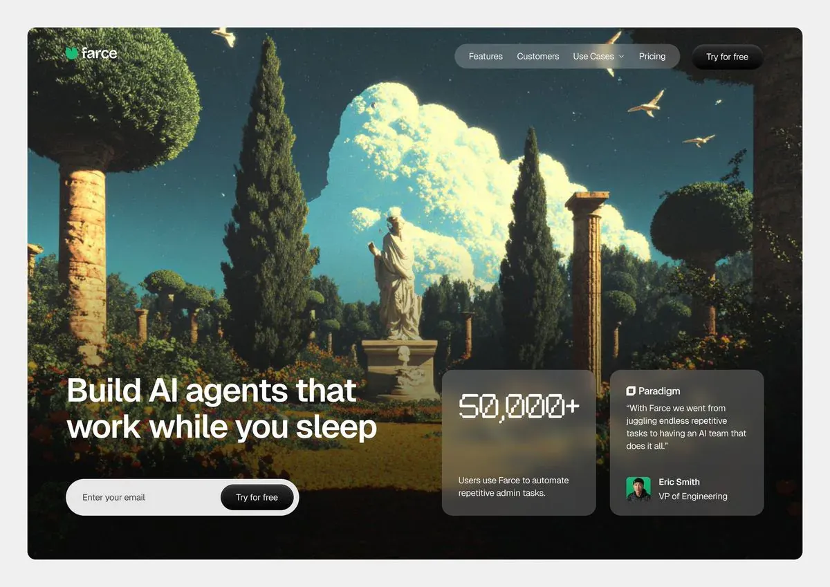
RebuildReference
Move across the image to wipe between the two. Click to lock the seam; arrow keys nudge it.
Imagery
2/2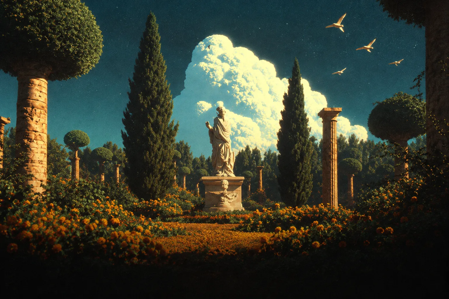
01-hero-backdrop
Dusk in a constructed classical garden — cypress spires, clipped topiary and broken stone columns around a pale marble figure, under a backlit cumulus stack in a deep teal sky

02-testimonial-avatar
Head-and-shoulders portrait of a person against a dark green background
Prompts
117,255 chars
# Full-bleed cinematic hero with frosted proof cards

A single-viewport hero **section**: one photographic field bleeding to all four edges, a floating pill navbar at the top, and a bottom row where the headline + email capture sit on the left and two frosted glass cards sit on the right, all sharing one bottom edge. No motion report was supplied for this reference — every timing below is marked **not measured** and given as a range; spatial and layout values read off the still are marked **(inferred)**.

Reference viewport: **1440 × 992** (the design's own aspect, 1.45:1). Height is `100dvh` with a `min-height: 680px`.

---

## 1. Structure

**Container:** none in the usual sense — the image is full-bleed, edge to edge, no rounded corners on the page, no outer margin, no colour sheet behind it. All *content* is inset by a **72px** left/right gutter, giving a 1296px content width. Reference grid: 12 columns × 86px with 24px gutters, but both clusters are fixed-width and edge-anchored rather than truly fluid.

**Vertical anchors:** header block starts 36px from the top; the entire lower composition hangs from the bottom — the form and both cards end on the same line, **88px above the bottom edge**.

**Column structure of the lower row:**
- Left cluster: x = 72 → 692 (620px wide, columns 1–6). Headline + email capture.
- Dead space: 88px.
- Right rail: x = 780 → 1368 (588px, right-aligned to the gutter). Two 282px cards with a 24px gap.

**Sections, top to bottom:**

1. **Header overlay** — logo left; frosted pill navbar + solid dark CTA pill right. Absolutely positioned over section 2, 36px from top.
2. **Hero backdrop** — the full-bleed photographic field plus its two gradient scrims. Occupies the whole viewport, z-index below everything.
3. **Hero copy block** — headline (2 lines) + inline email capture, bottom-left.
4. **Proof rail** — stat card + testimonial card, bottom-right.

Sections 1, 3 and 4 are layers on top of section 2, not stacked siblings. This artifact is a section: the page ends at 1.0 viewport unless another section is appended below it.

---

## 2. Scroll map

| # | Section | Height | Viewports | Scroll consumed | Kind |
|---|---------|--------|-----------|-----------------|------|
| 1 | Header overlay | 48px (pill row) | 0.05 | 0px — overlays section 2 | entrance (on load) |
| 2 | Hero backdrop | 992px | 1.00 | 992px | entrance on load + scroll-linked parallax while leaving |
| 3 | Hero copy block | 194px | 0.20 | 0px — overlays section 2 | entrance (on load) |
| 4 | Proof rail | 270px | 0.27 | 0px — overlays section 2 | entrance (on load) |

**Total page height: 992px (1.0 viewport).** Nothing pins, nothing stacks, and nothing here is triggered by scrolling *into* view — the whole composition is above the fold and plays once on load. The only scroll-linked value is the backdrop parallax in section 2, which runs while the hero exits and reverses on the way back up.

---

## 3. Spacing

- Page gutters: **72px** left and right. Top offset for the header: **36px**. Bottom gutter: **88px**.
- Header: logo → nav pill gap is fluid (`justify-content: space-between`); nav pill → CTA pill gap **16px**. Nav pill inner padding **28px** horizontal, link gap **22px**, chevron gap **6px**.
- Headline block → email form: **48px**.
- Email form: 424 × 62px, inner left padding **28px**, inner button inset **6px** from the top, right and bottom edges of the field.
- Cards: 282 × 270px each, **24px** apart, **28px** padding on all four sides.
- Inside the stat card: number sits at the top of the padding box, caption is bottom-aligned to the padding box — the space between them is whatever is left (~85px at 1440), not a fixed gap.
- Inside the testimonial card: mark+name row → quote **18px**; quote → attribution row is bottom-aligned the same way (~30px); avatar → name/role text **12px**; name → role **2px**.
- Rhythm: there is exactly one vertical rhythm in this design — 88px from the bottom edge, 72px from the sides. Everything else is internal card padding at 28px. Don't invent a 96/128/160 section scale; there are no section breaks to apply it to.

---

## 4. Type

Two families only.

**Body/display family — grotesk.** Neo-grotesk with tight apertures, near-flat terminals, tight default tracking. Free stand-in: **Inter Tight** (or Schibsted Grotesk / Familjen Grotesk). Never the default Inter at default tracking.

**Numeral family — squared mono.** Rectangular counters, blocky comma, digital-readout feel; tabular figures. Free stand-in: **Martian Mono** (or Azeret Mono). Used for the stat number and nothing else.

| Level | Family | Size | Line-height | Tracking | Weight | Colour | Max length |
|---|---|---|---|---|---|---|---|
| Wordmark | grotesk | 22px | 1.0 | -0.01em | 600 | #FFFFFF | 1 word |
| Nav link | grotesk | 15px | 1.4 | 0 | 450 | rgba(255,255,255,0.88) | 1–2 words |
| CTA label | grotesk | 15px | 1.0 | -0.005em | 500 | #FFFFFF | 3 words |
| H1 | grotesk | 64px | **1.05** (67px) | -0.02em | 550 | #FFFFFF | 2 lines, ~20ch each, block max-width 620px |
| Input placeholder | grotesk | 16px | 1.4 | 0 | 400 | #6B6B68 | 2–3 words |
| Form button label | grotesk | 15px | 1.0 | -0.005em | 500 | #FFFFFF | 3 words |
| Stat number | squared mono | 52px | 1.0 | 0.01em | 500 | #FFFFFF | 7 characters |
| Stat caption | grotesk | 14px | 1.55 | 0 | 400 | rgba(255,255,255,0.72) | 2 lines, ~30ch |
| Card source name | grotesk | 15px | 1.2 | -0.005em | 600 | #FFFFFF | 1 word |
| Quote | grotesk | 15px | 1.5 | 0 | 400 | rgba(255,255,255,0.82) | 4 lines, ~28ch |
| Attribution name | grotesk | 15px | 1.3 | 0 | 600 | #FFFFFF | 2 words |
| Attribution role | grotesk | 14px | 1.3 | 0 | 400 | rgba(255,255,255,0.60) | 2–3 words |

Placeholder copy by role: eyebrow — none, there is no eyebrow. Headline — 6 words on two lines, breaking manually after word 4 so line 2 is slightly longer than line 1 (inferred). Stat caption — one sentence, 9–11 words. Quote — one sentence, 22–26 words, wrapped in typographic quotes.

---

## 5. Colour

| Hex | Role |
|---|---|
| **#2E4349** | The dominant field. It is the atmosphere of the photograph — the sky occupying the top two-thirds of the screen — not a fill you paint. Nothing in the UI uses it except the form button's hover state. |
| **#0B0B0A** | Near-black. The crushed bottom of the image, the header CTA pill fill, the form's inner button fill, the page's fallback background before the image loads. Second-largest surface. |
| **#262725** | Warm dark grey. The base tint of the frosted cards (used at ~42% alpha) and of any lifted surface on dark. |
| **#F9FBBB** | Pale luminous yellow. **Photographic only** — the backlit cloud highlight. Never type, never a fill, never a button. |
| **#F7D779** | Warm amber. The single UI accent: the logo mark, the focus ring, and at most one more spot. Allowed once per screen. |
| **#FFFFFF** | Type and the email field. All text on the image is white or white at 60–88%. |

Rule of thumb: the screen is ~60% teal-to-black photograph, ~25% near-black, ~10% white type, and under 2% accent. If the accent is doing more than that, it's wrong.

Two scrims sit on the image and are structural, not decorative:
- Bottom: `linear-gradient(to top, rgba(11,11,10,0.88) 0%, rgba(11,11,10,0.40) 30%, transparent 56%)`
- Top: `linear-gradient(to bottom, rgba(11,11,10,0.35) 0%, transparent 18%)`

---

## 6. Surface

- **Cards (both):** fill `rgba(38,39,37,0.42)`, `backdrop-filter: blur(24px) saturate(120%)`, border `1px solid rgba(255,255,255,0.12)`, radius **20px**, plus a `inset 0 1px 0 rgba(255,255,255,0.10)` top highlight. **No drop shadow.** The foliage behind the cards must remain legible through them.
- **Nav pill:** fill `rgba(255,255,255,0.10)`, `backdrop-filter: blur(20px)`, border `1px solid rgba(255,255,255,0.14)`, radius 999px, height **44px**.
- **CTA pill:** fill `#0B0B0A`, border `1px solid rgba(255,255,255,0.10)`, radius 999px, **132 × 48px**. No blur, no shadow.
- **Email field:** fill `#FFFFFF`, no border, radius 999px, **424 × 62px**. Inner button `#0B0B0A`, radius 999px, **148 × 50px**.
- **Avatar:** 44px rounded square, radius **12px** (inferred).
- **Source mark:** 20px rounded square, radius 5px, white glyph on transparent.
- Shadows: none anywhere in the design. Depth comes entirely from the backdrop blur, the 1px hairlines and the photographic vignette.

---

## 7. Imagery

**1. Hero backdrop — 1440 × 992 (≈1.45:1), `object-fit: cover`, focal point 50% × 55%.**
A constructed, slightly uncanny classical garden at dusk: cypress spires and clipped topiary spheres, weathered stone columns with broken capitals standing in the left and right thirds, a pale marble figure on a plinth at the centre, a bed of marigolds burning warm in the near foreground, and a towering cumulus stack backlit to near-white filling the upper middle. A handful of birds in flight, small and off-centre. Treatment: 35mm film grade, teal sky against amber ground, visible grain across the whole frame, halation blooming off the cloud edges, a strong natural vignette, and the bottom third falling to near-black so type reads without a box behind it. It should look photographed and graded, not illustrated and not rendered with a glow filter.

**2. Attribution avatar — 1:1, 44px.** A tight head-and-shoulders crop of a person against a dark background, colour-graded to match the frame (slightly desaturated, warm skin against cool surround). Not a cut-out on white.

**3. Source mark — 1:1, 20px.** A single flat monochrome white glyph, geometric, no wordmark beside it inside the badge.

---

## 8. Motion

Restrained by design: the whole composition resolves on load in under a second, and nothing travels more than 24px. All durations are **not measured** — pick a value inside the range given.

### Section 1 — Header overlay
- **kind:** entrance (once, on load — not scroll-linked)
- **what moves:** logo, nav pill, CTA pill, as three items
- **from → to:** opacity 0 → 1; translateY -8px → 0 (inferred)
- **range:** trigger is page load, not a scroll position. Duration not measured — use 350–500ms; easing `cubic-bezier(0.22, 1, 0.36, 1)`; stagger not measured — use 50–80ms, left to right. No delay.
- **reduced motion:** opacity 0 → 1 over 150ms, no translate.

### Section 2 — Hero backdrop
- **kind:** entrance on load, then scroll-linked while exiting
- **what moves:** the image layer only; the scrims never move
- **from → to:** entrance — scale 1.05 → 1.00, opacity 0 → 1 (inferred). Scroll-linked — translateY 0 → -72px (≈7% of section height, inferred), reversing exactly on the way back up; the scrims and all overlay content scroll at 1:1 so the backdrop drifts behind them.
- **range:** entrance fires on load; duration not measured — use 900–1400ms, easing `cubic-bezier(0.16, 1, 0.3, 1)`, no stagger. The scroll-linked range runs from scroll position 0 until the section's bottom edge reaches the top of the viewport (0 → 992px).
- **reduced motion:** no scale-in (opacity only, 200ms) and no parallax — the image is fixed relative to the page.

### Section 3 — Hero copy block
- **kind:** entrance (once, on load)
- **what moves:** headline line 1, headline line 2, email field — three items
- **from → to:** opacity 0 → 1; translateY 16px → 0 (inferred). The headline animates per line, not per word or per character.
- **range:** load, beginning ~120ms after the backdrop entrance starts. Duration not measured — use 500–700ms; easing `cubic-bezier(0.22, 1, 0.36, 1)`; stagger not measured — use 70–100ms.
- **reduced motion:** opacity 0 → 1 over 150ms, no translate, no stagger.

### Section 4 — Proof rail
- **kind:** entrance (once, on load)
- **what moves:** the two cards as whole units; their contents do not animate independently, and the stat number does not count up
- **from → to:** opacity 0 → 1; translateY 20px → 0; `backdrop-filter` blur 0 → 24px as the card resolves (inferred)
- **range:** load, starting alongside the last item of section 3. Duration not measured — use 550–750ms; easing `cubic-bezier(0.22, 1, 0.36, 1)`; stagger not measured — use 90–120ms, stat card first.
- **reduced motion:** opacity 0 → 1 over 150ms, blur applied immediately, no translate.

### Interaction transitions (not part of the scroll choreography)
- Nav link hover: colour `rgba(255,255,255,0.88)` → `#FFFFFF`, 150ms ease-out.
- "Use Cases" open: chevron rotates 0° → 180° (200ms); panel appears 8px below the pill, opacity 0 → 1 + translateY -6px → 0, 180ms ease-out. Close: same, reversed, 140ms.
- CTA pill hover: fill `#0B0B0A` → `#262725`, border to `rgba(255,255,255,0.18)`, 160ms.
- Any pill press: scale 1 → 0.98, 90ms, springs back on release.
- Email field focus: 2px ring in `rgba(247,215,121,0.45)` offset 2px, 120ms. Placeholder does not move or shrink — there is no floating label.
- Form button hover: fill `#0B0B0A` → `#2E4349`, 160ms.
- Cards: no hover state at all. They are not interactive.

---

## 9. Responsive (below 640px)

- Gutters 72px → **20px**; bottom gutter 88px → **32px**; header top offset 36px → 20px.
- Hero height stays `100dvh` with `min-height: 640px`.
- Header: the nav pill collapses to a single 44px circular frosted icon button (menu) on the right; the CTA pill is removed from the header and lives inside the opened drawer. Logo stays at 20px.
- H1: 64px → **36px / 1.08 / -0.02em**, wrapping to three lines, block width auto.
- Email form: full width, height 62 → 56px, inner button stays *inside* the field, label shortens to one or two words; if the label won't fit above 96px, use an arrow glyph, never a button on its own line below.
- **Section 4 leaves the hero.** The two cards move into their own `#0B0B0A` band directly beneath the hero, stacked full-width with a 24px gap, 28px padding retained, and the page becomes two sections tall. The cards keep their frosted treatment, which now reads as a lighter grey block — that is expected.
- Image focal point shifts to 58% × 55% so the central figure survives the crop, and the bottom scrim strengthens to `rgba(11,11,10,0.92)`.
- Card entrance (section 4) becomes a scroll entrance rather than a load entrance, once, when the card's top reaches 85% of the viewport; everything else is unchanged.

---

## 10. Don'ts

- **Don't reproduce the mat.** The reference still shows the design inset on a flat `#F0F0F0` sheet with its corners rounded against it. That is the photograph's framing. The page is full-bleed: no outer margin, no rounded page corners, no light background, and `#F0F0F0` is not in the palette.
- **Don't centre the hero.** No centred headline, no centred form, nothing vertically centred. The entire composition hangs off the bottom edge, and the form and both cards share one bottom line at 88px. If the headline is optically centred in the viewport, you have built a different design.
- **Don't let the headline grow.** Two lines, 620px max, ~20 characters a line. A third line or a 900px measure destroys the left/right balance with the card rail.
- **Don't reach for a stock landscape.** No city skyline, no office, no desk, no laptop, no abstract 3D blob. The image is a constructed cinematic scene with heavy grain, halation and a teal/amber grade. If it looks clean and digital, it's wrong.
- **Don't add the AI-landing-page default kit:** no purple-to-blue gradient, no mesh gradient, no glowing orbs, no starfield or particle canvas, no faint grid lines, no animated aurora. The photograph is the entire visual interest.
- **Don't make the cards opaque.** They must be transparent enough that foliage and colour read through them. Solid `#1a1a1a` panels flatten the whole thing.
- **Don't add shadows.** Not to the cards, not to the pills, not to the input. Depth is blur + 1px hairline + vignette.
- **Don't give the navbar a full-width bar or a bottom border.** It is a floating pill with a gap on both sides, and it does not gain a solid background on scroll.
- **Don't accent the CTA.** The primary button is near-black on a bright photograph — that contrast *is* the emphasis. Painting it `#F7D779` or green is the single easiest way to ruin this.
- **Don't set the stat number in the body grotesk,** and don't count it up on entrance. The squared mono is the one place a second family appears; it earns its keep by being static and oversized.
- **Don't split the email button out of the field.** It sits inside the white pill with a 6px inset. No separate button below, no "no credit card required" line, no second CTA beside it.
- **Don't add a logo strip, scroll indicator, chevron or "scroll to explore"** to the hero. The bottom edge is already occupied.
- **Don't positively letterspace the headline** or use a rounded/geometric-friendly face (Poppins, Nunito, Quicksand). Tracking is negative, weight is 550 — not 800, not 300.
- **Don't animate on scroll.** Everything above resolves on load; the only scroll-driven value on the page is the backdrop's 72px parallax. Word-by-word headline reveals, big 60px translate-ups and blur-in text all contradict the restraint of this design.
- **Don't drop the grain and vignette in favour of a flat dark overlay.** The legibility of white type over the bottom third depends on the crushed, grainy falloff, not on a `rgba(0,0,0,0.5)` sheet.
Versions
1Each rebuild is kept. The live one is what the comparison shows. LiveOpus 5.5Extra highfrontend-designemil-design-engtransitions-devhumanizergsaplast month · 37s · 2 images · 20260917T172738ZOpen