Giga — Misty landscape AI hero
Rebuild
Opus 5.5Extra highfrontend-designemil-design-engtransitions-devhumanizergsapView
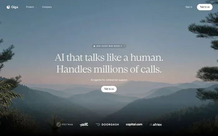
RebuildReference
Move across the image to wipe between the two. Click to lock the seam; arrow keys nudge it.
Imagery
2/2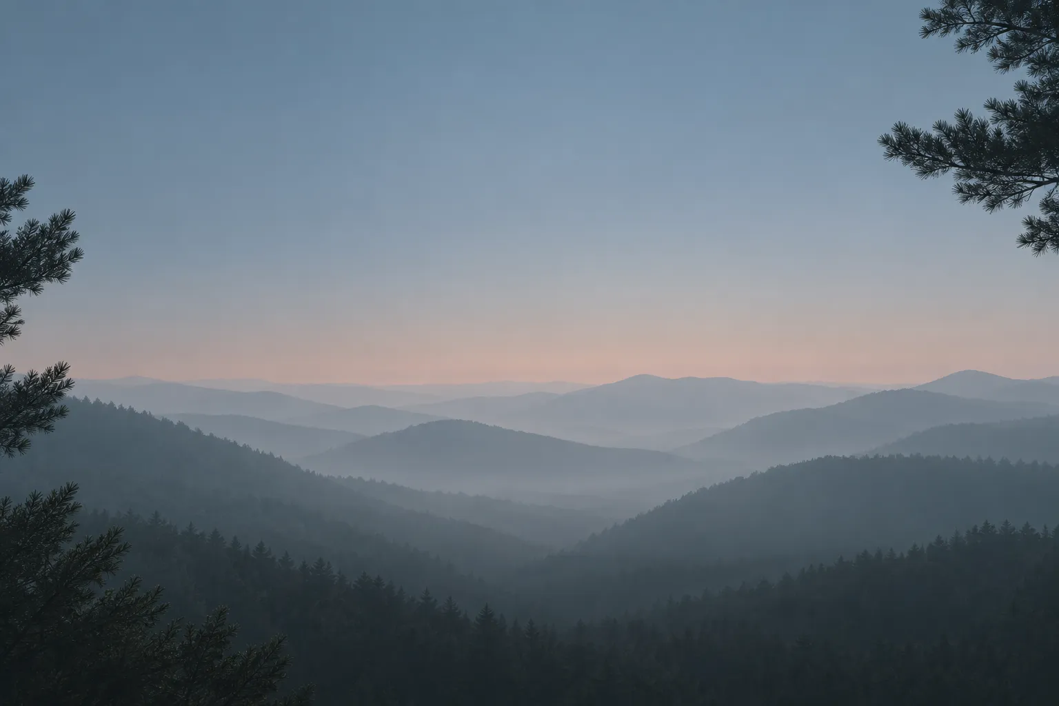
01-hero-misty-ridges
Fogged mountain ridgelines receding into pale blue-grey haze at dawn, framed by dark conifer branches at the corners
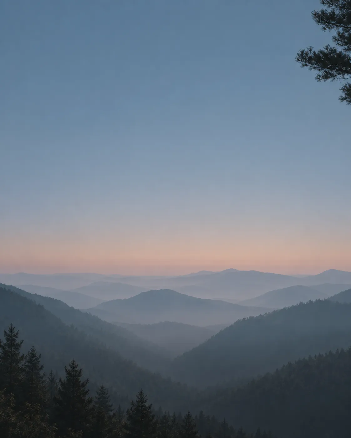
02-hero-misty-ridges-portrait
Portrait crop of the same fogged mountain ridgelines, horizon low in the frame, conifer branches framing the top-right and bottom-left
Prompts
115,587 chars
# Misty landscape AI hero — rebuild prompt

A single-viewport, full-bleed landing hero: one desaturated photograph of fogged mountain ridges, a classical serif headline in white centred over it, a glass announcement pill above, one white CTA pill below, and a row of client wordmarks hanging at the bottom edge. Everything is white ink on a photograph. There is no card, no panel, no second colour.

**Scope note:** the source capture is exactly one viewport tall and nothing below the fold was captured. This prompt specifies the full hero viewport — nav, hero, logo wall — and stops there. Where a value below the fold would be needed, the section says so rather than inventing content.

**No motion report was supplied with this reference.** Every timing, distance and easing below is marked **(inferred)** and given as a range. Do not substitute a precise number, and do not introduce lerp/stiffness/spring parameters — none were measured.

---

## Structure

Reference frame: **1440 × 900** (the design is built to the viewport, not to a content grid).

- **Container:** none in the usual sense. The photograph is full-bleed, edge to edge, 100vw × 100svh.
- **Nav:** edge-to-edge with **40px** side gutters — it is *not* constrained to a centred max-width.
- **Hero copy:** a single centred column, **max-width 760px**, centred on the viewport's horizontal centre. Text is centre-aligned.
- **Columns:** one. No grid, no asymmetry, no split layout.

Sections, top to bottom:

1. **Nav bar** — fixed transparent overlay. Left: mark + wordmark. Centre-left: two dropdown links. Right: a text link and a white pill button.
2. **Hero** — the full-bleed photograph, 100svh, holding a vertically centred copy stack: announcement pill → headline (2 lines) → subhead (1 line) → CTA pill.
3. **Logo wall** — a 120px band anchored to the bottom edge of the hero viewport, overlapping the photograph. Six monochrome client wordmarks in one centred row. It does not have its own background or its own section height; it hangs inside section 2's last 120px.

---

## Scroll map

| # | Section | Height | Viewports | Scroll consumed | Kind |
|---|---------|--------|-----------|-----------------|------|
| 1 | Nav bar | 88px | 0.10 | 0px (fixed overlay, never scrolls away) | static |
| 2 | Hero | 900px | 1.00 | 900px | entrance on load; scroll-linked parallax only if content follows |
| 3 | Logo wall | 120px | 0.13 | 0px (overlaps section 2's final 120px) | entrance |

**Total page height: 900px = 1.00 viewport** (captured extent).

The captured page does not scroll. If you extend it with sections below the fold, section 2's parallax (see Motion) becomes active and consumes its own 900px; section 1 gains a scrolled state. Do not pin or stack anything — this design has no pinning.

---

## Spacing

- Nav: height **88px**, content row **40px** tall centred at **y = 44**, side gutters **40px**.
- Nav internal: brand → first link **48px**; between the two dropdown links **40px**; link label → its chevron **6px**; "Sign in" → CTA pill **24px**.
- Hero copy stack, centred so that its optical centre sits at **y ≈ 449** (half the viewport). Measured tops:
  - announcement pill **y 290**, height **28px**
  - **40px** gap
  - headline block **y 354–510** (two lines × 78px)
  - **28px** gap
  - subhead **y ≈ 524–544**
  - **32px** gap
  - CTA pill **y 568**, height **40px**
- Logo wall: row centre **y ≈ 823**, i.e. **80px** from the bottom edge. Gap between adjacent wordmarks **56px**; row total width **≈ 690px**.
- Rhythm: the stack tightens as it descends (40 → 28 → 32). Nothing in the hero uses a spacing value above 48px. The generosity of the design comes from the empty photograph around the stack, not from large paddings.

---

## Type

All values **(inferred)** from the still — no type table was supplied.

| Level | Class | Size | Line-height | Letter-spacing | Weight | Colour |
|---|---|---|---|---|---|---|
| Headline | **serif display** — moderate-contrast transitional, bracketed serifs, wide aperture. Free stand-in: **Newsreader** 400 (second choice: Source Serif 4) | 60px | 1.30 (78px) | −0.01em | 400 | #FFFFFF |
| Subhead | grotesk — free stand-in **Inter** | 14px | 1.5 (21px) | 0.01em | 400 | #FFFFFF @ 72% |
| Announcement pill | grotesk, **uppercase** (a mono at the same tracking is acceptable) | 11px | 1.0 | 0.12em | 500 | #FFFFFF @ 90% |
| Nav link / "Sign in" | grotesk | 14px | 1.4 | 0 | 500 | #FFFFFF @ 88% |
| Wordmark | grotesk | 17px | 1.0 | −0.01em | 600 | #FFFFFF |
| Button label | grotesk | 14px | 1.0 | 0 | 500 | #060706 |

- **Max line length:** headline **760px** with a **manual break after line 1** — two lines of roughly equal width (line 1 ≈ 716px). Subhead **max-width 480px**, one line. Never let the headline wrap to three lines at desktop.
- Placeholder copy by role: announcement **4–6 words, uppercase** (e.g. a funding/launch note); headline **8–10 words on two lines**, a plain declarative sentence pair; subhead **5–7 words**, lower-case sentence case, no period; CTA label **2–3 words**.

---

## Colour

| Hex | Role |
|---|---|
| **#6A8396** | Blue-grey sky and mist. **The largest surface** — roughly the upper half of the frame plus the receding ridges. This is the page's de-facto background. |
| **#969698** | Neutral grey haze. The mid-distance ridge planes and the fog between them. Second surface tone; it is what makes the depth read. |
| **#060706** | Near-black. The near-field conifer silhouettes at the top-right, left edge and bottom-left corner; also the announcement pill fill and the label colour on both white buttons. |
| **#FFFFFF** | **The single accent.** Allowed only in: all type, the two pill button fills, the logo-wall wordmarks, the announcement pill's dot and hairline border. |
| **#C4A091** *(inferred)* | A warm rose/amber band that appears **only inside the photograph**, at the horizon where the sky meets the furthest ridge. It is never a UI colour — no button, border, or text uses it. |

There is no brand hue, no link blue, no success green. The page is monochrome plus the photograph's own two-tone gradient.

**Scrims** *(inferred)*, all inside the photograph, no separate UI surfaces:
- Top: `linear-gradient(rgba(6,7,6,0.25), transparent)` over the top **160px**, so the nav stays legible against sky.
- Bottom: `linear-gradient(transparent, rgba(6,7,6,0.35))` over the bottom **220px**, under the logo wall.
- Centre: an optional radial vignette, `rgba(6,7,6,0.18)` at a ~700px radius centred on the copy stack. Cap it at 20% — see Don'ts.

---

## Surface

- **Borders:** one, and only one — a **1px** hairline on the announcement pill, `rgba(255,255,255,0.14)`. Nothing else has a border. No dividers, no section rules.
- **Radii:** **999px** (full pill) on the announcement badge and both buttons. Nothing else has a radius because nothing else is a box.
- **Shadows:** **none.** No box-shadow, no text-shadow, no glow. Depth is entirely the photograph's atmospheric perspective.
- **Glass:** the announcement pill only — `rgba(6,7,6,0.30)` fill with `backdrop-filter: blur(12px)` *(inferred)*. The nav does not have a glass panel in the resting state.

---

## Imagery

**1. The hero photograph** (section 2) — the only photograph in the design, and it carries the whole page.

- *Subject:* a wide mountain vista at the blue hour, shot from a high vantage looking across a valley. At least **five** ridgelines recede into fog, each plane lighter and lower-contrast than the one in front of it — the nearest ridge near-black, the furthest barely separable from the sky. Near-field conifer branches intrude, sharply in focus and fully silhouetted, from the **top-right corner**, the **left edge at mid-height**, and the **bottom-left corner**; they frame a soft, empty centre.
- *Treatment:* almost monochrome. A cool blue-grey field with one warm band where the sky meets the horizon. Low contrast in the far planes, high contrast in the near foliage. Low clarity, no sharpening halos, grain minimal.
- *Aspect / placement:* full-bleed cover, **16:10** at the reference frame; supply the source at **3:2 or wider, ≥2880px**. `object-fit: cover`; focal point set **below** the vertical centre so the ridgelines land in the lower half and the copy stack sits on open sky and mist.

**2. Logo-wall marks** (section 3) — six client wordmarks, several with a small leading icon. Rendered as **pure white, single-colour** artwork at **20px** cap height, widths varying **60–110px**, placed directly on the photograph at **~75% opacity**. They are SVGs, not text.

---

## Motion

Restrained by design: three movements on the whole page, all small.

### 1. Nav bar
- **kind** — static (fixed overlay). It has one scrolled state, which only exists if the page is extended.
- **what moves** — nothing on load. On scroll (if content follows): the nav's own background layer.
- **from → to** — background `transparent` → `rgba(6,7,6,0.45)` with `backdrop-filter: blur(12px)`; no translate, no height change, no shrink. **(inferred)**
- **range** — scroll-linked, from scroll 0 until **~80px** of scroll; reverses on the way back up. Duration not measured — cross-fade over **150–250ms** if you implement it as a threshold toggle instead. **(inferred)**
- **reduced motion** — identical; a background opacity change is not motion. Keep it.

### 2. Hero
- **kind** — entrance on load, plus a scroll-linked parallax that is only active if the page is extended below the fold.
- **what moves** — (a) the copy stack: announcement pill, headline, subhead, CTA pill, as four staggered children; (b) the photograph layer.
- **from → to** —
  - Copy stack children: `opacity 0 → 1`, `translateY 16px → 0`. No scale, no blur, no clip-path. **(inferred)**
  - Photograph: `scale 1.04 → 1.00` on load **(inferred)**; then, on scroll, `translateY 0 → −80px` while the page moves 900px — i.e. the background drifts up at roughly 0.09× scroll speed. Scroll-linked and reversing. **(inferred)**
- **range** — Entrance fires **once, on load** (not on intersection — the hero is above the fold). Duration **600–800ms** per child, easing a decelerating cubic (`cubic-bezier(0.16, 1, 0.3, 1)` or similar), stagger **70–110ms** in DOM order, top to bottom. Not measured; pick one value in each range and use it consistently. The parallax range is *from the hero's top at scroll 0 until the hero has left the viewport*.
- **reduced motion** — no translate, no scale, no parallax. Elements render at their final position; fade `opacity 0 → 1` over **200ms** with no stagger, or appear instantly. The photograph is locked at `scale 1.00, translateY 0`.

### 3. Logo wall
- **kind** — entrance, once.
- **what moves** — the six wordmarks as a group, staggered left to right.
- **from → to** — `opacity 0 → 0.75`, `translateY 12px → 0`. No scale. **(inferred)**
- **range** — fires **once, on load**, continuing the section-2 stagger (it is the last item in the same sequence, not a separate scroll trigger — it is already on screen). Duration **500–700ms**, same decelerating easing, stagger **50–80ms** per mark. **(inferred)**
- **reduced motion** — marks render at `opacity 0.75`, no translate, no stagger.

### Interaction transitions
These are hover/press/open states, entirely separate from the scroll choreography above. All durations **(inferred)**, 120–200ms unless noted.

- **Nav link hover:** colour `#FFFFFF @ 88% → 100%`. No underline, no background.
- **Nav dropdown open/close:** panel `opacity 0 → 1`, `translateY −6px → 0`, 160–220ms; the link's chevron rotates `0 → 180deg` over the same duration. Close mirrors it.
- **Pill button hover** (both nav and hero): fill `#FFFFFF → #F1F2F1`, 140ms. No lift, no shadow, no scale-up.
- **Pill button press:** `scale 1 → 0.98`, 90ms.
- **Announcement pill hover:** fill `rgba(6,7,6,0.30) → rgba(6,7,6,0.42)`; trailing chevron `translateX 0 → 2px`, 150ms.
- **Focus-visible (all interactive elements):** 2px `#FFFFFF` ring at 2px offset. No colour change.
- **Logo wall:** no hover state. The marks are not links.

---

## Responsive (below 640px)

- Hero height becomes **100svh**, not `100vh` — the URL-bar resize otherwise jumps the centred stack.
- Gutters **40px → 20px**. Nav height **88px → 64px**.
- Nav collapses: brand at left, hamburger at right. "Product", "Company" and "Sign in" move into a full-height sheet. **The white CTA pill stays visible in the bar** — it is the one element that must not be hidden behind the menu.
- Headline **60px → 34px**, line-height **1.25**, letter-spacing **0**. Remove the manual line break and let it wrap naturally to **three** lines; max-width 100%.
- Subhead stays **14px**, max-width **320px**.
- CTA pill: height stays **40px**; do not make it full-width.
- Stack gaps compress: 40 / 28 / 32 → **28 / 20 / 24**.
- Logo wall: **six in one row → two rows of three**, gap **56px → 28px** horizontal and **20px** vertical; mark height **20px → 16px**. Do not turn it into a horizontal scroller, and do not drop marks.
- Photograph: swap to a **4:5 or 3:4 crop** of the same scene with the horizon held in the lower third. Do not simply `cover` the 3:2 asset — the framing foliage gets cropped out and the composition collapses.

---

## Don'ts

- **Don't lay a flat dark overlay over the photograph.** The whole design depends on white type sitting on a *mid-light* luminous sky. Gradient scrims at the top and bottom edges plus a ≤20% centre vignette — that is the entire budget. A 40% black wash makes it look like every other hero.
- **Don't grade the photograph.** No teal-and-orange, no saturation boost, no "cinematic" contrast curve. It is nearly monochrome blue-grey with one warm horizon band, and that restraint *is* the reference.
- **Don't build the background as a CSS gradient.** The layered atmospheric recession of real fog cannot be faked with `linear-gradient`, and the design has nothing else in it.
- **Don't set the headline in a sans.** The single idea here is a classical serif over a photograph. A grotesk headline deletes the design.
- **Don't bold the headline.** Weight 400. A 600 or 700 serif reads like a newspaper masthead.
- **Don't put a card, frosted panel, or dark box behind the hero copy.** The announcement pill is the only glass surface on the page.
- **Don't add shadows or `text-shadow`** to win legibility. Fix it with the scrim or by moving the focal point.
- **Don't tint the buttons.** Solid `#FFFFFF` with `#060706` labels, both of them, identical. No gradient fill, no brand colour, no outline variant.
- **Don't animate the headline per-word or per-character,** and don't blur-in. One block, one fade-rise, 16px.
- **Don't add a scroll-down chevron, mouse-scroll glyph, or bouncing arrow.** Nothing in this design bounces.
- **Don't make the logo wall colour, and don't give it a white strip or its own section.** White at ~75% opacity, directly on the photograph, hanging 80px off the bottom edge.
- **Don't constrain the nav to a centred max-width container.** It is edge-to-edge at 40px gutters while the copy stack is narrow and centred — that contrast is deliberate.
- **Don't use `#000000`.** The dark is `#060706`.
- **Don't promote the announcement pill to a sticky banner** above the nav. It belongs inside the copy stack, 40px above the headline.
- **Don't autoplay a video loop of drifting mist.** The only background motion is a slow scale-down on load and a ~0.09× parallax drift.
- **Don't left-align the hero.** Centre-aligned, and optically centred in the viewport — not `justify-content: center` on a container that ignores the nav's 88px.
Versions
1Each rebuild is kept. The live one is what the comparison shows. LiveOpus 5.5Extra highfrontend-designemil-design-engtransitions-devhumanizergsaplast month · 36s · 2 images · 20260917T184147ZOpen