Golden-hour lawn services hero
Rebuild
Opus 5.5Extra highfrontend-designemil-design-engtransitions-devgsaphumanizerView
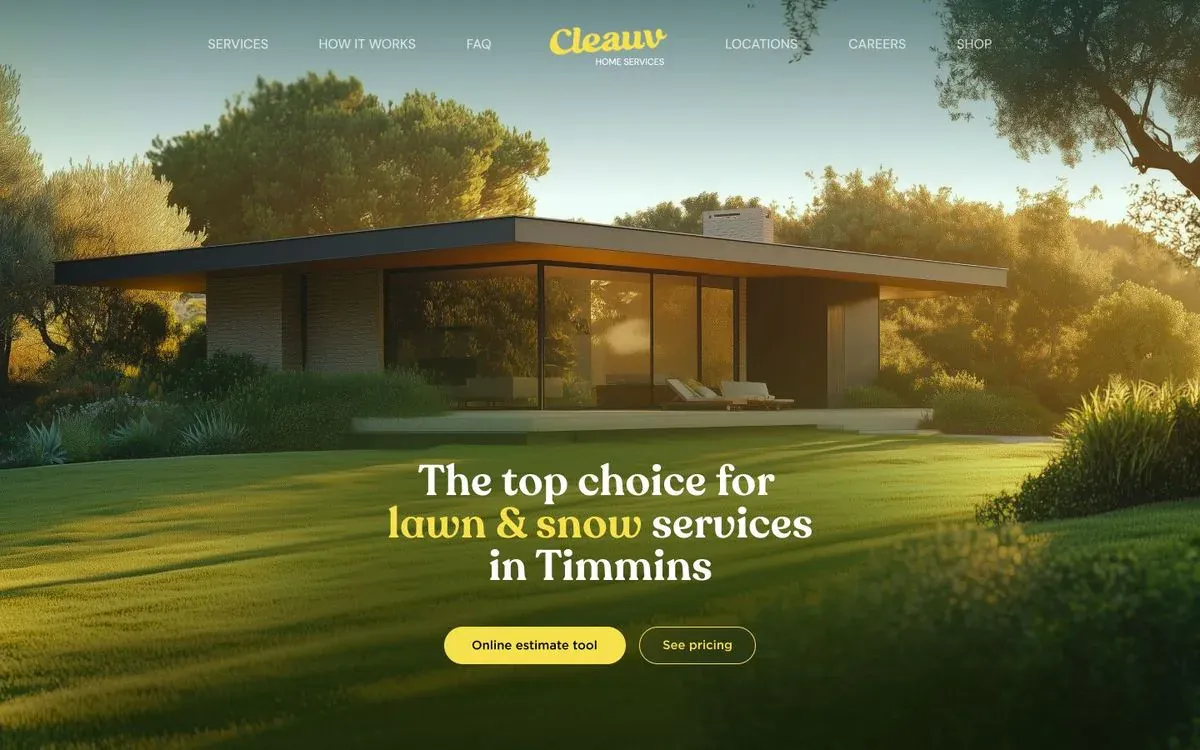
RebuildReference
Move across the image to wipe between the two. Click to lock the seam; arrow keys nudge it.
Imagery
1/1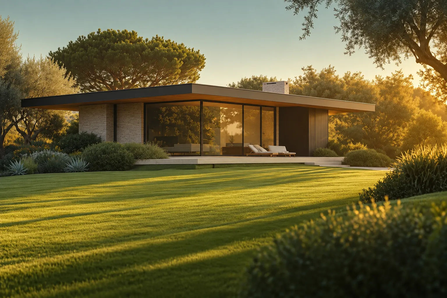
01-hero-photo
Modernist single-storey glass pavilion on a wide, freshly mown lawn at golden hour, framed by olive trees and an umbrella pine
Prompts
113,290 chars
# Golden-hour photo hero: centred serif headline, symmetric nav

Build a single full-viewport landing hero. One edge-to-edge golden-hour photograph fills the whole screen. It shows a modernist glass house on a wide, sunlit lawn. A transparent navigation row sits over the sky, with a script wordmark centred between two symmetric groups of links. Lower down, a soft display-serif headline of three lines sits on the lawn, centred. Two pill buttons sit under it. The only saturated UI colour is a lemon-yellow accent. The page should feel calm, expensive and warm. The photograph does most of the work, and the type stays small enough not to compete with it.

No motion was measured for this reference. Every motion value below is marked "(inferred)" or "not measured".

## Structure

- Layout frame: 1440 × 900 CSS px (desktop reference). The hero is `100svh` tall, with a minimum of 720px.
- Container: the nav row sits in a centred container about 960px wide. The headline block is a single centred column with a maximum width of 560px.
- Columns: the nav is a three-column grid, `1fr auto 1fr`. The left link group aligns to the end of its column, the wordmark takes the auto column, and the right link group aligns to the start of its column. The composition is mirror-symmetric around the page's vertical centre line. The hero content below the nav is one centred column.

Sections, top to bottom:

1. **Nav**: sits over the top of section 2 with absolute positioning, so it takes no space in the flow. It holds three links on the left, a centred wordmark with a small descriptor underneath, and three links on the right. It has no background.
2. **Hero**: the full-bleed photograph plus gradient overlays. The headline block and button pair are anchored to the bottom of the viewport.

This reference is the hero only. Do not invent sections below it.

## Scroll map

- 1 Nav: 0px in flow (overlays the top ~80px of section 2) · 0 viewports · consumes 0px of scroll · entrance
- 2 Hero: 900px · 1.00 viewport · consumes 900px of scroll · entrance on load, then static
- **Total page height: 900px (1.0 viewport)**

## Spacing

- Nav: 32px padding at the top of the viewport. The wordmark runs from about 34px to 78px from the top, descriptor included.
- Gap between neighbouring nav links: 60px. Gap between the innermost link on each side and the wordmark: 70px. The links span about 944px in total, centred.
- Wordmark to descriptor line: 2–4px, stacked tightly.
- Nav links are vertically centred on the wordmark's script line, not on the descriptor.
- Hero content: a flex column with `justify-content: flex-end` and `padding-bottom: 104px`. The headline block then starts about 61% of the way down the viewport (about 552px at 900 tall). It sits on the lawn, just below the house's terrace.
- Headline to buttons: 48px.
- Button to button: 16px, side by side and centred as a pair.
- Horizontal page padding: 40px on desktop and 20px on mobile. It only matters when the viewport is narrower than the container.
- Rhythm: there is no vertical rhythm between sections because there is only one. The composition has three layers: a thin nav band in the sky, open air over the whole middle 50% (the house), and a compact text block in the lower third.

## Type

Anchor: body text is **17px**. This capture has no running text, but use 17px for any supporting line you add, and derive every level from it.

- **Headline (H1)**: soft-cornered display serif with high contrast and ball terminals. It is warm rather than sharp. Free stand-in: **Fraunces** at weight 600 with SOFT 100 and opsz around 72. The Google Fonts static weight 600 also works.
  - Size 3.0× body = **52px**, line-height **0.95**, letter-spacing −0.01em, weight 600.
  - Centred, three lines, about 18–22 characters per line, maximum width 560px. Break the lines by hand.
  - Line 1: claim, 4 words.
  - Line 2: two accent words joined by "&", followed by one ordinary word. Only the "word & word" part is accent-coloured.
  - Line 3: place or qualifier, 2–3 words.
- **Wordmark**: chunky upright script, about 2× body (about 34px tall, about 140px wide), set in the accent colour. Free stand-in: **Lobster** at 32–34px. Placeholder: a brand name of 1 word.
- **Wordmark descriptor**: geometric sans, uppercase. 0.71× body = **12px**, line-height 1, letter-spacing 0.08em, weight 400, white. Placeholder: category descriptor, 2 words.
- **Nav links**: geometric sans, uppercase. Free stand-in: **Poppins**. 0.88× body = **15px**, line-height 1, letter-spacing 0.02em, weight 300. White at 85% opacity. Placeholders: 1–3 words each, three per side.
- **Button labels**: the same geometric sans, sentence case. 0.88× body = **15px**, line-height 1, letter-spacing 0, weight 500. Placeholders: the primary is a 3-word action; the secondary is a 2-word action.
- **Body (reserve)**: geometric sans, 17px / 1.55 / 0 / 400, maximum 60ch.

## Colour

The photograph covers essentially 100% of the surface. The palette is taken from it, and the UI borrows only one colour.

- `#F7E14C`: sun lemon-yellow. This is **the single accent**. It is allowed in only five places:
  - the wordmark
  - the "word & word" phrase in headline line 2
  - the primary button fill
  - the secondary button's border and label
  - nav link hover and focus rings

  It appears nowhere else. It reads as neon against the green.
- `#1B260B`: deepest lawn shadow, an olive-black. Use it for the primary button label, as the tint in the overlay gradients, and as the page background colour behind the image while it loads.
- `#565919`: olive midtone of the sunlit lawn. It is the dominant colour of the lower half of the photo. Do not use it in the UI.
- `#789694`: hazy sage-teal sky. It is the backdrop for the nav. Do not use it in the UI.
- `#987729`: golden ochre of backlit foliage and the glowing roof underside. It only appears in the photo. If you need a pressed state for the primary button, darken toward it (see Interactions).
- Headline and descriptor text: `#FFFFFF`, or a barely warm `#FFFDF4`.

Overlays (inferred):

- Top scrim: `linear-gradient(to bottom, rgba(27,38,11,0.28) 0, rgba(27,38,11,0) 180px)`, so the nav reads against the pale sky.
- Bottom scrim: `linear-gradient(to top, rgba(27,38,11,0.55) 0%, rgba(27,38,11,0) 48%)`.
- A faint corner vignette. The lower corners fall off toward `#1B260B`.

## Surface

- There are no cards, panels, dividers or rules anywhere.
- Buttons are fully rounded pills (`border-radius: 999px`), **44px** tall, with 32px horizontal padding.
  - Primary: about 218px wide. Solid `#F7E14C` fill, `#1B260B` label, no border.
  - Secondary: about 140px wide. Transparent fill, 1px border in `#F7E14C` at 80% opacity, `#F7E14C` label.
- No box-shadows. No text-shadows. No backdrop blur.

## Imagery

There is one image: the full-bleed hero photograph.

- **Aspect and fit**: 16:10 at desktop, filling the viewport with `object-fit: cover` and `object-position: 45% 55%`. Source it at 2400 × 1500 or larger.
- **Subject**: a single-storey modernist pavilion set back in the middle distance.
  - The roof is a thin, flat, cantilevered slab with a dark fascia. Its underside glows amber in the sun and overhangs deeply at both ends. A small chimney block rises right of centre.
  - The centre of the front is floor-to-ceiling glass with slim dark mullions, and a warm interior shows through.
  - Pale stacked-stone piers stand on the left, and dark timber cladding covers the right.
  - A low concrete terrace plinth runs across the front, with two white loungers on it.
- **Placement in frame**: the house spans roughly 5%–84% of the width and 29%–58% of the height. The roof line sits just under a third of the way down. The whole house stays above the headline.
- **Setting**:
  - A wide umbrella pine rises behind the roof on the left.
  - Olive trees frame both edges, and one olive branch reaches into the top-right corner over the sky.
  - Rounded shrubs, agaves and ornamental grasses line the terrace.
- **Light**: golden hour, with a low sun from the back right. Foliage is rim-lit gold, the air is slightly hazy, and the sky in the top 20% is soft, pale sage-teal.
- **Foreground**: a sweeping, freshly mown lawn fills the lower ~42% of the frame. It is deep green, with bright raking sun bands and long diagonal shadows, and it rolls gently. In the lower-right corner, out-of-focus clumps of shrubs and grasses catch gold at their tips.
- **Treatment**: photoreal and warm-graded. The render feels almost architectural-visualisation. No duotone, no desaturation.

## Motion

No motion report was supplied. Everything here is inferred from the "restrained motion" character of the design.

**1 Nav**
- kind: entrance (on page load, not tied to scroll)
- what moves: the left link group, the wordmark with its descriptor, and the right link group, as one row
- from → to: opacity 0 → 1, translateY −8px → 0 (inferred)
- range: starts 200ms after the hero image begins (inferred). Duration not measured, 500–700ms. Ease-out (inferred). No stagger between the links.
- reduced motion: the nav is shown in its final state immediately.

**2 Hero**
- kind: entrance on load, then static. The image does not parallax and nothing is scroll-linked; the section scrolls away normally.
- what moves:
  - the background photograph
  - the three headline lines, as separate lines
  - the button pair
- from → to:
  - Photograph: opacity 0 → 1 and scale 1.06 → 1.00 (inferred).
  - Headline lines: each goes opacity 0 → 1, translateY 20px → 0 (inferred).
  - Buttons: opacity 0 → 1, translateY 12px → 0 (inferred).
- range:
  - Photograph: starts on first paint. Duration not measured, 1.4–2.0s, with a slow ease-out.
  - Headline: the first line starts about 400ms in (inferred). Each line's duration is not measured, 600–900ms, ease-out. The stagger between lines is not measured, 80–120ms.
  - Buttons: start after the last headline line begins. Duration not measured, 500–700ms, ease-out.
- reduced motion: everything is shown at its final opacity and position immediately. There is no scale on the photograph.

**Interactions** (separate from the load sequence):

- Nav link hover: colour changes from white at 85% to `#F7E14C` over 150–200ms, ease-out. No underline.
- Primary button hover: the fill lightens slightly, to about `#FAE86E`, over 150ms. Press: scale 0.98 and the fill darkens toward `#E6CF3A`, over 100ms.
- Secondary button hover: the fill goes from transparent to `rgba(247,225,76,0.12)` and the border goes to full opacity, over 150ms. Press: scale 0.98.
- Focus-visible, on all controls: a 2px `#F7E14C` outline with a 3px offset.
- Mobile menu open and close: a full-screen `#1B260B` panel at 96% opacity fades in over 200–250ms. The links fade in on the same timing, with no stagger.

## Responsive (below 640px)

- **Nav**:
  - The links collapse into a menu button with two thin white lines, 44 × 44 hit area, at the top right.
  - The wordmark moves to the top left at about 28px. The descriptor stays under it at 12px.
  - The menu panel lists the links stacked and centred: uppercase geometric sans, 17px, weight 400, 28px gaps, white. Hover and focus use the accent.
- **Hero**:
  - Height is `100svh`, with a minimum of 640px.
  - The photograph shifts to `object-position: 40% 50%` so the glazed front stays in frame.
  - Bottom padding drops to 56px.
- **Headline**:
  - Size drops to 2.1× body (**36px**), line-height 1.0, maximum width 18ch.
  - The accent phrase stays together on its own line, and the lines stay centred.
- **Buttons**:
  - They stack vertically, full width up to 320px, centred, 48px tall, with a 12px gap.
  - The primary goes on top.
- Nothing else is dropped. The overlays stay, and the bottom scrim strengthens to 0.65.

## Don'ts

- Don't darken the whole photo with a flat overlay. The golden glow is the design. Use only the top and bottom gradient scrims.
- Don't give the nav a bar background, glass blur, bottom border or sticky behaviour. Don't put a CTA button at the top right. Don't show a hamburger on desktop.
- Don't move the wordmark to the left. The nav is mirror-symmetric around a centred script wordmark.
- Don't set nav links bold or in title case. They are light (300), uppercase and slightly translucent.
- Don't use a sans or a sharp high-fashion Didone for the headline. It needs a soft, friendly display serif at weight 600.
- Don't make the headline huge. At 52px it is deliberately modest, and the house must stay unobscured.
- Don't centre the headline vertically, and don't align it left. It sits centred in the lower third, on the lawn.
- Don't add a subheading paragraph, trust badges, star ratings, a stats row, a scroll-down chevron, or a video background.
- Don't shift the accent toward mustard, gold or orange (`#987729` is photo-only). Don't make any button green. Yellow is the only UI colour.
- Don't give buttons shadows, glows, gradients or 6–8px corners. They are flat pills, 44px tall.
- Don't use a daytime blue-sky suburban house, a tract home or a lawnmower close-up for the image. It must be low backlit sun, long shadows, a modernist glass pavilion and a deep green lawn.
- Don't add parallax, scroll-jacking or looping ambient motion. The page makes one quiet arrival and then holds still.
Versions
1Each rebuild is kept. The live one is what the comparison shows. LiveOpus 5.5Extra highfrontend-designemil-design-engtransitions-devgsaphumanizer4 weeks ago · 318s · 1 image · 20260922T193604ZOpen