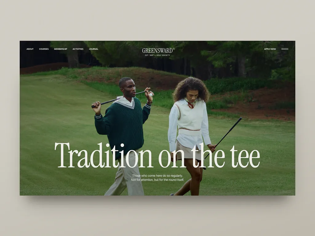
Golf club landing hero
Rebuild
Opus 5.5Extra highfrontend-designemil-design-engtransitions-devhumanizergsapView
RebuildReference
Move across the image to wipe between the two. Click to lock the seam; arrow keys nudge it.
Imagery
1/1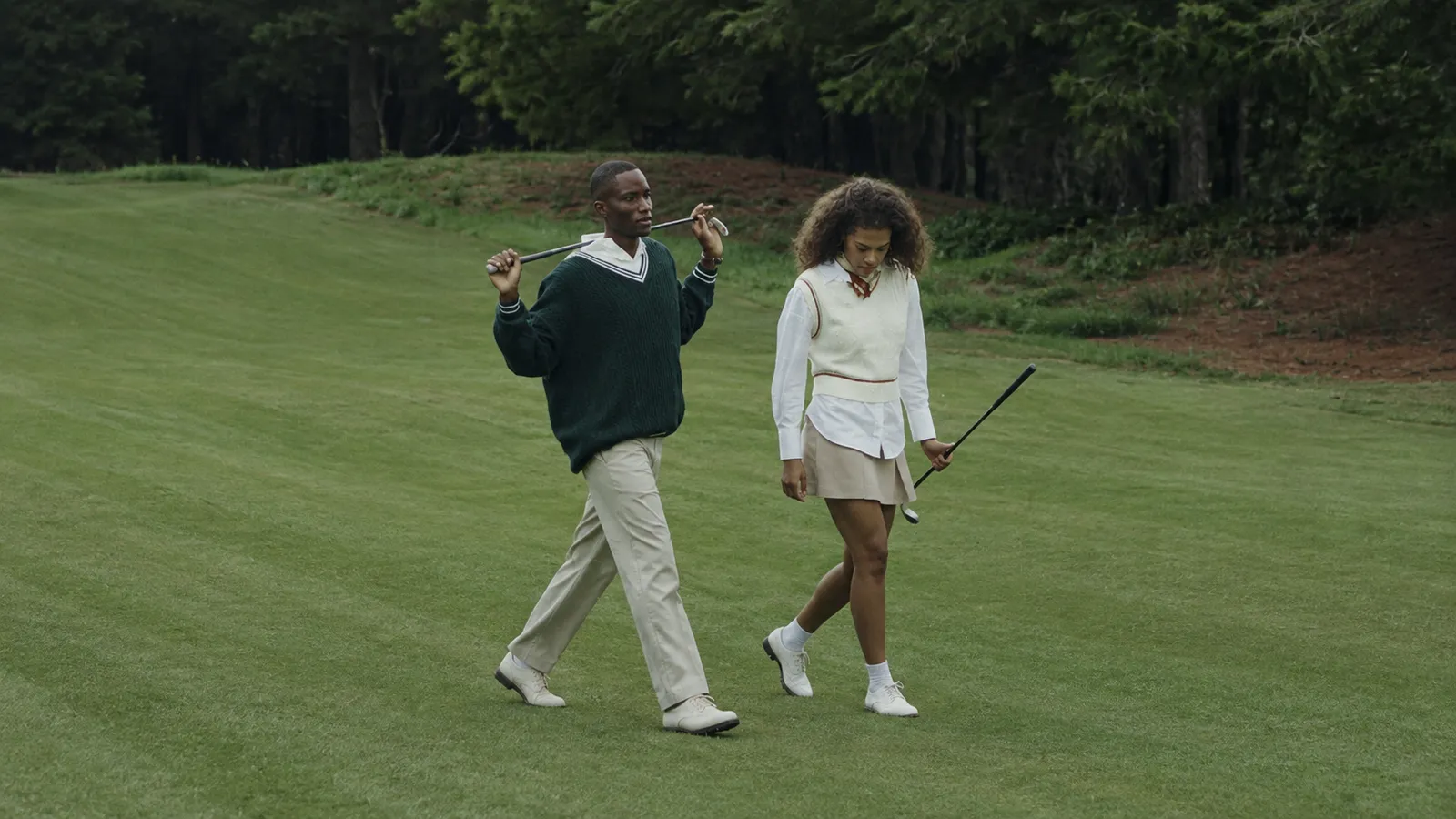
01-hero-fairway-walkers
Two golfers walking across a mown fairway carrying clubs, a dense dark treeline behind them
Prompts
115,056 chars
# Full-bleed editorial hero — photographic stage with centred serif display line

A single-viewport hero section for a members-club / heritage-sport site. One uncropped photograph fills the entire viewport; a transparent three-zone nav floats on top of it; a large high-contrast serif headline sits in the lower third, centred, deliberately overlapping the people in the photo. Nothing is boxed, nothing is rounded, nothing has a shadow. The whole effect depends on restraint: one image, one type moment, no UI chrome.

The source capture shows this design inset on a flat warm-grey mat. That mat is the photograph's framing, not part of the design — build the page full-bleed, edge to edge, with no outer margin and no rounded page corners.

## Structure

- Design viewport: **1440 × 810** (16:9). Hero is `100vh` with `min-height: 720px`.
- Container: the **media is full-bleed** (100vw, no max-width). The **text layer** is a centred container, `max-width: 1080px` (75% of 1440), with 40px side gutters. The **nav** is also full-bleed with 40px side gutters — it is not inside the 1080px container.
- Column structure: no grid columns are visible. The hero is a three-zone flex nav (left / centre / right, `justify-content: space-between`) over a single centred text stack. Everything hangs off one vertical centre axis.

Sections, top to bottom:

1. **Nav overlay** — fixed/absolute over the hero, transparent, no background, no rule. Left: 5 uppercase links. Centre: serif wordmark lockup (wordmark + superscript ® + a small uppercase tagline line beneath). Right: a text-only CTA and a two-line menu glyph.
2. **Hero media stage** — the full-bleed photograph, `object-fit: cover`, plus two gradient scrims (top and bottom).
3. **Hero text block** — bottom-anchored inside section 2, centred: display headline (one line at 1440) + a narrow two-line standfirst under it.

Section 4 (the first content section below the fold) is out of scope for this artifact; it begins at exactly `100vh` with no divider, no shape, no curve.

## Scroll map

Viewport reference 1440 × 810.

| # | Section | Height | Viewports | Scroll consumed | Kind |
|---|---------|--------|-----------|-----------------|------|
| 1 | Nav overlay | 82px (visual band; 0 in flow) | 0.10 | 0 — overlays section 2 | static (position fixed) |
| 2 | Hero media stage | 810px | 1.00 | 810px | scroll-linked (parallax only, no pin) |
| 3 | Hero text block | 226px (inside 2) | 0.28 | 0 — child of 2 | entrance on load, then scroll-linked exit |

**Total artifact height: 810px = 1.00 viewport.** Nothing pins, nothing stacks, the hero consumes exactly its own height. If you add content below, the hero must scroll away normally — do not sticky-pin it.

## Spacing

- Side gutters: **40px** at 1440 (nav and text layer both). 32px at 1024, 20px below 640.
- Nav: `padding-top: 32px`. Left links, wordmark and right cluster are baseline-aligned to the **wordmark's line**, not to the lockup's box — the tagline hangs 10px below that shared line.
- Gap between nav links: **28px**. Gap between CTA text and menu glyph: **32px**.
- Menu glyph: 30px wide, 2 rules, 1.5px thick, 8px apart.
- Hero text block: anchored to the bottom with **80px** bottom padding measured to the last line of the standfirst.
- Headline → standfirst gap: **32px** (optically ~64px baseline to baseline).
- Standfirst measure: `max-width: 300px`, centred — it is deliberately much narrower than the headline.
- Rhythm for sections below the fold (so the hero reads as part of a system): 120px top/bottom section padding at 1440, 80px at 1024, 56px below 640; 24px baseline gap inside text stacks.

## Type

Two families only.

- **Display / wordmark:** high-contrast transitional-to-Didone **serif display** — vertical stress, sharp thin strokes, flat bracketed serifs, generous x-height. Free stand-ins: **Bodoni Moda**, **Playfair Display**, or **Instrument Serif** for a tighter contemporary cut.
- **UI / running text:** neutral **grotesk**, no quirks, no geometric circles. Free stand-in: **Inter** (or Archivo).

Body anchor: **17px at 1440**, grotesk, regular.

| Level | Ratio to body | Size | Line-height | Letter-spacing | Weight | Max measure |
|---|---|---|---|---|---|---|
| Hero headline (3) | 7.0× | **119px** (use 120) | 0.95 | −0.01em | 400 serif | ~24ch, one line at 1440 |
| H2 (below fold) | 3.2× | 54px | 1.08 | −0.01em | 400 serif | 20ch |
| H3 | 1.65× | 28px | 1.25 | 0 | 400 serif | 28ch |
| Body | 1.0× | **17px** | 1.55 | 0 | 400 grotesk | 68ch |
| Hero standfirst (3) | 0.94× | 16px | 1.50 | 0 | 400 grotesk | 34ch (300px), centred |
| Wordmark (1) | 1.4× | 24px | 1.0 | 0.06em | 500 serif, uppercase | — |
| Nav link (1) | 0.82× | 14px | 1.0 | 0.08em | 500 grotesk, uppercase | — |
| CTA text (1) | 0.82× | 14px | 1.0 | 0.10em | 600 grotesk, uppercase | — |
| Tagline under wordmark (1) | 0.7× | 12px | 1.0 | 0.16em | 500 grotesk, uppercase | — |
| Caption / meta | 0.76× | 13px | 1.4 | 0.02em | 400 grotesk | 40ch |

The ® is set at 0.35em, raised to align its top with the wordmark's cap line.

Placeholder copy by role: nav — five single-word links (5–10 chars each); wordmark — one word, 8–11 chars; tagline — "EST. YYYY — TWO WORDS"; CTA — 2 words; headline — **5 words on one line**, sentence case, no punctuation; standfirst — two sentences, ~36 characters each, breaking onto exactly two lines.

## Colour

Four values. The photograph supplies most of the colour; the UI palette is almost monochrome.

- **`#161915` — near-black forest.** The dominant dark. It is the deep shade of the treeline that fills the top ~18% of the photo, and it is the page's true black for text on light surfaces and for dark sections below the fold.
- **`#54673A` — fairway olive.** The **single accent** and the only saturated colour in the system. In the hero it exists *only inside the photograph* (grass, knitwear) — no UI element on the hero is green. Below the fold the accent is allowed on: the active/hover nav underline, a small filled CTA, rules and bullets, and one dark-olive section background. Never on hero text, never as a hero overlay.
- **`#D0CDC4` — warm bone.** Light neutral surface for sections below the hero, and the muted tint for secondary text on dark. (The flat mat in the reference capture happens to be this colour; that is coincidence — treat bone as a page surface, not as a frame.)
- **`#F4F1EA` — warm off-white.** All hero text. Warm, never `#FFFFFF`.

Scrims over the photograph, both `#161915` based:
- Top: `linear-gradient(to bottom, rgba(22,25,21,0.45) 0%, rgba(22,25,21,0) 22%)` — exists only so the nav stays legible.
- Bottom: `linear-gradient(to top, rgba(22,25,21,0.28) 0%, rgba(22,25,21,0) 45%)`.

Keep both subtle. The grass behind the headline stays clearly green and clearly lit; if the image reads as darkened, the scrims are too strong.

## Surface

- Borders: **none** on the hero. Below the fold, hairlines are `1px solid rgba(22,25,21,0.14)` on bone, `1px solid rgba(244,241,234,0.18)` on dark.
- Corner radii: **0** everywhere — page, images, buttons, inputs. No rounded photo corners.
- Shadows: **none**. No drop shadow on the headline, no text-shadow for legibility — the scrims do that job.
- No blur, no glass, no backdrop-filter anywhere.

## Imagery

One image, and it carries the whole section.

**Hero photograph — 16:9, full-bleed, `object-fit: cover`, focal point at 50% 45%.**
Two people walking across a mown fairway toward the camera and slightly to the right, each carrying a club balanced over one shoulder, mid-stride, in the middle distance — they occupy roughly the central 45% of the frame width and their heads sit at about 32% from the top. Behind them, a low mown ridge and then a dense unlit treeline filling the top fifth of the frame; a bare reddish-earth bank at the right edge; faint mower stripes in the turf. Knitwear and collared shirts, nothing branded, nothing posed for camera — they are mid-conversation, not looking at the lens.

Treatment: overcast or late soft light, no direct sun, no highlight bloom. Greens pulled toward olive rather than emerald, contrast held low in the midtones, shadows deep but not crushed, a fine even grain across the frame. No HDR clarity, no vignette, no colour-grade split-toning.

Composition rule that must survive the rebuild: **the headline crosses the two figures at roughly thigh height.** Type in front of people, not beside them and not above them. The bottom crop sits just below their feet, so the ground line is visible and the frame does not feel truncated.

## Motion

No live-page motion capture was supplied with this reference. Every value below is **(inferred)** from the still; exact timings, easings and stagger were **not measured**, so they are given as ranges. Do not substitute a spring, lerp or duration parameter that is not in this list.

**1 — Nav overlay**
- kind — static *(inferred)*
- what moves — nothing. The nav is fixed over the hero and does not fade, shrink, collapse, or gain a background on scroll while the hero is on screen.
- from → to — n/a.
- range — n/a.
- reduced motion — unchanged; it was already static.

**2 — Hero media stage**
- kind — scroll-linked *(inferred)*; reverses on the way back up.
- what moves — the photograph only (the `<img>` inside an `overflow: hidden` stage). The scrims do not move.
- from → to — image `translateY: 0 → +60px` and `scale: 1.06 → 1.00`, i.e. the image starts slightly oversized so the parallax never exposes an edge. Total travel is ~7% of section height; **do not exceed 8%**.
- range — from page scroll 0 until the hero's bottom edge reaches the top of the viewport (0 → 810px of scroll). Linear mapping to scroll position, no easing curve, no smoothing lag.
- reduced motion — no parallax; the image is static at `scale: 1, translateY: 0`.

**3 — Hero text block**
- kind — **entrance** on load (plays once), then **scroll-linked** exit *(both inferred)*.
- what moves — headline and standfirst, as two separate elements. The headline animates as one block, not per character and not per word.
- from → to — entrance: headline `opacity 0 → 1`, `translateY +28px → 0`; standfirst `opacity 0 → 1`, `translateY +16px → 0`. Exit: the whole block `opacity 1 → 0`, `translateY 0 → −40px`.
- range — entrance trigger: on load, after the hero image's `decode()` resolves, not on a scroll threshold (the block is above the fold). Duration **not measured** — use 700–900ms; easing **not measured** — use a standard ease-out (`cubic-bezier(0.22, 1, 0.36, 1)`); stagger **not measured** — use 100–160ms, headline first. Exit range: scroll-linked from scroll position 400px until 810px (the last half of the hero's travel).
- reduced motion — no translate and no exit fade; both elements render at final position, `opacity 0 → 1` over 200ms or instantly.

### Interaction transitions

These are hover/press/open states, not part of the scroll choreography above.

- Nav link hover: a 1px underline in `#F4F1EA` grows from left, `scaleX 0 → 1`, 180ms ease-out; text colour unchanged. No opacity dimming of the siblings.
- CTA hover: letter-spacing `0.10em → 0.14em`, 200ms ease-out, plus the same 1px underline. No fill appears.
- Menu glyph hover: the two rules converge by 2px, 160ms.
- Menu open: full-viewport `#161915` panel wipes down via `clip-path: inset(0 0 100% 0) → inset(0 0 0 0)`, 420–520ms ease-out; menu items fade up 16px with 60ms stagger; glyph crossfades to an ×.
- Menu close: reverse, ~320ms.
- Press on any nav item: `opacity → 0.7`, 80ms.
- Focus-visible: 2px `#F4F1EA` outline, 3px offset, square corners.

## Responsive

Below 640px (reference 390 × 844):

- Nav: the five links and the CTA move **into** the menu panel. Only the wordmark lockup (centred) and the menu glyph (right) remain. Keep the tagline line under the wordmark; drop it only below 360px. Wordmark 19px, tagline 11px, gutters 20px, padding-top 24px.
- Hero: `height: 100svh`. Re-crop the photograph to portrait (4:5 or taller) with focal point on the two figures — do not letterbox the 16:9 crop and do not shrink the figures to specks.
- Headline: 48px (`~12.5vw`), line-height 1.02, breaking onto **three** lines, still centred.
- Standfirst: 16px, `max-width: 88%`, still centred, still two or three short lines.
- Text block bottom padding: 48px.
- Bottom scrim strengthens to `rgba(22,25,21,0.38)` because the portrait crop puts brighter turf behind the type.
- Nothing is dropped except the inline nav links and CTA. The parallax is disabled below 768px.

## Don'ts

- **Don't put the headline in a card, panel, or tinted box**, and don't flood the photo with a 40%-black overlay to "fix" contrast. Two soft directional gradients, nothing else.
- **Don't vertically centre the text.** It lives in the lower third, bottom-anchored. Centring it kills the composition.
- **Don't move the headline off the people.** The overlap of type and figures is the idea. Left-aligning it to the gutter, or floating it in empty sky, is the most likely wrong turn.
- **Don't uppercase or letterspace the headline.** Sentence case, tight tracking, one line at desktop. The uppercase-with-wide-tracking treatment belongs only to the 12–14px labels.
- **Don't use a geometric sans (Poppins, Montserrat) for the headline**, and don't use a serif for nav links. The whole system is one high-contrast serif against one neutral grotesk.
- **Don't make the nav sticky-with-a-background.** No blurred pill, no bar that fades in a solid or translucent panel on scroll, no shrinking logo. It is transparent and static over the photograph.
- **Don't delete the menu glyph because there are already visible links.** The hamburger and the inline nav coexist on desktop — the glyph opens an overflow panel. Hiding it above 640px breaks the layout's right-hand balance.
- **Don't turn the CTA into a filled green button.** It is text-only, 14px, uppercase, same colour as the nav links. The accent green never appears as a hero UI element.
- **Don't saturate the photo** toward vivid golf-course green, and don't add clarity/HDR. Muted olive, soft light, visible grain. A punchy image makes it look like a resort ad rather than an editorial page.
- **Don't add a scroll indicator** — no bouncing chevron, no vertical "SCROLL" word, no mouse glyph. There is none, and adding one crowds the bottom margin the standfirst depends on.
- **Don't round anything or add shadows**, including a text-shadow under the headline.
- **Don't animate the headline per character or per word**, and no blur-in, no 3D rotation, no mask-reveal that wipes letter by letter. One block, opacity and a short lift.
- **Don't pin the hero.** It scrolls away at 1:1; only the image inside it moves, and by no more than 8%.
- **Don't widen the standfirst** to match the headline. Its narrowness — ~300px under a ~1080px headline — is a deliberate proportion.
- **Don't use pure white or pure black.** `#F4F1EA` and `#161915`.
- **Don't reproduce the reference's flat grey surround** as a page background, outer margin, or rounded frame. The page is full-bleed.
Versions
1Each rebuild is kept. The live one is what the comparison shows. LiveOpus 5.5Extra highfrontend-designemil-design-engtransitions-devhumanizergsaplast month · 204s · 1 image · 20260919T183115ZOpen