Granger sports wellness site
Rebuild
Opus 5.5Extra highfrontend-designemil-design-engtransitions-devgsaphumanizerView
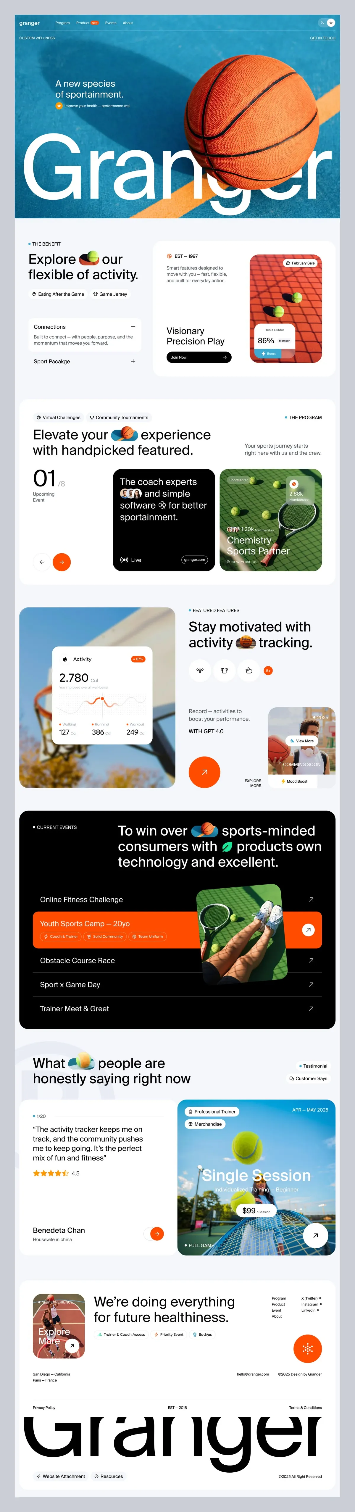
RebuildReference
Move across the image to wipe between the two. Click to lock the seam; arrow keys nudge it.
Imagery
4/4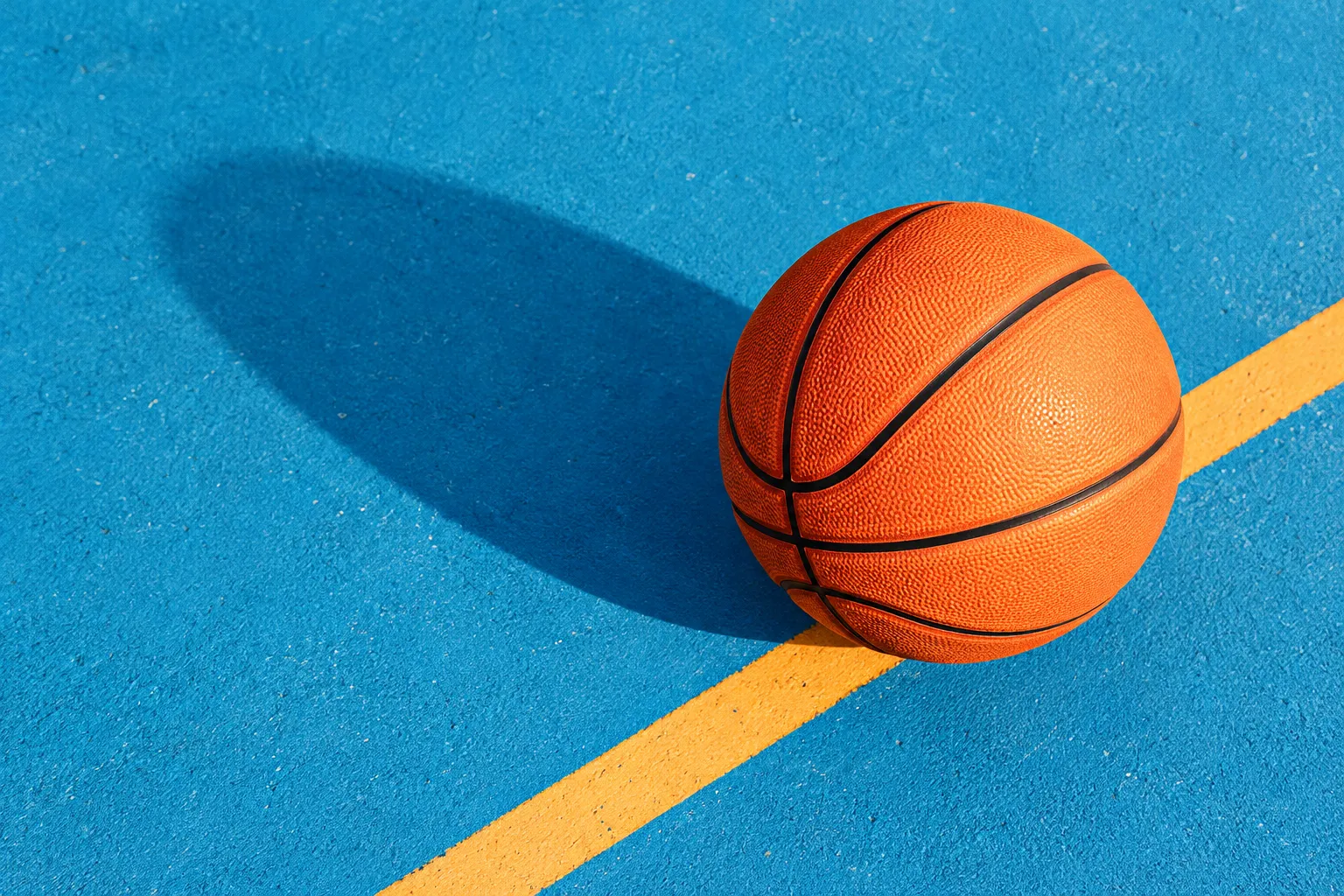
01-hero-basketball-court
Orange basketball on a bright blue outdoor court seen from directly above, with a thick yellow-orange court line
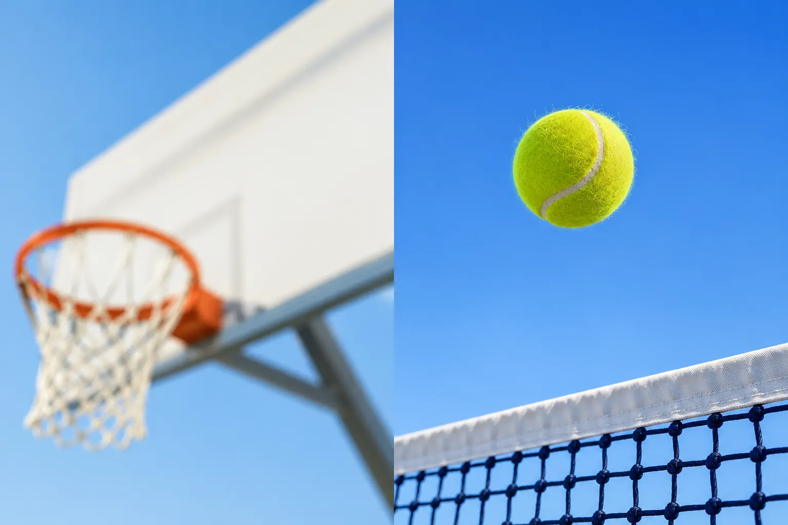
02-sky-photos· 2x1 sheet
Two upward-looking sports photos against open sky
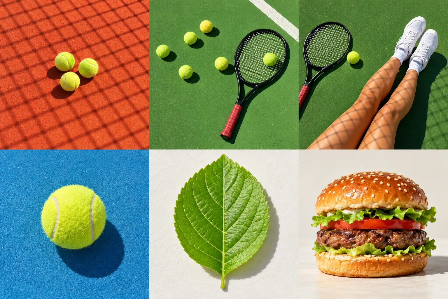
03-court-flatlays· 3x2 sheet
Six overhead sports and food photos in hard sunlight
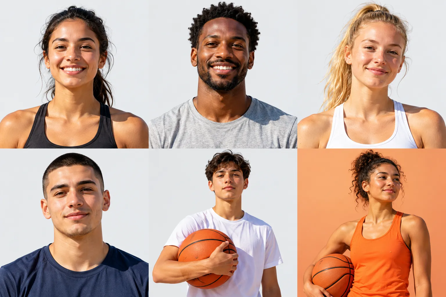
04-athlete-portraits· 3x2 sheet
Four headshots and two athlete portraits in hard daylight
Prompts
127,165 chars
# Sports wellness bento landing page

A light, minimal, high-contrast marketing page for a sports and wellness product. It opens with a full-bleed sports photo and a giant white wordmark that runs off the bottom edge. Below that is a stack of bento cards on a pale grey canvas, then one black "events" panel. The page ends in a white footer with a giant black wordmark whose top is clipped. Text is near-black. A single hot-orange accent appears only on small solid shapes. All other colour comes from saturated sports photography: basketball-court blue, tennis green and clay red. Frosted-glass pills appear only where they sit on photos.

## Structure

- Reference viewport: 1440 × 900.
- Section 1 is full-bleed, with no gutters and no radius. Everything after it sits in a centred container with 24px side gutters, so it is 1392px wide.
- The container uses a 12-column grid with 16px gaps. Sibling bento cards are 16px apart, and sections are 96px apart.

1. **Hero + nav.** A full-bleed photo, 900px tall.
   - Background: a top-down photo of a basketball on a blue hard court, set to `object-fit: cover`. The ball centre sits at about 77% x / 42% y, and the ball is about 480px across. A thick yellow-orange court line sweeps in from the bottom centre to the right edge.
   - Nav row: 24px from the top, 48px tall, 40px side padding.
     - Left: a placeholder wordmark (1 word), 20px/600, white.
     - Links: a block of 4 links starting at x = 184px, 14px/500, white, 32px apart. The 2nd link carries a small orange "new" badge: 18px tall, radius 999, 12px white text, 6px left margin.
     - Right: a 72×36 glass capsule. At its right end is a 28px white circle with an 8px black dot (a menu/theme toggle).
   - Sub-row, 96px from the top:
     - Left: an eyebrow, 2 words, 12px uppercase, white at 80%.
     - Right: a contact link, 2–3 words, 12px uppercase, white, with a 1px underline offset 3px.
   - Tagline: x = 184px, top ≈ 300px. Two lines, 4–5 words in total, 34px, white, max 18ch.
   - Caption row, 16px below the tagline: a 20px orange circle holding a tiny white glyph, then a 6–8 word caption at 13px, white at 80%.
   - Giant wordmark: one 6–8 letter word, white, 25vw (360px), weight 500, letter-spacing −0.05em, line-height 0.8.
     - Horizontal: it starts 40px from the left and is tracked to end about 40px from the right edge.
     - Vertical: the cap tops sit about 530px down, and the baseline about 28px above the hero's bottom edge. The hero is `overflow: hidden`, so the g-descenders are cut by the edge.
     - It sits in front of the photo and overlaps the lower part of the ball.
   - The hero has no buttons.
2. **Benefit bento.** 610px tall, laid out as `grid-template-columns: 5fr 7fr`, gap 16.
   - **2A, left card:** padding 40, a flex column with `space-between`.
     - Top:
       - An eyebrow with a dot (2 words).
       - 16px below it, an H2 on 2 lines (5–6 words) with an inline photo pill after word 1.
       - 20px below that, a meta row of two items, 20px apart. Each item is a 14px line icon plus 13px text (3–4 words).
     - Bottom: a 2-item accordion.
       - Each title row is 56px tall, with the title at 17px/500 and a 16px −/+ icon at the right.
       - The open item shows a body of 16px secondary text, 2 lines, max 44ch, with 20px bottom padding.
       - Items are separated by a 1px #D7D7D8 divider.
       - The first item is open.
   - **2B, right card:** padding 40, with an inner grid `1fr 330px`, gap 32.
     - Left column (`space-between`):
       - Top: a meta line (16px orange circle icon + a 12px uppercase "est. – year" tag). Then a body paragraph of 3 lines, max 30ch, in secondary text.
       - Bottom: a card title on 2 lines (3 words) at 28px. 20px below it, a black pill button 280×44: label 14px/500 white on the left, a white → on the right, padding 0 20.
     - Right column: a 330×530 photo card with radius 20.
       - Top-right: a glass pill (28px tall, 6px dot + 2-word label at 12px).
       - Bottom centre: a 170×140 mini UI card, white at 92%, radius 16, padding 12. It holds a 2-word caption (12px secondary), a value row ("NN%" at 22px/500 + a 12px label), and a full-width orange pill 28px tall with a ⚡ glyph and a 1-word label at 12px white.
3. **Program panel.** One white panel, about 800px tall, padding 56 64.
   - **Row 1** (`space-between`):
     - Left: two outlined chips, 8px apart. Each is 32px tall with a 1px #D7D7D8 border, radius 999, padding 0 14, a 14px icon and 2 words at 13px.
     - Right: an eyebrow with a dot.
   - **Row 2**, 24px below row 1: a grid of 8 / 4 columns.
     - Left: an H2 on 2 lines (7–8 words) with an inline photo pill after word 2.
     - Right (columns 9–12): a body paragraph of 2 lines, max 32ch, aligned to the bottom of the headline.
   - **Row 3**, 40px below row 2: a grid `0.72fr 1fr 1fr`, gap 24, height 440.
     - **3a, stat column** (no card, `space-between`):
       - A numeral "0N" at 112px, with "/N" at 16px in secondary text tucked against its cap-top right.
       - 12px below, a 2-line caption at 13px in secondary text.
       - At the bottom, two 48px circles 8px apart. Prev is white with a 1px #D7D7D8 border and a black ←. Next is filled orange with a white →.
     - **3b, black card:** radius 20, padding 32.
       - A statement at 34px, white, line-height 1.3, 4 lines, 12–14 words.
       - After word 3 sits an inline avatar stack: 3 photos, 32px each, overlapping −10px, with 2px black rings. A 24px line glyph sits mid-sentence.
       - Bottom row, left: a broadcast icon + "live"-style label at 14px white. Bottom row, right: an outlined pill, 30px tall, 1px white border at 35%, holding a URL placeholder at 12px.
     - **3c, photo card:** radius 20, with a black scrim over the bottom 45% (55% → 0).
       - Top-left: a glass category pill (1 word).
       - Top-right: a 36px orange circle with a white glyph. Under it, 2 lines at 12px white (a count + a label).
       - Bottom-left, stacked:
         - An avatar stack of three 24px avatars plus a 12px member count.
         - A title on 2 lines (3 words) at 28px white.
         - A location line at 12px uppercase with a pin icon.
4. **Feature-tracking bento.** 800px tall, `6 / 6` columns, gap 16.
   - **4A, photo card**, radius 28, full height.
     - A floating stats UI card 440×430 sits at left 140, top 170. It is white, radius 20, padding 24, with a soft shadow. Its contents, top to bottom:
       - Header: a 16px icon + a 1-word label at 14px/500. At the right, an orange "+NN%" pill, 22px tall, 12px white text.
       - A numeral at 44px followed by a unit at 14px in secondary text.
       - A 1-line helper caption at 12px.
       - A line chart 120px tall.
       - A 3-column stats row with 1px #EDEEF0 dividers. Each column has a 12px label with a 6px orange dot, then a value at 22px/500 + a unit at 12px.
   - **4B, white card:** padding 40, `space-between`.
     - Top:
       - An eyebrow.
       - An H2 on 2 lines (5 words) with an inline photo pill before the last word.
       - 28px below, an icon row 10px apart: three 44px outlined circles (18px line icons) and one 28px orange circle holding "N+" at 12px white.
     - Bottom: a grid `1fr 300px`, gap 24, aligned to the end.
       - Left:
         - A 2-line body at 16px in secondary text.
         - A 2–3 word tech tag at 12px uppercase, weight 500, black.
         - 40px below, a 120px orange circle with a white ↗ (32px, 2px stroke). To its right, bottom-aligned, a 2-line label at 12px uppercase.
       - Right: a 300×350 photo card, radius 20.
         - Top-right: a year at 12px white with a dot.
         - Centre: a 32px glass pill reading "↗ + 2 words".
         - Near the bottom: a 2-word uppercase label at 12px white.
         - Along the bottom: a white strip pill inset 12px, 32px tall, with an orange ⚡ icon + a 2-word label at 12px.
5. **Events panel.** Black, radius 28, padding 64, about 960px tall, `position: relative`.
   - Header, a grid of 4 / 8 columns:
     - Left: an eyebrow, white, with an orange dot.
     - Right: an H2 in white on 3 lines (13–15 words, max 30ch). It has two inline images: a photo capsule after word 3, and a 40px circular green-leaf photo cutout before a later word.
   - The list starts 64px below the header. It has 5 rows:
     - **Normal row:** 104px tall, padding 0 32. Label of 2–4 words at 22px white, a white 18px ↗ at the right, and a bottom border of 1px white at 12%.
     - **Active row** (2nd by default): background #FC4A01, radius 16, 160px tall.
       - The label sits at the top.
       - 12px below it, 3 chips 8px apart. Each is 28px tall, radius 999, with a 1px white border at 45%, a 12px icon and a 2-word label at 12px white, padding 0 10.
       - At the right, a 44px white circle with a black ↗.
   - **Preview photo:** 370×580, radius 20, rotated −4° (inferred).
     - Absolutely positioned at left 56% of the panel, with its top 24px above row 1.
     - It sits above the list, covering the middle of all 5 rows between the labels and the arrows.
6. **Testimonials.**
   - Heading row, on the canvas, inset 64px each side so it aligns with panel content:
     - Left: an H2 on 2 lines (7–8 words) with an inline photo pill after word 1.
     - Right: a right-aligned stack of an eyebrow with a dot, and below it a 14px icon + a 2-word label at 13px.
   - Cards, 40px below the heading: `6 / 6` columns, gap 16, 690px tall.
     - **6A, white quote card:** padding 40, `space-between`.
       - Top:
         - A counter "• N/NN" at 12px.
         - A quote at 22px, line-height 1.4, 4 lines (about 28 words, max 32ch), in straight double quotes.
         - 5 orange stars at 16px (the last one half-filled) + a rating at 14px/500.
       - Bottom:
         - Left: a placeholder person name at 18px/500, and below it a role/location at 13px in secondary text.
         - Right: a 44px orange circle with a white →.
     - **6B, photo promo card:** radius 28. Overlays are inset 24px.
       - Top-left: two stacked solid white pills, 28px tall, black 12px text with icons, 8px apart.
       - Top-right: a date range at 12px uppercase white.
       - Centre:
         - A 2-word title at 52px white on one line.
         - A descriptor at 14px, white at 70%.
         - A 36px glass price pill: price at 18px/500 + "/ unit" at 12px.
       - Bottom-left: an eyebrow at 12px uppercase white with a dot.
       - Bottom-right: a 64px white circle with a black ↗.
7. **Footer.** A white panel, radius 28, padding 64 64 40, about 920px tall, with a 24px gutter below it to the page end.
   - **Row A:** grid `225px 1fr auto`, with a 40px gap after the photo.
     - **Photo card**, 225×280, radius 16:
       - Top-left: a tiny label at 12px white.
       - Bottom-left: a 2-word title at 28px white.
       - Bottom-right: a 32px glass circle with ↗.
     - **Headline column:**
       - An H2 on 2 lines, 6–7 words, max 22ch.
       - 24px below, 3 meta items 24px apart, each a 14px icon + 13px text.
     - **Links column:** two link lists 40px apart, at 14px with line-height 1.5.
       - The first list has 4 nav links.
       - The second has 3 social links, each with a 12px ↗.
       - Below the lists, right-aligned, a 120px orange circle with a white 6-arm asterisk glyph at 40px.
   - **Row B**, 56px below row A: three items at 13px in secondary text.
     - Left: two location lines.
     - Centre-right: an email placeholder.
     - Right: a copyright line.
   - **Row C**, 120px below row B: a legal row of 3 items at 13px, aligned left, centre and right.
   - **Wordmark box**, 12px below row C: 200px tall, `overflow: hidden`.
     - It holds the same word as the hero, at 24vw (≈345px), weight 500, letter-spacing −0.05em, black.
     - The word sits so the box's top edge cuts off the top ~30% of the capitals, and the g-descenders sit fully inside the bottom.
   - **Row D**, 32px below the wordmark box: two icon+label links at 13px on the left, and a copyright line at 13px on the right.

## Scroll map

No motion report was supplied. Nothing pins or stacks, so each section's scroll equals its height. All heights below are inferred from the still. A viewport (vp) is 900px.

1. Hero: 900px / 1.00 vp. Scroll 900. Entrance (on load).
2. Benefit bento: 610px / 0.68 vp. Scroll 610. Entrance.
3. Program panel: 800px / 0.89 vp. Scroll 800. Entrance.
4. Feature-tracking bento: 800px / 0.89 vp. Scroll 800. Entrance.
5. Events panel: 960px / 1.07 vp. Scroll 960. Entrance.
6. Testimonials (heading + cards): 866px / 0.96 vp. Scroll 866. Entrance.
7. Footer (with the 24px bottom gutter): 944px / 1.05 vp. Scroll 944. Entrance.

There are 6 gaps of 96px between sections, adding 576px. **The total page height is ≈ 6,500px (≈ 7.2 viewports).**

## Spacing

- **Section rhythm:** 96px between every section, measured as canvas showing between cards. The hero touches the top of the page.
- **Bento gap:** 16px between sibling cards (sections 2, 4 and 6).
- **Padding:**
  - Full-width panels (3, 5, 7): 56–64px vertical, 64px horizontal.
  - Half-width cards: 40px.
  - Nested cards (black, photo and UI cards): 24–32px.
  - Overlays on photos: inset 20–24px.
- **Vertical gaps inside cards:**
  - Eyebrow → H2: 16px.
  - H2 → meta or chips: 20–28px.
  - Header block → card row: 40px.
  - Panel header → list: 64px.
- **Small gaps:** chips and pills are 8px apart, icon circles 10px apart, nav links 32px apart, and meta items 20–24px apart.
- **Content layout:** each card's content is split into a top cluster and a bottom cluster with `justify-content: space-between`. Empty space collects in the middle of the card, not at its bottom.

## Type

- **Family:** one neo-grotesk sans for everything (tight, neutral, slightly condensed apertures). Use **Inter Tight** (free) as the stand-in; Geist is also acceptable. There is no serif and no mono.
- **Weights:** only 400 and 500. Use 600 only for the small nav logo.
- **Body anchor:** 16px.

| Level | × body | px | line-height | letter-spacing | weight |
|---|---|---|---|---|---|
| Giant wordmark (hero) | 22.5× | 360 (25vw) | 0.8 | −0.05em | 500 |
| Giant wordmark (footer) | 21.5× | 345 (24vw) | 0.8 | −0.05em | 500 |
| Stat numeral | 7× | 112 | 1.0 | −0.04em | 400 |
| H2 / photo-card title | 3.25× | 52 | 1.15 | −0.025em | 400 |
| Numeral in stats UI | 2.75× | 44 | 1.0 | −0.03em | 500 |
| Hero tagline / black-card statement | 2.125× | 34 | 1.25–1.3 | −0.02em | 400 |
| Card title | 1.75× | 28 | 1.2 | −0.015em | 400 |
| List row label / quote | 1.375× | 22 | 1.2 (row) / 1.4 (quote) | −0.01em | 400 |
| Person name | 1.125× | 18 | 1.3 | −0.01em | 500 |
| Accordion title | 1.06× | 17 | 1.3 | 0 | 500 |
| Body | 1× | 16 | 1.5 | 0 | 400 |
| Nav link / button label | 0.875× | 14 | 1.3 | 0 | 500 |
| Chip / meta / caption | 0.8125× | 13 | 1.3 | 0 | 400 |
| Eyebrow / tiny labels | 0.75× | 12 | 1.2 | +0.04em, uppercase | 500 |

- **Line lengths:** body paragraphs are 30–44ch (kept narrow), H2s are 20–30ch, and the quote is at most 32ch.
- **Inline photo pills in H2s:** height 0.85em, width about 1.9em, radius 999, `vertical-align: −0.12em`, margin 0 0.15em. Some pills are two overlapping 0.85em circles instead of a capsule.
- **Alignment:** everything is left-aligned except labels in the right column.

## Colour

- **#FAFBFC (card surface, sampled):** all white cards and panels. This is the dominant surface.
- **#ECEEF1 (canvas, inferred):** the page background between cards. It is just dark enough to outline the white cards. Never use the mat grey #CBCED6.
- **#020202 (ink):** all headings and labels on light surfaces, the black card in 3b, the whole events panel, primary pill buttons, the footer wordmark, and arrows inside white circles.
- **#6E7178 (secondary text, inferred):** body paragraphs, captions, "/N", roles. On black, use white at 60%.
- **#D7D7D8 (hairline):** outlined chips, outlined icon circles, accordion dividers, and the prev-button border.
- **#FC4A01 (the single accent).** It may appear only on:
  - solid CTA circles (next arrow, quote →, the 120px circles);
  - the small badges (new, +NN%, N+);
  - the stats-UI boost pill;
  - the active events row;
  - rating stars;
  - eyebrow and stat dots, and the hero caption icon;
  - the chart line.

  It never appears on headline text, links, borders, card or section backgrounds, or as a gradient.
- **#F99857 (soft accent):** only as the chart's area tint (fading to transparent) and as the hover tone of orange circles. It already lives in the basketball photography.
- **Photography:** saturated blue, green, clay red and sky blue. This is the page's only other colour.

## Surface

- **Radii:** panels and half-width cards 28px; nested cards and photo cards 20px; mini UI cards and the active row 16px; pills and circles fully round.
- **The page itself has no radius**, and the hero is square-cornered and edge to edge.
- **Borders:** cards have none. 1px #D7D7D8 appears only on outlined chips and icon circles and on dividers. On black, borders are 1px white at 12–45%.
- **Shadows:** only floating UI cards that sit on photos get one: `0 24px 48px -12px rgba(2,2,2,0.18)`. Panels and cards are flat.
- **Glass (photos only):** background `rgba(255,255,255,0.18)`, `backdrop-filter: blur(16px)`, border 1px `rgba(255,255,255,0.35)`, white text. Used for the hero toggle, category pills, price pill, "view more" pill and small ↗ circles.

## Imagery

- **Hero background:** 1 photo, about 16:10, full-bleed. Top-down basketball on a cyan-blue court in hard sunlight, with a long shadow and a thick yellow-orange painted line.
- **Inline H2 pills:** 6 photos, capsule (≈ 2.2:1) or circular crops. Subjects: tennis ball + orange ball (S2), basketball on blue (S3), a snack/food item (S4), basketball capsule and green-leaf cutout (S5), tennis ball (S6).
- **Benefit card (2B):** 1 photo, about 2:3 portrait (330×530). Top-down tennis balls on a clay-red court crossed by net shadows.
- **Avatars:** 2 stacks of 3 photo headshots, 1:1 circles. 32px in the black card (3b) and 24px in the tennis card (3c).
- **Program card (3c):** 1 photo, about 1:1 (455×440). Top-down tennis racket and balls on a green court.
- **Feature card (4A):** 1 photo, about 6:7 (690×800). A basketball hoop and net seen from below against a pale blue sky, in soft focus.
- **Stats card in 4A:** ui, built in HTML/CSS. Its chart is vector: a smooth 2px orange line with one peak marker dot, dashed grey gridlines, and a #F99857 → transparent area fill.
- **Small photo card in 4B:** 1 photo, about 6:7 (300×350). A young athlete in a white tee holding a basketball, on a light backdrop.
- **Events preview (5):** 1 photo, about 2:3 (370×580), tilted. Top-down legs and sneakers of a player lying on a green court, with racket and ball.
- **Promo card (6B):** 1 photo, about 1:1 (690×690). A tennis ball in mid-air above a net against saturated blue sky.
- **Footer card (7):** 1 photo, 4:5 (225×280). An athlete in orange holding a ball, in warm tones.
- **Mini UI card in 2B:** ui, built in HTML/CSS.
- **Icons:** vector line icons, 1.5px stroke, 12–18px. Arrows ↗ → ←, ⚡, pin, broadcast, shirt, glove and similar. Rating stars and the 6-arm asterisk are also vector.

## Motion

No motion report was supplied. Every value below is inferred, the page is tagged "restrained motion", and durations are not measured.

**1. Hero**
- **kind:** entrance (on load). (inferred)
- **what moves:** the giant wordmark, then the tagline and caption, then the nav.
- **from → to:**
  - Wordmark: translateY 8–12% of its height → 0, opacity 0 → 1, inside the hero's overflow clip.
  - Tagline and caption: translateY 16–20px → 0, opacity 0 → 1.
- **range:** once, on page load. Duration not measured (600–900ms), ease-out, stagger 80–120ms.
- **reduced motion:** render the final state with no transition.

**2. Benefit bento**
- **kind:** entrance. (inferred)
- **what moves:** cards 2A and 2B.
- **from → to:** opacity 0 → 1, translateY 24–32px → 0.
- **range:** once, when the card's top reaches 85% of the viewport. 500–700ms (not measured), ease-out, 60–100ms stagger left → right.
- **reduced motion:** opacity fade only (≤200ms), or none.

**3. Program panel**
- **kind:** entrance. (inferred)
- **what moves:** the panel, then the three row-3 items.
- **from → to:** panel opacity 0 → 1 with translateY 24px → 0; then 3a, 3b and 3c each opacity 0 → 1 with translateY 16px → 0.
- **range:** once, when the panel's top reaches 85% of the viewport. 500–700ms (not measured), ease-out, 60–100ms stagger.
- **reduced motion:** no transforms; content is visible immediately.

**4. Feature-tracking bento**
- **kind:** entrance. (inferred)
- **what moves:** both cards, then the floating stats UI card. The chart line draws in.
- **from → to:**
  - Cards: opacity 0 → 1, translateY 24px → 0.
  - Stats card: translateY 20px → 0, opacity 0 → 1.
  - Chart: `stroke-dashoffset` from full length → 0.
- **range:** once, when the section's top reaches 85% of the viewport. 500–700ms for the cards; the chart draws over 800–1200ms (not measured), ease-out, with the stats card 120–200ms after its parent.
- **reduced motion:** chart drawn and cards visible, with no movement.

**5. Events panel**
- **kind:** entrance. (inferred)
- **what moves:** the panel, the list rows and the preview photo.
- **from → to:**
  - Panel: opacity 0 → 1, translateY 24px → 0.
  - Rows: opacity 0 → 1, translateY 12px → 0.
  - Preview photo: opacity 0 → 1, rotate 0° → −4°, scale 0.96 → 1.
- **range:** once, when the panel's top reaches 85% of the viewport. 500–700ms (not measured), ease-out, rows staggered 50–80ms.
- **reduced motion:** final state immediately, with the photo at −4° and no animation.

**6. Testimonials**
- **kind:** entrance. (inferred)
- **what moves:** the heading row, then both cards.
- **from → to:** opacity 0 → 1, translateY 24px → 0.
- **range:** once, when each element's top reaches 85% of the viewport. 500–700ms (not measured), ease-out, 60–100ms stagger.
- **reduced motion:** visible immediately.

**7. Footer**
- **kind:** entrance. (inferred)
- **what moves:** the panel content, then the giant wordmark.
- **from → to:**
  - Content: opacity 0 → 1, translateY 16px → 0.
  - Wordmark: translateY +60% of its height → its resting top-clipped position, inside the 200px overflow box.
- **range:** once, when the wordmark box's top reaches 90% of the viewport. 700–1000ms (not measured), ease-out.
- **reduced motion:** the wordmark is at rest from the start.

**Interaction transitions** (all inferred, 150–350ms, ease-out)
- **Events list rows:** hovering a row (or giving it focus) fills it with #FC4A01 and expands its height to 160px to reveal the chip row (`grid-template-rows: 0fr → 1fr`). Its ↗ becomes a white 44px circle. The preview photo moves vertically to centre on that row and cross-fades to that row's image. The previously active row collapses.
- **Accordion (2A):** opening rotates + into −, and the body animates from 0 → auto height with an opacity fade. Only one item is open at a time.
- **Orange circles:** on hover, background → #F99857 or `scale(1.04)`, and the arrow nudges 2px toward its direction. On press, `scale(0.97)`.
- **Black pill button:** on hover, the arrow translates 4px right and the background lifts to #1A1A1A.
- **Prev/next circles (3a):** the counter swaps and the slide cross-fades in about 300ms.
- **Photo cards:** on hover, the image scales 1 → 1.03 over 400–600ms, clipped by the card radius.
- **Nav links:** opacity 0.75 → 1.

## Responsive (<640px)

- Gutters become 16px. Panel padding becomes 24px, and radii become 20 for panels and 16 for nested cards. The section gap becomes 56px.
- **Hero:** height becomes 640px. Nav links collapse into the glass toggle, which opens a menu. The tagline moves to x = 20px at 22px and the caption stays. The wordmark stays at 25vw edge to edge with its descenders still clipped.
- **Sections 2, 4 and 6:** stack into one column; each card takes its natural height.
  - The image in 2B moves below the text at full width (4:5).
  - The stats UI in 4A centres at 90% width.
  - The small photo card in 4B drops below the CTA circle.
- **Section 3:** the stat column becomes a horizontal row (numeral at 72px with the arrows at the right). The black card and photo card stack, each 400px tall.
- **H2:** 32px. The statement and tagline become 24px, and the 120px circles become 80px.
- **Section 5:** the heading goes full width at 28px. Rows become 72px with 18px labels, and the active row 132px. The floating preview photo is dropped.
- **Section 7:** row A stacks in the order photo card, headline, links in 2 columns, orange circle. Rows B, C and D stack left-aligned. The wordmark stays at 24vw full width with its top clipped (box height scales to about 14vw).

## Don'ts

- Don't render the mat. Its #CBCED6 border is not the page background or a colour. The page runs edge to edge, the hero is square-cornered, and nothing sits behind it.
- Don't shrink the hero wordmark into a contained, centred headline. It must span the full width at about 25vw and be cut by the hero's bottom edge. The footer word must be cut by its box's top edge. Neither wordmark sits fully visible.
- Don't add hero CTA buttons, a hero subheading block, or a dark overlay on the hero photo. The photo stays bright and saturated.
- Don't use bold display type. Headlines are 400 with tight negative tracking. Heavy weights or default tracking make it look generic.
- Don't spread orange around. One accent, only on small solid shapes and the single active list row. No orange text, orange outlines, orange section bands, or orange-to-anything gradients.
- Don't introduce a second accent colour such as blue links, green success states or purple. Colour beyond ink and orange comes only from the photographs.
- Don't use glass on light surfaces. Frosted pills exist only on top of photos. Elsewhere, chips are outlined (1px #D7D7D8) or solid white.
- Don't put shadows or borders on the bento cards. They separate from the canvas by tone alone. Only the floating UI cards on photos cast a shadow.
- Don't centre section headings. Everything is left-aligned, with eyebrows and small labels pushed to the right edge.
- Don't swap the inline photo pills inside headlines for emoji, icons or coloured blobs. They are real photo crops at about 0.85em tall.
- Don't put icons in filled coloured squares. Icons are bare 1.5px strokes, either standalone or inside outlined circles. The only filled circles are orange or white.
- Don't make the events list a set of bordered cards. Rows are hairline-separated and transparent on black, and only the active row fills orange and expands.
- Don't widen the gaps between bento siblings. They stay at 16px while sections stay 96px apart; that contrast is the bento look.
- Don't add parallax, pinning, marquee tickers, cursor followers or count-up numbers. Motion stays restrained: one soft entrance per block, plus hover states.
- Don't replace the photography with illustrations or 3D icons. Every picture of a ball, court, person or food is a real photo with hard daylight and saturated colour.
Versions
1Each rebuild is kept. The live one is what the comparison shows. LiveOpus 5.5Extra highfrontend-designemil-design-engtransitions-devgsaphumanizer1 hour ago · 937s · 4 images · 20261028T162917ZOpen