Imagio AI — About page
Rebuild
Opus 5.5Highfrontend-designemil-design-engtransitions-devgsaphumanizerView
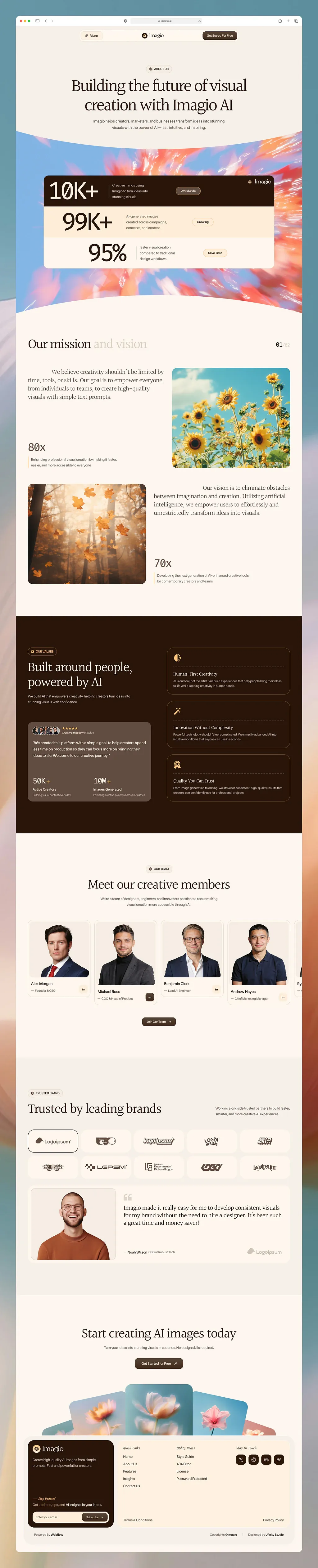
RebuildReference
Move across the image to wipe between the two. Click to lock the seam; arrow keys nudge it.
Imagery
4/4
01-ribbon-petal-zoom
Abstract zoom-blur of coral, peach and pink petals streaking outward from a clear blue sky
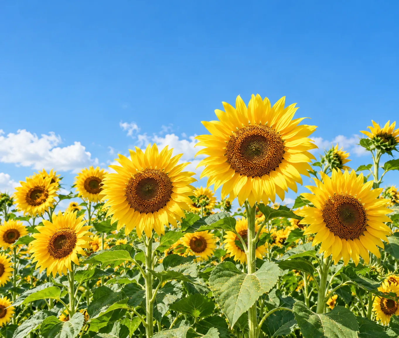
02-mission-sunflowers
Sunflowers seen from below against a bright blue sky with soft white clouds

03-mission-autumn-forest
Hazy autumn forest with orange leaves falling in warm backlight
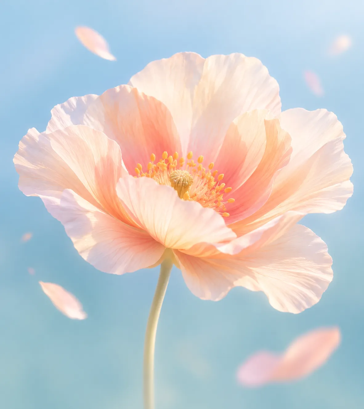
04-cta-fan-bloom
Dreamy macro of a soft peach blossom against a pastel blue background
Prompts
120,444 chars
# Warm editorial about page: cream, espresso and serif

Build a long about page for an AI image-generation product. It has a light cream surface, espresso-brown type and a single dark band. Headlines are in a soft serif and everything else is in a quiet grotesk. Photography supplies all the saturated colour; the UI stays almost monochrome. It reads like a magazine spread: hanging first-line indents, stepped stat cards, a curved photo ribbon and a fan of image cards that tucks behind the footer.

## Structure

- Page width 1440. Content container 1320 max, 60px side gutters. Some content blocks are narrower and noted below.
- The grid is a 12-column grid with a 24px gutter. Most sections use 6/6 or 5/7 splits.
- The page is full-bleed. Only section 5 changes background colour.

Sections, top to bottom:

1. **Nav.** A floating bar that overlays the top of the hero. It is centred, about 820px wide and 56px tall, with a transparent background.
   - Left: a "Menu" text button with a small grid or hamburger glyph.
   - Centre: logo mark plus wordmark.
   - Right: a small dark pill CTA, "Get started" style, 3–4 words.
2. **Hero.** Centred text on cream.
   - Eyebrow pill (1–2 words, uppercase).
   - Serif headline, 6–8 words on two lines.
   - Two-line sub-paragraph, about 22 words, centred, max 560px wide.
3. **Photo ribbon with stepped stats card.** A full-bleed abstract photo, masked so both its top and bottom edges are wide, shallow arcs that sag toward the centre (a smile-shaped ribbon). The cream above and below meets it on those curves.
   - The ribbon is about 900px tall at the centre.
   - A stats card, 1160px wide, sits centred on the photo and starts about 120px below the ribbon's top edge.
   - The card is three stacked horizontal rows of about 150px each. They touch, with no gap between them.
   - **Row 1:** dark espresso fill. Large numeral (e.g. "10K+") at left, a 3-line micro-description, a small tag pill (1 word) and a logo lockup at top-right in cream.
   - **Row 2:** pale peach fill. Same layout.
   - **Row 3:** cream fill. Same layout.
   - The content stair-steps right: row 2's numeral starts about 90px further right than row 1's, and row 3's about 90px further again. All rows share the right edge.
   - Only the outer corners of the card are rounded.
4. **Mission and vision.** An editorial zig-zag.
   - **Header row.** Serif H2 on the left. The first 2 words are espresso and the last 2 words are a pale muted beige ("Our mission" + muted "and vision"). On the far right is a small pager reading "01 / 02", with the second number muted.
   - **Row A.**
     - Left column (6 cols): a serif lead paragraph, 3–4 lines and about 35 words. Its first line has a text-indent of about 120px.
     - Under that, about 220px lower, a large light numeral ("80x" style).
     - Under the numeral, a 2-line caption, max 300px, with a 1px left rule.
     - Right column (5 cols, right-aligned): a photo at 1.18:1 with a 16px radius.
   - **Row B** mirrors Row A.
     - Left column (5 cols): a photo at about 1.18:1.
     - Right column (6 cols): a serif lead paragraph whose first line is indented about 240px.
     - Then, about 220px lower, a numeral ("70x" style) and a ruled caption.
5. **Values.** A full-bleed dark espresso band with all type in cream. 6/6 split, 48px gap.
   - **Left column, in order:**
     - Eyebrow pill, dark variant.
     - Serif H2 on two lines (3 + 3 words).
     - 2-line small body, max 420px.
     - About 120px lower, a raised card in lighter brown, about 400px tall, 24px padding.
   - **Inside the raised card, in order:**
     - A row of 4 overlapping round avatars, 32px each, overlapping by -10px.
     - 5 peach stars and a tiny label beside the avatars.
     - A 3-line quote, about 40 words, in 17px sans.
     - A hairline divider.
     - Two stats side by side ("50K+" / "10M+"), each with a 2-line micro-label.
     - A 36px dark square icon button at bottom-right.
   - **Right column:** 3 stacked outline cards, gap 16px, each about 230px tall, padding 28px. Each card has a peach line icon (24px) top-left, a serif title (3 words) about 60px lower, and a 2-line small description in cream at 60% opacity.
6. **Team.**
   - Centred header: eyebrow pill, serif H2 (4 words, one line) and a 2-line sub, max 520px.
   - Below the header is a horizontal carousel of portrait cards, 316px wide with a 20px gap.
   - The track starts at the container's left edge and bleeds off the right edge of the viewport, so a 5th card is cut off.
   - Each card has a white fill, an 8px inner padding and a 16px radius. It contains:
     - A photo at about 1:0.95 with a 12px radius.
     - The name (15px, weight 500).
     - The role (13px, muted, prefixed with an em dash).
     - A 32px dark square LinkedIn-style icon button at bottom-right.
   - The 2nd and 4th cards' photos are about 40px taller, so the name rows alternate heights (inferred).
   - About 64px below the carousel, a centred small dark pill button ("Join our team" + arrow).
7. **Trusted brands and testimonial.**
   - **Header row, split.** Left: eyebrow pill, then a serif H2 (4 words, one line). Right: a 2-line small paragraph, max 340px, aligned to the H2 baseline.
   - **Logo grid.** 5 columns × 2 rows of rounded white tiles, 96px tall, gap 16px. Each tile holds a single dark monochrome placeholder logo, centred. The first tile is shown in its active state: a 1.5px espresso border.
   - **Testimonial card,** 48px below the grid, full container width. White fill, 360px tall, 20px radius, overflow hidden.
     - Left: a 440px-wide photo, full card height.
     - Right, padding 48px: a large pale peach quote glyph, a serif quote (3 lines, about 30 words), and an attribution line (em dash, name, role) in 13px.
     - A faded placeholder logo sits at bottom-right.
8. **CTA with image fan.**
   - Centred: serif H2 (5 words, one line), a 1-line sub, and a dark pill button with an arrow.
   - About 70px below the button is a fan of 5 image cards, 960px wide overall, each with a 16px radius.
     - Centre card: about 300×330, front-most, upright.
     - Inner pair: rotated ±8°, about 40px lower, behind the centre card.
     - Outer pair: rotated ±14°, about 80px lower, furthest back.
   - The bottom of the fan is hidden behind the footer panel, which overlaps it by about 120px.
9. **Footer.**
   - A rounded panel (24px radius) inside a 1360px container. Its fill is one step deeper than the page cream. Padding 24px.
   - **Left: newsletter card.** About 430×460, dark espresso, 16px radius, padding 28px. Contents in order:
     - Logo.
     - 2-line description.
     - An italic serif micro-heading ("Stay updated" style).
     - A 2-line note.
     - An email input (cream-on-dark outline, 44px tall, pill) with an embedded small "Subscribe" pill.
   - **Right: three link columns.**
     - Column headings are italic serif and muted, 14px.
     - Columns: 5 links / 4 links / a row of 4 dark 36px square social buttons.
     - Under the columns is a hairline, then "Terms" left and "Privacy" right, 13px.
   - Below the panel, outside it, is a 48px sub-footer row: three 12px credits (left, centre, right).

## Scroll map

Viewport is 1440×900. Motion was not measured, so every kind below is inferred.

| # | Section | Height | Viewports | Scroll consumed | Kind |
|---|---|---|---|---|---|
| 1 | Nav | 56px (overlays 2) | 0.06 | 0 | static |
| 2 | Hero | 560px | 0.62 | 560px | entrance |
| 3 | Photo ribbon + stats card | 900px | 1.0 | 900px | scroll-linked photo + entrance card (inferred) |
| 4 | Mission and vision | 1480px | 1.64 | 1480px | entrance (heading fill possibly scroll-linked, inferred) |
| 5 | Values | 1090px | 1.21 | 1090px | entrance |
| 6 | Team | 1115px | 1.24 | 1115px | entrance + drag carousel |
| 7 | Trusted + testimonial | 1125px | 1.25 | 1125px | entrance |
| 8 | CTA + fan | 810px | 0.9 | 810px | entrance |
| 9 | Footer | 525px | 0.58 | 525px | static |

Total page height is about 7600px (about 8.4 viewports). Nothing pins or stacks.

## Spacing

- **Vertical section padding:** 140–160px top and bottom. Exceptions:
  - The hero is 140px top (under the nav) and 100px bottom.
  - Section 8 is 140px top, and its fan runs into the footer.
- **Section header to content:** 56–64px.
- **Eyebrow pill to H2:** 20px. **H2 to sub:** 16px.
- **Mission rows:** 120px between Row A and Row B. 48–64px between text column and photo.
- **Card padding:**
  - Stats rows: 28px vertical, 40px horizontal.
  - Values cards: 28px.
  - Testimonial text: 48px.
  - Team cards: 8px, with 16px below the photo.
- **Button padding:** 12×22px. **Eyebrow pill padding:** 6×12px, with a 6px dot or icon gap.
- **Gaps:** logo grid 16px, team carousel 20px, footer link column gap 64px, link list line gap 10px.
- **Rhythm:** a generous, even, magazine-like cadence. Sections are separated only by space and the one dark band. There are no divider lines between sections.

## Type

Two families:
- **Serif display:** soft transitional serif, regular weight, moderate contrast. Free stand-in: **Newsreader** (display optical size) or **Instrument Serif**. Used for all H1/H2 headings, lead paragraphs, the quote, card titles and footer column heads (italic).
- **Neutral grotesk:** free stand-in **Inter** or **Geist**. Used for body, UI and all numerals.

Body anchor is **17px**.

| Level | Family | Size | Line-height | Tracking | Weight |
|---|---|---|---|---|---|
| H1 hero | serif | 4.25× = 72px | 1.12 | -0.02em | 400 |
| H2 section | serif | 3× = 52px | 1.15 | -0.015em | 400 |
| Mega stat (stats card) | grotesk | 6× = 104px | 1.0 | -0.04em | 400 |
| Mid stat (80x / 50K+) | grotesk | 2.4× = 40px (50K+ at 1.4× = 24px) | 1.05 | -0.03em | 300–400 |
| Lead paragraph (mission) | serif | 1.5× = 26px | 1.5 | -0.005em | 400 |
| Testimonial quote | serif | 1.4× = 24px | 1.4 | 0 | 400 |
| Card title (values) | serif | 1.15× = 20px | 1.3 | 0 | 400 |
| Body / sub | grotesk | 17px | 1.55 | 0 | 400 |
| Small body / card desc | grotesk | 0.88× = 15px | 1.5 | 0 | 400 |
| Caption / role / micro-label | grotesk | 0.76× = 13px | 1.45 | 0 | 400 |
| Eyebrow pill | grotesk | 12px uppercase | 1 | 0.08em | 500 |
| Nav / buttons | grotesk | 14px | 1 | 0 | 500 |

- Max line length is 60ch for body and 46ch for lead paragraphs. The hero H1 is capped at about 880px so it breaks onto exactly two lines.
- Headings are never bold. All emphasis comes from size and the muted two-tone split.

## Colour

| Hex | Role |
|---|---|
| `#FAF2EA` | Page surface, covering about 80% of the page. Also cream text on dark. |
| `#2B1609` | Espresso. All primary text, the section 5 band, primary buttons, row 1 of the stats card, the newsletter card and social buttons. |
| `#F4B996` | Peach, the single accent. Allowed only on values icons, rating stars, the large quote glyph, and (at about 35% tint, `#FBE3D2`) the fill of stats row 2. Never on buttons, links or large surfaces. |
| `#6595A4`, `#84B5E4` | Blues that live only inside the photography (sky and cool tones). Never used as UI colours. |

Derived neutrals:
- Muted text `#8C7B6E`.
- Pale heading half `#CDBFB2`.
- Card white `#FFFCF8`.
- Footer panel `#F3E7DB`.
- Dark-band raised card `#43301F`.
- Dark-band outline `rgba(250,242,234,0.14)`.
- Hairlines `rgba(43,22,9,0.08)`.

## Surface

- **Borders:** 1px hairlines in espresso at 8% on light, cream at 14% on dark. The only heavy border is the 1.5px espresso active state on a logo tile.
- **Radii:**
  - Pills and buttons: 999px.
  - Stats card outer corners: 20px.
  - Photos and cards: 16px. Team photo insets: 12px.
  - Logo tiles: 14px. Testimonial card: 20px. Footer panel: 24px.
  - Square icon buttons: 8px.
- **Shadows:** essentially none. Cards separate from cream by being a whiter fill. At most a 0 1px 2px rgba(43,22,9,0.04) on team cards and logo tiles.

## Imagery

- **Section 3 ribbon:** an abstract long-exposure or zoom-blur of flowers and petals. Clear blue sky in the upper-left, with coral, peach, orange and pink streaks radiating out. The frame is full-bleed and about 1440×900, cropped by the arced mask.
- **Mission Row A:** sunflowers against a bright blue sky, shot from below in natural daylight. Aspect 1.18:1.
- **Mission Row B:** an autumn forest with orange leaves falling, warm hazy backlight. Aspect 1.18:1.
- **Values avatars:** 4 small circular headshots.
- **Team:** 4–5 studio portraits from the chest up, on a neutral light grey background, in business-casual clothes. Consistent lighting. Aspect about 1:0.95.
- **Testimonial:** a smiling person in glasses and a rust-orange sweater, on a warm neutral background. Portrait crop that fills the 440×360 slot.
- **CTA fan:** 5 dreamy macro flower images (peach bloom, pink petals) on pastel blue or teal backgrounds, soft focus, cohesive palette. Aspect about 0.9:1.
- **Logos:** placeholder monochrome espresso wordmarks.

## Motion

No motion report was provided. Everything below is inferred from the still, and no timings were measured.

**1. Nav**
- kind: static
- what moves: nothing
- from → to: n/a
- range: n/a
- reduced motion: same

**2. Hero**
- kind: entrance (inferred)
- what moves: eyebrow pill, H1 lines, sub-paragraph
- from → to: opacity 0 → 1, translateY 24px → 0
- range: once on load. Duration not measured (use 600–900ms), ease-out, stagger 80–120ms in that order.
- reduced motion: elements appear at rest, no translate

**3. Photo ribbon + stats card**
- kind: scroll-linked photo + entrance card (inferred)
- what moves: the photo inside its arced mask (slow parallax); the three stats rows
- from → to:
  - Photo: translateY -40px → +40px (inferred) as the section crosses the viewport.
  - Each stats row: opacity 0 → 1, translateY 32px → 0.
- range:
  - Photo: scroll-linked from the section top entering the viewport bottom until the section bottom leaves the top. It reverses on scroll up.
  - Rows: once, when the card top reaches 80% of the viewport. Duration not measured (600–900ms), ease-out, stagger 100–150ms from row 1 to row 3.
- reduced motion: the photo is fixed in its mask and the rows show at rest

**4. Mission and vision**
- kind: entrance; the heading colour fill may be scroll-linked (inferred)
- what moves: lead paragraphs, photos, numerals and captions; possibly the muted half of the H2
- from → to:
  - Text blocks: opacity 0 → 1, translateY 24px → 0.
  - Photos: clip-path inset(12% 0 0 0 round 16px) → inset(0 round 16px), with scale 1.06 → 1 on the image.
  - Muted heading words (if implemented): colour `#CDBFB2` → `#2B1609`, word by word.
- range:
  - Entrances: once each, when the element's top reaches 80% of the viewport. Duration not measured (600–1000ms), ease-out.
  - Heading fill: scroll-linked from the heading at 85% of the viewport to 45%. It reverses on scroll up.
- reduced motion: everything at rest; the heading stays two-tone

**5. Values**
- kind: entrance (inferred)
- what moves: eyebrow, H2, raised quote card, the three outline cards
- from → to: opacity 0 → 1, translateY 24px → 0
- range: once at 80% of the viewport. Duration not measured (600–900ms), ease-out. The right-hand cards stagger 100–150ms.
- reduced motion: at rest

**6. Team**
- kind: entrance (inferred), plus a user-driven horizontal carousel
- what moves: header, then the cards
- from → to: header opacity 0 → 1, translateY 20px → 0. Cards opacity 0 → 1, translateX 40px → 0.
- range: once at 80% of the viewport. Duration not measured (600–900ms), ease-out, stagger 80–120ms across cards. The track scrolls by drag or swipe with scroll-snap and does not auto-advance.
- reduced motion: cards at rest; native horizontal scroll still works

**7. Trusted + testimonial**
- kind: entrance (inferred)
- what moves: header, logo tiles, testimonial card
- from → to: opacity 0 → 1, translateY 16px → 0
- range: once at 80% of the viewport. Duration not measured (500–800ms), ease-out. Tiles stagger 40–60ms row by row.
- reduced motion: at rest

**8. CTA + fan**
- kind: entrance (inferred)
- what moves: heading, sub, button, the five fan cards
- from → to:
  - Text: opacity 0 → 1, translateY 20px → 0.
  - Fan cards: rotate 0° → final angle, translateY 60px → final offset, opacity 0 → 1. They start stacked behind the centre card and spread outward.
- range: once when the fan top reaches 85% of the viewport. Duration not measured (700–1000ms), ease-out, stagger 60–100ms from the centre outward.
- reduced motion: the fan is shown at its final angles

**9. Footer**
- kind: static
- what moves: nothing
- from → to: n/a
- range: n/a
- reduced motion: same

**Interaction transitions** (not scroll choreography):
- **Pill buttons, hover:** background lightens to `#43301F` and the arrow nudges 3px up-right. About 200ms ease.
- **Pill buttons, press:** scale 0.97.
- **Logo tiles, hover:** gain the 1.5px espresso border and the logo goes from 60% to 100% opacity. 150–200ms.
- **Team cards, hover:** the photo zooms to scale 1.04 inside its radius and the icon button inverts. About 300ms.
- **Values outline cards, hover:** the border brightens to cream at 30% opacity.
- **Footer links, hover:** colour goes from muted to espresso and an underline slides in from the left.
- **Email input, focus:** the border goes to cream at 60% opacity.
- **"Menu" button:** opens a full-width dropdown panel in cream with a 16px radius. Opacity plus translateY -8px → 0, 250ms. Close reverses.

## Responsive (below 640px)

- **Gutters and padding:** gutters drop to 20px. Section padding drops to 88px.
- **Type sizes:** H1 → 2.5× body (42px) and H2 → 2× (34px). Mega stats → 64px. Lead paragraphs → 20px, and the large first-line indents shrink to 48px.
- **Nav:** becomes full width, with logo left and Menu right. The CTA pill is dropped.
- **Ribbon:** the arc depth halves.
- **Stats card:** full width. The stair-step offset shrinks to 16px per row. Inside each row, the numeral sits on top with the description and pill below.
- **Mission:** rows stack with the photo first, then the paragraph, then the stat. The "01 / 02" pager is dropped.
- **Values:** columns stack, with the left column and quote card first and the three cards after.
- **Team:** the carousel stays horizontal, with 78vw cards and snap. The stagger offset is removed.
- **Logo grid:** becomes 2 columns × 5 rows.
- **Testimonial card:** stacks with the photo on top (16:10) and the text below.
- **CTA fan:** reduced to 3 cards (centre plus inner pair).
- **Footer:** the newsletter card goes full width on top. The link columns go 2-up, with socials below. The sub-footer stacks centred.

## Don'ts

- **Fonts:** don't set headlines in a bold sans or a heavy serif. The serif is regular weight and quiet, and bold kills the editorial calm. No Playfair-style high-drama italics either.
- **Colour:**
  - Don't use pure white `#FFF` as the page or pure black `#000` as text. The warmth comes from cream and espresso.
  - Don't promote the peach or the photo blues into buttons, links, gradients or section fills. Buttons are espresso, full stop.
- **Effects:** no drop shadows, glassmorphism, glows, or gradient borders. No purple AI gradients or sparkle icons.
- **Ribbon:** don't make the photo a straight-edged rectangle. The arced top and bottom edges are the signature of the page.
- **Stats card:** don't render the stats as three equal side-by-side boxes. They are stacked full-width rows with a stair-step offset and a dark → peach → cream fill progression.
- **Mission section:** don't centre the paragraphs or drop the large first-line indents. Don't put the stats next to the paragraphs; they float well below them with a hairline-ruled caption.
- **Section 5:** don't add a second dark section. It is the only dark band, and the newsletter card is the only other dark block.
- **Team carousel:** don't contain it inside the container on the right. It must bleed off the viewport edge. Don't make team cards bordered and shadowed; they are white fills on cream.
- **Logo strip:** don't animate the logos as an infinite marquee. They are a static tiled grid.
- **CTA fan:** don't lay the cards out flat in a row. They are rotated and overlapping, with the centre card in front, and the footer panel overlaps them.
- **Footer:** don't make it a full-bleed dark slab. It is a rounded cream panel with one dark card inside.
- **Copy:** no lorem-heavy walls. Keep every block to the stated lengths, and keep eyebrow pills to 1–2 uppercase words.
Versions
1Each rebuild is kept. The live one is what the comparison shows. LiveOpus 5.5Highfrontend-designemil-design-engtransitions-devgsaphumanizerlast week · 447s · 4 images · 20261011T215500ZOpen