Imagio — AI image generator landing
Landing pagedribbble.com/shots/27547076--Imagio-AI-Image-Generator-SaaS-Landing-page18 Sep 2026, 17:36
Rebuild
Opus 5.5Extra highfrontend-designemil-design-engtransitions-devgsaphumanizerView

RebuildReference
Move across the image to wipe between the two. Click to lock the seam; arrow keys nudge it.
Imagery
4/4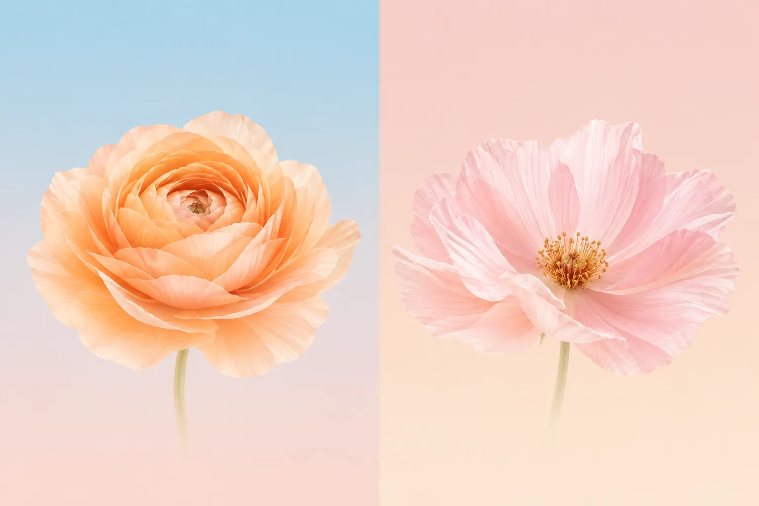
01-flower-cards-diptych
Two pastel flower cards: an apricot ranunculus on pale sky blue and a pale pink poppy on blush
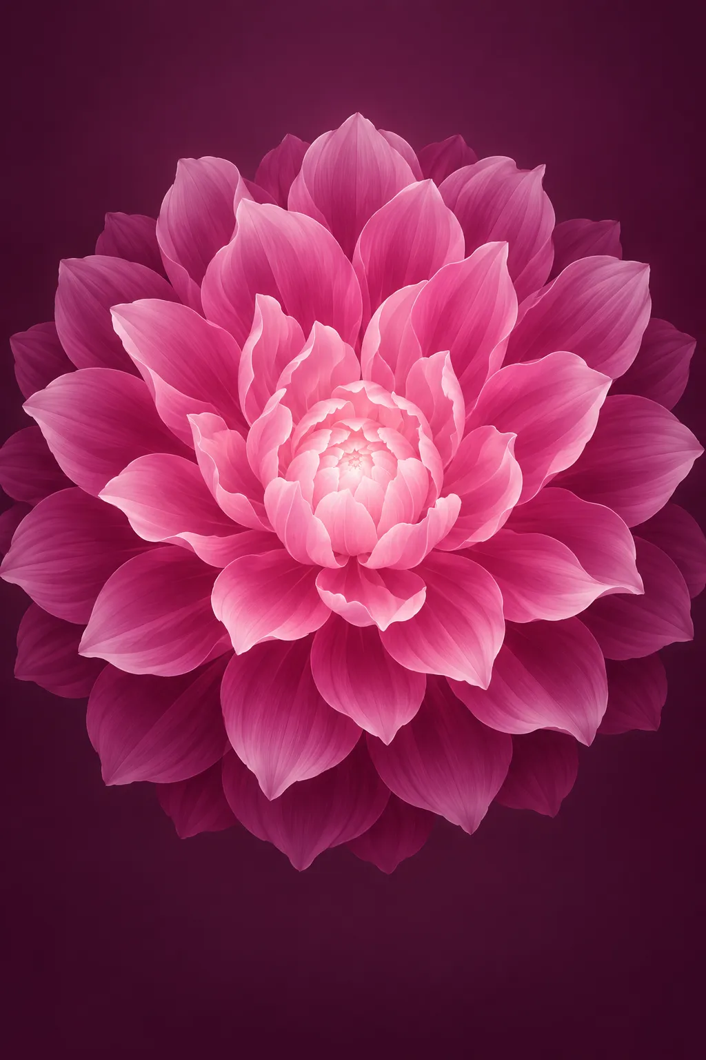
02-before-after-bloom
A glowing magenta bloom on a deep plum background

03-solutions-daisy
A single white daisy on a sky-blue to deep-teal gradient

04-testimonial-portraits-grid
Six smiling customer headshots on plain warm-grey backdrops
Prompts
124,665 chars
# Build prompt: warm cream editorial landing page for an AI image product

A long, quiet landing page for an AI image-generation SaaS. It feels like a stationery catalogue more than a tech site. The page is warm cream paper with deep espresso-brown ink. Headlines are set in a light editorial serif, and all supporting text is in a small neutral grotesk. The only colour comes from soft-focus pastel flower images on rotated, fanned "photo cards", and from one sky-to-teal blue accent that stays inside image-adjacent surfaces. In the middle of the page there is a single dark-brown band for pricing. The page ends on a dark-brown footer card. The source capture shows the page inside a browser window on a mat. Ignore the window and the mat, and build a full-bleed page.

No motion was measured for this reference. Every motion value below is inferred from the stills and marked as such.

## Structure

- Desktop canvas is 1440px wide. The content container is **1200px**, centred, with 120px side gutters.
- The grid is 12 columns with 24px gutters. Most rows use 3 equal columns (384px each) or a 50/50 split (588 / 24 / 588).
- Headers are of two kinds:
  - **Centred heading blocks** for sections 3, 4, 8, 10 and 11.
  - **Split heading rows** for sections 6, 7 and 9: eyebrow and H2 on the left, with a short paragraph pinned top-right, max 320px.

Sections, top to bottom:

1. **Nav.** A 72px bar laid over the hero.
   - Left: a "Menu" text button with a 2-line hamburger icon.
   - Centre: a logo mark plus a one-word wordmark.
   - Right: a dark-brown pill CTA (2–4 words + ↗).
2. **Hero.** A full-bleed panel ~1110px tall.
   - **Card fan.** A shallow arc of 6 portrait flower cards spans almost the full 1440 width.
   - **Prompt card** below the fan, 760px wide. It holds placeholder prompt text (1 line) top-left, 4 small option chips bottom-left (aspect ratio, style, count, quality), and a dark pill "generate" button (2 words + ↗) bottom-right.
   - **Centred serif H1** (5–7 words on 2 lines).
   - **Subtext** (2 lines, ~22 words).
3. **How it works.**
   - Centred heading block: eyebrow pill, H2 of 3 words, 2-line subtext.
   - Three step cards in a row, 384×265px each.
   - Each card has a "STEP 0X" micro-label top-left and a tiny UI mock centred inside it:
     - card 1: a text input with typed placeholder text;
     - card 2: a 3×2 grid of style chips;
     - card 3: a single dark pill button.
   - Under each card, outside it: a serif title (3–4 words) and a 2-line description.
4. **Core features bento.**
   - Centred heading block (H2 of 2 words).
   - A 3-column, 3-row bento:
     - **Row 1, cols 1–2:** "text-to-image" cell. Title and 2-line description top-left. Below them is a wide mock prompt input with chips, plus a floating dark dropdown chip ("choose type") overlapping its top edge.
     - **Col 3, rows 1–2:** tall "high-resolution" cell. Title and description on top. Below them is a 3:4 before/after image with a vertical divider and handle.
     - **Row 2, col 1:** "styles" cell. Title, description, then a row of 4 small style chips with one filled dark.
     - **Row 2, col 2:** "history" cell. Title, description, then a list of 3 faded prompt lines with a small play/cursor icon.
     - **Row 3:** three illustration-first cells, each with its title and 1-line description below the illustration:
       - two outlined image placeholders joined by a "+";
       - a small centred logo-mark badge;
       - a stack of 3 slightly rotated paper sheets.
5. **Statement.**
   - A fan of ~7 portrait cards, centred and 400px wide overall. They are splayed like a hand of playing cards from a bottom pivot. The backs are pale sky blue, and the front card shows a flower.
   - Below the fan: a 3-line centred serif statement (~30 words). It has an inline pill-shaped image chip set into line 2, like a word.
   - Three small dark-brown role tags (1 word each) float at the text's corners, each rotated ±6°.
6. **Solutions.**
   - A 1px hairline runs across the container top.
   - Split heading: eyebrow, then H2 (5–6 words on 2 lines); paragraph top-right.
   - Content row with a 64px top margin:
     - **Left (600px):** a vertical list of 4 audience items. Each has a serif title (2–3 words) and a 1-line description, separated by hairlines. The active item is a filled dark-brown rounded bar with cream text.
     - **Right (540×420px):** an image card. A blue gradient sits behind a single white flower, with a huge serif stat numeral ("500+" pattern) and a 1-line caption at the bottom centre.
7. **Pricing.** A full-bleed dark-brown band.
   - Split heading in cream: H2 of 6–7 words on 2 lines; paragraph top-right.
   - Three plan cards, 370×520px each:
     - left and right cards are cream;
     - the middle (featured) card is a lighter brown with a cream hairline border.
   - Card anatomy, top to bottom:
     1. Small icon, plan name and a 1-line description.
     2. Hairline.
     3. "WHAT'S INCLUDED" micro-label.
     4. 7 feature rows with check icons.
     5. Price row: serif price, "/month" in small text, and a monthly/yearly pill toggle on the paid cards.
     6. Full-width pill CTA.
8. **Testimonials.**
   - Centred heading block: H2 of 5–6 words on 2 lines, plus 1-line subtext.
   - A 3-column masonry of 384px columns, alternating quote cards and portrait photos:
     - col 1: quote, photo, quote;
     - col 2: photo, quote, photo, quote;
     - col 3: quote, photo, quote, photo.
   - Photo heights vary between 1:1 and 4:5, so the columns stagger.
9. **Insights.**
   - **Left column (380px):** eyebrow, H2 (4–5 words on 2 lines), 3-line subtext, and a small dark pill "view all" button.
   - **Right:** two article cards, 360px each with a 24px gap. Each has a 4:3 image, a 2-line serif title and a "Read more →" link.
10. **FAQ.**
    - Centred heading block: H2 of 2–3 words, 1-line subtext.
    - An 800px-wide stack of 5 accordion rows. The second row is open, showing a 2-line answer.
11. **Closing CTA.**
    - Centred H2 (one line, 4–5 words), 1-line subtext and a dark pill button.
    - Below them: an arc of 7 flower cards rising from the bottom edge over a sky-blue wash that bleeds down behind the footer's top edge.
12. **Footer.** A dark-brown rounded card, 1280px wide, inset from the page edges, ~500px tall.
    - Columns:
      - logo and 2-line description, plus a newsletter label, email input and cream "subscribe" pill;
      - two link columns of 5 links each;
      - a "stay in touch" heading with 4 square social buttons.
    - Inside bottom bar: copyright left, legal links right.
    - Below the card on cream: a 48px credits strip of 2 small text runs.

## Scroll map

Heights are inferred, at a 900px viewport.

1. Nav: 72px overlay inside the hero. Consumes 0. Static.
2. Hero: ~1110px / 1.23 vp. Consumes 1110. Entrance.
3. How it works: ~800px / 0.89 vp. Consumes 800. Entrance.
4. Core features: ~1430px / 1.59 vp. Consumes 1430. Entrance.
5. Statement: ~740px / 0.82 vp. Consumes 740, not pinned. Scroll-linked.
6. Solutions: ~1000px / 1.11 vp. Consumes 1000. Entrance.
7. Pricing: ~1030px / 1.14 vp. Consumes 1030. Entrance.
8. Testimonials: ~1460px / 1.62 vp. Consumes 1460. Entrance.
9. Insights: ~740px / 0.82 vp. Consumes 740. Entrance.
10. FAQ: ~820px / 0.91 vp. Consumes 820. Entrance.
11. Closing CTA: ~640px / 0.71 vp. Consumes 640. Entrance.
12. Footer: ~660px / 0.73 vp, including the credits strip. Consumes 660. Static.

**Total page height ≈ 10,430px ≈ 11.6 viewports.** No section pins or stacks.

## Spacing

- **Section rhythm:** 128px top and bottom padding on every cream section. Sections 7 and 8 use 128px inside the dark band. Section 5 uses 96px top and bottom because the card fan supplies its own air.
- **Centred heading block:**
  - eyebrow pill → 20px → H2 → 16px → subtext → 64px → content.
  - Split heading rows use the same eyebrow → H2 gaps. Their paragraph aligns to the eyebrow's top.
- **Hero vertical layout,** from the hero top:
  - card fan top at ~104px, fan height ~340px (outer cards sit lower on the arc);
  - prompt card top at ~490px, height 140px;
  - H1 top at ~690px;
  - subtext at ~865px;
  - ~170px empty cream below.
- **Prompt card:** 20px padding. 12px between the placeholder text and the chip row. Chips have an 8px gap, 28px height and 0 12px padding. The generate button is 40px tall with 0 18px padding.
- **Step cards:** 24px gap and 24px padding. 20px from the card's bottom to its title, and 8px from title to description.
- **Bento:** 24px gaps. Cells have 28px padding, and 20px from description to mock.
- **Solutions list:** items are ~104px pitch with 20px vertical × 24px horizontal padding. 6px from title to description. The list and image are separated by a 56px gap.
- **Pricing cards:** 20px gap and 24px inner padding. Feature rows sit 12px apart. Leave 24px above the price row and 20px from the price row to the CTA. The CTA is 48px tall.
- **Testimonials masonry:** 20px column gap and 20px vertical gap. Quote cards have 24px padding.
- **Insights:** 24px card gap. 16px from image to title, then 12px from title to link.
- **FAQ:** 12px gap between rows. Rows have 20px vertical × 24px horizontal padding and a ~64px closed height. An open answer adds 12px top spacing.
- **Footer card:** 48px padding and 48px column gap. The bottom bar has a 32px top margin and 24px top padding.

## Type

- **Display serif:** a light, moderate-contrast editorial serif with open counters. It is never bold. Use **Newsreader** (Google Fonts, display optical size) at weight 400; **Source Serif 4** (Display) works as an alternative.
- **UI and body sans:** a neutral grotesk. Use **Inter** or **Geist**.
- **Body anchor:** 17px.

| Level | Family | Size | Line-height | Letter-spacing | Weight |
|---|---|---|---|---|---|
| H1 hero | serif | 4.0× = 68px | 1.05 | -0.02em | 400 |
| H2 section | serif | 3.0× = 52px | 1.1 | -0.015em | 400 |
| Statement (s5) | serif | 2.5× = 42px | 1.3 | -0.01em | 400 |
| Stat numeral (s6) | serif | 4.0× = 68px | 1.0 | -0.02em | 400 |
| Price | serif | 2.35× = 40px | 1.0 | -0.01em | 400 |
| Card / feature / list titles | serif | 1.25× = 21px | 1.25 | -0.005em | 400 |
| Body / section subtext | sans | 17px | 1.55 | 0 | 400 |
| Secondary text (card descriptions, quotes, FAQ answers) | sans | 0.94× = 16px | 1.5 | 0 | 400 |
| FAQ question, plan name | sans | 1.0× = 17px | 1.4 | 0 | 500 |
| Nav, buttons, links | sans | 0.82× = 14px | 1.0 | 0.005em | 500 |
| Features list, chips, meta (names, roles) | sans | 0.82× = 14px | 1.45 | 0 | 400; names 500 |
| Eyebrow pill, "STEP 01", "WHAT'S INCLUDED" | sans uppercase | 0.71× = 12px | 1.0 | 0.08em | 500 |

**Measures:**

| Text | Max width | Approx. characters |
|---|---|---|
| H1 | 900px | ~28ch per line |
| Centred H2 | 720px | — |
| Split-row H2 | 560px | — |
| Statement | 1040px | — |
| Subtext | 520px | ~62ch |
| Card descriptions | 320px | — |

All text uses sentence case except the micro-labels.

## Colour

| Hex | Role |
|---|---|
| `#FAF2EA` | Cream paper. Page background on 85% of the surface. Also the light pricing cards and the text colour on dark surfaces. |
| `#2A1509` | Espresso brown. All primary text and every primary button. Also the pricing band background, the footer card, the active Solutions item, the floating role tags and the dark chips. |
| `#DBD4CB` | Warm grey. 1px hairlines and borders, inactive chip fills, toggle tracks. Also the top colour of the hero gradient. |
| `#175B76` | Deep teal. **The single accent.** |
| `#97C5D6` | Pale sky blue. The accent's light partner. |

**Where the accent may appear:**
- the bottom stop of the Solutions stat-card gradient;
- the statement-fan card backs;
- the closing-CTA sky wash;
- the inline image chip in the statement.

It never appears on buttons, links, icons, text or borders.

**Derived tones:**
- Muted text: `#7A6A5D` (brown at ~62% on cream).
- Faint text: `#B8ACA0`, used for unrevealed statement words and placeholder text.
- Raised fill: `#F3EADF`, used for step cards, bento mock surfaces, quote cards and FAQ rows.
- Prompt card fill: `#FFFDF9`.
- Featured pricing card: `#3A2416`.
- Text on dark: cream at 100%, muted cream at 65%, hairlines on dark cream at 15–20%.

**Gradients:**
- Hero panel: a vertical gradient from `#DBD4CB` at the top to `#F3EADF` at the bottom. It ends cleanly onto the `#FAF2EA` page.
- Solutions card: a vertical gradient from `#97C5D6` at the top to `#175B76` at the bottom.
- Closing CTA wash: a radial ellipse of `#97C5D6` at 70% behind the fan, fading to transparent by 60% radius.

## Surface

- **Borders:** 1px `#DBD4CB` on cream surfaces, and 1px cream at 18% on dark ones. Nothing is heavier than 1px.
- **Radii:**

  | Element | Radius |
  |---|---|
  | Buttons, chips, eyebrow pills, toggles, email input, inline image chip | pill (999px) |
  | Prompt card, step cards, bento mocks, pricing cards, quote cards, image cards | 20px |
  | Photo cards in the fans | 16px |
  | Solutions active bar, FAQ rows | 12px |
  | Social buttons | 10px |
  | Footer card | 24px |

- **Eyebrow pill:** 28px tall, `#FFFDF9` fill, 1px hairline, 0 12px padding. A 6px brown dot sits before the label.
- **Shadows:** used only on things that float.
  - Fanned photo cards: `0 18px 40px rgba(42,21,9,0.16)`.
  - Prompt card: `0 12px 32px rgba(42,21,9,0.08)`.
  - Floating dropdown chip and role tags: `0 6px 16px rgba(42,21,9,0.18)`.
  - Every other card is flat and defined by its hairline or its fill alone.

## Imagery

All imagery shares one look: soft-focus macro photographs of single flowers (ranunculus, poppy, cosmos, peony, daisy) on pastel gradient grounds of sky blue, blush, butter and peach. The light is diffuse with shallow depth of field, and nothing in the frame is saturated beyond the petals. They should read as "AI-generated art samples".

- **Hero fan (s2):** 6 cards, 3:4, ~210×280px.
  - Arrange them in a shallow arc across the full width. Rotations run −14°, −8°, −3°, +3°, +8°, +14°. The outer cards sit ~60px lower than the centre pair.
  - Subjects alternate peach, orange, yellow and pale pink flowers on blue or blush grounds.
- **Before/after (s4):** one 3:4 image, ~380×520px. A magenta-pink flower on a deep plum ground.
  - The left half is pixelated or blurred and the right half is crisp.
  - A 2px cream vertical divider has a 32px round cream handle at mid-height.
  - Small pill labels "Before" and "After" sit on either side, 16px from the bottom.
- **Statement fan (s5):** ~7 cards, 3:4, ~150×200px, splayed through ~70° from a bottom-centre pivot.
  - Back cards are flat `#97C5D6` with a faint inner border.
  - The front card shows a peach-white flower on a pale blue ground.
- **Inline chip (s5):** a 72×40 pill image (pastel flower crop) set on the text baseline like a word.
- **Solutions card (s6):** 540×420px. One white daisy or cosmos, centred, on the blue gradient. The stat numeral and caption sit in cream, centred, 32px from the bottom.
- **Testimonial portraits (s8):** 5–6 headshots of smiling adults in warm natural light on plain beige or stone backgrounds, chest-up. Aspects vary between 1:1 and 4:5, at 20px radius.
- **Insights cards (s9):** two 4:3 images, 360×270px: a pink flower on blush, and a pale flower on misty white-blue.
- **Closing fan (s11):** 7 cards, 3:4, ~190×250px, from the same set as the hero. They form an arc whose centre card rises highest, and the bottom edges tuck to within 0–16px of the footer card's top.
- **Icons:** 1.5px-stroke line icons in brown, 16–20px. The check icons in pricing sit in 18px circles.

## Motion

None of this was measured. The kinds are inferred from the stills, and every value is a range.

**1. Nav**
- kind: static (inferred). Whether it is sticky was not measured; build it non-sticky.
- what moves: nothing.
- from → to: —
- range: —
- reduced motion: same.

**2. Hero**
- kind: entrance (inferred).
- what moves: the fan cards, then the prompt card, H1 and subtext.
- from → to:
  - Cards start stacked at the centre: rotate 0, translateX toward 0, opacity 0. They end at their arc positions and rotations at opacity 1.
  - Text and prompt card: translateY 24px → 0, opacity 0 → 1.
- range:
  - Plays once on page load.
  - Duration not measured; use 700–1000ms for the fan and 500–700ms for the text.
  - Use a soft ease-out with no overshoot.
  - Fan cards stagger 50–80ms from the centre outward. The text follows 150–250ms after the fan starts.
- reduced motion: everything renders in its final position, with no movement.

**3. How it works**
- kind: entrance (inferred).
- what moves: the heading block, then the three step cards.
- from → to: translateY 24px → 0, opacity 0 → 1.
- range:
  - Plays once, when each element's top reaches 85% of the viewport.
  - Duration not measured, 500–700ms, ease-out.
  - Cards stagger 80–120ms left to right.
- reduced motion: shown at rest, opacity 1.

**4. Core features**
- kind: entrance (inferred).
- what moves: the heading block, then the bento cells.
- from → to: translateY 24px → 0, opacity 0 → 1.
- range:
  - Plays once per cell at 85% of the viewport.
  - Duration not measured, 500–700ms, ease-out.
  - Stagger 60–100ms in reading order.
- reduced motion: shown at rest. The before/after divider stays fixed at 50%.

**5. Statement**
- kind: scroll-linked (inferred from the half-grey text in the still).
- what moves:
  - statement words;
  - fan cards;
  - floating role tags.
- from → to:
  - Each word goes from colour `#B8ACA0` to `#2A1509`, in sequence. In the still, roughly the first 60% is filled.
  - Fan cards go from closed (all rotate 0, overlapped) to splayed (the full ~70° spread).
  - Role tags go from opacity 0 and scale 0.9 to opacity 1 and scale 1, each one as the words near it fill.
- range:
  - Starts when the section top enters the viewport bottom.
  - Ends when the statement's last line reaches ~40% of the viewport.
  - Fully reverses when scrolling back up. Not pinned.
- reduced motion: all words render in `#2A1509`, the fan stays splayed and the tags stay visible.

**6. Solutions**
- kind: entrance (inferred).
- what moves: the heading row, then the list items and the image card.
- from → to:
  - List items: translateY 20px → 0, opacity 0 → 1.
  - Image card: scale 0.97 → 1 and opacity 0 → 1.
- range:
  - Plays once at 85% of the viewport.
  - Duration not measured, 500–800ms, ease-out.
  - List stagger 60–100ms.
- reduced motion: shown at rest.

**7. Pricing**
- kind: entrance (inferred).
- what moves: the heading row, then the three cards.
- from → to: translateY 32px → 0, opacity 0 → 1.
- range:
  - Plays once at 85% of the viewport.
  - Duration not measured, 600–800ms, ease-out.
  - Stagger 80–120ms left to right.
- reduced motion: shown at rest.

**8. Testimonials**
- kind: entrance (inferred).
- what moves: the heading block, then each masonry tile.
- from → to: translateY 24px → 0, opacity 0 → 1.
- range:
  - Plays once per tile at 90% of the viewport.
  - Duration not measured, 500–700ms, ease-out.
  - Tiles that enter together stagger 60–100ms by column.
- reduced motion: shown at rest.

**9. Insights**
- kind: entrance (inferred).
- what moves: the left text column, then the two cards.
- from → to: translateY 24px → 0, opacity 0 → 1.
- range:
  - Plays once at 85% of the viewport.
  - Duration not measured, 500–700ms.
  - Stagger 100ms.
- reduced motion: shown at rest.

**10. FAQ**
- kind: entrance (inferred).
- what moves: the heading block, then the accordion rows.
- from → to: translateY 16px → 0, opacity 0 → 1.
- range:
  - Plays once at 85% of the viewport.
  - Duration not measured, 400–600ms.
  - Rows stagger 50–80ms.
- reduced motion: shown at rest.

**11. Closing CTA**
- kind: entrance (inferred).
- what moves: the heading group, then the card arc.
- from → to:
  - Heading group: translateY 20px → 0, opacity 0 → 1.
  - Card arc: translateY 80px → 0 and opacity 0 → 1, with rotations already applied.
- range:
  - Plays once when the section top reaches 75% of the viewport.
  - Duration not measured, 700–1000ms, ease-out.
  - Cards stagger 50–80ms from the centre outward.
- reduced motion: shown at rest.

**12. Footer**
- kind: static.
- what moves: nothing.
- from → to: —
- range: —
- reduced motion: same.

**Interaction transitions** (separate from the scroll choreography; durations not measured, 150–300ms ranges):
- **Buttons:**
  - Dark pills lighten to `#3A2416` on hover, and the ↗ arrow nudges 2px up and to the right.
  - On press: scale 0.98.
- **Chips:** hover fill goes `#DBD4CB` → slightly darker. Selected chips are `#2A1509` with cream text.
- **Solutions list:**
  - Hovering or clicking an item moves the dark active bar to it; the text colour inverts.
  - The right image card crossfades to that audience's image over 300–400ms.
- **FAQ:**
  - Opening a row animates its height open over 250–350ms ease-out. The plus icon rotates 45° to become an ×, or swaps to a minus.
  - Only one row is open at a time.
- **Before/after:** the divider is draggable on pointer and moves with no easing.
- **Pricing toggle:** the knob slides across the track over 200ms, and prices crossfade.
- **Image cards (s8 and s9):** on hover the image scales 1 → 1.03 inside its rounded mask over 400ms.
- **Fan cards (s2 and s11):** on hover a card lifts translateY −8px and its rotation eases toward 0.

## Responsive (<640px)

- **Layout:** container padding is 20px. Sections use 80px top and bottom padding.
- **Type:** H1 → 40px, H2 → 34px, statement → 26px. Body stays at 17px.
- **Hero:**
  - The fan shows 4 cards at 120×160px, with rotations reduced to ±10°.
  - The prompt card goes full width, its chips wrap to 2 rows and the generate button goes full width.
- **Steps (s3):** stack into one column.
- **Bento (s4):**
  - Becomes one column in reading order.
  - The before/after image becomes 4:5 at full width.
  - The floating dropdown chip is dropped.
- **Statement (s5):**
  - The fan shrinks to 260px wide.
  - The floating role tags are hidden.
  - The inline image chip shrinks to 48×28px.
- **Split heading rows (s6, s7, s9):** stack, with the paragraph below the H2.
- **Solutions (s6):** the list sits above the image card, which becomes full width at 4:3.
- **Pricing (s7):** the cards stack in source order with the featured card second.
- **Testimonials (s8):** become a single column of alternating quote and photo. Drop 2 of the photos.
- **Insights (s9):** the cards stack.
- **FAQ (s10):** full width.
- **Closing CTA (s11):** the arc keeps 5 cards.
- **Footer (s12):**
  - The card loses its inset: 12px side margins, 20px radius, 28px padding.
  - Columns stack: brand and newsletter, then the two link columns side by side, then the socials.
  - The bottom bar stacks.

## Don'ts

- **No sans-serif headlines and no bold serif.** Every H1, H2, statement, card title, price and stat is set in the serif at 400. If a headline looks heavy, the design is broken.
- **Keep the page cream and the text brown.** No pure white `#FFF` page, and no pure black text or buttons. The only near-white is the prompt card's `#FFFDF9`.
- **Keep the accent off controls.** Buttons, links, toggles and active states are all espresso brown. Blue lives only in and around imagery.
- **No purple-to-blue "AI" gradients.** Also no glowing orbs, glassmorphism, neon borders, sparkle emoji or dark-mode hero. Pricing is the only dark band and the footer the only dark card.
- **No icon-in-a-coloured-circle feature grid.** Features are shown with tiny UI mocks and line illustrations on quiet fills.
- **Pricing stays restrained.** Don't scale up the featured card, don't add a coloured "Most popular" ribbon, and don't give cards drop shadows. The featured card differs only by its lighter-brown fill and cream hairline.
- **Don't centre everything.** Sections 6, 7 and 9 are left-aligned split layouts. The centred blocks are only 3, 4, 8, 10 and 11.
- **No stock imagery of people at laptops, abstract 3D blobs or AI-robot art.** Every generated image is a pastel flower macro; people appear only in testimonials.
- **Keep the fan cards rotated.** Don't straighten them into a neat grid; the tilt and arc are the signature.
- **Statement fill must be scroll-linked.** Don't make it a one-shot fade or typewriter effect; it must scrub with scroll and reverse.
- **Keep the spacing roomy.** Don't shrink the 128px section spacing or the 64px heading-to-content gap.
- **Don't use radii below 12px on cards or over 24px on anything except pills.** No 1px-radius sharp boxes and no bubbly 32px+ cards.
- **Avoid heavy dividers, double borders and 2px outlines.** Hairlines are always 1px warm grey.
Versions
1Each rebuild is kept. The live one is what the comparison shows. LiveOpus 5.5Extra highfrontend-designemil-design-engtransitions-devgsaphumanizerlast week · 1328s · 4 images · 20261011T215630ZOpen