Keytail — AI SEO landing hero
Rebuild
Opus 5.5Highfrontend-designemil-design-engtransitions-devgsaphumanizerView
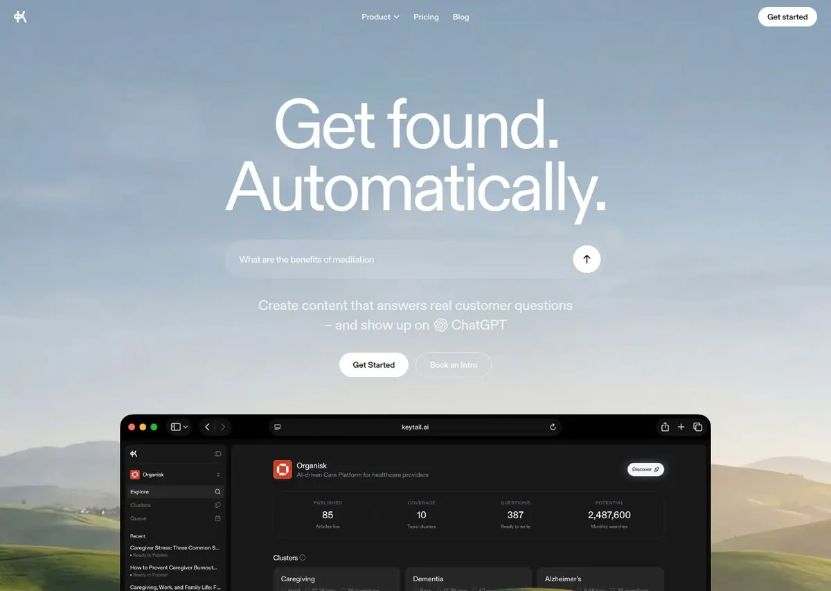
RebuildReference
Move across the image to wipe between the two. Click to lock the seam; arrow keys nudge it.
Imagery
1/1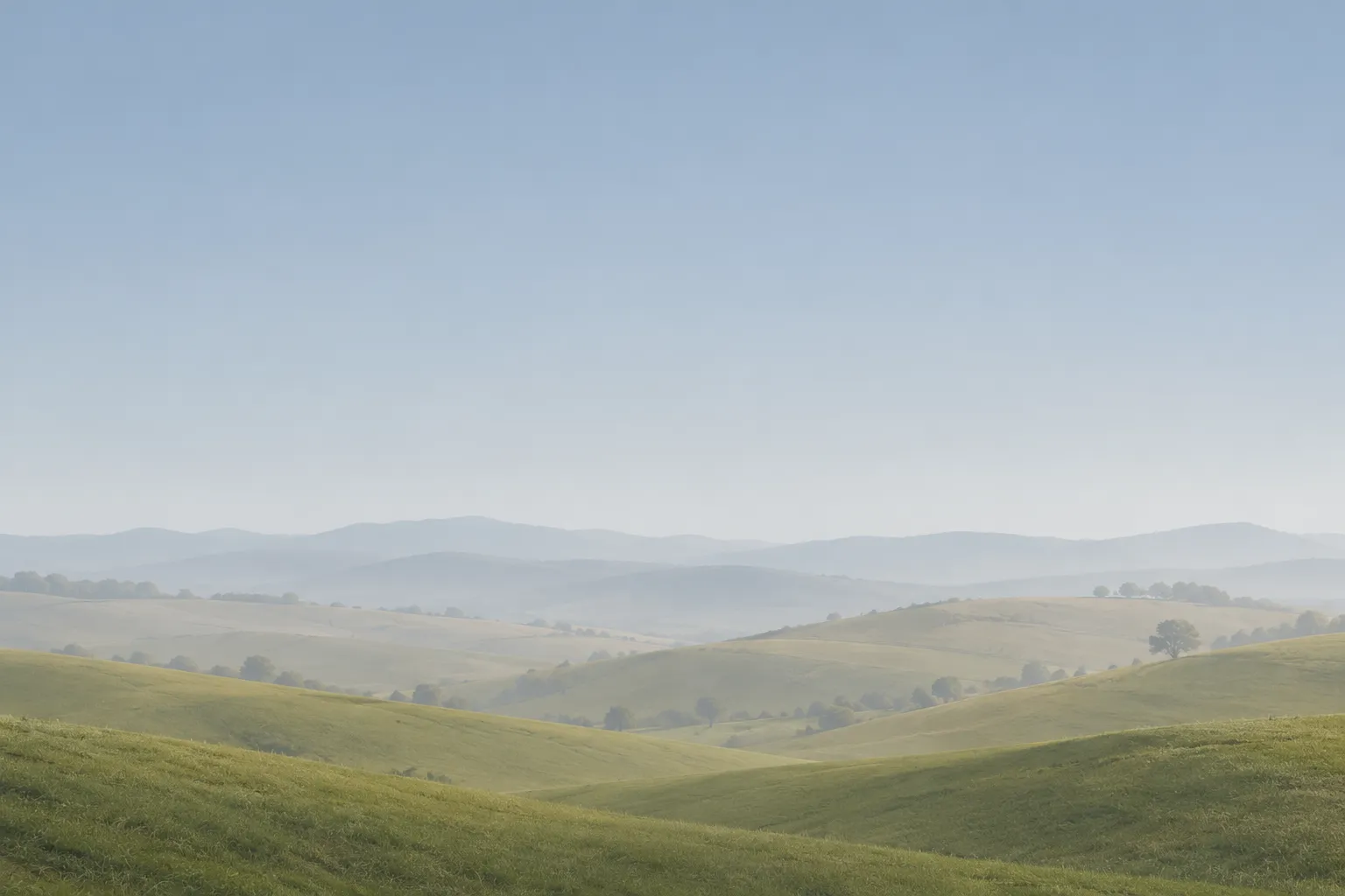
01-hazy-pastoral-backdrop
Soft, misty blue-grey sky above low rolling green hills fading into hazy distant ranges
Prompts
114,776 chars
# Full-bleed landscape hero with an AI prompt bar and a dark app window

Build a calm, minimal landing hero. A soft, hazy landscape photograph covers the whole page. A very large, light white grotesk headline sits centred on the pale sky. Below it come a frosted, pill-shaped prompt input, a two-line subhead and two pill buttons. A dark macOS-style browser window showing an analytics dashboard rises from the lower hills. All copy is white, and the only solid fills are a few white pills. The design depends on restraint: one photograph, one type family, white on sky, and a single dark object.

Viewport for every number below: 1440 × 900 CSS px. The reference capture shows the top 1024 CSS px of the page.

## Structure

- **Layout:** full bleed. The background photograph spans 100vw, edge to edge, with no container frame.
- **Content column:** centred. The hero text block is at most 680px wide, and the product window is 1024px wide. Both are centred on the page axis. Nothing in the hero is left-aligned except the logo.
- **Column structure:** a single centred column. Only the nav uses a three-part row (left, centre, right).

Sections, top to bottom:

1. **Nav bar.**
   - Overlays the photo, with no background of its own.
   - Left: a small monochrome logo glyph.
   - Centre: three links. The first is a dropdown with a small chevron.
   - Right: one white pill button.
2. **Hero.** Top to bottom:
   - A 2-line display headline. Line 1 is 2 words ending in a period; line 2 is 1 long word ending in a period.
   - A frosted prompt input with placeholder text (a natural-language question of 4–6 words) and a white circular submit button holding an up-arrow.
   - A subhead of 2 centred lines, about 14 words in total. Its second line ends with a small inline monochrome AI-assistant icon followed by the assistant's name.
   - Two pill buttons side by side: a solid white primary and a ghost secondary.
3. **Product shot.** A dark browser window, 1024px wide, centred. It shows a dashboard app:
   - left sidebar
   - workspace header
   - 4-up stats strip
   - a row of 3 "cluster" cards

   The window sits on the landscape, so the hills show on both sides of it. The bottom of the window may run off the first viewport.
4. **Closing CTA band (inferred; not in the capture).**
   - A short centred band on the same photo or on #D6D9D9.
   - Headline of 4–6 words at the H2 size.
   - The same two-pill button pair as section 2.
   - A thin footer line of meta links.

   Keep it as sparse as the hero. If you are unsure, end the page after section 3 with 120px of photo below the window.

## Scroll map

There was no motion report, so every value here is inferred from the still.

| # | Section | Height | Scroll consumed | Kind |
|---|---------|--------|-----------------|------|
| 1 | Nav bar | 72px (0.08 vp) | 0, overlays section 2 | static (inferred) |
| 2 | Hero, from page top to the top of the window | ≈ 720px (0.8 vp) | 720px | entrance (inferred) |
| 3 | Product shot: window ≈ 640px tall plus 120px of photo below it | ≈ 760px (0.84 vp) | 760px | entrance (inferred) |
| 4 | Closing CTA band plus footer line | ≈ 420px (0.47 vp) | 420px | static or entrance (inferred) |

Total page height is about 1900px (2.1 viewports), inferred. Nothing pins or stacks.

## Spacing

All values are CSS px at 1440 wide.

**Nav (section 1):**
- Logo inset 24px from the left edge. CTA pill inset 24px from the right edge.
- Vertical centre of the nav row is about 29px from the top.
- Centre links are about 30px apart.

**Hero (section 2), measured top to bottom:**

| From → to | Distance |
|-----------|----------|
| Page top → headline cap-top | ≈ 170px |
| Headline (2 lines) → prompt input | ≈ 48px |
| Prompt input (65px tall) → subhead | ≈ 36px |
| Subhead → button pair | ≈ 36px |
| Button pair → top of product window | ≈ 64px |

- Gap between the two buttons: 12px.

**Product window (section 3):**
- Window top at about y = 718px.
- Inside the window:
  - title bar: 44px tall
  - sidebar: 186px wide
  - main pane: inset 6px from the sidebar and from the window edge, with a rounded corner of its own
  - main pane content padding: ≈ 72px left and right, 32px top
- Stats strip: 18px inner padding.
- Gaps:
  - between the stats strip and the "Clusters" heading: 28px
  - between the cluster cards: 8px

**Rhythm:** the hero is spaced generously and evenly, at roughly 36–48px between blocks. There are no dividers between sections, and the photograph is the continuity. Between section 3 and section 4, leave at least 120px.

## Type

**Family:** a neo-grotesk or neutral grotesk with tight, even proportions and a single-storey feel at display sizes. Use **Inter Tight** (free) as the stand-in. **Geist** is an acceptable alternative. Use one family throughout, including inside the dashboard.

The body anchor is 17px.

| Level | Ratio to body | Size | Line-height | Letter-spacing | Weight | Notes |
|-------|---------------|------|-------------|----------------|--------|-------|
| Display headline (section 2) | 7.0× | 120px | 0.9 | −0.045em | 400 | White. 2 lines. Widest line ≈ 660px, about 12–14 characters per line. |
| H2, closing band (section 4) | 3.3× | 56px | 1.0 | −0.035em | 400 | Inferred |
| Subhead | 1.35× | 23px | 1.45 | −0.01em | 400 | White at 72% opacity. Max 560px wide, ≈ 48 characters per line. Centred. |
| Body / input placeholder | 1.0× | 17px | 1.5 | 0 | 400 | Placeholder is white at 80% |
| Nav links, button labels | 0.88× | 15px | 1.0 | 0 | 500 | |
| Dashboard large numbers | 1.1× | 19px | 1.2 | −0.01em | 500 | |
| Dashboard body / list titles | 0.8× | 14px | 1.3 | 0 | 400–500 | Scaled UI. Inside the product shot only. |
| Dashboard micro-labels (stats labels, status lines) | 0.7× | 12px | 1.2 | +0.08em | 500 | Uppercase |

The dashboard text sizes are a scaled screenshot of the real app. They are the only text allowed below 14px on the page, and even there never below 12px.

## Colour

| Hex | Role |
|-----|------|
| `#A6B7C7` | Sky blue-grey. The dominant surface, covering the upper 60% of the photograph behind the nav and headline. |
| `#D6D9D9` | Horizon haze. The lightest band of the photo, around the input and subhead. Also the fallback page colour. |
| `#656B37` | Olive hill green. Lower photo only. |
| `#A79C67` | Dry-grass khaki. Lower photo only, in the far hills. |
| `#181818` | Near-black. The product window chrome and dashboard base, and the text colour on white pills. |
| `#FFFFFF` | Every piece of hero text, plus the fill of the primary pills and the submit circle. |

**Dashboard internal tones (derived from `#181818`):**

| Hex | Use |
|-----|-----|
| `#1F1F1F` | Main pane |
| `#222222` | Cards |
| `#2C2C2C` | Active sidebar row, borders |
| `#8A8A8A` | Secondary text |
| `#EDEDED` | Primary text |

**Accent:** solid white is the single accent. It appears only on:
- the nav CTA pill
- the hero primary pill
- the submit circle
- the in-app "Discover" pill

Inside the dashboard, one small saturated tile is allowed as a workspace avatar: a brand red around `#D9452B`, about 34px. One 6px yellow status dot (`#E5C14A`) is allowed next to list items. Saturated colour appears nowhere else.

## Surface

**Prompt input:**
- Fully rounded pill, 658 × 65px.
- Fill: `rgba(255,255,255,0.22)` with `backdrop-filter: blur(16px)`.
- Border: none, or 1px `rgba(255,255,255,0.25)`.
- No shadow.
- Submit button: a 48px white circle inset 8px from the right, with an 18px `#181818` up-arrow stroked at 1.75px.

**Buttons:**
- Height 42px, horizontal padding 22px, radius 999px.
- Primary: white fill, `#181818` text.
- Ghost: transparent, 1px `rgba(255,255,255,0.4)` border, text white at 70%.
- Nav CTA: 36px tall, same style as the primary.

**Product window:**
- Outer radius 22px, fill `#181818`, 1px border `rgba(255,255,255,0.08)`.
- Shadow: one soft, large shadow only, `0 30px 80px rgba(0,0,0,0.25)`.
- Title bar contents:
  - three 12px traffic-light dots: `#FF5F57`, `#FEBC2E`, `#28C840`
  - a sidebar-toggle icon group
  - a back/forward capsule
  - a centred URL capsule, ≈ 420 × 30px, radius 10px, fill `#262626`, with a domain placeholder and a reload icon
  - three icons on the right
- Main pane radius: 14px.

**Dashboard internals:**
- Cards and stats strip: radius 12px, 1px border `#2C2C2C`.
- The four stats columns are separated by 1px vertical rules.
- No shadows inside the dashboard.

**Elsewhere:** no other borders, cards or shadows on the page.

## Imagery

1. **Background photograph (sections 1–3, full bleed).** A soft, overcast pastoral landscape.
   - The top two-thirds is an even, misty blue-grey sky with no hard clouds.
   - The bottom third is low rolling green hills fading into hazy blue-khaki ranges behind them.
   - Treatment: low contrast, slightly desaturated, airy, like early morning. Keep it cover-fit and anchored at the bottom so the hills meet the lower half of the product window.
   - Optional: a white overlay at 0–10% to keep the headline legible.
   - Aspect: about 16:11 at the hero, and it must reach at least 1400px tall.
2. **Product window (section 3).** A 1024 × ≈ 640px dark UI built in HTML/CSS, not a bitmap. Its contents:
   - **Sidebar:**
     - logo glyph and collapse icon
     - workspace switcher with a red tile and an up/down caret
     - three nav rows with right-aligned icons; the first row is active
     - a "Recent" label
     - 3–4 two-line items, each a truncated title plus a yellow-dot status line
   - **Main pane:**
     - header: avatar tile, name, and a one-line grey descriptor, with a white "Discover" pill on the right
     - stats strip: 4 columns, each a micro-label, a number and a caption
     - section label with an info icon
     - 3 cluster cards, each with a title and a meta row of 3 small icon+number pairs

   The window's lower edge may be cropped by the viewport. That is intended.

## Motion

No motion report was available, so everything here is inferred and every duration is a range.

**Section 1: Nav bar**
- **kind:** static (inferred)
- **what moves:** nothing. The nav stays absolute at the top and scrolls away with the page. Do not make it sticky with a background.
- **from → to:** none
- **range:** none
- **reduced motion:** identical

**Section 2: Hero**
- **kind:** entrance (inferred)
- **what moves:** the headline lines, then the prompt input, the subhead and the button pair
- **from → to:** opacity 0 → 1, translateY 16px → 0
- **range:** plays once on page load.
  - duration: not measured, use 600–900ms
  - easing: ease-out (cubic-bezier(0.22, 1, 0.36, 1))
  - stagger: 60–100ms per block
- **reduced motion:** everything is visible immediately, no translate

**Section 3: Product shot**
- **kind:** entrance (inferred)
- **what moves:** the browser window as one unit
- **from → to:** opacity 0 → 1, translateY 40px → 0, scale 0.98 → 1
- **range:** once, when the window's top reaches 85% of the viewport. On load it is already in view, so it plays after the hero stagger.
  - duration: not measured, use 800–1100ms
  - easing: the same ease-out
- **reduced motion:** visible immediately, no transform

**Section 4: Closing CTA band (inferred)**
- **kind:** static, or a single entrance (inferred)
- **what moves:** the headline and the button pair
- **from → to:** opacity 0 → 1, translateY 12px → 0
- **range:** once, when the band's top reaches 80% of the viewport
  - duration: not measured, use 500–700ms
  - stagger: 80ms
- **reduced motion:** visible immediately

**Interaction transitions** (not scroll choreography):

| Element | State | Change |
|---------|-------|--------|
| Primary pill | hover | background → `#EDEDED` |
| Primary pill | press | scale 0.98 |
| Ghost pill | hover | border → white at 70%, text → white at 100% |
| All pill transitions | — | 150–200ms ease |
| Submit circle | hover | arrow translateY −2px |
| Submit circle | press | scale 0.95 |
| Prompt input | focus | fill → `rgba(255,255,255,0.3)` plus a 1px white-50% ring. No glow. |
| Nav links | hover | opacity 0.85 → 1 |
| Dropdown | open | panel fades in with translateY 4px → 0, 160ms; closes in reverse |
| Dashboard rows | hover | background → `#2C2C2C`, 120ms |

## Responsive

Below 640px:

**Nav:**
- The centre links collapse into a 40px menu icon on the right, next to the CTA pill.
- Logo inset becomes 16px.

**Headline:**
- 52px, line-height 0.95, letter-spacing −0.04em.
- Allow the long second-line word to sit on its own line. The column is the full width minus 20px on each side.

**Prompt input, subhead and buttons:**
- Input: 100% width, 56px tall, with a 40px submit circle.
- Subhead: 18px, line-height 1.45.
- Buttons stay side by side if both fit. Otherwise stack them at full width with a 10px gap.

**Product window:**
- 100% width minus 16px gutters, radius 14px.
- Drop the dashboard sidebar.
- Stats become a 2 × 2 grid. Show only 1 cluster card at full width.
- Reduce the title bar to the traffic-light dots plus the URL capsule.

**Photo and spacing:**
- The photo stays cover-fit and anchored at the bottom.
- Section spacing shrinks by about 40%.

## Don'ts

**Headline:**
- No bold or black weights, and no gradient text. It is regular weight, white and very large. Its impact comes from scale and tight tracking, not weight.
- No eyebrow badge, "New" pill or announcement chip above the headline.

**Colour and surfaces:**
- Do not add a brand colour to the CTAs. No purple, blue or "AI gradient". White pills on a misty sky is the whole idea.
- No glassmorphism cards anywhere except the single prompt input. No glow, no neon border, no animated gradient ring around the input.
- Do not darken the photo with a heavy overlay or vignette. It must stay pale and airy, with white text reading against the haze.
- No grid lines, dot patterns, noise, blobs or particle backgrounds over the photo.

**Product window:**
- Do not tilt it in 3D, float it at an angle or put a coloured glow behind it. It sits flat, centred and square to the page, overlapping the hills.
- Do not use a light-theme dashboard, and do not put colourful charts in it. The UI is near-black, grey and white, with one red tile and one yellow dot.
- Do not drop it into a device frame (laptop or phone bezel). It is a bare browser window.

**Layout and motion:**
- Do not add logo clouds, testimonials, feature grids or stats counters to the hero. It is headline, input, subhead, buttons, window, and nothing else.
- No scroll-jacking, pinning, parallax-zoom on the headline or typewriter effects on the placeholder. Motion is a short, quiet fade-up and nothing more.
- Do not left-align the hero or split it into two columns. Every element is centred on one axis.

**Type:**
- Do not use a second typeface (no serif accent word, no mono labels) or any emoji.
Versions
1Each rebuild is kept. The live one is what the comparison shows. LiveOpus 5.5Highfrontend-designemil-design-engtransitions-devgsaphumanizerlast week · 347s · 1 image · 20261011T213340ZOpen