Le Friance — Furniture Ecommerce Homepage
Landing pagedribbble.com/shots/27730593-Premium-Furniture-E-commerce-Website-Design-Le-Friance18 Sep 2026, 17:40
Rebuild
Opus 5.5Extra highfrontend-designemil-design-engtransitions-devhumanizergsapView
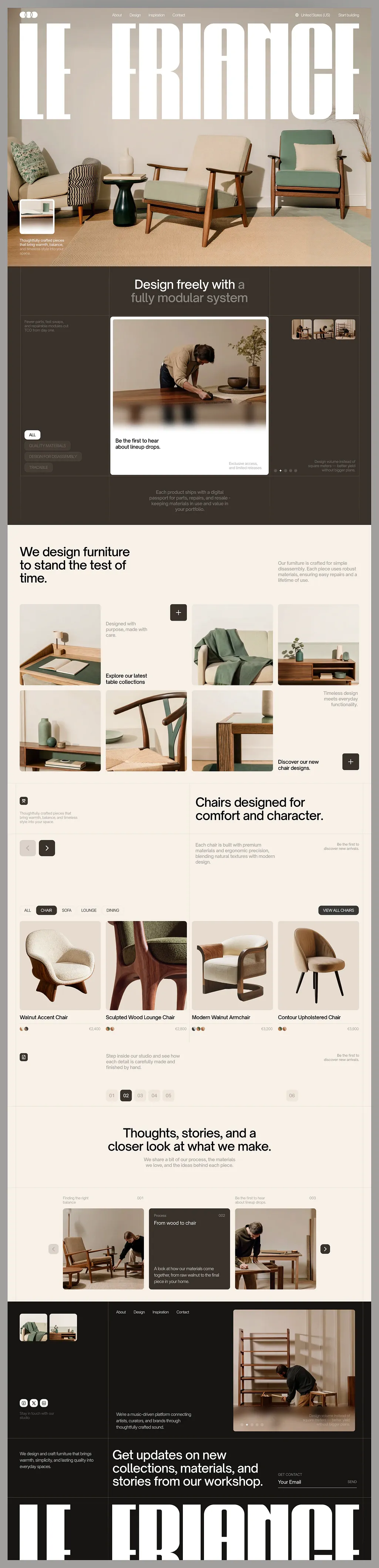
RebuildReference
Move across the image to wipe between the two. Click to lock the seam; arrow keys nudge it.
Imagery
4/4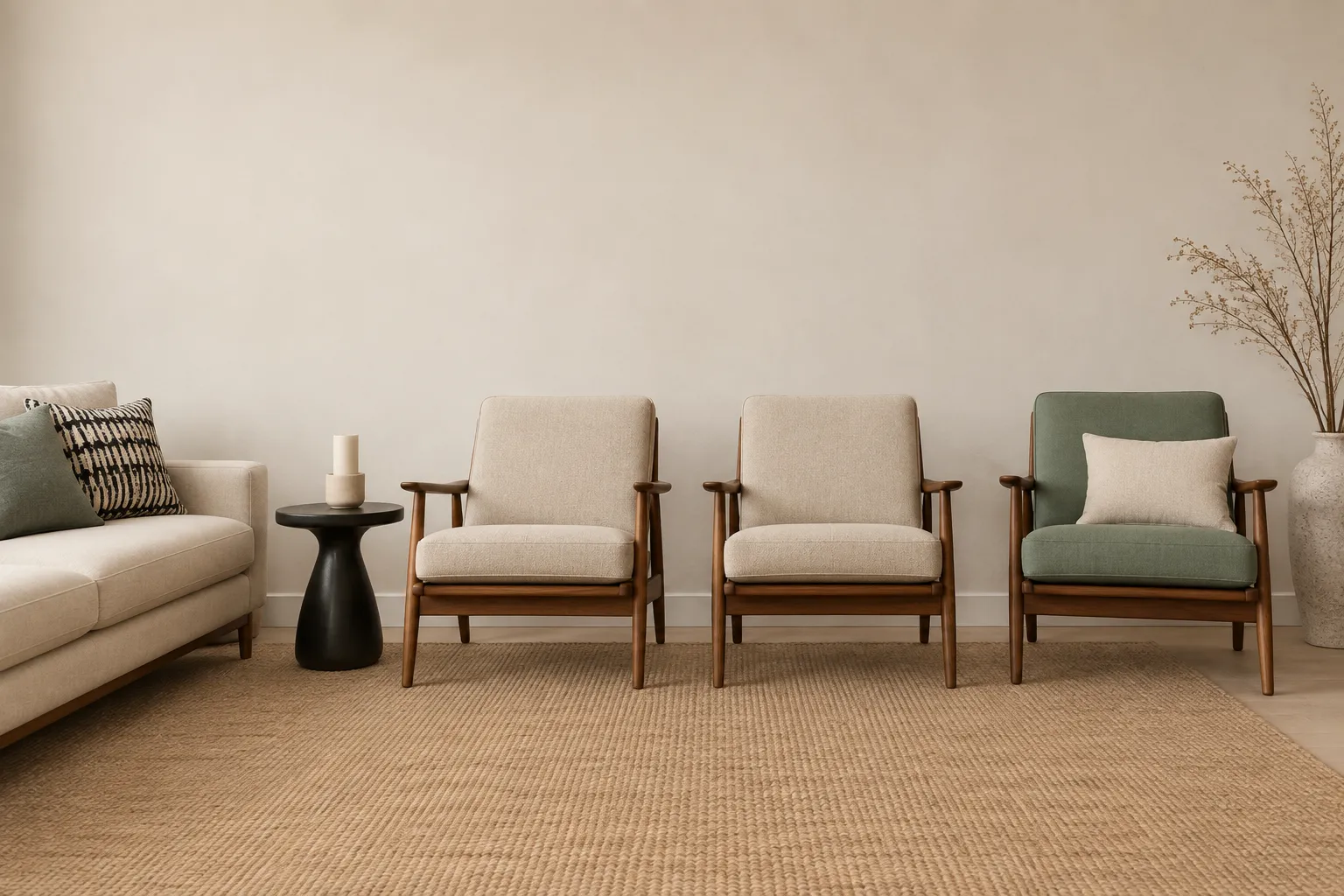
01-01-hero-interior
Warm daylit living room with two mid-century lounge chairs, a sage armchair and a woven rug on pale flooring
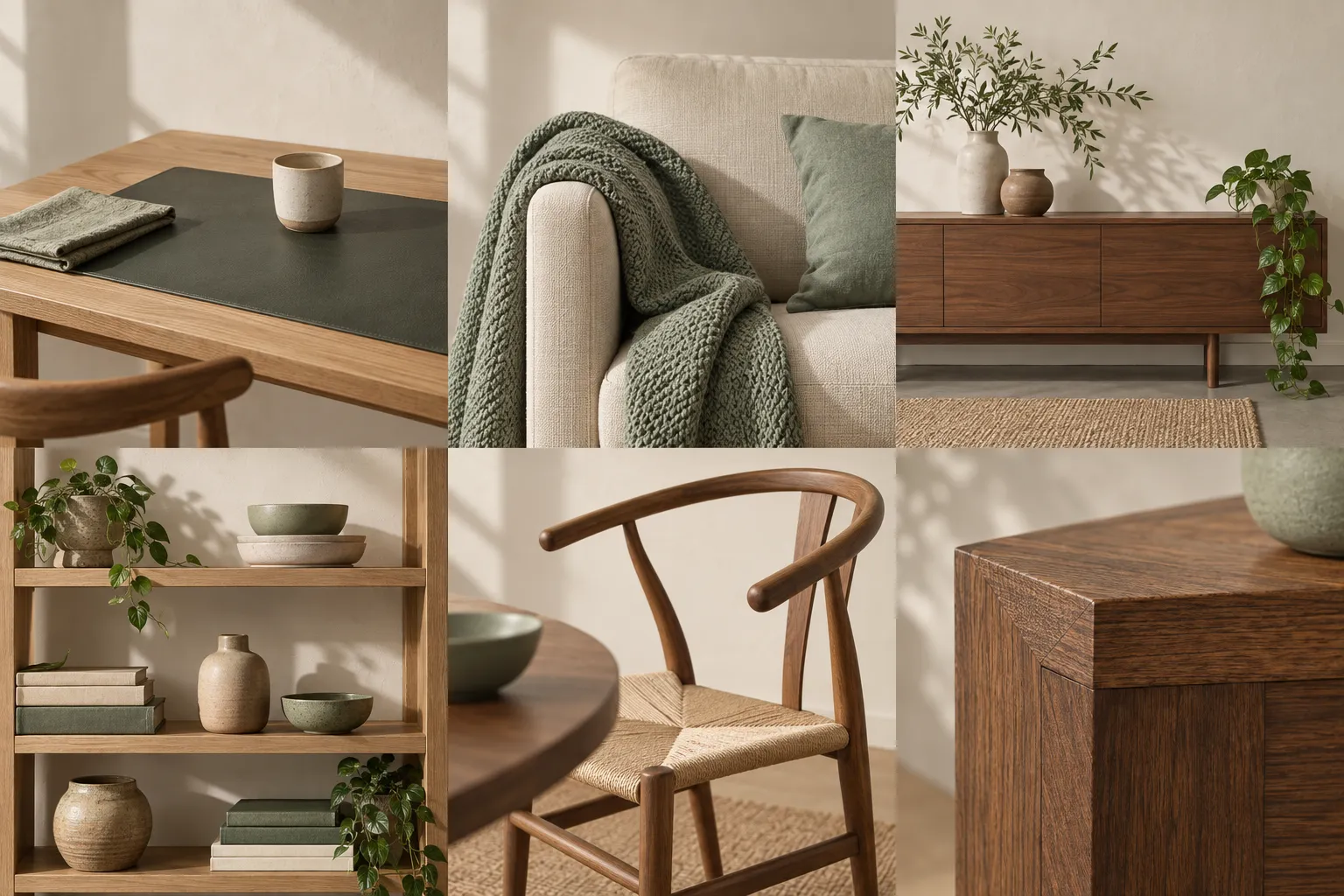
02-02-bento-interiors-sheet
Six warm interior detail photographs of a desk, a sage throw on a sofa arm, a sideboard, open shelving, a wishbone chair and a timber joint
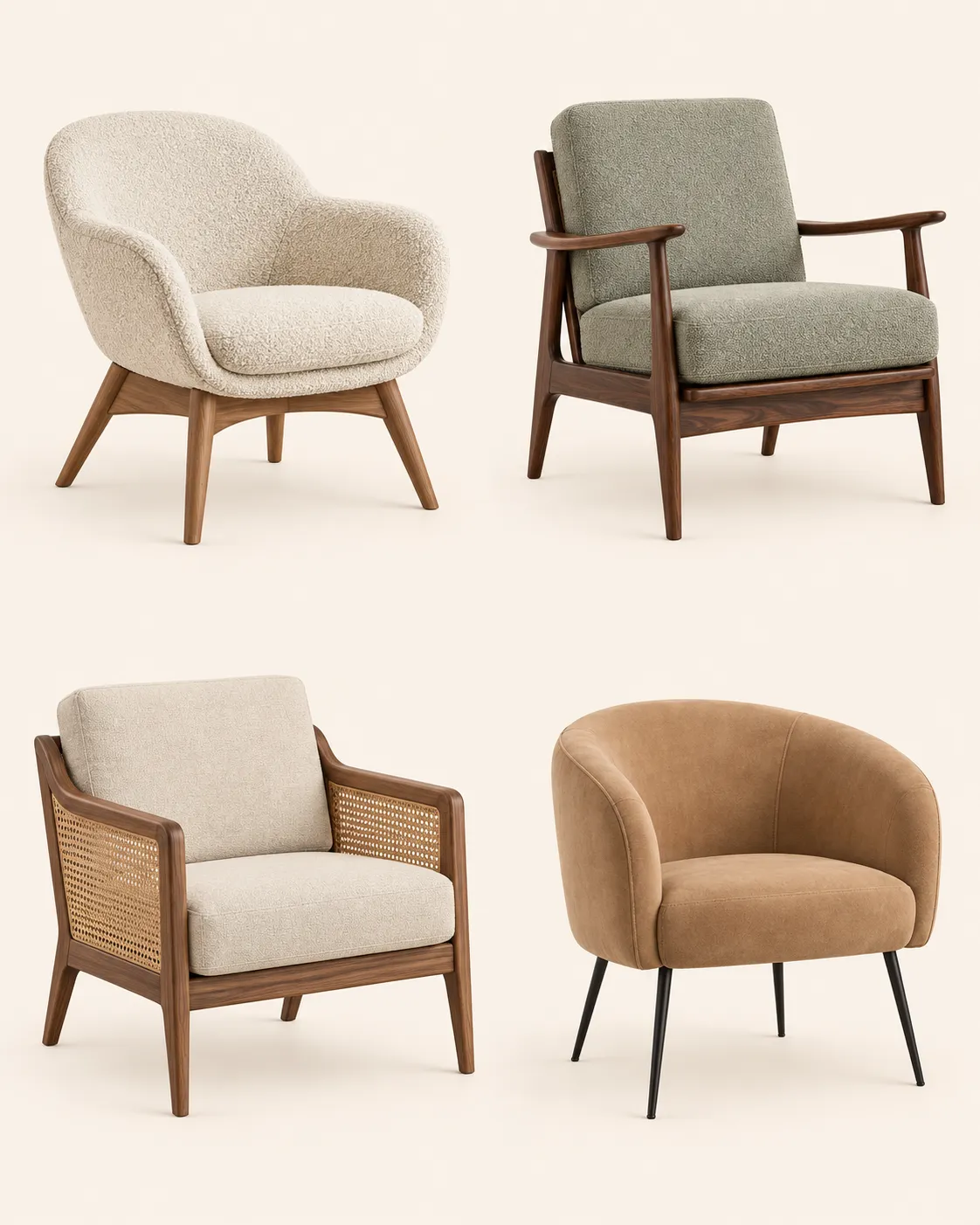
03-03-chair-product-sheet
Four designer chairs photographed separately on the same flat cream background
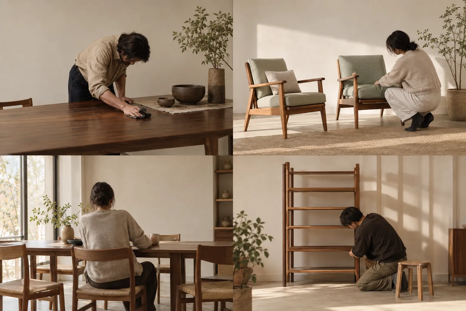
04-04-people-at-work-sheet
Four warm documentary photographs of people working with furniture — finishing a table, adjusting chairs, sitting at a dining table and assembling a shelf
Prompts
121,764 chars
# Cream furniture ecommerce homepage — rebuild prompt

A long, warm-neutral commerce landing page: a full-bleed interior photograph under an edge-to-edge ultra-condensed wordmark, one dark brown feature panel, a bento photo grid, a four-up product row, an editorial slider, and a dark footer that ends on the same wordmark cropped by the bottom of the page. Everything is cream, walnut and near-black. No brand marks, no logos — placeholder copy by role only.

**No live motion capture was supplied with this reference.** Every value in the Motion section is read off the stills and is marked **(inferred)**; durations, easings and stagger were **not measured**, so ranges are given. Do not invent exact timings, and do not specify lerp / stiffness / spring parameters.

---

## 1. Structure

- **Page**: full-bleed, no visible page margin or mat. Sections 1, 2, the slider strip in 5, and 6–7 run edge to edge; content inside them is constrained.
- **Container**: 1312px max-width, centred, 64px side gutters at 1440 (content runs x = 64 → 1376).
- **Grid**: 12 columns × 85.3px with 24px gutters for layout; the photo grids override this with their own 4 × 319px columns at 12px gaps.
- **Reference viewport**: 1440 × 900.

Sections, top to bottom:

1. **Hero** — full-bleed interior photograph, transparent nav, giant wordmark, caption chip bottom-left.
2. **Modular-system panel** — dark brown, three columns: filter chips left, floating white slide card centre, upcoming-slide rail right; two-tone centred headline above, centred footnote below.
3. **Bento photo grid** — cream. Left headline + right paragraph, then a 4 × 2 tile grid in which two cells are text instead of photo.
4. **Product row** — cream. Offset headline, prev/next controls, category filter pills, 4-up product tiles with swatches and prices, numbered pagination rail.
5. **Editorial slider** — cream. Centred headline + subcopy, then a full-bleed sand strip holding a 3-up slider with the middle card enlarged and dark.
6. **Footer** — dark brown. Thumbnail pair, nav row, large image with dots, social row, studio paragraph, then a bottom band with the newsletter CTA headline and an underline email field.
7. **Wordmark band** — near-black, the hero wordmark repeated and cropped by the bottom edge of the document.

---

## 2. Scroll map

Viewport = 900px. No section pins: the full-page composite shows no dead scroll anywhere, so **scroll consumed = section height for every section**. Carousels in 2, 4, 5 and 6 advance by click/drag, not by scroll.

| # | Section | Height | Viewports | Scroll consumed | Kind |
|---|---|---|---|---|---|
| 1 | Hero | 992px | 1.10 | 992px | scroll-linked (inferred) |
| 2 | Modular-system panel | 984px | 1.09 | 984px | entrance (inferred) |
| 3 | Bento photo grid | 1016px | 1.13 | 1016px | entrance (inferred) |
| 4 | Product row | 1176px | 1.31 | 1176px | entrance (inferred) |
| 5 | Editorial slider | 656px | 0.73 | 656px | entrance (inferred) |
| 6 | Footer | 926px | 1.03 | 926px | entrance (inferred) |
| 7 | Wordmark band | 210px | 0.23 | 210px | scroll-linked (inferred) |

**Total document height: 5960px ≈ 6.62 viewports.**

---

## 3. Spacing

- Section vertical padding: **96px top / 96px bottom** on cream sections (3, 4, 5); **120px top / 112px bottom** on the dark panel (2) and footer (6).
- Rhythm between sections on cream: sections 3 → 4 → 5 share the same background, separated by a 1px hairline and the 96 + 96 padding pair, i.e. **192px of air across each seam**. Do not collapse it.
- Headline block → first grid/media block: **72px**.
- Headline → its supporting paragraph (when stacked, section 5): **20px**.
- Photo grid gaps: **12px** both axes (sections 3 and 4). This tightness is the look — do not open it to 24 or 32.
- Product tile image → name: **16px**; name → swatch/price row: **10px**.
- Pills: height 34px, padding 0 16px, gap 8px.
- Square "+" buttons: 44 × 44, 12px inset from the tile edge.
- Circular arrow buttons: 44px diameter, 12px gap between the pair.
- Footer row spacing: image row → social/paragraph row **72px**; then hairline; then **56px** to the bottom CTA band.
- Nav bar: 72px tall, 24px from the top of the page, same 64px side gutters.

---

## 4. Type

Two families only.

- **Display (wordmark, section 7 and hero only)** — ultra-condensed heavy grotesk display, flat terminals, near-closed counters. Free stand-in: **Anton**; if it is still too wide, apply `transform: scaleX(0.88)` rather than reducing the size.
- **Everything else** — neutral grotesk, tight apertures, slightly condensed caps. Free stand-in: **Inter Tight** for headlines, **Inter** for body and UI.

Body anchor: **17px at 1440**. Every level below is a multiple of it.

| Level | Ratio | Size | Line-height | Tracking | Weight | Max measure |
|---|---|---|---|---|---|---|
| Wordmark (1, 7) | 28.2× | 480px (cap height ≈ 343px) | 0.82 | −0.015em | 700/900 | one line, full bleed |
| Section headline (2, 3, 4, 5) | 2.8× | 48px | 1.12 | −0.02em | 500 | 18ch (~520px) |
| Footer CTA headline (6) | 2.6× | 44px | 1.15 | −0.02em | 500 | 22ch (~600px) |
| Card title / grid link (3, 5) | 1.18× | 20px | 1.25 | −0.01em | 500 | 24ch |
| Body / lede paragraph | 1× | 17px | 1.55 | −0.005em | 400 | 62ch (~560px) |
| Product name | 1× | 17px | 1.3 | −0.005em | 500 | 20ch |
| Nav link, locale | 0.88× | 15px | 1.4 | 0 | 400 | — |
| Pills, buttons, price, small note | 0.82× | 14px | 1.5 | 0 (0.06em when uppercase) | 400/500 | 34ch (~300px) |
| Micro label, slide index, eyebrow | 0.7× | 12px | 1.35 | 0.08em, uppercase | 500 | 28ch |

Numerals in the pagination rail and prices are tabular. Nothing on the page is italic. Nothing below 12px.

Placeholder copy by role and length:
- Hero wordmark: one word or a two-word lockup, 8–10 characters total.
- Nav: 4 links, one word each; locale, 2–3 words; CTA, 2 words.
- Hero caption chip: 3 lines × ~34 characters.
- Section headlines: 5–8 words on two lines (section 3: 8–9 words on three lines).
- Supporting paragraphs: 22–30 words.
- Side notes parked at the far edges: 8–14 words, 2–4 short lines.
- Product names: 2–3 words. Prices: currency symbol + 4 digits with a thousands separator.
- Newsletter label: 2–3 words uppercase; field placeholder, 2 words; action, 1 word.

---

## 5. Colour

| Hex | Role |
|---|---|
| `#F9F1E8` | **Dominant surface** — warm cream. Sections 3, 4, 5 background; the floating slide card in 2; all text set on dark. Covers roughly 55% of the page. |
| `#181614` | **Ink** — all body and headline text on cream; fill for the primary pills, the dark "+" button and the active pagination chip; background of section 7 only. |
| `#3A322B` | **Dark panel** — background of section 2, the footer (6), and the enlarged editorial card in 5. Warm brown-grey, never neutral charcoal. |
| `#D6B797` | **The single accent** — warm tan. Allowed in exactly four places: the colour swatch dots on product tiles, the active carousel dot, the sand strip behind the slider in 5 (`#F1E5D6`, the accent mixed into cream at ~25%), and the newsletter underline on focus. Nowhere else. |
| `#765639` | Accent's dark step — the third swatch dot, and hover state for the accent underline. Not a text colour on cream. |

Derived values:
- Muted text on cream: `#181614` at 60% (`rgba(24,22,20,0.6)`).
- Muted text on dark: `#F9F1E8` at 55%; second half of the two-tone headline in section 2 at 45%.
- Hairlines: `rgba(24,22,20,0.12)` on cream, `rgba(249,241,232,0.14)` on dark.

No pure white, no pure black, no grey. No gradients anywhere except the soft floor shadow baked into the product photography.

---

## 6. Surface

- **Borders**: 1px only. Section seams, the pagination rail, the newsletter field underline, outlined pills, social icon circles, and two vertical 1px rules in section 2 that flank the centred headline column (at x = 438 and x = 1013, running 190px down from the section's top edge).
- **Radii**: photos and cards **8px**; small thumbnails and slide-rail tiles **4px**; square "+" buttons **8px**; pills, arrow buttons, social icons, dots **999px**. Nothing at 16px or above — the page reads square.
- **Shadows**: none, with one exception — the floating white slide card in section 2 carries `0 24px 60px rgba(24,22,20,0.28)` so it lifts off the brown. Cream sections have zero elevation.
- **Glass**: one frosted strip across the lower third of the slide-card image in section 2 — `backdrop-filter: blur(18px)`, `background: rgba(249,241,232,0.18)`, 64px tall, full image width, holding one line of 14px cream text **(inferred)**.

---

## 7. Imagery

All photography is the same world: warm daylight from one side, plaster or off-white walls, walnut and light-oak timber, cream/sage upholstery, no clutter, no visible branding, no smiling models. People appear only as hands, backs and working figures.

1. **Hero photo (1)** — 1440 × 992, **1.45:1**, full bleed behind the nav and wordmark. A furnished living room shot head-on: two mid-century lounge chairs with pale cushions centre, a sage-green armchair right, a low sofa with textile cushions left, a small dark pedestal table, a woven rug on pale flooring, a dried branch in a floor vase far right. The upper third is empty plaster wall — the wordmark sits in it. Exposure is bright; keep the top 40% of the frame quiet enough for white type.
2. **Slide-card image (2)** — 586 × 415, **1.41:1**, inside the white card. A person in a neutral shirt leaning over a walnut table, wiping or finishing the surface, a plant and two ceramic bowls in frame. Warm, documentary, shallow depth.
3. **Slide rail thumbnails (2)** — three tiles, 62 × 62, **1:1**, right column. Crops of upcoming slides: a chair silhouette, a workbench, a detail shot. The two inactive ones sit at 60% opacity.
4. **Bento tiles (3)** — six photos, **319px wide**; row 1 tiles are 319 × 288 (**1.11:1**), row 2 tiles are 319 × 328 (**0.97:1**).
   - 3a: light-wood writing table, straight on, with a dark green leather desk mat and two small objects.
   - 3c: corner of a sofa with a sage-green throw draped over the arm, close crop, fabric texture legible.
   - 3d: low walnut sideboard against a pale wall, two ceramic vases and a trailing plant on top, wide.
   - 3e: open shelving with ceramics, stacked books and a small plant, warm shadow.
   - 3f: wishbone-style chair, woven paper-cord seat, three-quarter view, a table edge and green bowl in the foreground.
   - 3g: macro of a mitred timber corner joint, grain and end-grain both visible.
5. **Product shots (4)** — four tiles, 319 × 402, **4:5 portrait**. Each chair centred on the cream ground, whole object in frame, shot at eye level, soft contact shadow only. Types: a cream shell accent chair on a splayed wood base; a dark sculpted-wood lounge chair with boucle upholstery; a cream armchair in walnut with cane detail; a tan upholstered barrel chair on thin black legs.
6. **Editorial cards (5)** — flanking cards 283 × 238 (**1.19:1**), active card is dark with no photo. Card 1: two lounge chairs in a bright room with a figure adjusting one. Card 3: a person at a walnut dining table in a workshop-lit room, seen from behind.
7. **Footer thumbnails (6)** — two tiles, 90 × 70, **1.29:1**: the sage-throw sofa crop and the sideboard, reused small.
8. **Footer feature image (6)** — 483 × 477, **1.01:1**. A person kneeling to assemble a slatted wooden shelf unit, sunlight raking across the floor, tools out of frame.

---

## 8. Motion

Everything below is **(inferred)** from the stills; nothing was measured on a live page. Where a number was not measurable, a range is given.

### Section 1 — Hero
- **kind**: scroll-linked **(inferred)**
- **what moves**: the hero photograph (background layer) and the wordmark (foreground layer).
- **from → to**: photo `translateY: 0 → −80px` and `scale: 1.06 → 1.0`; wordmark `translateY: 0 → +40px`, `opacity: 1 → 0.65`. Nav stays fixed at opacity 1.
- **range**: from page scroll 0 until the hero's bottom edge reaches the top of the viewport (0 → 992px of scroll). Reverses exactly on the way back up.
- **reduced motion**: no transform, no opacity change; the hero is a static image.

### Section 2 — Modular-system panel
- **kind**: entrance **(inferred)**
- **what moves**: headline (both tonal halves together), left filter-chip stack, the white slide card, the right thumbnail rail, the centred footnote.
- **from → to**: each `opacity 0 → 1`, `translateY +28px → 0`; the slide card additionally `scale 0.97 → 1`.
- **range**: trigger once, when the section's top reaches 80% of the viewport. Duration **not measured** — use 600–800ms. Easing: a standard ease-out (`cubic-bezier(0.22, 1, 0.36, 1)`). Stagger **not measured** — use 70–110ms in the order headline → card → chips → rail → footnote.
- **reduced motion**: all elements appear at final state, opacity fade only, ≤150ms.

### Section 3 — Bento photo grid
- **kind**: entrance **(inferred)**
- **what moves**: the headline lines, the right paragraph, and each of the eight grid cells (six photos, two text cells).
- **from → to**: headline lines `translateY +24px → 0`, `opacity 0 → 1`; grid cells `opacity 0 → 1` with the image inside each cell `scale 1.06 → 1` under a fixed 8px-radius clip, so the frame never moves.
- **range**: trigger once, when each cell's top reaches 85% of the viewport. Duration **not measured** — use 700–900ms for the image scale, 400–600ms for the fade. Stagger across the grid in reading order, **not measured** — use 60–90ms.
- **reduced motion**: fade only, no scale; stagger reduced to 0.

### Section 4 — Product row
- **kind**: entrance **(inferred)**
- **what moves**: the offset headline, the control row, the filter pills, the four product tiles, the pagination rail.
- **from → to**: `opacity 0 → 1`, `translateY +20px → 0` for all; product tiles stagger left to right.
- **range**: trigger once, at 80% of the viewport, per group. Duration **not measured** — use 500–700ms, ease-out. Tile stagger **not measured** — use 80–120ms.
- **reduced motion**: static, opacity only.

### Section 5 — Editorial slider
- **kind**: entrance **(inferred)**
- **what moves**: centred headline, subcopy, then the three cards and the two arrow buttons. The sand strip itself does not move.
- **from → to**: headline and subcopy `opacity 0 → 1`, `translateY +20px → 0`; cards `opacity 0 → 1`, `translateY +32px → 0`, active centre card last.
- **range**: trigger once, at 80% of the viewport. Duration **not measured** — use 600–800ms. Stagger **not measured** — use 90–130ms, outer cards first, centre card last.
- **reduced motion**: fade only.

### Section 6 — Footer
- **kind**: entrance **(inferred)**
- **what moves**: the thumbnail pair, nav row, feature image, social row, studio paragraph, then the bottom CTA headline and the newsletter field.
- **from → to**: `opacity 0 → 1`, `translateY +24px → 0`; the feature image also runs `clip-path: inset(0 0 12% 0) → inset(0 0 0 0)`.
- **range**: trigger once, at 85% of the viewport, top row then bottom band. Duration **not measured** — use 600–800ms. Stagger **not measured** — use 80–120ms.
- **reduced motion**: no clip animation, fade only.

### Section 7 — Wordmark band
- **kind**: scroll-linked **(inferred)**
- **what moves**: the cropped wordmark.
- **from → to**: `translateY +60px → 0` as the last 210px of the document enters view; the crop itself is structural (the glyphs are cut by the document's bottom edge, not animated).
- **range**: from the moment the band's top edge enters the viewport until the document bottom is reached. Reverses on scroll up.
- **reduced motion**: static, already at final position.

### Interaction transitions (not part of the scroll choreography)

- **Nav link hover**: underline grows from left, 1px, 180ms ease-out; colour unchanged.
- **Pill hover** (filter, "view all"): border darkens from 12% to 40% ink, 160ms. **Active/selected**: `#181614` fill, cream text, no transition on selection — it swaps instantly with the grid re-render.
- **"+" square button hover**: glyph rotates 90°, 220ms ease-out; fill inverts (dark ↔ cream) over 160ms.
- **Product tile hover**: the image scales `1 → 1.03` inside its fixed clip over 400ms ease-out; the name shifts 0, the price does not move; swatch dots gain a 1px ink ring.
- **Swatch dot press**: ring tightens to 2px, 120ms.
- **Arrow button hover**: fill inverts, the chevron slides 3px toward its direction, 160ms. **Disabled**: 35% opacity, no hover.
- **Carousel advance** (sections 2, 5, 6): the track translates one card-width plus gap over 420–600ms with an ease-in-out; the newly active card in section 5 grows from 283 × 238 to 334 × 289 over the same duration; the dot rail crossfades in 200ms.
- **Newsletter field focus**: the 1px underline thickens to 2px and turns `#D6B797`, 160ms; the placeholder does not move. **Send press**: the word scales to 0.97 for 90ms.
- **Cursor**: default. No custom cursor, no magnetic buttons.

---

## 9. Responsive (below 640px)

- Gutters 20px; container = full width − 40px.
- Wordmark stays full-bleed and still runs edge to edge; cap height ~86px (font-size ~120px). It is still cropped at the bottom in section 7. Do not centre it with side margins.
- Nav: logo + hamburger only; the four links and the locale move into the drawer; the CTA stays visible as a 14px text link.
- Hero: photo re-crops to **4:5**, section height 560px; the caption chip goes full width minus gutters and sits 20px above the bottom.
- Section 2: single column — headline, then the slide card (image re-crops to 4:3), then the caption, then the chip stack as a horizontally scrolling row with 12px gaps and no scrollbar; the thumbnail rail and the far-right note are **dropped**; the centred footnote stays.
- Section 3: bento becomes **2 columns**, 8px gaps; the two text cells become full-width rows in their original reading position; the "+" buttons shrink to 40px.
- Section 4: product grid becomes **2 columns**, 8px gaps, tiles stay 4:5; the prev/next pair moves under the headline; the filter pills scroll horizontally; the pagination rail shows `01 02 03` plus `06` and drops the rest.
- Section 5: the three cards become a snap-scrolling row, each card 86vw, all at the same size (no enlarged centre card); arrows dropped, dots kept.
- Section 6: everything stacks — feature image first at full width **4:3**, then nav as a 2-column list, then the thumbnail pair side by side at 48% each, then socials, then the CTA headline, then the newsletter field full width with `SEND` below the rule.
- Type: body 16px, section headlines 32px (2×), footer CTA 30px, card titles 18px, small notes 14px, micro 12px. Section padding drops to 64px top / 64px bottom.

---

## 10. Don'ts

- **Don't scale the wordmark to fit inside the container.** It is a full-bleed architectural element whose outer glyphs are optically flush with (and slightly cropped by) the page edges. A centred 96px headline version kills the page.
- **Don't reach for a serif or a Didone for the wordmark.** It is a heavy ultra-condensed grotesk, all caps, tight to the point of near-touching. And don't use it anywhere except sections 1 and 7 — no condensed type in headings, nav or buttons.
- **Don't substitute white for the cream.** `#F9F1E8` is warm and slightly pink; `#FFFFFF` or a cool grey immediately makes it a generic SaaS page. Likewise the dark is `#3A322B`, a brown — not `#111827`, not charcoal.
- **Don't use `#000000` or a pure-black overlay** on the hero. The caption chip is `#181614`, and the photograph is not darkened.
- **Don't add shadows to the cream sections.** One shadow exists on the whole page: the floating slide card in section 2.
- **Don't open the grid gaps.** 12px is the design. 24px or 32px turns a dense editorial grid into a card deck.
- **Don't fill the two empty bento cells with photos.** The text cells and the air around their two short lines are load-bearing — they are why the grid reads as composed rather than tiled.
- **Don't centre the layout.** The page is deliberately off-axis: section 3's headline is hard left with its paragraph hard right, section 4's headline starts at x ≈ 730 with a tiny note at x = 66, and small text blocks are parked at the far edges with large gaps between them. Resist the urge to tidy these into a symmetric two-column split. Only sections 2 and 5 are centred.
- **Don't introduce a coloured CTA.** There is no blue, no green button, no brand colour. Primary actions are `#181614` fills; the only chromatic note is the tan `#D6B797` in the swatch dots, the active dot, the slider strip and the focus underline.
- **Don't add commerce chrome.** No "New" / "Sale" badges, no star ratings, no wishlist hearts, no "Add to cart" buttons, no cart count in the nav. Each product tile is image, name, three swatches, price.
- **Don't pin anything or scrub every block.** The document has no dead scroll: the only scroll-linked elements are the hero parallax and the closing wordmark. Carousels advance on click, never on scroll hijack.
- **Don't make the nav sticky with a blurred white bar.** It sits over the hero photo and scrolls away with it.
- **Don't uppercase or letterspace the body and side notes.** Uppercase with tracking is reserved for 12px micro-labels and the filter pills.
- **Don't round images past 8px** or turn the tiles into pills; and don't add hairline borders around photos — the images meet the cream directly.
- **Don't use bright, wide-angle, high-saturation interior stock.** The photography is warm, softly lit, tightly cropped, and shows work being done — hands, backs, surfaces — never faces addressing the camera.
- **Don't let any type drop below the floor**: 16px for running text, 14px for nav, pills and buttons, 12px for labels and indices.
Versions
1Each rebuild is kept. The live one is what the comparison shows. LiveOpus 5.5Extra highfrontend-designemil-design-engtransitions-devhumanizergsaplast month · 288s · 4 images · 20260920T012237ZOpen