Verta — Cinematic AI Hero
Rebuild
Opus 5.5Extra highfrontend-designemil-design-engtransitions-devhumanizergsapView

RebuildReference
Move across the image to wipe between the two. Click to lock the seam; arrow keys nudge it.
Imagery
1/1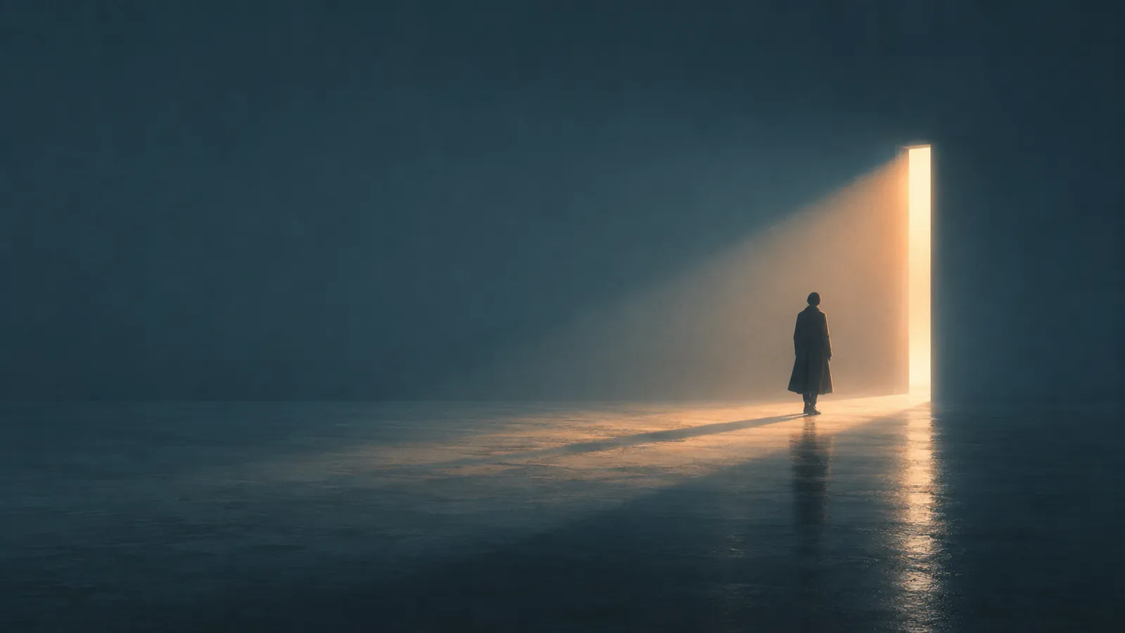
01-hero-backdrop
A lone figure in a long coat stands with their back to us in a vast, empty, hazed teal interior, facing a tall narrow slit of warm amber light in the far wall that casts a wedge of glow across the wet floor
Prompts
114,751 chars
# Cinematic Dark AI Hero — full-bleed photographic section

A single full-viewport hero section: one atmospheric photograph edge-to-edge, a transparent nav floating on top of it, a hairline of meta text at the vertical midpoint, and a two-column content bar pinned to the bottom of the viewport. Everything is typographic and transparent — the photograph does all of the decorative work. No cards, no panels, no gradients drawn in CSS other than the scrim.

This is one section, not a page. The four numbered items below are its bands, top to bottom (band 1 spans the whole section behind the others). The same numbers are used in every section of this prompt.

## Structure

- Viewport reference: **1440 × 850 CSS px**. Section height = `100svh`, `min-height: 720px`.
- Container: full-bleed. Content is held to a **1312px** content box via **64px** left/right gutters (no centred max-width card — the gutters are the container).
- Grid: **12 columns**, 24px gap → column = 87.3px. Content is placed on it, not centred.
- Bands, top to bottom:

1. **Full-bleed backdrop** — the photograph + scrim, `position: absolute; inset: 0; z-index: 0`. Spans the entire 850px.
2. **Header overlay** — y 0 → 96px. Logo (mark + wordmark) at the left gutter; 5 nav links immediately right of it; a single "Log In" link flush to the right gutter. Transparent, no rule, no fill.
3. **Meta rail** — a single line band at **y ≈ 408–436px** (vertical centre, 50% of the section). Two short lines of micro-copy: one flush left at the left gutter, one flush right at the right gutter, same baseline, nothing between them.
4. **Bottom content bar** — two columns, both **bottom-aligned** to a baseline 72px above the section bottom (y ≈ 778px).
   - Left column, **cols 1–6** (width ≈ 660px): headline only, 2 lines, starts y ≈ 657px.
   - Right column, **cols 8–12** (width ≈ 532px, starts x = 837px): paragraph (2 lines) → 28px gap → CTA row.
   - CTA row: a bordered ghost button (≈129 × 44px) then a bare text link, 16px apart.

Placeholder copy by role: wordmark 1 word; nav 1–2 words each, 5 items; account link 2 words; meta rail left "6–8 words, a denial", right "4–5 words, the counter-promise"; headline **5–7 words on exactly two lines**, each line ≤ 22 characters; paragraph 2 lines / ~130 characters total; primary button 2 words; text link 3–4 words.

## Scroll map

Motion was **not measured** on a live page — every number below is **(inferred)** from the still and given as a range where it is not structural.

| # | Band | Height | Viewports | Scroll consumed | Kind |
|---|---|---|---|---|---|
| 1 | Full-bleed backdrop | 850px | 1.00 | 850px | scroll-linked (parallax on exit) |
| 2 | Header overlay | 96px | 0.11 | — (overlay) | entrance, then static |
| 3 | Meta rail | 28px | 0.03 | — (overlay) | entrance |
| 4 | Bottom content bar | ~138px | 0.16 | — (overlay) | entrance |

**Total section height: 850px = 1.0 viewport.** Nothing pins, nothing stacks. The section scrolls away normally; the only scroll-linked value is the backdrop's parallax offset (band 1), which runs for the 850px it takes the section to leave the viewport.

## Spacing

- Side gutters: **64px** both sides, at every band. Left gutter is the alignment spine for logo, meta-rail-left and the headline — they share one edge.
- Header: **36px** from the top of the section to the nav's optical centreline (nav row is 24px tall, so 36px top padding → 96px band). Logo mark → wordmark gap **8px**; logo → first nav link **32px**; between nav links **24px**.
- Meta rail: sits at exactly 50% of the section height, no padding of its own.
- Bottom content bar: **72px** from the section bottom to the shared baseline. Headline line-box to paragraph: they are *not* vertically aligned at the top — the right column's block is shorter and bottom-aligns, so the paragraph's first line lands roughly level with the headline's second line.
- Paragraph → CTA row: **28px**. Button → text link: **16px**.
- Column gutter between the two content columns: **177px** of empty space (cols 1–6 vs 8–12 plus the skipped column). Do not close this gap; the emptiness across the middle is the composition.
- Rhythm: the section has exactly three horizontal events — 96px in, 50% in, 72px from the bottom. Nothing occupies the space between them.

## Type

Family class: **neo-grotesk**, tight and neutral — no humanist warmth, no geometric circles. Free stand-in: **Inter** (or Archivo). Single family throughout; weight, size and opacity carry the hierarchy.

Body anchor: **17px** at 1440.

| Level | Ratio to body | Size | Line-height | Letter-spacing | Weight |
|---|---|---|---|---|---|
| Headline (4) | **3.5×** | 60px | 1.07 (64px) | −0.025em | 500 |
| Logo wordmark (2) | 1.2× | 20px | 1.2 | −0.01em | 600 |
| Body paragraph (4) | **1×** | 17px | 1.5 (25.5px) | −0.005em | 400 |
| Nav link (2) | 0.88× | 15px | 1.4 | 0 | 450 |
| Account link (2) | 0.88× | 15px | 1.4 | 0 | 500 |
| Button label (4) | 0.88× | 15px | 1.2 | 0 | 500 |
| Text link (4) | 0.88× | 15px | 1.2 | 0 | 500 |
| Meta rail (3) | 0.7× | 12px | 1.4 | +0.01em | 400 |

Max line lengths: headline **≤ 22 characters per line** (≈660px, hard two-line break — author the break, don't let it wrap); paragraph **≤ 66 characters** (532px); meta rail lines ≤ 30 characters each.

The meta rail reads almost subliminal in the composition — it is small *and* held at 55% opacity. Keep it at 12px; do not go smaller to chase the effect.

## Colour

Sampled from the photograph; the photograph is the palette.

| Hex | Role |
|---|---|
| **#2A4652** | Dominant surface — the hazed teal wall/atmosphere, covers roughly half the frame. This is the section's perceived background colour; use it as the `background-color` behind the image so there is no white flash on load. |
| **#1A262D** | Deep field — floor, vignette, top corners. Second largest mass; the scrim pushes toward this. |
| **#576768** | Desaturated grey-teal midtone — the haze between the light and the wall. Never used as a UI colour, only present in the image. |
| **#FCD797** | **The single accent** — the light core of the doorway. |
| **#D89B72** | Accent falloff — the amber wedge of light on the floor. |

Accent rule, strictly: **#FCD797 and #D89B72 appear only inside the photograph.** No gold button, no gold text, no gold underline, no gold gradient, no gold icon. The one permitted exception is the keyboard focus ring (2px #FCD797, 2px offset), because it must be visible against teal.

Text colours, all white at set opacities: headline `#FFFFFF` 100%; paragraph `rgba(255,255,255,0.82)`; nav links `rgba(255,255,255,0.72)`; account link `rgba(255,255,255,0.88)`; logo `#FFFFFF`; meta rail `rgba(255,255,255,0.55)`.

Scrim over the image (both needed, both subtle):
- `linear-gradient(to top, rgba(16,26,32,0.55) 0%, rgba(16,26,32,0) 42%)` — protects the bottom content bar.
- `linear-gradient(to bottom, rgba(16,26,32,0.35) 0%, rgba(16,26,32,0) 18%)` — protects the nav.

## Surface

- Borders: exactly one — the ghost button, **1px solid rgba(255,255,255,0.45)**. No header rule, no dividers, no outlines anywhere else.
- Radii: **4px** on the ghost button. Everything else square. The section itself is full-bleed with square corners.
- Shadows: **none**. No box-shadow, no text-shadow, no glow. The image's own light does the lifting; the scrim does the contrast.
- Fills: the button is transparent over the photograph, not frosted. No `backdrop-filter` anywhere.

## Imagery

One image, and only one.

- **Hero backdrop (band 1)** — full-bleed, aspect **1440 × 850 (≈1.7:1)**, `object-fit: cover`, `object-position: center 55%`. Subject: a vast, near-empty dark interior seen straight on; a single small human figure in a long coat stands with their back to us, slightly right of centre, dwarfed by a tall vertical slit of warm light in the far wall. The slit runs from the floor to about three-quarters of the frame height and throws a hard-edged wedge of amber light diagonally across a wet concrete floor toward the lower-left corner. Treatment: heavy volumetric haze, duotone — cold teal everywhere except the light source and its wedge; the figure reads as a silhouette with a thin warm rim on one side. Low contrast in the shadows, no crushed blacks, fine film grain. The figure should sit at roughly 72% of the width and 62% of the height so it stays clear of both the headline (left) and the paragraph (right).

No logos, no icons, no illustrations, no second image. The logo mark is a 23px hairline circle outline, 1.5px stroke, white — drawn, not an asset.

## Motion

No live measurement was available; kinds, directions and orders are **(inferred)** from the composition, and every duration/offset is given as a range rather than an exact value.

**1 — Full-bleed backdrop**
- kind: scroll-linked (plus a one-time entrance scale)
- what moves: the `<img>` inside an `overflow: hidden` wrapper.
- from → to: **scroll-linked parallax** — `translateY: 0 → −60px to −90px` (inferred range) as the section exits. **Entrance** — `scale: 1.05 → 1.00`, `opacity: 0 → 1`, once on load.
- range: parallax runs from page scroll 0 until the section's bottom edge reaches the viewport top (850px of scroll) and **reverses on the way back up**. Entrance: on load, duration 1.0–1.4s (not measured), ease-out, no stagger.
- reduced motion: no parallax, no scale — image renders at its final transform, opacity fades in over ≤ 200ms.

**2 — Header overlay**
- kind: entrance, then static
- what moves: logo group and the nav-link row as one unit.
- from → to: `opacity 0 → 1`, `translateY −8px → 0`.
- range: on load, after a 100–200ms delay (not measured); duration 400–600ms; ease-out; stagger 0 (the row moves as one block, it does not cascade per link).
- reduced motion: opacity only, ≤ 200ms, no translate. The header does **not** hide, shrink, or gain a background on scroll.

**3 — Meta rail**
- kind: entrance
- what moves: the two micro-copy lines.
- from → to: `opacity 0 → 0.55` only. No translate, no blur, no clip.
- range: plays once on load, 250–400ms after the header (not measured); duration 500–700ms; linear-to-ease-out; both lines together, no stagger.
- reduced motion: appears at final opacity immediately.

**4 — Bottom content bar**
- kind: entrance (plays once on arrival; it is not scroll-linked and does not reverse)
- what moves: headline line 1, headline line 2, paragraph, CTA row — four items, in that order.
- from → to: each `opacity 0 → 1`, `translateY 24px → 0`, with the two headline lines additionally masked by `clip-path: inset(0 0 100% 0) → inset(0 0 0 0)` on a per-line wrapper so they rise out of their own line box.
- range: trigger is load for the initial view, or the element's top reaching 80% of the viewport if the section is not first on screen — once only. Duration 700–900ms per item (not measured), ease-out (a cubic with a long tail, e.g. `cubic-bezier(0.22, 1, 0.36, 1)`), **stagger 80–120ms** between the four items.
- reduced motion: no translate, no clip-path; the four items fade in together over ≤ 200ms.

### Interaction transitions (not part of the scroll choreography)

- Nav link hover: colour `rgba(255,255,255,0.72) → 1`, 160ms ease-out. No underline, no movement.
- Account link hover: same, plus a 1px underline fading in at 160ms.
- Ghost button hover: border `rgba(255,255,255,0.45) → 0.85`, background `transparent → rgba(255,255,255,0.08)`, 180ms ease-out.
- Ghost button press: `scale(0.985)`, 90ms.
- Text link hover: a 1px underline wipes in from the left over 200ms; label opacity `0.88 → 1`.
- Focus-visible (all interactive elements): 2px solid `#FCD797`, 2px offset, no transition.
- Logo hover: no state change.

## Responsive (below 640px)

- Section height `100svh`, `min-height: 620px`. Gutters **64px → 20px**.
- Band 2: nav links collapse to a hamburger at the right gutter; logo stays left; "Log In" moves into the opened sheet. Header band 96px → 64px.
- Band 3: keep the left meta line at the left gutter; **drop the right one** rather than stacking or shrinking it. It is a balance device that has no job in one column.
- Band 4: single column. Headline first, then paragraph, then CTAs. Headline **60px → 34px** (2× body), line-height 1.1, still two authored lines, ≤ 18 characters each. Paragraph 17px → 16px, full width. CTA row: button and text link stay on one row, left-aligned; the button does **not** go full-width.
- Bottom baseline padding 72px → 40px. Paragraph → CTA gap 28px → 20px; headline → paragraph gap 24px.
- Band 1: `object-position: 66% 58%` so the figure and the doorway both stay in frame; never let the crop centre on empty wall.

## Don'ts

- **Don't put the text on a panel.** No card, no translucent sheet, no frosted `backdrop-filter` block behind the headline or the paragraph. The type sits directly on the photograph; the bottom scrim is the only thing making it legible.
- **Don't darken the whole image.** A flat 40–50% black overlay is the default reach here and it kills the beam — the light wedge is the entire point. Use only the two edge gradients specified.
- **Don't let the accent escape the photograph.** No gold CTA, no gold eyebrow, no `linear-gradient` gold text, no glowing border. The button is a white hairline ghost and stays that way.
- **Don't centre the headline** or centre the hero content. The composition is left-spine headline, right-block paragraph, and a large void between them.
- **Don't top-align the two content columns.** They bottom-align to a shared baseline; top-aligning them collapses the stagger that makes the bar read as one horizontal band.
- **Don't use pill buttons.** 4px radius, not `rounded-full`, not 8px, not 12px.
- **Don't make the nav sticky, filled, blurred or shrinking.** It is transparent, it scrolls away with the section, it has no bottom rule.
- **Don't add a bouncing scroll cue**, mouse icon, or "scroll" label at the bottom centre. There is nothing there and that is deliberate.
- **Don't animate the headline word-by-word or character-by-character.** Two line-level clip reveals, that is all — a per-word cascade turns a cinematic still into a template.
- **Don't add a serif, a second family, or a mono eyebrow.** One neo-grotesk, four weights at most.
- **Don't let the headline wrap to three lines** at any width. Reduce the size or shorten the copy first.
- **Don't add text-shadow or a glow** to lift the type off the image — if it is not legible, the scrim gradient is wrong, not the type.
- **Don't scale the meta rail up** because it looks too small. Its near-invisibility at 12px / 55% opacity is the intended register.
- **Don't generate a bright, populated, or wide-angle "office" image.** The picture is mostly empty, mostly dark, one figure, one light source.
Captures
1Versions
1Each rebuild is kept. The live one is what the comparison shows. LiveOpus 5.5Extra highfrontend-designemil-design-engtransitions-devhumanizergsaplast month · 103s · 1 image · 20260917T191715ZOpen