Mindloop — Waitlist Landing Page
Section13 Sep 2026
Rebuild
Opus 5.5Extra highfrontend-designemil-design-engtransitions-devhumanizergsapView
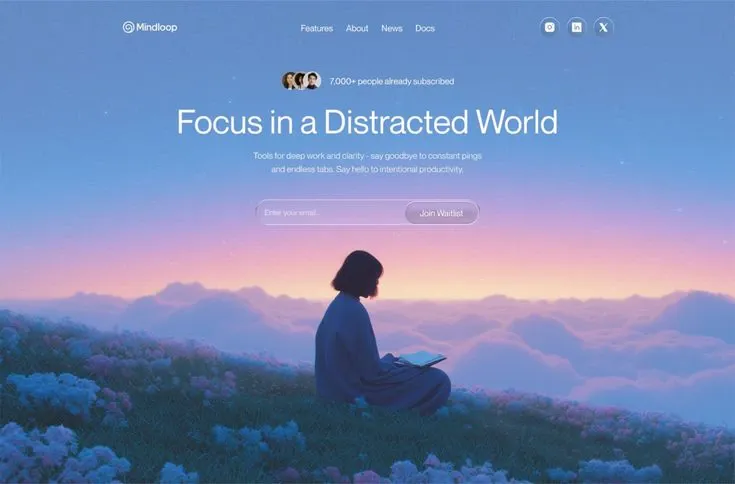
RebuildReference
Move across the image to wipe between the two. Click to lock the seam; arrow keys nudge it.
Imagery
1/1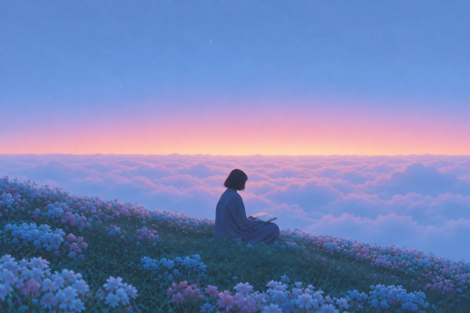
01-dusk-cloud-sea-figure
A lone figure in a long blue robe sits cross-legged on a flowering ridge at dusk above an unbroken sea of low cloud, with a warm blush horizon glow under a deep periwinkle sky
Prompts
118,766 chars
# Full-bleed dusk waitlist hero — build prompt

A single-screen waitlist landing page: one photographic sky filling the entire viewport, a centred column of nav → social proof → headline → subhead → inline email capture stacked in the upper 45%, and the lower half left entirely to the picture. No scroll, no second section. Everything below is given at a 1440 × 900 reference viewport.

**No motion report was supplied for this reference.** Every number in the Motion section is marked `(inferred)` from the still, and every timing value is written as "not measured" plus a range. Do not treat any of them as measured fact.

---

## 1. Structure

- **Page**: full-bleed. The background image is the page; it bleeds edge to edge with no margin, no rounded corners, no mat. If your source still shows rounded corners against a flat sheet, that is the photograph's framing — ignore it.
- **Container**: one centred column, `max-width: 960px`, side gutters 240px at 1440. The nav spans the full 960px; the hero text block is centred inside it with its own narrower measures (see Type).
- **Column structure**: single column, text-align centre, for every element except the nav (3-part flex: logo left / links centre / icon buttons right).
- **Vertical model**: the content column is top-anchored, not vertically centred. It starts 32px from the top and ends at roughly y=440; the bottom 52% of the viewport carries only the photograph.

Sections top to bottom:

1. **Background canvas** — the full-viewport photograph plus its gradient underlay. Occupies 0 → 900px, sits behind everything at `z-index: 0`.
2. **Nav bar** — logo + wordmark left, four text links centred, three circular icon buttons right. Transparent, not fixed, not sticky.
3. **Social-proof row** — three overlapping avatar circles + one short line of text, centred, horizontal.
4. **Headline** — one line at desktop.
5. **Sub-headline** — two centred lines.
6. **Waitlist form** — one pill containing an email input and a submit button inset on its right.

There is **no section 7**. No footer, no logo strip, no feature grid, no below-fold content of any kind. The emptiness of the lower half is the design.

---

## 2. Scroll map

| # | Section | Height | Viewports | Scroll consumed | Kind |
|---|---------|--------|-----------|-----------------|------|
| 1 | Background canvas | 900px | 1.00 | 0px | static |
| 2 | Nav bar | 48px | 0.05 | 0px | static (load entrance) |
| 3 | Social-proof row | 28px | 0.03 | 0px | static (load entrance) |
| 4 | Headline | 82px | 0.09 | 0px | static (load entrance) |
| 5 | Sub-headline | 52px | 0.06 | 0px | static (load entrance) |
| 6 | Waitlist form | 52px | 0.06 | 0px | static (load entrance) |

**Total page height: 900px = 1.00 viewport. The document does not scroll.** Set the page root to `min-height: 100svh` and let the body's natural height equal the viewport; there is no scroll-linked behaviour anywhere on this page, so do not build a scroll container, a progress value, or a pin. Sections 2–6 are layers inside section 1, not stacked blocks — their heights above are their own box heights, not slices of the page.

---

## 3. Spacing

Measured down the centre column (all values ±4px, inferred from the still):

- Page top → nav bar top: **32px**
- Nav bar height: **48px** (icon buttons 36px, centred in it)
- Nav bar bottom → social-proof row top: **72px**
- Social-proof row bottom → headline cap top: **32px**
- Headline baseline block bottom → subhead first line top: **24px**
- Subhead last line bottom → form pill top: **48px**
- Form pill bottom → viewport bottom: **460px** of uninterrupted photograph

Horizontal:

- Nav: logo group and icon group pinned to the 960px container edges; the four centre links in a flex row with **34px** gap.
- Social-proof row: avatar cluster then text, **10px** gap. Avatars overlap by **-8px** each.
- Form pill: **22px** left padding before the placeholder, **5px** right padding around the button, so the button sits flush-inset in the pill.

Rhythm: the block tightens as it descends — 72 → 32 → 24, then opens back to 48 before the form. Keep that asymmetry; even spacing between all five elements flattens the hierarchy and reads like a template.

---

## 4. Type

One family throughout. **Class: geometric-leaning grotesk** — circular bowls, double-storey `a`, open apertures, no ink traps, low contrast. Free stand-in: **Plus Jakarta Sans**; acceptable alternates **Figtree** or **Be Vietnam Pro**. Do not use Inter (too neutral/narrow at display size) and do not use a serif or a condensed display face.

| Level | Size | Line-height | Letter-spacing | Weight | Colour | Max measure |
|-------|------|-------------|----------------|--------|--------|-------------|
| Logo wordmark (2) | 17px | 1.2 | -0.01em | 500 | `#FFFFFF` | — |
| Nav links (2) | 15px | 1.2 | 0em | 450–500 | `rgba(255,255,255,0.88)` | — |
| Social proof (3) | 14px | 1.3 | 0em | 500 | `rgba(255,255,255,0.92)` | one line, ~34 chars |
| Headline (4) | **78px** | **1.05** | **-0.025em** | **400** | `#FFFFFF` | 840px, one line, 26–30 chars |
| Sub-headline (5) | 16px | 1.6 | -0.005em | 400 | `rgba(255,255,255,0.82)` | 480px, 2 lines, ~58 chars/line |
| Input placeholder (6) | 15px | 1.4 | 0em | 400 | `rgba(255,255,255,0.60)` | — |
| Button label (6) | 14px | 1.0 | -0.005em | 500 | `#2E3A52` | — |

The headline is **regular weight, not bold**. That is the single most important type decision on the page: at 78px a 400 in this class reads calm and wide, and a 600/700 turns it into a growth-hack banner.

Placeholder copy by role:
- Nav links: four single words, 4–8 characters each.
- Social proof: a count + short claim, 4–6 words ("`N,000+ people already subscribed`" shape).
- Headline: **5 words on one line**, a plain declarative phrase, no punctuation.
- Sub-headline: 20–26 words wrapping to exactly two lines, one sentence or two short ones.
- Input placeholder: 2–3 words. Button: 2 words.

---

## 5. Colour

The surface is a vertical dusk gradient carrying a photograph. Sampled roles:

- **`#658DC7`** — *dominant.* Mid-sky blue, covers roughly the upper third and reappears in the haze; this is the colour a viewer would name the page.
- **`#2866A7`** — deepest sky, the top ~18% of the gradient, darkest at y=0. Anchors the nav against white text.
- **`#88A3D9`** — periwinkle haze, the lit cloud tops and the upper flowers. A tint, not an accent.
- **`#F2C7BD`** — **the single accent.** Warm blush, and the only warm hue on the page. Allowed **only** in the horizon glow band (a soft ~90px belt around y=560) and as the warmest flower highlights. It must never appear on UI: not on the button, not as a link colour, not as a border, not as a focus ring.
- **`#264357`** — the darkest value, the hillside mass and the figure's silhouette; deepen to `#1B2E40` at the very bottom edge.

Gradient underlay, to paint beneath the photograph so the page never flashes white and so the composition survives if the image fails:

```
0%   #2866A7
18%  #658DC7
42%  #88A3D9
56%  #F2C7BD
64%  #264357
100% #1B2E40
```

UI colours are white and white-at-opacity only: text `#FFFFFF` and `rgba(255,255,255,0.82–0.92)`, fills `rgba(255,255,255,0.10–0.12)`, strokes `rgba(255,255,255,0.28–0.32)`. The one solid light element is the submit button: `rgba(237,231,238,0.92)` — a warm off-white, not pure white, not the blush accent.

No black anywhere. No `#000`, no black scrim, no black text.

---

## 6. Surface

- **Borders**: 1px, `rgba(255,255,255,0.30)` on the form pill and `rgba(255,255,255,0.32)` on the icon buttons. Nothing else is stroked.
- **Radii**: fully rounded (`999px`) on all four UI objects — form pill, submit button, icon buttons, avatar circles. There is not a single rectangular corner on the page. No 8px/12px card radii.
- **Glass**: form pill `background: rgba(255,255,255,0.12)` + `backdrop-filter: blur(14px) saturate(120%)`. Icon buttons `rgba(255,255,255,0.10)` + `blur(10px)`. Keep the blur low — this is a light veil over a photograph, not frosted glass; you should still read cloud shapes through the pill.
- **Shadows**: none. No `box-shadow` on the pill, the button, the icons or the text. The only depth cue is a soft optical bloom that belongs to the photograph itself. Text shadows in particular are forbidden — the sky is dark enough at those y-positions to carry white type.
- Avatar circles: 24px, 2px ring in `rgba(255,255,255,0.85)`, sitting on a `rgba(20,32,52,0.35)` rounded container with 3px padding so the cluster holds together against the sky.
- Form pill: 480 × 52px. Submit button inside: 118 × 42px.
- Icon buttons: 36px circles, 15px white glyphs, 10px gap between them.

---

## 7. Imagery

**One image. It is the entire page background.**

- **Subject**: a lone person seen from behind, seated cross-legged on a flowering ridge at dusk, above an unbroken sea of low cloud. They wear a loose, long blue robe that pools around them; dark chin-length hair; an open book or tablet rests on their lap. They sit slightly right of centre and occupy the vertical band from ~54% to ~86% of the viewport height, small enough that the sky dominates — roughly 1/6 of the frame width.
- **Setting**: the near foreground is a meadow of wildflower clumps in periwinkle and dusty pink, densest at the left and bottom edges, going soft at the very front. Behind the ridge, the cloud sea runs flat to a horizon lit warm at ~62% height, with a deep blue sky and faint stars above.
- **Treatment**: painterly, hazy, low local contrast — a rendered/diffusion look rather than a sharp travel photograph. The figure reads as a near-silhouette against the lit clouds, edge-lit only faintly. Gentle bloom at the horizon, soft focus falloff in the foreground flowers, fine film grain at roughly 3–4% opacity over the whole frame. No hard sun disc, no lens flare, no vignette.
- **Aspect ratio**: shot 16:10 (3:2 also works), rendered `object-fit: cover`, `object-position: 50% 100%` so the foreground flowers stay pinned to the bottom edge and any crop is taken from the sky.
- **Position**: `position: fixed; inset: 0` (or absolute on a 100svh wrapper), `z-index: 0`, with the gradient above painted underneath it.

No second image. No product screenshot, no app mockup, no device frame, no floating UI cards over the sky.

---

## 8. Motion

The page does not scroll, so **nothing here is scroll-linked**. All movement is a one-time load entrance plus a continuous ambient drift. Because no motion report was supplied, every field below is `(inferred)` from the still and all timings are **not measured** — the ranges given are the intended feel, not recovered values. Do not substitute lerp, stiffness or spring parameters; none were measured.

### Section 1 — Background canvas
- **kind**: static, with an ambient loop *(inferred)*
- **what moves**: the photograph layer only — as one plane. The figure, the hill and the clouds never move relative to each other.
- **from → to**: on load, `opacity 0 → 1` and `scale 1.04 → 1.00`. Then a continuous loop: `scale 1.00 → 1.03` with `translateY 0 → -8px`, reversing (yoyo) forever.
- **range**: not an entrance trigger and not scroll-linked — the load fade begins at first paint; the ambient loop runs indefinitely. Load fade duration **not measured**, use 900–1400ms, ease-out. Loop period **not measured**, use 24–40s per direction, `ease-in-out`. Keep it slow enough that it is invisible in any 3-second glance.
- **reduced motion**: drop the ambient loop entirely and hold `scale 1.00`; keep only the opacity fade, or show the image immediately.

### Section 2 — Nav bar
- **kind**: entrance, plays once *(inferred)*
- **what moves**: logo group, the four link items, the three icon buttons — as three groups, left to right.
- **from → to**: `opacity 0 → 1`, `translateY -10px → 0`.
- **range**: trigger on page load, not on viewport intersection (it is above the fold by definition). Duration **not measured**, use 450–650ms; easing a soft ease-out (`cubic-bezier(0.22, 1, 0.36, 1)` family); stagger between the three groups **not measured**, use 60–90ms. Nav starts before the hero column.
- **reduced motion**: opacity 0 → 1 only, no translate; or render immediately.

### Section 3 — Social-proof row
- **kind**: entrance, plays once *(inferred)*
- **what moves**: the avatar cluster and its text line, together as one unit.
- **from → to**: `opacity 0 → 1`, `translateY 16px → 0`.
- **range**: load trigger, first item in the hero column's stagger chain. Duration **not measured**, 600–800ms; ease-out; delay after nav **not measured**, 100–200ms.
- **reduced motion**: opacity only.

### Section 4 — Headline
- **kind**: entrance, plays once *(inferred)*
- **what moves**: the headline as a **single block**. Not per word, not per character, not per line.
- **from → to**: `opacity 0 → 1`, `translateY 20px → 0`, optional `filter: blur(6px) → blur(0)`.
- **range**: load trigger, second in the chain. Duration **not measured**, 700–900ms; ease-out; stagger from section 3 **not measured**, 80–120ms.
- **reduced motion**: opacity only, no translate, no blur.

### Section 5 — Sub-headline
- **kind**: entrance, plays once *(inferred)*
- **what moves**: both lines as one block.
- **from → to**: `opacity 0 → 1`, `translateY 18px → 0`.
- **range**: load trigger, third in the chain. Duration **not measured**, 700–900ms; ease-out; stagger from section 4 **not measured**, 80–120ms.
- **reduced motion**: opacity only.

### Section 6 — Waitlist form
- **kind**: entrance, plays once *(inferred)*
- **what moves**: the whole pill, including the button inside it, as one unit.
- **from → to**: `opacity 0 → 1`, `translateY 18px → 0`, `scale 0.98 → 1.00`.
- **range**: load trigger, last in the chain. Duration **not measured**, 700–900ms; ease-out; stagger from section 5 **not measured**, 80–120ms.
- **reduced motion**: opacity only, `scale 1.00` throughout.

Whole-page entrance budget: **not measured**; the full chain should resolve inside 1.6–2.2s from first paint.

### Interaction transitions (not part of the entrance choreography)

- **Nav link hover** — colour `rgba(255,255,255,0.88) → #FFFFFF`, 150ms ease-out. No underline, no translate.
- **Icon button hover** — fill `rgba(255,255,255,0.10) → rgba(255,255,255,0.20)`, border `0.32 → 0.45` alpha, 180ms ease-out.
- **Icon button press** — `scale 1 → 0.94`, 90ms.
- **Input focus** — pill border `rgba(255,255,255,0.30) → rgba(255,255,255,0.55)`, fill `0.12 → 0.16`, 200ms ease-out. No coloured focus ring and no glow; keyboard focus gets a 2px white outline offset 3px for accessibility.
- **Submit button hover** — fill `rgba(237,231,238,0.92) → rgba(255,255,255,1)`, 160ms ease-out.
- **Submit button press** — `scale 1 → 0.97`, 90ms.
- **Submit success** — the button label cross-fades to a confirmation word in place, 220ms; the pill does not resize and no modal opens.
- **Avatar hover** — none.

---

## 9. Responsive (below 640px)

- Gutters drop to 20px; the container becomes 100%.
- **Section 2**: the four centre nav links are **removed entirely** — no hamburger, no drawer, because there is nowhere to navigate on a one-screen page. Keep logo left and the three icon buttons right, shrunk to 32px with 8px gaps.
- Content column top offset grows from 32px to a 96px gap between nav and section 3, so the stack still sits above the figure's head.
- **Section 3**: avatars 20px, text 13px; keep on one line, shorten the copy rather than wrapping.
- **Section 4**: headline **36px / 1.10 / -0.02em**, wrapping to two or three lines, max-width 320px.
- **Section 5**: 15px / 1.55, max-width 300px, still two–three lines.
- **Section 6**: the pill splits — input becomes a full-width 52px pill, button a full-width 48px pill beneath it, 8px gap, both still `999px` radius. Button label stays 14px.
- **Section 1**: `object-position: 58% 100%` so the seated figure stays roughly centred in the narrow crop; the sky compresses, the foreground flowers stay.
- Use `100svh`, not `100vh`, so mobile browser chrome does not push the form off-screen. The page still must not scroll.

---

## 10. Don'ts

- **Don't lay a dark scrim over the photograph.** No `rgba(0,0,0,0.35)` overlay, no `linear-gradient(to bottom, rgba(0,0,0,.5), transparent)`. The sky is already dark enough at the text's y-positions; a scrim turns a luminous dusk into a stock hero.
- **Don't bold the headline.** 400 weight at 78px. Not 600, not 700, not a variable-weight "display" cut.
- **Don't put the hero text in a card.** No translucent panel, no bordered box, no blurred rectangle behind the copy. Only the form pill and the icon buttons have surfaces.
- **Don't vertically centre the content.** It sits in the top 45%; the empty lower half is the point. Centring it buries the figure behind the form.
- **Don't split the form.** Input and button live in one pill at desktop, button inset on the right with 5px of breathing room. A separate full-width button below the input is the wrong page.
- **Don't add anything below the fold** — no feature grid, no FAQ, no testimonial row, no footer, no "as seen in" logos, no scroll-cue chevron. The design is one screen and it does not scroll.
- **Don't build a scroll-linked system.** No parallax layers, no scroll progress, no pinning, no `IntersectionObserver` reveals. There is no scroll to link to.
- **Don't separate the image into parallax planes.** Moving the figure relative to the hill reveals that this is one photograph and breaks it instantly.
- **Don't animate the headline per character or per word.** One block, one fade-up.
- **Don't let the accent onto the UI.** `#F2C7BD` belongs to the horizon and the flowers. A blush button, a blush link or a blush focus ring destroys the restraint.
- **Don't use pure white for the submit fill** — `rgba(237,231,238,0.92)` keeps it sitting in the photograph's air rather than punching a hole in it.
- **Don't add shadows or text-shadows.** Not even a subtle one under the pill.
- **Don't over-blur the glass.** `blur(14px)` max; heavy frosted glass hides the clouds the pill is supposed to sit in.
- **Don't apply a duotone, heavy grade or strong vignette** to the image, and don't crank saturation. The palette is already doing the work; grain at 3–4% is the only filter allowed.
- **Don't make the nav sticky or give it a background** on scroll — there is no scroll, and a bar would cut the sky.
- **Don't let the headline wrap at 1440.** Tune the placeholder copy to 26–30 characters so it holds one line; a two-line desktop headline changes the whole vertical rhythm.
- **Don't use rounded-rectangle radii.** Every surface is a full pill or a circle.
- **Don't use Inter, a serif, or a condensed grotesk.** The wide circular geometry of the headline is half this design's character.
Captures
1Versions
1Each rebuild is kept. The live one is what the comparison shows. LiveOpus 5.5Extra highfrontend-designemil-design-engtransitions-devhumanizergsaplast month · 29s · 1 image · 20260917T185012ZOpen