Neon tennis club landing page
Rebuild
Opus 5.5Highfrontend-designemil-design-engtransitions-devgsaphumanizerView
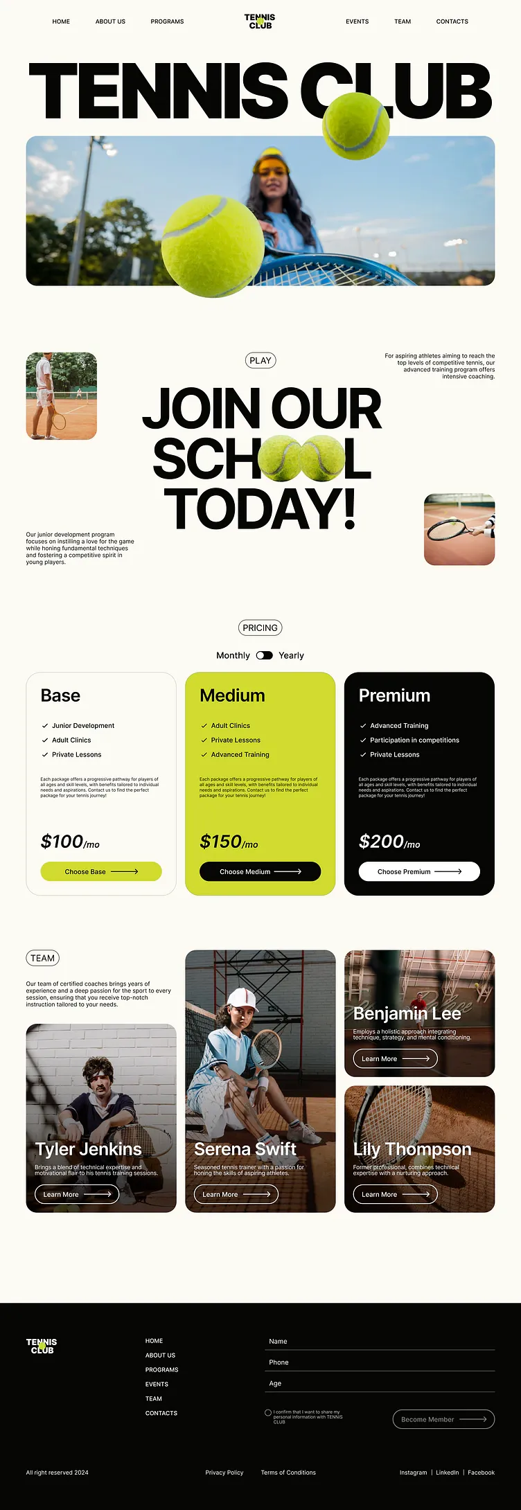
RebuildReference
Move across the image to wipe between the two. Click to lock the seam; arrow keys nudge it.
Imagery
4/4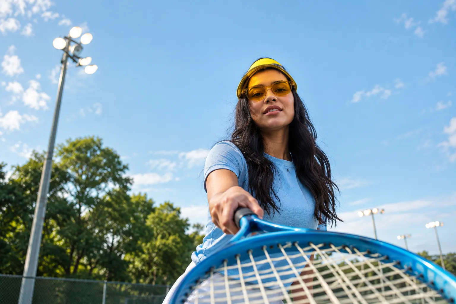
01-hero-banner
Low-angle daylight shot of a female tennis player in a yellow visor and sunglasses leaning toward the camera behind racket strings, with sky, trees and stadium floodlights behind
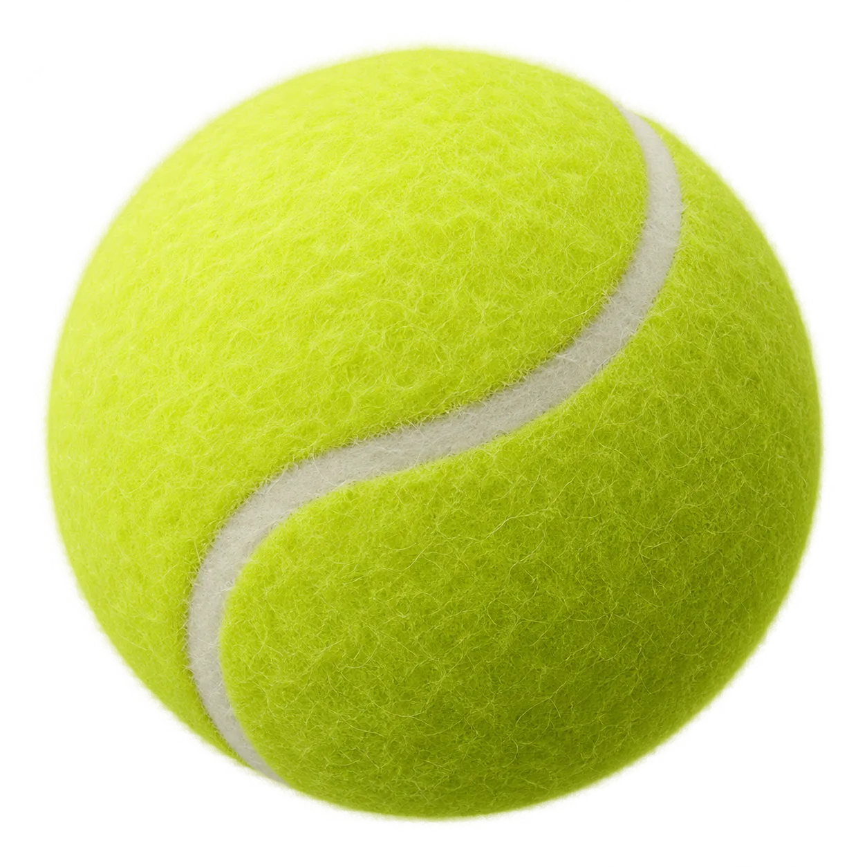
02-tennis-ball-cutout
Fluorescent lime tennis ball cutout
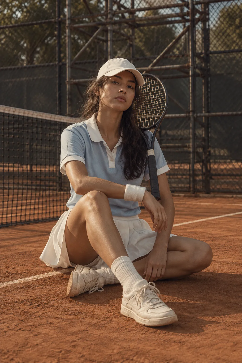
03-coach-tall-seated
Female tennis coach in a white cap and light blue polo seated on a clay court holding a racket, with fencing and scaffolding behind
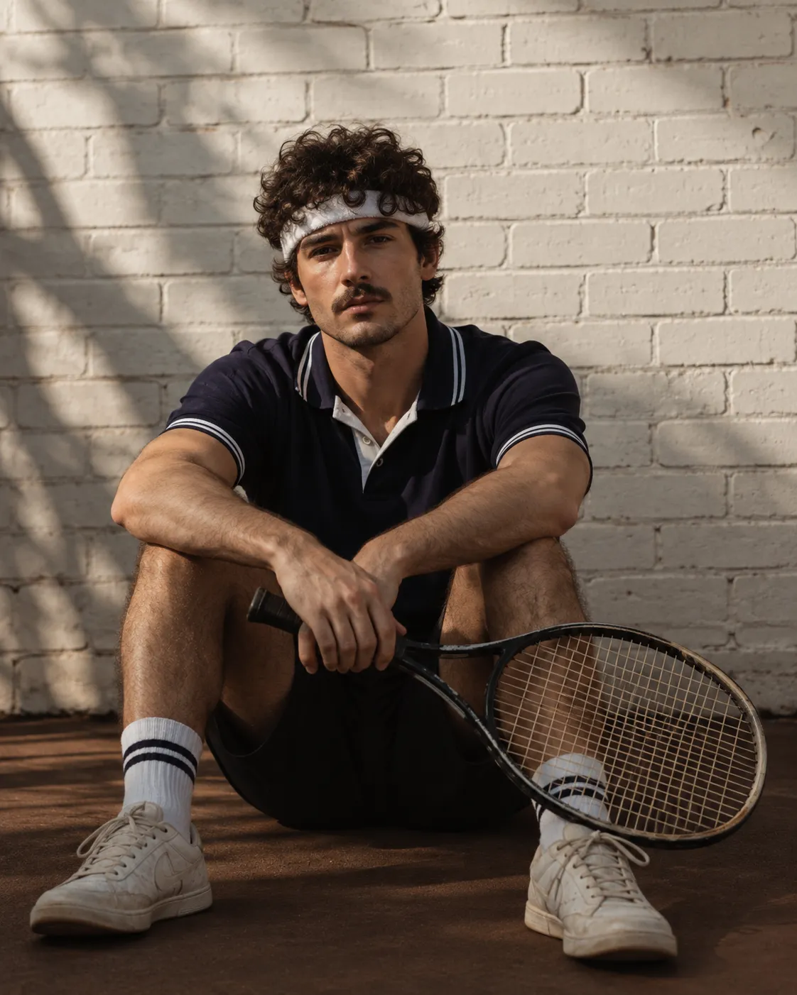
04-coach-portrait-male
Male tennis coach with a headband and dark navy polo seated against a white brick wall holding a racket
Prompts
115,858 chars
# Neon lime tennis club landing page

A light-mode sports club landing page. A warm off-white page carries huge black grotesk headlines. Fluorescent lime tennis balls overlap the type and the photos. The content is a flat, high-contrast set of tiles: rounded photo blocks, a three-way pricing row (white / lime / black), a bento team grid, and a black footer with a sign-up form. The brutalist feel comes from the scale of the type and the flat colour. It does not come from rough borders.

## Structure

- Desktop canvas is 1440px. The content container is **1296px** wide, with 72px side margins and no max-width beyond that. The nav is the one exception: its links sit inset at 144px from each edge.
- Grid: 3 equal columns of **416px** with a **24px** gutter. All card rows use this grid.

Sections, top to bottom:

1. **Nav bar.** Three text links on the left, a centred two-line stacked wordmark, three text links on the right. It is not sticky.
2. **Hero.**
   - A one-line display headline (two words, ~10–11 characters total) fills the full container width.
   - Directly under it is a wide rounded photo banner.
   - Two lime tennis-ball cutouts overlap the composition. A medium ball sits across the headline's bottom edge and the banner's top edge, over the 9th–10th letter. A large ball sits low on the banner, left of centre, and spills ~35px below the banner's bottom edge.
3. **Join / manifesto.** A free-floating editorial composition, not a grid:
   - small portrait photo at top-left
   - small right-aligned paragraph at top-right
   - centred outlined pill label (1 word)
   - centred three-line display headline (2 words / 1 word / 1 word + "!"). In the middle word, the two "O"s are replaced by two tennis-ball images sitting inline at cap height.
   - small paragraph at bottom-left
   - small square photo at bottom-right
4. **Pricing.**
   - Centred pill label, then a centred Monthly / Yearly toggle.
   - Three pricing cards in the 3-column grid: card 1 off-white with a hairline border, card 2 solid lime, card 3 solid black.
5. **Team.** Bento grid in the 3 columns:
   - Column 1 has the pill label, a 4-line intro paragraph, then a 4:5 portrait card that bottom-aligns with the other columns.
   - Column 2 is one tall card, the full height of the section.
   - Column 3 has two stacked landscape cards.
   - Each card is a coach photo with a dark bottom gradient, a white name, a 2-line bio and an outlined "Learn More →" pill.
6. **Footer.** Full-bleed black.
   - Top row: wordmark at x=72, a vertical nav list at x≈403, and a sign-up form at x≈730–1368. The form has three underline fields, a consent radio with fine print, and an outlined pill button aligned right.
   - Bottom bar: copyright at left, two legal links in the centre, three social links at right separated by "|".

## Scroll map

The viewport is assumed to be 1440×900. No motion report was supplied, so every number here was read from the page composite.

1. Nav — 112px — 0.12 vp — consumes 112px — static
2. Hero — 718px (y 112–830) — 0.80 vp — consumes 718px — entrance (inferred)
3. Join — 810px (y 830–1640) — 0.90 vp — consumes 810px — entrance (inferred)
4. Pricing — 910px (y 1640–2550) — 1.01 vp — consumes 910px — entrance (inferred)
5. Team — 1050px (y 2550–3600) — 1.17 vp — consumes 1050px — entrance (inferred)
6. Footer — 574px (y 3600–4174) — 0.64 vp — consumes 574px — static

**Total page height ≈ 4174px (≈4.6 viewports).** Nothing pins or stacks.

## Spacing

- **Section rhythm.** It is generous and slightly uneven, which keeps the page from feeling templated.
  - Hero banner bottom → Join content top: ~180px.
  - Join bottom → Pricing pill: ~170px.
  - Pricing cards → Team top: ~150px.
  - Team bottom → footer: ~250px of empty off-white. Keep this; it is a deliberate pause before the black footer.
- **Nav.** Height 112px, with link baselines at ~y58. The gap between links is ~64px.
- **Hero.**
  - Headline cap top at ~y170.
  - Headline bottom to banner top: ~20px. The headline nearly kisses the photo.
  - Banner: y376–789, height ~413px, full 1296px wide.
- **Join.**
  - Content block is ~595px tall.
  - Left photo is 194×240 at the top-left corner of the container.
  - Right photo is 194×196 at the bottom-right corner.
  - Paragraphs are max 300px wide, pinned to the opposite corners (top-right, bottom-left).
  - Pill to headline: 24px.
  - Headline lines step at ~140px.
- **Pricing.**
  - Pill to toggle: ~40px. Toggle to cards: ~44px.
  - Cards are 416×~618 with **40px** internal padding.
  - Inside a card:
    - title, then 40px to the feature list
    - feature rows step at 40px
    - fine-print paragraph 32px below the list
    - price block pushed to the bottom (flex column, `margin-top:auto`)
    - 24px to the full-width button
- **Team.**
  - Column 1: pill, then 20px to the intro paragraph (max 400px), then 40px to the card.
  - Column 2 card: 416×726.
  - Column 1 card: 416×522.
  - Column 3 cards: 416×351 each, with a 24px gap.
  - Card text inset is 24px from the left and bottom edges.
  - Name, then 12px to the bio, then 20px to the button.
- **Footer.**
  - Padding: 104px top, ~100px bottom.
  - Nav list rows step at 40px.
  - Form fields step at ~58px. Each is a 1px underline with the label as placeholder.
  - Consent row sits 40px below the last field. The button is on the same row, aligned right.
  - Bottom bar sits ~170px below the form.

## Type

- **Families.**
  - Display: a heavy, tightly-tracked neo-grotesk. Use **Inter Tight** at 800–900.
  - Text: a neutral grotesk. Use **Inter** at 400–500.
  - No serif or mono anywhere.
- **Body anchor: 16px.** The running paragraphs are short and small on this page.

| Level | Size | Line-height | Tracking | Weight | Notes |
|---|---|---|---|---|---|
| Hero display | 13.5× = **216px** | 0.85 | −0.06em | 900 | uppercase, one line, fills 1296px; size it to fit the container exactly |
| Join display | 9.5× = **152px** | 0.92 | −0.05em | 900 | uppercase, centred, 3 lines, max ~680px wide |
| Pricing card title | 2.75× = **44px** | 1.1 | −0.02em | 500 | sentence case |
| Price | 3× = **48px** | 1 | −0.02em | 600 italic | "/mo" suffix at 0.45× (≈22px), same italic, baseline-aligned |
| Team name | 2.6× = **42px** | 1.05 | −0.03em | 600 | white, one line |
| Toggle labels | 1.1× = **18px** | 1.2 | 0 | 500 | |
| Body / feature list | 1× = **16px** | 1.25 | 0 | 500 (list), 400 (paragraphs) | short paragraphs, max line ~38ch (300px) |
| Nav / footer links | 0.875× = **14px** | 1.2 | +0.02em | 500 | uppercase |
| Pill labels | 1× = **16px** | 1 | +0.02em | 500 | uppercase, inside a 1px outlined pill |
| Buttons | 0.875× = **14px** | 1 | 0 | 500 | sentence case |
| Fine print / bios / consent | 0.8× = **12.8px** | 1.3 | 0 | 400 | bios max ~2 lines, ~44ch |

The wordmark is a two-line stacked placeholder at 18px, weight 900, line-height 0.85. A 12px lime dot is tucked against the second line.

## Colour

| Hex | Role |
|---|---|
| `#FCFBF4` | **Page surface**, ~70% of the page. Warm off-white. Card 1 uses it too, slightly lifted with a border. |
| `#070705` | **Ink**. Covers all text on light, the outlined pills, the Premium card fill, the toggle track, the Medium card's button and the footer background. Second-largest area. |
| `#D2DB30` | **The single accent: neon lime.** Allowed only on: the tennis balls, the featured (middle) pricing card fill, the Base card's CTA button and the wordmark dot. |
| `#96A704` | Deep olive. The 1px border of the lime card, the hover fill for lime buttons, and the shading on the balls. Never used for text. |
| `#E6EA99` | Pale lime. Used only as the hover fill for outlined pills/buttons on light surfaces. |

Text colours:

- White text: on photos, the black card and the footer.
- Footer secondary text and the footer button label: white at 55% opacity.
- Field underlines: white at 30%.

## Surface

- **Borders.**
  - Outlined pills: 1px solid ink on light surfaces; 1px white on photos and in the footer.
  - Card 1: 1px `#070705` at 10% opacity.
  - Card 2: 1px `#96A704`.
  - Card 3: none.
- **Radii.**
  - Hero banner: 24px.
  - Join photos: 20px.
  - Pricing cards: 28px.
  - Team cards: 20px.
  - All buttons, pills and the toggle: 999px.
- **Shadows.** None anywhere. Depth comes only from the balls overlapping edges.
- **Buttons.**
  - Pricing CTAs are full-width filled pills, 54px tall. The label sits centred, followed by a long hairline arrow (~44px line, 1.5px stroke, small open head).
  - Team buttons are outlined white pills, 234×50.
  - The footer button is an outlined pill, 282×52.
- **Toggle.** A black 46×24 track with a 18px off-white knob sitting on the left (Monthly active).
- **Feature list.** Each item has a 12px thin check glyph in ink (on the black card, the check is white).

## Imagery

- **Hero banner (≈3.1:1, 1296×413).**
  - Shows a low-angle daylight action shot: a player in sunglasses and a visor leans toward the camera. Racket strings cross the foreground. Behind are blue sky, trees and stadium floodlights.
  - Saturated and sunny. Use object-fit cover, with the subject right of centre.
- **Tennis balls.**
  - Transparent cutouts of a fluorescent lime ball with white seams and soft internal shading. They must have no drop shadow beyond their own shading.
  - Sizes: ~188px on the headline/banner seam (centre ≈ x985, y351); ~284px on the banner (centre ≈ x588, y682); two at ~125px inline in the Join headline, touching side by side.
- **Join photos.**
  - Top-left, portrait 4:5: a full-length player in white on a clay court, mid-distance.
  - Bottom-right, ~1:1: a close crop of a racket held over a clay court.
- **Team photos.** Four coach portraits in moody, warm, slightly muted tones: clay orange, brown and deep shadow, with court nets or fences behind.
  - Column 1: ~4:5.
  - Column 2: ~4:7, the full-length seated subject.
  - Column 3: ~6:5 ×2.
  - Each has a bottom gradient from transparent to rgba(7,7,5,0.75) over its lower 45%.

## Motion

None of the motion below was measured. All of it is (inferred).

**1. Nav**

- kind: static
- what moves: nothing
- from → to: —
- range: —
- reduced motion: unchanged

**2. Hero**

- kind: entrance (inferred)
- what moves: the headline, the banner, then the two balls
- from → to:
  - Headline: opacity 0→1, translateY 40px→0.
  - Banner: opacity 0→1, scale 0.98→1.
  - Balls: scale 0.6→1, rotate −30°→0, opacity 0→1.
- range: plays once on page load. Duration and easing not measured; use 600–900ms with a strong ease-out. Stagger 100–150ms between headline, banner and balls.
- reduced motion: all elements render in their final state with no transform; at most an opacity fade under 200ms.

**3. Join**

- kind: entrance (inferred)
- what moves: the pill, the three headline lines, the two inline balls and the two corner photos
- from → to:
  - Pill: opacity 0→1.
  - Each headline line: translateY 32px→0, opacity 0→1.
  - Inline balls: scale 0→1.
  - Photos: translateY 24px→0, opacity 0→1.
- range: plays once, when the section top reaches 80% of the viewport. Duration not measured (500–800ms), ease-out. Lines stagger 80–120ms; the balls land after the headline.
- reduced motion: final state, no movement.

**4. Pricing**

- kind: entrance (inferred)
- what moves: the three cards
- from → to: translateY 40px→0, opacity 0→1.
- range: plays once, when the card row's top reaches 80% of the viewport. Duration not measured (500–700ms), ease-out, stagger 80–120ms left to right.
- reduced motion: final state.

**5. Team**

- kind: entrance (inferred)
- what moves: the intro text, then the four cards
- from → to:
  - Intro text: opacity 0→1, translateY 24px→0.
  - Card wrappers: opacity 0→1, translateY 40px→0.
  - Images inside the cards: scale 1.06→1.
- range: plays once, when each card's top reaches 85% of the viewport. Duration not measured (600–900ms), ease-out, stagger 80–120ms.
- reduced motion: final state.

**6. Footer**

- kind: static
- what moves: nothing
- from → to: —
- range: —
- reduced motion: unchanged

**Interaction transitions** (separate from the scroll choreography; 150–250ms ease-out, not measured):

- Nav and footer links: opacity 1 → 0.6 on hover.
- Outlined pills and buttons on light surfaces: fill to `#E6EA99` on hover.
- Outlined buttons on photos or black: fill white with ink text on hover.
- The long arrow in every button: translateX +6px on hover.
- Lime buttons: fill `#96A704` on hover. Black buttons: lift to `#2A2A26`. White buttons: go to `#E6EA99`.
- Every button: scale 0.98 on press.
- Pricing toggle: the knob slides 22px over 200ms, and the prices crossfade between the monthly and yearly values.
- Team cards: the image scales 1→1.04 on hover over 400ms. The card itself does not move.
- Footer fields: the underline goes from 30% to 100% white on focus.

## Responsive (<640px)

- **Container.** 20px side padding; the grid becomes a single column with 16px gaps.
- **Nav.** Collapses to the wordmark on the left and a 44px outlined pill "Menu" button on the right. The links move into a full-screen black overlay.
- **Hero.**
  - Headline still on one line, sized to fit the width (~17vw, around 64px). If it cannot fit, break it into two lines at line-height 0.85.
  - Banner becomes 4:3 with an 18px radius.
  - Balls scale proportionally (~28% and ~40% of the width) and keep their overlaps.
- **Join.**
  - Order: pill, then the headline (~15vw, about 56px; the inline balls scale with it), then the two photos side by side as a 2-up row (4:5 and 1:1 cropped to equal height), then both paragraphs, left-aligned at full width.
- **Pricing.** Cards stack in order Base / Medium / Premium. Card height becomes auto with a 32px minimum gap above the price.
- **Team.**
  - Pill and intro come first, then the cards one per row.
  - Cards are 4:5 and keep their overlays.
  - The bento height relationships are dropped.
- **Footer.**
  - Order: wordmark, then the nav list (2 columns), then the form full-width with a full-width button, then the bottom bar.
  - The bottom bar stacks into three centred rows at 12.8px.
- **Gaps.** Section gaps shrink to 96px. The empty band before the footer shrinks to 120px.

## Don'ts

- Don't shrink the hero headline to a "safe" 96px or centre it with breathing room. It must be edge to edge, ultra-black and almost touching the banner below.
- Don't use a lighter weight, a geometric or rounded display face, or a serif. The look depends on a dense 900-weight grotesk with negative tracking.
- Don't spread the lime around. No lime text on off-white, no lime section backgrounds, no lime links or icons. It appears only on the balls, the featured card, one CTA and the logo dot.
- Don't use pure white `#FFFFFF` for the page or a cool grey neutral. The off-white is warm and the black is near-black.
- Don't add drop shadows, glassmorphism, gradients on surfaces, or glows on the "neon". Everything is flat; only the photos carry depth.
- Don't clip the balls inside their containers. They must overlap edges: headline into banner, and banner out into the page.
- Don't put the Join section in a tidy grid. The corner photos and corner paragraphs must stay in opposite corners, asymmetric around the centred headline.
- Don't make the pricing cards identical with a "Most popular" badge. The hierarchy comes from the three fills (off-white / lime / black), with the button colours inverted per card.
- Don't use chunky chevron icons or solid arrow glyphs in buttons. Use long hairline arrows.
- Don't make the team grid uniform. Keep the 522 / 726 / 351+351 bento heights, with text over the photos rather than under them.
- Don't add extra sections (stats, testimonials, logo strips, FAQ), and don't add any parallax or pinning. Motion is limited to one-shot entrances.
- Don't use boxed inputs in the footer form. Use underline fields only, on black.
Versions
1Each rebuild is kept. The live one is what the comparison shows. LiveOpus 5.5Highfrontend-designemil-design-engtransitions-devgsaphumanizerlast week · 427s · 4 images · 20261011T213832ZOpen