NexGate — Data gateway hero
Rebuild
Opus 5.5Extra highfrontend-designemil-design-engtransitions-devhumanizergsapView
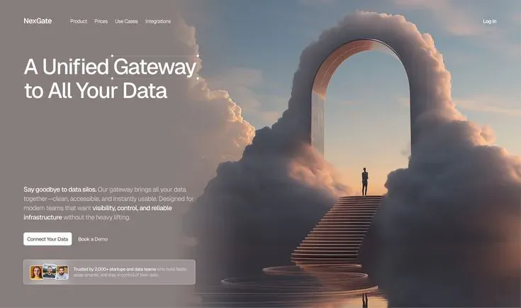
RebuildReference
Move across the image to wipe between the two. Click to lock the seam; arrow keys nudge it.
Imagery
2/2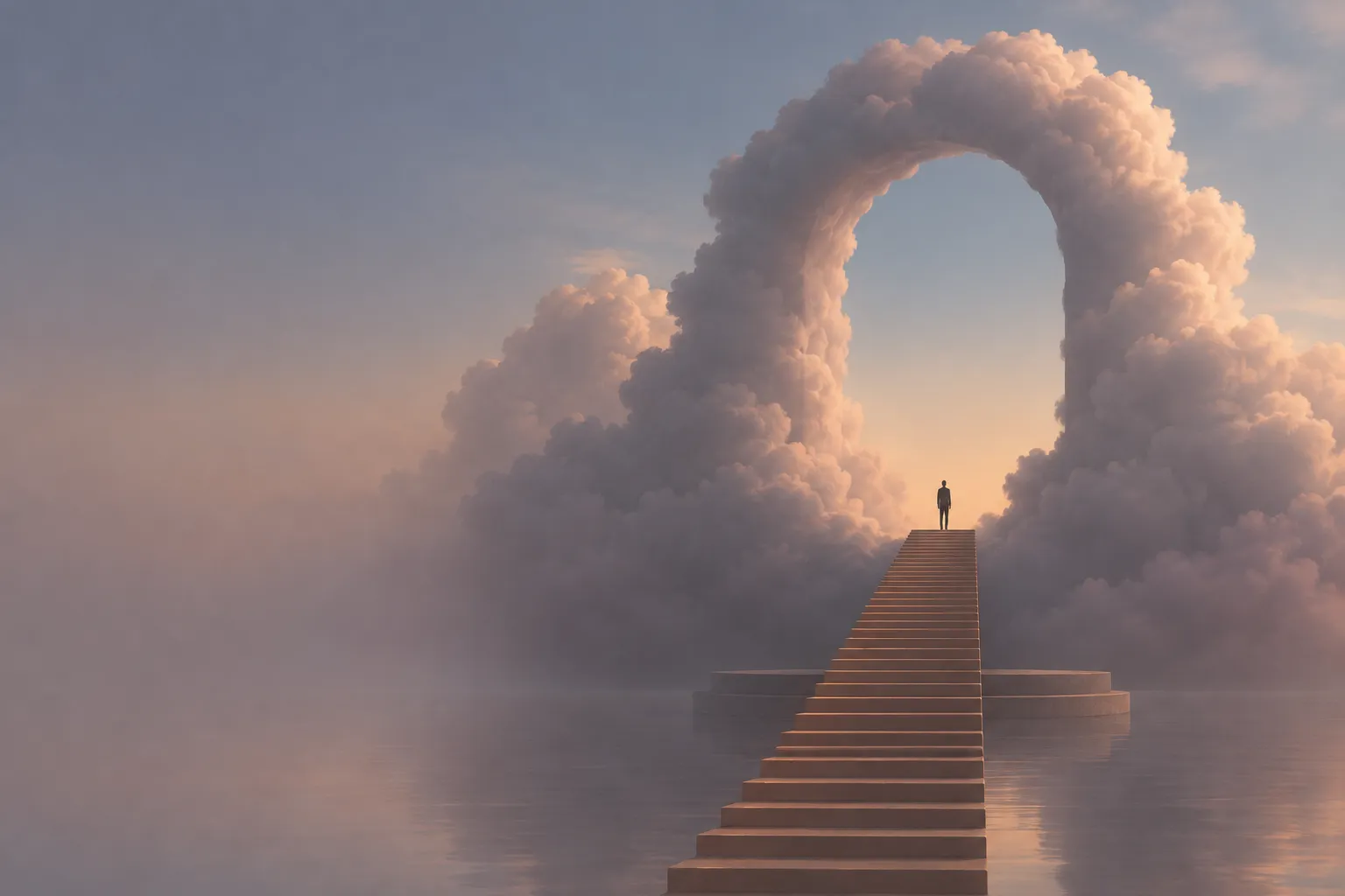
01-hero-cloud-arch
A monumental archway built from cloudbank standing on a circular stone plinth in still shallow water, with a lone figure partway up a long flight of lit stairs at dusk
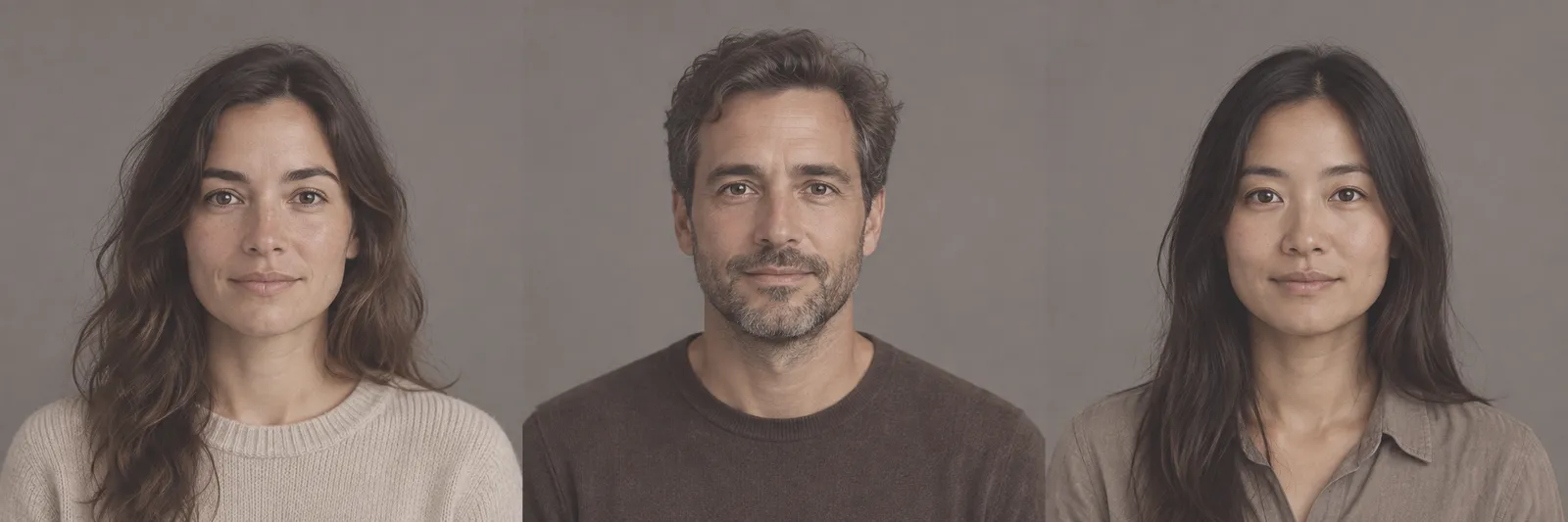
02-proof-avatars
Three overlapping head-and-shoulders portraits used as a small avatar stack
Prompts
116,532 chars
# Cinematic cloud-portal hero — full-bleed SaaS landing page

A single-screen, hero-led SaaS landing page: one full-bleed cinematic render fills the viewport, a soft dark gradient scrim washes the left ~half of it, and all copy sits in one left-aligned column on top of that scrim. Earth-toned, hazy, matte. Motion is deliberately restrained — nothing bounces, nothing pins.

**No motion report was supplied for this reference.** Every timing, distance, easing and trigger below is marked **(inferred)** or **not measured**, with a range. Do not treat any of them as measured values.

---

## 1. Structure

**Canvas:** 1440 × 880 reference viewport (the source still is 1.64:1, so the hero is one viewport tall at ~880px on a 1440 canvas). Page background `#37343A`.

**Container:** there is no centred max-width container. The page is full-bleed edge to edge; content is positioned off a **64px left gutter** and a **64px right gutter**, not off a centred wrapper. The only measured container is the **text column: 480px wide**, flush to the left gutter (so it occupies x = 64 → 544).

**Column structure:** optical split-screen, not a real two-column grid. The art is a single background layer spanning 100% width; the "left column" is created purely by the scrim + the 480px text column. Nothing is cropped or boxed.

**Sections, top to bottom:**

1. **Nav bar** — overlaid on the hero, transparent, no background, no border. Wordmark + 4 links at left, single "Log In" link at right.
2. **Hero** — full-bleed art, gradient scrim, text column containing: headline (2 lines) anchored to the top of the column, and a bottom-anchored group of paragraph → button row → social-proof card.
3. **Stats band** — a short dark band directly under the hero. **(inferred — not present in the supplied still; specified because the reference is catalogued as having a stats band. Build it as described so the page reads correctly below the fold.)**

---

## 2. Scroll map

| # | Section | Height | In viewports | Scroll consumed | Kind |
|---|---------|--------|--------------|-----------------|------|
| 1 | Nav bar | 72px (content box, overlaid) | — | 0px (occupies no scroll height of its own) | static |
| 2 | Hero | 880px | 1.00vp | 880px | entrance on load + scroll-linked parallax on the art layer |
| 3 | Stats band | 240px | 0.27vp | 240px | entrance (inferred) |

**Total page height: 1120px ≈ 1.27 viewports.** Nothing pins, nothing stacks, nothing consumes more scroll than its own height. If your rebuild is 4+ viewports tall, you have invented sections — don't.

---

## 3. Spacing

- Page gutters: **64px** left and right. Nav and text column share the same 64px left edge — they must align exactly.
- Nav: **32px** from page top to nav centre line (nav content box 72px, so ~28px padding-top). Gap between nav links: **32px**. Gap from wordmark to first link: **80px**.
- Hero text column: headline block top at **153px** from page top (i.e. **~50px** below the nav box).
- Headline → paragraph: **215px**. This gap is not a margin — the column is `justify-content: space-between` with headline pinned top and the lower group pinned bottom. Keep the void.
- Paragraph → button row: **36px**.
- Button row → proof card: **40px**.
- Proof card bottom → hero bottom: **80px**.
- Inside button row: **20px** gap.
- Inside proof card: **16px** padding all round, **12px** between avatar stack and text.
- Section rhythm: hero-to-stats has **no** gap — the stats band butts directly against the hero bottom edge, sharing it as a hard colour seam. Stats band internal padding: **56px** top and bottom.

---

## 4. Type

One family throughout. **Class: neo-grotesk**, slightly narrow, warm-neutral, low contrast. Free stand-in: **Inter Tight** (fallback Inter, then system-ui). Do not mix in a serif or a mono.

| Level | Size | Line-height | Tracking | Weight | Colour | Max measure |
|---|---|---|---|---|---|---|
| Wordmark | 18px | 1.2 | −0.01em | 600 | `#FFFFFF` | — |
| Nav link | 14px | 1.2 | 0 | 450–500 | `rgba(255,255,255,0.82)` | — |
| Headline | 60px | 1.12 (67px) | −0.02em | 500 | `#FFFFFF` | 480px ≈ 18ch, breaks to exactly 2 lines |
| Body paragraph | 16px | 1.65 (26px) | 0 | 400 | `rgba(255,255,255,0.68)` | 480px ≈ 58ch, 4–5 lines |
| Body emphasis (inline) | 16px | 1.65 | 0 | 600 | `#FFFFFF` | — |
| Button label | 14px | 1.0 | −0.005em | 500 | see Colour | — |
| Proof card text | 12px | 1.4 | 0 | 400 | `rgba(255,255,255,0.62)` | 2 lines |
| Proof card emphasis | 12px | 1.4 | 0 | 600 | `#FFFFFF` | — |
| Stat numeral (§3) | 44px | 1.1 | −0.02em | 500 | `#E7B995` | — |
| Stat label (§3) | 13px | 1.4 | 0.02em | 450 | `rgba(255,255,255,0.60)` | 160px |

The headline is **medium weight, sentence case**. The paragraph uses **two inline bold runs** — one at the very start (a short declarative clause, ~4–5 words, ending in a period) and one mid-paragraph (a 5–7 word phrase) — with the rest at 400. That weight alternation is the whole typographic idea of the block; don't flatten it.

**Placeholder copy by role:**
- Wordmark: 1 word, 7–8 characters.
- Nav: 4 links, 1–2 words each.
- Right-hand nav: 1 link, 2 words.
- Headline: 6–7 words on two lines; line 1 longer than line 2 (~17ch / ~16ch).
- Paragraph: 38–45 words, with the two bold runs described above.
- Primary button: 3 words. Secondary button: 3 words.
- Proof card: one sentence, ~22 words, beginning with a bold clause of ~6 words.
- Stats: 4 pairs — numeral (3–5 glyphs, e.g. `2,000+`, `99.9%`) + label (2–3 words).

---

## 5. Colour

| Hex | Role |
|---|---|
| `#867E7C` | **Dominant surface.** The mauve-grey haze of the scrimmed artwork — this tone covers roughly half the viewport and sets the page's temperature. It is an image tone, not a fill you paint. |
| `#37343A` | Deep plum-charcoal. Page background, the base of the scrim gradient, the stats band fill, and the label colour on the primary button. |
| `#56545B` | Mid slate. Hairline borders, dividers in the stats band, the proof-card panel tint. |
| `#E7B995` | **The single accent.** Warm peach. It originates in the artwork (the light burning through the portal, the lit treads, the horizon) and is allowed in the UI in exactly three places: the stat numerals, the link-hover underline, and the focus ring. |
| `#FFFFFF` | Headline, emphasis runs, primary button fill. |

**Accent discipline:** `#E7B995` never fills a button, never colours body text, never becomes a gradient, and never appears above the fold as a UI element — above the fold it exists only inside the photograph. The buttons are white-on-dark and transparent-on-dark, full stop.

**Scrim:** `linear-gradient(90deg, rgba(55,52,58,0.84) 0%, rgba(55,52,58,0.70) 28%, rgba(55,52,58,0) 52%)` across the full hero. Plus a second, subtler vertical pass — `linear-gradient(180deg, rgba(55,52,58,0.45) 0%, transparent 22%)` — so the nav stays legible over the bright cloud at the top right.

---

## 6. Surface

- **Borders:** 1px only. `rgba(255,255,255,0.14)` on the proof card; `rgba(255,255,255,0.10)` for the stats-band dividers. The nav has no bottom border.
- **Radii:** buttons **8px**. Proof card **12px**. Avatars **50%** (24px circles) with a 2px ring in the card's own tint so they read as stacked. Nothing else is rounded — the page itself has square corners and bleeds to all four edges.
- **Shadows:** none. No drop shadow on buttons, card, avatars or nav. Depth comes entirely from the scrim gradient and the artwork's own atmospheric haze. The proof card reads as a pane of tinted glass — `background: rgba(86,84,91,0.30)` with `backdrop-filter: blur(12px)` — not as a raised object.

---

## 7. Imagery

**A. Hero art — the only significant image.**
A soft, matte 3D render at dusk: a monumental freestanding arch built entirely from dense, slow-rolling cumulus cloudbank — the cloud *is* the masonry, with a clean dark keyhole of open sky at its centre. The arch stands on a low circular stone plinth in perfectly still shallow water. A long straight flight of narrow stairs runs from the foreground water up to the plinth, catching the warm light along each tread. One human figure, a plain silhouette, stands alone about two-thirds of the way up the stairs, facing the arch — the figure is roughly **1/45th of the frame height**, small enough that a viewer finds it a beat after the arch. Behind the opening the sky graduates from warm peach at the horizon to dusty grey-blue overhead.

*Treatment:* low contrast, desaturated, heavy atmospheric haze, visible fine grain. Highlights roll off — no blown whites, no lens flare, no bloom, no god-rays.

*Aspect / placement:* supply the source at **3:4 portrait** so it survives cropping; render it `object-fit: cover` across the whole hero (16:10 at desktop) with focal point at **64% horizontal, 50% vertical**, so the arch's centreline lands around x = 920 on a 1440 canvas and the stairs run down the right-of-centre. The text column must never overlap the arch opening.

**B. Avatar stack — 3 images.**
Three 1:1 portrait crops, tightly framed head-and-shoulders, overlapping left-to-right by 8px inside the proof card. Rendered at 24px. Desaturate them ~25% so they sit inside the page's earth-tone grade instead of popping as colour.

**C. Stats band — no imagery.** Type only.

---

## 8. Motion

Overall: **restrained**. One load sequence, one slow parallax, one entrance below the fold. No timelines, no pinning, no scrubbed video.

### Section 1 — Nav bar
- **kind** — static.
- **what moves** — nothing after load. The nav does **not** stick, does not re-appear on scroll-up, does not gain a background.
- **from → to** — on page load only, it shares the hero's load sequence: opacity 0 → 1, translateY −8px → 0 (inferred).
- **range** — entrance, on load, first in the stagger. Duration **not measured**; 400–600ms reads right. Easing **not measured**; a standard ease-out.
- **reduced motion** — renders at final state immediately.

### Section 2 — Hero
- **kind** — entrance on load, then scroll-linked parallax on the art layer only.
- **what moves** —
  *Entrance:* headline, paragraph, button row, proof card — as four separate items, in that order. The art layer fades as one piece underneath them.
  *Scroll-linked:* the background art layer only. Scrim and text scroll normally at 1:1.
- **from → to** —
  *Entrance (plays once):* each text item opacity 0 → 1, translateY **16px → 0** (inferred). Art layer opacity 0 → 1 with scale **1.04 → 1.00** (inferred).
  *Scroll-linked (reverses on the way back up):* art layer translateY **0 → −70px** across the section, i.e. it moves at roughly 0.92× page speed (inferred). Nothing else moves.
- **range** —
  *Entrance:* trigger is page load, not scroll — the hero is above the fold. Duration **not measured**; 500–700ms per item. Stagger **not measured**; 70–110ms between the four items. Easing **not measured**; ease-out, no overshoot, no spring.
  *Scroll-linked:* from scroll position 0 until the hero's bottom edge reaches the top of the viewport (880px of scroll). Linear mapping, no smoothing/lerp was measured — don't add one.
- **reduced motion** — no parallax at all (art layer is static within the section), no translate on entrance; opacity 0 → 1 only, or snap to final state.

### Section 3 — Stats band **(inferred)**
- **kind** — entrance, plays once.
- **what moves** — the four stat pairs (numeral + label), each as one unit. The dividers do not animate.
- **from → to** — opacity 0 → 1, translateY **12px → 0** (inferred). No count-up on the numerals — they render at their final value.
- **range** — trigger: once, when the band's top reaches **85%** of the viewport height. Duration **not measured**; 400–600ms. Stagger **not measured**; 60–90ms left to right. Easing ease-out.
- **reduced motion** — opacity only, no translate, no stagger.

### Interaction transitions (not part of the scroll choreography)
- **Nav link hover:** colour `rgba(255,255,255,0.82)` → `#FFFFFF`; a 1px `#E7B995` underline grows from the left edge to full width. ~150ms, ease-out.
- **Primary button hover:** fill `#FFFFFF` → `#F2ECE7`. No lift, no shadow, no scale-up. ~120ms.
- **Secondary button hover:** background transparent → `rgba(255,255,255,0.10)`. ~120ms.
- **Button press:** scale 0.985 and fill one step darker, ~80ms.
- **Focus-visible (any control):** 2px `#E7B995` ring, 2px offset, no transition.
- **Proof card and avatars:** no hover state.

---

## 9. Responsive (below 640px)

- Text column goes to **100% width minus 2 × 20px gutters**. Page gutters shrink 64px → **20px**; nav aligns to the same 20px.
- Nav collapses: wordmark left, "Log In" right, the 4 links **dropped into a hamburger** (single icon button, 24px, right of "Log In" — or drop the links entirely and keep only "Log In" if you don't want to build a menu). No full-screen overlay animation beyond a plain fade.
- Hero height becomes **min-height: 100svh** (use `svh`, not `vh`). The `space-between` distribution stays, but the headline→paragraph void compresses to whatever is left — set a **minimum of 72px**.
- Headline 60px → **36px / 1.15**, still 2–3 lines. Paragraph 16px → **15px / 1.6**.
- Art focal point shifts to **60% horizontal** so the arch stays whole in a portrait crop; strengthen the scrim to a vertical one: `linear-gradient(180deg, rgba(55,52,58,0.55) 0%, rgba(55,52,58,0.88) 65%)`, because there is no longer room for a left-right split.
- Buttons go **full width, stacked**, 12px gap, height 48px. Primary on top.
- Proof card keeps its layout (avatars left, text right) at full width; text drops to 11px / 1.45.
- Stats band: 4 across → **2 × 2 grid**, vertical dividers removed, 32px row gap, band height auto.
- Parallax on the art layer is **dropped entirely** on touch viewports.

---

## 10. Don'ts

- **Don't inset the page.** No rounded page corners, no margin, no card holding the hero. The art bleeds to all four edges of the viewport.
- **Don't build a literal two-column split** with the image in a 50%-wide box and a hard vertical seam. The art spans 100% width; the split is an illusion made by a gradient scrim that fades fully out by 52%.
- **Don't use a flat semi-opaque black rectangle** as the scrim. A visible hard edge kills it. It's a gradient, and it's plum-charcoal `#37343A`, not black — black turns the earth tones grey and dead.
- **Don't centre the hero text.** Everything is left-aligned on the 64px gutter, ragged right.
- **Don't add an eyebrow pill, badge, "New" chip or announcement bar** above the headline. There is nothing above the headline but the nav and 50px of air.
- **Don't set the headline at 700/800 or in caps.** It is 500 weight, sentence case, −0.02em. Bold headlines make this read like a generic startup template.
- **Don't close the headline→paragraph gap.** That 215px void is the composition — it's what lets the arch breathe. Do not fill it with a feature list, logos, or a scroll cue.
- **Don't add a bouncing scroll-down chevron or a "scroll" label.**
- **Don't let `#E7B995` become a button.** A peach CTA is the single most likely wrong turn here. Primary is white fill / `#37343A` text; secondary is a bare text button with no border.
- **Don't make the nav a floating translucent pill with a blur and a border.** It's transparent, flush, unadorned, and it scrolls away.
- **Don't put shadows on anything** — not the buttons, not the proof card, not the avatars.
- **Don't give buttons a pill radius.** 8px, not 999px.
- **Don't animate the headline per-word or per-character,** and don't add a blur-in or a mask-reveal. One block, one fade, one 16px rise.
- **Don't run a continuous Ken Burns zoom or an autoplaying video loop** on the art. The scale change happens once, on entrance, and stops.
- **Don't oversize the human figure in the artwork.** Scale is the entire point — it should be near-missable. Equally, don't make the arch a clean architectural CAD arch: it's built out of cloud, soft-edged, with no hard silhouette.
- **Don't grade the image teal-and-orange or push saturation.** Keep it hazy, desaturated, matte; the peach is the only warm note and it's low-intensity.
- **Don't let the text column encroach past 544px** — the copy must never overlap the arch opening at desktop.
- **Don't add gradient mesh blobs, noise overlays beyond the image's own grain, or a grid/dot background.** The photograph is the entire visual system.
- **Don't extend the page.** No invented feature grids, testimonial carousels, pricing tables or footers beyond the stats band. This reference is a hero plus one band.
Versions
1Each rebuild is kept. The live one is what the comparison shows. LiveOpus 5.5Extra highfrontend-designemil-design-engtransitions-devhumanizergsaplast month · 24s · 2 images · 20260917T185144ZOpen