Nightlife social app landing page
Rebuild
Opus 5.5Extra highfrontend-designemil-design-engtransitions-devgsaphumanizerView

RebuildReference
Move across the image to wipe between the two. Click to lock the seam; arrow keys nudge it.
Imagery
4/4
01-hero-side-cards· 2x2 sheet
Four daylight photos of young friends in bright streetwear against pale sky

02-feature-row-tiles· 2x2 sheet
Four daylight photos of young friends grouped around an empty centre

03-audience-and-portraits· 3x2 sheet
Three outdoor audience photos and three bright headshots of young adults
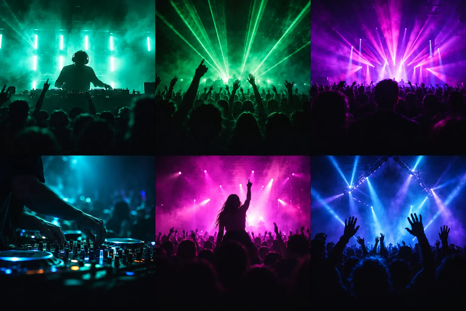
04-phone-club-thumbnails· 3x2 sheet
Six dark night-club scenes lit by neon stage light
Prompts
121,126 chars
# Light pastel mobile-app landing page with sky-blue gradient bands

A long, airy marketing page for a mobile social app. The page is near-white, and two full-bleed sky-blue gradient bands frame it: the hero at the top and a CTA band near the bottom. Both bands fade into the page colour. Phone mockups built in HTML/CSS show the product. Bright daylight photos of young people set the mood. Each section headline is set in two centred lines of large, light grotesk: a ghost-grey first line and a near-black second line. Everything else stays quiet: pastel step cards, feature cards with hairline borders, and small frosted-glass chips over photos and over the blue. It reads as sunny and editorial, not as a dark club site.

## Structure

- Viewport 1440 × 900. Page background is #FCFAFE and runs full-bleed.
- Content container: max 1280px, centred, 80px side padding at 1440. The implicit grid is 12 columns with a 24px gutter.
- Sections, top to bottom:
  1. **Nav + Hero.** Full-bleed blue gradient. The nav row sits on the gradient. Below it: a centred two-line headline, one small black pill CTA, and a centred phone. Four photo cards in perspective, two on each side, form a coverflow arc around the phone and reach both viewport edges.
  2. **Process steps.** Eyebrow pill, two-line H2, then 3 equal pastel cards (3 × 4 columns).
  3. **Feature rows.** Eyebrow, H2, then 4 row-cards, each the full container width. They alternate: image left / text right, then text left / image right, and repeat.
  4. **Audience.** Eyebrow, H2, then 3 equal portrait photo cards with the middle card raised. Each card has a glass caption panel.
  5. **Testimonial.** Eyebrow, H2, then two columns. Left: a giant italic greeting word, a quote paragraph and a role label. Right: a tilted portrait with a pin and a glass name tag.
  6. **CTA band.** Full-bleed blue gradient. Left: white headline, a short line of copy and 2 store badges. Right: a phone cropped by the band's bottom edge, with glass cards floating around it.
  7. **Footer.** Brand + newsletter column, 4 link columns, and a bottom bar with social icons and copyright.
- Column details:
  - Section 3 rows: a fixed 593px image cell plus a 1fr text cell.
  - Section 5: text column (max 500px) on the left, photo (≈535px) pushed to the right edge with space-between.
  - Section 6: text column ≈480px on the left. The phone is centred at ≈1025px from the container's left edge.
  - Section 7: brand column 400px, then link columns starting at 440 / 635 / 810 / 1020px from the container's left edge.

## Scroll map

No motion report was supplied. Heights come from the page composite. Nothing pins or stacks, so scroll consumed equals height.

1. Nav + Hero: 1220px · 1.36 vh · consumes 1220 · entrance (on load)
2. Process steps: 990px · 1.10 vh · consumes 990 · entrance
3. Feature rows: 2560px · 2.84 vh · consumes 2560 · entrance (per row)
4. Audience: 1010px · 1.12 vh · consumes 1010 · entrance
5. Testimonial: 1080px · 1.20 vh · consumes 1080 · entrance
6. CTA band: 750px · 0.83 vh · consumes 750 · entrance
7. Footer: 500px · 0.56 vh · consumes 500 · static

Total page height ≈ 8110px ≈ 9.0 viewports.

## Spacing

- **Nav** (section 1): top offset 32px, row height 40px. Logo, link pill and button are vertically centred on one line.
- **Hero vertical positions** (section 1, from page top):
  - Headline line 1 centre ≈170, line 2 ≈253.
  - CTA button centre ≈353, which leaves 32px between the headline and the button.
  - Phone top ≈427, bottom ≈1150.
  - Inner side cards span ≈490–1080. Outer side cards span ≈575–1040.
  - The gradient finishes fading to #FCFAFE at ≈1200, so the lower part of the phone sits on near-white.
- **Horizontal hero layout** at 1440:
  - Phone at x 552–896.
  - Left inner card ≈315–545, tucked behind the phone's left edge. Left outer card ≈0–295.
  - Right inner card ≈896–1165. Right outer card ≈1185–1440.
- **Section rhythm** (sections 2–5): padding is about 72px top and 72px bottom, so the last content of one section sits about 140px above the next eyebrow. From the bottom of the hero phone to section 2's eyebrow is about 185px.
- **Header block**, used the same way in sections 2–5: eyebrow pill, then 28px, then the two-line H2, then 80px, then the content.
- **Section 2:**
  - Cards are 411 × 480 with a 24px gap and 24px padding.
  - The index number sits at the top-left.
  - The icon tile is centred at ≈50% of the card height.
  - Title and description sit at the bottom: title, 8px gap, description.
- **Section 3:**
  - Each row is 1280 × 500, with 32px between rows.
  - The image cell is 593px wide and full row height.
  - The text block (max 440px) is vertically centred and anchored to the *outer* edge of the row with 48px padding. This leaves a wide empty gutter (~200px) between the image and the text.
  - Heading, then 16px, then the paragraph.
- **Section 4:**
  - Cards are 411 × 500 with a 24px gap. The middle card is translated up 56px.
  - The glass panel is inset 12px from the card's left, right and bottom edges, with 14px × 16px padding.
  - Inside the panel: icon tile, 12px gap, text stack.
- **Section 5:**
  - Photo ≈535 × 545.
  - The text column is vertically centred against the photo: greeting, 24px, quote, 20px, role label.
- **Section 6:**
  - The band is 750px tall.
  - The text block starts ≈270px below the band top: headline, 20px, line of copy, 28px, badges. Badges have a 12px gap.
  - The phone top is 160px below the band top. The phone is cut off by the band's bottom edge.
- **Section 7:**
  - Padding 120px top, 48px bottom.
  - Link rows have a 28px pitch. Column heading to first link is 16px.
  - Brand column: logo, 16px, newsletter label, 12px, input.
  - Bottom bar sits ≈150px below the link columns.

## Type

- **Family class:** neo-grotesk sans in the SF Pro / Inter mould. Use **Inter** (free) at weights 300, 400 and 500, plus Inter Italic 500 for the greeting word.
- Use one family only: no serif and no mono. Never use 600 or 700 on headlines.
- **Body anchor:** 16px. Every level below is a multiple of it.

| Level | × body | px | Line-height | Tracking | Weight | Colour |
|---|---|---|---|---|---|---|
| Hero H1 (s1) | 4.0× | 64 | 1.1 | -0.025em | each line pairs a 300 run with a 500 run | #FFFFFF |
| Section H2 (s2–s5) | 3.75× | 60 | 1.2 | -0.025em | line 1: 400 in #A9AAB1; line 2: 500 in #0E0E10 | — |
| Greeting word (s5) | 5.5× | 88 | 1.0 | -0.03em | 500 italic | #0E0E10 |
| CTA headline (s6) | 3.25× | 52 | 1.15 | -0.02em | 300 + 400 runs | #FFFFFF |
| Feature row heading (s3) | 1.75× | 28 | 1.2 | -0.015em | 500 | #0E0E10 |
| Card title (s2, s4 panel) | 1.125× | 18 | 1.3 | -0.01em | 500 | #0E0E10 |
| Body / feature paragraph | 1.0× | 16 | 1.6 | 0 | 400 | #6B6C74 |
| Testimonial quote | 1.06× | 17 | 1.6 | 0 | 400 | #3C3D44 |
| Small text (card descriptions, glass panels, CTA line) | 0.875× | 14 | 1.5 | 0 | 400 | #6B6C74 (white at 80% on blue) |
| Nav links, buttons | 0.875× | 14 | 1.0 | 0 | 500 | per button |
| Step index "01" | 0.875× | 14 | 1.0 | 0.02em, tabular numbers | 500 | #8A8B93 |
| Eyebrow pill | 0.75× | 12 | 1.0 | 0.01em | 500 | #6B6C74 |
| Footer heading / link | 0.875× | 14 | 1.4 | 0 | 500 / 400 | #0E0E10 / #6B6C74 |
| Copyright | 0.75× | 12 | 1.4 | 0 | 400 | #8A8B93 |
| Phone UI text | — | 12–13 | 1.3 | 0 | 400–500 | per UI |

- **Headline copy and line length:**
  - Every H1 and H2 is set as exactly two centred lines of 2–4 words each, about 14–22 characters per line, broken by hand.
  - Placeholder copy:
    - Hero: two short imperative phrases, 2–3 words each.
    - H2: a 3-word lead-in on line 1 and a 2–3 word payoff on line 2.
- **Body line length:** max ~56ch (≈440px). Step card descriptions are 2 lines of ~30 characters.
- **Placeholder copy elsewhere:**
  - Eyebrows: 2 words.
  - Feature headings: 3–5 words, 1–2 lines.
  - Feature paragraphs: 3–4 lines.
  - Testimonial quote: 3 lines, ~35 words, preceded by a one-word greeting with a comma.
  - Role label: 1 word.

## Colour

| Hex | Role |
|---|---|
| #FCFAFE | Page surface. Covers ~75% of the page: everything from section 2 through the footer, except band 6. |
| #FFFFFF | Card surface for section 3 rows and the footer input. Also the hero and CTA text and the hero's "early access" button. |
| #457BA7 | **The single accent (steel sky blue).** Deep top stop of the hero and CTA gradients, the footer newsletter send button, and the footer logo mark. Nowhere else: no blue text, links, icons or borders. |
| #86AAC8 | Mid stop of both gradients and the input focus border. |
| #0E0E10 | Ink. H2 line 2, the nav link pill, primary pill buttons, store badges, the testimonial pin, step icons. |
| #A9AAB1 | Ghost-grey first line of every H2. |
| #6B6C74 | Body and secondary text. |
| #ECEBF0 | Hairlines. |
| #F0EFF3 | Eyebrow pill fill. |
| #EEE7FB / #FBF6DF / #E8F0FA | Lavender / butter / ice-blue pastels, used only on the three step cards, in that order. |
| #0B8B55 | Green, sampled from the photos and phone UI. Use it only as positive-delta text inside phone mockups (e.g. "+18%") and let it appear naturally in photos. Never a button or brand colour. |

- **Gradients:**
  - Hero: `linear-gradient(180deg, #457BA7 0%, #86AAC8 42%, #C9DAEA 72%, #FCFAFE 100%)` over 0–1220px.
  - CTA band: the same stops. The band has a hard top edge against the testimonial section and softens into near-white over its last ~90px into the footer.
- **#D7D7D8** was sampled from the grey presentation sheet around the screenshot. It is not part of this design; do not use it.

## Surface

- **Radii:**
  - Step cards: 20px.
  - Feature row cards: 24px. The image cell shares the outer radius through `overflow: hidden`.
  - Audience cards: 20px.
  - Testimonial photo: 24px.
  - Glass panels and chips: 14–16px.
  - Icon tiles: 14px (56px tile) or 10px (36px tile).
  - Store badges: 10px.
  - Eyebrow, nav pill, buttons and newsletter input: 999px.
  - Phone frame 52px, screen 44px.
- **Borders:**
  - Feature rows: 1px #ECEBF0.
  - Footer input: 1px #E6E5EA.
  - Footer store badges: 1px #E6E5EA.
  - Glass elements: 1px rgba(255,255,255,0.55).
  - Step cards and audience cards have no border.
- **Shadows:** none on in-flow cards. Only floating objects get shadows:
  - Phones: `0 30px 60px rgba(20,40,70,0.22)`.
  - Glass chips: `0 8px 24px rgba(16,32,64,0.10)`.
  - Testimonial photo: `0 20px 40px rgba(0,0,0,0.12)`.
- **Glass recipe:** `background: rgba(255,255,255,0.6); backdrop-filter: blur(16px) saturate(140%)`, plus the 1px white border above. Use it only on:
  - the audience caption panels,
  - the testimonial name tag,
  - the CTA floating cards and chips,
  - the two round icon buttons in the CTA band.
- **Phone frame:** light silver bezel, 10px of #E9EAEE with a faint inner #D9DAE0 line, and a dynamic-island pill at the top.

## Imagery

1. **Hero side cards:** 4, photo.
   - Young adults in colourful streetwear in high-key daylight, often against open sky-blue backdrops: laughing, hugging, throwing a peace sign, mid-dance. The look is saturated pastel and flash-editorial.
   - Portrait about 3:4 before transform.
   - Each card is rotated in 3D toward the phone (`perspective: 1400px`):
     - Inner cards: rotateY ±32°, about 300 × 590.
     - Outer cards: rotateY ±38°, about 260 × 465.
   - This makes trapezoids that are taller at the inner edge. Radius 20px, no border.
2. **Hero phone:** 1, ui, 345 × 726, centred.
   - Dark screen #0B0B0E: status bar, a header row with avatar and two icons, and a "Discover"-style label.
   - A 2-column grid of 6 rounded thumbnails (radius 12) with tiny captions. The thumbnails are photos: DJ booths, neon stage lights, crowds.
   - Bottom tab bar with a raised white circular centre button.
3. **Step icons:** 3, vector.
   - Black 22px line glyphs (camera, stacked cards, pointer/tap) centred in white 56px rounded-square tiles.
   - Each step card also has an index number at the top-left.
4. **Feature row tiles:** 4, photo + ui, 593 × 500 (≈6:5).
   - A bright daylight photo of young people fills each tile.
   - A ui phone (~230px wide), tilted 0–6°, sits in it and is cropped by the tile's bottom edge, with people framed around it.
   - Phone screens, by row:
     1. Dark discover grid.
     2. "Featured tonight" cards with a row of story avatars.
     3. Light dashboard: three tabs, 4 stat tiles with coloured round icons and green deltas, a quick-actions strip.
     4. Member list: avatar, name, meta line and two round action icons per row.
5. **Audience cards:** 3, photo, 411 × 500 (≈4:5), radius 20px.
   - Subjects, left to right:
     - a group of friends posing outdoors against blue sky with a flag,
     - a sun-backlit festival crowd,
     - a man in sunglasses dancing with arms up.
   - Each card has a glass caption panel: a 36px white icon tile (vector glyph), a 1–2 word title and a 2-line description.
6. **Testimonial portrait:** 1, photo, ≈535 × 545 (≈1:1).
   - A close-up of a young woman with dark hair, smiling broadly against a bright neutral background.
   - Rotated +4°, radius 24px.
   - A black 18px pin dot sits centred on the top edge, half overlapping it.
   - A glass name-tag pill (14px name, 2 words) overlaps the bottom-right corner and shares the same rotation.
7. **CTA phone:** 1, ui, ≈395px wide.
   - Light dashboard screen, the same as row 3's.
   - Glass cards around it:
     - left, overlapping the phone: a ~270 × 84 user row with a 32px photo avatar, name and meta line, and a small icon;
     - right edge: 2 stacked stat chips with green deltas, allowed to overhang the container by ~50px;
     - above right: 2 round 36px glass icon buttons (vector glyphs).
8. **Avatars inside phone UIs:** many, photo, 24–32px circles.
9. **Logos and badges:** vector.
   - Neutral placeholder mark: a white 32px circle with a dark glyph in the nav; a #457BA7 mark plus a one-word 18px/500 wordmark in the footer.
   - Store badges: black pills in s6, outlined white in s7, with an Apple or Play glyph and 2-line text.
   - 5 social glyphs at 16px in #6B6C74.

## Motion

No motion report was supplied. Every value below is **(inferred)** from the "restrained motion" character, and all durations are **not measured**.

**1. Nav + Hero**
- kind — entrance (on page load)
- what moves — nav row, headline lines, CTA pill, phone, 4 side cards
- from → to:
  - nav and headline: opacity 0 → 1, translateY 16px → 0
  - CTA: same as the headline
  - phone: opacity 0 → 1, translateY 48px → 0
  - side cards: opacity 0 → 1, translateX 24px toward the centre → 0, rotateY final ±8° extra → final value
- range — once on load. Duration not measured (500–800ms), ease-out, stagger not measured (60–120ms) in this order: headline → CTA → phone → inner cards → outer cards.
- reduced motion — all elements render in their final state; at most a 150–250ms opacity fade.

**2. Process steps**
- kind — entrance
- what moves — eyebrow + H2 block, then the 3 cards
- from → to — opacity 0 → 1, translateY 24px → 0
- range — once, when each element's top reaches ~85% of viewport height. Duration not measured (500–700ms), ease-out, card stagger not measured (80–120ms).
- reduced motion — no transforms; content visible immediately.

**3. Feature rows**
- kind — entrance, per row
- what moves — the row card; inside it, the phone in the image tile
- from → to — row: opacity 0 → 1, translateY 24px → 0. Phone: translateY an extra 16px → 0, starting ~100ms after the row.
- range — once per row, when the row top reaches ~85% of viewport height. Duration not measured (500–800ms), ease-out.
- reduced motion — static, fully visible.

**4. Audience**
- kind — entrance
- what moves — 3 cards, then their glass panels
- from → to — cards: opacity 0 → 1, translateY 24px → 0. The middle card ends at its −56px offset. Panels: opacity 0 → 1, translateY 8px → 0.
- range — once, when the grid top reaches ~85% of the viewport. Duration not measured (500–700ms), ease-out, stagger not measured (80–120ms).
- reduced motion — static.

**5. Testimonial**
- kind — entrance
- what moves — text column, portrait, name tag
- from → to — text: opacity 0 → 1, translateY 16px → 0. Portrait: opacity 0 → 1, rotate 0° → 4°, translateY 24px → 0. Name tag fades in last.
- range — once, when the block top reaches ~80% of the viewport. Duration not measured (600–900ms), ease-out.
- reduced motion — portrait shown at its final 4° with no animation.

**6. CTA band**
- kind — entrance
- what moves — text block, phone, glass cards and chips
- from → to — text: opacity 0 → 1, translateY 16px → 0. Phone: translateY 40px → 0. Glass items: opacity 0 → 1, translateY 12px → 0, staggered.
- range — once, when the band top reaches ~80% of the viewport. Duration not measured (500–800ms), ease-out, stagger not measured (80–150ms).
- reduced motion — static.

**7. Footer**
- kind — static
- what moves — nothing
- from → to — n/a
- range — n/a
- reduced motion — n/a

**Interaction transitions** (all inferred, 150–250ms ease-out):
- Nav links: opacity 0.7 → 1 on hover.
- Black pill buttons: background #0E0E10 → #26272C and translateY −1px on hover; scale 0.98 on press.
- White "early access" button: background → #F1F1F4 on hover.
- Step and audience cards: translateY −4px on hover, with no added shadow.
- Feature rows: the photo inside the image cell scales 1 → 1.03 on row hover, over 400–600ms.
- Footer links: #6B6C74 → #0E0E10 on hover.
- Newsletter input: on focus, border → #86AAC8 plus a 3px ring of rgba(69,123,167,0.18). Send button darkens 8% on hover.
- Store badges: opacity 1 → 0.85 on hover.

## Responsive (<640px)

- **General:** container side padding 20px; about 80px between section content blocks.
- **Nav:** logo left, a 40px round glass menu button right. The black link pill and the "early access" button move into a full-width dropdown sheet.
- **Hero:**
  - H1 2.5× = 40px; each designed line may wrap.
  - Phone 240px wide.
  - Inner side cards kept at 60% scale and partly behind the phone; outer cards dropped.
  - Hero height ≈820px.
- **H2:** 2.25× = 36px, keeping the ghost-grey and black two-line treatment.
- **Section 2:** single column, cards 280px tall, 16px gap.
- **Section 3:** rows stack with the image on top (4:3) and the text below (24px padding), always image-first whatever the desktop alternation. 20px between rows.
- **Section 4:** horizontal scroll-snap row of 80vw cards; the middle-card offset is removed.
- **Section 5:**
  - Portrait first, at 88vw and rotated 2°.
  - Greeting 3.5× = 56px.
  - Then the quote and role.
- **Section 6:**
  - Text, then badges, then the phone at 260px wide, still cropped by the band's bottom.
  - Keep only the left glass user card; drop the stat chips and corner icon buttons.
- **Section 7:**
  - Brand and newsletter full width.
  - Link columns in a 2 × 2 grid.
  - Badges in a row.
  - Bottom bar stacked and centred.

## Don'ts

- **Mode:** don't make it dark, neon or purple because the subject is nightlife. The page is daylight-bright, near-white and sky blue. The only dark surfaces are the hero phone screen and small black pills.
- **Headings:**
  - Don't bold the headlines. They live at 300–500 weight, and their contrast comes from the ghost-grey first line against the black second line.
  - Don't put both lines in one colour, and don't left-align section headings.
- **Accent:** don't use blue as a text, link or icon colour. #457BA7 appears only in the two gradient bands, the send button and the footer mark. Green is never an accent.
- **Section backgrounds:** don't alternate grey and white bands. Everything between the hero and the CTA band is one continuous #FCFAFE surface.
- **Hero:**
  - Don't line the side cards up flat or fan them by z-rotation. They are 3D rotateY panels that recede toward the viewport edges, with the phone in front.
  - Don't add a second hero button, a subheadline paragraph or trust logos. The hero is the headline, one small pill and the phone.
- **Feature rows (section 3):** don't centre the text in its cell or butt it against the image. It hugs the outer edge and leaves a deliberate empty gutter.
- **Testimonial (section 5):** don't turn it into a 3-up quote grid with stars. It is one oversized italic greeting, one quote and one tilted, pinned portrait.
- **Shadows and glass:**
  - Don't drop shadows on step cards, feature rows or audience cards.
  - Don't frost large surfaces. Glass is for small floating chips over photos or blue only, and never gets a coloured tint, glow or gradient border.
- **Images:** don't use icons or illustrations where photos belong. People are always real daylight photos with saturated clothing; avoid moody, low-light club shots outside the phone screens.
- **Motion:** don't add parallax, pinning, marquee, counters, bouncy springs or hover tilts. Motion is one soft fade-up per block, once.
- **Small UI and spacing:**
  - Don't scale buttons or nav up. They stay at 14px text in 40px pills; the type does the talking.
  - Don't tighten the section rhythm. The ~140px air between sections and 80px between header and content is what makes the page feel calm.
Versions
1Each rebuild is kept. The live one is what the comparison shows. LiveOpus 5.5Extra highfrontend-designemil-design-engtransitions-devgsaphumanizer56 minutes ago · 1031s · 4 images · 20261028T165901ZOpen