Orange SaaS analytics landing page
Rebuild
Opus 5.5Extra highfrontend-designemil-design-engtransitions-devgsaphumanizerView
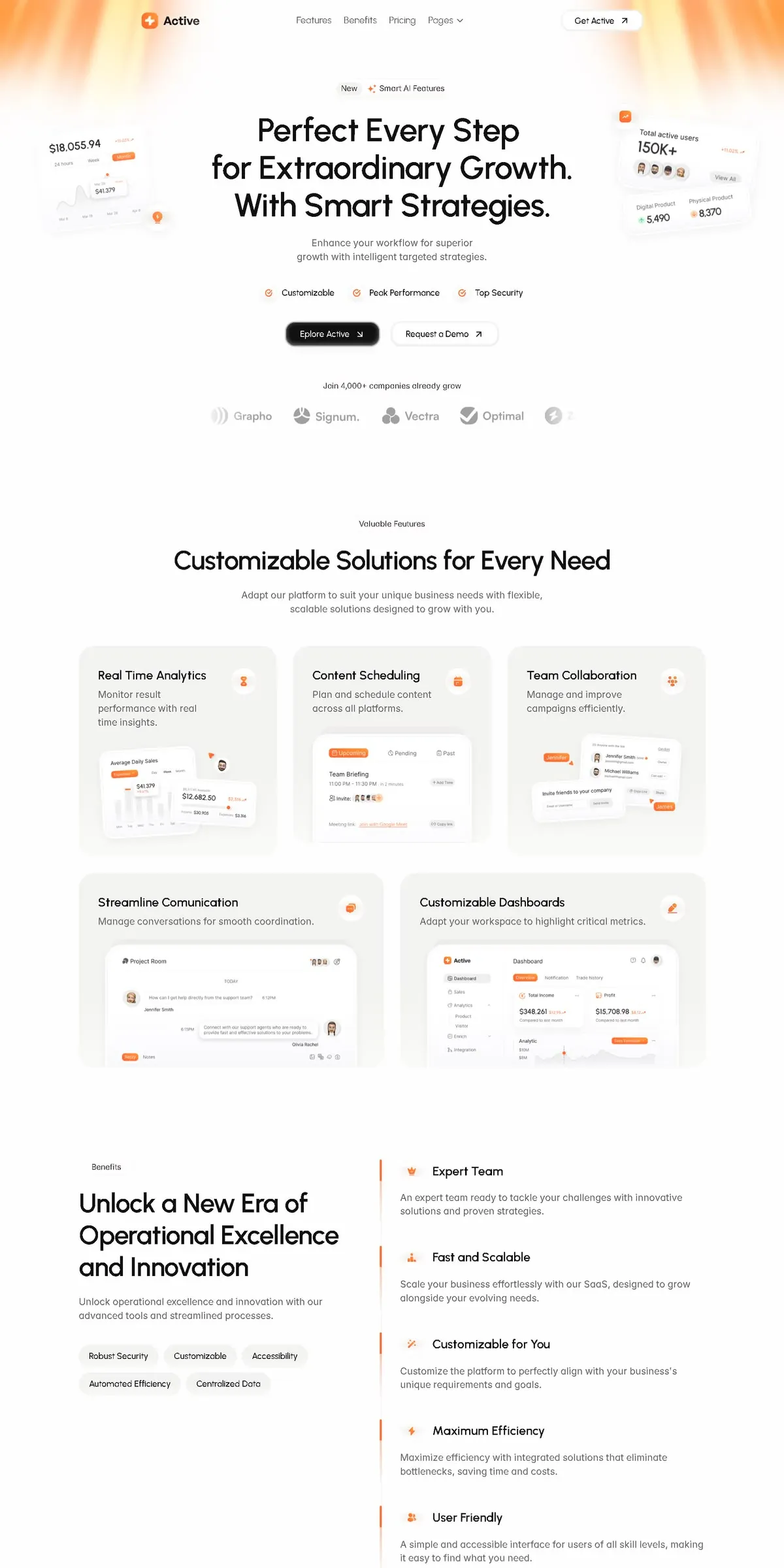
RebuildReference
Move across the image to wipe between the two. Click to lock the seam; arrow keys nudge it.
Imagery
1/1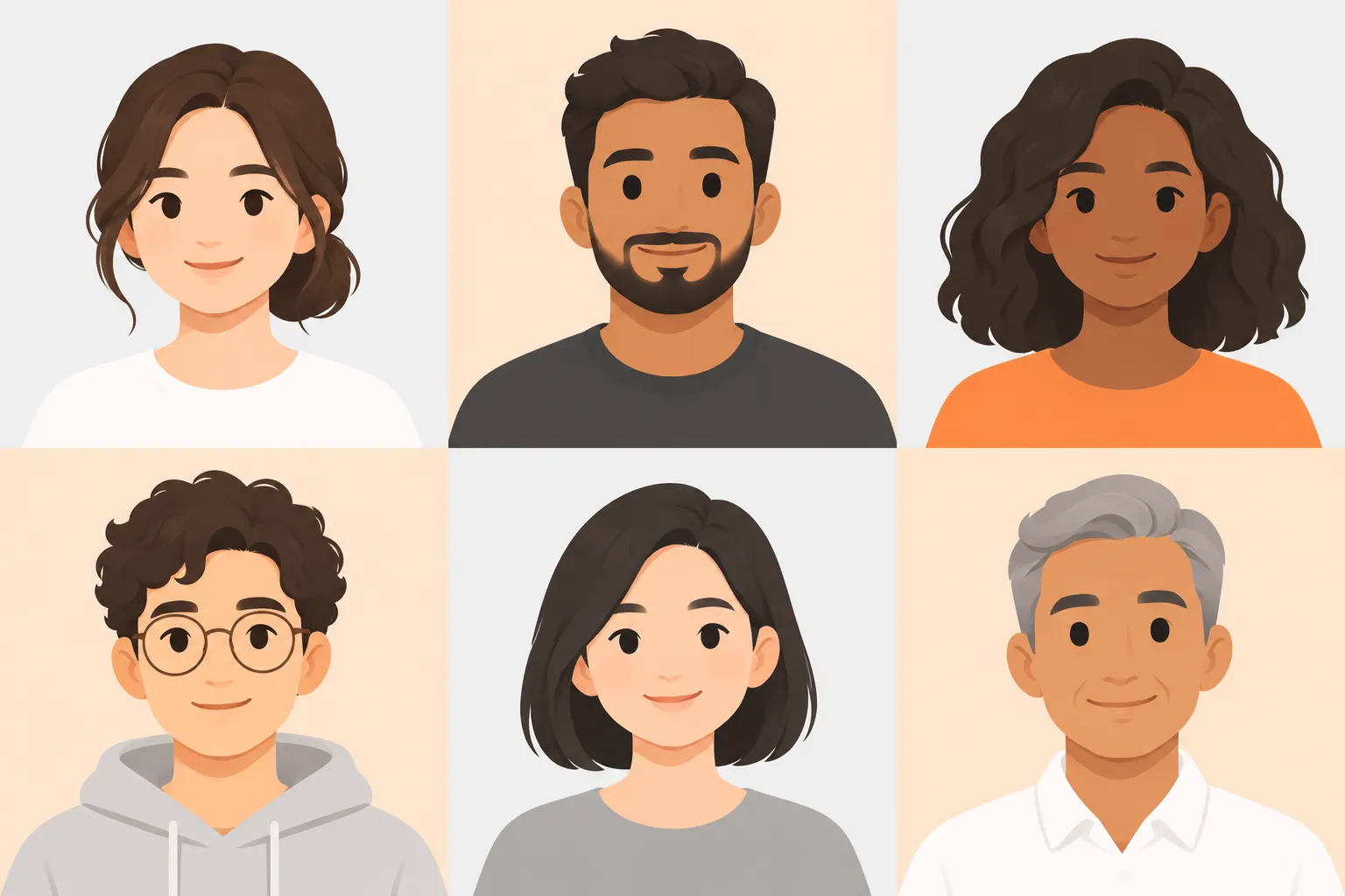
01-avatar-headshots· 3x2 sheet
Six flat-shaded cartoon avatar headshots on pale grey and pale peach backgrounds
Prompts
122,410 chars
# Build prompt: light SaaS landing page with an orange glow and a bento feature grid

Build a light, minimal SaaS analytics landing page. The background is an off-white sheet. A soft peach-to-orange light band sits across the top edge, like curtains of warm light that fade out before the headline. Below it comes a centred hero with three lines of headline, framed by two tilted frosted-glass stat cards that hang off the left and right edges of the content. Next is a 3 + 2 bento grid of pale-grey feature cards, each holding a small white product-UI mockup that runs off the card's bottom edge. Last is a left-aligned two-column benefits section. Orange is the only colour. It is used in small amounts: icons, active tabs, cursor tags and the glow. Everything else is near-black, grey and white. The page is calm and has a lot of air, with no dark sections.

All measurements are CSS px for a 1440 × 900 viewport. No motion report exists for this page, so every motion value below is read from the stills and marked (inferred).

## Structure

- **Container:** max-width 1152px, centred. That leaves 144px side margins at 1440. Min gutter is 24px.
- **Nav inner width:** about 920px, centred, so the nav is narrower than the content below it.
- **Grid:** the feature section uses a 6-column grid with a 30px gap. Row 1 has three cards spanning 2 columns each (about 364px wide). Row 2 has two cards spanning 3 columns each (about 561px wide).
- **Benefits:** two columns. Left column is 490px, column gap 64px, right column is 1fr (about 598px).

Sections, top to bottom:

1. **Nav bar.** Brand mark and wordmark on the left. Four text links centred, the last with a chevron (a dropdown). A white outline CTA with a ↗ arrow on the right. It sits on top of the glow band.
2. **Hero + logo wall.** Centred stack:
   - eyebrow pill
   - three-line headline
   - two-line subhead
   - row of three check items
   - two buttons
   - "join N,000+ companies" caption
   - logo strip that fades out at both ends

   Two glass stat cards float at the far left and far right, level with the headline.
3. **Feature bento.** Centred header (eyebrow, one-line H2, two-line subhead), then 3 cards in row 1 and 2 wider cards in row 2. Each card has a title, a description, a round icon badge at top-right, and a white UI mockup that is cropped by the card's bottom edge.
4. **Benefits split.**
   - **Left column:** eyebrow, three-line H2, two-line paragraph, five pill chips in two rows. Left-aligned.
   - **Right column:** a vertical list of five items behind a hairline left rule. Each item has a short orange segment on the rule, a small orange glyph, a title, and a two-line description.

The capture ends inside section 4. Do not invent pricing, testimonial or FAQ sections. End the page with 96px of padding after section 4. If a footer is required, use a single row: muted 14px text, 1px #EDEDED top rule, same container (inferred).

## Scroll map

All rows are (inferred). Viewport height is 900.

1. Nav: 80px, 0.09 vh, consumes 80px, static. Sits at y 0–80, in flow, not sticky.
2. Hero + logo wall: 784px, 0.87 vh, consumes 784px, entrance. Ends at y 864. The section 3 eyebrow lands just below the fold.
3. Feature bento: 1186px, 1.32 vh, consumes 1186px, entrance. Ends at y 2050.
4. Benefits split: about 920px, 1.02 vh, consumes about 920px, entrance. Ends at about y 2970.

**Total page height:** about 2970px, about 3.3 viewports. No section pins or stacks; scroll consumed always equals height.

## Spacing

**Rhythm between sections:** about 180px from the last element of one section to the first of the next (roughly 88px top and 92px bottom padding). Use this same gap everywhere.

**Section 1 (Nav)**
- Height 80px. Items vertically centred at y about 37.
- Gap between links: 24px.
- Logo mark to wordmark: 8px.

**Section 2 (Hero)** — y positions:
- eyebrow pill: top 146, height 30
- headline: top 206, 3 lines × 69px
- subhead: top 432 (gap 20)
- check row: top 526 (gap 40)
- buttons: top 592 (gap 44), height 44
- caption: top 700 (gap 64)
- logo row: top 748 (gap 32), height 30
- about 86px below the logo row to the section end

Within the hero:
- Check items: 28px apart; icon to label 8px.
- Buttons: 16px apart, padding 0 20px, icon gap 10px.
- Logo items: 40px apart. The visible strip is about 680px wide and centred, with 80px edge fades.

**Section 3 (Feature bento)**
- Header: eyebrow to H2 24px, H2 to subhead 20px, subhead to grid 56px.
- Grid gap 30px horizontal and vertical.
- Row 1 cards are 384px tall; row 2 cards are 356px tall.
- Cards have 36px padding top and sides and no bottom padding (the mockup is cropped by the bottom edge).
- Row 1: the text block is about 150px. The mockup starts about 165–190px from the card top and is inset 24–36px from the sides.
- Row 2: the title is about 40px from the top and the one-line description sits 12px below it. The mockup panel starts 132px from the top, is inset 48px on each side, and runs past the bottom.
- Icon badge: 40px, aligned to the top-right padding corner.

**Section 4 (Benefits split)**
- Left column: eyebrow to H2 24px, H2 to paragraph 20px, paragraph to chips 40px. Chips are 40px tall with 12px gaps both ways.
- Right column: padding-left 36px.
- Item pitch is about 158px (about 100px of content plus 58px gap).
- Within an item: icon circle (32px) to title 14px, title row to description 16px.

## Type

**Family:** geometric sans with a single-storey "a", round bowls and a slightly wide stance, used for all text. Free stand-in: **Outfit** (Google Fonts); **Urbanist** is an alternate. Use one family throughout. Use tabular numbers inside the mockups.

Body anchor: 17px.

| Level | Ratio | Size | Line-height | Tracking | Weight | Colour |
|---|---|---|---|---|---|---|
| H1 hero, 3 forced lines | 3.75× | 64px | 1.08 | −0.025em | 500 | #111111 |
| H2 section | 3× | 51px | 1.15 | −0.02em | 500 | #111111 |
| Benefit item title | 1.3× | 22px | 1.3 | −0.01em | 500 | #111111 |
| Feature card title | 1.2× | 20px | 1.3 | −0.01em | 500 | #111111 |
| Logo wordmarks | 1.2× | 20px | 1 | −0.01em | 600 | #B9B9B8 |
| Body / lead (hero and section subheads, benefits paragraph) | 1× | 17px | 1.55 | 0 | 400 | #666666 |
| Card and benefit descriptions | 0.94× | 16px | 1.6 | 0 | 400 | #666666 |
| Nav links, buttons, check items | 0.88× | 15px | 1.2 | 0 | 400 (buttons 500) | #333333 |
| Chips, section eyebrows, logo caption | 0.82× | 14px | 1.2 | 0 | 500 / 400 | #444444 |
| Hero eyebrow pill text | 0.76× | 13px | 1 | 0 | 500 | #333333 |
| Mockup labels and meta | 0.71× | 12px | 1.3 | 0 | 400–500 | #8A8A8A |
| Mockup big numbers | 1–1.3× | 17–22px | 1.1 | −0.01em | 600 | #111111 |

**Max line lengths:**
- Hero subhead: about 360px (about 45 characters, 2 lines).
- Section subhead: about 560px (about 70 characters, 2 lines).
- Hero H1: about 680px, three lines of 3–4 words each.
- Card descriptions in row 1: about 230px, wrapping to 2–3 lines beside the icon.
- Benefit descriptions: about 540px, 2 lines.
- Benefits paragraph: about 450px.

## Colour

| Hex | Role |
|---|---|
| #FCFCFC | Page surface, about 85% of the screen. Never pure white. |
| #F4F4F4 | Feature card fill, chip fill, inactive mockup tabs. One step darker than the page. |
| #FFFFFF | Mockup panels, secondary and nav CTA buttons, icon badges, base of the glass cards (at 65%). |
| #EDEDED | Faint hairlines: mockup panel borders, benefit list rule, eyebrow pill border. |
| #D8D8D8 | Stronger hairlines: secondary button border on hover, mockup inputs, dashed dividers. |
| #B9B9B8 | Logo wall, chart axes, inactive bar-chart bars, muted mockup icons. |
| #FEB678 | Warm glow tint: the top light band; also pale orange backgrounds at 20–30% inside mockups. |
| #FF6A1F | The single accent (inferred from the stills; the sampled palette only caught its tint). |
| #111111 | Headings and the primary button fill. |
| #666666 / #8A8A8A | Body text / meta text. |

**Where the accent #FF6A1F may appear:**
- brand mark
- hero check-circle icons and the sparkle in the eyebrow pill
- feature icon glyphs and benefit glyphs
- the 3px segments on the benefit rule
- active tab pills, cursor name-tags, chart highlight dots, tooltips and links inside mockups

Never use it on a button, a heading, a card fill or a section background.

**Data colour:** one small green dot (#2BB673) may mark a positive stat inside a mockup. Use it nowhere else.

**Hero glow (section 2 top):** a full-bleed band from y 0 to about 240px. It is most saturated at the very top, about #FF8A3D in the top-left and top-right corners (roughly the outer 250px each side). It is paler peach (#FEB678) across the middle top. Directly behind the nav centre it is nearly white. Soft vertical light streaks, 20–40px apart and blurred, run through the band. Everything fades to #FCFCFC by about 240px. Build it from:
- a vertical linear fade
- two corner radial ellipses (about 360 × 240)
- a blurred repeating vertical stripe layer, masked by the same vertical fade

## Surface

- **Feature cards:** fill #F4F4F4, radius 20px, no border, no drop shadow. Inset top highlight `0 1px 0 #FFFFFF` (inferred). `overflow: hidden`. The bottom about 25% of the card fades the mockup out into the card fill with a mask.
- **Mockup panels:** #FFFFFF, 1px #EDEDED border, radius 12px. Shadow `0 10px 30px rgba(17,17,17,0.06)`. Small inner chips and tabs use radius 999.
- **Glass stat cards (hero):**
  - background rgba(255,255,255,0.65), `backdrop-filter: blur(14px) saturate(140%)`
  - 1px rgba(255,255,255,0.9) border, radius 16px
  - shadow `0 24px 48px -12px rgba(17,17,17,0.12)`
  - the outer 30% of each card (the side facing the page edge) fades toward about 0.25 opacity with a mask
- **Primary button:** #111111 fill, white text, radius 12px, height 44px. A 1px dark outer ring and a faint inner top highlight make it look like a slightly raised key. Shadow `0 6px 14px rgba(0,0,0,0.18)`.
- **Secondary button and nav CTA:** #FFFFFF, 1px #E6E6E6 border, radius 12px. Shadow `0 1px 2px rgba(0,0,0,0.05)`. Height 44px in the hero, 40px in the nav.
- **Hero eyebrow pill:** #FFFFFF, 1px #EDEDED border, radius 999, height 30px, padding 3px 12px 3px 3px. Inside it on the left is a #F2F2F2 "New" tag pill.
- **Section eyebrows:** plain text in a barely-visible pill: #F6F6F6, no border, radius 999, padding 6px 16px.
- **Chips:** #F4F4F4, radius 999, height 40px, padding 0 16px, no border.
- **Icon badges (feature cards):** 40px white circle, shadow `0 2px 8px rgba(0,0,0,0.06)`, 18px orange glyph.
- **Benefit icons:** 32px circle, #F4F4F4 fill, 16px orange glyph.
- **Benefit rule:** 1px #EDEDED left border on the right column. Each item gets an absolutely positioned 3px × 36px #FF6A1F segment on top of the rule, aligned with its title row, radius 2px.

## Imagery

1. **Top glow band.** Vector (CSS gradient), 1 instance, full width × about 240px (about 6:1), page top behind sections 1–2. Warm orange-to-peach light with soft vertical streaks, fading to the page colour. No hard edges.
2. **Brand mark.** Vector, 1 instance, 1:1, 28px, nav left. Orange rounded square (radius 8px) with a white four-point plus/sparkle glyph, followed by a one-word wordmark at 20px / 600.
3. **Left glass stat card.** UI, 1 instance, about 200 × 190 (about 1.05:1).
   - **Position:** absolute, centre about 540px left of the page centre, top about y 230, so it bleeds past the container edge. Rotated −5°.
   - **Contents:**
     - a large currency figure (22px / 600) with a small orange delta label
     - three tiny period tabs, the last as an orange pill
     - a smooth grey line/area chart with a white tooltip bubble showing a value and a short date
     - tiny grey month labels along the bottom
     - a 22px orange circle with a white glyph overlapping the bottom-right corner
4. **Right glass stat cards.** UI, 2 stacked panels as 1 group, about 250 × 230 (about 1.1:1).
   - **Position:** centre about 536px right of the page centre, top about y 200. Transform: `perspective(900px) rotateY(16deg)`, so the right side recedes.
   - **Top panel:**
     - a 3-word label and a big "150K+"-style number (26px / 600) with a delta label
     - a stack of 4 overlapping 20px avatars
     - a tiny "view all" ghost button
     - a 24px orange square badge with a white trend glyph overlapping its top-left corner
   - **Lower panel** (offset 8px down, overlapping): two mini stats side by side, each with a 2-word label, a coloured dot (one green, one orange) and a 4-digit number.
5. **Avatars.** Illustration, about 17 in total, 1:1 circles, 18–28px. Flat-shaded cartoon headshots (Notion/memoji style) on pale circular backgrounds. Where they appear:
   - hero right card: 4
   - card 1: 1
   - card 2 (invite stack): 4
   - card 3 (member list): 2
   - card 4: 3 in the header stack plus 2 beside messages
   - card 5 (profile): 1

   Overlapping stacks use a 2px white ring and −6px overlap.
6. **Logo wall.** Vector, 5 wordmarks, each duplicated once for the loop. About 130 × 28 (about 4.5:1). Monochrome #B9B9B8. A simple geometric glyph (concentric arcs, a pinwheel, three circles, a checked badge, a bolt) plus a one-word name. Section 2 bottom. Strip edges fade through a horizontal mask.
7. **Card 1 mockup: Real-time analytics.** UI. Two overlapping white panels:
   - **Back-left panel** "average daily sales":
     - an orange tab pill and tiny period tabs
     - 7 bars in #ECECEC
     - a white tooltip with a dollar value
   - **Front-right panel** (offset down about 30px):
     - a big dollar figure with an orange delta chip
     - two tiny label/value pairs
   - **Floating extras:** a 28px avatar and an orange cursor arrow near the top-right.
8. **Card 2 mockup: Content scheduling.** UI. One white panel.
   - **Tabs row:** an orange "upcoming" pill plus 2 grey tabs with tiny icons.
   - **Event:**
     - a 2-word event title with a time range and duration meta
     - a "+ add time" meta on the right
     - an "invite" row with 4 avatars
   - **Footer:** a dashed divider, then a "meeting link" row with an orange underlined link and a grey "copy" chip.
9. **Card 3 mockup: Team collaboration.** UI. Two overlapping white panels.
   - **Back panel (top-right):** a member list of 2 rows. Each row has an avatar, name, email and a role dropdown.
   - **Front panel (bottom-left):** "invite friends" with a text input and a small send button.
   - **Cursor tags:** two orange name-tag pills with pointer arrows, one left of the list and one at the bottom-right.
10. **Card 4 mockup: Communication.** UI. A chat window.
    - **Header:** chat glyph, 2-word room name, then an avatar stack and settings icon on the right.
    - **Messages:**
      - a centred "TODAY" meta divider
      - an incoming message: avatar, 1-line grey bubble, time, sender name
      - an outgoing message: right-aligned 2-line bubble with an avatar and name
    - **Composer row:** an orange "reply" pill tab, a "notes" tab and 3–4 tiny icons.
11. **Card 5 mockup: Customizable dashboard.** UI. A mini app.
    - **Sidebar (about 25% width):** brand mark and name, then 7 nav items, the active one in a #F4F4F4 pill.
    - **Header:** "dashboard" title with icons and an avatar.
    - **Tabs:** orange "overview" pill plus 2 grey tabs.
    - **Stat cards:** two side by side. Each has an icon, label, big dollar number, delta chip and "compared to last month" meta.
    - **Chart:** "analytic" heading with an orange dropdown pill at the right, y-axis labels, and a grey line chart with an orange vertical marker.
12. **Icons.** Vector, 1.5px stroke or simple solid glyphs, 16–18px.
    - 3 check-circles (hero)
    - sparkle (eyebrow)
    - ↗ and ↘ arrows (buttons, nav CTA)
    - chevron (nav)
    - 5 feature glyphs: hourglass/timer, calendar, cluster of dots, chat bubbles, pencil
    - 5 benefit glyphs: crown, rising bars, magic wand, bolt, two people

    All orange except the button arrows and the chevron, which take the text colour.

## Motion

None of these values were measured. All are (inferred) from the stills. The brief says "restrained motion": entrances only, with no scroll-linked, pinned or parallax effects.

**1. Nav bar**
- kind — static
- what moves — nothing
- from → to — n/a
- range — n/a
- reduced motion — identical

**2. Hero + logo wall**
- kind — entrance (inferred), plus one continuous time-based loop
- what moves — in order:
  - eyebrow pill
  - headline (as one block)
  - subhead
  - check row
  - button row
  - logo caption
  - logo strip

  The two glass card groups enter alongside the headline.
- from → to
  - text blocks: opacity 0 → 1, translateY 20px → 0
  - glass cards: opacity 0 → 1, translateY 24px → 0, keeping their static tilt throughout
  - logo strip, after it appears: translateX 0 → −50% of the doubled track, looping linearly
- range
  - entrance: once, on page load
  - duration: not measured (500–800ms); soft ease-out
  - stagger: not measured (60–120ms), top to bottom
  - marquee speed: not measured (25–45s per loop); pauses on hover (inferred)
- reduced motion — all elements at their final state on load; the logo strip stops as a static centred row with its edge fades kept

**3. Feature bento**
- kind — entrance (inferred)
- what moves — the header group (eyebrow, H2, subhead) as one unit, then each of the 5 cards
- from → to — opacity 0 → 1, translateY 24px → 0. Mockups move with their card and have no separate parallax.
- range
  - trigger: once, when each element's top reaches about 85% of the viewport
  - duration: not measured (500–800ms); ease-out
  - stagger: not measured (80–120ms), left to right within each row
- reduced motion — everything visible immediately, no translate

**4. Benefits split**
- kind — entrance (inferred). No evidence of pinning, so the left column scrolls normally.
- what moves — left column block (eyebrow, H2, paragraph, then chips), and each of the 5 right-column items separately
- from → to — opacity 0 → 1, translateY 20px → 0. The orange rule segments arrive with their item and do not draw in.
- range
  - trigger: once, when each element's top reaches about 85% of the viewport
  - duration: not measured (500–800ms); ease-out
  - chip stagger: not measured (30–60ms)
  - item stagger: not measured (60–100ms)
- reduced motion — static, fully visible

**Interaction transitions** (hover, press, open, close; not part of the scroll choreography; all inferred):
- Nav links: colour #555 → #111, 150–200ms.
- Primary button:
  - hover: translateY(−1px), slightly larger shadow, and the arrow nudges 2px along its diagonal (150–200ms)
  - press: scale 0.98
- Secondary button and nav CTA: on hover, background #FFF → #F7F7F7 and border → #D8D8D8.
- Chips: on hover, background #F4F4F4 → #ECECEC.
- Feature cards: on hover, the inner mockup rises 6px over about 300ms with ease-out. The card itself does not move or gain a shadow.
- Nav dropdown: opens a white menu (radius 12px, the mockup-panel shadow) with opacity 0 → 1 and translateY −4px → 0 over 150–200ms. It closes with the reverse.

## Responsive (below 640px)

- **Gutter and rhythm:** 20px gutter; the section rhythm drops from 180px to 96px.
- **Nav:** links collapse into a 40px menu button. The brand stays on the left; the nav CTA moves into the menu.
- **Hero:**
  - Both glass stat cards are dropped.
  - H1 becomes 40px (2.35× body) with natural wrapping instead of forced breaks.
  - Subhead stays 17px.
  - Check items wrap centred, 2 then 1.
  - Buttons stack full width at 48px tall, 12px apart.
  - The logo marquee keeps running at the same height.
  - The glow band shrinks to about 180px tall.
- **Feature bento:**
  - H2 becomes 32px.
  - The grid becomes one column with a 16px gap, all cards full width and about 340px tall.
  - Card padding is 24px; row-1 descriptions use the full width.
  - The mockups keep their bottom crop, and wide panels (cards 4 and 5) may crop on the right as well.
- **Benefits:**
  - Columns stack, left content first; H2 becomes 32px.
  - Chips wrap freely.
  - The right list keeps its hairline rule and orange segments, with item pitch tightened to about 130px.

## Don'ts

- **Orange is not a fill colour.** Don't make the primary CTA orange, colour a heading, or give a section an orange background. The CTA is near-black. Orange stays in small doses: glyphs, active pills, cursor tags, segments and the glow.
- **Keep the glow warm and confined.** Don't turn it into a saturated solid band, a purple/pink/blue mesh gradient, or a blob behind the headline. It is warm light hanging from the top edge, and it must be gone by about 240px.
- **The page is not pure white.** Use #FCFCFC, with cards one step darker at #F4F4F4 and only the mockups pure white. Don't add borders or drop shadows to the feature cards. The depth comes from the white panels inside them.
- **Mockups bleed off the bottom.** Don't centre them inside the card with padding all round. They are cropped by the card's bottom edge and fade out.
- **Keep the bento 3 + 2.** Don't build an even 3 × 2 grid. Row 2 has two wider cards.
- **Headlines are medium weight.** Don't use 700–800 weight or gradient text. Use 500 with tight negative tracking.
- **No Inter or default system grotesk.** The single-storey geometric "a" carries the look.
- **Keep the hero glass cards quiet.** Don't centre them, enlarge them or make them crisp and opaque. They are small, tilted, partly faded at their outer edge, and hang off the content edges like background props. Don't animate their tilt on scroll.
- **Logo wall is grey only.** No original brand colours, no boxes or borders around logos, no grid of logo tiles. It is one grey row with faded ends.
- **Icons stay small.** No big icons in coloured squares, no emoji, no illustrations or stock photos in the feature cards. The cards show interface mockups only.
- **Benefits are left-aligned and split.** Don't centre the section, number the items, turn the items into cards, or put each item in a bordered box. The hairline rule with orange segments is the only structure.
- **Keep motion restrained.** No parallax, scroll-jacking, pinned storytelling, counters ticking up, or hover tilts. Only short fade-up entrances and the logo loop.
- **Use placeholder copy and keep it short.** Use 1-word nav links, 1–2 word chips, 2–3 word card titles and descriptions under 10 words. Long marketing paragraphs break the airy rhythm.
Versions
1Each rebuild is kept. The live one is what the comparison shows. LiveOpus 5.5Extra highfrontend-designemil-design-engtransitions-devgsaphumanizer2 hours ago · 960s · 1 image · 20261028T160031ZOpen