Pathway — Adventure travel hero
Rebuild
Opus 5.5Extra highfrontend-designemil-design-engtransitions-devhumanizergsapView
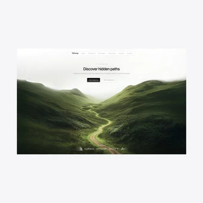
RebuildReference
Move across the image to wipe between the two. Click to lock the seam; arrow keys nudge it.
Imagery
1/1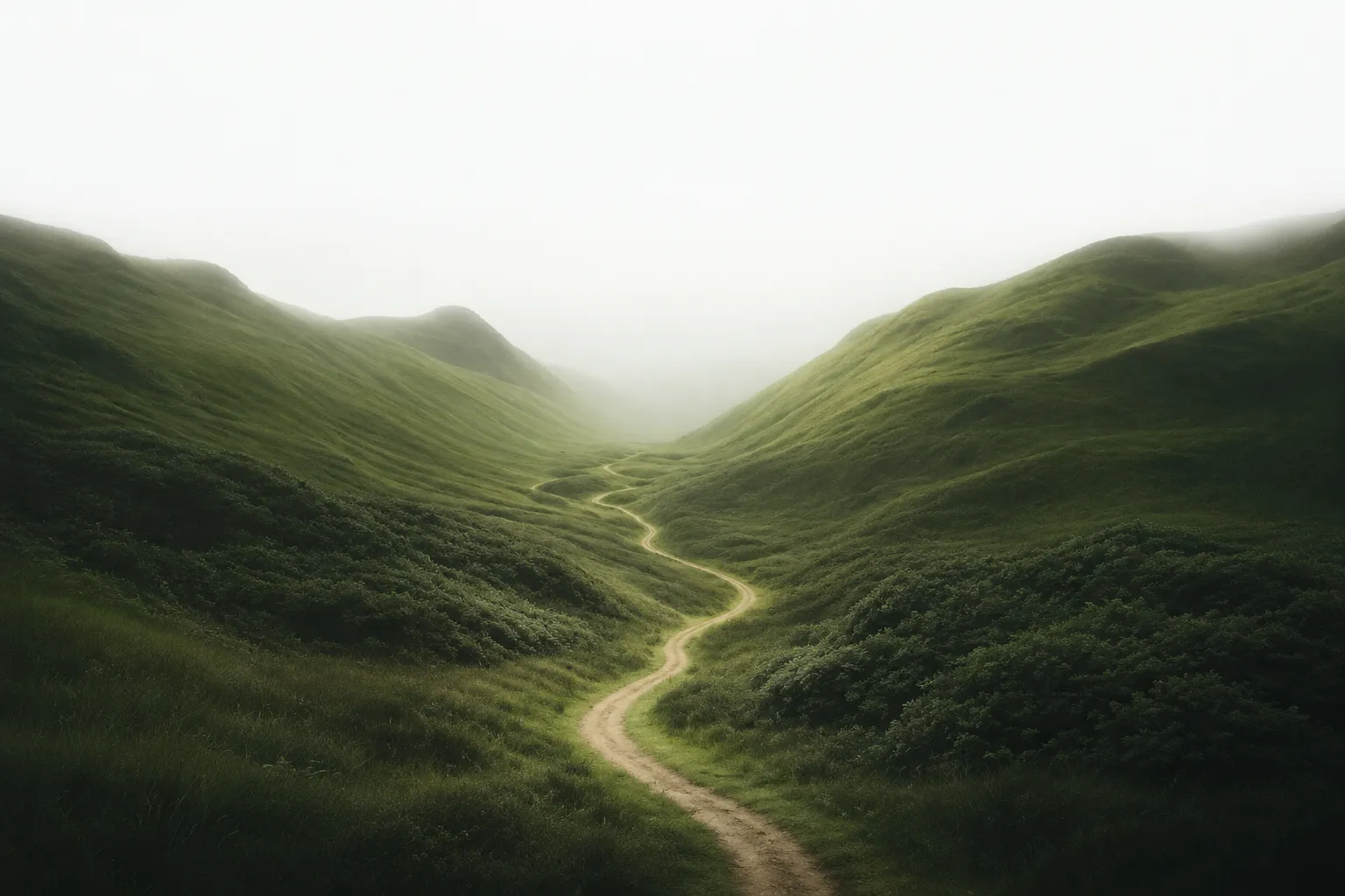
01-valley-path-hero
A pale dirt track S-curving up a misty green valley between two steep grass ridges, the far end dissolving into white fog
Prompts
115,776 chars
# Full-bleed photographic travel hero — rebuild prompt

A single-viewport landing hero: one full-bleed landscape photograph that fades to fog-white at the top, a floating pill navigation bar, a compact centred text cluster sitting in the upper third, and a partner logo wall laid directly over the dark foliage at the bottom. The entire colour story comes from the photograph; every piece of UI is achromatic.

**Important:** the source capture shows exactly one viewport. There is no content below the fold. Build the page as a single 100vh screen and do not invent sections to fill a scroll.

---

## 1. Structure

Design viewport: **1440 × 900**. (The source was rendered at a wider pixel size and scaled down, so every type and spacing number below is normalised to 1440 and marked **(inferred)** — the *ratios* are what must hold.)

- **Container:** none in the usual sense. The photograph is full-bleed — edge to edge, 100vw × 100vh, no page margin, no rounded corners on the page, nothing behind it.
- **Content column:** a single centred column, max-width **720px**, horizontally centred, used by the hero cluster (2) and the logo wall (3). No grid, no columns, no asymmetry — everything is centre-aligned on one axis.
- **Nav column:** independent of the content column — a **560px** pill, centred.

Sections top to bottom:

1. **Nav pill** — floating overlay, 24px from the top of the viewport, centred, sitting on top of the photograph.
2. **Hero** — the full-bleed photograph (100vw × 100vh) plus the centred text cluster (eyebrow chip → headline → subhead → two buttons) positioned in the **upper third**, not vertically centred.
3. **Logo wall** — a label and a row of 5 monochrome partner marks, anchored to the bottom of the same viewport, over the dark lower half of the photograph. It is not a separate band with its own background; it is an overlay inside 2.

---

## 2. Scroll map

| # | Section | Height | Viewports | Scroll consumed | Kind |
|---|---------|--------|-----------|-----------------|------|
| 1 | Nav pill | 46px (overlay, out of flow) | — | 0 | static |
| 2 | Hero | 900px | 1.00 | 900px | entrance (once, on load) |
| 3 | Logo wall | 76px (overlay inside 2) | — | 0 | entrance (once, on load) |

**Total page height: 900px — 1.00 viewport.** The document does not scroll. No sticky, no pinning, no stacking anywhere. If the build framework demands a scrollable body, let it be exactly one screen tall rather than padding it out.

---

## 3. Spacing

All values (inferred), normalised to 1440 × 900.

- **Nav pill:** 24px from viewport top. Pill is 560 × 46px, padding `0 20px 0 24px`, radius 999px. Wordmark sits left; the link row sits right; gap between the two groups is flexible (space-between). Gap between nav links: **22px**.
- **Hero cluster:** its first element (the eyebrow chip) starts **135px** from the viewport top — i.e. 15% down. This is the single most important spacing decision in the design: the cluster is high, not centred.
  - eyebrow chip → headline: **20px**
  - headline → subhead: **16px**
  - subhead → button row: **28px**
  - gap between the two buttons: **22px**
- **Eyebrow chip:** height 26px, padding `0 14px`, radius 999px.
- **Buttons:** height 48px, padding `0 26px`, radius 999px.
- **Logo wall:** label baseline sits **72px** from the bottom edge; logo row sits **44px** from the bottom edge (26px between label and logos). Gap between logos: **34px**. Total logo row width ≈ **420px**, centred.
- **Rhythm:** there is only one vertical rhythm here — a tight 16/20/28 cluster in the upper third, then a large empty gulf of roughly **520px** of pure photograph between the button row and the logo label. That emptiness is the design. Do not fill it with a scroll cue, a caption, a stat strip or a card.

---

## 4. Type

**Class:** neutral grotesk — tight apertures, near-neutral character, no personality. Free stand-in: **Inter** (or Inter Tight for the headline). Everything on the page is one family; there is no second typeface.

All sizes (inferred).

| Level | Size | Line-height | Letter-spacing | Weight | Colour |
|---|---|---|---|---|---|
| Wordmark (1) | 16px | 1.0 | −0.01em | 600 | `#1B241A` |
| Nav link (1) | 13px | 1.0 | 0 | 450–500 | `#1B241A` @ 70% |
| Eyebrow chip (2) | 11px | 1.0 | +0.02em | 500 | `#1B241A` @ 70%, sentence case |
| Headline (2) | 40px | 1.10 | −0.025em | 700 | `#1B241A` |
| Subhead (2) | 14.5px | 1.5 | 0 | 400 | `#1B241A` @ 65% |
| Button label (2) | 13px | 1.0 | −0.005em | 500 | see Colour |
| Logo-wall label (3) | 10px | 1.0 | +0.06em | 500 | `#F9FAF8` @ 60% |

**The critical ratio: headline ÷ subhead = 2.75.** The headline is deliberately restrained — it is *not* a 72–96px display line. It sits on **one line** and measures roughly **33% of the viewport width**; the subhead sits on **one line** and is *wider* than the headline, about **48%** of the viewport width. If your headline is wider than your subhead, the scale is wrong.

**Max line length:** subhead 78ch, hard-capped by the 720px column. Headline never wraps at desktop.

**Placeholder copy by role:**
- Wordmark: 1 word, 7 characters.
- Nav: 6 links, 1–2 words each (~7 characters average).
- Eyebrow chip: 3–4 words, sentence case.
- Headline: 3 words, one line, ~21 characters.
- Subhead: one sentence, 14–16 words, ~95 characters, one line at desktop.
- Buttons: 2 words each.
- Logo-wall label: 2 words.

---

## 5. Colour

| Hex | Role |
|---|---|
| `#F9FAF8` | Fog white. Covers the top ~35% of the surface — it is the photograph's own misty sky, and it doubles as the page background so there is no visible seam. All light text and all logo marks are this colour. |
| `#1B241A` | Near-black green. The ink colour: headline, wordmark, nav links, eyebrow text, and the fill of the primary button. Also the deepest shadow in the photograph's foreground. |
| `#3B432A` | Deep foliage shadow — photograph only, the shaded flanks of the hills. Never a UI colour. |
| `#798549` | Mid foliage green — photograph only. **The single accent**, and it is allowed in the UI in exactly two places: the focus ring, and (optionally) a 5px dot preceding the eyebrow text. Nowhere else. No green buttons, no green links, no green underlines. |
| `#C8C688` | Pale highlight — sunlit grass and the dirt path in the photograph. Never a UI colour. |

The governing rule: **the interface is achromatic (near-black ink, fog-white type, translucent white surfaces); all colour in the composition is supplied by the photograph.** A rebuild that tints the buttons or the chip green has misread the design.

Button colours:
- Primary: fill `#1B241A`, label `#F9FAF8`.
- Secondary: fill `#F9FAF8` @ 85% with a 12px backdrop blur, label `#1B241A`, 1px border `#1B241A` @ 8%.

---

## 6. Surface

- **Borders:** 1px only. Nav pill: 1px `#FFFFFF` @ 55%. Eyebrow chip: 1px `#1B241A` @ 10%. Secondary button: 1px `#1B241A` @ 8%. Primary button: no border.
- **Radii:** every surface on the page is a full pill — `999px` on the nav, the eyebrow chip and both buttons. There are no cards, no 8px/12px rectangles, no rounded corners on the page itself.
- **Translucency:** nav pill is `#F9FAF8` @ 72% with a 16px backdrop blur; eyebrow chip is `#F9FAF8` @ 55% with a 10px backdrop blur. Both read as frosted glass over the fog, which at that height is nearly white anyway — the effect is subtle and should stay subtle.
- **Shadows:** one, and it is barely there — `0 1px 2px rgba(27,36,26,0.04)` on the nav pill. No shadow on buttons, no shadow on the chip, no glow, no inner highlight.

---

## 7. Imagery

**One photograph. It carries the entire page.**

- **Subject:** a wide valley between two steep grass-covered ridges, photographed from the valley floor looking straight up its axis. A pale, narrow dirt track enters at the bottom centre and S-curves away from the camera, kinking left then right, until it thins to nothing at the mist. The ridges are dense with texture — tussock grass, scrub, a few darker thickets — and they fall away toward a bright fog bank that fills the far end of the valley and rises to consume the sky entirely.
- **Treatment:** desaturated, cool, high-key at the top and deeply shadowed at the bottom. There is **no sky** — the upper third is pure luminous fog that reaches `#F9FAF8` and blends invisibly into the page background. Contrast climbs steadily toward the bottom edge, where the foreground foliage reaches `#1B241A`. Grain is fine and film-like, not digital sharpening.
- **Aspect ratio:** 16:10, filling 100vw × 100vh, `object-fit: cover`, focal point at **50% 55%** so the path's vanishing point stays near the optical centre.
- **Placement:** section 2, behind everything. The headline sits over the fog (dark ink on near-white), the logo wall sits over the shadowed foreground (white marks on dark green). That single photograph doing both jobs is why no scrim is needed.

**Logo wall marks (3):** 5 wordmark-style partner logos, monochrome, rendered in `#F9FAF8` at **70% opacity**, normalised to an optical height of **18px** (not a uniform box height — a wide wordmark and a compact one should read as the same weight). Mixed widths, from ~50px to ~110px.

---

## 8. Motion

No live-page motion measurement exists for this reference. Every value below is **(inferred)** from the still, and durations are given as ranges. Do not substitute a spring, lerp or stiffness value — none was measured.

### Section 1 — Nav pill
- **kind:** entrance (plays once on load; does not reverse)
- **what moves:** the whole pill as one unit — wordmark and links do not animate independently.
- **from → to:** opacity 0 → 1; translateY −10px → 0px.
- **range:** trigger is page load, after the hero image has decoded. Duration **400–600ms**, ease-out. No stagger.
- **reduced motion:** renders at final state, opacity 1, translateY 0. No fade.

### Section 2 — Hero
- **kind:** entrance (plays once on load; does not reverse). The section is **not** scroll-linked — the page does not scroll, so there is no parallax, no scale-on-scroll, no pin.
- **what moves:** two things, in this order — (a) the photograph, (b) the text cluster's four children (eyebrow chip, headline, subhead, button row).
- **from → to:**
  - Photograph: opacity 0 → 1, scale 1.04 → 1.00, transform-origin 50% 55%. Duration **900–1400ms**, ease-out.
  - Text cluster children: opacity 0 → 1, translateY 14px → 0px each.
- **range:** trigger is page load (not a viewport intersection — the cluster is above the fold by definition). Cluster children start **~150ms** after the photograph begins, duration **500–700ms** each, ease-out, **stagger 70–90ms** in DOM order: chip → headline → subhead → button row. The two buttons animate together as one row, not individually.
- **reduced motion:** no scale on the photograph and no translate on the text. Optionally a single 200ms opacity fade on the photograph only; the text renders at final state immediately.

### Section 3 — Logo wall
- **kind:** entrance (plays once on load; does not reverse)
- **what moves:** the label and the logo row, as two units.
- **from → to:** opacity 0 → 0.6 (label) and 0 → 0.7 (logo row); translateY 10px → 0px on both.
- **range:** trigger is page load, beginning **~400ms** after the cluster's last child. Duration **500–700ms**, ease-out, **stagger 60–80ms** (label first, then the row — the five marks do not stagger individually).
- **reduced motion:** renders at final opacity, no translate.

### Interaction transitions (not part of the above)
- **Nav link hover:** colour `#1B241A` @ 70% → 100%, 150ms ease-out. No underline, no background pill, no movement.
- **Primary button hover:** fill `#1B241A` → `#3B432A`, 180ms ease-out. No lift, no shadow, no scale.
- **Secondary button hover:** fill `#F9FAF8` @ 85% → 100%, border `#1B241A` @ 8% → 16%, 180ms ease-out.
- **Button press:** scale 0.985, 90ms, released on pointer-up.
- **Focus-visible (any control):** 2px ring `#798549`, 2px offset, no transition.
- **Logo hover:** none. The logo wall is not interactive.
- **Mobile menu open/close:** panel opacity 0 → 1 with translateY −8px → 0, 220ms ease-out; close is the same reversed at 160ms.

---

## 9. Responsive (below 640px)

- Viewport becomes 100vw × 100svh — still full-bleed, still no page margin or radius.
- **Nav (1):** the 560px pill shrinks to `calc(100vw − 32px)`, max 360px, height 44px. All six links are **dropped** and replaced by a hamburger button at the right end of the pill; wordmark stays left. Menu opens as a full-width frosted panel beneath the pill, links stacked at 15px/2.2, left-aligned, 20px padding.
- **Hero cluster (2):** content column becomes `calc(100vw − 40px)`. Cluster top moves from 15% to **18%** of viewport height. Headline drops to **30px / 1.15**, wrapping to **two lines**. Subhead drops to **14px / 1.55**, wrapping to **three lines**. Eyebrow chip stays 11px. Gaps compress to 16 / 12 / 24.
- **Buttons (2):** stay side by side — do not stack them full-width. Height 44px, padding `0 20px`, gap 12px. If the labels cannot fit, shorten the labels before stacking.
- **Photograph (2):** switch to a portrait crop (4:5 source or `object-position: 50% 62%`) so the path's S-curve and the fog bank both stay visible; the fog must still reach the top edge at `#F9FAF8`.
- **Logo wall (3):** drop to **4 marks**, wrapped into **two rows of two**, optical height 15px, row gap 18px, column gap 28px. Label stays, at 10px. Whole block sits 32px from the bottom edge.

---

## 10. Don'ts

- **Don't vertically centre the hero cluster.** It sits at 15% from the top. Centring it drops the text onto the ridges and destroys the fog-on-white contrast that makes the headline legible without a scrim.
- **Don't scale up the headline.** The instinct is 72–96px display type; this design uses ~40px, narrower than its own subhead. A big headline turns a restrained travel page into a generic SaaS hero.
- **Don't add a dark overlay, scrim or gradient over the photograph.** The tonal range is baked into the image — white fog at the top, near-black foliage at the bottom. An overlay flattens exactly the gradient the layout depends on.
- **Don't add a gradient behind the logo wall** to "help" the white marks. They sit directly on the dark foliage at 70% opacity. That is the effect.
- **Don't give the page rounded corners, an outer margin, or a coloured sheet behind it.** The `#F6F6F6` mat in any reference image is photographic framing, not part of the design.
- **Don't make the nav a full-width sticky bar.** It is a 560px floating pill, 24px down, over the image, and it does not stick — there is nothing to stick through.
- **Don't tint UI green.** `#798549` and `#C8C688` belong to the photograph. The accent's only licensed appearances are the focus ring and an optional 5px dot in the eyebrow chip.
- **Don't use rectangular radii.** Every surface is a 999px pill. A 12px-radius button reads as a different design system entirely.
- **Don't add shadows, lifts, or glows to the buttons.** One 4%-opacity shadow on the nav, nothing else.
- **Don't reach for a serif, a condensed display face, or a second family.** One neutral grotesk, four weights at most.
- **Don't invent sections below the fold** — no feature grid, no testimonial band, no footer. The artifact is one screen.
- **Don't add parallax, a scroll-progress bar, or a bouncing scroll-down chevron.** The page does not scroll; motion is entrances only, and they play once.
- **Don't stagger the five logos individually or the two buttons individually.** Each is one unit. Over-choreographing is the failure mode for a design whose whole character is restraint.
- **Don't let the subhead wrap at desktop.** It is one line, wider than the headline; that width relationship is the composition's only asymmetry.
Versions
1Each rebuild is kept. The live one is what the comparison shows. LiveOpus 5.5Extra highfrontend-designemil-design-engtransitions-devhumanizergsaplast month · 25s · 1 image · 20260917T184001ZOpen