Planto IoT gardening case study hero
Rebuild
Opus 5.5Extra highfrontend-designemil-design-engtransitions-devgsaphumanizerView
RebuildReference
Move across the image to wipe between the two. Click to lock the seam; arrow keys nudge it.
Imagery
1/1
01-moss-forest-hero
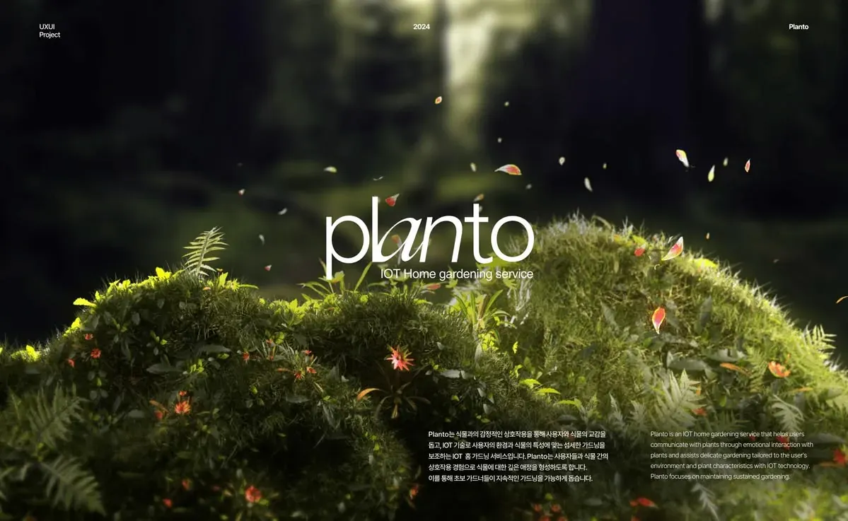
Low ground-level macro view of backlit moss mounds dotted with tiny orange-red star flowers, under a dark, heavily blurred forest with a pale shaft of light and falling petals
Prompts
113,729 chars
# Moss forest case study hero: full-bleed dark editorial section

This is a single full-viewport hero that opens a portfolio case study. A cinematic, low-angle macro image of a sunlit moss mound under a dark, heavily blurred forest fills the whole frame. A thin lowercase wordmark sits centred in the dark gap just above the moss crest. Three small meta labels run along the top edge, and a pair of short bilingual paragraphs sits in the bottom-right corner. Nothing else is on the page. The design works because there is very little UI: no nav, no buttons, no cards, white type only, and the photograph does all the colour work.

## Structure

- **Frame:** full-bleed. The image runs edge to edge with square corners. Content is inset 64px left and right, so the content width is 1312px at 1440.
- **Reference grid:** 12 columns, 24px gutters, 64px margins. Positions below are given in px because the elements are placed absolutely, not on a flow grid.
- **Layers, bottom to top:** (a) background image or video, (b) two soft gradients for legibility, (c) content.
- **Sections:**
  1. **Hero.** This is the only section. It contains, in reading order:
     - **Meta row** along the top edge, with three items:
       - left: a two-line label, one word per line (a discipline and "project"-type word)
       - centre: a four-digit year
       - right: a one-word project name
     - **Wordmark lockup**, centred horizontally, with its optical centre at about 46% of the section height:
       - product name: one lowercase word, 5–7 letters
       - tagline beneath it: 3–4 words describing the service
     - **Paragraph pair**, anchored to the bottom-right corner:
       - a primary-language paragraph, 4–6 lines
       - beside it, the same text in a second language as a translation, 5–7 lines

Exact placement at 1440 wide:
- Meta row: top edge at 44px. The left item starts at x=64. The right item ends at x=1376. The year is centred on x=720.
- Wordmark: the ascender tops sit at about 39% of the section height and the baseline at about 50%.
- Tagline: right-aligned to the wordmark's right edge. Its cap-top sits 12–16px below the wordmark baseline, inside the wordmark's descender band. It starts to the right of the first letter's descender, so the two never collide.
- Paragraph pair: two columns, each 300px wide, with a 72px gap between them. The block's right edge is on the right margin, so the primary paragraph spans x≈704–1004 and the translation spans x≈1076–1376. Both are top-aligned to each other, and the block's bottom edge sits 64px above the section bottom.

## Scroll map

1. **Hero:** 900px tall (1.0 viewport at 1440×900; the capture shows about 885px at 1440 wide). It consumes 900px of scroll. Kind: entrance on load, then static. It scrolls away 1:1 and is not pinned.

**Total page height:** about 900px (1 viewport). If you place it at the top of a longer case study, the next section starts flush at its bottom edge on #09090A.

## Spacing

- **Section:** `height: 100svh; min-height: 760px`. No outer margin.
- **Side padding:** 64px, about 4.4vw.
- **Top inset of the meta row:** 44px.
- **Bottom inset of the paragraph block:** 64px.
- **Meta left label:** two lines, line-height 1.2, no gap between them.
- **Wordmark to tagline:** the tagline overlaps the wordmark's descender band, so the gap is negative relative to the wordmark box. Use `margin-top: -0.12em` of the wordmark size, or position it absolutely.
- **Between the two paragraphs:** a 72px column gap.
- **Between paragraphs inside a column:** none. Each column holds a single paragraph.
- **Rhythm:** three clusters (top edge, optical centre, bottom-right corner) with large empty image areas between them. Leave the space between the meta row and the wordmark empty, about 290px at 1440. Leave the space between the wordmark lockup and the paragraphs empty too, about 230px.

## Type

Two families:
- **Display wordmark:** a light geometric sans, with one letter swapped for a serif italic.
  - Free stand-ins: **Jost 300** (or Outfit 300) for the upright letters.
  - **Instrument Serif Italic** (or Cormorant Garamond Italic 400) for the swapped letter.
- **Everything else:** a neutral neo-grotesk. Use **Pretendard**, which is free and covers Hangul and Latin if the primary language is Korean. Fall back to Inter.

The body anchor is 16px.

| Level | Family | Size | Line-height | Letter-spacing | Weight | Colour |
|---|---|---|---|---|---|---|
| Wordmark | geometric sans + one serif italic glyph | 9× = 144px | 0.85 | −0.03em | 300 | #FFFFFF |
| Tagline | neo-grotesk | 1.75× = 28px | 1.1 | −0.01em | 400 | #FFFFFF |
| Meta labels (all three) | neo-grotesk | 0.875× = 14px | 1.2 | 0 | 500 | #FFFFFF |
| Body, primary paragraph | neo-grotesk | 1× = 16px | 1.6 | −0.005em | 500 | #FFFFFF at 92% |
| Body, translation | neo-grotesk | 1× = 16px | 1.6 | 0 | 400 | #FFFFFF at 68% |

**Wordmark details:**
- All lowercase.
- Strokes are hairline-thin, about 1/12 of the x-height. It should feel drawn, not bold.
- Swap exactly one interior letter, ideally the third and preferably a vowel, for the serif italic at 1.05× the size. Kern it tight so it touches or slightly overlaps the ascender before it. That single italic glyph is the lockup's signature.

**Meta labels:** sentence case, not uppercase, not letter-spaced.

**Max line length:**
- body: 300px, about 38–42 Latin characters or about 20 CJK characters per line
- tagline: one line, no wrapping

## Colour

The photograph covers almost 100% of the surface. The UI adds only white type.

- **#09090A, near-black.** Page background behind the image. It is the darkest forest shadow in the top 40% of the frame and the tint of both legibility gradients. Any following section uses it.
- **#262917, deep olive.** The dominant blurred-forest mid-tone. Use it as the section's background-colour placeholder while the media loads.
- **#464926, moss shadow.** Imagery only: the shadowed undersides of the moss.
- **#7B8329, moss mid-tone.** Imagery only.
- **#B3B949, sunlit lime moss highlight.** This is the single UI accent. It may appear only as a keyboard focus ring or a 1px hover underline on a meta link. Never use it for fills, buttons, headings or blocks of text.
- **White, #FFFFFF.** All type, at the opacities given in the type table.
- **Orange-red petals and star flowers, about #E0562C (inferred, not in the sampled palette).** These exist only inside the photograph. Never pick this colour up into the UI.

**Legibility gradients:** soft and invisible as bands (inferred).
- top: `linear-gradient(to bottom, rgba(9,9,10,0.55) 0%, rgba(9,9,10,0) 28%)`
- bottom: `linear-gradient(to top, rgba(9,9,10,0.45) 0%, rgba(9,9,10,0) 38%)`

## Surface

- No borders, no dividers and no hairlines.
- Corner radius 0 everywhere. The section is full bleed with square corners.
- No shadows. No text-shadow on any type: legibility comes from the image's own darkness and the two gradients.
- No cards, panels, blur or glass behind any text. Every element sits directly on the photograph.

## Imagery

There is one picture, full bleed, filling the section: about 1.63:1 at 1440×885 with `object-fit: cover; object-position: 50% 55%`. It can be a still or a muted looping video with a still poster.

**Subject:** a low, ground-level macro view of a forest floor.
- **Lower 50–55% of the frame:**
  - two or three rounded mounds of dense, bright moss, ferns and grass blades, dotted with tiny orange-red star-shaped flowers
  - backlit, so the tips of the moss and grass glow yellow-green (#B3B949) with darker olive shadows beneath
  - the moss crest dips slightly at the centre, about 55% down, and rises to about 40% down on the right third
  - a fern frond pokes up on the left at about 25% across
- **Upper 45% of the frame:**
  - a deep, almost black forest, blurred by very shallow depth of field
  - one pale vertical shaft of light through the trees just left of centre, about 48–55% across, falling from the top edge toward the wordmark
  - a darker trunk silhouette on the right
- **In the middle band, about 15–60% down and mostly right of centre:** a scatter of small falling petals (orange-red, yellow, a few pale pink-white), some soft with motion blur, floating at different depths.

**Treatment:**
- cinematic, warm, high contrast
- shadows crushed toward #09090A
- no colour grade beyond the natural greens
- no vignette ring

The rendered-3D or macro-photo feel is intended.

**Composition rule:** the wordmark sits in the dark gap between the light shaft and the moss crest. The brightest background area sits directly above it and the brightest moss directly below it. The meta row sits on the darkest band at the top. The paragraphs sit on the darker lower-right moss.

## Motion

Restrained. Nothing reacts to scroll. Every value below is inferred: no measured motion report exists, so durations and easing are given as ranges and marked "not measured".

**1. Hero**

- **kind:** entrance. It plays once on load, then the section is static. The background may play an ambient video loop.
- **what moves:** background media, wordmark, tagline, meta row (three items), paragraph pair (two columns).
- **from → to (inferred):**
  - background: opacity 0 → 1, scale 1.04 → 1.00
  - wordmark: opacity 0 → 1, translateY 20px → 0, blur(6px) → blur(0)
  - tagline: opacity 0 → 1, translateY 10px → 0
  - meta items and both paragraphs: opacity 0 → 1, translateY 8px → 0
- **range:**
  - **Trigger:** once, on page load, after the background media has decoded.
  - **Duration (not measured):** background 1000–1600ms; text elements 600–900ms each.
  - **Easing (not measured):** a long, soft ease-out with no overshoot.
  - **Order:** background first; wordmark starts 200–300ms in; tagline 100–150ms after the wordmark; meta row and paragraphs together 100–150ms after that.
  - **Stagger (not measured):** 60–120ms between the two paragraph columns.
  - **Ambient loop:** if the background is a video, the petals drift slowly downward and diagonally. The loop length is not measured; use 8–15s. Muted, inline, seamless.
  - **On scroll:** no scroll-linked effect. The section scrolls away at 1:1.
- **reduced motion:** all elements render at their final state with no translate, blur or scale. At most, use an opacity fade of 200ms or less. The video is replaced by its poster still.

**Interaction transitions** (not part of the scroll choreography):
- **Meta items, if they are links:** hover changes opacity from 1 to 0.6 and optionally adds a 1px #B3B949 underline. Duration 150–250ms (not measured), ease-out.
- **Focus-visible:** a 1px #B3B949 outline with a 4px offset. No background change.
- **Press, open and close:** none. The hero has no buttons, menus or disclosures.

## Responsive (below 640px)

- **Section:** `height: 100svh; min-height: 640px`. Side padding 20px. Meta row top inset 24px.
- **Meta row:** keep all three positions (left, centre, right) at 13px with weight 500. The left label stays on two lines.
- **Wordmark:** about 22vw, roughly 80–88px on a 390px screen, with the same thin weight and italic-glyph swap. Move its optical centre up to about 38% of the height.
- **Tagline:** 18px, still right-aligned under the wordmark.
- **Background:** `object-position: 55% 60%`, so the moss crest stays just under the wordmark and the light shaft stays above it.
- **Paragraphs:** stack the primary paragraph above the translation, full content width, max 36ch, 16px gap. Anchor the stack 24px from the bottom. Body stays 16px.
- **Short viewports (below about 700px tall):** drop the translation paragraph and keep the primary one.
- **640–1024px:** keep the side-by-side pair, but each column becomes 44% of the content width with a 32px gap, right-aligned. Wordmark size is 13vw.

## Don'ts

- **No navigation:**
  - no hamburger, no link row, no logo in a corner
  - the three meta labels are the whole top bar and are not a nav
- **No CTA:** no buttons, no "View case study", no pill links, no centred button under the tagline.
- **Keep the wordmark thin:** do not set it bold, semibold or uppercase. Hairline strokes and lowercase are the point. Don't add gradient fill, glow or text-shadow to it.
- **Keep the italic swap to one letter:** don't set the whole word in the serif or in italic, and don't swap more than one letter.
- **Don't shrink the body:** the paragraphs look tiny in the screenshot, but they are 16px.
- **Keep the corner placement:**
  - don't centre the paragraphs or move them under the wordmark
  - they belong in the bottom-right corner, top-aligned, as two narrow columns
- **No uppercase eyebrows:** no letter-spaced uppercase eyebrow above the wordmark, and no small kicker label.
- **Keep the frame flat and full bleed:** no glass panels, frosted cards, borders, rounded insets or "device frame" around the image.
- **Don't brighten the photograph:**
  - don't lift its shadows and don't add a flat black overlay across the whole frame that greys out the moss
  - the top must stay near-black and the moss must stay saturated
- **Keep the green in the photo:** don't use green or lime as a UI fill or as a background colour behind text.
- **Don't promote the orange petals:** their colour must not become a link colour or accent.
- **No extra motion:**
  - no JavaScript confetti or particle system to fake the petals
  - no parallax, no pinning, no scroll-scrubbed zoom
  - no letter-by-letter wordmark animation with big translations
  - no bouncing "scroll down" arrow or mouse icon
- **Leave the empty areas empty:**
  - the dark area between the meta row and the wordmark is where the light shaft has to read
  - the moss area between the wordmark and the paragraphs needs the same space
Versions
1Each rebuild is kept. The live one is what the comparison shows. LiveOpus 5.5Extra highfrontend-designemil-design-engtransitions-devgsaphumanizer2 weeks ago · 347s · 1 image · 20261009T153804ZOpen