Pracima — Charity fundraising hero
Landing page13 Sep 2026, 16:45
Rebuild
Opus 5.5Extra highfrontend-designemil-design-engtransitions-devhumanizergsapView

RebuildReference
Move across the image to wipe between the two. Click to lock the seam; arrow keys nudge it.
Imagery
3/3
01-child-portrait-card
Close portrait of a child outdoors in a blue winter jacket, looking into the camera with a faint smile

02-two-children-card
Two young children standing side by side outdoors in checked shirts, both smiling at the camera
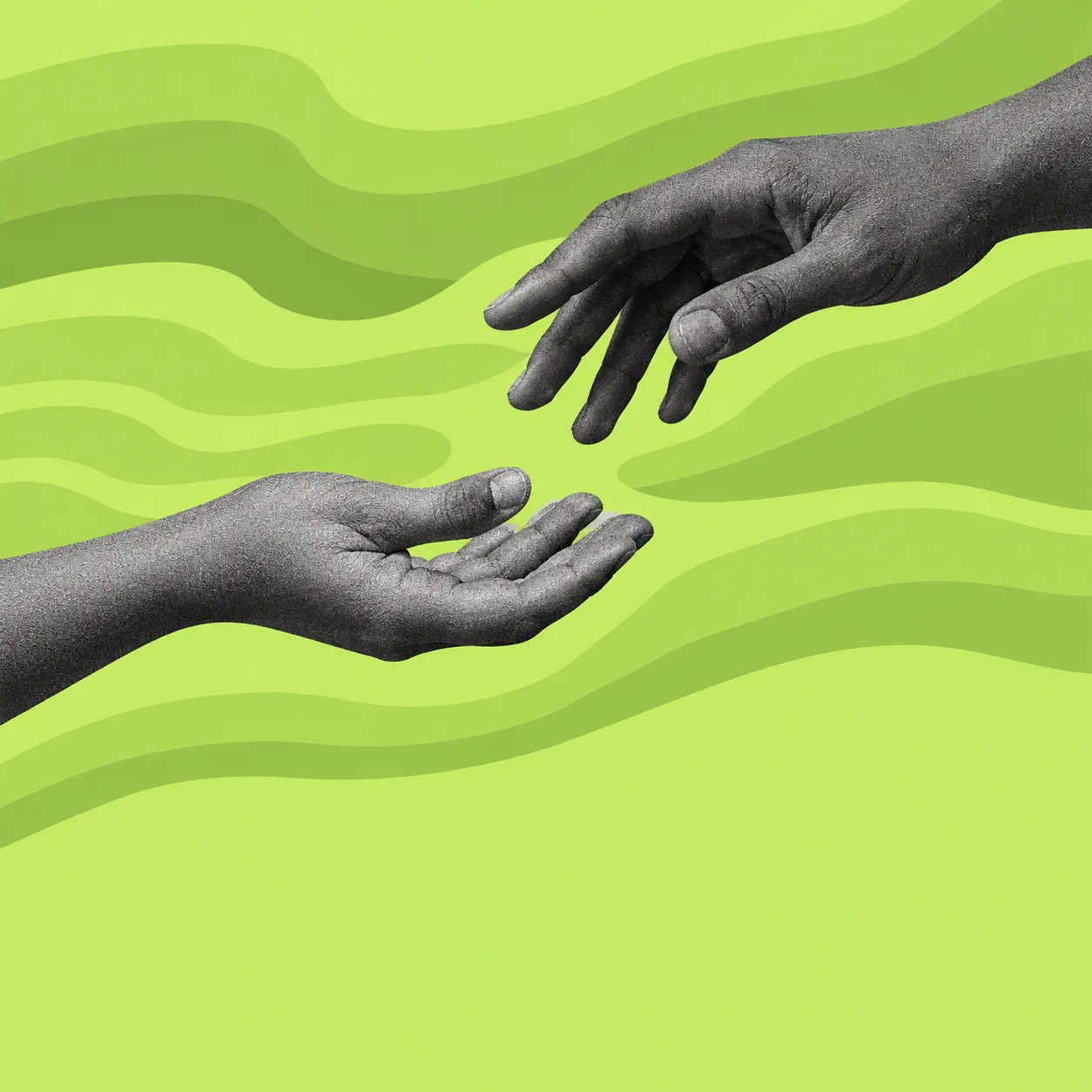
03-lime-reaching-hands
Two greyscale cut-out hands reaching toward each other over a lime field ruled with hand-drawn contour bands
Prompts
122,643 chars
# Staggered tab-card charity landing page

A light, editorial charity/fundraising landing page. A centred serif display hero sits on near-white with a soft lime glow behind it, and the fold is closed by a full-bleed field of five narrow "folder-tab" cards staggered in a shallow V — outer columns high, centre column low. Deep forest green is the ink and the dark surface; a single neon lime is the accent. No shadows anywhere.

> The capture this is derived from shows the page inset on a grey studio mat with the design's own corners rounded against it. That mat, the rounded corners against it and its drop shadow are the photograph's framing — **not** part of the design. Build the page full-bleed. The grey of the mat is not in the palette.
>
> No motion report was supplied for this reference: the capture is a single above-the-fold still. Sections 1–3 are described from the still; sections 4–10 are marked **(inferred)** and are to be built in the same system. Every value in **Motion** is inferred; no timing was measured, so durations and easings are given as ranges and directions, not as measured facts.

---

## Structure

- **Page width:** full-bleed, no max-width on the page itself.
- **Container:** 1200px max-width, centred, 120px side gutters at 1440. All prose, headings and standard sections live in this container.
- **Wide container:** the card field (3) and the pinned panel (7) break out to a 1368px row with 36px side gutters — they are deliberately wider than the 1200 container and read as edge-to-edge.
- **Grid:** the wide rows are 5 columns × 264px with 12px gaps (5×264 + 4×12 = 1368). The 1200 container uses a 12-column grid, 24px gutter (column = 78px).
- **Viewport assumed:** 1440 × 900.

Sections, top to bottom:

1. **Nav bar** — fixed, 92px tall, overlays the hero.
2. **Hero** — centred eyebrow-free display headline, sub-paragraph, two pill buttons, soft lime glow behind the headline.
3. **Card field** — the staggered five-column tab-card garden (stat card, photo card, join card, photo card, illustration card, plus a second stacked card in the two outer columns).
4. **Stats band** — four figures on one hairline-separated row. *(inferred)*
5. **Editorial split** — asymmetric two-column: sticky heading left (5 cols), running text + numbered list right (6 cols). *(inferred)*
6. **Causes grid** — three tab-cards with photos and progress bars, 4 columns each with the 4th column holding a text tile. *(inferred)*
7. **Pinned lime panel** — full-bleed accent panel with the reaching-hands motif; pins while three lines of copy swap. *(inferred)*
8. **Quote** — large serif pull-quote, scroll-linked word reveal. *(inferred)*
9. **Final CTA** — centred headline + donate pill on near-white, lime glow reprised. *(inferred)*
10. **Footer** — dark green full-bleed, four link columns + oversized wordmark. *(inferred)*

---

## Scroll map

*(No motion report supplied; all heights inferred. Viewport = 900px.)*

| # | Section | Height | Viewports | Scroll consumed | Kind |
|---|---------|--------|-----------|-----------------|------|
| 1 | Nav bar | 92px | 0.10 | 0 (fixed overlay) | static (state change on scroll) |
| 2 | Hero | 600px | 0.67 | 600px | entrance |
| 3 | Card field | 940px | 1.04 | 940px | scroll-linked |
| 4 | Stats band | 280px | 0.31 | 280px | entrance |
| 5 | Editorial split | 760px | 0.84 | 760px | entrance + sticky sub-column |
| 6 | Causes grid | 1000px | 1.11 | 1000px | entrance |
| 7 | Pinned lime panel | 800px | 0.89 | 2420px (2.69vp — pinned for 1.8vp) | pinned |
| 8 | Quote | 640px | 0.71 | 640px | scroll-linked |
| 9 | Final CTA | 620px | 0.69 | 620px | entrance |
| 10 | Footer | 460px | 0.51 | 460px | static |

**Total page height: 7,720px ≈ 8.6 viewports** (scrollable distance 6,820px). Section 7 is the only section whose scroll cost exceeds its height.

---

## Spacing

- **Page gutters:** 120px (1200 container); 36px for the wide rows (3, 7).
- **Nav:** 92px tall; logo 120px from the left edge, hamburger 120px from the right edge; nav list centred; 24px between each link and its dot separator (so ~50px word-to-word).
- **Hero (2):** 56px from the nav baseline to the headline box; headline → sub-paragraph 32px; sub-paragraph → button row 36px; button row → bottom of section 100px. Button gap 12px.
- **Card field (3):** 5 columns of 264px, 12px column gap, 36px page gutters. Vertical stagger, measured from the row's top line: **col 1 = 0, col 2 = +152px, col 3 = +276px, col 4 = +152px, col 5 = 0** — a shallow V. Cards stacked within a column sit 8px apart.
- **Card interior:** 28px padding all round; 20px for the tag on a photo card; the inset action bar sits 12px in from the card's left, right and bottom edges.
- **Section rhythm (4–10):** 120px top and bottom padding as the default; the two grid-heavy sections (6) get 140px top / 120px bottom; the pinned panel (7) is flush with no outer padding (its own interior padding is 96px). Heading → body inside a section: 28px. Body → grid: 64px. Grid row gap: 24px.
- **Nothing on the page uses a spacing value that is not a multiple of 4.**

---

## Type

Two families. A sturdy **old-style / transitional serif** carries almost the whole page — headlines, nav, running text, card headlines, numbers. A neutral **grotesk** appears only on buttons, tags and meta. Do not invert this.

- **Serif:** moderate contrast, short ascenders, a bold that is genuinely heavy rather than merely dark. Free stand-in: **Source Serif 4** (400 / 600 / 700). Acceptable alternates: **Fraunces** (opsz 14, soft 0) or **Lora**.
- **Grotesk:** free stand-in **Inter** (450 / 500) or **Instrument Sans**.

**Body anchor: 17px at 1440.** Every other level is a ratio of it.

| Level | Ratio | Size | Line-height | Tracking | Weight | Family | Max line |
|---|---|---|---|---|---|---|---|
| H1 display (2) | 4.2× | 72px | 1.08 | −0.02em | 700 | serif | 780px block, ~20 chars/line, 2 lines |
| H2 section (4–9) | 2.8× | 48px | 1.12 | −0.015em | 700 | serif | 640px, ~28 chars/line |
| Stat figure (3, 4) | 3.5× | 60px | 1.00 | −0.02em | 700 | serif | — |
| H3 join-card (3) | 1.9× | 32px | 1.15 | −0.01em | 700 | serif | 200px, 2 lines, centred |
| H4 card headline (3, 6) | 1.5× | 26px | 1.18 | −0.01em | 700 | serif | card width, 3 lines |
| Lead / hero sub | 1.06× | 18px | 1.55 | 0 | 400 | serif | 440px, 2 lines centred |
| Body | 1× | **17px** | 1.60 | 0 | 400 | serif | 560px (~68ch) |
| Nav link | 0.94× | 16px | 1.00 | 0 | 500 | serif | — |
| Button label | 0.94× | 16px | 1.00 | 0.01em | 500 | grotesk | — |
| Card meta / stat caption | 0.88× | 15px | 1.35 | 0 | 400 | serif | card width, 4 lines |
| Photo-card tag | 0.88× | 15px | 1.00 | 0 | 450 | grotesk | sentence case, **not** uppercase |
| Eyebrow (4–9) | 0.82× | 14px | 1.00 | 0.12em | 500 | grotesk | UPPERCASE |
| Footer meta / legal | 0.82× | 14px | 1.50 | 0 | 400 | grotesk | — |

Wordmark: serif 700 at 22px, sitting next to a 32px badge glyph with 10px between them.

Nothing on the page goes below 14px. Only the hero block and the centre card (3) are centre-aligned; everything else is left-aligned.

---

## Colour

| Hex | Role |
|---|---|
| **#FDFDFC** | Page surface. Covers ~70% of the document. Warm near-white, never pure #FFF. |
| **#023C2B** | Primary ink and primary dark surface. Headlines, body at full strength, the stat card, the "your home for help" card, the footer, the logo badge. |
| **#17191A** | Neutral near-black. The primary pill button and the second card in column 1 only. Reads as black next to the green, which is the point — do not merge it into #023C2B. |
| **#565E59** | Muted green-grey. Hero sub-paragraph, body at secondary strength, meta. |
| **#D8D9DA** | Light grey. Secondary button fill ("watch video"), inactive UI. |
| **#B8B9BB** | Mid grey. Icon strokes on light, dot separators in the nav, disabled states, progress-bar tracks. |
| **#E9E9E6** | Hairlines and rules (1px). |
| **#C5ED67** | **The single accent.** Neon lime. |

Where the lime is allowed: as a **surface** (the illustration card in 3, the pinned panel in 7, circular icon buttons on dark), as **text only on #023C2B** (the "your home for help" card, footer links on hover), and as a **very low-opacity glow** behind the display headline (2) and the final CTA (9). It may not be used as text on #FDFDFC — it fails contrast and cheapens instantly. Lime should occupy no more than ~8% of any single viewport.

Photo-card scrim: linear gradient, transparent → `rgba(2,60,43,0.72)` over the bottom 55% of the card, plus transparent → `rgba(2,60,43,0.35)` over the top 22% so the tag reads.

Hero glow: one soft ellipse, ~700 × 200px, centred behind the headline, `#C5ED67` at 28% opacity, blur 80px, `z-index` below the text. One ellipse only — not a page-wide wash.

---

## Surface

- **Corner radius: 24px** on every card, photo card and panel. The inset action bars inside cards are full pills (radius 32px at 64px tall). Buttons and tags are full pills (999px). Circular icon buttons are 48px.
- **The tab silhouette.** This is the signature. Each card in the field (3) and the grid (6) is a rounded rectangle with a **folder tab** cut into its top edge: a raised block, 52% of the card width and 34px tall, in the *same fill as the card*, joined to the body with a **concave 24px fillet** where the tab's inner edge meets the body's top edge. The tab sits on the **left** for cards in columns 1–2 and on the **right** for cards in columns 4–5. The centre card (column 3) has no tab — a plain 24px rounded rectangle. Implement as a single `clip-path` or an SVG mask on the card, so photos and gradients are clipped by it too.
- **Borders:** none on cards. A single 1px `#E9E9E6` hairline under the nav (2) and between rows in the stats band (4).
- **Shadows: none.** Not on cards, not on buttons, not on the nav. The drop shadow in the capture belongs to the mockup's mat. The only depth cue on this page is fill contrast.
- **Active nav indicator:** a 2px `#17191A` bar the width of the word, sitting on the nav's bottom hairline.
- **Hamburger:** two 36px × 2px `#17191A` lines, 10px apart. Two lines, not three. It is present at 1440 alongside the centred nav list — it is not a mobile-only control.

---

## Imagery

1. **Child portrait (card, column 2, section 3).** Head-and-shoulders of a child outdoors in soft natural light, looking directly into the lens, faintly smiling — candid documentary, not a posed studio shot. Aspect 3:4, filling the card (264 × 480), `object-fit: cover`, subject's eyes at ~38% from the card top so the tag and the bottom headline both clear the face. Grade: slightly desaturated, cool-neutral, no filter, no vignette beyond the scrim.
2. **Two children (card, column 4, section 3).** A pair side by side, mid-shot, daylight, both looking at the camera — the same documentary register as (1) so they read as one series. Aspect 3:4 at 264 × 480, same treatment.
3. **Reaching hands (card, column 5, section 3).** Two hands reaching toward each other from opposite edges, near-touching, greyscale photographic cut-out with visible grain — placed over a lime field ruled with hand-drawn topographic contour lines in a slightly deeper lime (`#B4DF52`). The upper hand enters from the card's top-right and is **clipped by the tab silhouette**; the lower hand rises from the left. Roughly square, 264 × 264, sitting in the card's upper two-thirds above the action bar.
4. **Contour field (section 7).** The same hand-drawn contour lines, enlarged, as a full-bleed lime panel background, with one greyscale cut-out hand entering from the lower-left corner. 1440 × 800.
5. **Cause photos (section 6).** Three documentary images in the same grade — a classroom, a water source, a shelter — 4:3, clipped by the tab silhouette.
6. **Icons.** Line icons only: 2px stroke, rounded caps, 40px box. A wide smiling-arc face, a heart cradled in an open hand, and a ↗ diagonal arrow for every circular button. No filled icons, no icon library that ships with a different stroke weight.

---

## Motion

*(No motion report was supplied; the reference is a single still. Every block below is **(inferred)**. No timing was measured — durations and easings are given as ranges and directions, not as measured values.)*

Global: all easings are `cubic-bezier(0.22, 1, 0.36, 1)` for entrances and linear for scroll-linked mappings. Entrances fire **once** and do not reverse; scroll-linked values are a function of scroll position and reverse on the way back up.

**1 — Nav bar**
- kind: static, with one state change (not scroll choreography)
- what moves: the bar's own background and hairline
- from → to: background transparent → `#FDFDFC` at 92% with `backdrop-filter: blur(12px)`; hairline opacity 0 → 1; bar height 92px → 76px
- range: crosses once at 40px of scroll; transition 200–260ms (inferred)
- reduced motion: the state still changes, instantly, with no height animation

**2 — Hero**
- kind: entrance
- what moves: headline (per line), sub-paragraph, button row, glow ellipse
- from → to: each headline line `opacity 0 → 1`, `translateY 24px → 0`, `clip-path inset(100% 0 0 0) → inset(0 0 0 0)`; sub-paragraph and buttons `opacity 0 → 1`, `translateY 16px → 0`; glow `opacity 0 → 0.28`, `scale 0.85 → 1`
- range: on load, 120ms after paint. Duration 700–900ms per element (inferred); stagger 90ms between the two headline lines, then 120ms to the sub-paragraph, then 80ms to the buttons. The glow runs 1200ms, starting with the first line.
- reduced motion: all elements at final state on load; the glow is drawn at full opacity with no scale

**3 — Card field**
- kind: scroll-linked
- what moves: the five columns, at different rates (the V deepens slightly as the section passes), and the tab silhouette of each card
- from → to: columns 1 and 5 `translateY 0 → −56px`; columns 2 and 4 `translateY 0 → −24px`; column 3 `translateY 0 → +32px`. Card opacity is unaffected — the cards are already visible at rest.
- range: from the section's top edge entering the viewport until the section's bottom edge leaves the top of the viewport (940px of scroll). Linear mapping, reverses on the way back up. Cap the total differential at 88px: the V must stay legible as a single arc, never separate into five drifting columns.
- reduced motion: no translation; the columns hold their resting stagger

**4 — Stats band** *(inferred)*
- kind: entrance
- what moves: four figures and their captions; the hairline above the row
- from → to: hairline `scaleX 0 → 1` from the left; each figure `opacity 0 → 1`, `translateY 20px → 0`, and its number counts from 0 to target
- range: once, when the band's top reaches 80% of the viewport. Hairline 500ms; figures 600–800ms with 90ms stagger; count-up 900–1200ms (inferred)
- reduced motion: numbers render at final value, hairline drawn, opacity only

**5 — Editorial split** *(inferred)*
- kind: entrance, with a sticky sub-column
- what moves: the left heading column sticks at 140px from the top for the length of the right column's scroll; right-column paragraphs and list items enter
- from → to: right-column blocks `opacity 0 → 1`, `translateY 24px → 0`; list markers `scale 0.8 → 1`
- range: sticky range = 760px, releasing when the section's bottom reaches the heading's bottom. Entrances fire once at 80% of viewport, 600–800ms, 80ms stagger.
- reduced motion: sticky becomes static; entrances are opacity-only

**6 — Causes grid** *(inferred)*
- kind: entrance
- what moves: the three cause cards and the text tile
- from → to: `opacity 0 → 1`, `translateY 32px → 0`, `clip-path inset(0 0 12% 0) → inset(0)`; each card's progress bar `scaleX 0 → target` from the left
- range: once, when each card's top reaches 85% of the viewport. 700–900ms, 110ms stagger left to right; progress bars start 200ms after their card lands and run 900ms.
- reduced motion: cards at final state; progress bars drawn at their target width

**7 — Pinned lime panel** *(inferred)*
- kind: pinned
- what moves: three lines of copy cross-fade in place while the contour background drifts and the cut-out hand rises
- from → to: over the pin, background `translateY 0 → −120px` and `scale 1 → 1.06`; the hand `translateY 80px → −40px`; copy line 1 `opacity 1 → 0 / translateY 0 → −20px` handing to line 2 then line 3, each `opacity 0 → 1 / translateY 20px → 0`
- range: **pinned for 1.8 viewports** (1620px), from the moment the panel's top reaches the top of the viewport. Copy handovers at 33% and 66% of the pinned range, each crossing over 12% of it. Scroll-linked throughout — scrolling back up reverses the copy sequence.
- reduced motion: no pin. The panel is 800px tall and static, showing only copy line 1; background and hand do not move

**8 — Quote** *(inferred)*
- kind: scroll-linked
- what moves: the pull-quote, word by word
- from → to: each word `color #B8B9BB → #023C2B`, mapped to scroll position; the attribution line `opacity 0 → 1` over the last 15% of the range
- range: from the quote's top reaching 75% of the viewport until its bottom reaches 40% of the viewport. Reverses on the way back up.
- reduced motion: the quote renders at full `#023C2B` with no per-word mapping

**9 — Final CTA** *(inferred)*
- kind: entrance
- what moves: headline, button, glow ellipse
- from → to: identical to (2) but a shorter throw — headline `translateY 16px → 0`, glow `opacity 0 → 0.22`, `scale 0.9 → 1`
- range: once, at 80% of viewport. 700–900ms, 100ms stagger.
- reduced motion: final state, glow static

**10 — Footer**
- kind: static
- what moves: nothing. The footer does not animate in, does not parallax and does not reveal.
- from → to: —
- range: —
- reduced motion: unchanged

### Interaction transitions

These are hover/press/open states and are not part of the scroll choreography.

- **Nav link hover:** the 2px indicator bar grows from centre, `scaleX 0 → 1`, 180ms.
- **Primary pill hover:** fill `#17191A → #023C2B`, 160ms. Press: `scale 0.98`, 90ms. No lift, no shadow.
- **Secondary pill hover:** fill `#D8D9DA → #C9CAC7`, 160ms.
- **Circular arrow button hover:** `scale 1 → 1.06` and the ↗ glyph `translate(2px, −2px)`, 200ms. The whole card is the hover target, not just the circle.
- **Photo card hover:** image `scale 1 → 1.03`, 400ms; the bottom scrim deepens to `rgba(2,60,43,0.82)`.
- **Menu open (hamburger):** full-viewport `#023C2B` sheet, `clip-path circle()` expanding from the button, 340ms; links stagger in at 50ms. Close reverses in 260ms.
- **Focus-visible:** 2px `#C5ED67` ring at 2px offset — the one place lime touches the white surface, and only transiently.

---

## Responsive (below 640px)

- Container gutters drop to 20px; the 1368px wide row collapses to the same 20px gutters.
- **Nav:** the centred link list and its dot separators are dropped entirely. Logo left, hamburger right, 64px tall.
- **Hero (2):** headline 40px / 1.12 (2.35× a 17px body); sub-paragraph 17px, max-width 300px; the two pills stack full-width with an 10px gap, 52px tall each; the glow shrinks to 320 × 140.
- **Card field (3):** the V stagger is **dropped** — all offsets become 0. The five cards become a horizontal scroll-snap rail, 268px wide each, 12px gap, 20px scroll-padding, with the second stacked card in columns 1 and 5 appended to the rail as its own item. Tab side alternates left/right down the rail so the silhouette survives.
- **Stats band (4):** 2 × 2 grid; figures drop to 40px.
- **Editorial split (5):** single column; the sticky heading becomes static.
- **Causes grid (6):** one card per row, full width, photos to 16:10.
- **Pinned panel (7):** the pin is released. It becomes a static 640px panel showing copy line 1 only; the contour background stays put.
- **Quote (8):** 26px, word reveal retained.
- **Footer (10):** link columns stack to two, the oversized wordmark drops to 48px.
- Section padding: 120px → 72px top and bottom throughout.

---

## Don'ts

- **Don't rebuild the mockup.** No grey mat, no rounded page corners against a backdrop, no browser chrome, no drop shadow under the page. It is a full-bleed white page.
- **Don't add shadows to the cards.** The temptation is enormous because the cards overlap in a field; resist it. Fill contrast is the only depth cue on this page. A single `box-shadow` anywhere ruins it.
- **Don't normalise the card tops.** A plain CSS grid will align all five columns and destroy the design. The V stagger (0 / +152 / +276 / +152 / 0) is the composition — it is symmetric and deliberate, not random scatter.
- **Don't misread the tab.** It is not a rounded top corner, not a pill badge sitting on top of the card, not a browser tab. It is a notch cut into the card's silhouette with a **concave fillet** at the joint, in the card's own fill, mirroring left/right around the centre column. If your tab doesn't have a concave inner corner, it is wrong.
- **Don't use a geometric sans (Poppins, Montserrat, DM Sans) for the headline.** It is a serif page. Equally, don't reach for a high-contrast didone (Playfair, Bodoni) — the serif here is sturdy and workmanlike with a heavy bold, not glamorous.
- **Don't put lime text on white.** Lime is a surface, an icon fill, a focus ring, and text on dark green. Nothing else.
- **Don't flood the page with lime.** Two lime elements per fold is the ceiling — in the hero fold that is the illustration card and the one circular button in the stat card.
- **Don't uppercase the nav or the photo-card tags.** They are sentence case with no tracking. Uppercase letterspacing belongs only to the section eyebrows in 4–9.
- **Don't centre the body copy of sections 4–10.** Only the hero block, the centre card and the final CTA are centred.
- **Don't use pure #000 or pure #FFF anywhere,** and don't collapse `#17191A` into `#023C2B` — the neutral black next to the green is an intentional two-dark system.
- **Don't apply a heavy filter, duotone or green tint to the photographs.** They are lightly desaturated documentary images; the only overlay is the bottom scrim that makes the white headline legible.
- **Don't let the parallax in (3) exceed ~88px of total differential.** Past that the V breaks into five unrelated columns and the section stops reading as one object.
- **Don't reach for the usual landing-page furniture:** no greyscale "trusted by" logo row, no cookie banner, no testimonial carousel with dots, no gradient mesh background, no glassmorphic cards, no emoji, no counter with a "+" that animates on every scroll pass.
- **Don't make the hamburger conditional on viewport.** It sits at 1440 beside the centred nav and is two lines, not three.
- **Don't animate the footer.** It arrives already there.
Captures
1Versions
1Each rebuild is kept. The live one is what the comparison shows. LiveOpus 5.5Extra highfrontend-designemil-design-engtransitions-devhumanizergsaplast month · 343s · 3 images · 20260918T022926ZOpen