Resurf — Mac app landing page
Rebuild
Opus 5.5Extra highfrontend-designemil-design-engtransitions-devhumanizergsapView
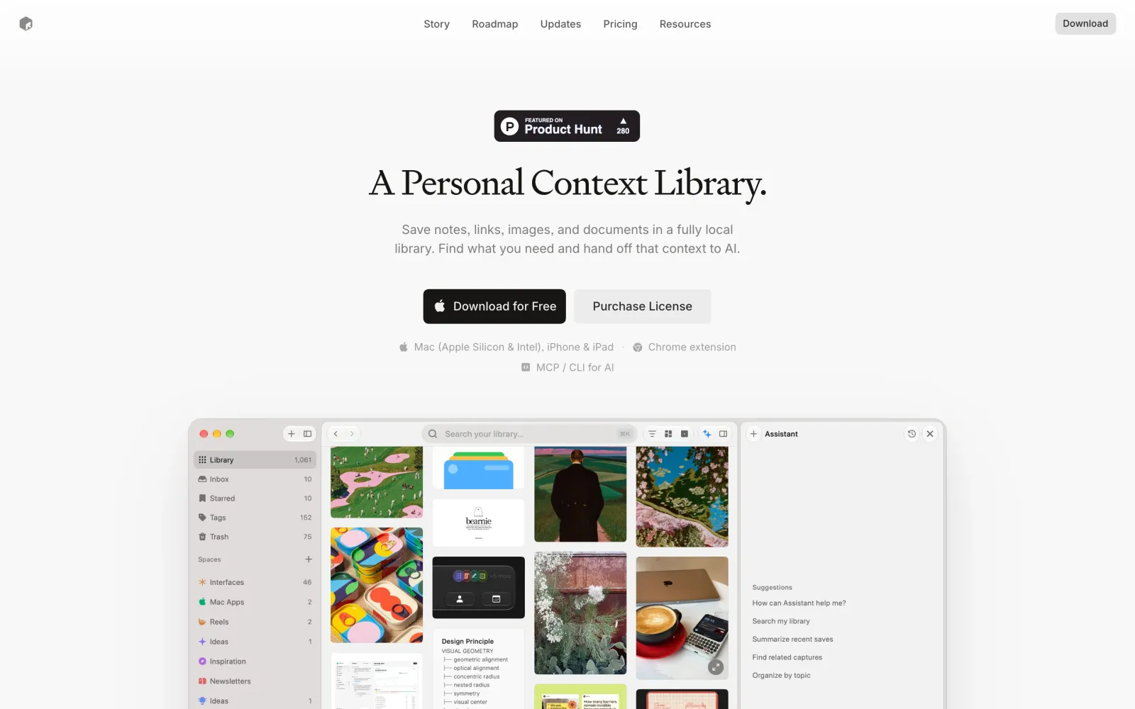
RebuildReference
Move across the image to wipe between the two. Click to lock the seam; arrow keys nudge it.
Imagery
3/3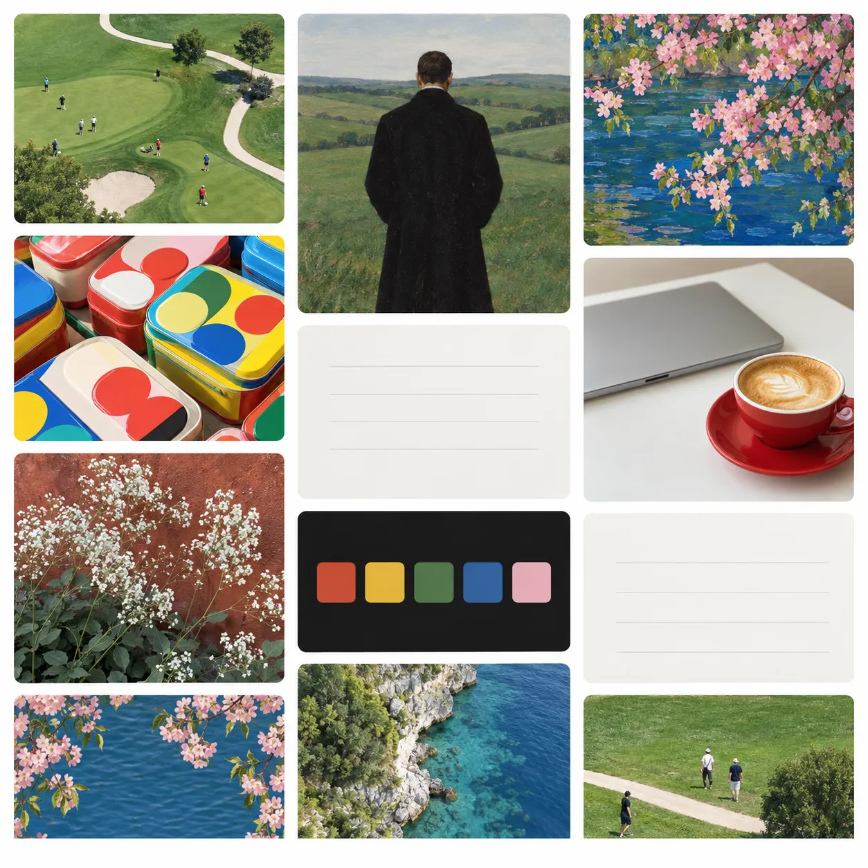
01-hero-library-grid
Masonry grid of saved photo and artwork thumbnails filling the centre pane of the hero app window
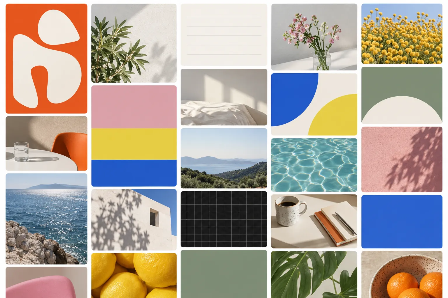
02-surfaces-library-grid
Denser masonry grid of varied saved thumbnails for the second app window
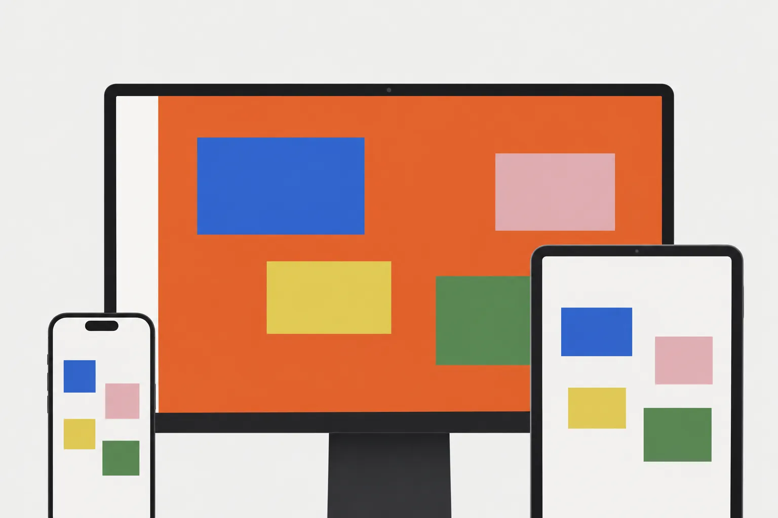
03-device-composite
Straight-on composite of a desktop display with an orange app screen, a phone overlapping at lower left and a tablet at lower right
Prompts
122,694 chars
# Rebuild prompt — light minimal Mac-app landing page, serif headlines, near-white ground

A single-column, centre-aligned marketing page for a desktop application. Near-white ground, one high-contrast serif for headlines, a grotesk for everything else, no gradients, no dark sections, no colour anywhere except inside the product screenshots. Its whole character comes from restraint: generous white space, hairline borders, one near-black button, and large light-mode app screenshots doing the heavy lifting.

The page is full-bleed: it starts at the very top edge of the viewport and runs edge to edge. No outer margin, no rounded page corners, no coloured sheet behind it.

**No motion report was supplied for this reference.** Every value in the Motion section is read off stills and marked **(inferred)**; durations, easings and stagger amounts are given as ranges and labelled "not measured". Do not invent exact timing numbers or physics parameters.

---

## 1. Structure

- **Viewport reference:** 1440 × 900 CSS px.
- **Media container:** 960px, centred (240px margins). All app screenshots, the tab row, the format strip and the device band use this width.
- **Text container:** 460px for lead paragraphs and meta lines (520px inside the band in section 6). Headlines may run wider — up to ~560px — but always break onto two lines rather than filling the 960.
- **Grid container (section 3 only):** 816px, centred (312px margins) — inset 72px on each side relative to the media container. This inset is deliberate; the feature grid is visibly narrower than the screenshots above and below it.
- **Feature grid:** 3 columns × 4 rows, fixed-height cards (254px column, 290px card).
- **Alignment:** every heading, paragraph and button row is centre-aligned. Card interiors are left-aligned. That contrast is the layout's only structural tension — keep it.

Sections, top to bottom:

1. **Top nav** — logo mark left, 5 text links centred, one small button right.
2. **Hero** — badge pill, serif headline, lead paragraph, two buttons, two lines of platform meta, large app window bleeding past the fold.
3. **Feature grid** — two-line serif heading, one-line sub, 12 cards in 3 × 4.
4. **Surfaces tour** — two-line serif heading, two-line sub, a 5-pill tab row, a second full-width app window, one caption line.
5. **Format strip** — short serif heading, one-line sub, two rows of format chips masked at both edges.
6. **Native band** — a rounded light-grey panel, 960 wide: heading, three-line paragraph, three small pills, and a device composite cropped by the panel's bottom edge.
7. **Closing CTA** — two-line serif heading, one dark button, one line of fine print.
8. **Footer** — hairline rule, copyright line, one row of ~10 text links.

---

## 2. Scroll map

Viewport height = 900px.

| # | Section | Height | Viewports | Scroll consumed | Kind |
|---|---------|--------|-----------|-----------------|------|
| 1 | Top nav | 72px | 0.08 | 0 (overlays hero) | static / sticky |
| 2 | Hero | 1200px | 1.33 | 1200px | entrance + scroll-linked shot |
| 3 | Feature grid | 1560px | 1.73 | 1560px | entrance (staggered) |
| 4 | Surfaces tour | 960px | 1.07 | 960px | entrance |
| 5 | Format strip | 510px | 0.57 | 510px | scroll-linked drift |
| 6 | Native band | 970px | 1.08 | 970px | scroll-linked parallax |
| 7 | Closing CTA | 280px | 0.31 | 280px | entrance |
| 8 | Footer | 289px | 0.32 | 289px | static |

Section tops in absolute scroll: 2 at 0 · 3 at 1200 · 4 at 2760 · 5 at 3720 · 6 at 4230 · 7 at 5200 · 8 at 5480.

**Total page height: 5769px ≈ 6.41 viewports.** Nothing pins; nothing stacks. The page is a plain vertical stack and scroll depth equals content height.

---

## 3. Spacing

**Section rhythm.** 120px top padding, 140px bottom padding is the default. Exceptions: the hero opens with 88px below the 72px nav; section 7 is tight (96/72) so the CTA reads as a coda, not a full section; the footer is 48/56.

**Hero (2), top to bottom from y=0:**
- nav band 72px tall, 32px horizontal padding, no border
- badge pill top at 143, height 34
- badge → headline 40
- headline → lead 28
- lead → button row 48
- button row → meta line 1 28
- meta line 1 → meta line 2 10
- meta → app window 64
- app window top at 519, 958 × 600, bottom at 1119; 81px of ground below it before section 3

**Feature grid (3):**
- heading block top at 1232, two lines
- heading → sub 20
- sub → grid 56 (grid top 1379)
- column gap 24, row gap 28, card height 290
- card padding 20; media panel inside the card 214 × 150; media → title 20; title → description 8

**Surfaces tour (4):** heading → sub 20 · sub → tab row 44 · tab row (36px tall pills, 8px gap) → window 48 · window 958 × 606 · window → caption 24.

**Format strip (5):** heading → sub 18 · sub → chips 48 · chip rows: each chip 150 × 108, 6 visible per row, 8px gaps, 8px between the two rows.

**Native band (6):** panel 958 wide, 906 tall, 24px radius. Inside: 80 top padding, heading → paragraph 20, paragraph → pill row 28, pill row → device composite 56, composite flush to the panel's bottom edge (it is cropped by it, not floated above it).

**CTA (7):** heading (2 lines) → button 32 · button → fine print 20.

**Footer (8):** 1px rule across the 960 container, 40px below it to the copyright line, 24px to the link row, link gap 22.

---

## 4. Type

**Classes.** Headlines: a high-contrast transitional/Didone-leaning **serif display**, regular weight only — free stand-in **Instrument Serif 400**, fallback **Source Serif 4 400**. Everything else: a neutral **grotesk** — free stand-in **Inter** (or Geist). No mono anywhere on the page.

**Body anchor: 17px.** Every level below is a multiple of it.

| Level | Multiple | Size | Line-height | Tracking | Weight | Family |
|---|---|---|---|---|---|---|
| Hero headline (2) | 3.05× | 52px | 1.05 | −0.015em | 400 | serif |
| Section heading (3, 4, 6) | 2.35× | 40px | 1.15 | −0.012em | 400 | serif |
| Minor heading (5, 7) | 2.0× | 34px | 1.15 | −0.01em | 400 | serif |
| Hero lead (2) | 1.06× | 18px | 1.4 | 0 | 400 | grotesk |
| Section sub / body | 1.0× | 17px | 1.5 | 0 | 400 | grotesk |
| Nav link | 0.88× | 15px | 1 | 0 | 450 | grotesk |
| Button label | 0.94× | 16px | 1 | −0.005em | 550 | grotesk |
| Platform meta (2) | 0.88× | 15px | 1.5 | 0 | 400 | grotesk |
| Card title (3) | 0.94× | 16px | 1.3 | −0.005em | 600 | grotesk |
| Card description (3) | 0.82× | 14px | 1.45 | 0 | 400 | grotesk |
| Tab pill (4) | 0.82× | 14px | 1 | 0 | 500 | grotesk |
| Caption under window (4) | 0.82× | 14px | 1.5 | 0 | 400 | grotesk |
| Chip label (5) | 0.82× | 14px | 1.2 | 0 | 450 | grotesk |
| Band pill (6) | 0.76× | 13px | 1 | 0 | 500 | grotesk |
| Status chip on card (3) | 0.71× | 12px | 1 | +0.01em | 500 | grotesk |
| Footer link | 0.82× | 14px | 1.6 | 0 | 400 | grotesk |
| Footer copyright | 0.76× | 13px | 1.6 | 0 | 400 | grotesk |

**Max line length.** Lead and section subs: 460px (~58 characters) — force the two-line break. Band paragraph: 520px over three lines. Card descriptions: 214px (~34 characters) over two lines. Headlines: break by hand at 2 lines, never 3.

**Copy roles (placeholder, no brand names, no slogans).**
- Badge (2): 10px uppercase label + 14px name + a 3-digit count.
- Hero headline: 4 words on one line, ending in a full stop. The period is part of the design.
- Hero lead: 18–22 words on two lines.
- Meta line 1: platform list, 7–9 words with a middle dot separator; line 2: 4 words.
- Section headings: 6–8 words on two lines (3, 4), 2 words (5), 5–6 words on two lines (7).
- Card title: 2–3 words. Card description: 8–14 words. Two of the twelve cards carry a 1-word status chip right of the title.
- Tab pills: 1 word each, five of them.
- Chips (5): 1 word each, twelve total across two rows.
- Band pills: 2–3 words each, three of them.
- CTA fine print: 12–16 words on one line.

---

## 5. Colour

| Hex | Role |
|---|---|
| **#F8F8F8** | **Dominant ground.** ~85% of the visible surface. The page background top to bottom; every section sits on it. |
| #FFFFFF | Raised surfaces only: feature card fill, app-window chrome, tab-row track, footer is *not* white. |
| #F1F0EF | Recessed fill: the media panel inside each feature card, the section-6 band, chip tiles. One step darker than the ground. |
| **#E0DCDB** | **Every border and rule.** 1px hairlines: card borders, window border, band border, footer rule, pill outlines. |
| #B9B8B7 | Tertiary text and icon strokes: platform meta, caption, footer copyright, monoline chip icons, disabled states. |
| #6E6E6E | Secondary body text: hero lead, section subs, card descriptions, footer links. |
| #1A1A1A | Ink: all headlines, card titles, nav links, tab labels. |
| #111111 | Dark fills: the primary button and the badge pill. White text on it. |
| **#46ACFE** | **The single accent.** Electric blue, used sparingly. |
| #477A39 | Incidental only — a green that occurs inside content thumbnails. Allowed as one 6px "local" status dot in section 6; nowhere else in the chrome. |

**Where #46ACFE is allowed:** inside the app screenshots (selected sidebar row, primary control, link text), one or two monoline glyphs in the feature-card illustrations, the focus ring (2px, 2px offset), and text-link hover in the footer. **It never appears on a button, a heading, a border or a background.** The primary CTA is near-black, not blue. If you find yourself reaching for blue to make something "pop", the answer is more white space instead.

---

## 6. Surface

- **Borders:** 1px solid #E0DCDB everywhere. No 2px borders, no coloured borders, no inset rings.
- **Radii:** feature card 16 · media panel inside card 10 · app window 12 · band 24 · buttons 10 · chips/tiles 12 · pills and tabs 999 · badge 8.
- **Shadows:** essentially absent. Exactly two allowances: the two app windows (sections 2 and 4) get `0 24px 60px rgba(0,0,0,0.08), 0 2px 6px rgba(0,0,0,0.04)` so they lift off the ground; the device composite in section 6 gets the same at 0.10. Feature cards, chips, pills, buttons and the band get **no shadow at all** — they are defined by their hairline only.
- **App-window chrome:** macOS style — 3 traffic lights top-left at 12px diameter, a toolbar row ~44px tall with a pill-shaped search field centred and small monoline icon groups either side. Not a browser frame, no URL bar, no tab strip.

---

## 7. Imagery

1. **Hero app window (2)** — 958 × 600, ratio 1.60:1, centred, bottom edge at 1119 so it is cut by the fold on a 900px viewport. Content: a three-pane light-mode desktop app — left sidebar ~150px with grouped nav rows carrying right-aligned counts and a section of coloured emoji-style icons; a centre masonry grid of saved cards at 3 columns with real photographic and screenshot content (a landscape, a product still, a document card, a dark UI card); a right assistant panel ~250px, mostly empty, with a small list of suggestion lines low down and an input field at the bottom. The treatment is flat and literal — an honest screenshot, not a stylised illustration, not tilted, not in a 3D perspective mockup.
2. **Feature card vignettes (3)** — 12 of them, 214 × 150, ratio 1.43:1, each filling the top of its card on the recessed fill. Each is a cropped fragment of product UI rendered at real size: three keycaps in a row; a small inbox card with a label; a cluster of tag chips in muted pastels; a blank note with a slider; a row of three platform glyph tiles; a search result list; a voice waveform in a dark pill; a paragraph with one highlighted span; a summary list with a progress row; a model-picker dropdown; a chat bubble with a cursor; a single blue folder. Keep them small in frame, generously padded, never filling the panel edge to edge.
3. **Surfaces window (4)** — 958 × 606, ratio 1.58:1, centred. The same app in a different state: a denser grid with more image variety and an open context menu overlaying one card, showing that this is a live interface and not a static picture.
4. **Format chip icons (5)** — 20px monoline glyphs in #B9B8B7, one per chip, sitting top-left inside each tile with the label below.
5. **Device composite (6)** — a desktop display showing a vivid orange-dominated app screen (the one strong colour on the entire page, and it is inside a screenshot, which is why it is allowed), with a phone overlapping its lower-left and a tablet its lower-right. Roughly 3:2 overall, anchored to the band's bottom edge and cropped by it — the devices run off the bottom rather than sitting fully inside. Straight-on, no perspective, no reflections, no floating shadows under the devices.

---

## 8. Motion

All values below are **(inferred)** from stills. Timings and easings are **not measured** — ranges are given; choose one and keep it consistent.

### Section 1 — Top nav
- **kind:** static (sticky position, no state change) (inferred)
- **what moves:** nothing. The bar stays at the top with the page ground showing through it.
- **from → to:** no transform, no opacity change, no background change, no border appearing on scroll.
- **range:** n/a
- **reduced motion:** identical.

### Section 2 — Hero
- **kind:** entrance for the text block, scroll-linked for the app window (inferred)
- **what moves:** badge, headline, lead, button row and meta enter as a stack; then the app window responds to scroll.
- **from → to:** entrance — each element `opacity 0 → 1`, `translateY 16px → 0`. App window — on load `opacity 0 → 1`, `translateY 28px → 0`, `scale 0.985 → 1`; then, scroll-linked, `translateY 0 → −40px` and `scale 1 → 1.01` as the page scrolls, reversing exactly on the way back up.
- **range:** entrance fires once on load, no scroll trigger; duration not measured, use 500–700ms; easing a standard ease-out cubic; stagger not measured, use 60–90ms per element in DOM order. The scroll-linked part runs from scroll 0 until the window's top reaches the nav (scroll ≈ 450), then holds.
- **reduced motion:** all entrances become `opacity 0 → 1` with no translate or scale; the scroll-linked transform is disabled entirely and the window sits at its resting position.

### Section 3 — Feature grid
- **kind:** entrance, once (inferred)
- **what moves:** the heading and sub as one unit, then the 12 cards.
- **from → to:** `opacity 0 → 1`, `translateY 20px → 0`. No scale, no blur, no clip reveal.
- **range:** triggered once when each element's top reaches 85% of the viewport height; duration not measured, use 450–600ms; ease-out; cards stagger by row, not by cell — all three cards in a row share a start, rows offset by 80–120ms (not measured). It does not reverse on scroll up.
- **reduced motion:** opacity only, no translate, no stagger.

### Section 4 — Surfaces tour
- **kind:** entrance, once (inferred)
- **what moves:** heading/sub, tab row, app window, caption.
- **from → to:** `opacity 0 → 1`, `translateY 20px → 0` for the text and tabs; the window adds `scale 0.99 → 1`.
- **range:** once, when each element's top reaches 85% of the viewport; duration 450–600ms (not measured); ease-out; stagger 70–100ms across the four elements.
- **reduced motion:** opacity only.

### Section 5 — Format strip
- **kind:** scroll-linked (reverses on the way back up) (inferred)
- **what moves:** the two chip rows drift horizontally in opposite directions, masked by a 120px linear alpha fade at both edges of the 960 container.
- **from → to:** row 1 `translateX +40px → −40px`; row 2 `translateX −40px → +40px`. Opacity unchanged. The heading and sub enter separately with `opacity 0 → 1, translateY 16px → 0`, once, at 85% of the viewport.
- **range:** the drift is a function of scroll position, mapped from the section's top entering the bottom of the viewport until its bottom leaves the top. Total travel is small — this is a subtle counter-drift, not a marquee, and it must not autoplay on a timer.
- **reduced motion:** both rows lock at `translateX 0`; the edge masks stay.

### Section 6 — Native band
- **kind:** scroll-linked (reverses) (inferred)
- **what moves:** the device composite inside the band, against the band's own fixed frame.
- **from → to:** composite `translateY +50px → −10px` (a slow parallax lag relative to the band). The band itself, its heading, paragraph and pills do not move; they enter once with `opacity 0 → 1, translateY 20px → 0` at 85% of the viewport, stagger 70–100ms (not measured).
- **range:** from the band's top entering the viewport bottom until the band's bottom reaches the viewport bottom. The composite is always clipped by the band's rounded bottom edge — the parallax happens inside `overflow: hidden`, it never overhangs.
- **reduced motion:** parallax disabled, composite fixed at its mid position; entrances become opacity-only.

### Section 7 — Closing CTA
- **kind:** entrance, once (inferred)
- **what moves:** heading, button, fine print.
- **from → to:** `opacity 0 → 1`, `translateY 16px → 0`.
- **range:** once, at 85% of the viewport; 450–600ms (not measured); ease-out; 60–80ms stagger.
- **reduced motion:** opacity only.

### Section 8 — Footer
- **kind:** static (inferred)
- **what moves:** nothing. No entrance, no rule-draw animation, no link cascade.
- **from → to:** n/a
- **range:** n/a
- **reduced motion:** identical.

### Interaction transitions (not part of the scroll choreography)

- **Nav link hover:** colour #1A1A1A → #6E6E6E, 120ms ease. No underline, no background pill.
- **Primary button hover:** #111111 → #262626, 140ms. Press: `scale 0.985`, 80ms.
- **Secondary button hover:** fill #EDECEB → #E4E2E1, 140ms. Press: same 0.985 scale.
- **Feature card hover:** border #E0DCDB → #CFCBCA and fill #FFFFFF → #FCFCFC, 160ms ease. **No lift, no shadow, no translate.**
- **Tab pill (4):** clicking a pill swaps the app window's content. The active pill gets a #FFFFFF fill with the hairline border and #1A1A1A text; inactive pills are transparent with #6E6E6E text. The indicator slides between pills over 200–260ms ease-out; the screenshot itself cross-fades `opacity 0 → 1` over 180–240ms with no slide and no height change — the window must not resize between tabs.
- **Chip hover (5):** icon #B9B8B7 → #6E6E6E, 120ms.
- **Footer link hover:** #6E6E6E → #1A1A1A, 120ms; this is the one place a text link may take #46ACFE instead if you want a single spark of accent.
- **Focus-visible (everything):** 2px #46ACFE ring at 2px offset, no transition.

---

## 9. Responsive (below 640px)

- Container becomes `100% − 40px` gutters; the 960 / 816 / 460 widths all collapse to it.
- **Nav (1):** logo left, button right, the five links move into a menu (or are dropped). The bar keeps its 72px height and stays borderless.
- **Type:** hero headline 52 → 34px, section headings 40 → 28px, minor headings 34 → 26px, hero lead 18 → 17px. Body stays 17px. Nothing scales below its floor: nav and buttons stay ≥14px, captions and chips ≥12px.
- **Hero (2):** the two buttons stack full-width with a 10px gap; the meta lines wrap to three lines; the app window scales to container width keeping its 1.6:1 ratio and stays fully visible — do not crop it to a square, and do not replace it with a phone screenshot.
- **Feature grid (3):** 3 columns → 1 column, cards go auto-height, row gap 16. The 72px grid inset disappears — cards use the full container.
- **Surfaces tour (4):** the tab row becomes a horizontally scrollable strip with no visible scrollbar and the same edge fade used in section 5; the window scales to container width.
- **Format strip (5):** chips become 2 rows of 3 visible with the same masked counter-drift, or one row if space is tight. Tile height 108 → 88.
- **Native band (6):** radius 24 → 16, padding 80 → 48 top / 20 sides. The device composite crops to the phone plus a vertical slice of the desktop screen, still clipped by the bottom edge. Pills wrap to two rows.
- **CTA (7):** button goes full width; fine print wraps to two lines.
- **Footer (8):** links wrap into a two-column list, left-aligned; copyright above them.
- Section padding 120/140 → 72/80 throughout.

---

## 10. Don'ts

- **Don't use #FFFFFF for the page background.** The ground is #F8F8F8 and the cards are white on top of it; invert that and the whole surface hierarchy disappears.
- **Don't bold the serif.** Every headline on the page is weight 400. A 600-weight serif headline instantly reads as a different, cheaper page. Likewise, don't substitute a geometric sans for the serif — the serif/grotesk pairing is the entire identity.
- **Don't let the accent escape the screenshots.** No blue buttons, no blue links in body copy, no blue heading words, no gradient from #46ACFE. The primary CTA is #111111. If the page looks monochrome, that is correct.
- **Don't add a border, blur backdrop, shadow or shrink-on-scroll state to the nav.** It sits flat on the ground and stays there.
- **Don't put shadows on the feature cards.** Hairline borders only, and no hover lift — hover changes colour, nothing else.
- **Don't add uppercase letterspaced eyebrows above the section headings.** There are none anywhere on this page; a "FEATURES" kicker would break it.
- **Don't widen the container past 960 or stretch headlines across it.** Heading blocks are ~460–560px wide with a manual two-line break, floating in a lot of empty ground. The white space is doing the work.
- **Don't make the feature grid 2 columns or square cards.** It is 3 × 4, cards are wider than tall (254 × 290 including text), and the grid is visibly narrower than the screenshots above and below it — preserve that 72px inset.
- **Don't centre the card text.** Headings centre, card interiors left-align.
- **Don't crop the hero screenshot into a neat card above the fold.** It must be cut by the bottom of the viewport so the page reads as continuing.
- **Don't frame the app shots in a browser chrome or a tilted 3D mockup.** Flat, straight-on, macOS window with traffic lights.
- **Don't animate the headline per-letter, per-word, or with a blur/clip reveal.** Everything on this page enters the same way: short fade plus a 16–20px rise. One vocabulary, repeated.
- **Don't add parallax to sections 2–5.** Only the device composite in section 6 and the chip drift in section 5 are scroll-linked; everything else is a play-once entrance that does not reverse.
- **Don't pin, stack or scroll-jack anything.** The page is a plain 5769px stack; adding a pinned section changes its measured scroll depth.
- **Don't drop body copy to 14px to fit more in.** Running text is 17px; 14px is only for card descriptions, captions, footer links and tab labels.
- **Don't introduce a dark section, a coloured CTA band, or a tinted footer.** The footer sits on the same #F8F8F8 as everything above it, separated only by a 1px rule.
Captures
2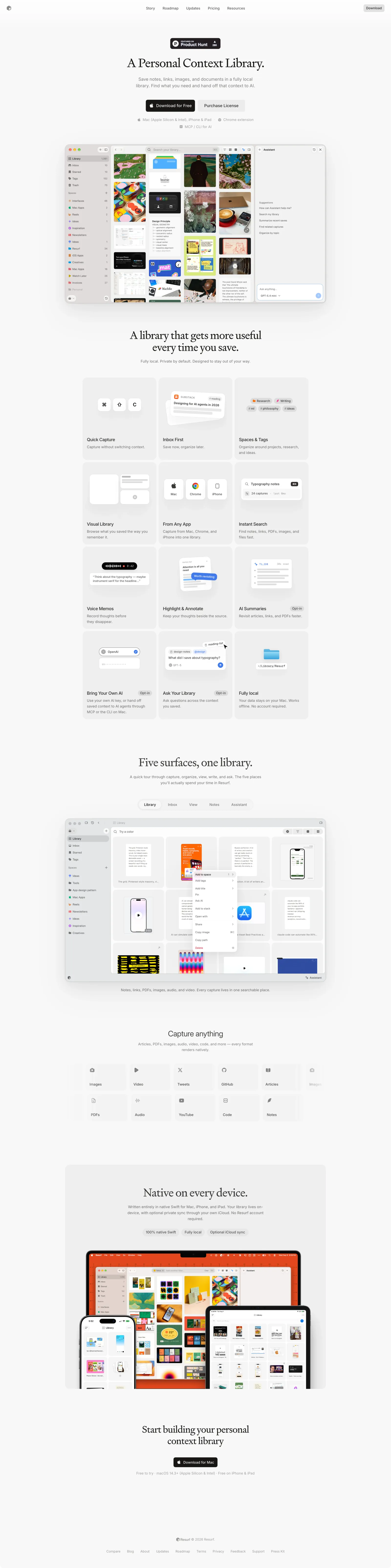
Versions
1Each rebuild is kept. The live one is what the comparison shows. LiveOpus 5.5Extra highfrontend-designemil-design-engtransitions-devhumanizergsaplast month · 89s · 3 images · 20260918T150158ZOpen