Sentry — AI security landing page
Landing pagedribbble.com/shots/27590903-AI-Cybersecurity-SaaS-Website-Landing-Page-UI-Design18 Sep 2026, 17:38
Rebuild
Opus 5.5Extra highfrontend-designemil-design-engtransitions-devgsaphumanizerView
RebuildReference
Move across the image to wipe between the two. Click to lock the seam; arrow keys nudge it.
Prompts
121,469 chars
# Isometric blue security landing page

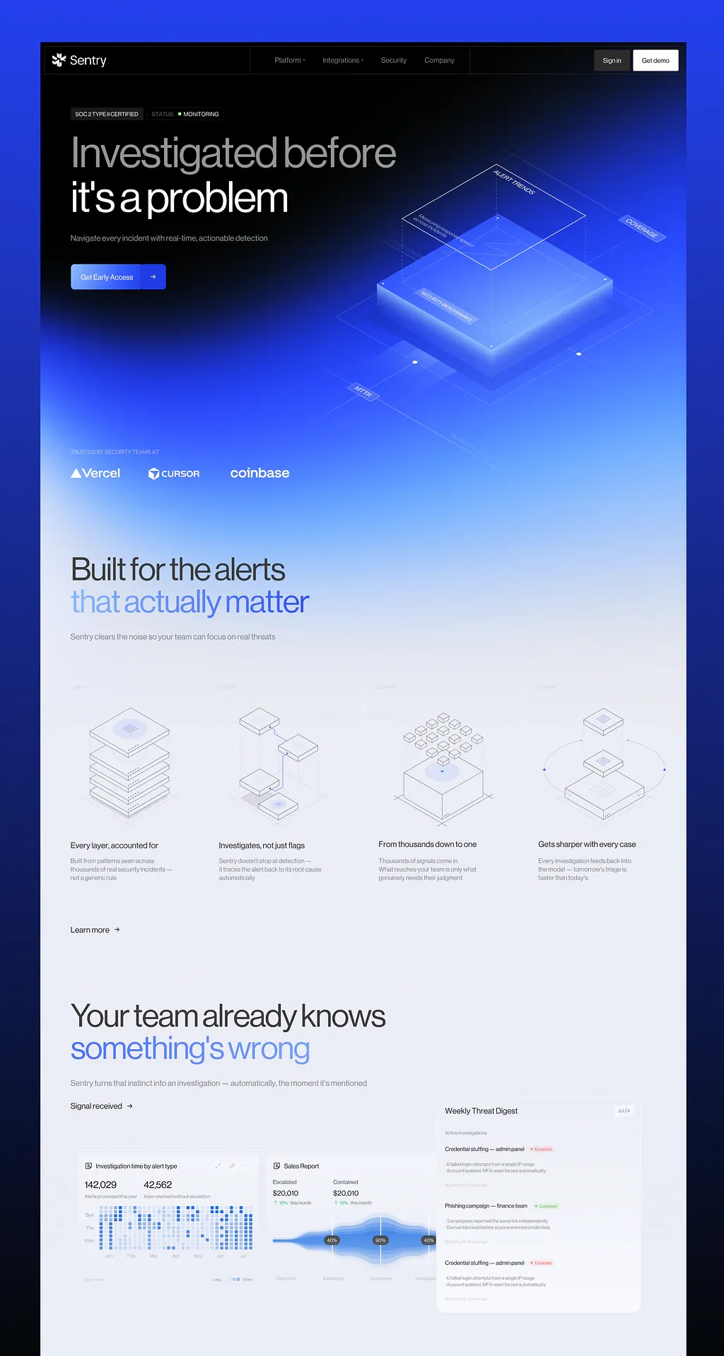
A 1440px, full-bleed landing page for a technical AI product. It opens on a black hero that becomes an electric royal-blue glow and then dissolves into a pale, cool lavender-grey page. The headlines are large, light-weight and very tightly tracked. The page uses isometric line illustrations and a layered analytics dashboard composite. It uses one accent hue family, blue, in three steps.

## Structure

- Canvas: 1440px, full bleed. Page gutter: 64px left and right, so content is 1312px wide. Grid: 12 columns with 24px gutters (each column ≈ 87px).
- Two surface zones: a dark backdrop behind sections 1–3, then a gradient that dissolves into a pale page for sections 4–6. There is no hard seam between them.

1. **Nav bar.** Fixed, inset 8px from the top, left and right edges, 60px tall. It is a bordered bar split into three equal cells by 1px vertical dividers:
   - Logo cell: left-aligned.
   - Link cell: 4 links, centred. The first two have a small chevron.
   - Action cell: two buttons, right-aligned.
2. **Hero.**
   - Text column: columns 1–6, max 760px wide, left-aligned. It holds a row of two status chips, the H1 (two lines), a one-line lead and a split CTA button.
   - Right side: a large isometric illustration in columns 7–12. It bleeds off the right edge and down into section 3.
3. **Logo strip.** Sits on the blue part of the hero backdrop, left-aligned. It has a small uppercase label, then one row of 3–5 white wordmarks.
4. **Feature section.**
   - H2 on two lines. Line 1 is near-black; line 2 is a pale-blue gradient.
   - One-line lead.
   - A 4-cell grid. Each cell has a faint index label, an isometric line illustration, a title and a description.
   - A text link with an arrow below the grid.
5. **Signal section.**
   - H2 on two lines. Line 1 is near-black; line 2 is a saturated-blue gradient.
   - One-line lead, then a text link with an arrow.
   - A dashboard composite:
     - A wide, faint tray on the left holding two analytics cards: a heatmap card and a funnel/stream-chart card.
     - A taller white "digest" card overlapping the tray's right end, sitting above it.
6. **Footer** (inferred; the capture ends inside section 5):
   - 1px hairline on top.
   - Wordmark on the left, and 3 short link columns (4 links each) in columns 7–12.
   - A 12px legal row 48px below.
   - Padding: 64px top and bottom.

## Scroll map

Viewport is 1440×900. No motion capture exists, so all heights are read off the still (inferred). Nothing pins or stacks, so the scroll each section consumes equals its height.

1. Nav: 60px (0.07 vh). Fixed overlay, consumes 0. Static.
2. Hero: 0–880px. 880px, 0.98 vh, consumes 880. Entrance.
3. Logo strip: 880–1040px. 160px, 0.18 vh, consumes 160. Entrance.
4. Features: 1040–2060px. 1020px, 1.13 vh, consumes 1020. Entrance.
5. Signal and dashboard: 2060–2960px. 900px, 1.0 vh, consumes 900. Entrance.
6. Footer: 2960–3200px. About 240px, 0.27 vh. Static (inferred).

**Total: about 3200px (about 3.6 viewports).** About 2960px of that is visible in the capture.

## Spacing

**Nav**
- Inset 8px from the top, left and right edges. Height 60px.
- Cell padding: 0 16px. Links are 32px apart.
- Buttons are 44px tall, 8px apart, and 8px from the right divider/edge.

**Hero** (y values measured from the top of the page)
- Chips start at y≈148px. They are 26px tall and 8px apart.
- Gaps: chips → H1 32px; H1 → lead 36px; lead → CTA 56px.
- The CTA ends at about y=550px. Below that, the left half stays empty.
- The illustration fills x≈590–1440 and y≈270–915.

**Logo strip**
- The label sits at y≈910px. Label → logos: 24px.
- Logos are 28px tall with 64px gaps. Bottom padding: 72px.

**Features**
- Padding-top 96px. Gaps: H2 → lead 28px; lead → grid 72px.
- The grid breaks wider than the gutter: it sits 32px from each viewport edge (1376px wide). It has 4 equal cells of about 341px with 4px gaps.
- Each cell is 520px tall. Padding: 24px top, 32px sides, 48px bottom. This puts the first cell's text on the 64px page gutter.
- Inside a cell: index label → illustration box 24px. The illustration box is 276px tall. Illustration → title 44px; title → description 10px.
- Grid → text link: 48px. Section padding-bottom: 72px.

**Signal**
- Padding-top 80px. Gaps: H2 → lead 28px; lead → link 32px; link → tray 80px.
- Tray:
  - Starts at x=64 and is about 824px wide and 328px tall.
  - Inner padding 12px; 12px gap between its two cards.
  - Its bottom 44px is a caption/legend strip.
- Tray cards: each about 422px wide and 244px tall, with 16px padding.
- Digest card:
  - About 454×484px. Its left edge overlaps the tray's right edge by about 8px, and its right edge sits about 103px from the viewport edge.
  - Its top aligns with the text-link row (about 110px above the tray top). Its bottom hangs 40px below the tray.
  - Padding 20px; 40px between list items.
- Section padding-bottom: 120px.

**Rhythm**
- About 150px of empty space between the last element of one section and the next H2.
- The heading block is tight (28–32px gaps); the jump to the content block is 72–80px.

## Type

**Family:** a neutral neo-grotesk with tight letterforms (the Neue Montreal / Aeonik class). Use **Inter Tight** as the free stand-in (Geist is acceptable). Use one family for everything, including uppercase labels. Use tabular numerals in the dashboard. No serif, no mono.

**Body anchor: 17px.**

| Level | × body | px | line-height | tracking | weight | notes |
|---|---|---|---|---|---|---|
| H1 (hero) | 5.2× | 88 | 1.02 | −0.055em | 400 | 2 lines, max 760px. Line 1 ~2 words, line 2 ~3–4 words |
| H2 (sections 4, 5) | 3.8× | 64 | 1.1 | −0.05em | 400 | 2 lines, max 760px. Line 1 ~4 words, line 2 ~2–3 words |
| Lead / body | 1× | 17 | 1.5 | −0.01em | 400 | Single line, max 680px (~75ch) |
| Feature title | 1× | 17 | 1.35 | −0.015em | 500 | 3–5 words |
| Feature description | 0.82× | 14 | 1.45 | 0 | 400 | 3 lines, max 250px (~34ch) |
| Nav wordmark | 1.3× | 22 | 1 | −0.03em | 500 | Paired with a 20px geometric mark |
| Dashboard hero number | 1.3× | 22 | 1.1 | −0.02em | 400 | Tabular |
| Dashboard value | 1.05× | 18 | 1.1 | −0.02em | 400 | Tabular |
| Digest card title | 0.94× | 16 | 1.3 | −0.01em | 500 | 3 words |
| Card title / list-item title | 0.82× | 14 | 1.35 | 0 | 500 | |
| Hero CTA, text links | 0.88× | 15 | 1 | −0.01em | 500 | |
| Nav links, nav buttons | 0.82× | 14 | 1 | 0 | 400 / 500 | |
| Chips, strip label, isometric tags | 0.71× | 12 | 1 | +0.02em | 500 | Uppercase |
| Micro (meta, axis, legend, index labels) | 0.71× | 12 | 1.35 | 0 (index labels +0.04em uppercase) | 400 | |

## Colour

**Palette roles**

| Hex | Role | Where it appears |
|---|---|---|
| **#EAEDF5** | Dominant surface, about 65% of the page | Everything below the hero dissolve (sections 4–6) |
| **#020304** | Near-black | Hero base; nav bar fill; H2 line 1 and all dark text on the light page; % pills in the stream chart (at 90%) |
| **#233EE9** | Royal blue, deep accent | Core of the hero glow; slab side faces; CTA arrow segment; end stop of section 5's H2 gradient; strongest heatmap cells; stream-chart core |
| **#4877FE** | Primary accent | CTA main fill; start stop of section 5's H2 gradient; end stop of section 4's H2 gradient; blue paths and dots in line illustrations; mid chart bands |
| **#88B8FC** | Pale accent | Start stop of section 4's H2 gradient; the fringe where the hero dissolves to light; mid heatmap cells; outer chart band; slab edge highlights |

**Derived neutrals**
- #FFFFFF: H1 line 2, logos, "Get demo" button, digest card.
- #C4C8D2: lead text on dark.
- #8C8E96 → #BFC1C8: H1 line 1 silver gradient (horizontal).
- #6B7180: muted text on light.
- #7A8090 / #A4A9B6: secondary and meta text.
- #9AA0AE: line-art strokes.
- #DCE1EC: hairlines on light.
- rgba(255,255,255,0.12): hairlines on dark.
- #1E1F24: "Sign in" button fill.
- #F1F3F8: feature cell tint.

**Status colours:** green #34C77B and red #E5484D. They appear only inside tiny status pills (on 12% tints of themselves) and as the 6px square in the hero chip.

**Where the accent may appear.** Blue appears only in:
- the hero backdrop and illustration,
- the single primary CTA,
- line 2 of each H2,
- small accents inside line illustrations,
- data-viz.

It never appears in body text, the nav, borders, secondary buttons or section fills below the hero.

**Hero backdrop.** One wrapper spans sections 2–3 plus 200px into section 4 (about 1240px tall). It has three layers:
- Base: #020304.
- Glow: radial-gradient(ellipse 70% 60% at 72% 58%, #233EE9 0%, rgba(35,62,233,.85) 35%, transparent 70%).
- Dissolve: linear-gradient(180deg, transparent 0%, transparent 48%, #233EE9 66%, #4877FE 76%, #88B8FC 88%, #EAEDF5 100%).

The result: the top-left stays pure black through the H1, the right side glows blue from about y=250px, and the logo strip sits on a mid blue between #4877FE and #88B8FC.

## Surface

**Borders**
- 1px everywhere; there are no 2px borders.
- On dark: rgba(255,255,255,0.12). On light: #DCE1EC, or rgba(2,3,4,0.07) for the faintest cells.

**Corner radii**

| Element | Radius |
|---|---|
| Buttons (nav and CTA) | 4px |
| Chips, isometric tags | 2px |
| Feature cells | 4px |
| Tray | 12px |
| Dashboard cards | 8px |
| Digest card | 12px |
| Status and % pills | 999px |
| Heatmap squares | 2px |

**Nav:** filled #020304 with a full 1px border, plus 1px dividers between the three cells.

**Feature cells:** #F1F3F8 at about 70% on the page colour, with a hairline border. They should be barely visible.

**Tray:** rgba(255,255,255,0.45) with a hairline border. Its two cards are rgba(255,255,255,0.8) with hairline borders.

**CTA:** a split button, 52px tall.
- Left segment: gradient from #6A90FF (top) to #4877FE (bottom), with white text.
- Right segment: a 52×52 square in #233EE9 with a white 14px arrow.
- A 1px inner top highlight in rgba(255,255,255,.25).

**Shadows**
- The digest card is the only element with a shadow: 0 1px 2px rgba(2,3,4,.04), 0 24px 48px -12px rgba(35,62,233,.14).
- Glow appears only in the hero illustration (under the slab and on the vertex dots). No other UI element glows.

## Imagery

**1. Hero isometric scene.** One inline SVG, about 850×650 (about 4:3). Its centre is at about x=1110, y=600 on the page, and it bleeds off the right edge. It uses a true 30° isometric projection.
- **Slab.** A square slab, drawn as a diamond about 420px wide with about 36px of visible thickness.
  - Top face: gradient from #4877FE (near corner) to #233EE9 (far corner), with a 1px #88B8FC edge highlight.
  - Side faces: #1F36D6 and #1A2EC0.
  - A blurred #233EE9 glow at 60% spreads about 120px beneath it.
  - Tiny 3px white dots at its top corners.
- **Floating plane.** About 110px above the slab, a matching wireframe diamond (1px white at 70%). 1px dashed vertical lines (white at 35%) join its corners to the slab. A tiny 1px sparkline sits on its surface.
- **Outer plane.** A larger wireframe plane (about 1.6× the slab) at the slab's base, drawn 1px in white at 15%. Extension lines run off-canvas and down into the logo strip.
- **Tags.** Four small rectangular tags with a 1px white 50% border. Each holds a 12px uppercase metric name of 1–2 words and lies flat along an isometric edge:
  - the floating plane's top edge,
  - the outer plane's right corner,
  - the slab's front-left edge,
  - the outer plane's lower-left edge.
- **Annotations.** Faint 12px annotations (white at 25%) lie flat along two more edges.
- **Vertex dots.** 3–4 white dots, 6px each, with a 12px white glow, on the outer-plane vertices.

**2. Four feature illustrations.** Isometric line drawings, about 280×240 each, centred in the 276px box.
- Strokes: 1px #9AA0AE. Faces: white or #F4F6FA fills.
- Blue appears only in small accents: dot-matrix patches in #4877FE on top faces, a single connecting path, and 4–6px dots.
- The four subjects:
  1. A stack of 5 thin tiles; the top tile carries a blue dotted disc.
  2. Three separated tiles at different heights, joined by a blue stepped path, with faint vertical guide lines.
  3. A large cube with about 15 small cubes hovering above it in a loose cluster, converging onto one blue dot on the cube's top face.
  4. Two small stacked tiles over a base platform, ringed by a thin elliptical orbit that carries two blue dots.

**3. Dashboard composite.** Build it in HTML/SVG, not as an image.
- **Heatmap card**
  - Header: a small document icon and a title of 4–5 words. Three faint icon buttons sit top-right.
  - Two stat pairs, each a big number with a 12px caption of 3–4 words.
  - A heatmap of 7 rows × 28 columns of 10px squares with 3px gaps. Cells use 5 steps (#DDE3F2, #C2D6FB, #88B8FC, #4877FE, #233EE9), weighted so blue forms clusters.
  - Day labels on rows 1, 4 and 7; 7 month labels underneath.
- **Stream-chart card**
  - Title of 2 words.
  - Two stats, each with a 12px label, an 18px value and a 12px green "↑ n% period" delta.
  - A horizontal stream chart, about 400×90. It is built from three nested bands, symmetric about a horizontal axis:
    - outer band #88B8FC at 35%,
    - mid band #4877FE at 70%,
    - core #233EE9.
  - The bands grow from about 6px thick at the left to about 80px at 60% of the width, then narrow slightly.
  - Three 1px white vertical stage markers, each with a dark % pill (22px tall, 12px white text) centred on the axis.
  - The chart's right end runs underneath the digest card.
  - Stage labels in 12px muted text sit in the tray's caption strip.
- **Tray caption strip:** a faint link on the left and a "less ▪▪▪ more" legend.
- **Digest card**
  - Header: a title of 3 words and a date chip (12px, #EEF1F7 fill, 4px radius).
  - A hairline, then a 12px muted role label.
  - 3 list items. Each has:
    - a 14px/500 title of 3–5 words,
    - a status pill (red for escalated, green for contained),
    - two 12px detail lines of about 8 words each, prefixed with "·",
    - a 12px meta line: attribution · relative time.

**4. Logos.** 3–5 monochrome white placeholder wordmarks, 28px tall, left-aligned in a single row.

## Motion

Nothing on this page is scroll-linked, pinned or stacked. There was no live capture, so every value below is inferred from the stills, and every duration is not measured.

**1. Nav**
- kind: static. The bar is fixed and does not animate (inferred).
- what moves: nothing.
- from → to: none.
- range: none.
- reduced motion: same.

**2. Hero**
- kind: entrance, plus a continuous idle loop (inferred).
- what moves: chips, H1 line 1, H1 line 2, lead, CTA, illustration. In the idle loop: the floating wireframe plane and the vertex dots.
- from → to:
  - Text: opacity 0 → 1, translateY 20px → 0.
  - Illustration: opacity 0 → 1, translateY 32px → 0, scale 0.97 → 1.
  - Idle: the floating plane bobs translateY 0 → −8px → 0, and the vertex dots pulse opacity 0.6 → 1.
- range:
  - Plays once on page load, in reading order. The illustration starts with the H1.
  - Duration not measured (range 600–900ms). Ease-out (curve not measured). Stagger not measured (range 80–120ms).
  - Idle loop period not measured (range 5–7s).
- reduced motion: everything renders in its final state with no idle loop. A plain opacity fade of 200ms or less is allowed.

**3. Logo strip**
- kind: entrance (inferred).
- what moves: the label, then each logo.
- from → to: opacity 0 → 1, translateY 12px → 0.
- range:
  - Plays once, when the strip's top reaches 85% of the viewport.
  - Duration not measured (range 400–700ms). Ease-out. Stagger not measured (range 60–100ms), left to right.
- reduced motion: shown immediately.

**4. Features**
- kind: entrance (inferred).
- what moves: H2 line 1, H2 line 2, lead, the four cells (left to right), the text link. Inside each cell, the blue accent path/dots.
- from → to:
  - Elements: opacity 0 → 1, translateY 24px → 0.
  - Blue strokes in each cell: stroke-dashoffset 100% → 0 after the cell lands.
- range:
  - Each group plays once, when its top reaches 80% of the viewport.
  - Duration not measured (range 500–800ms). Ease-out.
  - Cell stagger not measured (range 80–120ms). Stroke draw not measured (range 600–900ms).
- reduced motion: final state, with strokes fully drawn.

**5. Signal and dashboard**
- kind: entrance (inferred).
- what moves: H2 lines, lead, link, tray, digest card, heatmap cells, stream chart.
- from → to:
  - Heading group: opacity 0 → 1, translateY 24px → 0.
  - Tray: opacity 0 → 1, translateY 32px → 0.
  - Digest card: opacity 0 → 1, translateY 48px → 0, starting after the tray.
  - Heatmap cells: opacity 0 → 1, sweeping column by column from left to right.
  - Stream chart: clip-path inset(0 100% 0 0) → inset(0 0 0 0).
- range:
  - Heading plays once at 80% of the viewport. The composite triggers once, when the tray's top reaches 80%.
  - Tray duration not measured (range 600–800ms).
  - Digest card delay not measured (range 120–200ms after the tray).
  - Heatmap sweep not measured (range 400–700ms total).
  - Chart reveal not measured (range 700–1000ms). Ease-out.
- reduced motion: all elements shown fully drawn, with no sweep or reveal.

**6. Footer**
- kind: static.
- what moves: nothing.
- from → to: none.
- range: none.
- reduced motion: same.

## Interaction transitions

These are separate from the scroll choreography. Durations were not measured; use 150–250ms, ease-out.

- **Nav links:** hover changes the colour from #A5A9B4 to #FFFFFF.
- **Nav chevron items:** open a dropdown panel that fades in and drops 4px (#0B0C10 fill, hairline border, 8px radius). The chevron rotates 180°. Closing reverses it.
- **"Sign in":** hover changes the fill from #1E1F24 to #2A2C33.
- **"Get demo":** hover changes the fill from #FFFFFF to #DDE3F2.
- **Hero CTA:**
  - Hover: the left segment brightens by about 6% and the arrow shifts 3px right.
  - Press: scale 0.98.
- **Text links:** on hover the arrow translates 4px right and the text is underlined 1px, offset 4px.
- **Feature cells:** on hover the border darkens to #CDD3E0 and the blue accents go to full opacity from 80%. Nothing lifts.
- **Heatmap cells:** on hover show a dark tooltip (12px text, 4px radius) holding a count and a date.

## Responsive (below 640px)

- **Gutter:** 20px.
- **Nav:** becomes two cells: logo, and "Get demo" plus a menu button. The link cell is dropped into a full-screen menu. Inset stays 8px; height becomes 56px.
- **Hero:**
  - Text stacks first. H1 drops to 48px (2.8×) at line-height 1.05. Chips may wrap.
  - The illustration moves below the CTA at 100% width (scaled to about 360px wide), no longer bleeding off the edge.
  - Hero height becomes auto.
- **Logo strip:** logos wrap to 2 rows at 22px tall, 32px apart.
- **Feature section:**
  - H2 drops to 40px (2.35×).
  - The grid becomes 1 column (2×2 between 640 and 1024px) and moves back inside the 20px gutter.
  - Each cell becomes auto height, with the illustration box at 220px.
- **Dashboard:**
  - The overlap is dropped. The digest card stacks below the tray at full width.
  - The two tray cards stack.
  - The heatmap crops to its last 14 columns.
  - The stream chart goes full width.
- **Rhythm:** section spacing shrinks from about 150px to 96px.

## Don'ts

- **Headlines:**
  - Don't bold them. They are weight 400 with very tight negative tracking, and at default tracking the page looks generic.
  - Don't centre the hero. Text is left-aligned and the illustration sits right.
  - Don't put eyebrow labels ("Features", "How it works") above the H2s. The only small uppercase labels are the hero chips, the logo-strip label and the cell index labels.
  - Don't apply gradient text anywhere except line 2 of the H2s and the silver H1 line 1. Never use rainbow or purple-to-pink gradients.
- **Colour:**
  - Don't make the whole page dark. It turns from black to pale lavender at the logo strip, and it does so through a soft gradient, never a hard edge or a divider.
  - Don't introduce a second accent hue: no violet, cyan, teal or neon green glows. The "neon" is only electric royal blue; green and red live only in tiny status pills.
  - Don't use pure white as the page background below the hero. It is #EAEDF5; white is reserved for the digest card and dashboard surfaces.
  - Don't put a blue frame or mat around the page. It is full bleed.
- **Surfaces and buttons:**
  - Don't use rounded pill buttons or large radii. Buttons are 4px, and the CTA is a split two-segment button.
  - Don't add glassmorphism, backdrop blur, or glowing borders on cards.
  - Don't drop-shadow every card. Only the digest card has a shadow.
  - Don't make the feature cells white cards with shadows. They are barely-tinted panels with hairlines, butted together with 4px gaps.
- **Illustration and imagery:**
  - Don't replace the isometric SVG with a 3D render, stock photo or abstract blob. It is a precise wireframe plus one glossy slab.
  - Don't use icon-in-circle feature items or emoji. Each cell carries an isometric line drawing with sparse blue accents.
  - Don't lay out the logo wall as a centred grey grid of 6–8 logos. It is 3–5 white wordmarks, left-aligned, on the blue.
- **Dashboard:**
  - Don't use chart-library defaults: no gridlines, legends in boxes, multicolour series or rounded bar charts.
  - Data-viz is monochrome blue in three steps, with dark % pills.
  - Don't flatten the composite into a neat side-by-side row. The digest card must overlap the tray and sit higher and lower than it.
Versions
1Each rebuild is kept. The live one is what the comparison shows. LiveOpus 5.5Extra highfrontend-designemil-design-engtransitions-devgsaphumanizer3 weeks ago · 1287s · 20260928T175414ZOpen