SK Builders real estate landing
Rebuild
Opus 5.5Extra highfrontend-designemil-design-engtransitions-devhumanizergsapView

RebuildReference
Move across the image to wipe between the two. Click to lock the seam; arrow keys nudge it.
Imagery
4/4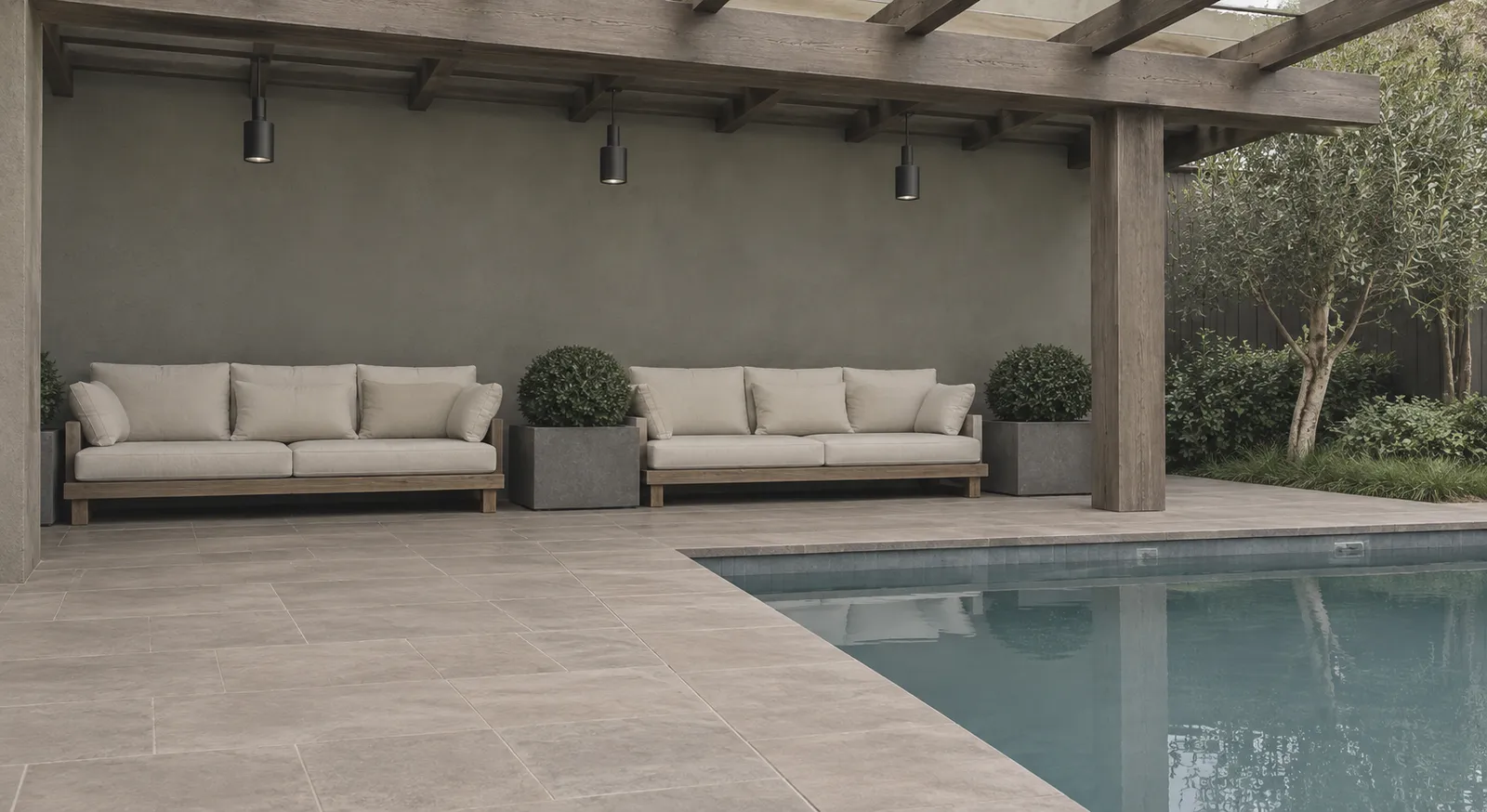
01-hero-terrace
Covered outdoor terrace with a timber pergola, low pale-cushioned sofas, clipped topiary in planters and a pool edge at the lower right
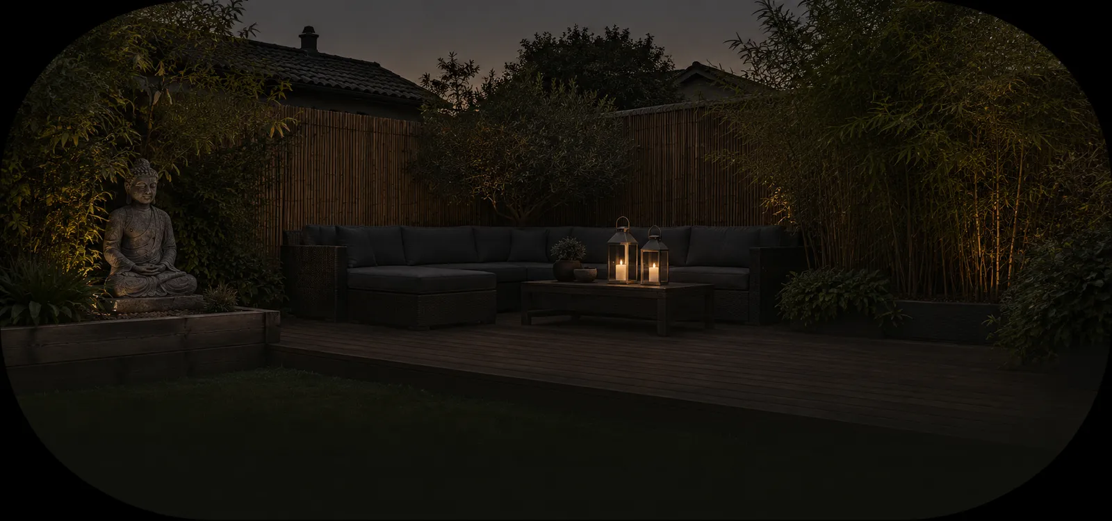
02-video-courtyard
Dusk garden courtyard with a deck, dark sectional seating, lit lanterns on a low table, tall bamboo screening and a stone figure at the left
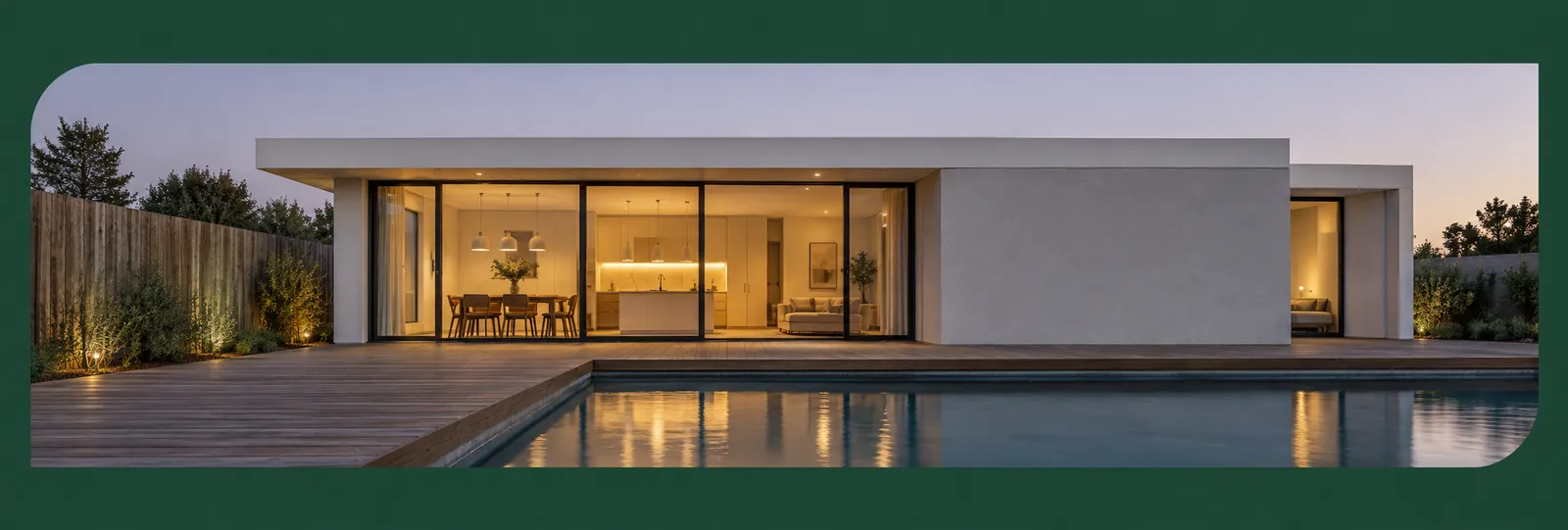
03-project-panorama
Single-storey modern house at blue hour seen across its pool, full-height glazing glowing warm from inside, timber deck and a weathered fence at the left
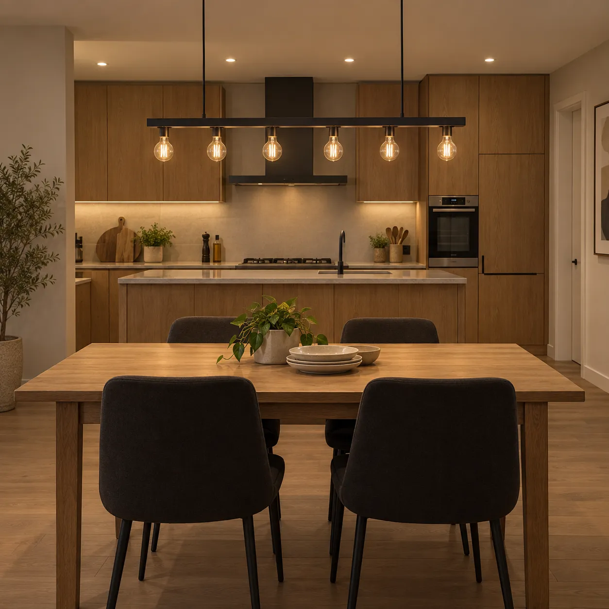
04-quality-interior
Open kitchen and dining space with a timber table set for a meal, dark chairs and a linear pendant of exposed bulbs above
Prompts
121,471 chars
# Dark green real estate landing — rebuild prompt

A full-bleed, dark, editorial property-marketing page. Two surfaces alternate — deep forest green and near-black — with white uppercase display type, one terracotta accent, and photographs masked into extreme radii (near-stadium rounded rectangles and one true circle). Motion is restrained: entrances on arrival, two scroll-linked image moves, nothing pinned.

No motion report was supplied with this reference. **Every motion number below is marked (inferred)**; durations, easings and stagger are given as ranges because they were not measured.

---

## 1. Structure

- **Design viewport:** 1160 × 760 px. The page is full-bleed — no outer margin, no mat, no rounded corners on the page itself, nothing behind it.
- **Content container:** 1024 px, centred, 68 px side gutters. 12 columns, 24 px gutter.
- **Grid overlay:** green sections only carry 1 px vertical rules at the column boundaries in `rgba(255,255,255,0.045)`, running the full section height, behind everything. Black sections have none. (inferred)
- **Total page height:** 4269 px.

Sections, top to bottom:

1. **Nav** — overlay on the hero, not a separate band.
2. **Hero** — green. Left headline block, photograph bleeding right.
3. **About + stats** — black. Two columns, three-figure stat row.
4. **Video band** — black. One wide photograph, play button, word overlay.
5. **Project carousel** — green. Label row, panoramic photograph, prev/next.
6. **Quality** — green. Left text block, circular photograph right with a ghosted second circle.
7. **CTA band** — black. Huge centred headline with a photograph sitting on top of the second line.
8. **Footer** — green. Centred mark, blurb, socials, rule, link row.

Column assignments:

- §2 headline + body + badge: cols 1–7. Hero photo: cols 6–12, right edge flush to container right (x = 1092).
- §3 left column (label, blurb, button): cols 1–4. Right column (headline, body, stats): cols 6–12.
- §5 label: cols 1–5. Intro paragraph: cols 9–12, right-aligned. Photograph: cols 1–12.
- §6 label + headline + body + button: cols 1–5. Circle: cols 7–12.
- §7 headline: cols 1–12, centred.
- §8 everything centred on the container axis.

---

## 2. Scroll map

Viewport = 760 px. "vp" = viewports.

| # | Section | Height | vp | Scroll consumed | Kind |
|---|---------|--------|----|-----------------|------|
| 1 | Nav (overlay) | 80 | 0.11 | 0 (rides the hero) | static |
| 2 | Hero | 756 | 0.99 | 756 | entrance on load |
| 3 | About + stats | 604 | 0.79 | 604 | entrance |
| 4 | Video band | 536 | 0.71 | 536 | scroll-linked + entrance |
| 5 | Project carousel | 710 | 0.93 | 710 | scroll-linked + entrance |
| 6 | Quality | 710 | 0.93 | 710 | entrance |
| 7 | CTA band | 584 | 0.77 | 584 | entrance |
| 8 | Footer | 369 | 0.49 | 369 | static |

**Total page height: 4269 px (5.6 viewports).** Nothing pins; scroll distance equals document height. (inferred — measured off the still)

Section boundaries in absolute scroll: §2 0–756 · §3 756–1360 · §4 1360–1896 · §5 1896–2606 · §6 2606–3316 · §7 3316–3900 · §8 3900–4269.

---

## 3. Spacing

- **Section padding:** black sections 140 px top / 140 px bottom. Green content sections 120 px top / 120 px bottom. Footer 72 px top / 56 px bottom. Never go below 120 px — the air between blocks is the layout.
- **§1 Nav:** 22 px from page top, container gutters, pill height 38 px, pill inner padding 6 px, gap between nav items 26 px, gap between Login and the Get started button 20 px.
- **§2 Hero:** headline top at y = 118. Headline → body 34 px. Body → badge 56 px. Badge is a 148 px circle at x = 68. Photo box top y = 320, height 350.
- **§3:** label row → left blurb 210 px (the blurb hangs low, aligned to the headline's body copy). Blurb → button 26 px. Headline → body 28 px. Body → stat row 44 px. Stat number → label 10 px. Stat columns are 190 px apart on a 3-up row, left-aligned, no dividers, no boxes.
- **§4:** image is container-width (1024) × 481, 140 px below the stat row. The word overlay sits on the image's bottom edge, baseline 34 px above the image bottom.
- **§5:** label → paragraph are on the same row (label left, paragraph right). Row → photograph 72 px. Photograph → arrow pair 44 px. Arrows centred, 16 px apart.
- **§6:** label → headline 74 px. Headline → body 30 px. Body → button 30 px. Circle vertical centre aligns with the headline/body block's centre.
- **§7:** headline block centred vertically in the band; the photograph is absolutely positioned over line 2, horizontally centred at x = 570.
- **§8:** mark → blurb 28 px, blurb → socials 26 px, socials → rule 44 px, rule → link row 28 px. Footer link row items 1 px `rgba(255,255,255,0.18)` vertical dividers, 64 px apart.
- **Rhythm:** black bands are shorter and tighter than green ones; the page alternates green (tall, airy) → black (dense) → green → black → green.

---

## 4. Type

One family throughout: a **normal-width neo-grotesque**. Free stand-in: **Archivo** (400 / 500 / 600 / 700 / 800). Not condensed, not geometric. All values inferred from the stills.

| Level | Size | Line-height | Tracking | Weight | Case |
|---|---|---|---|---|---|
| §2 H1 | 92 px | 0.98 | −0.025em | 800 | UPPER, ends in a period |
| §7 display | 104 px | 1.05 | −0.03em | 800 | UPPER |
| §4 image overlay word | 62 px | 1.0 | −0.01em | 700 | UPPER |
| §3 / §6 H2 | 46 px | 1.18 | −0.02em | 800 | UPPER, ends in a period |
| Stat figure | 36 px | 1.0 | −0.02em | 700 | — |
| Stat "+" | 26 px | 1.0 | 0 | 700 | accent colour |
| Section label (§3, §5, §6) | 22 px | 1.2 | −0.01em | 400 | Title Case |
| Body / paragraph | 13 px | 1.75 | 0 | 400 | sentence |
| Stat caption | 13 px | 1.4 | 0 | 400 | Title Case |
| Nav link | 13 px | 1.0 | 0 | 500 | Title Case |
| Button label | 12 px | 1.0 | 0.01em | 600 | Title Case |
| Footer link | 12 px | 1.0 | 0.08em | 500 | UPPER |
| Wordmark | 14 px | 1.0 | 0.04em | 700 | UPPER |

- **Max line length:** body copy never exceeds 520 px (§3 right column); the narrow blurbs in §2, §3-left and §6 are 320 px. Roughly 58–66 characters at the widest.
- **Muted-word rule:** every display headline has exactly one word set in the muted grey — line 2's noun in §2, the adjective in §3 and §6, the final word in §7. Same weight and size, colour only.
- Headlines break on hard line breaks, not on wrapping: §2 is 3 lines, §3 is 3 lines, §6 is 3 lines, §7 is 2 lines.

---

## 5. Colour

| Hex | Role |
|---|---|
| `#1D4634` | **Dominant surface.** Deep desaturated forest green — hero, project, quality and footer bands. Covers roughly 55% of the page. It is the page background of those sections, edge to edge. |
| `#010101` | **Second surface.** Near-black — the about/stats + video block and the CTA band. Roughly 35% of the page. |
| `#FFFFFF` | Primary type: all display headlines, nav links, stat figures, overlay word. |
| `#484747` | Muted type only — the one greyed word per headline, on black. On green use `rgba(255,255,255,0.42)` for the same effect. |
| `#FBD6C4` | Pale peach hairlines and small decorative strokes: the label circles and their sparkle glyphs, the badge ring, the carousel arrow outlines, social icon glyphs. Never a fill for a large area. |
| `#D89868` | **The single accent.** Terracotta. Allowed on: the Get started pill (§1, §3, §6), the three circular arrow buttons (§2, §6, §7), the "+" after each stat figure, the active carousel arrow's fill. Cap it at six accent objects per viewport; most viewports have one or two. |

Body copy on green is `rgba(255,255,255,0.70)`; on black `rgba(255,255,255,0.62)`. Rules and dividers `rgba(255,255,255,0.15)`.

Do not tint the photographs; they run at full colour and are the only saturation on the page besides the accent.

---

## 6. Surface

- **Borders:** 1 px only, `rgba(255,255,255,0.15)` for the footer rule and dividers, `#FBD6C4` at 1 px for the decorative circles, badge ring and carousel arrow outlines. No borders on cards — there are no cards.
- **Radii — this is the signature and it is extreme:**
  - §2 hero photo: 120 px top-left, 32 px top-right, 120 px bottom-right, 32 px bottom-left (asymmetric; the large radii face the page's outer corners).
  - §4 video band photo: 140 px on all four corners — nearly a stadium.
  - §5 panorama: 96 px top-left and bottom-right, 24 px on the other two.
  - §6 portrait: a true circle, 324 px diameter, plus a second 240 px circle behind and right of it at 22% opacity, cropped by the viewport edge.
  - §7 photo: 72 px all corners.
  - Pills and circular buttons: fully round.
- **Shadows:** none anywhere. No glow, no glass, no gradient overlays on the green. The only softening is a 10–14 px blur on the ghosted §6 circle.
- The nav pill is `rgba(255,255,255,0.10)` with a 1 px `rgba(255,255,255,0.18)` edge; the active item inside it is a solid white pill with dark green text.

---

## 7. Imagery

Five photographs, all warm and real-estate literal, all shot in natural or golden light. No people, no faces, no stock-model staging.

1. **§2 hero — 640 × 350, ~1.83:1.** A covered outdoor terrace: pergola beams overhead, low modular sofas with pale cushions, clipped topiary in planters, a pool edge catching light at the lower right. Daylight, flat and calm. Sits cols 6–12 and is *behind* the headline — line 3 of the H1 runs across its left third in white.
2. **§4 video band — 1024 × 481, ~2.13:1.** A dusk garden courtyard: a deck with sectional seating, tall bamboo screening, lanterns lit on the table, a stone figure at the left. Darker exposure so the white play button and the overlay word read cleanly. Optional 0–20% bottom-up black scrim only if contrast demands it.
3. **§5 panorama — 1024 × 303, ~3.38:1.** A single-storey modern house at blue hour seen across its pool: full-height glazing with warm interior light spilling out, timber deck, flat roof plane, weathered fence at the left. Very wide crop, horizon on the upper third.
4. **§6 circle — 324 × 324, 1:1.** Interior: an open kitchen-dining space, timber table set for a meal, dark chairs, a linear pendant fixture above, cabinetry behind. Warm tungsten, shallow depth. The second ghosted circle is the *next* interior in the set, blurred and 22% opaque.
5. **§7 CTA — 393 × 216, ~1.82:1.** A two-storey modern villa exterior against open sky, pool in the foreground corner. Bright, high-key — it must pop off the black band. Sits *in front of* line 2 of the headline, covering its middle band so the letterforms read above and below it.

Two vector marks, not images: a **4-point sparkle/star** inside a 44 px pale-peach outlined circle before each section label, and a 148 px **circular badge** in §2 — 1 px pale-peach ring, a short phrase set as circular text around it (≈4 words), sparkle in the centre.

---

## 8. Motion

Restrained. Two scroll-linked moves in the whole page, everything else is a one-time entrance, nothing pins. All values inferred from the stills; durations and easings **not measured** — use the ranges given.

### §1 Nav
- **kind** — static (inferred)
- **what moves** — nothing; the bar rides the hero and scrolls off. It does not stick, does not shrink, does not gain a solid background.
- **from → to** — n/a
- **range** — n/a
- **reduced motion** — identical.

### §2 Hero
- **kind** — entrance, once on load (not scroll-linked) (inferred)
- **what moves** — headline lines (3), body paragraph, badge, photo block, arrow button
- **from → to** — headline lines: opacity 0 → 1, translateY 28px → 0. Body: opacity 0 → 1, translateY 16px → 0. Photo block: opacity 0 → 1, scale 1.04 → 1, clip-path inset from the right `inset(0 12% 0 0)` → `inset(0 0 0 0)`. Badge: opacity 0 → 1 with a slow continuous rotation of the ring text, 30–45 s per turn, linear, infinite. Arrow button: opacity 0 → 1, scale 0.85 → 1.
- **range** — trigger: page load, no scroll condition. Duration not measured; 700–900 ms for the photo, 500–650 ms for text. Easing not measured; a soft ease-out (cubic-bezier ≈ .16,1,.3,1). Stagger not measured; 70–100 ms between headline lines, photo starting with line 1, arrow last at +400 ms.
- **reduced motion** — all elements render at the end state on load; badge ring does not rotate.

### §3 About + stats
- **kind** — entrance, once (inferred)
- **what moves** — section label + sparkle circle, left blurb + button, headline lines, body, three stat groups
- **from → to** — opacity 0 → 1, translateY 24px → 0 for each. Stat figures additionally count up from 0 to their value, once only, and never re-run on scroll back.
- **range** — trigger: once, when the element's top reaches 80% of the viewport (absolute scroll ≈ 380–900). Duration not measured; 500–700 ms, counters 900–1200 ms. Easing not measured; ease-out. Stagger not measured; 80–120 ms down the column, 100 ms between the three stats.
- **reduced motion** — no translate, no count-up; figures print final values, opacity snaps to 1.

### §4 Video band
- **kind** — scroll-linked (reverses on the way back up), plus one entrance for the overlay word
- **what moves** — the photograph inside its fixed 140 px-radius mask (background-position pan + scale), the play button, the overlay word
- **from → to** — image scale 1.12 → 1.0 and translateY +24px → −24px inside the mask, as a direct function of scroll. Play button: static once entered, with a continuous 2.4–3 s opacity 0.5 → 0 / scale 1 → 1.6 ring pulse behind it. Overlay word: entrance, clip-path `inset(0 0 100% 0)` → `inset(0 0 0 0)` (wipes up from its baseline) plus translateY 20px → 0.
- **range** — scroll-linked part: from the section top entering the viewport (scroll ≈ 1160) until the section's bottom reaches the viewport bottom (scroll ≈ 1896) — mapped linearly, no easing, no smoothing lerp. Word entrance: once, when the image's top reaches 75% of the viewport; duration not measured, 600–800 ms, ease-out.
- **reduced motion** — image holds at scale 1.0 / translateY 0; play-button ring does not pulse; the word appears at full opacity with no wipe.

### §5 Project carousel
- **kind** — entrance for the text row, scroll-linked for the panorama
- **what moves** — label + sparkle, right paragraph, panorama, arrow pair
- **from → to** — label and paragraph: opacity 0 → 1, translateY 24px → 0 (entrance). Panorama: horizontal pan of the image inside its mask, translateX +3% → −3%, as a function of scroll, plus scale 1.06 → 1.0. Arrows: opacity 0 → 1, translateY 16px → 0 (entrance, last).
- **range** — entrances: once, at 80% of the viewport, 500–700 ms, ease-out, 90 ms stagger (not measured). Scroll-linked pan: from the panorama's top entering the viewport (scroll ≈ 1930) until its bottom leaves the top of the viewport (scroll ≈ 2470), linear.
- **reduced motion** — panorama fixed at translateX 0 / scale 1; entrances resolve instantly.

### §6 Quality
- **kind** — entrance, once (inferred)
- **what moves** — label, headline lines, body, button, the circle, the ghosted circle
- **from → to** — text: opacity 0 → 1, translateY 26px → 0. Circle: opacity 0 → 1, scale 0.92 → 1, and its inner photo scale 1.1 → 1 (so the image settles inside the mask). Ghost circle: opacity 0 → 0.22, translateX +40px → 0. Arrow button on the circle's lower-left: opacity 0 → 1, scale 0.85 → 1, last.
- **range** — once, when the section's top reaches 80% of the viewport (scroll ≈ 2450). Duration not measured; 600–800 ms circle, 500–650 ms text. Easing not measured; ease-out. Stagger not measured; 80–110 ms, circle beginning with the headline.
- **reduced motion** — end state on arrival, no scale, no slide.

### §7 CTA band
- **kind** — entrance, once (inferred)
- **what moves** — the two headline lines, the photograph, its arrow button
- **from → to** — line 1: opacity 0 → 1, translateY 32px → 0. Line 2: same, +90 ms. Photograph: opacity 0 → 1, translateY 48px → 0, scale 0.94 → 1 — it rises into place over the word. Arrow button: scale 0.8 → 1, last.
- **range** — once, when the band's top reaches 85% of the viewport (scroll ≈ 2900). Duration not measured; 700–900 ms. Easing not measured; ease-out with a hint of overshoot on the photo only. Stagger not measured; 90–140 ms.
- **reduced motion** — everything at final position, opacity 1, no rise.

### §8 Footer
- **kind** — static
- **what moves** — nothing. No reveal, no rule-draw, no icon animation on arrival.
- **from → to** — n/a
- **range** — n/a
- **reduced motion** — identical.

### Interaction transitions (not part of the scroll choreography)

- Nav item hover: text `rgba(255,255,255,0.7)` → `#FFFFFF`, 140 ms. The active white pill does not move between items.
- Dropdown caret items: click opens a panel below the pill, opacity 0 → 1 and translateY −8px → 0 over 160–200 ms; closes in 120 ms.
- Accent pill button hover: background `#D89868` → `#E3A87A`, 160 ms ease. No lift, no shadow, no scale.
- Pill button press: scale 0.98, 90 ms.
- Circular arrow button (§2, §6, §7) hover: background `#D89868` → `#E3A87A` and the arrow glyph rotates −45° → 0°, 200 ms.
- Carousel arrows hover: outline `#FBD6C4` → filled `#D89868` with a dark glyph, 160 ms. Clicking advances the panorama with a 400–500 ms horizontal slide.
- Play button hover: white disc scales 1 → 1.06, 180 ms.
- Social icon hover: glyph `#FBD6C4` → `#D89868`, 140 ms.
- Footer link hover: 1 px underline grows from left, 180 ms.
- Focus-visible everywhere: 2 px `#D89868` outline, 3 px offset.

---

## 9. Responsive (below 640px)

- Container becomes 100% with 20 px gutters.
- §1: the centre pill nav collapses to a hamburger; logo left, hamburger right, Login drops out, Get started stays.
- §2: H1 to 40 px / 1.05; body 14 px full width; photo moves below the text, full bleed to the gutters, 4:3, radius 48 px / 12 px alternating; the arrow button shrinks to 48 px and sits at the photo's top-right inside the edge; the circular badge drops entirely.
- §3: single column — label, headline (28 px), body, blurb, button, then stats as a 3-up row that wraps to a 2 + 1; stat figures 28 px.
- §4: image 3:2, radius 56 px; overlay word 30 px, centred; play button 56 px.
- §5: intro paragraph moves below the label, left-aligned; panorama crops to 16:9; arrows stay centred.
- §6: circle becomes a full-width 1:1 image with the same circular mask, capped at 300 px and centred, below the text; the ghosted second circle is dropped.
- §7: display type to 36 px / 1.08 over 3 lines; the photograph moves *below* the headline instead of over it, 16:9, 32 px radius.
- §8: socials and links stack; the 5 footer links become a 2-column list with no vertical dividers.
- Section padding drops to 72 px top / 72 px bottom, never lower.
- Vertical grid rules are dropped. All scroll-linked motion is disabled on touch; entrances stay, at 70% of their translate distance.

---

## 10. Don'ts

- **Don't inset the page on a coloured sheet.** No outer margin, no page-level rounded corners, no colour behind the layout. The green is the hero section's own background, not a mat.
- **Don't soften the radii.** The default 12–16 px "rounded-lg" instinct kills this design. Image radii are 72–140 px and deliberately asymmetric in §2 and §5. If it looks like a normal card, it's wrong.
- **Don't reach for a condensed display face** (Bebas, Oswald, Anton) or a serif. The headlines are a normal-width grotesque at weight 800 with negative tracking — mass, not compression.
- **Don't sentence-case the headlines** or drop the full stop. §2, §3 and §6 all end in a period; all four display headlines are uppercase.
- **Don't colour the muted word.** The de-emphasised word in each headline is neutral grey `#484747` (or 42% white on green) — not the terracotta, not a lighter green, not a gradient.
- **Don't spread the accent.** `#D89868` is one accent with a short allow-list (pills, three circular arrow buttons, the stat "+", the active carousel arrow). Terracotta section labels, terracotta underlines or a terracotta footer will flatten the whole thing.
- **Don't use `#000000` as the green sections' background** or drift the green toward teal/emerald. It is a dark, desaturated forest green, `#1D4634`, and it must stay muddy.
- **Don't add shadows, glassmorphism, noise or gradient overlays.** The only blur in the file is the ghosted circle in §6.
- **Don't centre the hero.** The H1 is hard left at the gutter, the photo bleeds right, and line 3 crosses in front of the photo. Preserve that overlap in both directions: text over image in §2, image over text in §7.
- **Don't make the stats a card grid.** Three bare number/label pairs on one row — no boxes, no borders, no dividers, no icons.
- **Don't pin anything.** No sticky hero, no horizontal-scroll section, no scroll-jacking. Document height equals scroll distance.
- **Don't animate on every scroll pass.** Entrances play once; the stat counters especially must not re-run when the user scrolls back up. Only the §4 and §5 image transforms track scroll and reverse.
- **Don't make §4 a real autoplaying `<video>`.** It's a still with a play affordance.
- **Don't inflate the body copy.** 13 px at 1.75 line-height, capped at 520 px, held at 62–70% white. It is deliberately quiet against 92 px headlines; bumping it to 16/1.5 destroys the scale contrast.
- **Don't tighten the section padding** to fit more above the fold, and don't add a sixth content section. The emptiness between blocks is the design.
- **Don't add a sticky nav that turns opaque on scroll**, and don't leave the centre pill without its solid white active state.
Versions
1Each rebuild is kept. The live one is what the comparison shows. LiveOpus 5.5Extra highfrontend-designemil-design-engtransitions-devhumanizergsaplast month · 221s · 2 images · 20260917T192824ZOpen