Solacecare — Dark telehealth landing
Rebuild
Opus 5.5Extra highfrontend-designemil-design-engtransitions-devhumanizergsapView
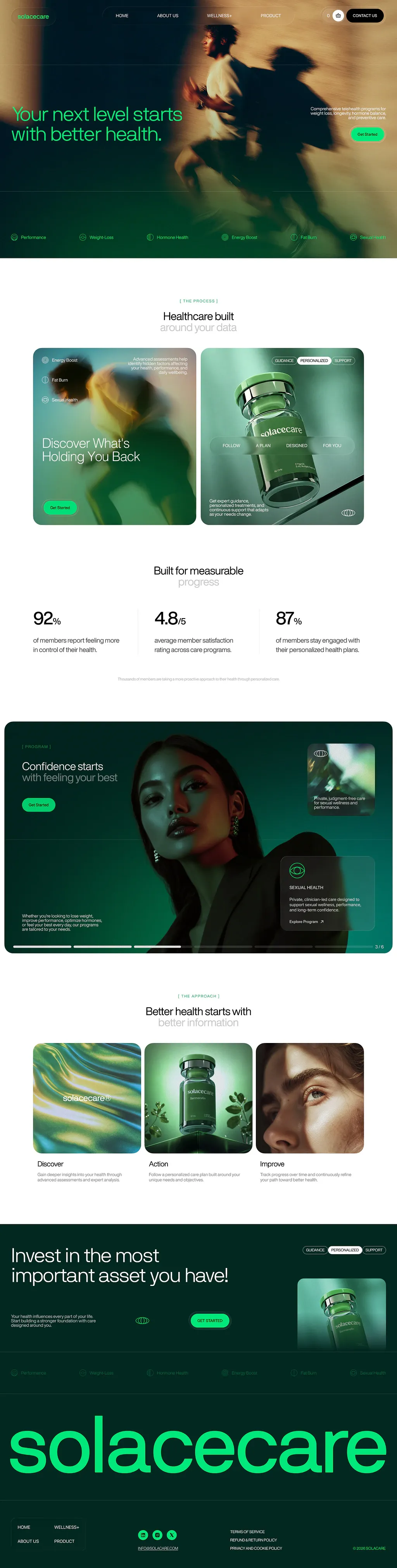
RebuildReference
Move across the image to wipe between the two. Click to lock the seam; arrow keys nudge it.
Imagery
4/4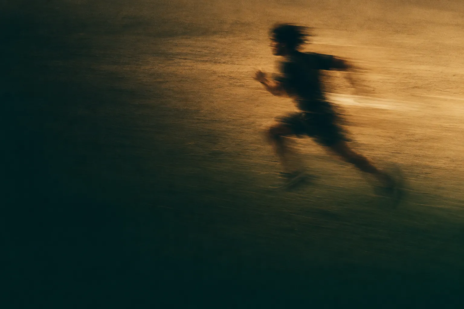
01-hero-runner-motion-blur
Long-exposure photograph of a lone runner smeared into horizontal streaks across warm sand-coloured ground
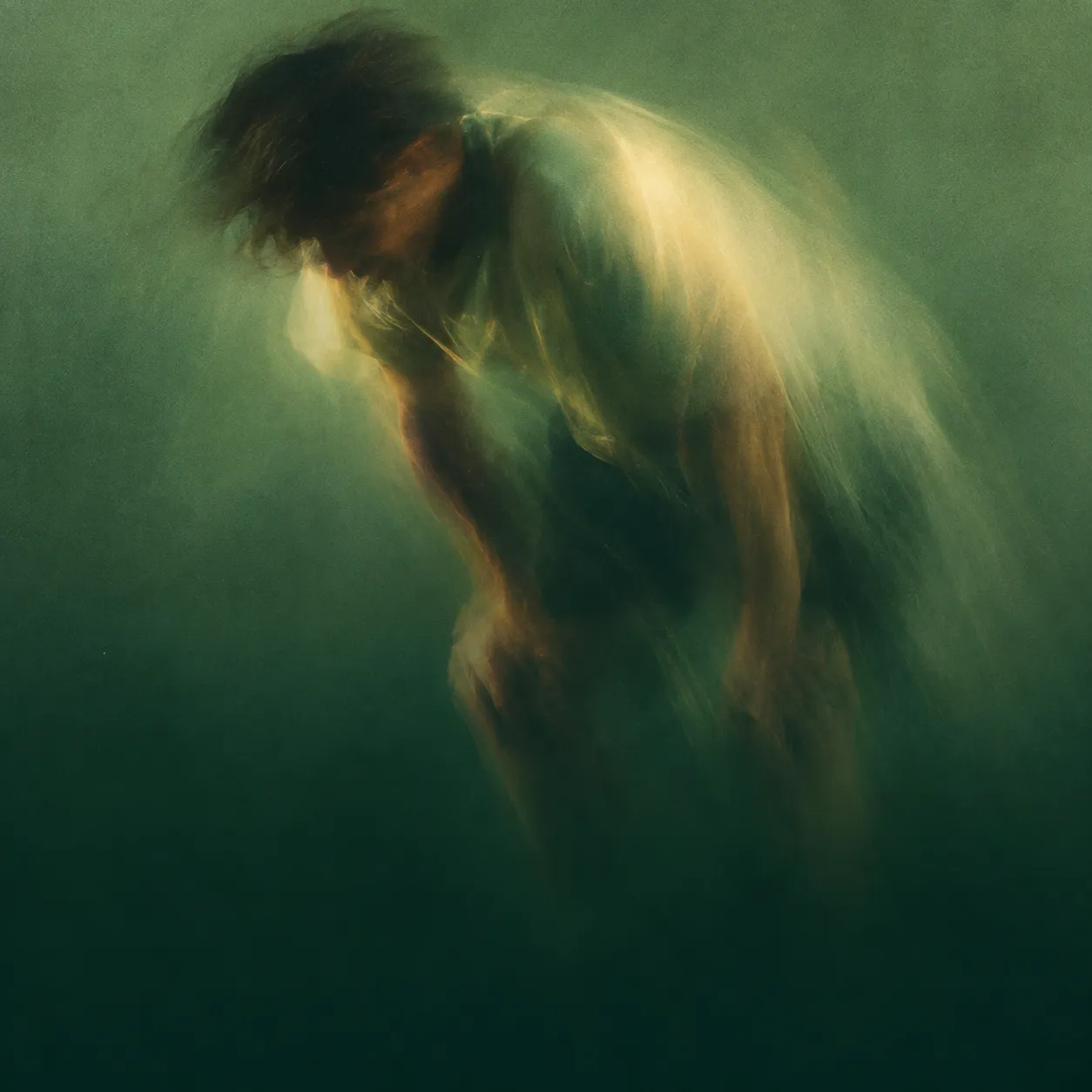
02-process-figure-motion-blur
Green-graded long-exposure photograph of a figure bent forward mid-effort, smeared into streaks
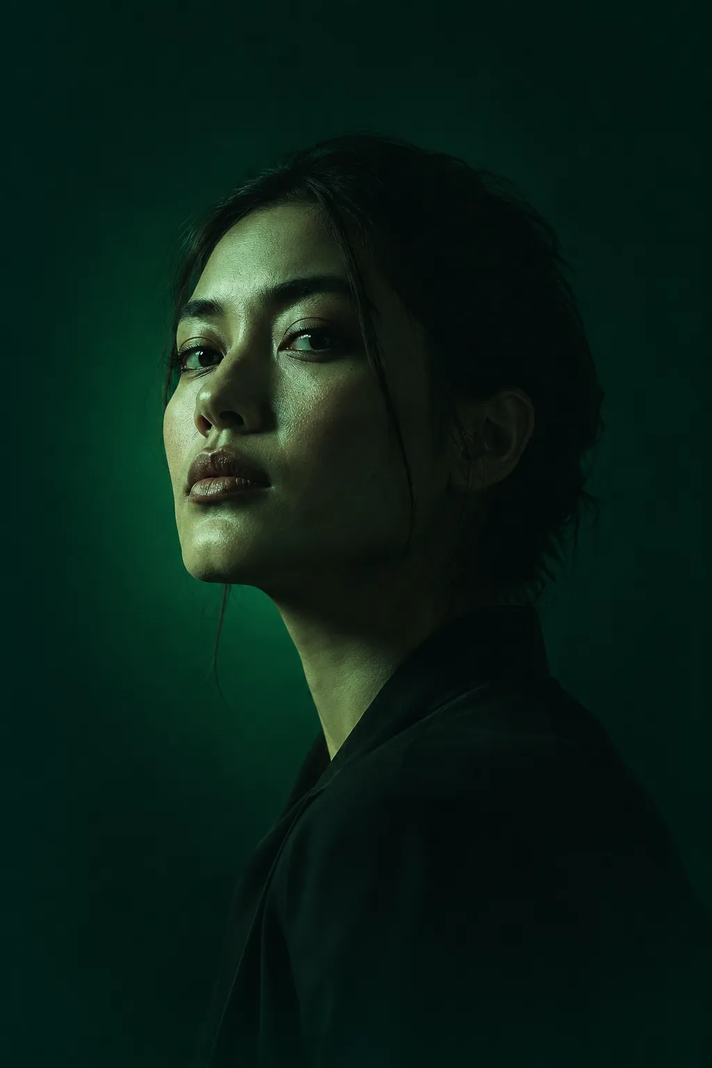
03-program-portrait
Three-quarter studio portrait lit hard from one side, graded deep green, face half in near-black
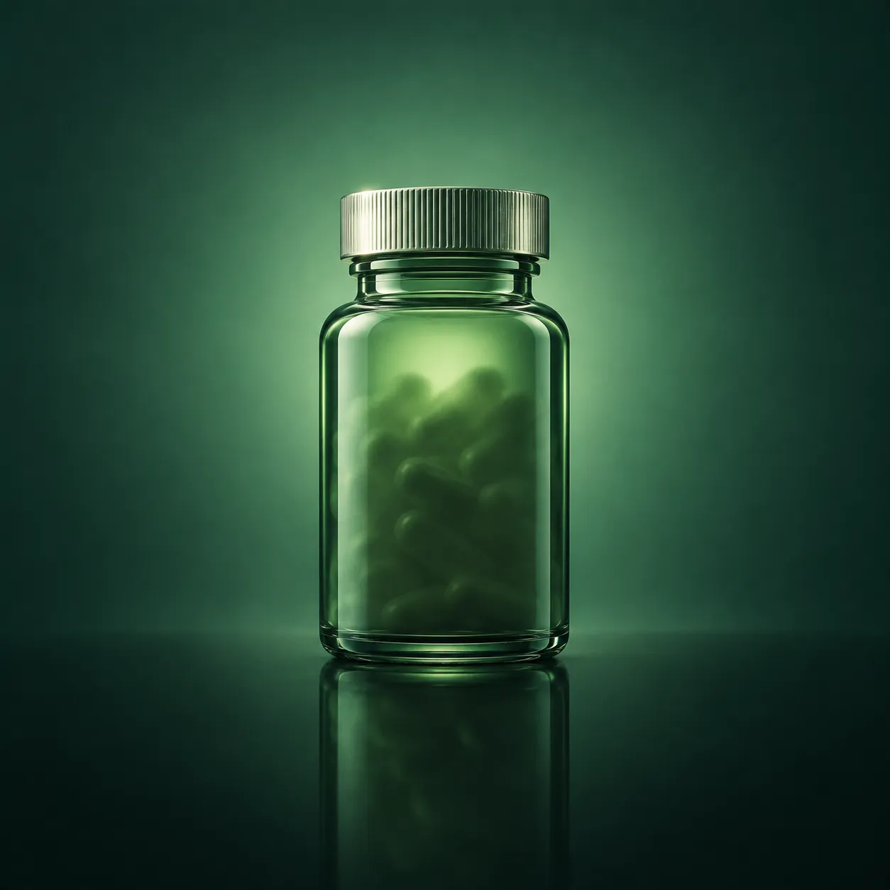
04-product-bottle-green
Backlit green glass supplement bottle with a metal cap on a dark reflective surface against a green gradient
Prompts
123,084 chars
# Dark green wellness landing page

A long, photography-led marketing page built on two grounds that alternate: a near-black forest green and a warm off-white. One neon green accent carries every call to action. All type is geometric sans, set light and tracked tight; headlines are two lines with the second line dropped to ~35% opacity — that two-tone headline is the page's signature and appears in four places. Photography is motion-blurred, heavily green-graded, and always full-bleed inside its container. No shadows anywhere.

**No motion report was supplied for this reference.** Every value in the Motion section is read from the stills and the page composite and is marked `(inferred)`; durations and easings are given as ranges, not exact measured numbers.

---

## Structure

- Page width: full-bleed, designed at 1440.
- Two horizontal systems:
  - **Content container** — 1200px max, centred, 120px gutters at 1440. Used by sections 2, 3, 5.
  - **Edge gutter** — 48px from each viewport edge. Used by the nav, section 1's headline row and chip strip, section 6, and section 7.
  - Section 4 is an inset panel: 34px from each edge (so 1372px wide), with its own 24px inner padding on top of that.
- Grid: sections 2 and 5 are equal-column grids with a deliberately tight **16px** gap. Section 2 is 2 columns (592px each). Section 5 is 3 columns (389px each).

Sections, top to bottom:

1. **Hero** — full-bleed motion-blur photograph, nav overlaid, headline bottom-left / paragraph + CTA bottom-right, six-item category chip strip across the bottom on a dark gradient.
2. **Process** — off-white. Eyebrow, centred two-tone headline, then two large near-square photo cards side by side, each with overlaid text.
3. **Stats band** — off-white. Centred two-tone headline, three statistics in a row split by vertical hairlines, one small centred footnote.
4. **Program carousel** — inset dark panel. Eyebrow + headline + CTA top-left, tall cut-out portrait centre, a small square image card and a glass info card stacked on the right, a supporting paragraph bottom-left, segmented progress bar and "3 / 6" counter along the bottom.
5. **Approach** — off-white. Eyebrow, centred two-tone headline, three photo cards with a title and a two-line paragraph beneath each.
6. **Closing CTA** — full-bleed dark. Large headline left, paragraph + circular glyph + pill button under it, three micro-pills and a tall product card on the right, a ghosted repeat of the hero chip strip across the bottom.
7. **Footer** — darkest ground. An oversized lowercase wordmark fitted edge to edge, hairline rule, then a four-block link row with social icons and a copyright.

---

## Scroll map

Reference viewport 1440 × 900.

| # | Section | Height | Viewports | Scroll consumed | Kind |
|---|---------|--------|-----------|-----------------|------|
| 1 | Hero | 937px | 1.04 | 937px | scroll-linked (photo parallax) + entrance on nav/headline |
| 2 | Process | 1037px | 1.15 | 1037px | entrance |
| 3 | Stats band | 582px | 0.65 | 582px | entrance (numbers count up once) |
| 4 | Program carousel | 937px | 1.04 | 937px | entrance, then user-driven (not scroll-linked) |
| 5 | Approach | 852px | 0.95 | 852px | entrance, staggered |
| 6 | Closing CTA | 724px | 0.80 | 724px | entrance |
| 7 | Footer | 611px | 0.68 | 611px | entrance on the wordmark |

**Total page height ≈ 5680px ≈ 6.3 viewports.** Nothing pins; nothing stacks. Section boundaries land at 937 / 1974 / 2556 / 3493 / 4345 / 5069 / 5680.

---

## Spacing

**Vertical rhythm.** Off-white sections (2, 3, 5) use 128px top padding and 96–128px bottom padding. Dark sections (1, 4, 6) run their content to a 48–64px inner margin instead — they feel denser because the photograph fills the box.

Section internals:

- **1** — nav bar 88px tall, top-aligned, 48px gutters. Headline block sits 180px above the section bottom; paragraph on the right shares its top baseline. Chip strip occupies the bottom 120px, separated by a 1px hairline.
- **2** — 128px top pad → eyebrow → 20px → headline (2 lines, 48px each) → 56px → card row (625px tall) → 94px bottom pad.
- **3** — 96px top pad → headline (2 × 48px) → 64px → stat row (130px tall) → 64px → footnote → 96px bottom pad.
- **4** — panel inset 34px horizontally, 30px above and below. Inside: 24px panel padding, plus 48px from panel edge to the eyebrow. Headline → CTA gap 32px. Bottom paragraph sits 72px above the progress bar; progress bar 24px above the panel floor.
- **5** — 128px top pad → eyebrow → 20px → headline (2 × 48px) → 56px → card row → 40px bottom pad. Inside a card: image → 24px → title → 16px → paragraph.
- **6** — 96px top pad, headline (2 × 68px), 32px to paragraph, 28px to the button row, then 72px to the ghosted chip strip, 56px bottom.
- **7** — 64px top pad → wordmark → 48px → hairline → 40px → link row → 48px bottom.

**Horizontal.** Nav links 40px apart. Right-hand nav cluster 16px apart. Chip strip: 6 items distributed evenly edge to edge, icon 12px from its label. Card grid gaps 16px. Stat columns split by 1px vertical rules with 48px of clearance either side. Card inner padding 32px; glass card inner padding 24px.

---

## Type

**Family class: geometric sans** — near-circular bowls, double-storey `a`, low contrast, generous x-height. Free stand-in: **Outfit**; alternates **Figtree** or **Plus Jakarta Sans**. One family for the whole page, weights 400 and 500 only. No mono, no serif, no second family.

Body anchor: **17px** at 1440. Every other level is a multiple of it.

| Level | Ratio | Size | Line-height | Tracking | Weight |
|---|---|---|---|---|---|
| Footer wordmark (7) | 11.8× | ~200px — **fit to the container width**, not a fixed size | 0.85 | -0.04em | 500 |
| Hero headline (1), CTA headline (6) | 3.5× | 60px | 1.12 | -0.02em | 400 |
| Stat number (3) | 3.75× | 64px | 1.0 | -0.03em | 500 |
| Section headline (2, 3, 5) | 2.35× | 40px | 1.20 | -0.02em | 400 |
| Carousel headline (4) | 2.0× | 34px | 1.18 | -0.02em | 400 |
| Card headline in 2a | 1.65× | 28px | 1.20 | -0.015em | 400 |
| Stat suffix (`%`, `/5`) | 1.4× | 24px | 1.0 | 0 | 400 |
| Card title (5) | 1.4× | 24px | 1.25 | -0.01em | 500 |
| Body / stat description | 1× | 17px | 1.55 | 0 | 400 |
| Supporting paragraph (1, 2, 4, 5, 6) | 0.88× | 15px | 1.50 | 0 | 400 |
| Nav link, button label, slider counter | 0.82× | 14px | 1.0 | 0.02em | 500 |
| Eyebrow, footer link | 0.76× | 13px, uppercase | 1.0 | 0.16em (eyebrow) / 0.06em (footer) | 500 |
| Micro-pill, chip label, in-image label | 0.7× | 12px, uppercase | 1.3 | 0.08em | 500 |

Never below 12px; nav and buttons never below 14px.

**Max line length.** Running paragraphs 46–52ch. Hero and card overlay paragraphs 28–32ch (they are deliberately narrow columns). Headlines break at 18–22ch per line and are hard-broken, not left to wrap.

**The two-tone headline.** Sections 2, 3, 4 and 5 all set their headline on two lines: line 1 at full-strength foreground, line 2 at ~35% opacity of the same colour. On off-white that reads as `#090805` over `rgba(9,8,5,0.35)`; on dark, `#FEFEFE` over `rgba(254,254,254,0.38)`. Same size, same weight — only opacity changes.

**Placeholder copy by role:** eyebrow 2–3 words wrapped in brackets (`[ THE PROCESS ]`); headlines 5–7 words on two lines; hero paragraph 3 lines / ~18 words; card paragraphs 2–3 lines / ~14 words; stat descriptions 2 lines / ~10 words; footnote 1 line / ~14 words at 12px and 40% opacity; chip labels 1–2 words; button labels 2 words.

---

## Colour

| Hex | Role |
|---|---|
| `#FEFEFE` | Off-white. The largest single surface (~45%) — grounds sections 2, 3, 5 — and all text on dark grounds. Never pure `#FFFFFF`. |
| `#022821` | Deep forest green-black (~35%). Ground for sections 4 and 6, the hero's gradient overlay, and the fill of the neon pill buttons' label text. |
| `#090805` | Near-black (~15%). Footer ground, all body and headline text on off-white, and the deepest end of every photo gradient. Never pure `#000000`. |
| `#017846` | Mid green (~3%). Support only: the mid-stop of dark gradients, button press state, hairline borders at low opacity, icon strokes on dark. Never a text colour. |
| `#01C66B` | **The single accent** (~2% of pixels). |

**Where the accent is allowed:** pill button fills (with `#022821` text on them); the bracketed eyebrow labels; the giant footer wordmark; social icon circles; small icon glyphs and the arrow in the glass card; the filled segment of the carousel progress bar; link hover underlines. The hero headline's first line also takes the accent while the second line stays `#FEFEFE`.

**Where it is banned:** section backgrounds, paragraph text, headings in sections 2/3/5/6, borders longer than a button, and anything on the off-white ground larger than 13px except the eyebrow.

Hairlines: `rgba(254,254,254,0.12)` on dark, `rgba(9,8,5,0.10)` on off-white. Muted text: 35–40% opacity of the ground's opposite.

---

## Surface

- **Borders:** 1px only. Outlined chips and micro-pills on dark use `rgba(254,254,254,0.30)`; the section-4 panel edge uses `rgba(1,198,107,0.18)`. Photo cards on off-white have **no border at all**.
- **Radii:** 20px on the large photo cards (2, 5); 24px on the section-4 panel; 16px on the small image cards inside 4 and 6; 12px on the glass info card; 999px on every pill, chip and icon circle.
- **Shadows: none.** Not on cards, not on buttons, not on the glass card. Depth comes from three things only: the gradient baked over each photograph, the 1px hairlines, and the soft green radial glow behind the section-4 portrait.
- **Glass card (4):** `rgba(2,40,33,0.55)` fill, 1px `rgba(254,254,254,0.16)` border, 20px backdrop blur. It is the only blurred surface on the page.
- The page's own outer corners are square — it is full bleed, not a rounded sheet.

---

## Imagery

All photography is graded the same way: shadows pushed to deep green, highlights held warm, saturation lifted in the greens only. Every image is a hard crop with a gradient baked over the region where text sits.

- **IMG-1 — Hero**, 1440 × 840, ≈1.7:1, top of section 1 bleeding under the nav. A long-exposure frame of a figure running left to right, smeared horizontally so limbs dissolve into streaks; warm sand-ochre ground, the figure's dark form cutting through it. A `#022821` → transparent gradient rises over the bottom 45% and a lighter wash sits over the top 120px so the nav reads.
- **IMG-2 — Process, left card**, 592 × 625, ≈0.95:1. Same long-exposure treatment: a figure bent forward mid-effort, motion smeared, the whole frame pulled toward green. Bottom third darkened for the overlaid headline and button.
- **IMG-3 — Process, right card**, 592 × 625. Close product photography: a glass supplement bottle with a metal cap, lit from behind so the glass glows, standing on a reflective black surface against a soft green gradient backdrop. Clean, still, the opposite of IMG-2's motion.
- **IMG-4 — Program portrait**, 440 × 770, ≈0.57:1, centred in the section-4 panel. A face in three-quarter view, single hard key light from the left rendering one cheek bright green and the other side in near-black; skin cool, eyes catching the light. Vignetted or cut out so it sits into the panel rather than in a box.
- **IMG-5 — Program, small card**, 227 × 227 square, top right of section 4. Abstract: backlit foliage and green bokeh, nothing readable.
- **IMG-6 — Approach, card 1**, 389 × 370, ≈1:0.95. An iridescent soap-film / oil-on-water surface in green and gold, rippling; a small brand wordmark overprinted in the middle in white.
- **IMG-7 — Approach, card 2**, 389 × 370. The bottle again, now surrounded by dark plant leaves, lit from above, deep shadows.
- **IMG-8 — Approach, card 3**, 389 × 370. Macro of an eye and brow in warm natural daylight, skin texture visible, looking up out of frame. This is the one warm image on the page — leave it warm.
- **IMG-9 — Closing CTA card**, 270 × 326, ≈0.83:1, right side of section 6. The bottle a third time, darker and closer, almost silhouetted in green.

---

## Motion

All values below are `(inferred)` from the stills and composite. Durations are ranges. Easing is described as a class; no spring, lerp or stiffness parameters are specified because none were measured.

### 1 — Hero
- **kind:** scroll-linked (background) + entrance (foreground), both `(inferred)`
- **what moves:** the hero photograph; the nav row; the headline's two lines; the right-hand paragraph and pill; the six chip items.
- **from → to:** Photograph `translateY 0 → -90px` with `scale 1.06 → 1.06` held (parallax against the section, which scrolls normally). Nav `opacity 0 → 1`, `translateY -16px → 0`. Headline lines `opacity 0 → 1`, `translateY 32px → 0`. Paragraph + pill `opacity 0 → 1`, `translateY 24px → 0`. Chips `opacity 0 → 1`, `translateY 16px → 0`.
- **range:** Photograph is **scroll-linked** and reverses on the way back up — mapped from page scroll 0 to 937px (the section top at the viewport top until the section bottom reaches the viewport top). Foreground items are **entrances that play once on load**, 600–900ms, ease-out, with a 60–100ms stagger: nav first, then headline line 1, line 2, paragraph, pill, then the chip row as its own 40–60ms-per-item stagger.
- **reduced motion:** No parallax — the photo is static. Entrances become a single 150–200ms opacity fade with no translate.

### 2 — Process
- **kind:** entrance, once `(inferred)`
- **what moves:** eyebrow, headline line 1, headline line 2, then the two photo cards.
- **from → to:** Text `opacity 0 → 1`, `translateY 24px → 0`. Cards `opacity 0 → 1`, `translateY 40px → 0`, `scale 0.985 → 1`, and the photo inside each card reveals with `clip-path inset(0 0 12% 0) → inset(0 0 0 0)`.
- **range:** triggers once when the block's top reaches 80% of the viewport; 700–900ms, ease-out; 80–120ms stagger down the list, the two cards 120ms apart left then right.
- **reduced motion:** opacity only, 150ms, no clip-path, no stagger.

### 3 — Stats band
- **kind:** entrance, once `(inferred)`
- **what moves:** headline, the three stat numbers, their descriptions, the two vertical rules, the footnote.
- **from → to:** Headline and text `opacity 0 → 1`, `translateY 20px → 0`. Numbers count from 0 to their final value (`0 → 92`, `0 → 4.8`, `0 → 87`) — a **once-only** count, not scroll-linked; it does not run backwards on scroll-up. Rules `scaleY 0 → 1` from the centre.
- **range:** triggers once when the stat row's top reaches 80% of the viewport; count duration 1200–1600ms, ease-out; column stagger 120–160ms left to right.
- **reduced motion:** numbers appear at their final value immediately; rules appear at full height; text fades 150ms.

### 4 — Program carousel
- **kind:** entrance on arrival, then user-driven. **Not scroll-linked** — the slide index never changes with scroll position. `(inferred)`
- **what moves:** the panel, the portrait, the small image card, the glass card, the progress bar.
- **from → to:** Panel `opacity 0 → 1`, `translateY 32px → 0`. Portrait `opacity 0 → 1`, `translateY 48px → 0`, `scale 1.04 → 1`. Right-hand cards `opacity 0 → 1`, `translateX 32px → 0`. Progress bar's active segment `scaleX 0 → 1` from the left.
- **range:** entrance once, when the panel's top reaches 85% of the viewport; 800ms–1.0s, ease-out; 100–140ms stagger (panel → portrait → small card → glass card → bar). Slide changes afterwards are user-triggered only — see interactions.
- **reduced motion:** panel and contents fade in at 150ms; the progress segment appears filled; autoplay, if any, is disabled.

### 5 — Approach
- **kind:** entrance, once, staggered `(inferred)`
- **what moves:** eyebrow, both headline lines, then each of the three cards as a unit (image, title, paragraph together).
- **from → to:** `opacity 0 → 1`, `translateY 36px → 0`; each card's image additionally `scale 1.05 → 1` inside its fixed 20px-radius frame.
- **range:** triggers once when the card row's top reaches 80% of the viewport; 700–900ms, ease-out; 100–140ms stagger card to card, left to right.
- **reduced motion:** opacity only, 150ms, all three at once, image held at `scale 1`.

### 6 — Closing CTA
- **kind:** entrance, once `(inferred)`
- **what moves:** headline lines, paragraph, glyph + pill, the three micro-pills, the product card, the ghosted chip strip.
- **from → to:** Headline lines `opacity 0 → 1`, `translateY 40px → 0`. Paragraph and button row `opacity 0 → 1`, `translateY 24px → 0`. Product card `opacity 0 → 1`, `translateY 48px → 0`. Ghosted chip strip `opacity 0 → 0.28`.
- **range:** triggers once when the section's top reaches 75% of the viewport; 800ms–1.0s, ease-out; 90–120ms stagger, headline first, product card last.
- **reduced motion:** opacity only, 150ms; the chip strip goes straight to 0.28.

### 7 — Footer
- **kind:** entrance, once `(inferred)`
- **what moves:** the oversized wordmark, then the hairline, then the link columns.
- **from → to:** Wordmark `opacity 0 → 1`, `translateY 60px → 0`, revealed with `clip-path inset(0 0 100% 0) → inset(0 0 0 0)` so it rises out of its own baseline. Hairline `scaleX 0 → 1` from the left. Link columns `opacity 0 → 1`, `translateY 16px → 0`.
- **range:** triggers once when the wordmark's top reaches 90% of the viewport; wordmark 900ms–1.1s, ease-out; hairline 400–600ms; columns 500ms with 60–80ms stagger.
- **reduced motion:** wordmark fades 150ms with no clip or translate; hairline appears at full width.

### Interaction transitions
These are input-driven and are **not** part of the scroll choreography.

- **Neon pill button** — hover: background `#01C66B → #01E07A`, `scale 1 → 1.02`, 180ms ease-out. Press: `scale 0.98`, background `#017846`, 90ms.
- **White nav pill** — hover: background `#FEFEFE → #01C66B`, label `#090805` stays, 180ms.
- **Nav link** — hover: a 1px accent underline grows from left, `scaleX 0 → 1`, 220ms ease-out; label opacity 0.7 → 1.
- **Photo card (2, 5)** — hover: inner image `scale 1 → 1.04` over 400–500ms ease-out, frame and radius unchanged; no lift, no shadow.
- **Carousel** — next/previous by drag or by clicking a progress segment: slides cross-fade and translate `±40px` over 500–650ms ease-out; the counter swaps instantly; the active segment fills `scaleX 0 → 1` over the same duration.
- **Micro-pill group (GUIDANCE / PERSONALIZED / SUPPORT)** — selecting one moves the filled state: background transitions `transparent → #FEFEFE`, label `#FEFEFE → #022821`, 200ms.
- **Glass card arrow link** — hover: arrow `translate 3px, -3px`, 180ms; card border brightens to `rgba(254,254,254,0.28)`.
- **Footer link / social circle** — hover: colour to `#01C66B`, 150ms; circles fill and invert their glyph.

---

## Responsive (below 640px)

- Gutters drop to 20px; the section-4 panel inset drops to 12px.
- Nav collapses to logo + pill button + hamburger; the centred link list moves into an overlay sheet. Nav stays 64px tall.
- Hero: height 620px. Headline 32px/1.15 on three lines; paragraph and CTA move **below** the headline, left-aligned, no longer opposite it. The chip strip becomes a horizontally scrolling single-row strip with 12px gaps and no visible scrollbar; keep all six items.
- Section 2: cards stack to one column, each 100% wide and 420px tall, 16px apart. The overlaid paragraph in the top-right of card 2a drops out entirely; the chips and headline stay.
- Section 3: stats stack to one column, centred, with the vertical rules replaced by full-width horizontal hairlines. Stat numbers drop to 44px. The footnote stays.
- Section 4: the portrait becomes a 4:5 image at full panel width, the small square image card is dropped, and the glass card moves below the portrait at full width. Headline 26px. Progress bar and counter stay, pinned to the panel floor.
- Section 5: three cards stack; images stay near-square at full width; titles 20px.
- Section 6: single column. Headline 32px on three lines. The micro-pill row moves above the headline; the product card moves below the button and becomes 4:3 full width.
- Section 7: wordmark still fits edge to edge (≈62px at 375). Link blocks become a 2-column grid; the social row and copyright sit on their own rows beneath.
- Section vertical padding halves: 128px → 64px, 96px → 56px.
- Entrance translate distances halve; the hero parallax is disabled on touch.

---

## Don'ts

- **Don't make the accent a gradient.** `#01C66B` is a flat fill everywhere it appears. No green-to-teal button gradients, no glow filters, no neon text-shadow. The only gradients on the page are the dark green washes baked over photographs.
- **Don't let the accent exceed ~2% of the surface.** If more than the buttons, eyebrows, small glyphs and the footer wordmark are green, it's wrong. Do not tint section backgrounds green.
- **Don't bold the headlines.** They are weight 400 at 40–60px with `-0.02em` tracking. A 700-weight headline destroys the editorial feel immediately.
- **Don't drop the two-tone headline.** Line 2 at 35% opacity in four separate sections is the page's identity, not a fade-in artefact. Both lines are the same size and weight — only opacity differs.
- **Don't widen the card gaps.** The grid gap is 16px, not 24 or 32. The cards are meant to read as one continuous band of imagery with a seam, not as separated tiles.
- **Don't add shadows or "lift on hover."** No `box-shadow` anywhere on this page. Card hover scales the image inside the frame; the frame itself never moves.
- **Don't round the page's outer corners or inset the whole design on a coloured mat.** Sections 1, 6 and 7 bleed to the viewport edges.
- **Don't use a sticky nav that turns into a solid white bar.** The nav sits over the hero and scrolls away with it.
- **Don't use pure black or pure white.** `#090805` and `#FEFEFE`. Pure `#000`/`#FFF` will read as a template.
- **Don't make the stats band dark.** The alternation off-white → dark → off-white → dark is the page's pacing; three dark sections in a row flattens it.
- **Don't put borders on the photo cards** in sections 2 and 5. The only 1px borders are on outlined chips, micro-pills, icon circles, the section-4 panel and the glass card.
- **Don't scroll-link the carousel.** Slide index is user-driven. Hijacking scroll to advance slides is the wrong pattern here and breaks the scroll map.
- **Don't re-trigger entrances on every scroll pass.** Every entrance plays once. Only the hero photograph's parallax is scroll-linked and reversible.
- **Don't clean up the photography.** The hero and section-2 left card must stay motion-smeared and green-graded; swapping in crisp, well-lit lifestyle stock removes the only thing holding the page together.
- **Don't set the footer wordmark at a fixed px size.** It is fitted to the container width — it must touch both gutters at every breakpoint, with the descender-free lowercase baseline sitting tight against the hairline above the links.
- **Don't use a second typeface** for labels or numerals, and don't reach for a mono for the micro-pills — they are the same geometric sans at 12px uppercase with `0.08em` tracking.
Versions
1Each rebuild is kept. The live one is what the comparison shows. LiveOpus 5.5Extra highfrontend-designemil-design-engtransitions-devhumanizergsap4 weeks ago · 276s · 4 images · 20260920T124616ZOpen