Solara — Solar Energy Landing Page
Rebuild
Opus 5.5Extra highfrontend-designemil-design-engtransitions-devgsaphumanizerView
RebuildReference
Move across the image to wipe between the two. Click to lock the seam; arrow keys nudge it.
Imagery
4/4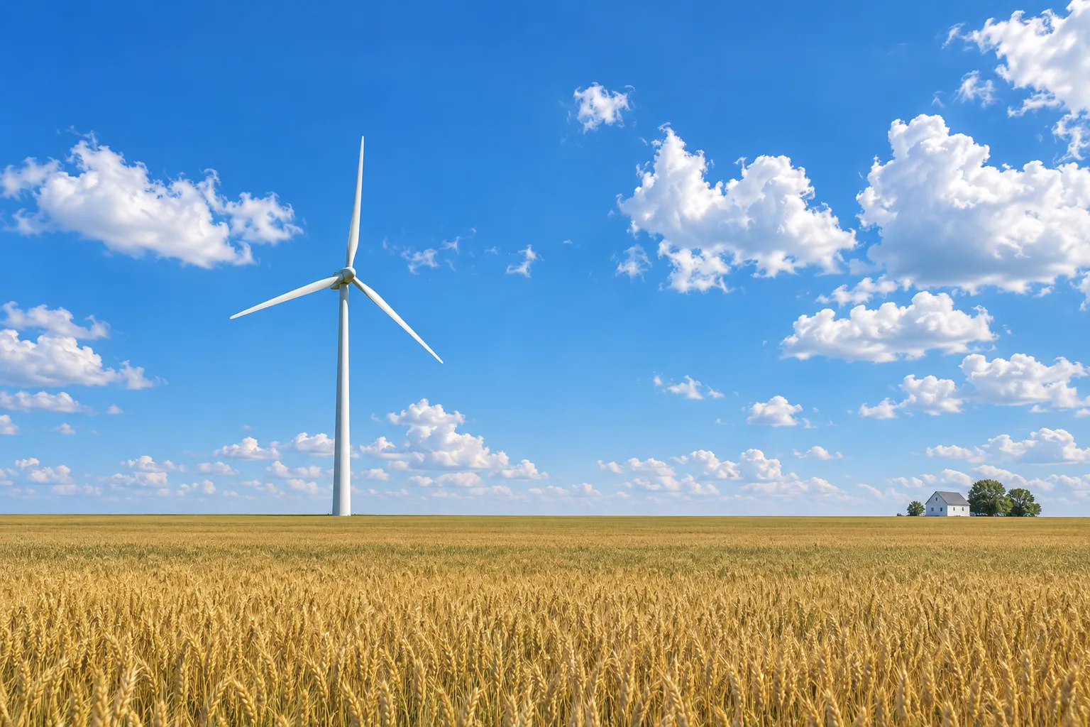
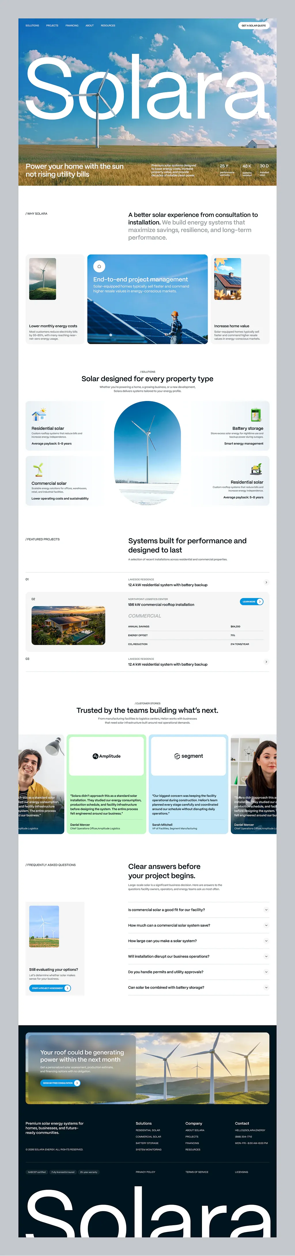
01-hero-turbine-wheat-field
A lone white wind turbine in a golden wheat field under a blue sky with scattered cumulus clouds, a small white farmhouse on the far horizon
02-value-card-solar-technician
A technician in an orange hard hat stands among tilted rows of solar panels under a clear blue sky
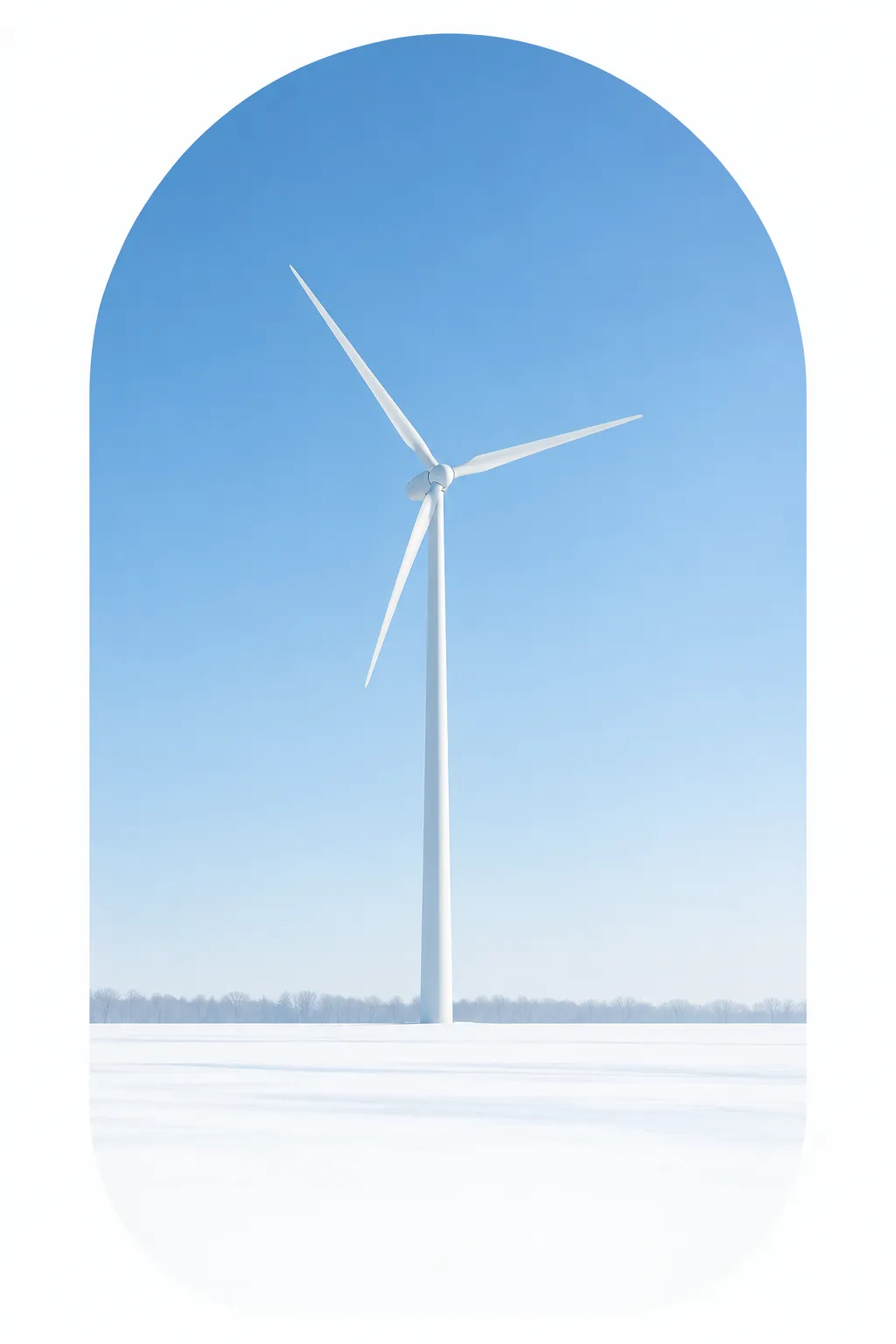
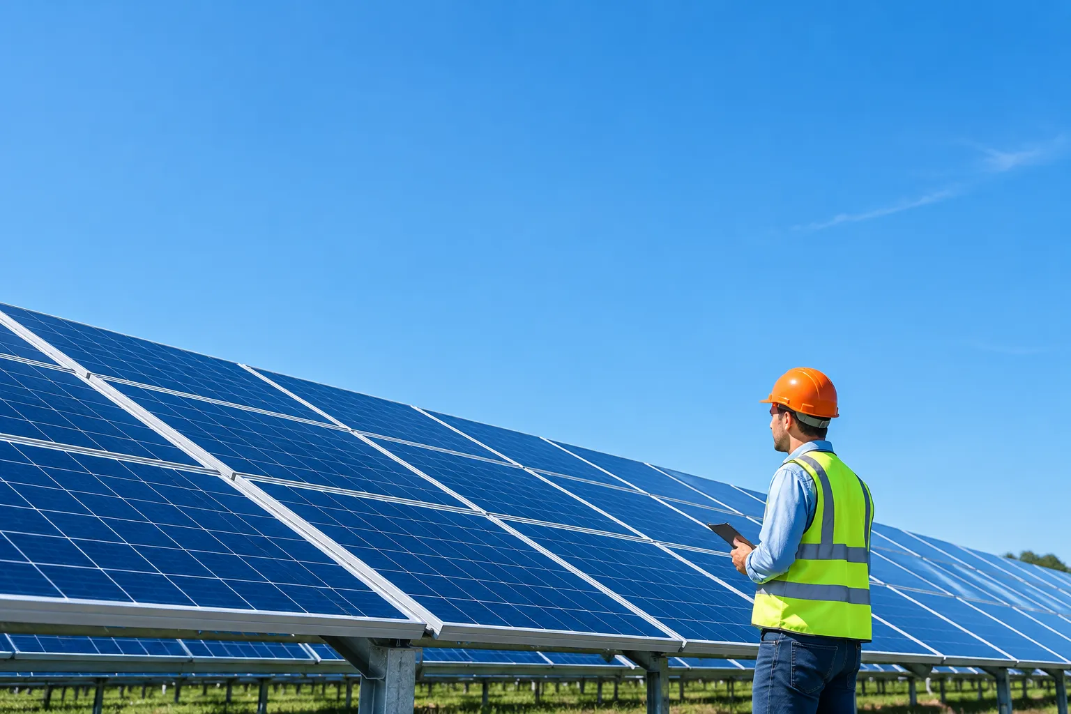
03-solutions-arch-snow-turbine
A single white wind turbine on a flat snowy plain under a pale hazy blue sky
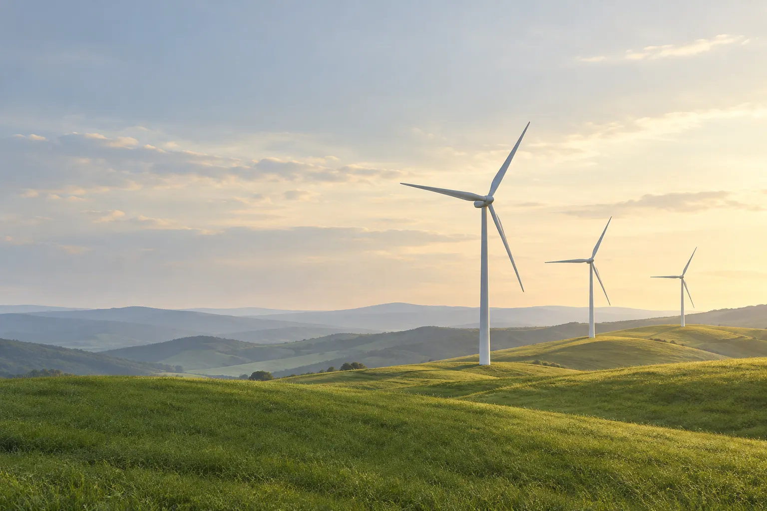
04-cta-turbines-rolling-hills
Three white wind turbines on sunlit green rolling hills in a soft warm haze
Prompts
126,498 chars
# Giant-wordmark clean-energy landing page

A bright, airy marketing page for a renewable-energy installer. It has a near-white surface and deep navy ink, with one saturated blue used only on pill buttons. The photography is high-key daylight: turbines, panels, wheat fields and sky. A huge wordmark runs edge to edge at both ends of the page. At the top it is white over the hero photo. At the bottom it is white on navy, with its lower edge cut off where the page ends. The layout is an asymmetric 12-column editorial grid with a lot of white space, flat tinted cards, hairline lists and no shadows. Treat the design as a full-bleed page with no outer margin or frame.

No motion report or motion strips came with this reference. Every motion value below is inferred from the stills.

## Structure

- Reference width is 1440px, and viewport maths assumes a 1440×900 viewport.
- Every section is full-bleed. Content sits inside 40px side gutters, so the content box is 1360px. Above 1440, cap the content at 1360 and center it. Backgrounds and the hero photo stay full-bleed.
- Use a 12-column grid with 20px gaps, giving columns of about 95px. Column 6 starts at x≈615. The **content column** is columns 6–12 (x≈615–1400, about 785px wide). In asymmetric sections the eyebrow sits in column 1, top-aligned, and everything else goes in the content column.

Sections, top to bottom:

1. **Hero:** full-bleed photo, nav laid over it, giant wordmark, and a bottom row with the headline, a paragraph and stats.
2. **Value intro and feature grid:** asymmetric header with a two-tone lead, then three cards at 1fr / 2fr / 1fr.
3. **Solutions:** centered header, then a 2×2 card grid split by a tall arch image in the middle.
4. **Featured projects:** asymmetric header, then a 3-row accordion list with row 2 open.
5. **Testimonials:** centered header, then a full-bleed card track cut off by both viewport edges.
6. **FAQ:** asymmetric header, then a side card (columns 1–3) and a 6-row accordion in the content column.
7. **CTA band:** a photo card inset on the dark navy surface, which starts here.
8. **Footer:** navy; a blurb and 3 link columns, a legal/badge row, and a giant wordmark cut off at the bottom.

### 1 · Hero (y 0–920)
- The photo covers the section. Add a bottom scrim: `linear-gradient(to top, rgba(0,19,30,.45) 0%, transparent 40%)`.
- **Nav row:** 80px tall and transparent, with items centered at y≈40.
  - Left: 5 one-word links in uppercase, white, 36px apart, starting at x=40. There is no logo in the nav.
  - Right: a white pill CTA with ink text, label 3–4 words, 40px tall, padding 0 20px, no arrow circle.
- **Wordmark:** one word of 5–7 letters in sentence case, white. It starts at x=40 and is sized to fill the full 1360px content width. Cap top sits at y≈210 and the baseline at y≈560, so it fills the sky area of the photo.
- **Bottom row:** top-aligned, starting at y≈790, with 40px left below it.
  - Columns 1–5: headline, 2 lines of about 5 words each, white, max-width 600.
  - Columns 7–9: paragraph of about 25 words on 4 lines, white at 85%, max-width 270.
  - Columns 10–12: three stats in equal sub-columns. Each value is 2 digits, a space and a unit letter. Below it goes a 2-word label on 2 lines, white at 70%, 6px gap.

### 2 · Value intro (y 920–1796)
- **Header:**
  - Eyebrow (`/ ` plus 2 words) in column 1.
  - Lead in the content column: 2 sentences, about 25 words, on 4 lines. The first sentence is ink and the second is muted gray, running on in the same paragraph.
- **Cards:** 56px below the header. Grid 1fr 2fr 1fr, gap 20, height 500.
  - **Side cards** (≈330×500):
    - #F3F5F6 fill, radius 12, padding 20, no border.
    - A portrait thumbnail (2:3, ≈150×225, radius 8) sits top-left.
    - Title (3–4 words, one line) and description (2–3 lines, about 15 words, gray) are pinned to the bottom, 8px apart.
  - **Middle card** (≈660×500):
    - Full-bleed photo, radius 12, overflow hidden, padding 32.
    - Top-left: a 36px white circle holding an 18px ink line icon (a house).
    - 32px below it, the title (3–4 words, one line, white).
    - 12px below that, the description: 2 lines, white at 80%, max-width 440.
    - All the text sits over the sky part of the photo.

### 3 · Solutions (y 1796–2649)
- **Centered header:**
  - Eyebrow (`/ ` plus 1 word).
  - 12px gap, then an H2 on one line (5–6 words).
  - 20px gap, then a subtitle: 2 lines, about 25 words, gray, max-width 520.
- **Grid:** 56px below the header. Columns 1fr / 380px / 1fr, gap 20.
  - Each outer column holds 2 stacked cards, 260px tall each with a 20px gap, so each stack is 540px.
  - The center column holds the arch image, 380×470, top-aligned with the stacks.
- **Cards:**
  - #F3F5F6 fill, radius 12, padding 24, no border.
  - A 56px glossy 3D illustrated icon sits in the card's outer top corner.
  - A bottom-aligned text block holds:
    - title (2 words)
    - description (2 lines, about 14 words, gray)
    - 16px below, a meta line of 3–5 words in ink at 14px/600.
- **Mirroring:** the left cards have the icon top-left and left-aligned text. The right cards have the icon top-right and right-aligned text. Everything hugs the outer edges, and the arch is the axis.

### 4 · Featured projects (y 2649–3560)
- **Header:**
  - Eyebrow in column 1.
  - In the content column: an H2 of about 9 words on 2 lines with an explicit break.
  - 24px below it, a one-line gray subtitle of about 12 words.
- **List:** 64px below the header, spanning the full 1360px. A 1px #D7D9DA hairline sits above and between rows.
- **Collapsed row** (≈96px tall, padding 24 top and bottom):
  - Index ("01", 14px ink) at x=40.
  - In the content column: a label (12px uppercase gray, 2 words), 6px gap, then a title (18px/500, 6–8 words).
  - At the far right: a 32px circle with a 1px #D7D9DA border and a chevron pointing right.
- **Expanded row** (≈330px tall):
  - The row becomes a #F3F5F6 card with radius 12 and padding 24.
  - Index top-left. A landscape thumbnail (≈400×215, about 1.85:1, radius 8) is pinned bottom-left.
  - The content column shows the label and title as in the collapsed row. The chevron is replaced by a blue pill (2 words) at top-right.
  - 24px below the title: one category word in uppercase at 20px, in very light gray #C3C8CB.
  - 16px below that: a 3-row spec table across the content column.
    - Rows are 40px with a hairline on top.
    - The label (12px uppercase gray) sits at the column start.
    - The value (14px/500 ink) sits at x≈1160. Values cover money saved, a percentage offset and tons per year.
- Row 02 is open by default. Rows 01 and 03 are collapsed.

### 5 · Testimonials (y 3560–4472)
- **Centered header:**
  - Eyebrow.
  - H2 on one line, about 7 words.
  - Subtitle on 2 lines, max-width 560, gray.
- **Track:** 56px below the header. A full-bleed row that breaks out of the gutters, with cards 430×550 and a 20px gap.
  - The page center falls in the gap between two full cards, at x≈280–710 and x≈730–1160.
  - The cards on either side are cut off by the viewport edges, with about 260px of each visible.
- **Card order:** photo · mint logo · blue logo · photo, repeating.
- **Logo card:**
  - An 8px frame of saturated pastel (#C4F2B8 mint, or #C7E5F7 sky).
  - Inside the frame, on top: a white panel, radius 8, about 210px tall, with a black company-logo placeholder (about 120px wide) centered.
  - 8px below that, a pale tint panel (#E8FAE4 or #E5F3FB, radius 8) fills the rest, padding 20. It holds:
    - a quote of about 40 words on 4–5 lines, ink, at the top
    - name (14/600) and role (12px gray) at the bottom.
- **Photo card:**
  - Radius 12.
  - A portrait photo fills the top ~55% and fades into #00131E over ~80px.
  - On the navy part: the quote in white, the name in white, the role in white at 60%.
- There are no arrows, dots or counters.

### 6 · FAQ (y 4472–5518)
- **Header:** built like §4. The H2 is 2 lines with an explicit break (about 7 words). The subtitle is 2 lines, gray, max-width 520.
- **Body:** starts 72px below the header.
  - **Left:** a card in columns 1–3 (≈316×510), the same component as the §2 side cards. It has:
    - a 2:3 thumbnail at top-left
    - a title (3–4 words, a question)
    - a 2-line gray description
    - 16px below that, a blue pill CTA of 3–4 words.
  - **Content column:** 6 rows, each 86px.
    - The question (18/500, 6–10 words, ending in "?") sits on the left.
    - A 16px gray chevron pointing down sits on the right.
    - Each row has a hairline at the bottom.
    - The first row's top lines up with the top of the card.
- 160px of padding below, then the navy begins.

### 7 · CTA band (y 5518–5992, navy #00131E from here to the end)
- 40px of padding above the card and at the sides.
- **Card:** 1360×392, radius 12, cover photo.
- **Overlay:** `linear-gradient(90deg, rgba(0,19,30,.38) 0%, transparent 55%)`.
- **Text block:** inset 80px from the card's left edge and centered vertically.
  - Headline: about 10 words on 2 lines, white.
  - 16px gap, then a paragraph of about 18 words on 2 lines, white at 75%, max-width 380.
  - 24px gap, then a blue pill CTA of about 4 words.

### 8 · Footer (y 5992–6708)
- The footer grid starts 92px below the CTA card.
- **Row 1:**
  - Blurb at x 40–360: about 12 words on 3 lines, white, 20/500.
  - Link columns start at x≈640, ≈915 and ≈1190.
    - Each column has a heading (1 word, 14/500, white).
    - 16px below it, 4 items in uppercase 12px, white at 60%, 10px apart.
    - The third column is contact details: email, phone and hours.
- **Copyright:** 154px below the top of row 1, under the blurb. Uppercase 12px, white at 50%.
- **Legal and badge row:** 120px below the copyright.
  - Under the blurb: three outlined pills, each 24px tall, with a 1px rgba(255,255,255,.2) border, 12px text and white at 70%, 2–4 words each.
  - Three uppercase 12px legal links, one aligned to each link column.
- **Wordmark:** 80px below that row. White, the same size and left edge as the hero wordmark. The page ends inside the letters, cutting off the bottom 10–15% of the glyphs. Use overflow hidden, with no padding below.

## Scroll map

All values are measured from the stills (inferred) at a 900px viewport. Nothing pins or stacks, so the scroll each section consumes equals its height.

1. Hero: 920px · 1.02 vp · consumes 920 · entrance (on load)
2. Value intro: 876px · 0.97 vp · consumes 876 · entrance
3. Solutions: 853px · 0.95 vp · consumes 853 · entrance
4. Projects: 911px · 1.01 vp · consumes 911 · entrance
5. Testimonials: 912px · 1.01 vp · consumes 912 · entrance
6. FAQ: 1046px · 1.16 vp · consumes 1046 · entrance
7. CTA band: 474px · 0.53 vp · consumes 474 · entrance
8. Footer: 716px · 0.80 vp · consumes 716 · static

**Total page height ≈ 6,708px ≈ 7.45 viewports.**

## Spacing

- **Gutters:** 40px. **Grid gap and card gap:** 20px everywhere, including the testimonial track.
- **Space between sections** (previous section's content to the next eyebrow):

  | Before section | Space |
  |---|---|
  | §2 | 160 |
  | §3 | 144 |
  | §4 | 200 |
  | §5 | 192 |
  | §6 | 168 |
  | After §6, before the navy | 160 |

  The base rhythm is about 160px, opening up to about 200px around Projects and Testimonials.
- **Headers:**
  - Asymmetric headers: the eyebrow sits on the same top line as the H2 or lead, and H2→subtitle is 24px.
  - Centered headers: eyebrow→H2 is 12px and H2→subtitle is 20px.
- **Header to content:** §2 56 · §3 56 · §4 64 · §5 56 · §6 72.
- **Card padding:**
  - 20: §2 side cards, §6 card, testimonial text panels
  - 24: §3 cards, the expanded project row
  - 32: §2 middle card
  - 80: left inset of the CTA text
- **Rows:** project rows are 96 collapsed and 330 expanded. FAQ rows are 86. Spec rows are 40.
- **Navy area:** 40 above the CTA card · 92 from the CTA to the footer grid · 154 from the grid top to the copyright · 120 from the copyright to the legal row · 80 from the legal row to the wordmark · 0 below the wordmark.

## Type

- **Family class:** a neo-grotesk sans with a large x-height and tight display tracking. The free stand-in is **Inter**, using Inter Display, or opsz on, for sizes of 28px and up. Use one family for everything; no serif, no mono.
- **Weights:** only 400 and 500, plus 600 for buttons and names.
- **Body anchor:** 16px.

| Level | × body | px | line-height | tracking | weight / notes |
|---|---|---|---|---|---|
| Wordmark (§1, §8) | ≈30× | ≈475 (fit to 1360 width, ~33vw) | 0.8 | −0.03em | 500, sentence case |
| Hero headline | 2.5× | 40 | 1.08 | −0.025em | 500, white |
| H2 | 2.375× | 38 | 1.12 | −0.025em | 500 |
| Lead (§2) | 2× | 32 | 1.3 | −0.02em | 500, two-tone |
| Display card title (§2 middle, §7 headline) | 1.875× | 30 | 1.15 | −0.02em | 500 |
| Stat value (§1) | 1.75× | 28 | 1.0 | −0.01em | 500 |
| Card title, footer blurb | 1.25× | 20 | 1.25 | −0.01em | 500 |
| Category ghost tag (§4) | 1.25× | 20 | 1.2 | +0.04em | 500 uppercase, #C3C8CB |
| Row title, FAQ question | 1.125× | 18 | 1.35 | −0.005em | 500 |
| Testimonial quote | 1.0625× | 17 | 1.45 | 0 | 400 |
| Body, subtitles, card descriptions | 1× | 16 | 1.5 | 0 | 400, gray |
| Nav links, buttons | 0.875× | 14 | 1.0 | +0.02em | 500 / 600 uppercase |
| Meta line, spec value, testimonial name | 0.875× | 14 | 1.4 | 0 | 600 / 500 |
| Eyebrow, label, footer link, role, copyright | 0.75× | 12 | 1.3 | +0.04em | 500 uppercase |

- **Eyebrows** always start with `/ `, for example `/ TWO WORDS`.
- **Line lengths:**
  - body ≤ 60ch
  - hero paragraph ≈ 30ch
  - lead ≤ 48ch (in the 785px column)
  - H2 lines ≤ 34ch, using explicit two-line breaks in §4 and §6
  - centered subtitles ≤ 70ch per line.

## Colour

| Hex | Role |
|---|---|
| **#FCFDFD** | Main surface. Background of §1–§6 (about 75% of the page). Also the inner logo panels, and all text and the wordmark on navy. |
| **#00131E** | Ink for every heading and body text on light. The surface of §7–§8 (the last ~1,190px). The lower half of photo testimonial cards. The tint of the photo scrims. |
| **#D7D9DA** | Hairlines (project list, spec table, FAQ), the border of the chevron circles, the hover fill of the white nav pill. |
| **#1878B8** | **The single accent.** Only on the fill of pill CTAs: the project "learn more" pill, the FAQ card pill and the CTA band pill. Inside each is a white circle with a blue arrow. Never on headings, links, icons, eyebrows or backgrounds. |
| **#6CB4E4** | Light blue support. Focus rings and hover of accent pills. The base of the sky testimonial frame. Otherwise it only appears inside photographs. |

Derived tints that were not sampled:

| Hex | Use |
|---|---|
| #F3F5F6 | Card fill |
| #5E6A72 | Secondary text |
| #9AA3A9 | Muted second sentence of the lead |
| #C3C8CB | Ghost category tag |
| #C4F2B8 frame / #E8FAE4 panel | Mint testimonial card. This is the page's only "neon" moment, and it appears only there. |
| #C7E5F7 frame / #E5F3FB panel | Sky testimonial card |

Blue covers well under 1% of the surface. High contrast comes from navy ink on near-white, not from colour.

## Surface

- **No shadows anywhere.** No card borders either. Cards are flat #F3F5F6 fills.
- **Radii:**
  - 12px: cards, testimonial cards, the CTA card, the expanded project row
  - 8px: thumbnails and inner panels
  - 999px: pills
  - 50%: icon and chevron circles
  - 0: the page itself
- **Arch (§3):** the top edge is a full semicircle (radius 190px, half the width). The bottom corners are 40px (inferred).
- **Hairlines:** 1px #D7D9DA on light, 1px rgba(255,255,255,.2) on navy.
- **Blue pill CTA:**
  - 40px tall, padding-left 18px, padding-right 6px.
  - Label 14px/600, uppercase, white.
  - Then a 28px white circle holding a 14px blue arrow pointing right.
- **Nav pill:** white fill, ink label, 40px tall, padding 0 20px, no circle.

## Imagery

All imagery is bright, high-key daylight photography with saturated blue skies, natural colour and no filters or duotones.

1. **§1 hero (1440×920, ≈1.57:1, cover, full-bleed).**
   - The upper 60% is deep blue sky with puffy white cumulus clouds.
   - A single white three-blade wind turbine stands at about 33% from the left, with its hub at about 45% height, behind the wordmark.
   - A golden ripe wheat field fills the bottom ~30%.
   - A small white farmhouse with trees sits on the horizon at about 85% across.
2. **§2 left thumbnail (2:3):** a lone turbine on a green grassy hill under a pale sky.
3. **§2 middle card (≈4:3 crop of 660×500):**
   - Low-angle view of tilted solar panel rows under a deep blue sky.
   - A technician in an orange hard hat and hi-vis stands at the right.
   - The sky occupies the upper-left, where the text sits.
4. **§2 right thumbnail (2:3):** a suburban house with dark panels on a pitched roof, warm late-afternoon light, blue sky.
5. **§3 arch (380×470, ≈4:5):** a single turbine against a pale, hazy blue sky over flat white or snowy ground. Very airy, with the lower part fading toward white.
6. **§3 icons (56px):** four glossy 3D clay-style objects in candy pastels:
   - a house with a sun
   - a green battery
   - a sprouting seedling
   - a factory with a sun.
7. **§4 expanded thumbnail (≈1.85:1):** aerial dusk view of a modern flat-roofed villa with rooftop arrays, palm trees and warm lit windows.
8. **§5 photo cards:**
   - Portrait 1: a smiling man in a mustard shirt beside a desk lamp, in a bright studio.
   - Portrait 2: a woman with long brown hair against a plain light wall.
   - Both are head-and-shoulders and fill the top ~55% of the card.
9. **§5 logo cards:** black monochrome logo placeholders, about 120px wide.
10. **§6 thumbnail (2:3):** two turbines on a green rolling hill under a blue sky.
11. **§7 CTA (1360×392, ≈3.5:1, cover):**
    - Wide panorama of three white turbines on sunlit green rolling hills under a soft, hazy, warm sky.
    - The turbines sit in the right half, and the haze on the left holds the text.

## Motion

**1 · Hero**
- **kind:** entrance, on page load (inferred)
- **what moves:** nav, then the wordmark, then the bottom row (headline, paragraph, stats)
- **from → to:**
  - nav: opacity 0→1
  - wordmark: opacity 0→1 and translateY 40px→0
  - bottom-row items: opacity 0→1 and translateY 16px→0 (all inferred)
- **range:** once, on load. Duration not measured, 700–1000ms for the wordmark and 500–700ms for the others. Strong ease-out. Stagger not measured, 80–120ms between the bottom-row items.
- **reduced motion:** render at the final state with no transforms. An opacity fade of ≤150ms at most.

**2 · Value intro**
- **kind:** entrance (inferred)
- **what moves:** the eyebrow and lead, then the three cards
- **from → to:** opacity 0→1 and translateY 24px→0 (inferred)
- **range:** once, when the element's top reaches 85% of the viewport. Duration not measured, 500–800ms. Ease-out. Cards stagger left→right, 80–120ms (not measured).
- **reduced motion:** content is visible at once, no transforms.

**3 · Solutions**
- **kind:** entrance (inferred)
- **what moves:** the centered header, the arch image, then the four cards
- **from → to:**
  - header and cards: opacity 0→1 and translateY 24px→0
  - arch: opacity 0→1 and scale 1.04→1 (inferred)
- **range:** once, when each element's top reaches 85% of the viewport. Duration not measured, 500–800ms. Ease-out. Cards stagger 60–100ms, top row before bottom row.
- **reduced motion:** final state, no transforms or scale.

**4 · Featured projects**
- **kind:** entrance (inferred)
- **what moves:** the header, then each list row
- **from → to:** opacity 0→1 and translateY 20px→0 (inferred)
- **range:** once, when the row's top reaches 85% of the viewport. Duration not measured, 400–700ms. Ease-out. Rows stagger 60–100ms.
- **reduced motion:** final state.

**5 · Testimonials**
- **kind:** entrance (inferred)
- **what moves:** the header, then the card track as one unit
- **from → to:** opacity 0→1 and translateY 24px→0 (inferred). There is no horizontal auto-scroll and no marquee.
- **range:** once, when the track's top reaches 85% of the viewport. Duration not measured, 500–800ms. Ease-out.
- **reduced motion:** final state.

**6 · FAQ**
- **kind:** entrance (inferred)
- **what moves:** the header, the side card, then the six rows
- **from → to:** opacity 0→1 and translateY 20px→0 (inferred)
- **range:** once, at 85% of the viewport. Duration not measured, 400–700ms. Rows stagger 50–80ms.
- **reduced motion:** final state.

**7 · CTA band**
- **kind:** entrance (inferred)
- **what moves:** the CTA card, then its text block
- **from → to:**
  - card: opacity 0→1 and translateY 32px→0
  - text: opacity 0→1 and translateY 12px→0 (inferred)
- **range:** once, when the card's top reaches 85% of the viewport. Duration not measured, 600–900ms. Ease-out. Text follows after 100–150ms.
- **reduced motion:** final state.

**8 · Footer**
- **kind:** static
- **what moves:** nothing. The wordmark does not move, scale or parallax.
- **from → to:** none
- **range:** none
- **reduced motion:** same as default.

**Interaction transitions** (these are separate from the scroll choreography, and all timings are inferred):
- **Nav links:** on hover, opacity 1→0.7, 150–200ms.
- **White nav pill:** on hover, fill #FCFDFD→#D7D9DA, 150–200ms.
- **Blue pills:**
  - Hover: fill darkens slightly from #1878B8, a 2px #6CB4E4 focus/hover ring appears, and the arrow inside the circle shifts 3px right. 150–250ms.
  - Press: scale 0.98.
- **Project rows (accordion, one open at a time):**
  - Clicking a row animates its height to auto over 300–450ms with ease-out.
  - The #F3F5F6 fill fades in.
  - The thumbnail, ghost tag and spec table fade in about 80ms later.
  - The chevron circle cross-fades into the blue pill.
  - Closing reverses this.
- **FAQ rows:** clicking reveals a 2–4 line answer. Height animates to auto over 250–350ms and the chevron rotates 0→180°. All rows start closed.
- **Testimonial track:** horizontal drag and trackpad scroll with scroll-snap to cards. The scrollbar is hidden and there are no visible controls (inferred).
- **Card images (§2, §4):** optional hover scale 1→1.03 inside the radius, 400–600ms. No lift and no shadow.

## Responsive (below 640px)

- **Global:**
  - Gutters become 20px.
  - H2 → 28px, lead → 24px, hero headline → 28px, display card titles → 24px.
  - Body stays 16px.
  - Section spacing shrinks to 96px.
- **§1 Hero:**
  - Height 100svh, min 640.
  - Nav links collapse into a menu pill. The white CTA pill stays but is shortened to 2 words.
  - The wordmark still spans the full width between gutters (≈30vw).
  - The bottom row stacks: headline, paragraph, then the 3 stats in a single 3-column row.
- **§2:**
  - The header stacks, with the eyebrow above the lead.
  - The cards go to one column. The middle photo card comes first, at 420px tall.
  - Side cards become horizontal: a 96×144 thumbnail on the left, text on the right, auto height.
- **§3:**
  - The arch goes first, full width, max 320 wide and 400 tall, centered.
  - Cards become one column, all left-aligned, with the icon top-left. Drop the mirroring.
- **§4:**
  - The index moves inline above the label, and the chevron stays at the right.
  - The expanded row stacks: a full-width 16:9 thumbnail, then label and title, then the blue pill, then the ghost tag, then the spec table.
  - In the spec table, the label sits left and the value right on the same line.
- **§5:** the track becomes a scroll-snap carousel with cards at 82vw × 520. The first card aligns to the 20px gutter and the next card peeks in.
- **§6:** the header stacks, the FAQ list comes first, and the side card goes below it at full width with the thumbnail dropped.
- **§7:**
  - The card height becomes auto, min 440, with the photo positioned to the right.
  - The overlay becomes a bottom-up navy gradient.
  - The text sits at the bottom with a 24px inset.
- **§8:**
  - The blurb goes full width.
  - The two link columns sit side by side, with contact details full width below them.
  - The badges wrap, and the legal links stack.
  - The wordmark stays edge to edge and is still cut off at the bottom.

## Don'ts

- **Don't** treat the grey mat around the mockup as part of the design. The page is full-bleed white, with no outer margin, no rounded page corners and no grey behind it.
- **Don't** put a logo in the nav or a logo mark in the footer. The giant wordmark is the brand, used twice, and it must fill the width. Never shrink it to a "big heading" with space beside it, and never let it wrap.
- **Don't** center the §2, §4 and §6 headers. Their asymmetry is the system: a tiny eyebrow in column 1 and the text in the content column from x≈615. Only §3 and §5 are centered.
- **Don't** use the blue for anything but pill CTA fills. No blue headings, links, icons, eyebrows, underlines or section backgrounds.
- **Don't** add shadows, card borders, glows or hover lifts. Depth comes only from the #F3F5F6 fills, photos and hairlines.
- **Don't** alternate grey and white section bands. All light sections share #FCFDFD. The only surface change is the single switch to navy at the CTA.
- **Don't** make it a dark-mode page or a dark hero. Only the last ~18% is navy, and the hero is a sunny photo.
- **Don't** use bold (700+) headings or uppercase headlines. Headings are 500 with tight negative tracking. Uppercase is only for 12–14px labels, nav and buttons.
- **Don't** set display sizes at Inter's default tracking. It looks loose and generic.
- **Don't** use outline line icons for the solution cards. They are small glossy 3D illustrated objects. The one line icon is the house in the §2 chip.
- **Don't** contain the testimonials in a tidy 3-up grid inside the gutters. The track bleeds off both viewport edges with cropped neighbours.
- **Don't** make square or 8px-radius buttons, or ghost buttons. CTAs are pills with an inset white circle and an arrow.
- **Don't** spread the mint/sky pastels to other components or use them as page accents. They live only on the two logo testimonial cards.
- **Don't** use stock-moody, desaturated or dusk-heavy photography for the hero, or illustrations instead of photos. The page needs high-noon blue skies and real landscapes. Only the one project thumbnail is at dusk.
- **Don't** add parallax, pinning, scroll-scrubbed wordmarks, marquees, counters that tick up, or bouncy springs. The page's motion is quiet one-time fade-ups.
- **Don't** give the footer wordmark bottom padding. The page has to end inside the letters.
Versions
1Each rebuild is kept. The live one is what the comparison shows. LiveOpus 5.5Extra highfrontend-designemil-design-engtransitions-devgsaphumanizerlast week · 1205s · 4 images · 20261011T223915ZOpen