Stayli — Vacation rental landing page
Rebuild
Opus 5.5Extra highfrontend-designemil-design-engtransitions-devhumanizergsapView

RebuildReference
Move across the image to wipe between the two. Click to lock the seam; arrow keys nudge it.
Imagery
4/4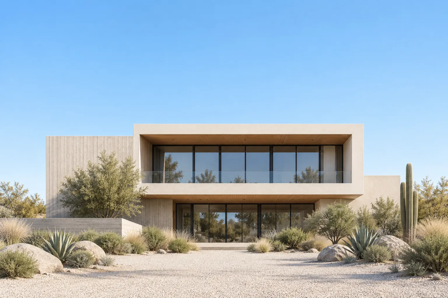
01-house-wide-establishing
Low flat-roofed modern desert house seen head-on across a gravel drive under a clear graduated blue sky
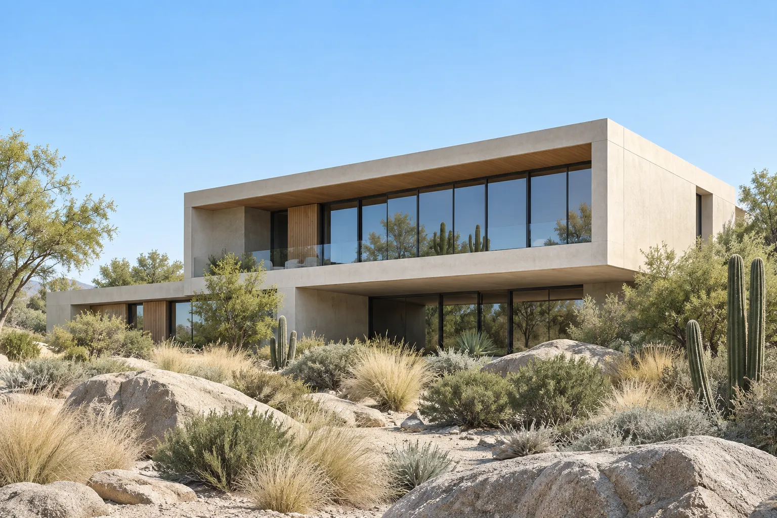
02-house-three-quarter
Three-quarter view of the same modern desert house with granite boulders and dry grasses in the foreground
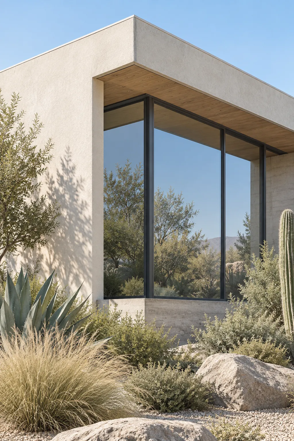
03-house-vertical-detail
Tall vertical crop of a glazed corner of the modern desert house framed by dry planting
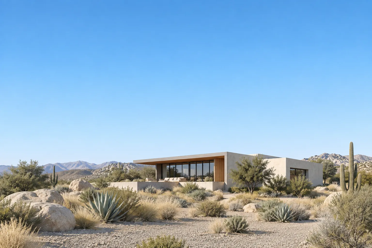
04-cta-band-wide
Wide view of the modern desert house with open sky filling the upper half of the frame
Prompts
123,083 chars
# Bright rental-listing landing page — rebuild prompt

A long, light, high-contrast marketing page for a vacation-rental / stay-booking product. The whole design rests on one idea: a near-white sheet, near-black type and buttons, hairline-bordered cards, and photography that supplies the only real colour (a graduated blue desert sky). Everything else is restraint.

**All pixel numbers below describe a 1200px-wide viewport with a 900px-tall window, matching the capture.** Scale type and padding down proportionally below that.

> No motion report was supplied with this reference. Every timing, easing, trigger and scroll range below is marked **(inferred)** and read off the stills plus the full-page composite. Durations are given as ranges, never exact values; nothing here was measured on a live page.

---

## Structure

Full-bleed page, no visible page frame or mat. Content container is **max-width 1200px, 40px side padding → 1120px content column**, centred. Base grid is 12 columns with a **32px gutter**; the recurring layouts are 3 × 352px (card rows), 2 × 544px (split blocks), and an asymmetric 2/1 (722px + 366px) for the gallery and contact blocks.

Sections top to bottom:

1. **Nav bar** — transparent overlay on the hero, 88px tall, full container width. Wordmark left (circular glyph + 6-letter name), 6 text links centred, one dark solid button right.
2. **Hero** — centred type on a sky gradient, then a full-bleed photograph, then a second narrow photograph strip.
3. **Statement block** — small left label, large right paragraph, two icon/feature items under the paragraph, one dark button.
4. **Gallery pair** — two photographs side by side, 2/1 widths.
5. **Listings row** — eyebrow + 2-line headline left, outline button right, 3 property cards, carousel arrows below left.
6. **Why-choose trio** — centred eyebrow + centred 2-line headline, 3 centred feature columns each with a square icon tile.
7. **Since-year split header** — 2-line headline left, paragraph + dark button right.
8. **Video panel** — one full-container photograph with a play pill in the lower right.
9. **Testimonial** — large quote + attribution + arrows left, one portrait photograph right.
10. **Blog row** — eyebrow + 2-line headline left, outline button right, 3 article cards.
11. **CTA band** — full-bleed photograph with sky, centred 2-line headline, one light button.
12. **Contact split** — eyebrow + headline + paragraph + dark button left, one tall photograph right.
13. **Footer** — near-black block: logo mark, 4 link columns, newsletter field, then an oversized wordmark band flush to the bottom edge.

---

## Scroll map

Viewport = 900px. Kinds are conservative on purpose: **nothing pins and nothing stacks.** All values (inferred) from the page composite.

| # | Section | Height | Viewports | Scroll consumed | Kind |
|---|---------|--------|-----------|-----------------|------|
| 1 | Nav bar | 88px | 0.10 | 0 (sticky overlay) | scroll-linked (background only) |
| 2 | Hero | 1060px | 1.18 | 1060px | entrance + scroll-linked photo |
| 3 | Statement block | 660px | 0.73 | 660px | entrance |
| 4 | Gallery pair | 500px | 0.56 | 500px | entrance |
| 5 | Listings row | 880px | 0.98 | 880px | entrance |
| 6 | Why-choose trio | 480px | 0.53 | 480px | entrance |
| 7 | Since-year header | 320px | 0.36 | 320px | entrance |
| 8 | Video panel | 700px | 0.78 | 700px | scroll-linked |
| 9 | Testimonial | 480px | 0.53 | 480px | entrance |
| 10 | Blog row | 740px | 0.82 | 740px | entrance |
| 11 | CTA band | 840px | 0.93 | 840px | scroll-linked |
| 12 | Contact split | 560px | 0.62 | 560px | entrance |
| 13 | Footer | 798px | 0.89 | 798px | entrance |

**Total page height: 8018px ≈ 8.9 viewports.**

---

## Spacing

- **Section rhythm:** 120px top and bottom padding is the default (240px of air between adjacent section contents). Three pairs are deliberately tighter: 2→3 uses 96px, 3→4 uses 64px, 7→8 uses 48px (the header and its video panel read as one unit).
- Sections 11 and 13 have no side padding — they bleed. Their *inner* content keeps the 1120px column.
- **Headline → supporting copy:** 20px. **Eyebrow → headline:** 16px. **Copy → button:** 32px.
- **Card grid gap:** 32px horizontal. **Split block gap:** 40px.
- **Card internals:** 8px outer padding around the image, image then 10px radius; text block 16px padding, 8px between title and location, 12px before the meta/price row.
- **Feature items (3, 6):** 20px icon-tile → title, 8px title → paragraph.
- **Nav:** 32px between links, 40px between the link cluster and the button.
- **Footer:** 64px top padding, 48px between the link grid and the wordmark band, wordmark sits flush to the bottom with 0 padding beneath it and is clipped by the page edge.

---

## Type

One family throughout. Class: **neo-grotesk** — tight apertures, near-neutral, low contrast. Free stand-in: **Inter Tight** (or Geist). Headlines are *medium, never bold*.

| Level | Size | Line-height | Letter-spacing | Weight |
|---|---|---|---|---|
| Hero H1 (2) | 52px | 1.18 | −0.02em | 500 |
| Section H2 (5, 6, 7, 10, 12) | 40px | 1.20 | −0.02em | 500 |
| CTA H2 (11) | 44px | 1.20 | −0.02em | 500 |
| Statement paragraph (3) | 22px | 1.45 | −0.01em | 400 |
| Pull quote (9) | 28px | 1.35 | −0.01em | 400 |
| Card / feature title | 16px | 1.30 | −0.01em | 500 |
| Body & card excerpt | 14px | 1.60 | 0 | 400 |
| Eyebrow (5, 6, 10, 12) | 11px | 1.20 | 0.12em, uppercase | 500 |
| Nav link | 13px | 1.20 | 0 | 400 |
| Button label | 13px | 1.20 | −0.005em | 500 |
| Meta / badge / date | 11px | 1.30 | 0.02em | 400 |
| Footer link | 13px | 1.90 | 0 | 400 |
| Footer wordmark | 220px | 0.85 | −0.04em | 500 |

**Max line length:** 62ch for the statement paragraph (3) and the quote (9); 46ch for card excerpts and feature paragraphs; hero subcopy is hard-wrapped to two short lines of ~40ch. Headlines are hand-broken to exactly two lines everywhere — never let them run to three.

---

## Colour

- **#FCFCFC — ground.** Roughly 70% of the surface: every section background from 3 to 12. Warm-neutral off-white, not pure white.
- **#131312 — ink.** All body and heading text, all solid buttons, the icon tiles' glyphs, and the entire footer block (13). The second-largest area, almost all of it concentrated in the footer.
- **#D9D9D8 — hairline.** 1px card and input borders, section dividers, outline-button borders, avatar rings. Also mixed into the ground for muted meta text (use **#6B6B68**, inferred, for secondary copy — it is #D9D9D8's role, one step darker so it stays legible).
- **#96CBFB — sky, light stop.** Top of the hero gradient (2) and the CTA band gradient (11). Continuous with the photographs' own sky, which is the point: the gradient is there so the page appears to *become* the photo.
- **#539CDA — sky, deep stop.** Upper band of the same two gradients only.

**The accent is the blue, and it is photographic.** It is allowed in exactly three places: the hero gradient, the CTA band gradient, and the skies inside the images. It never appears as a button, a link, a border, a focus ring, or a hover state. Buttons are #131312 on light and #FCFCFC on dark — no blue UI, ever.

One tiny exception (inferred, not in the sampled palette): the price chip on the listing cards (5) is a pale chartreuse pill, roughly **#DCEB57**, with #131312 text. It appears on nothing else, occupies maybe 0.05% of the page, and is the only saturated non-photographic colour. Keep it that small or drop it.

---

## Surface

- **Borders:** 1px solid #D9D9D8. Used on listing cards, blog cards, the newsletter input, outline buttons, carousel arrow buttons, and the square icon tiles. Nothing uses a 2px border.
- **Radii:** cards 14px; images inside cards 10px; standalone photographs (2, 4, 8, 9, 12) 16px; buttons 10px rounded rectangle; badges, price chips, tag chips, the play pill and the carousel arrows are full pills (999px); icon tiles 10px; newsletter input 8px.
- **Shadows: none.** No drop shadow, no card elevation, no glow, no inner shadow. Separation comes entirely from the hairline and from the gap between the near-white ground and the photograph. The only soft edge on the page is the hero gradient itself.
- The full-bleed hero photo (2) and CTA band (11) have **square corners** — they touch all four page edges. Only contained images are rounded.

---

## Imagery

All photography is one continuous location and one treatment: a **low, flat-roofed modern house in a hot dry landscape** — pale stucco and board-formed concrete volumes, deep-set floor-to-ceiling glazing with slim dark mullions, a shaded recessed terrace, surrounded by granite boulders, bleached ornamental grasses, agave and a tall columnar cactus, under a cloudless graduated sky. Midday sun, hard short shadows, natural colour, mild contrast, no filter, no grade toward teal or orange. Every frame reads as the same property photographed from a different distance.

1. **Hero primary (2)** — the house head-on from the drive, sky filling the top third so it joins the gradient above it. Full-bleed, **16:6** (1200 × 440).
2. **Hero strip (2)** — a wider, flatter crop of the same scene, ground and planting only, sitting directly beneath the primary. Full-bleed, **16:2.1** (1200 × 158).
3. **Gallery left (4)** — three-quarter view of the building mass with boulders in the foreground. **3:2** (722 × 481).
4. **Gallery right (4)** — a tighter vertical-ish crop of one glazed corner. **3:4** (366 × 488) — wait, matched to the left image's height: **366 × 481, roughly 3:4.**
5. **Listing card thumbnails (5), ×3** — the same house at varying distance and time of day. **4:3** (336 × 252 inside the card).
6. **Video still (8)** — the widest, most establishing shot of the whole page: full property in landscape, generous sky. **1120 × 560, 2:1.**
7. **Testimonial portrait (9)** — a vertical crop: corner of the house with planting, no people. **4:5** (366 × 458).
8. **Blog card thumbnails (10), ×3** — architectural details and landscape edges. **4:3** (336 × 252).
9. **CTA band (11)** — dusk-leaning wide shot, sky occupying the top half so the overlaid white headline sits on unbroken blue. Full-bleed, **1200 × 840.**
10. **Contact image (12)** — vertical, an angled view of the glazed façade. **4:5** (366 × 458).

No people, no logos, no signage, no interiors, no drone-top-down shots.

---

## Motion

The page is deliberately quiet: it is a light editorial layout, not a motion piece. Almost every section is a single fade-and-rise entrance that plays **once**; two sections carry gentle scroll-linked image movement that **reverses on scroll-up**; nothing pins, nothing stacks, nothing scroll-jacks.

Global entrance defaults — **(inferred, not measured)**: trigger when the element's top reaches 80% of the viewport; duration in the **500–700ms** range; ease-out with a long tail (an `ease-out`-family curve, e.g. cubic-bezier(0.22, 1, 0.36, 1)); stagger between siblings in the **60–90ms** range. Travel distance is small — 16 to 24px — never 60px or more.

### 1. Nav bar
- **kind** — scroll-linked (background only)
- **what moves** — nothing translates; the bar's own background and border cross-fade
- **from → to** — background `transparent` → `rgba(252,252,252,0.92)` with `backdrop-filter: blur(12px)` and a 1px #D9D9D8 bottom border fading 0 → 1; link colour #FCFCFC → #131312; the right-hand button inverts from #FCFCFC-on-transparent to solid #131312 with #FCFCFC text
- **range** — from 0 to 120px of scroll; reverses exactly on the way back up (inferred)
- **reduced motion** — same state change, applied instantly at the 120px threshold, no blur transition
- The bar is sticky and never hides on scroll-down.

### 2. Hero
- **kind** — entrance (type) + scroll-linked (photograph)
- **what moves** — headline, subcopy, button enter; then the primary photo and the strip beneath it
- **from → to** — type: opacity 0 → 1, translateY 24px → 0, in the order headline / subcopy / button. Photograph: translateY 0 → −60px and scale 1.04 → 1.0 as the page scrolls, i.e. it settles rather than parallaxes away (inferred)
- **range** — type entrance fires on load, ~150ms after paint, duration 600–800ms (inferred), 80ms stagger. Photo: scroll-linked from page top until the photo's bottom edge reaches the viewport top; reverses on scroll-up
- **reduced motion** — type appears at final position with a plain opacity fade; photo is locked at translateY 0, scale 1.0

### 3. Statement block
- **kind** — entrance
- **what moves** — left label, statement paragraph, then the two feature items, then the button
- **from → to** — opacity 0 → 1, translateY 20px → 0
- **range** — once, when the section's top reaches 80% of the viewport; 500–700ms (inferred); 70ms stagger, the two feature items staggering left-to-right
- **reduced motion** — opacity only, no translate

### 4. Gallery pair
- **kind** — entrance
- **what moves** — the two photographs, each as a clipped reveal
- **from → to** — `clip-path: inset(0 0 12% 0)` → `inset(0 0 0 0)` with the inner image at scale 1.06 → 1.0; opacity stays 1 throughout
- **range** — once, when each image's top reaches 85% of the viewport; 700–900ms (inferred); 100ms stagger, left before right
- **reduced motion** — images render at final clip and scale, no reveal

### 5. Listings row
- **kind** — entrance
- **what moves** — eyebrow + headline + outline button as one group, then the three cards, then the arrow pair
- **from → to** — opacity 0 → 1, translateY 24px → 0
- **range** — once, when the section top reaches 80% of the viewport; 500–700ms (inferred); cards stagger 80ms left-to-right; arrows follow the last card
- **reduced motion** — opacity only
- The carousel itself does not advance on scroll — it moves only on arrow press (see interactions).

### 6. Why-choose trio
- **kind** — entrance
- **what moves** — centred eyebrow, centred headline, then three columns
- **from → to** — opacity 0 → 1, translateY 16px → 0; icon tiles additionally scale 0.92 → 1.0
- **range** — once, when the section top reaches 80% of the viewport; 450–650ms (inferred); 70ms stagger across the three columns
- **reduced motion** — opacity only, tiles at scale 1.0

### 7. Since-year header
- **kind** — entrance
- **what moves** — left headline and right paragraph/button, as two groups
- **from → to** — opacity 0 → 1, translateY 20px → 0
- **range** — once, at 80% of the viewport; 500–700ms (inferred); 90ms between the left and right groups
- **reduced motion** — opacity only

### 8. Video panel
- **kind** — scroll-linked
- **what moves** — the photograph inside its rounded 16px frame; the play pill
- **from → to** — the image is 112% of the frame height and translates translateY +28px → −28px across the section's pass, a contained vertical drift with no scale change; the play pill is static relative to the frame. Reverses on scroll-up (inferred)
- **range** — from the frame's top entering the viewport bottom until its bottom leaves the viewport top
- **reduced motion** — image centred and locked, no drift
- The frame also gets the section-6 style entrance reveal on first arrival (`clip-path: inset(0 0 10% 0)` → `inset(0)`, 700–900ms, inferred), once.

### 9. Testimonial
- **kind** — entrance
- **what moves** — quote, attribution block, arrow pair, and the portrait image
- **from → to** — text: opacity 0 → 1, translateY 20px → 0. Image: `clip-path: inset(0 0 12% 0)` → `inset(0)` with inner scale 1.06 → 1.0
- **range** — once, at 80% of the viewport; text 500–700ms, image 700–900ms (inferred); text leads the image by 100ms
- **reduced motion** — final states, opacity fade only
- Quote changes triggered by the arrows are an interaction, not part of this entrance.

### 10. Blog row
- **kind** — entrance
- **what moves** — header group (eyebrow, headline, outline button), then three cards
- **from → to** — opacity 0 → 1, translateY 24px → 0
- **range** — once, at 80% of the viewport; 500–700ms (inferred); 80ms stagger left-to-right
- **reduced motion** — opacity only

### 11. CTA band
- **kind** — scroll-linked
- **what moves** — the full-bleed background photograph behind static centred type
- **from → to** — background image scale 1.08 → 1.0 and translateY +40px → −40px across the band's pass; the headline and button do not move at all. Reverses on scroll-up (inferred)
- **range** — from the band's top edge entering the viewport bottom until its bottom edge reaches the viewport top
- **reduced motion** — background fixed at scale 1.0, translateY 0
- The headline and button additionally fade in once (opacity 0 → 1, translateY 16px → 0, 500–700ms, inferred) when the band is 60% in view.

### 12. Contact split
- **kind** — entrance
- **what moves** — left text column (eyebrow, headline, paragraph, button), then the right photograph
- **from → to** — text: opacity 0 → 1, translateY 20px → 0. Image: `clip-path: inset(0 0 12% 0)` → `inset(0)`, inner scale 1.05 → 1.0
- **range** — once, at 80% of the viewport; 500–700ms text, 700–900ms image (inferred); 90ms offset
- **reduced motion** — final states, opacity only

### 13. Footer
- **kind** — entrance (link grid) + static (wordmark)
- **what moves** — the four link columns and the newsletter block fade up; the oversized wordmark does **not** move, scale, scroll horizontally or track the cursor
- **from → to** — columns: opacity 0 → 1, translateY 16px → 0
- **range** — once, when the footer top reaches 90% of the viewport; 450–650ms (inferred); 60ms stagger across the columns
- **reduced motion** — opacity only

### Interaction transitions (not scroll choreography)

- **Nav link hover** — colour steps to full ink (or full white pre-scroll) with a 1px underline growing from left, 150–200ms (inferred).
- **Solid button hover** — background #131312 → #2A2A28, no lift, no shadow, 150ms.
- **Outline button hover** — fills: background transparent → #131312, label → #FCFCFC, border colour follows, 150ms.
- **Light button on photo hover (11)** — background #FCFCFC → #E8E8E6.
- **Button press** — scale 0.98 for the duration of the press, instant release.
- **Card hover (5, 10)** — the inner image scales 1.0 → 1.04 inside its fixed 10px-radius frame, 300–400ms (inferred); the card border darkens #D9D9D8 → #B9B9B6. The card itself never translates or gains a shadow.
- **Carousel arrows (5, 9)** — on press the track translates by one card + 32px gap, 400–500ms ease-out (inferred); disabled arrow drops to 40% opacity. Arrow hover inverts the pill to #131312/#FCFCFC.
- **Play pill (8)** — hover scales 1.0 → 1.04 and the triangle glyph nudges 1px right; press opens a modal that fades in over a #131312 scrim at 70% opacity, 250–350ms (inferred); Escape and scrim click close with the same transition reversed.
- **Newsletter input focus** — border #D9D9D8 → #131312, no ring, no colour shift, 120ms.
- **Focus-visible (all)** — 2px #131312 outline at 2px offset. Never blue.

---

## Responsive

Below 640px, container padding drops to 20px (content column = viewport − 40px).

- **1** Nav: links collapse into a hamburger; the solid button stays visible at 32px tall; the open drawer is a full-height #FCFCFC panel sliding from the right, 250–350ms (inferred).
- **2** Hero H1 → 32px/1.20; subcopy → 15px; hero photo crops to 4:3, strip is **dropped**; the scroll-linked photo drift is disabled.
- **3** Stacks: label above paragraph; paragraph → 18px/1.5; the two feature items stack full width.
- **4** Gallery stacks to two full-width 4:3 images, 16px gap.
- **5, 10** Card rows become a horizontally scrollable track with 20px leading inset, cards at 78vw, snap-to-start; the header button moves below the headline and goes full width; carousel arrows are **dropped** in 5 (native swipe replaces them).
- **6** Feature columns stack, left-aligned rather than centred; icon tiles stay 40px.
- **7** Headline 40 → 28px, paragraph and button stack beneath.
- **8** Video panel goes 3:2, radius 12px, drift disabled; play pill shrinks to icon-only 40px.
- **9** Quote → 20px/1.4, image moves below the attribution at 3:2; arrows sit under the image.
- **11** Band height 840 → 520px; headline → 30px; background uses a tighter centre crop so the sky still sits behind the type.
- **12** Text above, image below at 4:3.
- **13** Footer link grid 4 → 2 columns; newsletter field full width with the button stacked beneath; wordmark scales to fill the viewport width exactly (≈ 88px), still clipped at the bottom edge.
- Section padding 120px → 64px throughout; tight pairs → 32px. Total page height lands around 5600–6000px at 390px wide.

---

## Don'ts

- **Don't use blue as a UI colour.** Every model reaching for a "travel/booking" palette will paint the buttons #539CDA. Buttons are near-black. The blue exists only as sky — in two gradients and inside the photographs. One blue link ruins the whole page.
- **Don't bold the headlines.** They are weight 500 with −0.02em tracking. `font-bold` / 700 makes it look like a template.
- **Don't add shadows.** No `shadow-md`, no `shadow-lg`, no card elevation on hover. The entire design's separation budget is one 1px #D9D9D8 hairline.
- **Don't centre everything.** Only 2, 6 and 11 are centred. Sections 3, 5, 7, 9, 10, 12 are left-aligned with the button or secondary column pushed right. Centring section 5 or 10 collapses the editorial rhythm.
- **Don't use pure #FFFFFF or #000000.** The ground is #FCFCFC and the ink is #131312 — the slight warmth is most of the page's character.
- **Don't pin, stack or scroll-jack.** There is no sticky section, no horizontal scroll section, no "scrollytelling" step sequence. Restraint is the brief; adding a pinned section is the single most likely way to get this wrong.
- **Don't parallax the contained photographs.** Only 2, 8 and 11 move, and only within their own frame at ±28–60px. A 200px parallax on the gallery images looks cheap here.
- **Don't re-trigger entrances.** Every fade-up plays once and stays. Re-animating on scroll-up makes an 8000px page feel nervous.
- **Don't inflate the body copy.** Body is 14px/1.6 and card excerpts are 14px. 16–18px body destroys the density that makes the hairline cards read as a system.
- **Don't reach for a serif, a display face or a second family.** One neo-grotesk at four weights maximum.
- **Don't round the full-bleed sections.** Sections 2, 11 and 13 have square corners and touch the viewport edges; only contained images get 16px.
- **Don't put borders or shadows on photographs.** Images are radius-clipped and nothing else.
- **Don't let the sticky nav become a solid white bar with a shadow.** It's a 92%-opacity blurred sheet with a 1px bottom hairline.
- **Don't scatter the chartreuse.** If you include the price chip, it appears on listing cards only — never on a badge, a button, a tag or a link.
- **Don't let headlines wrap to three lines.** Every headline on this page is hand-broken to exactly two; set explicit max-widths or `<br>` breakpoints.
- **Don't clip or centre the footer wordmark politely.** It is oversized, flush to the bottom edge, and deliberately cut off by it.
Versions
1Each rebuild is kept. The live one is what the comparison shows. LiveOpus 5.5Extra highfrontend-designemil-design-engtransitions-devhumanizergsaplast month · 72s · 4 images · 20260917T180210ZOpen