Stride — Fitness coaching page
Rebuild
Opus 5.5Highfrontend-designemil-design-engtransitions-devgsaphumanizerView
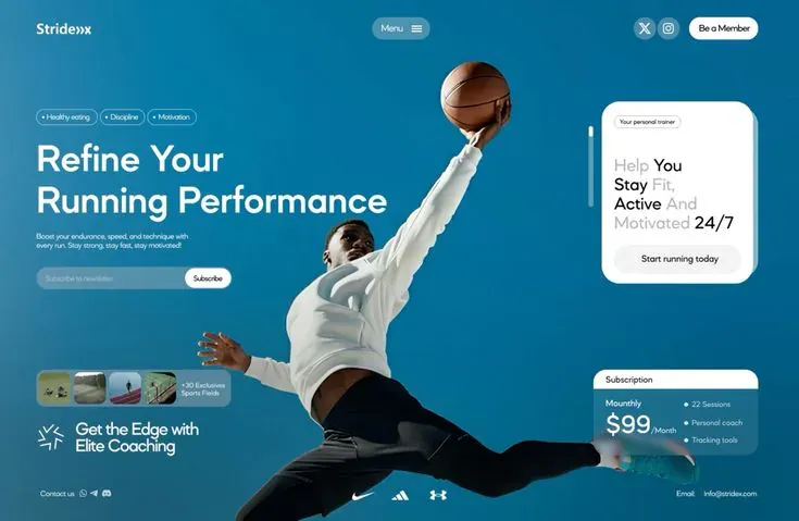
RebuildReference
Move across the image to wipe between the two. Click to lock the seam; arrow keys nudge it.
Imagery
2/2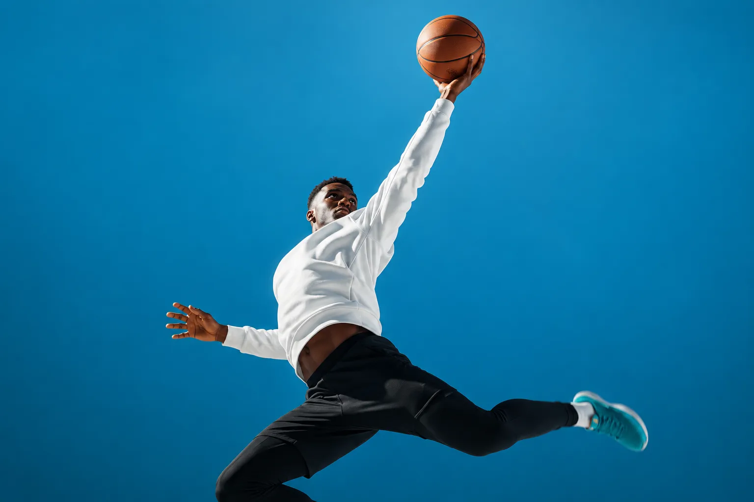
01-hero-athlete
Athlete in a white long-sleeve top and black trousers leaping diagonally with one arm stretched up, palm under a basketball, against a seamless cerulean studio backdrop
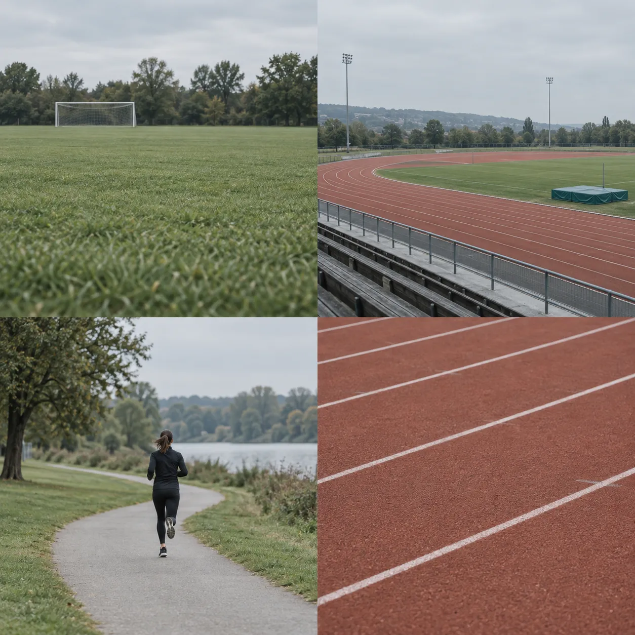
02-venue-thumbnails
Four small outdoor training venues: a grass field, an open track under overcast sky, a lone runner on a path, and terracotta running-track lanes
Prompts
115,701 chars
# Full-bleed athletic coaching hero: one viewport with glass cards

A single-screen landing page. One studio photograph fills the whole viewport: an athlete mid-leap against a saturated cerulean backdrop. All UI floats on top of it. Headline, chips and newsletter sit in a left column. Two cards sit in a right rail: a solid white "personal trainer" card and a glass pricing card. A thin bottom strip holds contact links and a monochrome logo wall. The effect is calm, airy and premium, with one strong photo and very little chrome.

## Structure

- **Stage:** full-bleed. `width: 100vw; min-height: 100vh`, designed at 1440 × 938. It has no outer container box. Content uses a 64px side gutter, so the inner width is 1312px.
- **Grid:** 12 columns, 24px gaps, over the 1312px inner width.
  - Left column: columns 1–6, max 700px wide.
  - The photo's subject owns the middle. Keep columns 5–9 visually clear of text, and let the athlete's arm and ball cross between the columns.
  - Right rail: columns 10–12, about 296px wide, right-aligned to the gutter.
- **Sections, top to bottom.** All of them sit inside the one stage.
  1. **Nav bar.** An overlay band, 100px tall, at the top of the stage.
  2. **Hero stage (photo).** A full-bleed background photograph covering the entire 938px.
  3. **Left column copy.** Topic chips, a two-line headline, a short paragraph and a newsletter pill in the upper half. Lower down: a thumbnail strip card and an icon plus two-line tagline.
  4. **Right rail cards.**
     - 4a: the white personal-trainer card, upper right, with a small vertical progress bar to its left.
     - 4b: the glass pricing card, lower right.
  5. **Footer strip / logo wall.** An overlay band pinned to the bottom of the stage, with contact at left, three partner logos centred and email at right.

## Scroll map

- **1 Nav bar:** 100px (0.11 vh). Overlay at the top of 2, so it consumes no scroll of its own. Kind: entrance (inferred).
- **2 Hero stage:** 938px (1.04 viewports at 900px viewport height). Consumes 938px of scroll. Kind: static background with a load entrance (inferred).
- **3 Left column copy:** occupies y 200–820 inside 2. Consumes no extra scroll. Kind: entrance (inferred).
- **4 Right rail cards:** 4a occupies y 182–510 and 4b occupies y 667–833, both inside 2. Consumes no extra scroll. Kind: entrance (inferred).
- **5 Footer strip:** 64px tall, overlaying y 858–922 inside 2. Consumes no extra scroll. Kind: static.
- **Total page height:** about 938px, roughly one viewport. Nothing pins, stacks or scrolls beyond the stage.

## Spacing

- **Stage padding.** 64px left and right. The nav's vertical centre sits 50px from the top, and the footer strip's centre sits 44px above the bottom.
- **Left column vertical rhythm**, top to bottom. The column starts at y ≈ 205.
  - Chips row: 28px tall, with 8px between chips.
  - 20px down to the headline.
  - Headline: 2 lines, about 150px block.
  - 24px down to the paragraph (2 lines).
  - 24px down to the newsletter pill (44px tall).
  - An open gap of about 140px, where the photo breathes.
  - Thumbnail strip card, 64px tall.
  - 24px down to the tagline row (56px tall).
- **Nav bar.**
  - Pills are 42px tall.
  - Menu pill: centred, 104px wide, with 18px horizontal padding.
  - Right cluster: two 42px circular icon buttons 8px apart, then 12px, then the member pill (about 128 × 42, 20px horizontal padding).
- **Trainer card (4a).**
  - Size: 276 × 328, with 20px internal padding.
  - Label pill at the top.
  - 20px down to the statement.
  - Statement block: 4 lines.
  - Auto space, then the full-width button (50px tall), sitting 20px above the card bottom.
  - Progress bar: sits 20px to the left of the card, at y 225–295.
- **Pricing card (4b).**
  - Size: 296 × 166.
  - Header band: 36px tall, with 16px horizontal padding.
  - Body: 18px padding, split into two columns (price left, feature list right) with a 24px gap.
  - Feature list items sit 14px apart.
- **Thumbnail strip card.**
  - Size: 350 × 64, with 8px padding.
  - Four 48–56px thumbs, 6px apart.
  - 12px gap before the caption.
- **Footer strip.**
  - Left: label, then 12px, then three 16px icons 8px apart.
  - Centre: logos 40px apart.
  - Right: label, then 16px, then the address.

## Type

- **Family:** geometric sans with round bowls, a single-storey feel and friendly terminals. Use **Outfit** (Google Fonts); Urbanist is an acceptable substitute. Use one family throughout.
- **Anchor:** body = 16px.

| Level | Ratio | Size | Line-height | Letter-spacing | Weight |
|---|---|---|---|---|---|
| H1 headline (2 lines) | 4.25× | 68px | 1.08 | −0.02em | 500 |
| Price figure | 2.75× | 44px | 1.0 | −0.02em | 500 |
| Card statement (4 lines) | 1.75× | 28px | 1.18 | −0.01em | 500 |
| Tagline beside burst icon (2 lines) | 1.75× | 28px | 1.15 | −0.01em | 400 |
| Body paragraph | 1× | 16px | 1.5 | 0 | 400 |
| Nav pills / buttons | 0.9× | 15px (min 14) | 1 | 0 | 500 |
| Pricing header label, "Monthly" label | 0.9× | 14–15px | 1.2 | 0 | 500 |
| Chips, feature list, thumb caption, footer meta, "/Month" suffix | 0.8× | 13px | 1.3 | 0 | 400 |
| Card label pill | 0.75× | 12px | 1 | 0 | 400 |

- **Line lengths.**
  - Paragraph: max-width 360px, about 45 characters per line, 2 lines.
  - Headline: breaks after word 2 of about 4. The second line is the longer one and runs to about 700px.
  - Card statement: forced into 4 short lines of 1–2 words each.
- **Two-tone statement.** In the trainer card statement, words alternate between near-black #03080B and a light grey, `rgba(3,8,11,0.35)`. Roughly: grey word, black word / black word, grey word / black word, grey word / grey word, black figure. The black words carry the meaning, and the grey words are connective.

## Colour

- **#026B95 cerulean.** This is about 80% of the surface. It is the photo's studio backdrop, not a CSS fill. Use it as the fallback `background-color` behind the image.
- **#03465A deep teal-navy.** The photo's darker vignette toward the edges and bottom. Also the tint behind glass surfaces: `rgba(3,70,90,0.25)` under the backdrop blur.
- **#FCFCFC near-white.** All text over the photo, the trainer card fill, the pricing header band, the member pill, the Subscribe button and the logos. White is the page's real "accent": solid white marks the three action/primary surfaces (member pill, trainer card, pricing header) and nothing else gets a solid fill.
- **#03080B near-black.** Used only for text sitting on white surfaces (the card statement, button labels in white pills, the pricing header label). Never use it as a background.
- **#A9D8E7 pale sky.** The single secondary accent. It is allowed in three places only:
  - the offset plate stacked behind the trainer card, as a solid fill;
  - translucent fills for the nav's menu pill, the icon buttons and the newsletter input, at `rgba(169,216,231,0.30)`;
  - the thumbnail strip card, at 0.22.
- **Neutral button fill.** The trainer card button is `rgba(3,8,11,0.06)` on white, about #EEEFEF.
- **No other hues.** Accidental colours in the photos (shoes, thumbnails) are fine. Never introduce them into UI.

## Surface

- **Radii.**
  - Pills (nav, chips, input, buttons): 999px.
  - Trainer card and its offset plate: 24px.
  - Pricing card: 16px, with the white header band taking the top radius only.
  - Thumbnail strip card: 14px. Thumbnails: 8px.
- **Borders.**
  - Chips: 1px `rgba(252,252,252,0.6)` with a transparent fill. Each chip has a 4px white dot before its label, 6px gap, and 12px horizontal padding.
  - Card label pill: 1px `rgba(3,8,11,0.25)`.
  - No other borders.
- **Glass.** The pricing body, the thumbnail strip card, the nav translucent pills and the input use `backdrop-filter: blur(16px) saturate(1.2)` over their translucent fill. The athlete's foot passes behind the pricing card and must read as blurred through it.
- **Shadows.** None. Depth on the trainer card comes only from the solid #A9D8E7 plate, offset +10px x / +10px y, which peeks out on the right and bottom edges.
- **Progress bar.** 2px wide, 70px tall, radius 1. The top 40% is solid #FCFCFC and the rest is `rgba(252,252,252,0.3)`. It implies the trainer card is one of a set.
- **Burst icon.** 40px, about 10 short white strokes, 2px weight, radiating from a centre with an open core.

## Imagery

- **Hero photograph (section 2).**
  - Aspect: a full-bleed cover at 1440 × 938 (about 3:2), with `object-fit: cover` and `object-position: 55% 30%`.
  - Subject: one athlete shot in the studio mid-leap, body diagonal and one arm fully extended upward, palm under a basketball near the top edge.
  - Clothing: a white long-sleeve top, black trousers and bright teal shoes.
  - Placement: the athlete sits just right of centre (x 30%–88%). The ball rises into the top 20% between the nav's menu pill and the right cluster. The legs sweep toward the bottom right, behind the pricing card.
  - Background: a seamless saturated cerulean backdrop (#026B95) with a soft natural vignette darkening to #03465A at the corners and bottom.
  - Treatment: crisp, bright and high-key on the subject. No grain, no duotone and no added gradient overlay.
- **Four thumbnails (in section 3's strip card).** Square, 1:1, 52px. Each is an outdoor training venue shot small and slightly muted:
  1. a grass field;
  2. an open track under an overcast sky;
  3. a lone runner on a path;
  4. terracotta running-track lanes.

  A 2-line caption follows the thumbnails: a "+N" count plus a 2–3 word noun phrase.
- **Logos (section 5).** Three monochrome white sportswear-style marks at about 28px tall. Use neutral placeholder glyph marks, not real brands.
- **Social icons.** Nav has X and Instagram-style glyphs at 18px inside the 42px circles. The footer has messaging-app glyphs at 16px.

## Placeholder copy (by role)

- **Nav.** Wordmark at top-left: one short word plus a small chevron glyph, 22px, weight 600. Centre: "Menu" with a hamburger icon. Right: two social icons, then a white pill CTA of 2–3 words.
- **Chips.** Three topics, 1–2 words each.
- **H1.** A 3–4 word imperative across 2 lines.
- **Paragraph.** 2 sentences, about 20 words.
- **Newsletter pill.** About 350 × 44. Placeholder of 3 words. An inset white "Subscribe" pill button, 84 × 34, sits 5px from the right edge.
- **Tagline.** 5–6 words on 2 lines.
- **Trainer card.**
  - Label: 3 words.
  - Statement: about 7 words plus a "24/7"-style figure.
  - Button: 3 words.
- **Pricing card.**
  - Header: 1 word.
  - Body: a period label of 1 word, a price of 2–3 digits with a "$" and a "/period" suffix, and 3 features of 2 words each.
- **Footer.** Left: "Contact"-style label. Right: an "Email" label plus an address.

## Motion

No Motion report exists for this page. Every value below is **(inferred)**, and durations are ranges, not measurements.

**1 Nav bar**
- kind: entrance (inferred)
- what moves: wordmark, menu pill, right cluster
- from → to: opacity 0 → 1, translateY −12px → 0
- range: once on page load; 500–700ms (not measured), ease-out; the three groups staggered 60–80ms
- reduced motion: appears at full opacity with no translate

**2 Hero stage (photo)**
- kind: entrance (inferred); static once settled
- what moves: the background photograph
- from → to: scale 1.04 → 1.0, opacity 0.6 → 1
- range: once on load; 900–1200ms (not measured), a gentle ease-out
- reduced motion: static image, no scale

**3 Left column copy**
- kind: entrance (inferred)
- what moves: in order — chips, H1 (line by line), paragraph, newsletter pill, thumbnail strip, tagline row
- from → to: opacity 0 → 1, translateY 20px → 0
- range: once on load, starting about 150ms after the nav; 600–800ms each (not measured), ease-out; stagger 70–100ms
- reduced motion: all visible immediately with no translate

**4 Right rail cards**
- kind: entrance (inferred)
- what moves: 4a (trainer card together with its offset plate), then the progress bar, then 4b (pricing card)
- from → to:
  - cards: opacity 0 → 1, translateY 24px → 0
  - the plate settles last, moving from offset 0,0 to +10px,+10px
  - progress bar fill: height 0 → 40%
- range: once on load, after section 3 starts, about 300ms in; 700–900ms (not measured), ease-out; 120ms between 4a and 4b
- reduced motion: final state shown at once, plate already offset

**5 Footer strip**
- kind: static
- what moves: nothing
- from → to: n/a
- range: n/a
- reduced motion: n/a

**Interaction transitions** (not part of the load choreography)
- **White pills (member CTA, Subscribe).** On hover, the background goes to #A9D8E7. 200ms ease.
- **Translucent pills and icon circles.** On hover, the fill opacity goes 0.30 → 0.45. 200ms.
- **Chips.** On hover, the border goes to full-opacity white. 150ms.
- **Trainer card button.** On hover, the fill goes to #03080B with #FCFCFC text. 220ms. On press: scale 0.98.
- **Menu pill.** On click, the hamburger morphs to ×, and a full-height panel fades in over the stage (opacity 0 → 1, 250ms) as a #03465A overlay at 0.9 with blur. Close reverses it.
- **Footer logos.** Opacity 0.8 at rest, 1 on hover.

## Responsive (below 640px)

- **Stage.** Becomes auto height. The photo stays full-bleed as the top block at 100svh with `object-position: 60% 20%`.
- **Nav.** Reduces to wordmark plus a menu icon button. Social icons and the member pill move into the menu.
- **Left column.**
  - Gutter: 20px.
  - H1: 40px (2.5×), line-height 1.1.
  - Chips wrap.
  - The paragraph and newsletter pill go full width.
- **Cards.** The copy block sits over the lower photo. Below it, cards stack on a #026B95 background in this order:
  1. trainer card, full width minus the 10px plate offset;
  2. pricing card, full width;
  3. thumbnail strip.

  Gap between cards: 16px.
- **Dropped.** The progress bar and the tagline row.
- **Footer strip.** Stacks as three centred rows: logos, contact, email. 16px gap.
- **Pricing body.** Stays two-column down to 360px width, then stacks.

## Don'ts

- Don't add sections below the stage. There are no features grid, no testimonials and no FAQ. The whole page is one composed viewport.
- Don't lay a dark gradient scrim over the photo to "help legibility". The white text sits directly on the blue backdrop, and the vignette is the photo's own.
- Don't centre the headline or put the copy inside a card. It floats at the left, top-aligned with the trainer card's zone, and never overlaps the athlete's torso.
- Don't make every card glass. The trainer card is **solid** near-white with a solid pale-blue plate, and that contrast with the glass pricing card is the point.
- Don't use drop shadows, glows or coloured borders anywhere. Depth comes from the plate offset and backdrop blur only.
- Don't introduce a warm accent: no orange CTA, no neon green, no gradient buttons. Primary actions are white pills with near-black text.
- Don't go bold. Headline 500, never 700 or 800, and no uppercase headings. Don't use Inter, Roboto or system-ui; the rounded geometric sans carries the friendliness.
- Don't render the statement all in one colour. The alternating grey and black words are the signature.
- Don't colour the logo wall or give it a light band. Three small white marks sit on the photo, spaced wide, centred under the athlete.
- Don't use tight 8px corner radii on the cards, or sharp corners on anything. Pills are fully round and the cards are soft (16–24px).
- Don't add scroll-linked parallax, pinning or looping animations. The motion is a single restrained load-in, then stillness.
- Don't pick a generic gym or dumbbell stock photo. It needs one studio athlete in a dramatic upward reach on a seamless saturated-blue backdrop, bright enough to act as the page's colour.
Versions
1Each rebuild is kept. The live one is what the comparison shows. LiveOpus 5.5Highfrontend-designemil-design-engtransitions-devgsaphumanizer4 weeks ago · 236s · 2 images · 20260924T152747ZOpen