Tenista — Tennis academy landing page
Rebuild
Opus 5.5Highfrontend-designemil-design-engtransitions-devgsaphumanizerView
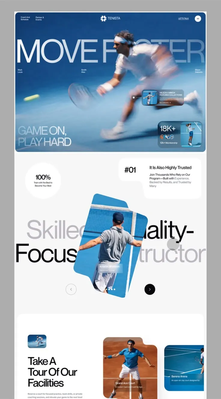
RebuildReference
Move across the image to wipe between the two. Click to lock the seam; arrow keys nudge it.
Imagery
4/4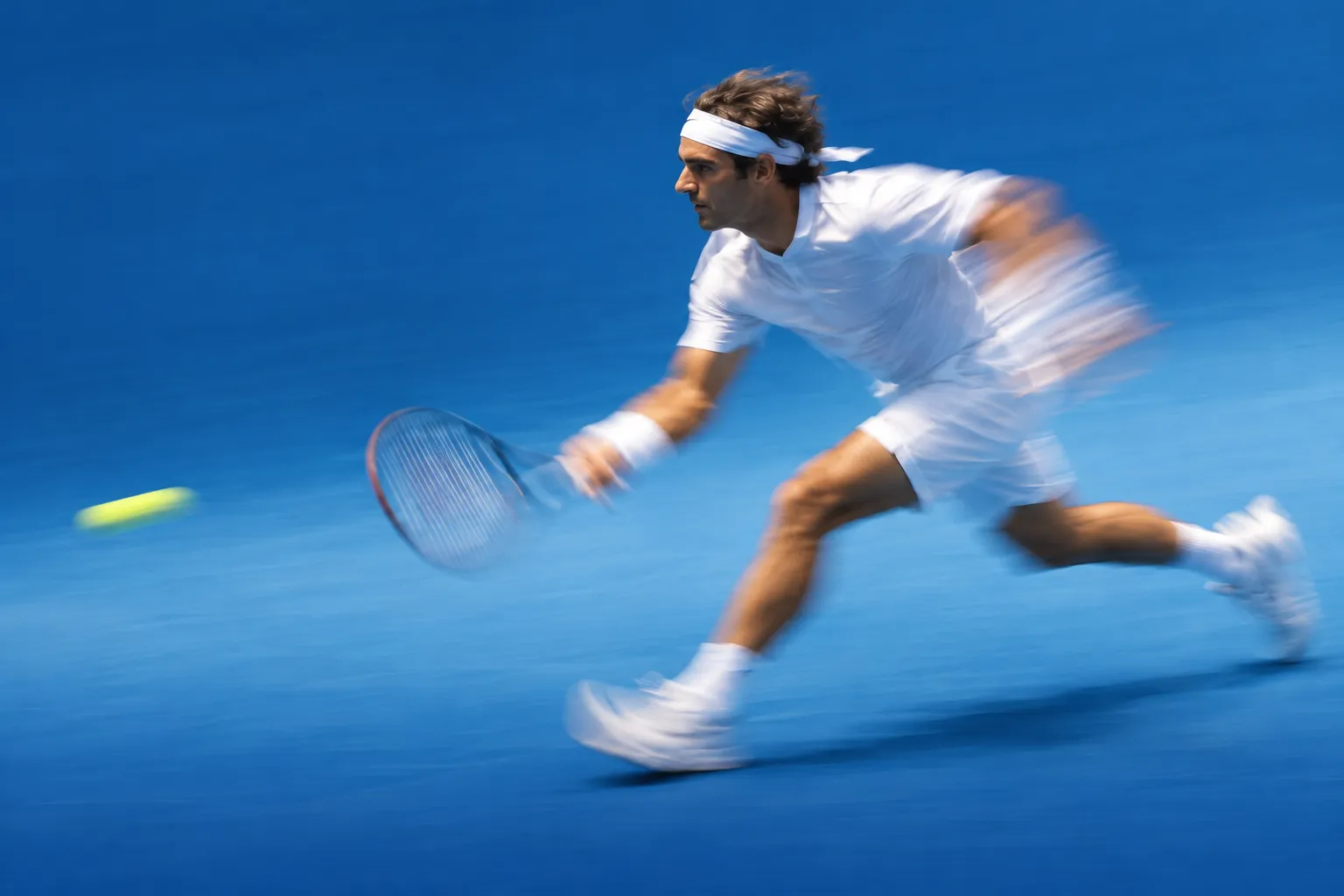
01-hero-action
Tennis player in white lunging hard to the right across a blue hard court, body and racquet blurred with motion, a yellow ball streaking on the left
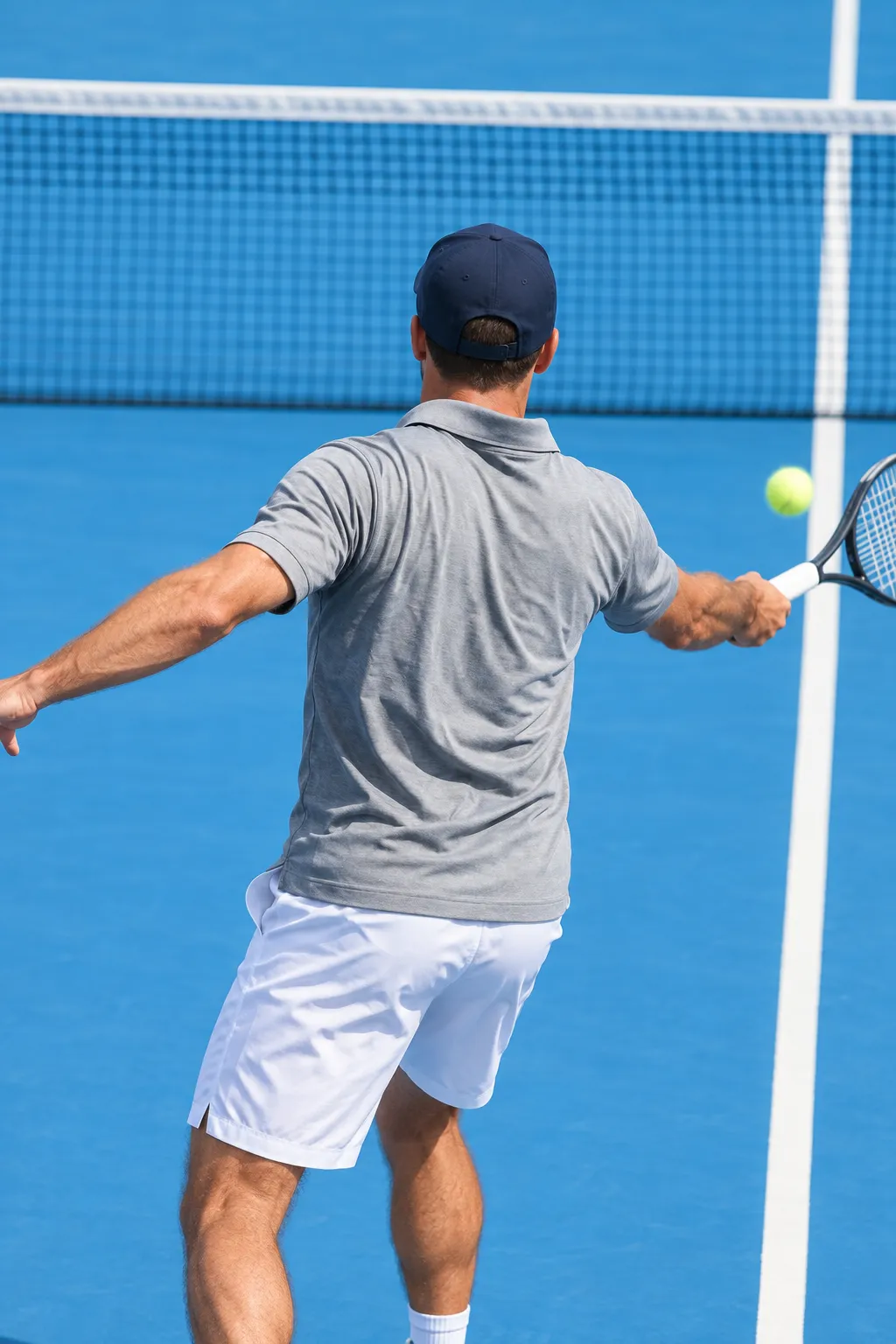
02-instructor-coach
Tennis coach seen from behind in a grey polo and navy cap, swinging a forehand in front of the net on a bright blue court
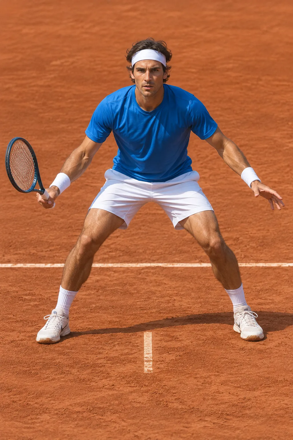
03-gallery-clay-court
Player in a blue shirt and white shorts in a wide ready stance on a terracotta clay court
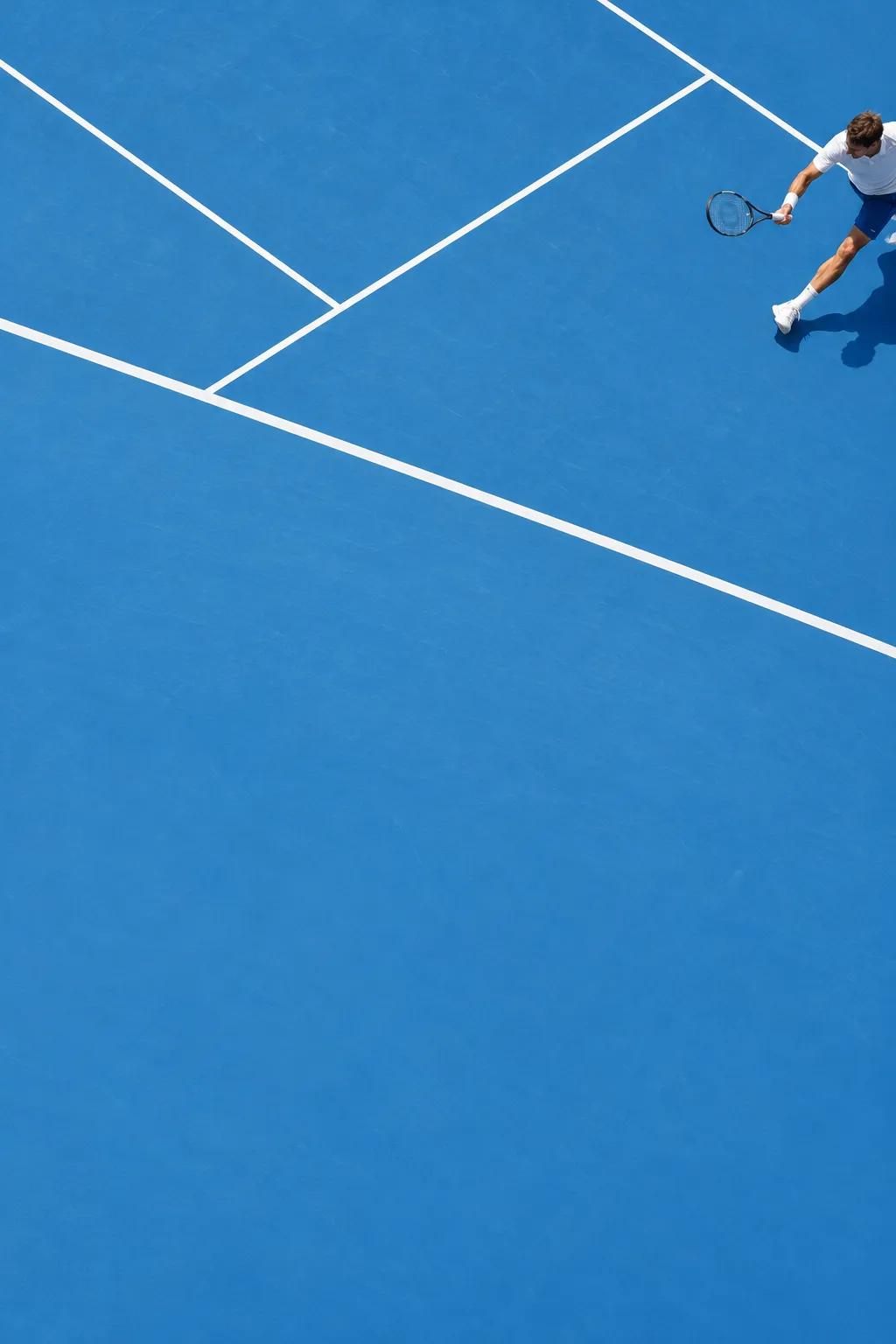
04-gallery-blue-aerial
Overhead view of an open-air blue hard court with white lines and a small player at the edge of the frame
Prompts
116,792 chars
# Sporty editorial academy landing page: light mode, motion-blur hero, tilted card overlapping a giant headline

A light-mode landing page for a sports training academy. A full-bleed action photo fills the hero and sits behind and in front of a huge thin grotesk headline. Below it, a tilted photo card cuts through a two-tone, two-line display headline, and a white rounded panel holds a horizontal gallery of cards with notched corners. The tone is editorial and calm. Display type is very large, all other type is very small, frosted-glass chips sit over the photos, and every bit of colour comes from the court-blue photography. The design is 1440px wide, edge to edge, with no outer frame.

## Structure

- Viewport reference: 1440 × 900. Page gutter: **40px** each side, so the content width is **1360px**. There is no centred max-width box. Content runs gutter to gutter, and the two display headlines are allowed to run past the right gutter and get clipped.
- Grid: 12 columns, 24px gutters, inside the 1360px. Most of the composition is absolutely positioned on top of this grid rather than flowing in its columns.

Sections, top to bottom:

1. **Hero.** A full-bleed photo panel inset 8px from the top, left and right edges of the viewport. It holds the nav bar, a giant two-word headline, three small name labels, a two-line slogan bottom-left, a glass "featured" hotspot card mid-right and a glass stats card bottom-right.
2. **Instructor carousel.** No panel; it sits on the page canvas. Top-left is a white stat circle, top-right a white notched "#01" trust card. The centre holds a two-line display headline in mixed grey and black, with a tilted portrait photo card overlapping its middle. A prev/next circle-button pair flanks the bottom of the card.
3. **Facilities tour.** A large white rounded panel inset 20px from the viewport sides. The left column has a small thumbnail, a three-line headline, a short paragraph and a CTA. On the right, a horizontally scrolling gallery of notched photo cards bleeds off the panel's right edge.

The capture ends partway through section 3. Finish section 3 with a text CTA under the paragraph and close the page with 40px of canvas. Do not invent further sections.

## Scroll map

There was no motion report, so every value here is inferred from the still. Viewport height is 900px.

1. Hero: 1043px (1.16 vh) including the 8px top inset. Consumes 1043px. Kind: entrance (on load).
2. Instructor carousel: ~1160px (1.29 vh) including its top and bottom padding. Consumes 1160px. Kind: entrance.
3. Facilities tour: ~900px (1.0 vh) panel, plus 40px canvas below. Consumes ~940px. Kind: entrance. Its gallery scrolls horizontally on drag or arrow input, not on page scroll.

Total page height is about **3140px (≈3.5 viewports)** (inferred). Nothing pins or stacks.

## Spacing

- **Hero panel:** 8px from the viewport on top, left and right; height 1035px; inner padding 40px left and right.
- **Hero nav:** 28px from the panel top, 72px tall.
- **Hero headline:** sits 140px below the panel top.
- **Name labels:** 24px under the headline baseline.
- **Slogan:** 56px from the panel bottom.
- **Stats card:** 24px from the panel's right and bottom edges.
- **Section 1 → 2:** 80px of canvas between the hero bottom and the top of the stat circle.
- **Section 2 top row:** the stat circle sits 80px in from the left. The trust card's right edge is 40px from the right edge.
- **Section 2 headline:** the first headline row starts 290px below the top of section 2. The two rows touch each other (line-height under 1).
- **Section 2 buttons:** the prev/next buttons sit 40px below the second headline row. They are centred 270px to the left and 270px to the right of the page's centre line.
- **Section 2 → 3:** 120–140px between the carousel buttons and the top of the facilities panel.
- **Facilities panel:** 20px from the viewport sides, padding 150px top, 80px left, 120px bottom. Right padding is 0 because the gallery bleeds.
- **Facilities left column:** 520px wide.
  - Thumbnail → headline: 64px.
  - Headline → paragraph: 40px.
  - Paragraph → CTA: 32px.
- **Gallery:** starts 60px right of the left column. Cards are 400px wide with a **52px gap**. Even-numbered cards are pushed **60px down** from the odd ones, giving a staggered baseline.
- **Glass chips inside photos:** 16px padding, 16px from the photo's bottom-left corner.
- **Rhythm:** big vertical air (80–140px) between blocks. Inside each block, everything is tight (4–16px).

## Type

The family class is a **neo-grotesk** (Helvetica Now / Neue Haas style). Free stand-in: **Inter Tight**, with Inter for small text. Use one family for everything; there is no serif and no mono.

The anchor is body text at **17px / 1.5**. Every other level is a ratio of it:

| Level | Ratio | Size | Line-height | Tracking | Weight | Notes |
|---|---|---|---|---|---|---|
| Hero display ("two-word imperative", all caps) | 14× | 240px | 0.85 | −0.06em | 400 | white at ~88% opacity, spans the full panel width on one line |
| Section 2 display (4 words, 2 rows) | 11× | 187px | 0.92 | −0.055em | 400 | sentence case; words alternate grey / near-black |
| Hero slogan (2 short lines, caps) | 5× | 85px | 0.92 | −0.05em | 400 | white at 55% opacity |
| Section 3 headline (4–5 words, 3 lines) | 4.5× | 76px | 1.0 | −0.04em | 500 | title case, near-black |
| Big numerals ("#01", stats like "18K+") | 3.3× | 56px | 1.0 | −0.04em | 500 | |
| Stat-circle numeral ("100%") | 2.6× | 44px | 1.0 | −0.03em | 500 | |
| Card title ("trust" heading, 4–5 words) | 1.4× | 24px | 1.2 | −0.02em | 500 | |
| Card paragraph | 1.05× | 18px | 1.4 | −0.01em | 400 | the second half of the sentence switches to grey |
| Body (facilities paragraph) | 1× | 17px | 1.5 | 0 | 400 | max 44ch |
| Nav links (two-line stacked, 2–3 words) | 0.82× | 14px | 1.15 | 0 | 400 | |
| Nav CTA ("let's talk", caps, underlined) | 0.82× | 14px | 1 | 0.02em | 500 | |
| Glass chip title | 0.88× | 15px | 1.2 | 0 | 500 | |
| Glass chip meta, hero name labels, captions | 0.76× | 13px | 1.25 | 0 | 400 | |
| Smallest meta (inside the hero glass cards) | 0.7× | 12px | 1.3 | 0 | 400 | |

- Max line lengths: body 44ch, the trust card paragraph about 34ch, and the stat-circle caption about 22ch (two centred lines).
- Use title case for small headings ("Every Word Capitalised"). This is part of the look.

## Colour

| Hex | Role |
|---|---|
| `#F3F3F4` | Page canvas (inferred; one step below the cards so the white shapes read) |
| `#FFFFFF` / `#FAFAFA` | Cards, the stat circle, the facilities panel, and white text and glass on photos. `#FAFAFA` is the dominant light value on the page. |
| `#0E0E0F` | Primary text and the filled "next" button |
| `#C6C5C7` | The grey half of the two-tone display headline, and the grey tail of card paragraphs |
| `#8A8A8E` | Secondary small text (inferred) |
| `#298CC5` | Bright court blue. Appears **only inside photography** (hard courts, sky-lit surfaces) and as a faint tint on hero glass. |
| `#174B84` | Deep court blue. Shadow tone of the hero photo, and the colour the hero fades into at the bottom. |
| `#984926` | Clay-court terracotta. Appears **only in a gallery photo**; never used in UI. |

There is no UI accent colour. The photography carries the blue, and the interface stays white, grey and black. The only "accent" in the UI is the solid black "next" button and the underline on the nav CTA. Never use blue for buttons, links or headings.

## Surface

- **Radii:**
  - Hero panel: 20px.
  - Facilities panel: 40px.
  - Trust card and gallery cards: 28px.
  - Glass cards on the hero: 18px.
  - Glass chips: 10px.
  - Thumbnail: 12px.
  - Stat circle, buttons and avatars: full circles.
- **Notched shapes** are the signature. Build them with an SVG `clip-path` path or a mask, and use 24px concave fillets at every inside corner.
  - **Trust card (section 2):** a wide top band about 600 × 160px, with a narrower lower block about 420px wide aligned to the right edge, hanging 130px further down. The "#01" numeral sits in the band's left lobe, which has nothing beneath it.
  - **Gallery cards and the tilted instructor card:** the top-right corner is stepped down. The top edge stops about 70% of the way across, drops 40px, and continues to the right edge, with concave and convex fillets at the step.
- **Glass** (all hero cards and the chips on photos):
  - background `rgba(255,255,255,0.16)`
  - `backdrop-filter: blur(16px) saturate(1.2)`
  - 1px border `rgba(255,255,255,0.35)`
  - white text
- **Borders:** none on white cards. The "prev" button has a 1px `#C6C5C7` ring.
- **Shadows:** essentially none. At most, give the tilted card `0 30px 60px -20px rgba(23,75,132,0.35)` so it lifts off the headline. No other shadows.

## Imagery

1. **Hero photo** (fills the 1424 × 1035 panel, object-fit cover).
   - Subject: a tennis player in white lunging hard to the right across a blue hard court. Heavy motion blur on the body, racquet and limbs, a blurred yellow ball streak on the left, and blue court filling the frame.
   - Grade: cool and saturated, shading into `#174B84` at the bottom.
   - Layering: the player's head and shoulders sit **in front of** the right half of the headline. Use a second cut-out PNG layer of the figure above the text, so the letters pass behind the player.
2. **Hero featured-card thumbnail.** About 1:1, 80px. A small player on a blue court.
3. **Hero stats-card image.** About 3:4, filling the right half of the stats card. A player serving on a blue court, seen from a distance.
4. **Avatar stack** in the stats card. Four 28px circular member portraits, overlapping by −8px.
5. **Instructor card** (about 440 × 660, 2:3, rotated **+12°** clockwise).
   - Subject: a coach seen from behind, in a grey polo and cap, mid-forehand in front of a net, on a bright blue court with white lines.
   - Overlays: a glass name chip (name plus role) near the bottom, and 4 white pagination dots under it, with the active dot stretched to a 16px pill.
6. **Facilities thumbnail.** 136 × 100, roughly 4:3. A small action shot on a blue court.
7. **Gallery cards** (400 × 520, about 3:4; there should be 4–5 of them).
   - Alternate between court surfaces: one terracotta clay court with a player in blue mid-stance, one blue hard court shot from above with a small player.
   - Each card has a glass chip at the bottom: venue name (2 words) plus a one-line description truncated with an ellipsis.

All photography is real action sport, saturated, lit by daylight, and shot in close crop or from above. No illustrations, gradients or abstract art.

## Motion

None of these values were measured; all are inferred. Durations below are given as ranges.

**1. Hero**
- **Kind:** entrance, on page load.
- **What moves:** the display headline, the player cut-out layer, the slogan, and the two glass cards.
- **From → to:**
  - Headline: opacity 0 → 1, translateY 40px → 0.
  - Cut-out: opacity 0 → 1, scale 1.04 → 1.
  - Glass cards and slogan: opacity 0 → 1, translateY 24px → 0.
- **Range:** once, on load. Duration not measured; use 700–1000ms with ease-out (e.g. `cubic-bezier(0.22,1,0.36,1)`). Stagger 80–120ms in the order headline → cut-out → slogan → featured card → stats card.
- **Reduced motion:** everything renders in its final state; no movement or fade.

**2. Instructor carousel**
- **Kind:** entrance.
- **What moves:** the stat circle and trust card, then the two headline rows, then the tilted card, then the buttons.
- **From → to:**
  - Circle and trust card: opacity 0 → 1, translateY 24px → 0.
  - Headline rows: opacity 0 → 1, translateY 32px → 0.
  - Tilted card: opacity 0 → 1, rotate 4° → 12°, translateY 40px → 0.
  - Buttons: opacity 0 → 1.
- **Range:** once, when the section top reaches 80% of the viewport. Duration not measured; use 600–900ms ease-out with a 100ms stagger.
- **Reduced motion:** final state, no movement.

**3. Facilities tour**
- **Kind:** entrance.
- **What moves:** the panel, the left column elements and the gallery cards.
- **From → to:**
  - Panel: opacity 0 → 1, translateY 32px → 0.
  - Left column: opacity 0 → 1, translateY 20px → 0, staggered.
  - Gallery cards: opacity 0 → 1, translateX 40px → 0, staggered left to right.
- **Range:** once, when the panel top reaches 80% of the viewport. Duration not measured; use 600–900ms ease-out with an 80–100ms stagger.
- **Reduced motion:** final state, no movement.

**Interaction transitions** (not part of the scroll choreography):
- **Carousel next/prev:** the outgoing tilted card fades out and slides 40px sideways. The incoming card fades in at +12°. Pagination dots update and the active pill width animates. Use 400–500ms ease-in-out.
- **Gallery:** drag or wheel-x scroll with CSS scroll-snap (start alignment). Cards do not scale.
- **Buttons:**
  - "Next" (black, filled): the background lightens to `#2A2A2C` on hover.
  - "Prev" (ringed): the ring darkens to `#0E0E0F` on hover.
  - Press on either: scale 0.96, 150ms.
- **Nav links and CTA:** the underline slides in on hover from left to right, 200ms. The CTA's underline shrinks and regrows.
- **Glass cards and chips:** background alpha goes 0.16 → 0.26 on hover, 200ms. The arrow in the hero card's "see collections" link nudges 4px right.
- **Menu button** (white 40px circle with a two-bar icon): it opens a full-screen white overlay that fades in over 300ms, and closes in reverse.
- **Optional:** a 40px translucent grey cursor-follower circle over section 2 (inferred from a stray grey dot over the headline). It eases toward the pointer.

## Responsive (below 640px)

- **Gutters:** 20px. The hero panel is inset 6px with a 16px radius.
- **Hero:**
  - The panel becomes 100svh tall.
  - The headline wraps to two lines at 18vw (about 68px) with line-height 0.85.
  - The three name labels and the featured hotspot card are dropped.
  - The stats card stays, full width minus gutters, pinned to the bottom.
  - The slogan goes to 40px and sits above the stats card.
  - The nav keeps the logo and menu button only; the two text links and "let's talk" move into the menu.
- **Instructor carousel:**
  - The stat circle (160px) and trust card stack, full width, above the headline. The trust card keeps its notch but scales down.
  - The display headline drops to 64px, still two-toned, and can wrap to four lines.
  - The tilted card shrinks to 280 × 420 at +8°, centred, and still overlaps the text.
  - The buttons move under the card at 56px.
- **Facilities tour:**
  - The panel goes to 24px radius with 24px padding.
  - The left column stacks above the gallery, and the headline drops to 44px.
  - Gallery cards become 78vw wide with no vertical stagger, and the gallery stays a swipeable row that bleeds right.

## Don'ts

- **Background colour:** don't put the page on a coloured or grey mat, and don't give the page itself rounded corners. Only the hero panel and the facilities panel are rounded, and they sit on a near-white canvas.
- **Blue:** don't make blue the UI accent. No blue buttons, links, headings or section backgrounds. Blue lives in the photos only.
- **Display weight:** don't set the display headlines bold or heavy. They are **regular (400) with very tight negative tracking**. The impact comes from size, not weight. Bold display type makes this look like a gym flyer.
- **Hero overlap:** don't put the hero headline fully above the photo or fully behind it. The player must break through it, which takes the two layers described in Imagery.
- **Section 2 headline:** don't centre it in one colour, and don't keep it inside the gutters. The rows are offset, alternate grey and black word by word, and the second row is clipped by the viewport's right edge.
- **Instructor card:** don't straighten it. The +12° tilt and the notched corner are the composition.
- **Notches:** don't replace the notched/stepped card shapes with plain rounded rectangles. They're the brand gesture. Keep them on the trust card, the instructor card and every gallery card.
- **Shadows and borders:** no drop shadows on white cards, no 1px grey borders around them, and no card grid with equal heights. The gallery is staggered and bleeds off the edge.
- **Glass:** use it only where something sits over a photo. Never on a white background.
- **Small text sizes:** don't inflate the small text to "readable" 16px everywhere. Nav, labels and chips stay 12–15px, so the contrast with the 187–240px display type is extreme.
- **Placeholder content:** no gradient blobs, illustrations, icons-in-circles feature rows, emoji, or stock "smiling team" photos. Every image is mid-action on a court.
- **Motion:** no parallax, scroll-jacking, pinning, marquee tickers or count-up number animations. Motion is short entrances and carousel transitions only.
Versions
1Each rebuild is kept. The live one is what the comparison shows. LiveOpus 5.5Highfrontend-designemil-design-engtransitions-devgsaphumanizerlast week · 495s · 4 images · 20261011T222839ZOpen