Terrava — Green Infrastructure Landing
Rebuild
Opus 5.5Extra highfrontend-designemil-design-engtransitions-devhumanizergsapView
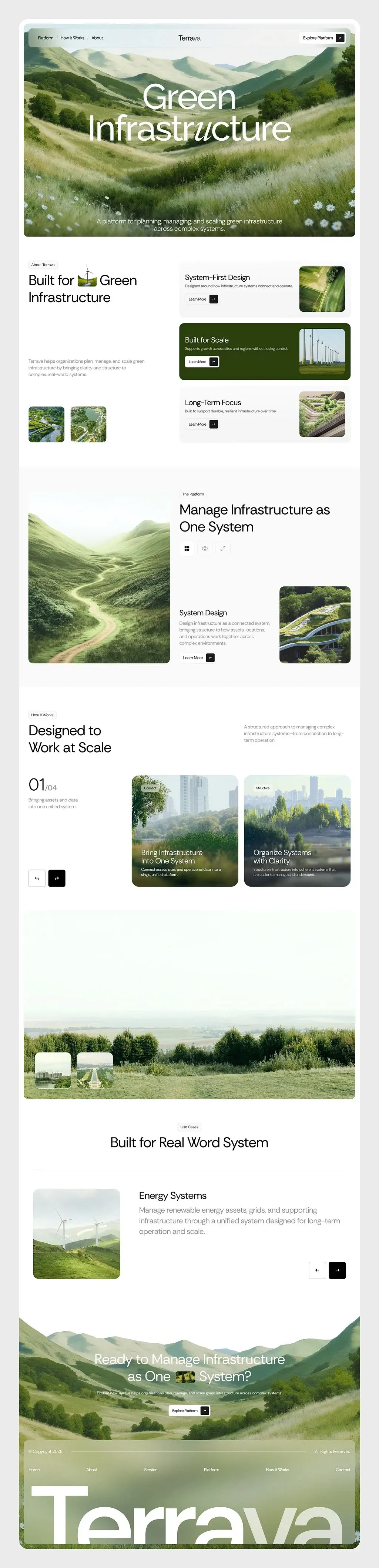
RebuildReference
Move across the image to wipe between the two. Click to lock the seam; arrow keys nudge it.
Imagery
4/4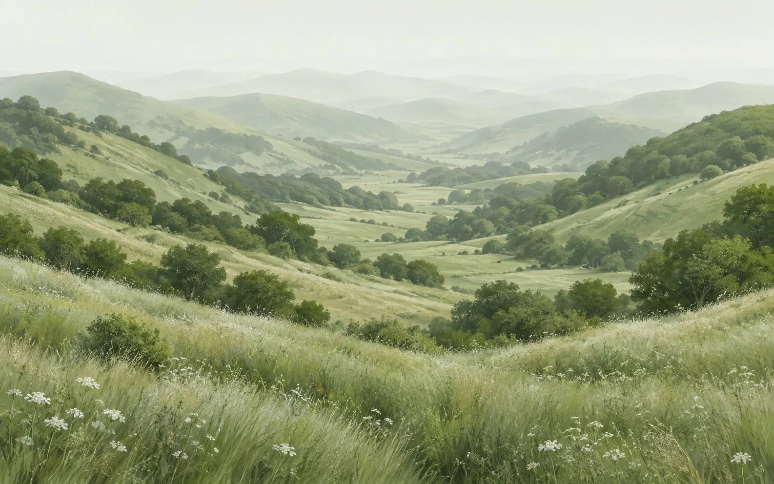
01-hero-valley-meadow
Soft, hazy render of a green valley running between rolling grass hills under flat overcast light, with a white wildflower meadow in the foreground
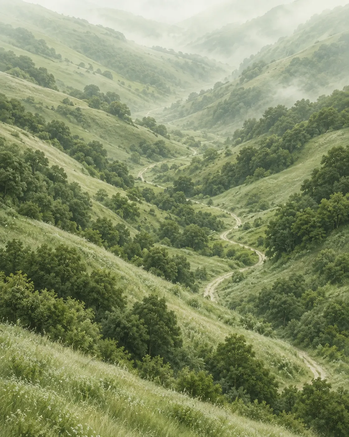
02-platform-portrait-path
Tall render of a narrow footpath winding down through steep green hills with mist collecting in the folds
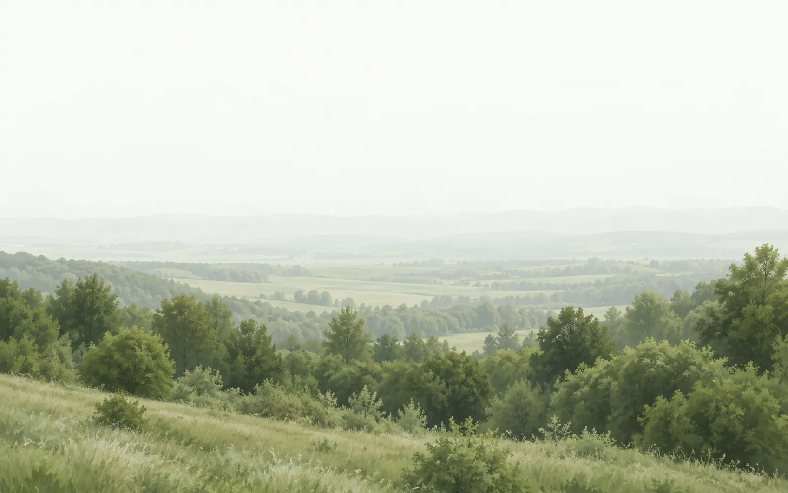
03-landscape-interlude-overlook
Very low contrast render of a hazy overlook, near-white sky over a distant valley with dense trees across the foreground
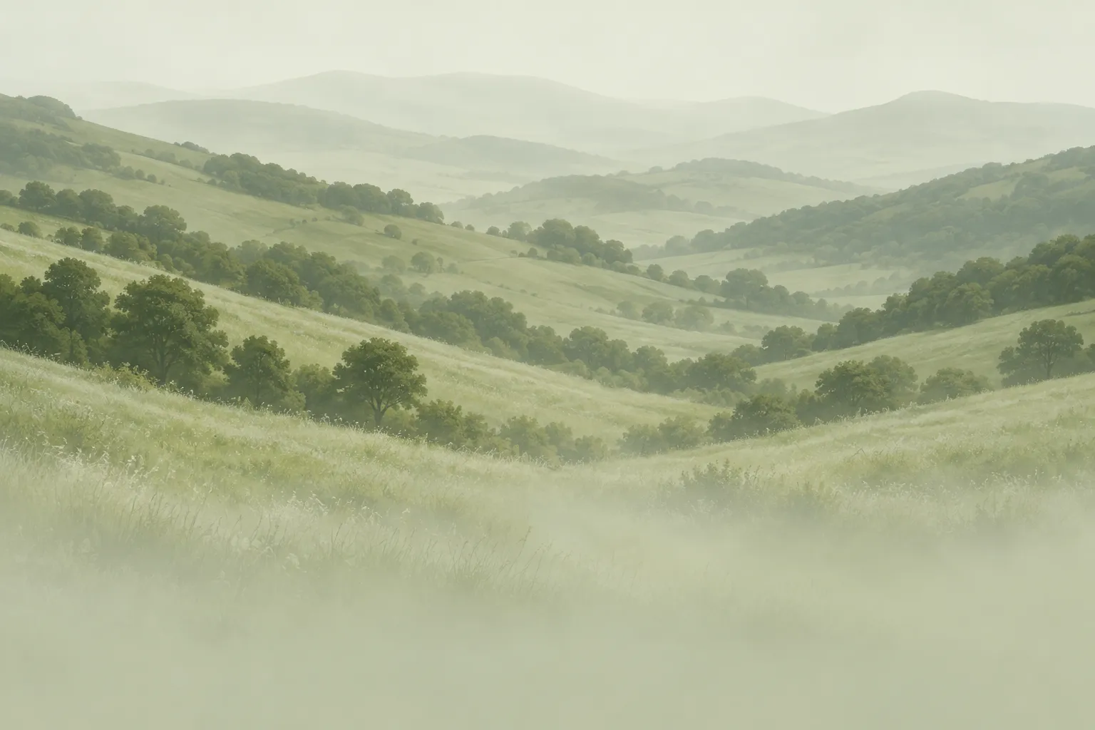
04-cta-footer-layered-hills
Render of green hills receding in pale layers, the lower part washing out into a soft sage haze
Prompts
125,378 chars
# Full-bleed landscape photo landing page

A long, light, photograph-led marketing page: near-white paper, wide photographic panels held inside a small outer gutter with generous corner radii, a single deep-forest accent, and deliberately restrained motion. Nothing bounces, nothing pins. Build at a 1440 × 900 reference viewport.

**Measurement note:** no motion report was supplied with this reference. Every number below is derived from the stills and is therefore **(inferred)** unless stated otherwise; the section heights and offsets are proportional reconstructions from the full-page composite and are accurate to roughly ±3%. Where a value could not be read at all it says "not measured" and gives a range. Do not substitute library parameters (lerp, stiffness, spring) — none were measured.

---

## Structure

**Two gutters, not one.** This is the defining layout rule:

- **Photographic panels** (hero, landscape interlude, CTA/footer) sit at a **28px** gutter — 1384px wide, 24px radius. They are the widest thing on the page.
- **The content grid** sits at a **56px** gutter — a **1320px** container, centred. All text, cards and small images align to this, so they are visibly inset from the photo panels by 28px on each side.
- Inside the 1320px container the recurring split is **576px / 32px gap / 712px** (left / right). Section 4 breaks this for a carousel: a **400px** left rail, 24px gap, then a card track that runs to the container's right edge and clips.
- No section ever centres its text except sections 6 (heading only) and 7.

Sections, top to bottom:

1. **Hero** — full-bleed photo panel, nav overlaid, centred headline, centred sub-line at the foot of the panel.
2. **About + capability cards** — left: eyebrow chip, two-line heading with an inline image chip, paragraph, a pair of square thumbnails. Right: three stacked capability cards, the middle one filled in the accent.
3. **Platform** — a full-width tonal band (the only tinted band on the page). Left: a tall portrait photo. Right: eyebrow, two-line heading, a row of three icon tabs, then a sub-block of heading + paragraph + button with a near-square photo beside it.
4. **How it works** — top row: eyebrow + two-line heading (left), a three-line paragraph (right rail). Below: left rail with a large step numeral, a two-line caption and a prev/next pair; right, a horizontal card carousel of four photo cards, two and a sliver visible.
5. **Landscape interlude** — a single wide photo panel, nothing but two small overlay thumbnails pinned near its bottom-left.
6. **Use cases** — centred eyebrow and one-line heading, a hairline rule, then a row: square-ish photo left, heading + lead paragraph right, prev/next pair at the lower right, closing hairline rule.
7. **CTA** — centred headline with an inline image chip, two-line sub-copy, one button. Sits on a photo panel.
8. **Footer** — shares the *same continuous photo panel* as 7 (one image, not two). Hairline rule, copyright row, a six-link nav row spread edge to edge, then an oversized wordmark filling the container width.

---

## Scroll map

Viewport = 900px. No section pins or stacks; every section consumes exactly its own height.

| # | Section | Height | Viewports | Scroll consumed | Kind |
|---|---|---|---|---|---|
| 1 | Hero | 900px | 1.00 | 900px | scroll-linked (image drift) |
| 2 | About + cards | 930px | 1.03 | 930px | entrance |
| 3 | Platform band | 900px | 1.00 | 900px | entrance |
| 4 | How it works | 840px | 0.93 | 840px | entrance |
| 5 | Landscape interlude | 860px | 0.96 | 860px | scroll-linked (parallax) |
| 6 | Use cases | 900px | 1.00 | 900px | entrance |
| 7 | CTA | 480px | 0.53 | 480px | scroll-linked (parallax, shared panel) |
| 8 | Footer | 460px | 0.51 | 460px | entrance |

Absolute offsets: 1 → 0–900 · 2 → 900–1830 · 3 → 1830–2730 · 4 → 2730–3570 · 5 → 3570–4430 · 6 → 4430–5330 · 7 → 5330–5810 · 8 → 5810–6270.

**Total page height: 6270px ≈ 6.97 viewports.** (inferred)

---

## Spacing

- Page gutter: **28px** for photo panels, **56px** for the content container (1320px).
- Text sections: **120px** top padding, **120px** bottom padding. Section 3's tonal band uses **88px** top and bottom around its contents.
- Between a photo panel and the next section's first element: **112px**. Between section 4's end and the section 5 panel: **32px** — the interlude panel almost touches the block above it, which is what makes it read as a breath rather than a section.
- Vertical rhythm inside a block: eyebrow chip → heading **24px**; heading → paragraph **32px**; paragraph → image or button **48px**; heading → icon row (§3) **40px**.
- Capability cards (§2): **224px** tall each, **24px** gap, **24px** internal padding on all sides. Three cards + two gaps = 720px, which is exactly the height of the left column's content — the two columns end on the same line.
- Square thumbnail pair (§2): **156 × 156** each, **32px** gap.
- Carousel (§4): cards **438 × 464**, **24px** gap, track clipped at the container's right edge.
- Prev/next buttons: **64 × 64**, 14px radius, **8px** apart.
- Button groups: a pill **36px** tall (nav: 40px) with 20px horizontal padding, then **4px**, then a **36 × 36** (nav: 40 × 40) rounded square, 8px radius.
- Nav: top edge **74px** from the page top, row height 40px, left links **28px** apart.
- Use cases (§6): hairline → content **56px**; content → closing hairline **56px**.
- Footer (§8): rule → copyright row **20px**; copyright → nav row **40px**; nav row → wordmark **48px**; wordmark baseline **64px** above the page bottom.

---

## Type

One family throughout: a **neo-grotesk** with slightly narrow, low-contrast letterforms, set light-to-medium and tracked negative at display sizes. Free stand-in: **Inter Tight** (or Instrument Sans). The footer wordmark wants an **extended grotesk** cut — free stand-in **Archivo Expanded 500**.

One exception, and it matters: **a single lowercase letter inside the hero headline is swapped for a contrasting swash italic** (a script/italic serif, free stand-in **Playfair Display Italic** or **EB Garamond Italic**), optically sized to match the x-height of its neighbours. One letter, in one word, once on the page.

| Level | Size | Line-height | Tracking | Weight | Max measure |
|---|---|---|---|---|---|
| H1 (hero) | 104px | 1.18 | −0.035em | 450 | 2 lines, ≈880px |
| H2 (section) | 56px | 1.25 | −0.025em | 450 | 2 lines, ≈640px |
| H2 (CTA, §7) | 52px | 1.20 | −0.025em | 450 | 2 lines, centred, ≈800px |
| H3 (card / sub-block titles) | 24px | 1.30 | −0.01em | 500 | — |
| H3 (§6 use-case title) | 26px | 1.30 | −0.01em | 500 | — |
| Carousel card title | 24px | 1.25 | −0.01em | 500 | 2 lines, ≈340px |
| Step numeral (§4) | 64px | 1.00 | −0.02em | 450 | — ("/04" suffix at 18px, 400) |
| Lead paragraph (§6) | 20px | 1.60 | 0 | 400 | **840px, ≈78 chars** |
| Body | 16px | 1.65 | 0 | 400 | **500px, ≈62 chars** |
| Small body (cards, hero sub, CTA sub) | 13px | 1.50 | 0 | 400 | ≈360px |
| Eyebrow chip | 12px | 1.20 | 0.02em | 450 | sentence case, 2–3 words |
| Button label / footer nav | 13px | 1.00 | 0.01em | 450 | — |
| Meta (copyright row) | 12px | 1.00 | 0.01em | 400 | — |
| Nav wordmark | 20px | 1.00 | −0.01em | 500 | — |
| Footer wordmark | ≈250px | 0.90 | tuned to fill 1320px exactly | 500 | one word |

Eyebrows are **sentence case**, never uppercase.

---

## Colour

| Hex | Role |
|---|---|
| **#FBFCFC** | Base surface. The page background, edge to edge, and the fill of the two non-accent capability cards. Covers the majority of the non-photographic area. |
| **#F2F3F0** (inferred) | The tonal band behind section 3 — the only tinted band on the page. Also the resting fill of secondary buttons. |
| **#D7D9D7** | Line colour. 1px hairlines, card borders, the two rules in section 6, button outlines. Never a fill for anything larger than a button. |
| **#263B09** | **The single accent.** Allowed in exactly four places: the fill of the middle capability card in §2; the small arrow squares attached to every button; the next/advance button in §4 and §6; and the CTA button's arrow square. Nowhere else. |
| **#576827** | Accent support only — the pressed/hover darkening of #263B09 and the tint of the small label chips on the carousel cards. Never a text colour on light surfaces. |
| **#99A578** | The sage that comes out of the photography. Used as a translucent haze over the bottom of the §7/§8 panel (≈35%) and as the tint of the carousel label chips' backgrounds. Not used as a flat block anywhere. |

Text: **#1E2219** for headings and primary text (inferred — near-black with a green cast, never #000), **#767C72** for body and secondary text (inferred — a warm grey, *not* a green tint), **#FFFFFF** for anything sitting on a photograph. On the accent card, the title is #FFFFFF and the sub-line #FFFFFF at 72%.

---

## Surface

- **Radii:** photo panels **24px**; capability and carousel cards **16px**; small thumbnails and inline image chips **10px**; arrow squares **8px**; prev/next buttons **14px**; pills fully rounded.
- **Borders:** 1px **#D7D9D7** on the two light capability cards, on the eyebrow chips, on secondary/prev buttons and on pill buttons. **The accent card has no border.** **Photo panels have no border.**
- **Rules:** 1px #D7D9D7, full container width, two of them, both in §6. One more inside the footer at 1px #FFFFFF at 25%.
- **Shadows: none.** Not on cards, not on buttons, not on images, not on the carousel. Every separation on this page is done with a tonal fill or a hairline. This is the single easiest way to ruin the design.
- Photographs carry a scrim where type sits on them: hero, a top-down #1E2219 gradient from 28% to 0% over the top 45% of the panel plus a 20% flat lift behind the sub-line; carousel cards, a bottom-up #1E2219 gradient from 55% to 0% over the lower 55%; CTA/footer, see Imagery.

---

## Imagery

One photographic family throughout: temperate green hills under overcast light, desaturated, warm-green, high in fine grass and foliage texture, low in contrast, with a painterly softness. No blue skies, no golden hour, no people, no hard shadows.

1. **Hero panel** — 1384 × 866 (≈1.6:1). A broad valley running away between rolling grass hills; a wildflower meadow of small white heads in the near foreground; the far hills fading into pale haze. Flat overcast light. Sits at the 28px gutter, 28px from the page top.
2. **Capability card thumbnails** — three at 230 × 186 (1.24:1), each pinned to the right edge inside its card, vertically centred. Subjects: a close ribbon of green terrain read almost as texture; a line of wind turbines strung along a ridge; a terraced planted roof structure seen from above.
3. **About thumbnail pair** — two at 156 × 156 (1:1), side by side under the §2 paragraph. Aerials: a river bend threading dense vegetation; a planted corridor cutting between built edges.
4. **Platform portrait** — 576 × 714 (0.81:1), left of §3. A footpath winding down through steep green hills, seen from a raised viewpoint, mist collecting in the folds.
5. **Platform sub-block image** — 282 × 290 (≈1:1), right of the §3 sub-block. A vegetated structure — planting spilling over a concrete edge, a green roof meeting a walkway.
6. **Carousel cards** — four at 438 × 464 (0.94:1). Each shows vegetation meeting built infrastructure at middle distance: a park's tree canopy with a city skyline behind it; a treeline with towers rising past it; a planted embankment beside a roadway; a wooded ridge above a settlement. The subject sits high in the frame so the lower third can carry the scrim and the title.
7. **Landscape interlude** — 1384 × 860 (≈1.6:1). A high, hazy overlook: a washed-out near-white sky filling the upper third so the panel dissolves into the page background at its top edge, a distant valley in the middle, dense dark trees across the lower half. The lowest-contrast image on the page and intentionally so.
8. **Interlude overlay thumbnails** — two at 166 × 140, side by side, 24px apart, pinned 40px from the panel's left edge and 40px from its bottom. Tight crops from the same family: a pale building among trees; a light structure standing in an open field.
9. **Use-case image** — 344 × 320 (≈1.08:1), left of §6. Wind turbines standing on a green hillside, the blades cropped by the frame's top.
10. **CTA + footer panel** — 1384 × 940 (≈1.47:1), one continuous image spanning sections 7 and 8. Hills receding in layers, the same valley language as the hero. A sage haze (#99A578, ≈35%) rises from the bottom edge across the lower 45% so the footer's white type and the oversized wordmark read as tonal and low-contrast rather than as hard white. The panel's bottom corners are square; it terminates at the page bottom.
11. **Inline headline chips** — two, ≈64 × 34 (1.9:1), 10px radius, set inline *inside* a headline, baseline-aligned with the cap height, 8px of space each side. One in the §2 heading, one in the §7 heading. Each is a horizontal sliver from the same photographic family — a strip of hillside, a row of turbines — cropped so it reads as a texture swatch, not a picture.

---

## Motion

Restrained by design. Two scroll-linked parallaxes, short single-play entrances everywhere else, no pinning, no stacking, no scroll-jacking. Durations and easings below were **not measured**; use the stated ranges.

### 1 — Hero
- **kind** — scroll-linked (reverses on the way back up)
- **what moves** — the hero photograph inside its panel; the nav, headline and sub-line do not move
- **from → to** — photo `translateY: 0 → −60px` and `scale: 1.06 → 1.06` (pre-scaled so the drift never exposes an edge); panel and text hold at `opacity: 1`
- **range** — from page scroll 0 until the panel's bottom edge reaches the viewport top (0 → 900px of scroll); linear against scroll (inferred)
- **reduced motion** — photo fixed at `translateY: 0`, `scale: 1`

### 2 — About + capability cards
- **kind** — entrance, plays once
- **what moves** — left column (eyebrow chip, heading, paragraph, thumbnail pair) and the three capability cards
- **from → to** — `opacity: 0 → 1`, `translateY: 24px → 0`
- **range** — triggers once when each group's top reaches 80% of the viewport height. Duration 500–700ms, easing a soft ease-out (cubic-bezier ≈ 0.22, 1, 0.36, 1) — not measured. Stagger 80–110ms, applied in two independent chains: left column top-to-bottom, then the three cards top-to-bottom. The cards do not wait for the left column.
- **reduced motion** — all elements render at final state, no translate

### 3 — Platform band
- **kind** — entrance, plays once
- **what moves** — the portrait photo, and the right column (eyebrow, heading, icon row, sub-block)
- **from → to** — portrait `opacity: 0 → 1` with `clip-path: inset(0 0 12% 0) → inset(0 0 0 0)` (a short reveal from the bottom edge, no translate); right column `opacity: 0 → 1`, `translateY: 20px → 0`
- **range** — triggers once when the band's top reaches 80% of the viewport height. Duration 600–800ms for the photo reveal, 450–600ms for the text; easing ease-out — not measured. Right-column stagger 70–100ms. The tonal band itself does not fade in; it is painted at full opacity from the start.
- **reduced motion** — photo at full clip, text at final position

### 4 — How it works
- **kind** — entrance, plays once (the carousel itself is interaction-driven, not scroll-driven)
- **what moves** — heading block, right paragraph, step numeral + caption, prev/next pair, and the carousel cards
- **from → to** — text groups `opacity: 0 → 1`, `translateY: 24px → 0`; carousel cards `opacity: 0 → 1`, `translateX: 32px → 0` (they arrive from the right, in the direction the track runs)
- **range** — triggers once when the section's top reaches 80% of the viewport height. Duration 500–700ms, ease-out — not measured. Stagger 90–120ms, cards last.
- **reduced motion** — everything at final state; the track still scrolls on click, but instantly rather than animated

### 5 — Landscape interlude
- **kind** — scroll-linked (reverses)
- **what moves** — the photograph inside the panel, and the two overlay thumbnails
- **from → to** — photo `translateY: −50px → 50px` (pre-scaled to 1.12 so no edge shows); overlay thumbnails `translateY: 30px → −30px` — they counter-move against the photo, which is the whole point of the section
- **range** — from the panel's top edge entering the viewport bottom until its bottom edge leaves the viewport top; linear against scroll (inferred)
- **reduced motion** — photo and thumbnails fixed at `translateY: 0`

### 6 — Use cases
- **kind** — entrance, plays once
- **what moves** — centred eyebrow and heading, both hairline rules, the photo, the text column, the prev/next pair
- **from → to** — eyebrow and heading `opacity: 0 → 1`, `translateY: 16px → 0`; hairline rules `transform: scaleX(0) → scaleX(1)` from the left origin; photo and text column `opacity: 0 → 1`, `translateY: 24px → 0`
- **range** — triggers once when the section's top reaches 80% of the viewport height. Rule draw 700–900ms, everything else 500–700ms; ease-out — not measured. Stagger 80–110ms in reading order: eyebrow, heading, rule, photo, text, buttons.
- **reduced motion** — rules render at full width, no scaleX; everything else at final state

### 7 — CTA
- **kind** — scroll-linked for the background, entrance for the contents
- **what moves** — the shared §7/§8 photograph drifts; the headline, sub-copy and button enter
- **from → to** — photo `translateY: −40px → 40px` at `scale: 1.1`, scroll-linked and reversing; contents `opacity: 0 → 1`, `translateY: 20px → 0`, once
- **range** — parallax runs from the panel's top edge entering the viewport bottom until the page bottom is reached. The entrance triggers once when the headline's top reaches 80% of the viewport height; duration 500–700ms, ease-out — not measured; stagger 90ms across headline → sub-copy → button.
- **reduced motion** — photo fixed, contents at final state

### 8 — Footer
- **kind** — entrance, plays once
- **what moves** — the hairline rule, the copyright row, the nav row, the wordmark
- **from → to** — rule `scaleX(0) → scaleX(1)` from the left; copyright and nav rows `opacity: 0 → 1`, `translateY: 12px → 0`; wordmark `opacity: 0 → 1`, `translateY: 40px → 0` (it rises further than anything else on the page)
- **range** — triggers once when the footer's top reaches 90% of the viewport height — late, because it is at the page bottom. Rule 600–800ms; rows 400–600ms; wordmark 800–1000ms with a slower ease-out — not measured. Stagger 100ms, wordmark last. The wordmark does **not** track scroll and does **not** scale.
- **reduced motion** — rule at full width, all text at final state

### Interaction transitions (not part of the scroll choreography)

- **Pill button hover** — background #FBFCFC → #F2F3F0, border #D7D9D7 → #C6C9C5; 150ms ease-out. The attached arrow square goes #263B09 → #576827 and its arrow glyph translates 2px right and 2px up.
- **Accent card hover** — fill #263B09 → #1D2E07; 200ms. No lift, no shadow, no scale.
- **Light card hover** — border #D7D9D7 → #B9BDB6 only; 150ms. The card does not move.
- **Prev/next hover** — the light (prev) button's border darkens to #B9BDB6; the dark (next) button goes #263B09 → #576827. Disabled state: 40% opacity, no pointer events.
- **Press (all buttons)** — `scale: 0.97`, 90ms; releases on pointer-up.
- **Carousel advance** — the track translates by card width + gap (462px) over 450–600ms, ease-out. Manual only: click the arrows or drag. The step numeral cross-fades (`01` → `02`) over 200ms; the caption cross-fades with it. Never auto-advances.
- **Platform icon tabs (§3)** — clicking an icon swaps the sub-block: outgoing content `opacity: 1 → 0` over 150ms, incoming `opacity: 0 → 1`, `translateY: 8px → 0` over 250ms. The active icon sits at #1E2219, inactive at #767C72; 150ms.
- **Nav / footer links hover** — underline draws in from the left over 200ms; colour unchanged.
- **Image hover** — none. Photographs do not zoom, brighten, or tilt on hover anywhere on this page.

---

## Responsive (below 640px)

- Content container padding **20px**; photo panels drop to a **12px** gutter and **16px** radius. The two-gutter distinction mostly collapses but is still visible.
- Section padding **72px** top and bottom.
- Hero panel height **620px**; H1 → **44px / 1.08 / −0.03em**; the swash italic letter stays. Sub-line 13px, two lines, still at the foot of the panel.
- Nav: left links hidden behind a hamburger; layout becomes wordmark left, hamburger + arrow square right. The button pill's text label is dropped, the 40 × 40 arrow square remains.
- H2 → **32px / 1.2**; lead paragraph → **17px / 1.6**; step numeral → **44px**.
- All 576/712 splits stack to one column: §2 left column then the three cards; §3 photo above text; §6 photo above text. Column gap becomes a 40px vertical gap.
- Capability cards go full width, height auto (min 168px), image shrinks to 112 × 96 and stays right-aligned.
- Thumbnail pair stays **side by side** at 1:1, gap 12px — do not stack these.
- Carousel cards **78vw** wide with a 22vw peek of the next card, scroll-snap on the track, 16px gap. Prev/next move below the track, left-aligned, 48 × 48. The step numeral sits above the track.
- §3 icon row stays a single horizontal row at 22px icons, 20px apart.
- **Dropped below 640px:** the two overlay thumbnails on the landscape interlude (§5) — the panel becomes a bare image at 420px tall; the peeking third carousel card's shadow of a fourth; and the inline headline chips shrink to 40 × 22 (drop them entirely if they force a line break at three words or fewer).
- Footer: nav row becomes a two-column list, 16px row gap, left-aligned. The wordmark still fills the container width (≈62px at 320px of container) and keeps its baseline 32px above the page bottom.
- Parallax ranges halve (§1 photo drift −30px; §5 ±25px; §7 ±20px); entrances keep their triggers and durations.

---

## Don'ts

- **Don't reintroduce the presentation mat.** The page background is #FBFCFC edge to edge. There is no outer frame, no grey sheet behind the layout, no max-width wrapper with a visible colour behind it, and the page's own corners are square.
- **Don't add a single shadow.** No `box-shadow` on cards, buttons, images, the carousel, or the nav — not even a 1px hairline shadow "for depth". Hairlines and tonal fills do all the work here, and a shadow instantly makes it look like a template.
- **Don't bold the headlines.** They are weight 450 with −0.025 to −0.035em tracking. Setting them 600 or 700 destroys the whole voice of the page.
- **Don't let the accent green touch type.** #263B09 is a fill colour for one card, the arrow squares and the CTA button. Headings, links, eyebrows, icons and body text never take it. There are no green links.
- **Don't add a dark section.** One card is dark. The footer is not dark — it is a photograph with a sage haze. Resist the reflex to close a light page with a dark footer block.
- **Don't split sections 7 and 8 into two images.** It is one continuous photograph; a seam between the CTA and the footer is the most visible way to get this wrong.
- **Don't make the nav sticky,** and don't have it condense into a floating pill on scroll. It sits over the hero and scrolls away with it.
- **Don't parallax everything.** Exactly three panels drift (§1, §5, §7). Cards, text and thumbnails never track scroll — they enter once and stay put.
- **Don't re-trigger entrances.** They play once on first arrival and do not replay when scrolling back up. Anything that re-fades on every pass reads as cheap here.
- **Don't uppercase the eyebrows** or track them out to +0.15em. They are 12px sentence case inside a hairline pill.
- **Don't use an italic of the body grotesk** for the hero's swash letter. It must be a contrasting script or italic serif, one lowercase letter only, mid-word. Two swash letters is one too many.
- **Don't round the images to pills or circles.** 24px on panels, 16px on cards, 10px on chips. And don't put a border on a photograph.
- **Don't tint the body copy green.** It is a warm grey (#767C72). Green body text on a green-photo page turns to mud.
- **Don't reach for pure #000 or #FFF on light surfaces.** Headings are #1E2219. White is reserved for type sitting on photographs.
- **Don't auto-advance either carousel,** and don't add dot indicators — the `01/04` numeral is the position indicator.
- **Don't break the photographic family.** Every image is overcast, desaturated, temperate green, no people, no blue sky, no sunset. A single saturated or sunlit stock photo will read as a foreign object.
- **Don't centre the body text.** Only the §6 eyebrow and heading and the whole of §7 are centred; everything else is left-aligned, including all card copy.
- **Don't add section dividers.** There are exactly two hairline rules on the whole page, both in §6, plus one white rule in the footer.
- **Don't add gradients as decoration, glass/blur panels, a scroll progress bar, a custom cursor, a marquee, or a noise overlay.** None of these exist here, and each one is a default that would flatten the restraint the design depends on.
- **Don't shrink the footer wordmark to a "reasonable" size.** It fills the container width at ≈250px. It being almost absurdly large, low-contrast and tonal is the intended ending.
Versions
1Each rebuild is kept. The live one is what the comparison shows. LiveOpus 5.5Extra highfrontend-designemil-design-engtransitions-devhumanizergsaplast month · 61s · 4 images · 20260917T184530ZOpen