The Social Club — Events landing page
Rebuild
Opus 5.5Highfrontend-designemil-design-engtransitions-devgsaphumanizerView
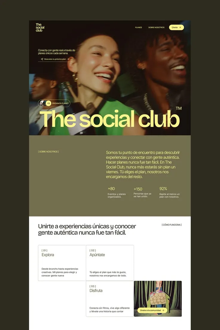
RebuildReference
Move across the image to wipe between the two. Click to lock the seam; arrow keys nudge it.
Imagery
2/2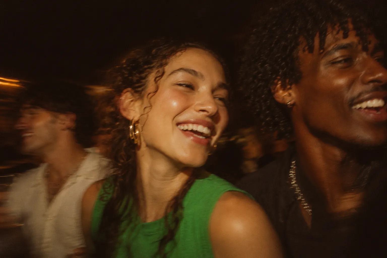
01-hero-flash-party
Three friends laughing together at a night party, caught in warm on-camera flash with motion blur
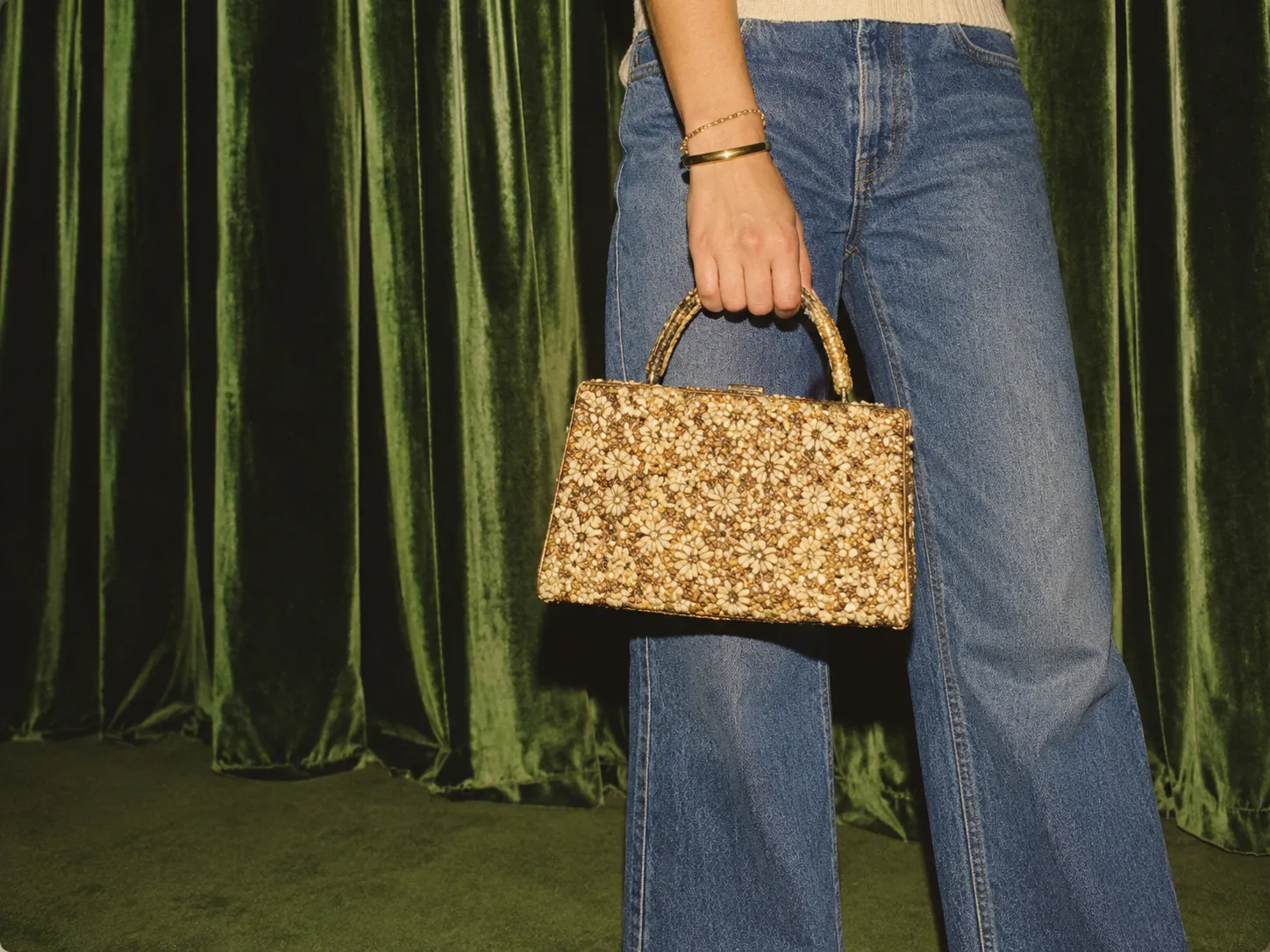
02-photo-card-handbag
Flash-lit detail of a person holding a beaded woven handbag in front of a pleated green velvet curtain
Prompts
113,475 chars
# Events club landing page: full-bleed photo hero, olive about band, staircase steps grid

Build a three-section landing page for a social-events community. It should feel like a printed editorial: a big night-flash photo with an oversized pale-lemon wordmark headline, then a flat olive band with a large paragraph and three stats, then a white "how it works" section where three numbered cards and one photo card step diagonally across a 3-column grid. Use a single grotesk family throughout. Bracketed uppercase labels like `[ LABEL ]` act as section markers. Nothing has shadows or gradients except the photo scrim. Motion is restrained.

Design width is 1440px. Pages edges are flat: no outer margin, no rounded page corners.

## Structure

- **Content container:** 1280px wide, with an 80px gutter each side at 1440.
- **Nav row:** sits slightly wider, at 64px from each edge.
- **Grid:** 12 columns, 0 gutter, inside the container. Section 3 uses 3 equal columns of ~426.67px with no gap.

Sections, top to bottom:

1. **Hero.** Full-bleed photograph with the nav overlaid at the top.
   - Small intro block, upper left.
   - Pill badge and a giant one-line headline at the bottom left.
2. **About and stats band.** Flat olive background, two columns:
   - Left: bracketed label at column 1.
   - Right: a large paragraph starting at ~x 688px (column 7), with a row of three stats below it.
3. **How it works.** White background.
   - Two-line heading on the left, bracketed label on the right.
   - A staircase grid of 3 numbered step cards and 1 photo card with a CTA.
   - The page ends here, with no footer in the reference.

## Scroll map

Reference viewport is 1440×900.

1. Hero: 1020px, 1.13 vh. Consumes 1020px. Entrance on load, plus a subtle scroll-linked photo drift (inferred).
2. About and stats band: 720px, 0.80 vh. Consumes 720px. Entrance.
3. How it works: 1012px, 1.12 vh. Consumes 1012px. Entrance.

Nothing pins or stacks. **Total page height ≈ 2752px (≈3.06 viewports).**

## Spacing

All values are at 1440, on an 8px base.

**1. Hero**
- Nav: top padding 40px, side padding 64px. The logo top aligns with the CTA top.
- Nav links: 56px apart; 40px between the last link and the CTA pill.
- Intro block: top edge ~250px from the page top, left edge at 80px, ~340px wide.
- Inside the intro block: intro text, then 20px, then the text link. A 1px hairline runs under the link the full block width, 8px below the link text.
- Pill badge: bottom edge 28px above the headline's cap top. Its left edge sits at 80px.
- Headline: left edge ~96px (optically inset ~16px from the badge). Its baseline sits ~64–72px above the section bottom.

**2. About and stats band**
- Padding: 144px top, 160px bottom.
- Left column holds only the label, top-aligned with the first paragraph line.
- Paragraph: starts at x ≈ 688px, max width ~660px.
- Paragraph to stats row: 72px.
- Stats row: 3 columns of ~230px each, inset 16px from the paragraph's left edge. Inside each stat, number then 12px then caption.

**3. How it works**
- Padding: 64px top, 120px bottom.
- Heading: max width ~880px. The label is right-aligned to the container edge and top-aligned with the heading.
- Heading bottom to grid top: 88px.
- Grid rows are 316px tall. Cards share 1px borders; there is no gap.
- Card padding: 32px on all sides.

**Rhythm:** sections butt against each other with colour changes, not dividers or white space. Inner padding is generous at the top of the olive band (144px) and tight at the top of the white section (64px). That asymmetry is intentional.

## Type

The only family is a neo-grotesk with tight display tracking. Free stand-in: **Inter Tight**, or Inter with display optical sizing. It is not geometric, not a serif, not a mono. **Body anchor is 17px.**

| Level | Size | Line-height | Letter-spacing | Weight | Notes |
|---|---|---|---|---|---|
| Hero display headline | 12.25× → 208px | 0.88 | −0.055em | 500 | One line, spans ~1240px; pale lemon |
| Trademark-style superscript | 1.5× → 26px | 1 | 0 | 400 | Top-right of the headline, cream/white |
| About paragraph | 1.9× → 32px | 1.3 | −0.015em | 400 | Max ~40ch (660px), 6 lines |
| Section heading (sec. 3) | 3× → 51px | 1.12 | −0.025em | 400 | 2 lines, max ~42ch per line |
| Stat number | 1.6× → 28px | 1.1 | −0.02em | 400 | Leading "+" or trailing "%" |
| Card title | 1.5× → 26px | 1.15 | −0.02em | 400 | Olive colour |
| Hero intro text | 1.1× → 19px | 1.35 | −0.01em | 400 | 2 lines, max ~34ch |
| Body / card text | 1× → 17px (16px allowed in cards) | 1.5 | 0 | 400 | Max ~34ch in cards |
| Stat caption | 0.85× → 14px | 1.4 | 0 | 400 | 2 lines, max ~22ch |
| Nav links | 0.82× → 14px | 1 | +0.04em | 500 | UPPERCASE |
| Buttons (pills) | 0.88× → 15px | 1 | 0 | 500 | Sentence case, followed by an arrow → |
| Text link (hero) | 0.82× → 14px | 1 | 0 | 400 | Small sparkle/asterisk glyph before it, arrow after |
| Bracket labels `[ LABEL ]` | 0.75× → 12–13px | 1 | +0.06em | 400 | UPPERCASE, spaces inside the brackets |
| Step index `[ 01 ]` | 0.75× → 13px | 1 | +0.04em | 400 | Same style as the labels |
| Badge label | 0.72× → 12px | 1 | +0.06em | 500 | UPPERCASE |
| Logo wordmark | 1.3× → 22px | 0.95 | −0.03em | 600 | 3 stacked short lowercase lines, 1 word each |

All weights are 400–500. Nothing is bold; the display size alone carries the hierarchy.

## Colour

- **#1A120D (near-black brown):** text on white, card text, button text on lemon pills. Also the scrim tint over the hero photo.
- **#FEFEFE (white):** surface of section 3 and the card backgrounds.
- **#736F4E (olive):** the full surface of section 2 and the step card titles. It is the page's "middle" colour.
- **#FDFC96 (pale lemon): the single accent.** Allowed only in these places:
  - The hero headline.
  - Nav links.
  - Pill CTA fills (nav CTA, photo-card CTA, the badge's "+N" circle).
  - All text on the olive band (paragraph, label, numbers).
  - Never on white backgrounds as text.
- **#65361B (burnt brown):** lives only inside the photography (warm skin and shadow tones). Use it as the image placeholder fill while photos load. It is never used for UI.
- **Supporting tints derived from the palette:**
  - Card borders: 1px #E4E2DA (warm light grey).
  - Hero hairlines and badge outline: rgba(254,254,254,0.45).
  - Stat captions on olive: #FEFEFE at 85%.

## Surface

- **Borders:** 1px everywhere.
  - Step cards: #E4E2DA. Adjacent cards share one border, so it is never doubled.
  - Hero pill badge: translucent white.
- **Radii:**
  - Step cards and photo card: 4px.
  - Pills (nav CTA, badge, photo CTA): 999px.
  - Avatars and the "+N" circle: 50%.
  - Sections and the hero image: 0.
- **Shadows:** none, anywhere.
- **Hero scrim:**
  - Top gradient: rgba(26,18,13,0.6) → transparent across the top 40%, for nav and intro legibility.
  - Light bottom gradient: rgba(26,18,13,0.25) → transparent across the bottom 30%, behind the headline.

## Imagery

1. **Hero photo (section 1):** full-bleed, 1440×1020 (~1.41:1), `object-fit: cover`, focal point upper-centre.
   - Candid on-camera-flash night shot of three young adults laughing at a party.
   - Shallow depth, motion blur on the edges, and a heavy warm cast: amber skin, deep brown shadows, one saturated green garment.
   - Film grain. It should feel candid, not posed.
2. **Pill badge avatars (section 1):** two overlapping 32px circular face crops, overlapped by 10px. They are followed by a 32px lemon circle holding "+N" in 11–12px dark text, then the uppercase badge label.
3. **Photo card (section 3, row 2 / column 3):** ~426×316 (~4:3), 4px radius.
   - Flash-lit fashion detail: a figure cropped from waist to knee, holding a patterned beaded or woven handbag.
   - Behind it, a pleated olive-green velvet curtain.
   - Retro and slightly kitsch, with saturated greens matching the olive band.
   - A lemon CTA pill sits inside, 32px from the bottom-left corner.

## Motion

No motion report was supplied, so everything below is inferred from the "restrained motion" characteristic. Durations and easings are **not measured**; ranges are given instead.

**1. Hero**
- **kind:** entrance on load. Optional scroll-linked photo drift (inferred).
- **what moves:**
  - Hero photo.
  - Nav row.
  - Intro block.
  - Pill badge.
  - Display headline.
- **from → to:**
  - Photo: scale 1.06 → 1, opacity 0 → 1.
  - Nav and intro block: opacity 0 → 1, translateY 12px → 0.
  - Badge: opacity 0 → 1, translateY 16px → 0.
  - Headline: revealed line-masked, translateY 100% → 0 inside an `overflow: hidden` wrapper.
  - Drift (scroll-linked, reverses on scroll up): photo translateY 0 → 80px while the hero scrolls from top-at-viewport-top until its bottom reaches the viewport top.
- **range:**
  - Plays once on page load.
  - Photo: 900–1400ms, ease-out (inferred, not measured).
  - Text: 500–800ms, cubic-bezier(0.2,0.7,0.2,1)-like ease-out. Stagger 60–100ms in the order nav → intro → badge → headline.
- **reduced motion:**
  - Everything appears at its final state.
  - The photo drift is disabled.

**2. About and stats band**
- **kind:** entrance.
- **what moves:**
  - Label.
  - Paragraph.
  - The three stats.
- **from → to:** opacity 0 → 1, translateY 24px → 0.
- **range:**
  - Plays once, when the paragraph's top reaches 80% of the viewport.
  - 500–700ms ease-out.
  - Stats stagger 80–120ms left to right.
  - Optional: numbers count up from 0 over 800–1200ms (inferred).
- **reduced motion:**
  - Static and fully visible.
  - Numbers show their final values.

**3. How it works**
- **kind:** entrance.
- **what moves:**
  - Heading and label.
  - The four grid cells.
- **from → to:**
  - Heading and label: opacity 0 → 1, translateY 20px → 0.
  - Cells: opacity 0 → 1, translateY 24px → 0.
- **range:**
  - Plays once, when each element's top reaches 80% of the viewport.
  - 500–700ms ease-out.
  - Cells stagger 80–120ms in reading order: 01 → 02 → 03 → photo card.
- **reduced motion:** static and fully visible.

**Interaction transitions** (not part of the scroll choreography):
- **Lemon pills:**
  - Hover: background darkens slightly to #F4F27A and the arrow nudges 3px right. 150–200ms ease-out.
  - Press: scale 0.98.
- **Nav links:** hover fades opacity 1 → 0.7, or a 1px underline grows from left. 150ms.
- **Hero text link:** on hover, the hairline under it goes from 45% to 100% white and the arrow shifts 3px right.
- **Step cards:** hover changes the border to #736F4E. 200ms. No lift, no shadow.
- **Photo card:** hover scales the image 1 → 1.03 inside its clip. 400–600ms ease-out.

## Responsive (below 640px)

- **Gutter:** 20px everywhere, nav included.
- **Nav:** text links are dropped. The logo and lemon CTA pill stay; a minimal menu trigger is optional.
- **Hero:**
  - Height becomes 100svh, minimum 640px.
  - Intro block stays top-left at full width.
  - Headline scales with the viewport (≈17–18vw, so ~64–70px) and may wrap to two lines ("first two words / last word"), line-height 0.9.
  - Badge sits above it.
- **About and stats band:**
  - Label stacks above the paragraph.
  - Paragraph drops to 22px / 1.35.
  - Padding becomes 80px top and 96px bottom.
  - Stats become a single column, each separated by a 1px rgba(253,252,150,0.3) hairline with 20px vertical padding.
- **How it works:**
  - Heading drops to 30px / 1.15; the label moves above it.
  - The staircase collapses to one column in the order 01, 02, 03, photo card.
  - Each card is a full-width cell with auto height (min 220px). Cards still share 1px borders.
  - Photo card keeps 4:3.

## Don'ts

- **Don't** draw the dark #2E2C1F presentation mat, an outer margin, a rounded page frame or a drop shadow around the page. The page is edge-to-edge.
- **Don't** make the hero headline bold, centred, or wrapped at desktop. It is one weight-500 line in pale lemon, nearly the full container width, tightly tracked and sitting low in the hero.
- **Don't** use the lemon accent as text on white, or add a second accent colour (no blue links, no green success states). Olive and lemon do all the work.
- **Don't** lay the steps out as a neat 3-up row of equal cards with gaps and shadows. They are a zero-gap staircase:
  - Row 1: card 01 in column 1, card 02 in column 2, column 3 empty.
  - Row 2: column 1 empty, card 03 in column 2, photo card in column 3.
  - The empty cells are part of the design.
- **Don't** put icons, emoji or illustrations in the step cards. Each card is just `[ 0N ]`, an olive title and bottom-anchored body text, with empty space in between.
- **Don't** centre-align anything except the contents of the pills and badge. Everything is left-aligned except the right-aligned section-3 label.
- **Don't** use stock-bright, evenly lit photography. Images must be flash-lit, warm, grainy, candid and slightly blurred.
- **Don't** add card shadows, glassmorphism, gradient buttons or rounded corners larger than 4px on rectangles.
- **Don't** add dividers, coloured section seams or extra white space between sections. The colour change is the divider.
- **Don't** set the about paragraph at body size. It is a 32px statement, and the stats under it are smaller than it, not bigger.
- **Don't** reach for a geometric sans (Poppins, Montserrat) or a serif display. It is one neo-grotesk family at regular/medium weights.
- **Don't** add parallax layers, marquee tickers, cursor followers or pinned scroll sequences. Motion is a few gentle entrances and, at most, one slow photo drift.
Versions
1Each rebuild is kept. The live one is what the comparison shows. LiveOpus 5.5Highfrontend-designemil-design-engtransitions-devgsaphumanizerlast week · 182s · 2 images · 20261011T215700ZOpen