Tilestone — Real estate homepage
Rebuild
Opus 5.5Extra highfrontend-designemil-design-engtransitions-devhumanizergsapView
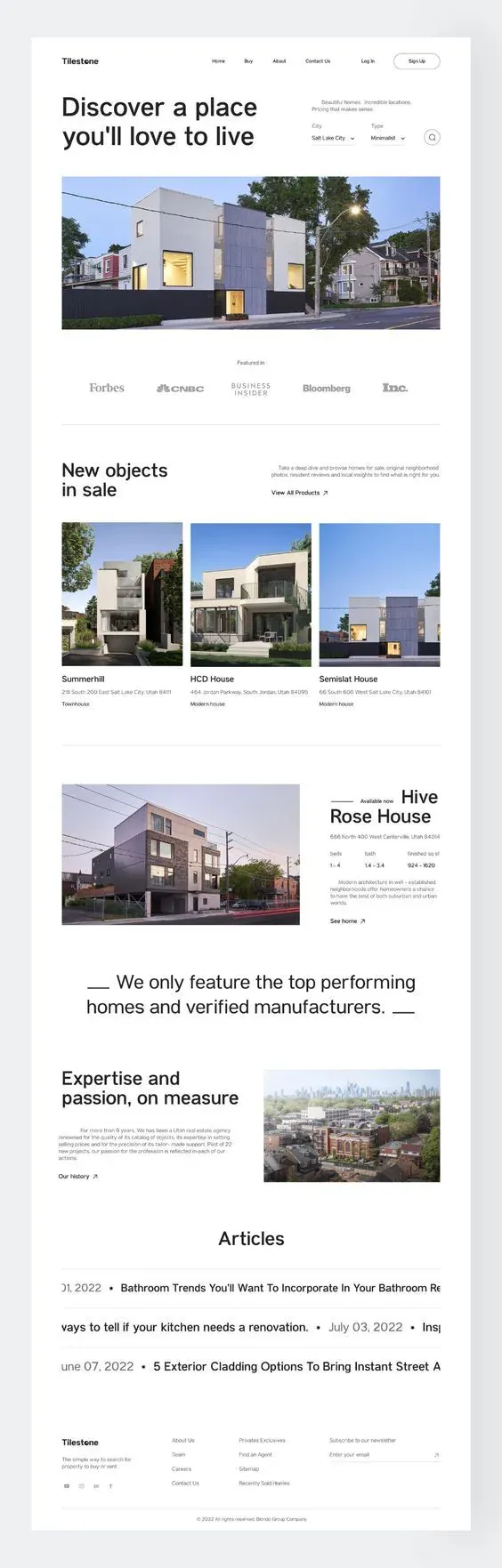
RebuildReference
Move across the image to wipe between the two. Click to lock the seam; arrow keys nudge it.
Imagery
4/4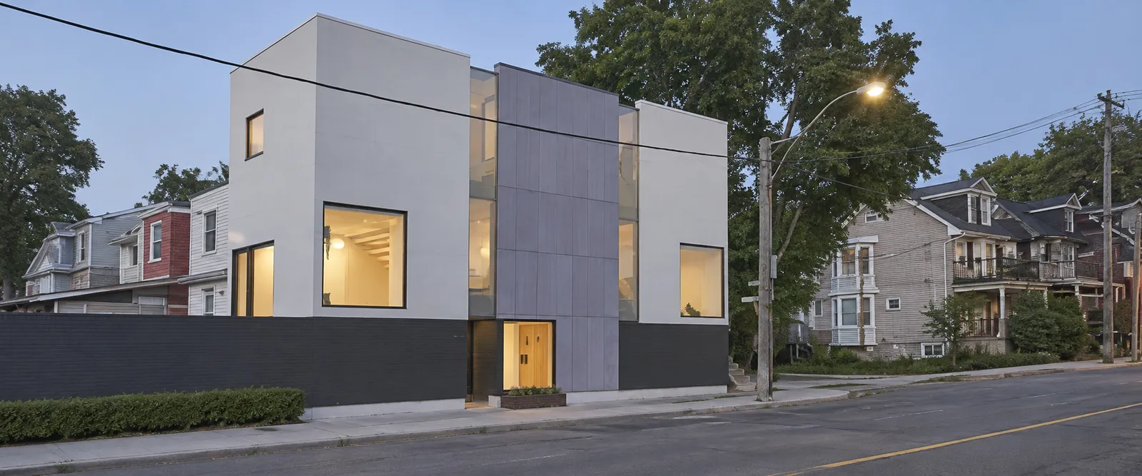
01-hero-blue-hour-street
Blue-hour street view of a boxy modern multi-unit house with warm-lit windows beside older pitched-roof neighbours
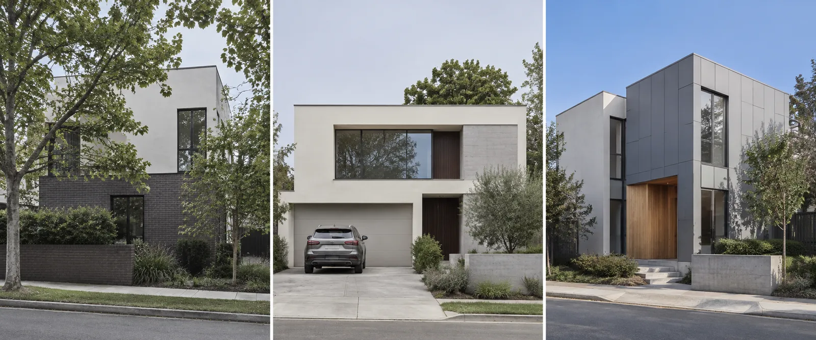
02-catalogue-card-triptych
Three modern houses photographed as separate exteriors: a dark-brick and white cube behind trees, a cream stucco house with recessed glazing, and a grey-panelled house with a glowing timber entry
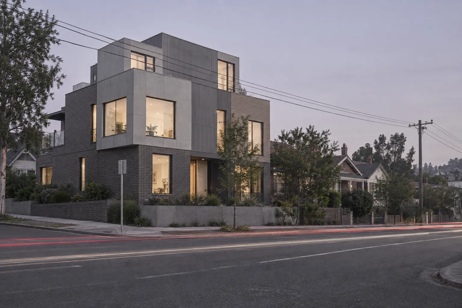
03-featured-listing-dusk-light-trails
Corner-lot modern house at dusk with red and white vehicle light trails streaking across the road in front of it
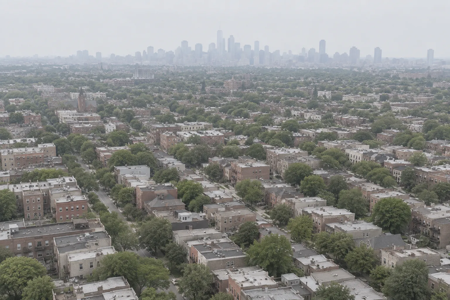
04-about-aerial-neighbourhood
High aerial over a low-rise brick neighbourhood with a hazy downtown skyline on the horizon
Prompts
121,558 chars
# Light editorial real-estate homepage — rebuild prompt

A near-white, hairline-ruled listings homepage for property search. Full-bleed page: the layout runs edge to edge in the viewport, has no outer margin, no page-level rounded corners and nothing behind it. One typeface, one accent, zero shadows, zero rounded images.

> **Measurement note:** no motion capture was supplied for this reference. All geometry and type below is read off a single full-page still and is marked **(inferred)** where it is a reconstruction. Every timing, easing and stagger in the Motion section is **not measured** — ranges are given, and they must be treated as ranges. Do not invent lerp/stiffness/spring values; none were measured.

## 1. Structure

Design viewport: **1440 × 900**. Page background `#FDFDFD` edge to edge — no section ever changes background colour.

- Content container: **1280px**, centred → **80px** gutters at 1440. (inferred)
- Grid: **12 columns, 24px gutter**, column = 84.67px. Two sections override the grid with their own tracks (see 4 and 5).
- Everything is left-aligned to the container except sections 6 and 8, which are centred, and the right column of section 5, which is right-aligned.

Sections, top to bottom (these numbers are used in every section below):

1. **Header / nav bar** — sticky
2. **Hero** — split headline + search, then a wide inset photograph
3. **Logo wall** — "Featured in" + 5 wordmarks, closed by a full-width hairline
4. **Catalogue** — "New objects in sale" + 3 property cards, closed by a full-width hairline
5. **Featured listing** — photograph left, right-aligned detail column right
6. **Statement** — centred two-line pull quote flanked by short rules
7. **About** — heading + narrow right-aligned paragraph + link, photograph right
8. **Articles** — centred heading + 3 full-bleed clipped headline rows separated by hairlines
9. **Footer** — brand column + 3 link columns + newsletter, then a centred legal bar

## 2. Scroll map

At 900px viewport height. Nothing pins, nothing stacks: scroll consumed equals height for every section. (all inferred)

| # | Section | Height | Viewports | Scroll consumed | Kind |
|---|---|---|---|---|---|
| 1 | Header | 96px | 0.11 | 96px (sticky, adds none) | static |
| 2 | Hero | 880px | 0.98 | 880px | entrance + scroll-linked image |
| 3 | Logo wall | 320px | 0.36 | 320px | entrance |
| 4 | Catalogue | 1080px | 1.20 | 1080px | entrance (staggered) |
| 5 | Featured listing | 760px | 0.84 | 760px | entrance + scroll-linked image |
| 6 | Statement | 320px | 0.36 | 320px | entrance |
| 7 | About | 560px | 0.62 | 560px | entrance |
| 8 | Articles | 640px | 0.71 | 640px | scroll-linked |
| 9 | Footer | 360px | 0.40 | 360px | entrance |

**Total page height: 5016px ≈ 5.57 viewports.**

## 3. Spacing

Vertical rhythm is built on 8px. Section padding is generous but never symmetric with the type — headings hang close to the top of their section, content hangs low.

- **1 Header:** 96px tall, 20px top/bottom padding, container gutters.
- **2 Hero:** 72px from header baseline to headline cap. Headline block → filter row baseline gap 0 (they are parallel columns). 88px from the filter row bottom to the photograph. 120px from photograph bottom to section end.
- **3 Logo wall:** 96px top padding, label → logo row 40px, logos → hairline 96px. Logos distributed with `space-between` across the full 1280.
- **4 Catalogue:** 120px top padding. Heading → card grid 88px. Card grid gap **16px** (deliberately tight — see Don'ts). Card image → title 16px, title → address 8px, address → tag 12px. 120px to the closing hairline.
- **5 Featured listing:** 120px top / 120px bottom. Two tracks: **816px photo + 48px gap + 416px column**. Inside the column: eyebrow row → title 16px, title → address 24px, address → spec row 32px, spec row → paragraph 32px, paragraph → link 40px.
- **6 Statement:** 96px top / 96px bottom.
- **7 About:** 96px top / 96px bottom. Two tracks: **616px text + 64px gap + 600px photo**. Heading → paragraph 32px; the paragraph is **indented 60px** from the heading's left edge. Paragraph → link 32px.
- **8 Articles:** 120px top padding, heading → first hairline 48px, rows 104px tall each, 96px bottom padding.
- **9 Footer:** hairline, then 56px top padding, 48px bottom, then a second hairline and a 64px legal bar.

Rhythm between sections: 2→3 and 5→6 run on padding alone; 3→4, 4→5 and 8→9 are separated by a **1px `#D8D8D9` rule spanning the full 1280 container**. No rule anywhere else.

## 4. Type

One family for the whole page: a **geometric-leaning grotesk** — tight apertures, near-circular `o`, low contrast, short descenders. Free stand-in: **General Sans** (Fontshare), fallback **Inter Tight**. Weights used: 400, 500, 600 only. No second family, no serif anywhere except inside the logo-wall wordmarks, which are artwork.

All values inferred from the still.

| Level | Size | Line-height | Tracking | Weight | Max measure |
|---|---|---|---|---|---|
| Hero headline (h1) | 76px | 1.08 | -0.03em | 600 | 16–18ch, 660px, breaks to exactly 2 lines |
| Section heading (h2, §4/§7/§8) | 54px | 1.12 | -0.025em | 600 | 14ch, 2 lines in §4 and §7, 1 line in §8 |
| Statement (§6) | 52px | 1.35 | -0.02em | 400 | 1060px, exactly 2 lines |
| Featured listing title (§5) | 48px | 1.10 | -0.02em | 600 | 2 lines |
| Article row headline (§8) | 32px | 1.20 | -0.01em | 500 | single line, never wraps |
| Lead paragraph (§2) | 17px | 1.55 | 0 | 400 | 44ch / 370px |
| Small paragraph (§5, §7) | 14px | 1.60 | 0 | 400 | 38ch / 300px |
| Card title (§4) | 18px | 1.30 | -0.01em | 500 | — |
| Card address (§4) | 13px | 1.50 | 0 | 400 | 34ch |
| Card tag (§4) | 13px | 1.40 | 0 | 500 | — |
| Nav link (§1) | 16px | 1.00 | 0 | 400 | — |
| Button label | 14px | 1.00 | 0 | 500 | — |
| Eyebrow / field label | 13px | 1.20 | 0 | 400 | — |
| Spec value (§5) | 15px | 1.30 | 0 | 500 | — |
| Footer link (§9) | 14px | 1.90 | 0 | 400 | — |
| Legal line (§9) | 12px | 1.40 | 0 | 400 | — |

Sentence case everywhere. **Nothing on this page is uppercase** — not the eyebrows, not the labels, not the footer headings. Footer column headings are 14px/500 in ink; their links are 14px/400 muted.

Placeholder copy by role: nav — 4 links of 1–2 words; hero headline — 6 words on 2 lines; hero lead — 2 short sentences, ~60 characters total; §4 heading — 4 words on 2 lines; §4 intro — 1 sentence, ~150 characters; card titles — 1–2 words; card addresses — a full street address on one line; card tag — 1–2 words; §5 eyebrow — 2 words; §5 title — 3 words on 2 lines; §5 specs — 3 label/value pairs (count, count, range); §5 paragraph — 1 sentence, ~180 characters; §6 statement — 10–12 words on 2 lines; §7 heading — 5 words on 2 lines; §7 paragraph — ~230 characters; §8 rows — a date plus a 6–10 word article title, repeated; footer links — 1–3 words each.

## 5. Colour

| Hex | Role |
|---|---|
| `#FDFDFD` | The surface. ~92% of the page. Every section, every card, the header and the footer sit on it unchanged. |
| `#141414` (inferred) | Ink. Headings, nav links, card titles, spec values, footer headings, the statement. |
| `#6E6E6E` (inferred) | Secondary ink. All body paragraphs, addresses, footer links, eyebrows. |
| `#B8B8B8` | Quietest mark. The five logo-wall wordmarks, input placeholder text, icon strokes at rest. |
| `#D8D8D9` | Every line on the page: section rules, article-row rules, the select underlines, the newsletter underline, the outline of the pill button and the circular icon buttons, the spec-row divider. 1px, never heavier. |
| `#78A6E6` | **The single accent.** It is a sky blue that occurs naturally in the photography; in UI it is allowed in exactly three places: the 2px focus ring on keyboard focus, the 1px underline that appears under an inline `↗` link on hover, and the border of the newsletter field while it holds focus. It is never a fill, never a heading colour, never a background, never a badge. |

## 6. Surface

- Borders: **1px solid `#D8D8D9`**, everywhere, no exceptions, no 2px emphasis borders.
- Radii: **0px on every image, every card, every section block.** Pill (`999px`) only on the header's sign-up button (36px tall, 1px outline, transparent fill) and on the two circular icon buttons — the 40px hero search button and the 24px footer newsletter submit. Nothing in between: no 8px, no 12px, no 16px cards.
- Shadows: **none.** No elevation, no glow, no inner shadow, no ring offsets. Separation comes only from whitespace and hairlines.
- Inputs: no box. A label above, the value in ink, a 1px bottom rule the width of the field, and a small caret glyph for selects.
- Photographs sit flush inside their grid tracks with square corners and no border, no overlay, no gradient scrim.

## 7. Imagery

Five photographs, all documentary architectural exteriors in available light — uncorrected verticals are fine, mild haze is fine, no colour grade, no lens flare, no people, no furniture-catalogue staging. Square corners, full saturation of the original frame.

1. **§2 Hero — 1280 × 533 (2.4:1)**, inset in the container with the 80px gutters showing on both sides. A three-quarter street-level view of a boxy modern multi-unit house at blue hour: flat-panelled façade, warm interior lights burning in tall windows, older pitched-roof neighbours pressed up against it, overhead power lines crossing the frame, a road and kerb in the foreground. The point is contrast between the new volume and the old street.
2–4. **§4 Catalogue cards — 416 × 520 (4:5)**, three across. (a) A dark-brick and white cube half-hidden by mature trees. (b) A cream stucco house with deep recessed glazing and a car on the drive, shot flat-on at midday. (c) A grey-panelled house with a glowing timber-lined entry set against a clean blue sky — this frame carries the accent blue.
5. **§5 Featured listing — 816 × 525 (3:2)**, left track. A corner-lot modern house at dusk with long red and white vehicle light trails streaking across the foreground road; long exposure, everything else static.
6. **§7 About — 600 × 400 (3:2)**, right track. A high aerial over a low-rise brick neighbourhood with a hazy downtown skyline on the horizon. Cool, flat, slightly atmospheric.

**§3 logo wall** is not photography: five wordmarks as flat SVG/text in `#B8B8B8`, ~22px cap height, mixed widths, distributed `space-between`. **§9 footer** carries four 16px monochrome social glyphs in `#B8B8B8`.

## 8. Motion

"Restrained" is the governing instruction: nothing translates more than 24px, nothing scales more than 1.06, no element animates more than two properties, no easing overshoots. **Every timing below is not measured.**

**§1 Header — kind: static.**
- what moves — nothing. The bar is `position: sticky; top: 0`, `#FDFDFD`, no border until scrolled.
- from → to — no scroll-driven property change. Optionally a 1px `#D8D8D9` bottom rule fades `opacity 0 → 1` once `scrollY > 96`.
- range — n/a (the rule change is a threshold, not a scroll-linked ramp).
- reduced motion — the rule appears instantly at the threshold.

**§2 Hero — kind: entrance, plus one scroll-linked element.**
- what moves — headline lines, lead paragraph, filter row, then the photograph.
- from → to — text: `opacity 0 → 1`, `translateY 24px → 0`. Photograph wrapper: `opacity 0 → 1`, `translateY 32px → 0`; the `<img>` inside it separately runs **scroll-linked** `scale 1.06 → 1.00`.
- range — entrances fire once on load, not on scroll: duration not measured, use 700–900ms; easing not measured, use a standard ease-out (`cubic-bezier(0.22, 1, 0.36, 1)`); stagger not measured, use 80–120ms in the order headline line 1, headline line 2, lead, filter row, photograph. The image scale is scroll-linked and reverses on the way back up: it runs **from the moment the photograph's top enters the viewport until the photograph's bottom reaches the viewport bottom**.
- reduced motion — text renders at final state, image locked at `scale 1`.

**§3 Logo wall — kind: entrance.**
- what moves — the "Featured in" label, then the five wordmarks.
- from → to — `opacity 0 → 1` only. No translate.
- range — once, when the logo row's top reaches 85% of the viewport; duration not measured, use 500–700ms; stagger not measured, use 60–80ms left to right.
- reduced motion — all six render at `opacity 1` immediately.

**§4 Catalogue — kind: entrance (staggered).**
- what moves — heading (2 lines), intro paragraph + link, then the three cards as whole units.
- from → to — `opacity 0 → 1`, `translateY 24px → 0`. Card images do **not** scale or clip.
- range — once, when each group's top reaches 80% of the viewport; duration not measured, use 600–800ms; stagger not measured, use 90–120ms across the three cards, left to right. Heading and intro fire as one group before the cards.
- reduced motion — everything renders at final state.

**§5 Featured listing — kind: entrance, plus one scroll-linked element.**
- what moves — photograph, then the right column's rows (eyebrow, title, address, spec row, paragraph, link).
- from → to — photograph wrapper `opacity 0 → 1`, `translateY 24px → 0`; its `<img>` runs **scroll-linked** `translateY -16px → 16px` (a shallow parallax inside the fixed frame, `overflow: hidden`), reversing on scroll up. Column rows `opacity 0 → 1`, `translateY 16px → 0`.
- range — entrances once, when the section top reaches 80% of the viewport; duration not measured, use 600–800ms; stagger not measured, use 70–90ms down the column. The parallax runs from the section top entering the viewport until the section bottom leaves it.
- reduced motion — no parallax, image centred; rows render at final state.

**§6 Statement — kind: entrance.**
- what moves — the two flanking 40 × 2px rules and the two lines of the quote.
- from → to — rules `scaleX 0 → 1` from their outer edge; lines `opacity 0 → 1`, `translateY 12px → 0`.
- range — once, when the block's top reaches 80% of the viewport; duration not measured, use 600–800ms; stagger not measured, use 100–140ms between line 1 and line 2, with the rules leading line 1 by the same amount.
- reduced motion — rules at full width, lines at final state.

**§7 About — kind: entrance.**
- what moves — heading, indented paragraph, link, photograph.
- from → to — `opacity 0 → 1`, `translateY 20px → 0` for the text stack; the photograph uses `clip-path: inset(0 0 100% 0) → inset(0 0 0 0)` — a top-to-bottom reveal with no movement of the image itself.
- range — once, when the section top reaches 80% of the viewport; duration not measured, use text 600–800ms / reveal 800–1000ms; stagger not measured, use 80–100ms, text leading the photograph.
- reduced motion — photograph fully revealed on paint, text at final state.

**§8 Articles — kind: scroll-linked.**
- what moves — the three headline rows, each a single line of repeated "date • title •" items wider than the viewport, clipped by the full-bleed row (`overflow: hidden`), plus the centred heading.
- from → to — heading is an entrance (`opacity 0 → 1`, `translateY 16px → 0`, once at 80%). The rows are scroll-linked and reverse on the way back up: row 1 `translateX 0 → -180px`, row 2 `translateX -180px → 0` (opposite direction), row 3 `translateX 0 → -180px`. Content is duplicated so no gap ever enters the frame; rows are clipped at both container edges so the first and last words are always cut mid-word — that clipping is the design, visible even at rest. (inferred)
- range — the translate maps linearly to scroll from the moment the section top enters the viewport until the section bottom leaves it. Displacement not measured; keep it in the 120–240px band — enough to read as drift, not as a carousel.
- reduced motion — rows are static at their mid position, still clipped at both edges, no transform bound to scroll.

**§9 Footer — kind: entrance.**
- what moves — the four columns and the legal bar.
- from → to — `opacity 0 → 1`, `translateY 16px → 0`.
- range — once, when the footer's top reaches 90% of the viewport; duration not measured, use 500–700ms; stagger not measured, use 60–80ms left to right, legal bar last.
- reduced motion — renders at final state.

### Interaction transitions (not part of the scroll choreography)

- Nav link hover: `#6E6E6E → #141414`, 150ms ease.
- Pill sign-up button hover: border `#D8D8D9 → #141414`, label stays ink; 150ms. Press: `scale 0.98`, 80ms.
- Card hover: title stays put; the image runs `scale 1 → 1.03` over 400ms ease-out inside its square frame (`overflow: hidden`). No shadow, no lift, no border change.
- `↗` link hover (View all, See home, Our history): the arrow glyph translates `2px, -2px` and a 1px `#78A6E6` underline wipes in left-to-right under the label, 180ms.
- Select open: the caret rotates 180° over 180ms; the menu appears with `opacity 0 → 1` and `translateY -4px → 0`, 140ms, square corners, 1px `#D8D8D9` border, no shadow. Close reverses in 100ms.
- Search / newsletter circular button hover: border and glyph `#D8D8D9/#B8B8B8 → #141414`, 150ms.
- Newsletter field focus: bottom rule `#D8D8D9 → #78A6E6`, 150ms.
- Keyboard focus anywhere: 2px `#78A6E6` ring, 2px offset, square.

## 9. Responsive (below 640px)

- Container gutters drop to **20px**; content width is whatever remains. The page stays full-bleed.
- §1: centre links collapse into a text "Menu" toggle at the right; the logo stays left; "Log in" is dropped from the bar and moves into the open menu; the pill button stays visible and shrinks to 32px tall. Open menu is a full-height `#FDFDFD` panel, links at 24px/500, no overlay blur.
- §2: single column. Headline 36px/1.10, lead below it at 16px full width. The two selects stack full-width with their underlines; the circular search button becomes a full-width 48px pill labelled with a word. Hero photograph re-crops to **4:3**, top margin 48px.
- §3: label above, wordmarks in a 2-column grid, 32px row gap, last mark centred across both columns.
- §4: heading 32px, intro below it. Cards go to a **single column**, gap 32px; images re-crop to 3:2 so the column does not run tall.
- §5: photograph first at 3:2, then the detail column, **left-aligned** (the right-alignment is dropped entirely). Title 32px. Spec row stays a 3-across row but at 13px values.
- §6: statement 26px/1.35; the two flanking rules are **dropped**.
- §7: heading 32px, photograph moves below the text at 3:2, paragraph indentation removed and alignment set to left.
- §8: heading 32px; rows keep their full-bleed clipped behaviour but headlines drop to 20px and row height to 72px; displacement halves to 60–120px.
- §9: brand column, then link columns stacked one per row with 32px gaps, newsletter last, social glyphs under the legal line. Legal line stays centred.
- Everything that was an entrance stays an entrance with the same triggers; the scroll-linked hero scale and §5 parallax are **dropped** on touch — they are the two effects that cost the most and read the least on a phone.

## 10. Don'ts

- **Don't round anything that holds a photograph.** No 12px cards, no 16px hero, no `rounded-2xl`. Images are square-cornered and butt straight against the whitespace. The only curves on the page are three pills.
- **Don't add shadows or hover lift.** No `box-shadow`, no `-translate-y-1` on cards, no ring. If a card needs definition, it doesn't get any — the whitespace is the definition.
- **Don't widen the card gutter.** 16px between three 416px cards is the signature; 24 or 32px turns it into a generic product grid.
- **Don't bleed the hero photograph to the viewport edges.** It sits inside the 1280 container with the 80px gutters visible on both sides, and it is only 2.4:1 — not a 100vh hero.
- **Don't centre the hero headline** or put it over the image. It is left-aligned in the left half, with the lead and the search controls parallel to it on the right, and the photograph is a separate block below.
- **Don't use the blue as a UI fill.** No blue buttons, no blue links, no blue badges, no blue section background. It is a focus ring, a hover underline, and the sky in one photograph.
- **Don't introduce a grey or tinted section background** to "separate" sections. Every section is `#FDFDFD`; separation is padding plus three 1px rules and nothing else.
- **Don't uppercase the eyebrows or labels** and don't add `0.1em` tracking to them. Sentence case, normal tracking, 13px.
- **Don't run the article rows as a constant CSS marquee.** Their movement is a function of scroll position and reverses when you scroll back up. Equally, don't turn them into a carousel with arrows, dots or snap points.
- **Don't un-clip the article rows.** Headlines cut mid-word at both container edges at rest. Centring them or fitting them to the container destroys the section.
- **Don't add price chips, "featured" badges, heart/save icons or star ratings to the cards.** A card is: image, title, address, one-word tag. Nothing else.
- **Don't put a gradient scrim, overlay or duotone on any photograph**, and don't crop them to squares.
- **Don't make the sticky header translucent with a heavy backdrop blur.** It is opaque `#FDFDFD` and gains a single 1px rule after 96px of scroll.
- **Don't add a second typeface** for the headings, and don't reach past weight 600 — there is no 700/800 on this page.
- **Don't animate on every scroll pass.** Sections 3, 4, 6, 7 and 9 are once-only entrances; replaying them on the way back up reads as a template.
- **Don't scale entrance distances up.** 16–32px of translate, full stop. A 60px rise or a `scale(0.9)` pop-in contradicts the whole restraint of the page.
Versions
1Each rebuild is kept. The live one is what the comparison shows. LiveOpus 5.5Extra highfrontend-designemil-design-engtransitions-devhumanizergsaplast month · 259s · 3 images · 20260917T190938ZOpen