Timso hybrid team scheduling landing
Rebuild
Opus 5.5Extra highfrontend-designemil-design-engtransitions-devgsaphumanizerView
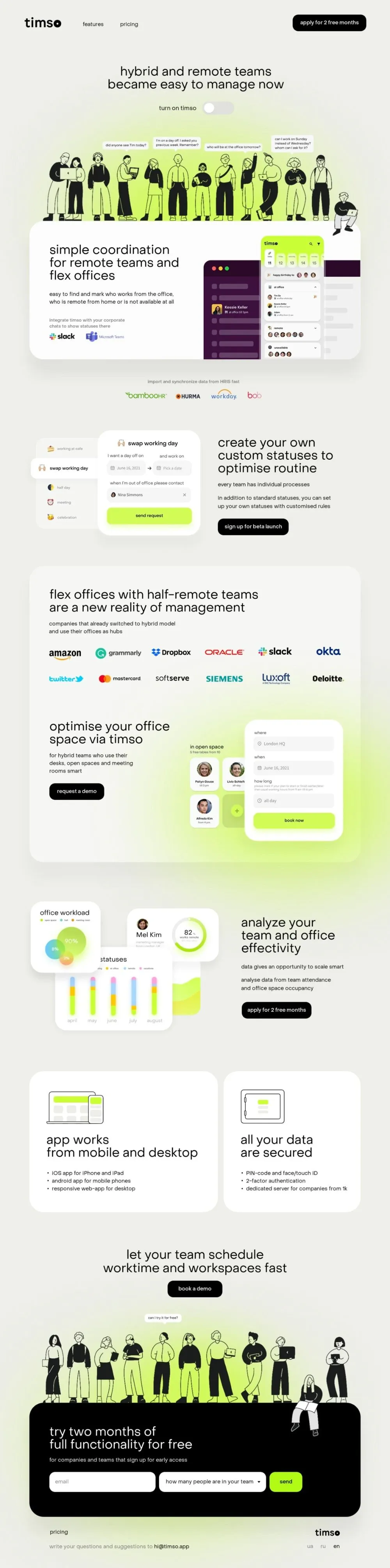
RebuildReference
Move across the image to wipe between the two. Click to lock the seam; arrow keys nudge it.
Imagery
3/3
01-crowd-hero
Hand-drawn black-and-white line art of about fifteen diverse people standing shoulder to shoulder

02-crowd-closing
Hand-drawn black-and-white line art of about twelve people holding laptops, phones and mugs
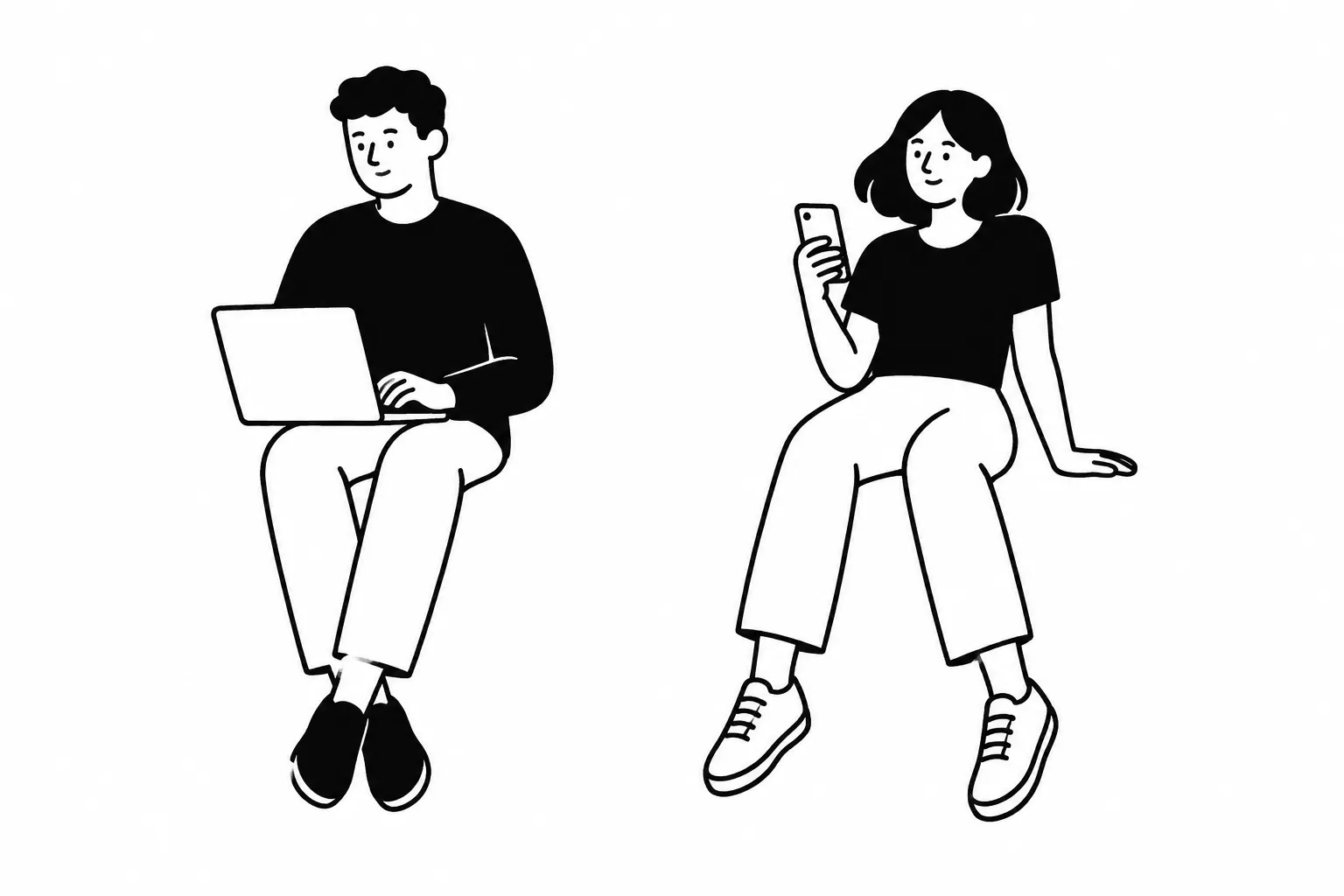
03-edge-sitters
Two hand-drawn black-and-white figures sitting on a ledge with their legs dangling, one with a laptop on their knees
Prompts
126,422 chars
# Light pastel SaaS landing: line-art crowds, lime glow, floating UI cards

Build a 1440px-wide, light-mode B2B landing page. The page is calm and quiet: an off-white grey-green background, near-black ink, white cards with large radii, and one acid-lime accent. The lime mostly appears as soft blurred glows behind black-and-white hand-drawn crowds of people. Every headline is lowercase at regular weight, and the type hierarchy is flat. Product features are shown as overlapping fragments of app UI built in HTML/CSS. Feature rows alternate text-left and text-right. Only the hero and the closing call to action are centred. Motion is limited to one-time entrances.

No motion report exists for this page. Every motion value below and every scroll-map number is **(inferred)** from a single full-page still.

## Structure

- **Canvas:** 1440px design width. The page background `#EDEEE9` runs edge to edge. There is no outer margin, no frame, and no rounded page corners.
- **Nav gutter:** 80px left and right.
- **Content container:** 1240px, centred (100px gutters at 1440). It uses a 12-column grid with 24px gutters. Cards and panels span the full 1240px.
- **Inner text line:** cards have 72px side padding, so card text starts at x = 172. The footer aligns to the same x = 172 / x = 1268 lines.
- **Feature rows:** two columns. The text column is about 450–540px wide. The UI composite takes the rest. The side alternates from row to row.

Sections, top to bottom:

1. **Nav bar** (y 0–112)
   - Left: a bold lowercase wordmark, 5–6 letters.
   - About 80px to its right: two one-word text links, about 60px apart. They sit next to the logo, not centred and not right-aligned.
   - Far right: a black primary button, 4–5 words (an offer).
   - Background is transparent over the page. No border, no shadow.
2. **Hero** (y 112–805)
   - Centred stack. Starting about 110px below the nav: H1, two lines, 7–9 words.
   - 32px below: a toggle row with a short label (2–3 words) and a switch shown in the off state.
   - About 110px below that: a row of 4 white speech bubbles, each holding a 1–2 line question of 6–10 words. They sit at heights that vary by 0–20px, and each tail points down at a head.
   - Directly under the bubbles: **crowd A**, about 15 line-art people standing shoulder to shoulder, about 1100 × 285px, centred. The crowd's bottom runs about 30px *behind* the top of card 3.
   - A lime radial glow sits behind the lower half of the crowd.
   - One extra figure sits on the top-right corner of card 3 (x ≈ 1250–1350) with a laptop on its knees and its legs hanging over the card's face.
3. **Coordination feature card** (y 805–1320)
   - White card, 1240 × 515, padding 88px top and 72px sides.
   - Left column (x 172–620):
     - H2, 3 lines, 6–8 words.
     - 32px gap, then body text, 2 lines (about 20 words).
     - 32px gap, then a muted caption, 2 lines (about 10 words).
     - 16px gap, then two chat-app integration marks (icon + wordmark, about 22px tall, 32px apart).
   - Right side (x 753–1200): an app-mock composite anchored to the card bottom.
     - A plum desktop window, about 440 × 360, runs nearly flush to the card's bottom edge.
     - A white phone screen, 232 × 450, overlaps the window's right third. The phone's top is 60px below the card top and its right edge is at x = 1200.
4. **Integrations strip** (y 1320–1520)
   - Centred: a muted one-line caption, 6–8 words.
   - 24px below: a row of 4 partner wordmarks in their own colours, about 24px tall, 48px apart.
   - No box and no divider.
5. **Custom statuses feature** (y 1520–2060). UI on the left, text on the right.
   - **Left composite** (x 120–741, about 400px tall):
     - A white status-list card, 250 × 320.
     - A white request-modal card, 376 × 400, overlapping the list's right edge by about 10px.
     - The list's second item is lifted out as a white floating pill. It pokes 20px past the list's left edge and sits above both cards.
   - **Right column** (x 805–1340), vertically centred:
     - H2, 3 lines, 5–7 words.
     - 40px gap, then a lead line of 4–6 words.
     - 24px gap, then body text, 2 lines (about 16 words).
     - 32px gap, then a black button, 4–5 words.
6. **Social-proof + office-space panel** (section y 2060–3260; panel y 2099–3205, 1240 × 1106)
   - A translucent white "glass" panel: padding 84px top, 72px sides, 96px bottom.
   - A lime glow behind its bottom-right half bleeds through the panel and slightly past its bottom edge.
   - **6a:**
     - H2, 2 lines, 8–10 words, wide, at most about 36 characters per line.
     - 28px gap, then body text, 2 lines (about 14 words, max 460px).
     - 48px gap, then a **logo wall** of 12 client wordmarks in 2 rows of 6, spaced evenly (space-between) across 1096px. Logos are about 26–30px tall, in their native brand colours, with about 100px from row to row.
   - **6b** starts about 140px lower. Text on the left, UI on the right.
     - Left:
       - H2, 2 lines, 4–6 words.
       - 28px gap, then body text, 3 lines, narrow (max 300px, about 16 words).
       - 32px gap, then a black button, 2–3 words.
     - Right, part 1 (x 703–923): a two-line label pair (zone name + "n free of m" meta) above a 2×2 grid of 96px tiles. Three tiles show people; the bottom-right tile is a lime "+".
     - Right, part 2: a white booking-form card, 365 × 455, at x 908–1273. Its top sits about 30px above the grid, and it overlaps the grid by about 16px.
7. **Analytics feature** (y 3260–3920). UI on the left, text on the right.
   - **Cluster** (x 100–812, about 470px tall):
     - Card A, "workload", 265 × 265, at top-left, in front.
     - Card B, a bar chart, 440 × 280. It starts about 95px right of and 190px below A's top-left corner, so it sits partly behind A.
     - Card C, a profile/score card, 345 × 240, at top-right, about 25px down. It overlaps B's top-right.
     - A lime area-chart blob sits on C's bottom-right and spills outside it.
   - **Text** (x 894–1340): H2 (3 lines, 5–6 words), lead line, 2-line body, black button. Same spacing as section 5.
8. **Two-up capability cards** (section y 3920–4580; cards y 3993–4514, 521px tall)
   - Grid of 7fr / 5fr (about 705 + 511) with a 24px gap.
   - White cards, padding 64px.
   - Each card, top to bottom:
     - An outline device illustration, about 120 × 100.
     - About 60px gap, then H2, 2 lines, 4–6 words.
     - 28px gap, then 3 bullets of 4–7 words each, with "•" markers.
9. **Closing CTA** (y 4580–5234)
   - Centred H2, 2 lines, 7–9 words. 24px gap, then a black button, 2–3 words.
   - About 80px below: one speech bubble (a 4–6 word question) above one head.
   - Then **crowd B**: about 12 figures, some holding laptops, phones or mugs, about 1100 × 340. Their feet stand on the top edge of panel 10.
   - A lime glow sits behind the crowd's lower half.
10. **Signup panel** (y 5234–5661)
    - Black panel, 1240 × 427, padding 94px top and bottom, 72px sides.
    - Crowd B's rightmost figure sits on the panel's top edge (x ≈ 1100–1290), legs hanging over the black face.
    - Content, top to bottom:
      - White H2, 2 lines, 6–8 words.
      - 20px gap, then a muted caption, 1 line (about 10 words).
      - 28px gap, then a form row, all fields 64px tall with 16–20px gaps: an email input (400px), a select (385px, placeholder is a 6–7 word question, chevron on the right), and a lime submit button (126px, 1 word).
11. **Footer** (y 5661–5833)
    - 40px top padding, 48px bottom.
    - Left, at x = 172: a one-word text link. 12px below it, a muted line of 8–10 words ending in a bolder contact email.
    - Right, ending at x = 1268: a small wordmark. 12px below it, a language switcher of three two-letter codes, 24px apart.

## Scroll map

All values are (inferred), using a 900px viewport. No section pins or stacks, so the scroll each section consumes equals its height.

1. Nav: 112px · 0.12 vp · consumes 112px · static
2. Hero: 693px · 0.77 vp · consumes 693px · entrance
3. Coordination card: 515px · 0.57 vp · consumes 515px · entrance
4. Integrations strip: 200px · 0.22 vp · consumes 200px · entrance
5. Custom statuses: 540px · 0.60 vp · consumes 540px · entrance
6. Social-proof + office panel: 1200px · 1.33 vp · consumes 1200px · entrance
7. Analytics: 660px · 0.73 vp · consumes 660px · entrance
8. Two-up cards: 660px · 0.73 vp · consumes 660px · entrance
9. Closing CTA + crowd: 654px · 0.73 vp · consumes 654px · entrance
10. Signup panel: 427px · 0.47 vp · consumes 427px · entrance
11. Footer: 172px · 0.19 vp · consumes 172px · static

**Total page height ≈ 5830px ≈ 6.5 viewports.**

## Spacing

- **Between sections:** 96–160px, typically 120px.
  - Card 3 bottom → caption 4: 85px.
  - Logos 4 → section 5: 110px.
  - Section 5 → panel 6: 95px.
  - Panel 6 → cluster 7: 150px.
  - Section 7 → cards 8: 160px.
  - Cards 8 → CTA 9 headline: 125px.
  - Panel 10 → footer: 40px.
- **Inside a text column:**
  - H2 → body: 28–32px.
  - H2 → lead line: 40px.
  - Lead → body: 24px.
  - Paragraph → paragraph: 16px.
  - Body → button: 32px.
  - Caption → logo row: 16–24px.
- **Card padding:** 88/72px on card 3, 84/72/96px on panel 6, 64px on cards 8, 94/72px on panel 10.
- **Overlap offsets** inside UI composites: −10 to −40px. Cards always overlap each other; they never sit side by side with a gap.
- **Buttons:** 56px tall, 24px horizontal padding.
- **Form fields:** 64px tall, 20px horizontal padding.
- **Mock-card internal padding:** 20–24px. Rows inside mocks: 10–14px apart.
- **Logo wall:** spaced evenly (space-between) across the full inner width; about 70px vertical gap between rows.

## Type

- **Family class:** a neutral grotesk with geometric leanings, open apertures and a double-storey "a". Free stand-in: **Manrope** (400/500/700). Fallback: Inter.
- **One family only.**
- **Case:** all copy is lowercase, including the nav, buttons, labels and headlines. The only exception is the logos.

| Level | Ratio to body | Size | Line-height | Letter-spacing | Weight | Notes |
|---|---|---|---|---|---|---|
| H1 (hero) | 2.8× | 48px | 1.08 | −0.01em | 400 | centred, 2 lines, max-width 640px (≈26 characters per line) |
| H2 (sections, cards, panels) | 2.6× | 44px | 1.08 | −0.01em | 400 | 2–3 lines; 20–24 characters per line in feature columns (max 540px), up to 36 in the panel-6 headline (max 800px) |
| Body / lead | 1× | 17px | 1.6 | 0 | 400 | max-width 460px (≈48 characters); narrow variant 300px |
| Bullet list | 0.94× | 16px | 1.6 | 0 | 400 | "•" markers, no icons |
| Nav link | 0.94× | 16px | 1 | 0 | 400 | |
| Button label | 0.94× | 16px | 1 | 0 | 500 | |
| Caption / meta / placeholder | 0.82× | 14px | 1.45 | 0 | 400 | muted colour |
| Mock card title | 0.88× | 15px | 1.3 | 0 | 500 | inside UI fragments |
| Mock score numeral | 1.65× | 28px | 1 | −0.01em | 500 | the number in the ring |
| Micro (mocks, bubbles, chart labels) | 0.7× | 12px | 1.35 | 0 | 400/500 | the floor, never smaller |
| Wordmark (nav) | 1.9× | 32px | 1 | −0.03em | 700 | footer wordmark is 24px |
| Language codes | 0.82× | 14px | 1 | 0 | 400 / 600 (active) | |

The hierarchy is deliberately flat: headlines are only about 2.6× the body. The page gets its drama from the illustrations and whitespace, not from type size.

## Colour

| Hex | Role | Coverage / where |
|---|---|---|
| `#EDEEE9` | Page background | ≈65% of the surface, everywhere behind cards |
| `#FFFFFF` (read from stills) | Card and mock surfaces | Card 3, cards 8, all UI fragments, speech bubbles, signup inputs; panel 6 at about 50% opacity |
| `#020202` | Ink | All text, line-art strokes and black fills, every primary button, the signup panel fill, toggle knob outline |
| `#C9C9C7` | Neutral grey | Toggle track (off), skeleton bars in mocks, chart tracks, field icons, hairlines inside mocks |
| `#7C7D78` (inferred) | Muted text | Captions, meta, placeholders, inactive language codes; `#8C8C88` on the black panel |
| `#DBF689` | **The single accent (lime)** | Allowed: radial glows behind crowds A and B and behind panel 6; fills of in-mock action buttons; the signup submit button; the phone header bar and date chips; chart fills, the ring arc and the area chart; the "+" tile; fills inside the section-8 device illustrations. Never on text, the nav CTA, section buttons, or as a full card background. |
| `#461A46` | Deep plum | Only the desktop app window in section 3. Use a lighter plum `#5E335E` (inferred) for its skeleton bars. Nowhere else. |
| Data pastels (inferred): cyan `#8EE3F5`, pink `#F7A8CF`, peach `#FFC08A`, butter `#F6E27A` | Chart and status-icon colours | Only inside the analytics cards and the small status icons, at small sizes |

Glow recipe:

- `radial-gradient(ellipse at center, #DBF689 0%, rgba(219,246,137,.55) 40%, transparent 70%)` on an element with `filter: blur(40px)`.
- Hero glow: about 1300 × 220, spanning y ≈ 650–860, centred.
- Crowd B glow: spanning y ≈ 5030–5240.
- Panel-6 glow: x 575–1370, y 3030–3240, placed behind the panel.

## Surface

- **Borders:** none on cards, panels or buttons. Fields inside mocks are filled `#F3F4F0` with no stroke; signup inputs are plain white on black.
- **Radii:**
  - Section cards and panels (3, 6, 8, 10): 32px.
  - UI mock cards: 20–24px.
  - Phone screen: 22px.
  - Desktop window: 16px.
  - People tiles: 16px.
  - Buttons and inputs: 14px. These are rounded rectangles, not full pills.
  - Date chips: 8px.
  - Speech bubbles: 10px.
  - Toggle and avatars: fully round.
- **Shadows:**
  - Section cards: a faint ambient shadow, `0 20px 60px rgba(2,2,2,.05)`.
  - Floating mock cards and the phone: `0 16px 40px rgba(2,2,2,.10)`.
  - The lifted list pill: `0 8px 24px rgba(2,2,2,.12)`.
  - No hard or offset shadows.
- **Glass:** panel 6 is `rgba(255,255,255,.5)` with `backdrop-filter: blur(24px)` over its lime glow. This is the only translucent surface.

## Imagery

- **Crowd A (hero) and crowd B (closing):**
  - Monochrome, hand-drawn line-art people. Roughly 2px black strokes with flat solid black or white fills: black hair and clothes, white skin. No greys and no colour.
  - Diverse bodies, casual clothes, relaxed poses. In crowd B, several figures hold laptops, phones or mugs.
  - Crowd A is about 3.9:1 (1100 × 285). Crowd B is about 3.2:1 (1100 × 340).
  - Each crowd has one figure sitting on the edge of the card or panel below it.
  - Free stand-in: Open Peeps (CC0), composed into a row. Colour comes only from the glow behind them.
- **Speech bubbles:** CSS. White, 10px radius, 8 × 12px padding, 12px text, a small downward tail. No shadow.
- **Desktop window mock** (section 3):
  - Plum, 16px radius, with three traffic-light dots (`#FF5F57` / `#FEBC2E` / `#28C840`, 10px) at top-left.
  - The left half is a list of rounded skeleton bars, 10px tall.
  - One highlighted row has a 32px avatar, a white name at 13px, and a lime status dot with a muted 12px status.
- **Phone mock** (section 3):
  - White.
  - A lime header bar holding a tiny wordmark and 2 icons.
  - A strip of 5 lime-tint date chips (day numeral + weekday).
  - A notice pill with an avatar stack.
  - Three status groups, each with a 12px label. The first group has rows of a 24px avatar, a name and a status line. The other two groups show overlapping stacks of 5 avatars.
- **Status list + request modal** (section 5):
  - The list has 5 rows, each a 16px pastel icon plus a 13px grey label.
  - The modal has, in order:
    - an icon + 15px title;
    - two column labels over two date fields joined by an arrow, each field with a calendar glyph;
    - a label above a field holding an avatar chip, a name and a "×" clear control;
    - a full-width lime button, 48px tall, with a black label.
- **People tiles** (section 6b):
  - Real headshot photos cropped to 56px circles, on neutral backgrounds.
  - Under each photo: a name (12px, 600) and a role (12px, muted).
  - The fourth tile is lime-tinted with a 40px lime circle holding a black "+".
- **Booking card** (section 6b): three labelled fields (location with a pin glyph, date with a calendar glyph, duration with a clock glyph plus a small option text above), then a full-width lime button.
- **Analytics cards** (section 7):
  - **A:** title, a legend row of tiny coloured dots, then a bubble chart. A large lime circle carries a percentage, with smaller cyan and peach circles overlapping it, softly glowing.
  - **B:** title and legend, then 5 month groups of vertical rounded bars, about 10px wide, in lime, butter, pink, cyan and grey, with 12px month labels.
  - **C:** a 40px avatar, a 17px name and a 12px role. A ring gauge with a lime arc on a grey track, about 82% full, holds the 28px numeral and a micro caption. A smooth lime area chart bleeds out of the bottom-right corner.
- **Device illustrations** (section 8): black 2px outline drawings, about 120 × 100. Card 1 shows a laptop with a phone beside it. Card 2 shows a tablet or phone with a toggle/lock motif. The screens are filled with lime blocks.
- **Wordmarks:** placeholder SVG wordmarks in their native colours, about 22–30px tall, never boxed.
- **Build all UI fragments in HTML/CSS**, not as raster screenshots.

## Motion

Section order matches Structure. Nothing is scroll-linked and nothing reverses on scroll-up. Every entrance plays once.

**1. Nav bar**
- kind — static
- what moves — nothing
- from → to — none
- range — none
- reduced motion — identical

**2. Hero**
- kind — entrance (inferred)
- what moves — H1 lines, toggle row, crowd A, its glow, speech bubbles
- from → to:
  - H1 and toggle: opacity 0 → 1, translateY 16px → 0.
  - Crowd: opacity 0 → 1, translateY 24px → 0.
  - Glow: opacity 0 → 1, scale 0.92 → 1.
  - Bubbles: opacity 0 → 1, scale 0.85 → 1, with the transform origin at the tail.
- range — once, on page load.
  - Duration: not measured (500–800ms). Easing: not measured; use a soft ease-out.
  - Stagger: H1 → toggle → crowd + glow → bubbles at 80–120ms steps; 60–100ms between bubbles.
- reduced motion — everything renders at its end state with no transforms (an opacity fade of ≤150ms at most)

**3. Coordination card**
- kind — entrance (inferred)
- what moves — the card with its text, then the phone mock. The sitting figure moves with the card.
- from → to:
  - Card: opacity 0 → 1, translateY 32px → 0.
  - Phone: opacity 0 → 1, translateY 24px → 0.
- range — once, when the card's top reaches 85% of the viewport. Duration not measured (600–800ms), ease-out. The phone follows 100–150ms after the card.
- reduced motion — static, fully visible

**4. Integrations strip**
- kind — entrance (inferred)
- what moves — caption, then the 4 wordmarks
- from → to — opacity 0 → 1, translateY 12px → 0
- range — once, when the strip's top reaches 90% of the viewport. Duration not measured (400–600ms), ease-out. Wordmarks stagger 50–80ms.
- reduced motion — static

**5. Custom statuses**
- kind — entrance (inferred)
- what moves — status list card, request modal, lifted pill, then the right-column text children
- from → to:
  - List and modal: opacity 0 → 1, translateY 24px → 0.
  - Lifted pill: opacity 0 → 1, translateX −12px → 0, last.
  - Text children: opacity 0 → 1, translateY 16px → 0.
- range — once, when the section's top reaches 80% of the viewport. Duration not measured (500–700ms), ease-out. Stagger 80–120ms.
- reduced motion — static

**6. Social-proof + office panel**
- kind — entrance (inferred)
- what moves — the panel, the 6a text, the logo-wall rows, then the 6b text, people tiles and booking card
- from → to:
  - Panel: opacity 0 → 1, translateY 32px → 0.
  - Logo rows: opacity 0 → 1, translateY 12px → 0, row by row.
  - Tiles: opacity 0 → 1, scale 0.95 → 1.
  - Booking card: opacity 0 → 1, translateY 24px → 0.
- range:
  - The panel and 6a play once when the panel's top reaches 80% of the viewport.
  - 6b plays once when its own top reaches 80%.
  - Duration not measured (500–700ms), ease-out. Stagger 60–100ms.
- reduced motion — static

**7. Analytics**
- kind — entrance (inferred)
- what moves — cards A, B and C, the area-chart blob, then the text column
- from → to — cards: opacity 0 → 1, translateY 24px → 0. Chart internals (bars, ring, area) stay static; nothing in the still suggests they animate.
- range — once, when the cluster's top reaches 80% of the viewport. Duration not measured (500–700ms), ease-out. Stagger A → B → C at 100ms, then the text at 80ms steps.
- reduced motion — static

**8. Two-up cards**
- kind — entrance (inferred)
- what moves — the two cards
- from → to — opacity 0 → 1, translateY 24px → 0
- range — once, when the row's top reaches 85% of the viewport. Duration not measured (500–700ms), ease-out. Stagger 100ms, left then right.
- reduced motion — static

**9. Closing CTA**
- kind — entrance (inferred)
- what moves — H2 and button, crowd B with its glow, the speech bubble
- from → to:
  - H2 and button: opacity 0 → 1, translateY 16px → 0.
  - Crowd: opacity 0 → 1, translateY 24px → 0.
  - Glow: opacity 0 → 1.
  - Bubble: opacity 0 → 1, scale 0.85 → 1, last.
- range — once, when the H2's top reaches 80% of the viewport. Duration not measured (500–800ms), ease-out. Stagger 100ms.
- reduced motion — static

**10. Signup panel**
- kind — entrance (inferred)
- what moves — the panel (the sitting figure moves with it), then the form fields
- from → to:
  - Panel: opacity 0 → 1, translateY 24px → 0.
  - Fields: opacity 0 → 1, translateY 8px → 0.
- range — once, when the panel's top reaches 85% of the viewport. Duration not measured (500–700ms), ease-out. Fields stagger 60ms.
- reduced motion — static

**11. Footer**
- kind — static
- what moves — nothing
- from → to — none
- range — none
- reduced motion — identical

### Interaction transitions (not scroll choreography)

- **Black buttons:**
  - Hover: background → `#2A2A2A`, 150–200ms ease.
  - Press: scale 0.98.
  - Focus-visible: 2px `#020202` outline with a 3px offset.
- **Lime buttons:**
  - Hover: background → `#CDEE6A`.
  - Press: scale 0.98.
  - Focus-visible on the black panel: 2px lime outline.
- **Nav and footer links:** hover shows a 1px underline at a 4px offset, 150ms.
- **Hero toggle:**
  - On click, the knob slides translateX by the track width minus the knob, and the track goes `#C9C9C7` → `#DBF689` (inferred), 200–250ms ease-in-out.
  - Anything else it changes on the page: not measured. Keep the effect to the switch.
- **Signup inputs:** on focus, a 2px lime ring and no layout shift.
- **Select:** native list. The chevron rotates 180° on open (inferred), 150ms.
- **Language switcher:** hover changes muted → black in 150ms. The active code stays black at weight 600.
- **Logos and mock cards:** no hover effects.

## Responsive (below 640px)

- **Layout:**
  - Side padding 20px, fluid container.
  - Cards and panels: 24px radius, padding 28px top/bottom and 24px sides.
  - Section gaps: 64–80px.
- **Type:**
  - Body 16px.
  - H1 34px (2.1×), line-height 1.12.
  - H2 30px (1.9×), line-height 1.12.
  - Captions 13px, micro text 12px.
  - Buttons 44px tall with 14px labels.
- **Nav:**
  - 64px tall, wordmark 24px.
  - Drop the two text links.
  - Keep the CTA, shortened to 2–3 words.
- **Crowds A and B:**
  - Render each at about 900px wide inside an `overflow: hidden` band, centred, so 7–8 figures show (about 240px tall).
  - Keep the figure sitting on the edge, at a smaller size, at the right edge of the card or panel.
  - Hero speech bubbles drop to 2.
- **Card 3:** stack text first, then the mock composite, scaled to about 0.7 and centred, with the plum window peeking out behind the phone.
- **Feature rows 5, 6b and 7:**
  - Stack text first, then the UI composite.
  - Halve the overlap offsets and scale the composite to fit 100% of the width.
  - In section 5, drop the lifted pill's leftward overhang.
- **Logos:**
  - Integrations strip: 2×2.
  - Logo wall: 3 columns × 4 rows, logos 20px tall, 32px row gap.
- **Section 8:** single column, 16px gap.
- **Signup form:** fields stack full width, 56px tall, 12px gap. The submit button goes full width.
- **Footer:** stacks. The left block comes first; the wordmark and language switcher follow, left-aligned, 24px below.

## Don'ts

- **Type**
  - Don't capitalise anything. No Title Case or Sentence case in headlines, buttons or nav. All copy is lowercase.
  - Don't bold headlines or enlarge the hero. H1 stays at about 48px and weight 400. A 72–96px hero ruins the quiet tone.
  - Don't add eyebrow labels, kicker tags, gradient text, stat counters, testimonials or a pricing table. None exist here.
  - Don't mix in a serif, a mono or a second sans.
- **Colour**
  - Don't use lime on text, on the nav CTA or on section buttons. Primary buttons are black. Lime belongs to glows, in-mock actions, charts and the single signup submit.
  - Don't put the plum anywhere except the desktop window mock.
  - Don't add a blue or purple SaaS gradient, a mesh background or a coloured hero. The only gradients are the blurred lime glows.
  - Don't use pure white as the page background. The page is `#EDEEE9`; white is reserved for cards.
  - Don't grey out or box the logo walls. Show the logos small, in their own colours, floating on the surface.
- **Imagery and surfaces**
  - Don't colour the illustrations or swap them for 3D renders, stock photos or flat vector "corporate Memphis" people in colour. Crowds are strictly black-and-white line art.
  - Don't let the crowds float free. They stand on, or tuck behind, the top edge of the next card or panel, and one figure sits on the edge.
  - Don't put borders on cards or use hard drop shadows. Use white on off-white, 32px radii and a whisper of ambient shadow.
  - Don't make buttons full pills or outline/ghost buttons. They are solid 56px rounded rectangles with a 14px radius.
  - Don't render UI mocks as single flat screenshots in a browser frame. They are 2–3 separate white or plum fragments overlapping at offsets, each with its own shadow.
  - Don't round the page or add a margin or background around it. The design is full-bleed.
- **Layout**
  - Don't centre the feature rows or put them in equal 50/50 grids with text and image aligned to the same top. Text columns are narrow and vertically centred against larger overlapping composites, and they alternate sides.
- **Motion**
  - Don't add parallax, pinned sections, scroll-jacking, marquee logo strips or looping animations.
  - Motion is limited to one-time fade-ups of 12–32px.
Versions
1Each rebuild is kept. The live one is what the comparison shows. LiveOpus 5.5Extra highfrontend-designemil-design-engtransitions-devgsaphumanizer4 days ago · 1361s · 3 images · 20261016T155500ZOpen