Topspin tennis coaching landing page
Landing page13 Sep 2026
Rebuild
Opus 5.5Extra highfrontend-designemil-design-engtransitions-devhumanizergsapView
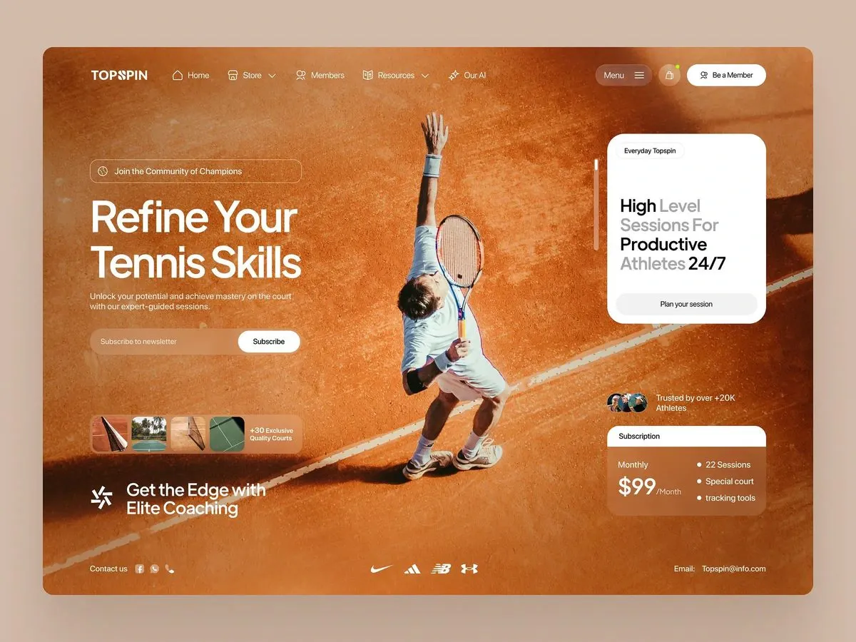
RebuildReference
Move across the image to wipe between the two. Click to lock the seam; arrow keys nudge it.
Imagery
4/4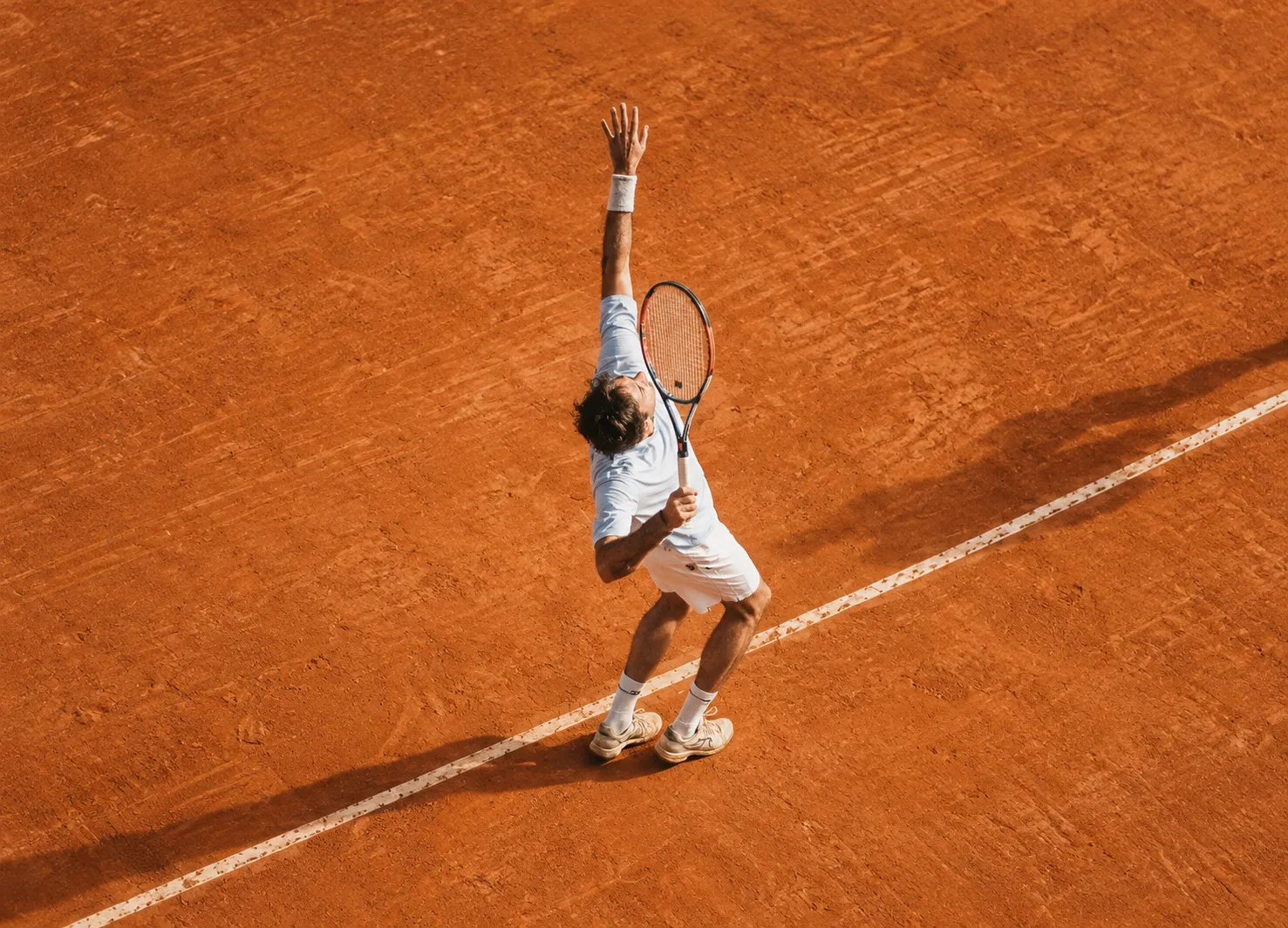
01-hero-clay-court-plate
Overhead view of a player mid-serve on an orange clay tennis court, a white baseline running diagonally across the clay
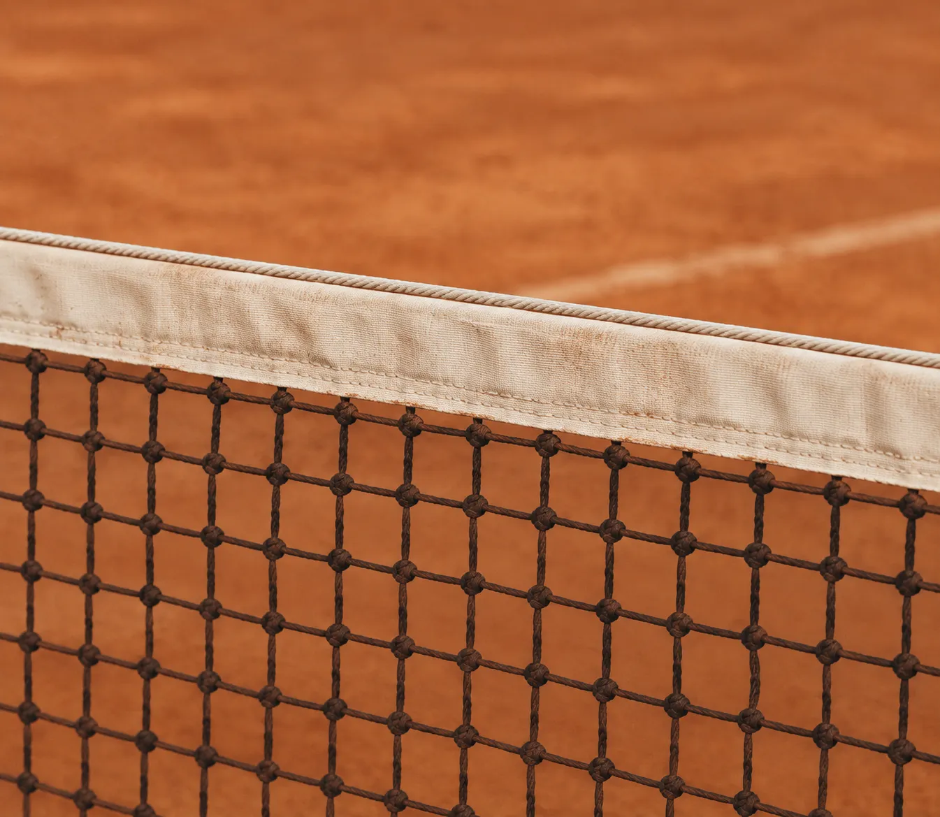
02-chip-net-cord
Close crop of a tennis net band and mesh against warm clay
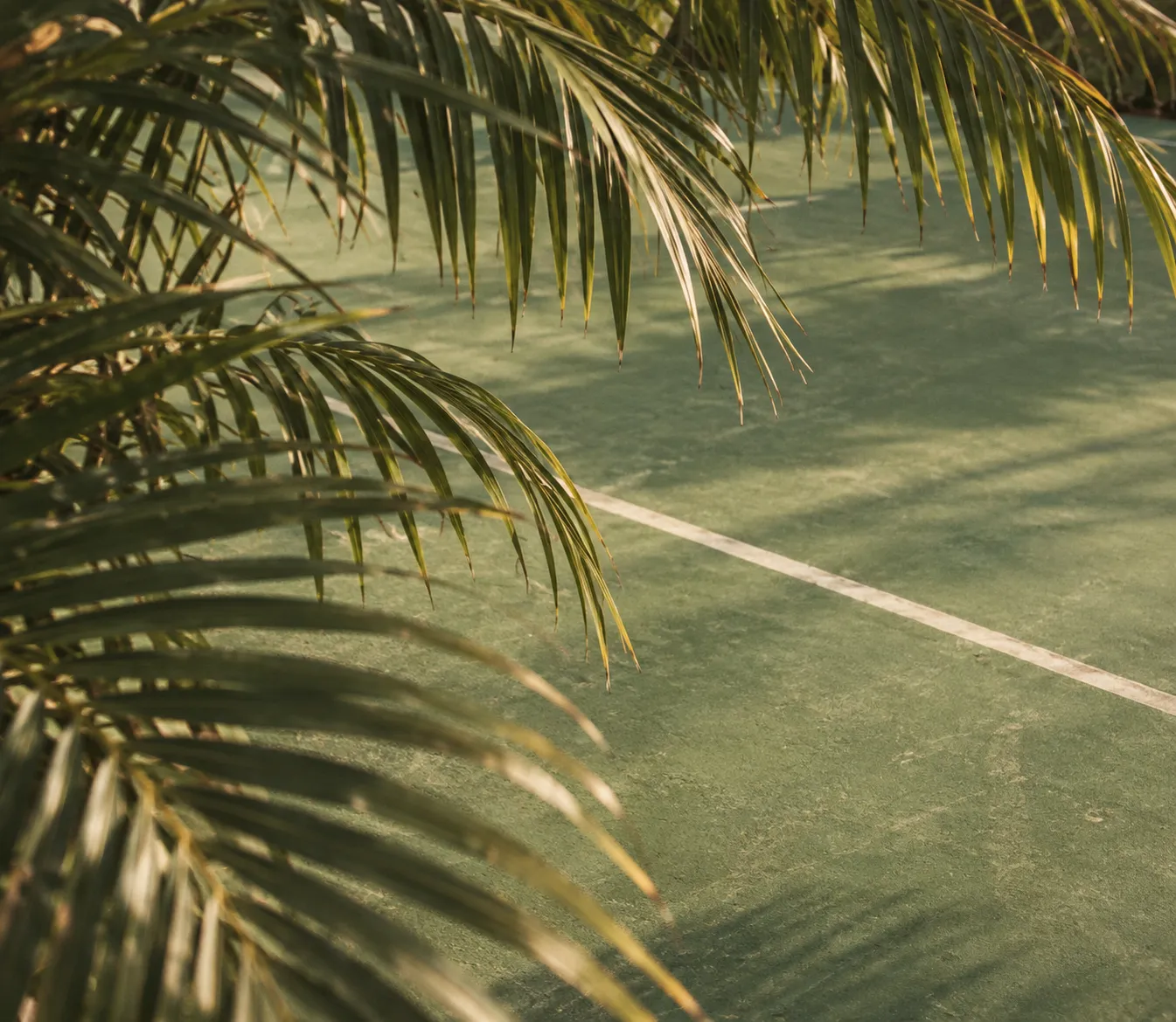
03-chip-palm-green-court
Green tennis court glimpsed through palm foliage
04-chip-teal-hardcourt
Corner of a flat teal hard court with a white boundary line
Prompts
124,552 chars
# Full-bleed clay court hero — reusable build prompt

A single-screen landing page: one photographic surface, edge to edge, with every module — nav, hero copy, newsletter, statement card, social proof, pricing, footer — floating on top of it as white chrome. The photograph is the layout. Nothing is in a box with a background colour except two cards.

**Reference viewport: 1440 × 1035 (aspect 1.39).** All px values below are at that width. The page is *full-bleed*: no outer margin, no rounded page corners, no colour behind it, no max-width wrapper.

**No motion report was supplied for this reference.** Every number in the Motion section is marked `(inferred)` and every timing is given as a range with "not measured" where it cannot be derived from a still. Do not invent exact durations, lerp factors or spring constants.

---

## 1. Structure

No centred container. The page is a full-viewport stage with a symmetric **88px left/right gutter** and a **57px top / 53px bottom** inset. Two overlay columns sit on the photograph:

- **Left column** — 396px wide, left edge at x=88, top-aligned under the nav, running to the bottom inset.
- **Right column** — 297px wide, right edge at x=1352 (88px from the right), top at y=164.
- The **centre band** between them (roughly x=484 → x=851) is left empty: it is where the photographic subject lives.

Sections, top to bottom / front to back:

1. **Background plate** — full-bleed photograph + gradient scrim (z=0, behind everything).
2. **Nav bar** — full-width row, floating, no bar background.
3. **Hero copy block** — eyebrow pill, two-line H1, two-line paragraph (left column).
4. **Newsletter signup** — inline field + pill button (left column).
5. **Thumbnail strip** — 4 image chips + a two-line count label in one outlined capsule (left column).
6. **Tagline lockup** — glyph + two-line statement (left column, bottom).
7. **Statement card** — opaque white card (right column, top).
8. **Scroll rail** — 3px vertical indicator, left of the statement card.
9. **Social proof** — overlapped avatars + two-line label (right column).
10. **Pricing card** — white header strip + translucent body (right column, bottom).
11. **Footer strip** — contact + social dots (left), logo wall (centre), email (right).

---

## 2. Scroll map

This design **does not scroll at desktop widths**. The whole composition is one viewport; `html, body { height: 100%; overflow: hidden; }` at ≥1024px. Every scroll position down the page resolves to the same frame. Sections 2–11 are overlay regions inside section 1, so they consume no scroll of their own.

| # | Section | Height | Viewports | Scroll consumed | Kind |
|---|---|---|---|---|---|
| 1 | Background plate | 1035px | 1.00 | 0 | static (optional slow scale, §Motion) |
| 2 | Nav bar | 40px (row at y=37–77) | 0.04 | 0 | entrance on load |
| 3 | Hero copy block | 273px (y=162–435) | 0.26 | 0 | entrance on load |
| 4 | Newsletter signup | 48px (y=467–515) | 0.05 | 0 | entrance on load |
| 5 | Thumbnail strip | 68px (y=631–699) | 0.07 | 0 | entrance on load |
| 6 | Tagline lockup | 53px (y=817–870) | 0.05 | 0 | entrance on load |
| 7 | Statement card | 356px (y=164–520) | 0.34 | 0 | entrance on load |
| 8 | Scroll rail | 156px (y=221–377) | 0.15 | 0 | static |
| 9 | Social proof | 37px (y=651–688) | 0.04 | 0 | entrance on load |
| 10 | Pricing card | 168px (y=712–880) | 0.16 | 0 | entrance on load |
| 11 | Footer strip | 20px (row centred at y=980) | 0.02 | 0 | entrance on load |

**Total page height: 1035px = 1.00 viewport. Total scrollable distance: 0px.**

Height behaviour: the composition is height-constrained, not content-driven. The **gap between §4 and §5 (116px)** and the **gap between §7 and §9 (131px)** are the two flex spacers that absorb viewport height. On a 1440×900 screen they compress to their minimums (56px and 64px); they never go below that, and nothing else shrinks. Below 900px of viewport height, allow the page to scroll rather than compress further.

---

## 3. Spacing

Left column (§3–§6), vertical:
- Nav row bottom → eyebrow pill top: **85px**
- Eyebrow pill → H1: **39px**
- H1 → paragraph: **17px** (deliberately tight — the paragraph hangs off the headline)
- Paragraph → newsletter field: **32px**
- Newsletter field → thumbnail strip: **116px** (flex spacer, min 56px)
- Thumbnail strip → tagline lockup: **53px**
- Tagline lockup → footer row: **57px**

Right column (§7–§10), vertical:
- Top inset → statement card: **164px**
- Statement card → social proof: **131px** (flex spacer, min 64px)
- Social proof → pricing card: **24px**
- Pricing card → footer row: **48px**

Internal padding:
- Nav pills: 16px horizontal, 40px tall. Nav link row gap: **34px**; icon → label gap **8px**; label → chevron gap **6px**.
- Eyebrow pill: 18px left / 22px right, icon → text gap 10px.
- Newsletter field: 22px left padding, button inset 5px from the field's right and vertical edges.
- Thumbnail capsule: 5px padding all round; chip gap **3px** (chips very slightly overlap, ~2px negative); chip → label gap 10px.
- Statement card: **27px** padding all round.
- Pricing card: header strip 41px tall with 20px horizontal padding; body 24px padding, two-column split with the bullet column starting at 52% of the card width; bullet rows 31px apart.
- Footer: social dot gap 8px; "Contact us" → dots gap 12px; logo wall gaps **35px**.

Rhythm: the left column reads as three weight-groups (copy+field / strip / tagline) separated by the two largest gaps on the page; the right column mirrors it with card / proof+pricing. Gutters (88px) are exactly equal left and right — do not let the right column drift.

---

## 4. Type

One family throughout: a **geometric grotesk** with tight apertures, near-circular bowls and a low, wide `$`. Free stand-in: **General Sans** (Fontshare) or **Satoshi**; fallback **Inter** with the tracking values below applied. No second family, no serif anywhere.

| Level | Size / line-height | Tracking | Weight | Colour | Max line |
|---|---|---|---|---|---|
| Wordmark (§2) | 22px / 1.0 | −0.02em | 800, uppercase | #FCFCFC | one word, 7 chars |
| Nav link (§2) | 15px / 1.2 | 0 | 500 | #FCFCFC | 1–2 words |
| Pill button label (§2, §7) | 14px / 1.0 | 0 | 600 | #1A1A1A on white, #FCFCFC on glass | 2–3 words |
| Eyebrow (§3) | 15px / 1.0 | 0 | 500 | #FCFCFC | 4–6 words |
| H1 (§3) | **76px / 1.08** | −0.025em | 700 | #FCFCFC | **12–14 chars per line, 2 lines** |
| Body (§3) | 16px / 1.4 | 0 | 400 | rgba(252,252,252,0.82) | **46ch / 387px, 2 lines** |
| Field placeholder (§4) | 15px / 1.0 | 0 | 400 | rgba(252,252,252,0.7) | 3 words |
| Strip label (§5) | 12px / 1.25 | 0 | 600 | #FCFCFC | 2 lines, 9–11 chars each |
| Tagline (§6) | 28px / 1.18 | −0.01em | 500 | #FCFCFC | 2 lines, 18–22 chars each |
| Card micro-pill (§7) | 14px / 1.0 | 0 | 400 | #1A1A1A | 2 words |
| Card statement (§7) | **30px / 1.2** | −0.01em | mixed 700 / 400 | #1A1A1A (700) / #9B9B9B (400) | 4 lines, 12–16 chars each |
| Card button (§7) | 15px / 1.0 | 0 | 500 | #1A1A1A | 3 words |
| Social proof (§9) | 15px / 1.25 | 0 | 500 | #FCFCFC | 2 lines, ~20 chars |
| Pricing header (§10) | 15px / 1.0 | 0 | 500 | #1A1A1A | 1 word |
| Pricing plan label (§10) | 15px / 1.0 | 0 | 400 | rgba(252,252,252,0.85) | 1 word |
| Price (§10) | 35px / 1.0 | −0.02em | 700 | #FCFCFC | 3–4 chars |
| Price suffix (§10) | 13px / 1.0 | 0 | 400 | rgba(252,252,252,0.7) | "/Month" |
| Bullet row (§10) | 15px / 1.0 | 0 | 400 | #FCFCFC | 2 words |
| Footer (§11) | 15px / 1.0 | 0 | 400 | #FCFCFC | 2–4 words |

Two type moves carry the page and must not be softened:

- **§3 H1 is set solid.** Line-height 1.08 with −0.025em tracking, so the two lines nearly touch. Placeholder copy: a two-word verb phrase on line 1, a two-word noun phrase on line 2 (e.g. 11 and 13 characters).
- **§7 statement alternates weight mid-sentence.** Four lines, ~14 characters each, where 3–4 word-groups are 700/near-black and the rest are 400/#9B9B9B, and the alternation crosses line breaks rather than aligning to them. Pattern: `**bold** grey / grey grey / **bold** / grey **bold**`.

Wordmark detail: uppercase, heavy, tightly tracked, with one letter's counter replaced by a circular glyph carrying two crossing seam arcs.

---

## 5. Colour

The screenshot's outer sheet (#D2BAA8) is the mockup mat — **it is not in this palette and must not appear anywhere in the build.**

| Hex | Role | Coverage |
|---|---|---|
| **#C66A28** | The photographic surface — mid clay orange. This is the page. It is a *photograph*, not a fill; sample it only for the fallback `background-color` behind the image while it loads. | ~60% |
| **#88350C** | Deep clay: the darker upper-left of the frame and the colour of the legibility scrim. | ~25% |
| **#471B0A** | Darkest value — corner vignette, the subject's cast shadow, the tint mixed into the §10 pricing body. | ~10% |
| **#FCFCFC** | Every piece of chrome: all text on the photograph, the §7 card, the §10 header strip, all pill fills and hairlines, the logo wall. | ~5% |

Supporting neutrals, inside white surfaces only: **#1A1A1A** (ink), **#9B9B9B** (secondary statement words), **#F0F0EE** (§7 button fill), **#E6E6E4** (hairline on the §7 micro-pill).

**The single accent is a green status dot, #8CD24E (inferred).** It appears exactly once, 7px in diameter, on the top-right corner of the square cart button in §2. Nowhere else. No second accent, no orange buttons, no coloured link states — on an orange page, **white is the ink and white is the emphasis**; any added hue reads as a bug.

Scrim: a linear gradient from the left edge, `rgba(71,27,10,0.55)` at 0% → `rgba(71,27,10,0.18)` at 42% → transparent at 62%, plus a radial vignette `rgba(71,27,10,0.35)` at the four corners falling to transparent by 45% of the radius. The centre of the frame stays clean — do **not** flatten the whole photo with a full-bleed scrim.

Translucent surfaces:
- Nav "Menu" pill and square button: `rgba(71,27,10,0.32)` + `backdrop-filter: blur(12px)`.
- §3 eyebrow pill, §4 field, §5 capsule: fill `rgba(252,252,252,0.10)`, no blur or a very light 6px blur.
- §10 body: `rgba(198,106,40,0.55)` over the photo with an 8px blur — reads as warm translucent tan, and you can still see the court line through it.

---

## 6. Surface

- **Borders:** 1px only. `rgba(252,252,252,0.35)` on the §3 eyebrow pill, §4 field and §5 capsule; `#E6E6E4` on the §7 micro-pill; `rgba(252,252,252,0.4)` 2px rings around the §9 avatars. No border on the §7 or §10 cards.
- **Radii:** pills and the newsletter field are **fully rounded** (radius = half height: 20px, 24px). §5 capsule **18px**. §5 image chips **11px**. §7 card **21px**. §10 card **18px** (header strip inherits the top corners only). §2 square cart button **13px** on a 43px square. §7 inner button fully rounded (20px). Avatars and social dots: circles.
- **Shadows:** almost none. One soft shadow on the §7 white card only: `0 18px 48px rgba(71,27,10,0.22)`. The §10 card gets nothing — its separation comes from the white header strip. No shadow on pills, no shadow on text, no glow.
- **Text legibility** comes from the gradient scrim, never from `text-shadow`.

---

## 7. Imagery

**A. Background plate (§1) — one photograph, the whole page.** A clay tennis court shot from an elevated, slightly oblique angle, so a single white baseline runs as a long diagonal from the lower-left corner up to the upper-right. The clay fills the frame corner to corner with visible drag-broom texture and scuff marks. A player is caught mid-serve, centred horizontally and occupying roughly the middle third, body extended, one arm reaching high toward the top of the frame, racquet across the torso, long hard shadow thrown down-left across the clay. Whites of the kit read cool against the orange. Treatment: warm, slightly lifted blacks, a shallow grain, no HDR crunch, no colour-pop filter. Aspect **1.39:1**, `object-fit: cover`, focal point at 50% 40% — the raised hand must stay inside the frame and the diagonal line must reach both the lower-left and the right edge.

**B. Court chips (§5) — four 61×53 images, 1.15:1, in a row.** Small crops of different court surfaces and surrounds: a net cord close-up, a green court seen through palm foliage, a net post against clay, a flat teal hard-court corner. They are deliberately varied in hue — the only place on the page where greens and teals appear. Treated the same as A: warm, unfiltered.

**C. Avatars (§9) — three 37px circles, 1:1, overlapped by 12px.** Cropped head-and-shoulders portraits of athletes, tight crop, warm light, each with a 2px translucent white ring. The stack reads as a texture, not as three recognisable faces.

**D. Logo wall (§11) — four monochrome marks.** Flat white silhouettes, ~20px tall, optically balanced rather than equal-width, centred as a group on the viewport. Use neutral geometric placeholder marks — a swoosh-like curve, a three-bar chevron, a slab monogram, a stacked-arrow — **never real brand logos**. No colour, no greyscale, no opacity dip below 0.9.

**E. Tagline glyph (§6) — a 32px abstract mark**, four white slashes radiating from an open centre, stroke ~2.5px, no container.

---

## 8. Motion

No motion was measured for this reference. Everything here is `(inferred)` from a single still, and the design is **static after load** — there is no scroll, therefore there is nothing scroll-linked on the page. Durations are given as ranges; anything narrower is not measured.

### §1 Background plate
- **kind** — static (inferred). Optionally one very slow ambient move; if you add it, keep it under the perception threshold.
- **what moves** — the photograph only.
- **from → to** — `scale 1.06 → 1.00` on the image, opacity 0 → 1. Optional ambient after settle: `scale 1.00 → 1.03` (inferred, amplitude not measured).
- **range** — entrance on document ready. Duration 900–1400ms, ease-out (cubic-bezier(0.16, 1, 0.3, 1)). Ambient loop, if used: 18–30s, alternating, linear.
- **reduced motion** — no scale, no loop; opacity 0 → 1 over 200ms.

### §2 Nav bar
- **kind** — entrance, once on load (inferred).
- **what moves** — wordmark, the link row, the three right-hand controls.
- **from → to** — `opacity 0 → 1`, `translateY −10px → 0`.
- **range** — trigger: page load, after §1 reaches ~40% of its entrance. Duration 400–600ms, ease-out. Stagger 40–60ms left to right; the three right-hand controls stagger as one group after the links.
- **reduced motion** — opacity only, 150ms, no stagger.

### §3 Hero copy block
- **kind** — entrance, once on load (inferred).
- **what moves** — eyebrow pill, H1 line 1, H1 line 2, paragraph.
- **from → to** — `opacity 0 → 1`, `translateY 24px → 0`. The two H1 lines animate as separate lines; optionally add `clip-path: inset(0 0 100% 0) → inset(0 0 0% 0)` per line so they wipe upward from their own baseline.
- **range** — trigger: page load, 120ms after §2 starts. Duration 600–800ms, ease-out. Stagger **80–100ms** in reading order: eyebrow → line 1 → line 2 → paragraph.
- **reduced motion** — opacity only, 200ms, no translate, no clip wipe, no stagger.

### §4 Newsletter signup
- **kind** — entrance, once on load (inferred).
- **what moves** — the field capsule as one unit (button included).
- **from → to** — `opacity 0 → 1`, `translateY 20px → 0`.
- **range** — continues the §3 stagger, one step (80–100ms) after the paragraph. Duration 600–800ms, ease-out.
- **reduced motion** — opacity only, 200ms.

### §5 Thumbnail strip
- **kind** — entrance, once on load (inferred).
- **what moves** — the capsule, then the four chips inside it.
- **from → to** — capsule `opacity 0 → 1`, `translateY 20px → 0`. Chips `opacity 0 → 1`, `scale 0.9 → 1`, transform-origin centre.
- **range** — trigger: page load, ~500ms in. Capsule 500–700ms ease-out; chips stagger 50–70ms left to right, starting when the capsule is ~60% through.
- **reduced motion** — capsule and chips fade together, 200ms, no scale.

### §6 Tagline lockup
- **kind** — entrance, once on load (inferred).
- **what moves** — glyph and the two text lines.
- **from → to** — `opacity 0 → 1`, `translateY 18px → 0`; glyph additionally `rotate −20deg → 0`.
- **range** — trigger: page load, last in the left column. Duration 600–800ms, ease-out, stagger 70ms (glyph → line 1 → line 2).
- **reduced motion** — opacity only, 200ms, no rotation.

### §7 Statement card
- **kind** — entrance, once on load (inferred).
- **what moves** — the card, then its contents.
- **from → to** — card `opacity 0 → 1`, `translateY 32px → 0`, `scale 0.97 → 1`. Contents (micro-pill, four statement lines, button) `opacity 0 → 1`, `translateY 12px → 0`.
- **range** — trigger: page load, starting alongside §3's headline. Card 700–900ms ease-out; contents stagger 60–80ms, beginning at ~50% of the card's own move. The four statement lines are four separate steps.
- **reduced motion** — card fades in 200ms; contents appear with it, no stagger, no scale.

### §8 Scroll rail
- **kind** — static.
- **what moves** — nothing. A 3px × 156px rounded rail, track `rgba(252,252,252,0.3)`, with a brighter `rgba(252,252,252,0.9)` segment covering the top ~35% of its length. It is a decorative indicator; because the page does not scroll, it never advances.
- **from → to** — n/a. It may fade in with §7 (opacity 0 → 1, 400ms).
- **range** — n/a.
- **reduced motion** — identical; it is already static.

### §9 Social proof
- **kind** — entrance, once on load (inferred).
- **what moves** — the three avatars and the two-line label.
- **from → to** — avatars `opacity 0 → 1`, `scale 0.85 → 1`, `translateX −8px → 0`; label `opacity 0 → 1`, `translateY 10px → 0`.
- **range** — trigger: page load, after §7's contents. Duration 400–600ms, ease-out, avatar stagger 60ms left to right, label last.
- **reduced motion** — opacity only, 200ms, no scale or slide.

### §10 Pricing card
- **kind** — entrance, once on load (inferred).
- **what moves** — the card, then the price group and the three bullet rows.
- **from → to** — card `opacity 0 → 1`, `translateY 24px → 0`. Bullet rows `opacity 0 → 1`, `translateX 10px → 0`.
- **range** — trigger: page load, immediately after §9. Card 600–800ms ease-out; bullet rows stagger 60–80ms top to bottom.
- **reduced motion** — opacity only, 200ms.

### §11 Footer strip
- **kind** — entrance, once on load (inferred).
- **what moves** — contact group, logo wall, email — three groups.
- **from → to** — `opacity 0 → 1`, `translateY 12px → 0`.
- **range** — trigger: page load, last on the page. Duration 400–600ms, ease-out, 60ms stagger; the four logo marks stagger 40ms within their group.
- **reduced motion** — opacity only, 200ms, no stagger.

### Interaction transitions (not part of the load choreography)

- Nav link **hover**: label opacity 0.8 → 1, icon stroke brightens to full white; 150ms ease-out. No underline, no colour change.
- Nav dropdown (**Store**, **Resources**) **open**: chevron rotates 0 → 180deg (200ms); panel `opacity 0 → 1`, `translateY −8px → 0`, `scale 0.98 → 1`, 180–240ms ease-out. **Close** reverses at 140ms.
- White pill buttons ("Be a Member", "Plan your session") **hover**: background #FCFCFC → #EDEDEA, 150ms. **Press**: `scale 0.97`, 80ms.
- Glass pills ("Menu", cart) **hover**: fill 0.32 → 0.44 alpha, 150ms. **Press**: `scale 0.96`.
- Newsletter field **focus**: border `rgba(252,252,252,0.35)` → `rgba(252,252,252,0.75)`, fill alpha 0.10 → 0.16, 160ms. No focus glow, no colour ring — but keep a visible 2px `:focus-visible` outline in white for keyboard users.
- §5 chips **hover**: `scale 1 → 1.08`, z-index raised so it overlaps its neighbours, 180ms ease-out.
- §9 avatar stack **hover**: the overlap opens from −12px to −6px, 220ms ease-out.
- All hover states are suppressed under `prefers-reduced-motion` except opacity and colour changes.

---

## 9. Responsive

Below **640px** the page stops being a single screen and becomes a normal scrolling stack.

- Release `overflow: hidden`. Page height becomes content height.
- Gutters 88px → **20px**; top inset 57px → 24px; bottom inset 53px → 32px.
- **§1** becomes a 4:5 hero block behind §2–§4 only (not the whole page), focal point 55% 35% so the player's raised arm and the diagonal line both survive the crop. Below that block the background is a flat `#88350C`. Strengthen the scrim to `rgba(71,27,10,0.5)` flat across the crop.
- **§2** drops the five-item link row and the cart button entirely. Keeps wordmark left, "Menu" glass pill right. "Be a Member" moves into the opened menu panel.
- **§3** H1 76px → **40px / 1.1**, still two lines. Paragraph 16px → 15px, max width 100%. Eyebrow pill full width of the column, text stays 15px.
- **§4** field full width, 48px tall, button stays inline at 104px wide.
- **§5** capsule full width; chips shrink to 52×45 and stay at four across; label wraps to two lines at 11px.
- **§6** tagline 28px → 22px, glyph 32px → 26px, still two lines.
- **§7** moves below §6, full column width, padding 27px → 20px; statement 30px → 24px, still four lines with the same weight alternation; button full width.
- **§9** sits under §7 with 32px above; avatars 37px → 32px.
- **§10** full column width, 24px below §9; the two-column body **stacks**: price group on top, bullet rows below with 12px gaps, card height grows to ~200px.
- **§11** becomes three stacked rows, 20px apart, all left-aligned: contact + dots, logo wall (4 marks in one row, gap collapses to 24px, marks 16px tall), email. Do not centre the logo wall on mobile.
- Both flex spacers (§4→§5, §7→§9) collapse to a fixed 40px.

---

## 10. Don'ts

- **Don't render the mat.** No #D2BAA8 sheet, no rounded page corners, no outer margin, no drop shadow under the viewport. The photograph touches all four edges of the browser window.
- **Don't add sections below the fold.** There is no features grid, no testimonial row, no FAQ, no second CTA. The pricing, the logo wall and the footer are *inside the first screen*. If you find yourself writing a second `<section>` with a white background, you have rebuilt the wrong page.
- **Don't animate on scroll.** No reveal-on-scroll, no parallax, no pinning — the page does not scroll at desktop. Everything happens once, on load.
- **Don't replace the photograph with a flat orange fill or a CSS gradient.** The clay texture, the broom marks, the diagonal white line and the cast shadow are the entire visual argument. A gradient background makes this a generic SaaS hero.
- **Don't darken the whole frame.** The scrim is directional — heavy on the left where the copy sits, gone by 62% across. A uniform `rgba(0,0,0,0.4)` overlay kills the clay colour and the page dies with it.
- **Don't centre the hero.** Copy is hard-left, cards are hard-right, the subject owns the middle. No centred headline, no centred CTA.
- **Don't colour anything.** No orange buttons, no orange text, no gradient text, no coloured hover states. White is the only ink. The one exception is the 7px green dot on the cart button — keep it, and keep it alone.
- **Don't make §7 a glass card.** It is opaque #FCFCFC with black text. Frosted/blurred treatment there destroys the contrast jump that anchors the right column. §10's body *is* translucent — the two cards are deliberately different materials.
- **Don't square off the pills.** The eyebrow, the newsletter field, the nav pills and the §7 button are fully rounded capsules. An 8px radius on the field is the single most common way to lose this design's feel.
- **Don't let the H1 breathe.** Line-height stays at 1.08 with negative tracking. Default 1.2 line-height and 0 tracking makes it look like a template.
- **Don't align §7's weight alternation to line breaks.** The bold/grey switch must cross lines mid-phrase; that mismatch is the whole idea.
- **Don't build a three-column pricing table.** One plan, one price, one card, split left (price) / right (three dot-bulleted features). No "Most popular" badge, no toggle, no comparison.
- **Don't use real brand logos** in §11 — neutral placeholder marks only, flat white, no greyscale, no hover lift.
- **Don't add shadows or text-shadows** beyond the single soft shadow on §7. No glows, no neumorphism, no borders on the cards.
- **Don't tint the §5 chips to match the page.** Their greens and teals are the only cool colours in the composition and they're doing deliberate work.
- **Don't make the §8 rail a functional scrollbar** or give it a percentage that updates — it's a static indicator sitting 16px to the left of the card, and it must not be mistaken for a slider.
Captures
1Versions
1Each rebuild is kept. The live one is what the comparison shows. LiveOpus 5.5Extra highfrontend-designemil-design-engtransitions-devhumanizergsaplast month · 64s · 4 images · 20260917T190111ZOpen