Wellness treatment landing page
Rebuild
Opus 5.5Extra highfrontend-designemil-design-engtransitions-devhumanizergsapView

RebuildReference
Move across the image to wipe between the two. Click to lock the seam; arrow keys nudge it.
Imagery
4/4
01-hero-calm-daylight-portrait
Woman with over-ear headphones, head tilted back and eyes closed in warm afternoon daylight
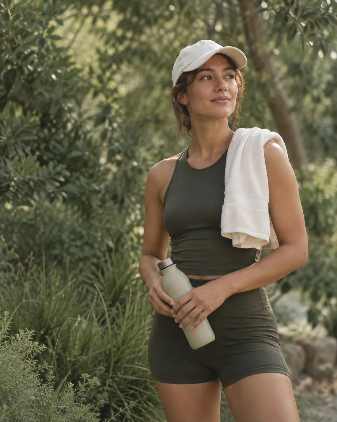
02-treatment-outdoor-athletic-portrait
Woman in athletic wear with a towel over her shoulder and a water bottle, standing in green outdoor light
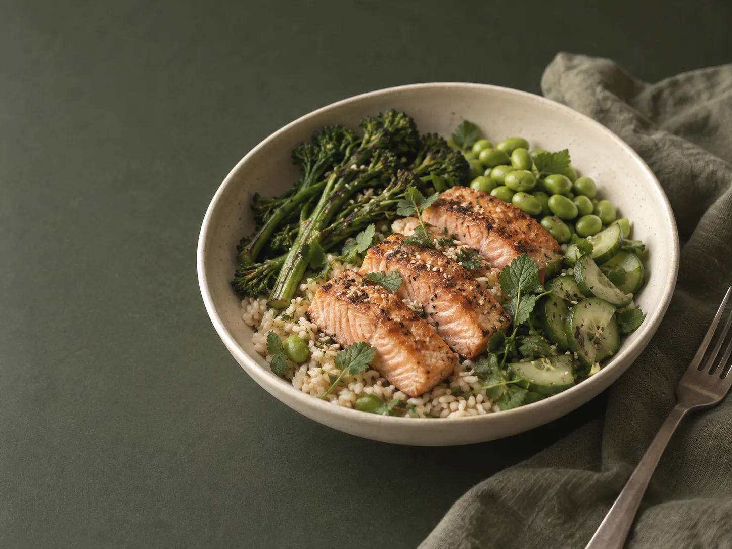
03-featured-meal-bowl
Bowl of salmon, rice and greens on a dark olive surface in soft daylight
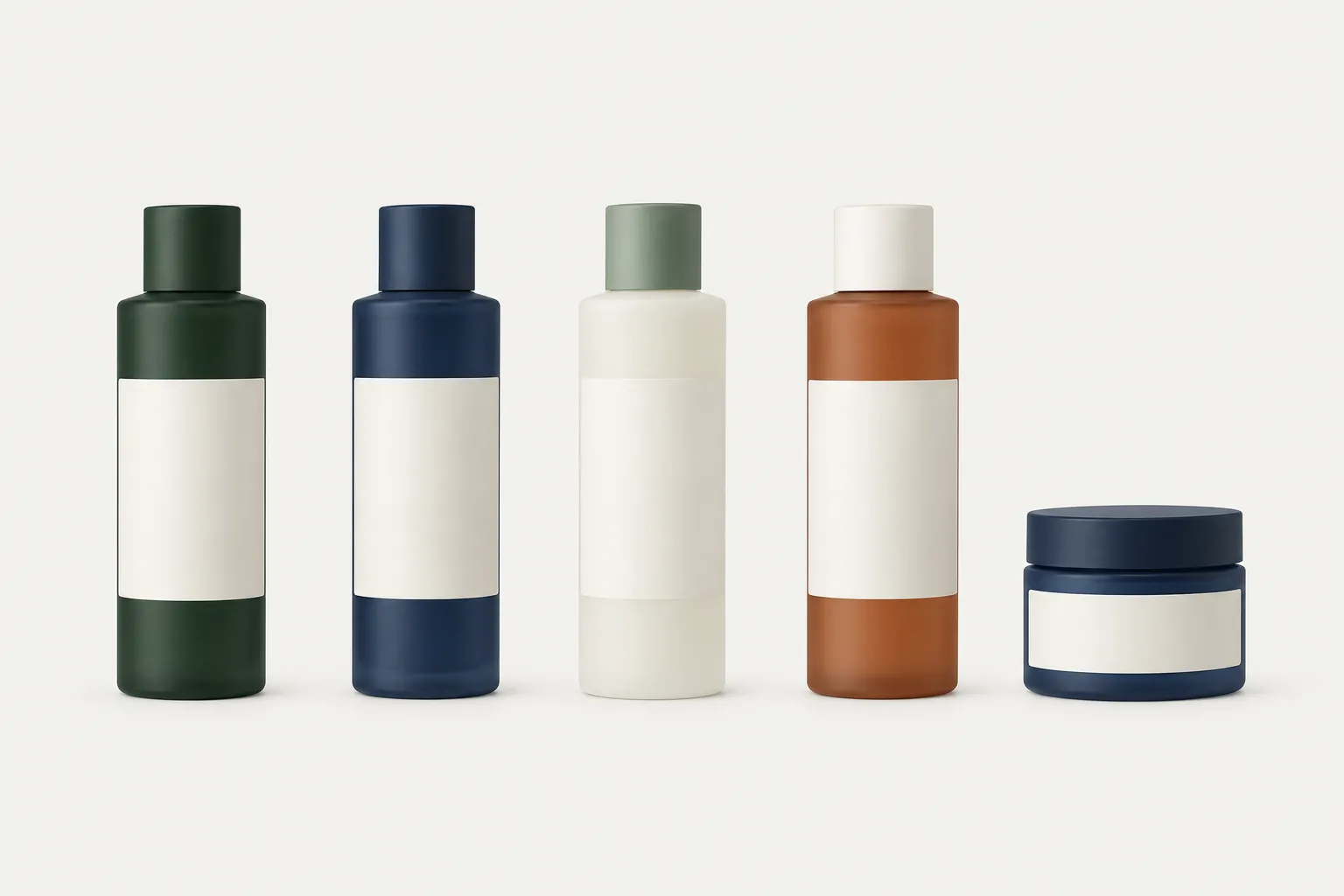
04-product-family-row
Row of five matte skincare and supplement bottles on a flat off-white plinth
Prompts
126,328 chars
# Wellness Treatment Landing Page — Build Prompt

A long, light-mode editorial landing page for a health/treatment service. Cold near-white paper, near-black type, one deep forest-green panel colour and exactly one loud accent (a lime). Photography is warm and human; the UI around it is flat, hairline-ruled, and almost shadowless. Everything is left-aligned to a single container. Motion is deliberately restrained — short fades and small rises, one parallax, nothing else.

No motion report was supplied with this reference. **Every timing, offset and range below is marked `(inferred)` and is read off the stills; durations and easings are given as ranges, not exact values, and nothing is specified as a library parameter.**

---

## 1. Structure

**Canvas**
- Page background `#FDFDFD`.
- Content container: **max-width 1320px**, centred, **60px side gutters** at 1440.
- Grid: **12 columns × 86px, 24px gutter** (12·86 + 11·24 = 1320).
- Three full-bleed panels break the container: the hero (§1, bleeds to all edges, bottom corners rounded), the testimonial panel (§6, inset 40px left/right, all corners rounded) and the footer (§8, bleeds to left/right/bottom, top corners rounded).

**Section label row** — every section from §2 to §7 opens with the same device: a 1px hairline across the full container, then 16px below it a row with a mono uppercase label at the left (`+ ABOUT US`) and a bracketed index at the right (`[ 01 ]`). Same treatment on light and on dark panels, colour inverted.

**Sections, top to bottom**

1. **Hero** — full-bleed photograph, floating nav, badge, headline bottom-left, support paragraph + CTA bottom-right, meta rule at the base.
2. **About / pull quote** — label `+ ABOUT US` `[ 01 ]`. Portrait card left, large pull quote right, then a second row: interior photo, short CTA block, lime stat card.
3. **Featured treatment** — label `+ FEATURED TREATMENT` `[ 02 ]`. Big heading left, tag-chip cloud beneath it, specialist card bottom-left, lime metric card overlapping a square food photograph right.
4. **Treatment list** — label `+ OUR TREATMENT` `[ 03 ]`. Heading left, small quote right, then a tall lifestyle photo with an overlaid dark price card (left) beside a 4-row accordion of treatments (right, first row open).
5. **Products** — label `+ OUR PRODUCTS` `[ 04 ]`. Filter chip row + search field, heading, then a product carousel: small cards, one large featured card with a discount tag and a buy pill, and a right-hand product detail column. Counter + prev/next below.
6. **Testimonials** — inset deep-green panel. Label, heading, carousel arrows top-right; portrait card left, lime quote card right, counter bottom-left.
7. **FAQ** — label `+ FAQ` `[ 06 ]`. Heading left with a small lime routine card beneath it; 5-row question accordion right, second row open.
8. **Footer** — near-black panel. CTA heading + pill left, four/five meta columns right, then a nav + social row, then a legal row.

---

## 2. Scroll map

Reference viewport 1440 × 900. All values **(inferred)** from the full-page composite; the capture is 1200 × 6761 image px read as a 1440 CSS px layout (÷0.833).

| # | Section | Height | Viewports | Scroll consumed | Kind |
|---|---------|--------|-----------|-----------------|------|
| 1 | Hero | 1100px | 1.22 | 1100px | entrance on load, then scroll-linked (parallax) |
| 2 | About / pull quote | 920px | 1.02 | 920px | entrance |
| 3 | Featured treatment | 1000px | 1.11 | 1000px | entrance |
| 4 | Treatment list | 1280px | 1.42 | 1280px | entrance |
| 5 | Products | 1080px | 1.20 | 1080px | entrance |
| 6 | Testimonials | 1120px | 1.24 | 1120px | entrance |
| 7 | FAQ | 930px | 1.03 | 930px | entrance |
| 8 | Footer | 690px | 0.77 | 690px | entrance |

**Total page height ≈ 8120px ≈ 9.0 viewports.** Nothing pins, nothing stacks, nothing consumes more scroll than its own height. The page reads at normal scroll speed all the way down; do not add a pinned section.

---

## 3. Spacing

- **Section padding:** 120px top / 140px bottom for §2–§5 and §7. §6 panel: 40px outer margin, 80px inner padding all round. §8: 96px top / 56px bottom inside the panel.
- **Section rhythm inside a section:** hairline → 16px → label row → 56px → heading → 64px → content.
- **Row gap** between the two content rows of §2 and §3: 72px.
- **Grid gutter:** 24px everywhere. Card-to-card gap in the §5 carousel: 20px.
- **Card padding:** 28px on small cards (lime stat card, price card, specialist card), 40px on the large lime quote card in §6.
- **Controls:** pill button height 48px, padding 0 8px 0 24px (the trailing circular icon disc is 32px and sits inside the pill, 8px from its right edge). Chips 38px tall, 0 18px, 8px gap, wrapping. Search field 40px tall, 280px wide.
- **Accordion rows (§4, §7):** 32px padding top and bottom, separated by 1px hairlines; the open row expands to add a 16px gap then the answer paragraph, then 24px before its CTA row.
- **Hero internals:** nav 28px from the top; badge 40px under the logo; headline block bottom-anchored with its last baseline 330px above the hero's bottom edge; meta hairline 56px above the bottom edge with its two items 20px below it.
- **Footer columns:** 24px between label and value, 48px between column groups, 64px above the nav/social row, 32px above the legal row.

---

## 4. Type

Two families only.

- **Primary — neutral grotesk, slightly tightened.** Free stand-in: **Inter Tight** (fallback Inter). Used for everything except labels and meta.
- **Secondary — monospace.** Free stand-in: **JetBrains Mono** (or IBM Plex Mono). Used *only* for section labels, bracketed indices, timezone meta, counters (`1 / 8`), footer meta labels and numeric figures inside cards.

**Body anchor: 17px at 1440.** Every other level is a ratio of it.

| Role | Ratio | Size | Line-height | Tracking | Weight |
|---|---|---|---|---|---|
| Section display heading (§3, §4, §5) | 3.3× | 56px | 1.08 (60px) | −0.025em | 450 |
| Hero headline (§1) | 3.05× | 52px | 1.12 (58px) | −0.02em | 400 |
| Panel heading (§6, §7) | 2.35× | 40px | 1.15 (46px) | −0.02em | 450 |
| Pull quote (§2) | 2.2× | 38px | 1.35 (51px) | −0.01em | 400 |
| Big figure (`16h`, `1.800`, `$400`) | 2.35× | 40px | 1.0 | −0.02em | 500, tabular, mono |
| Accordion / list title (§4, §7) | 1.9× | 32px | 1.2 (38px) | −0.015em | 400 |
| Quote card body (§6) | 1.65× | 28px | 1.4 (39px) | −0.01em | 400 |
| Footer CTA heading (§8) | 1.65× | 28px | 1.25 (35px) | −0.015em | 450 |
| Product / card title (§2, §5) | 1.4× | 24px | 1.25 (30px) | −0.01em | 450 |
| **Body (running text)** | **1×** | **17px** | **1.6 (27px)** | 0 | 400 |
| Small body / card copy | 0.88× | 15px | 1.55 (23px) | 0 | 400 |
| Nav link, button label | 0.88× | 15px | 1.0 | 0 | 500 |
| Chip / filter label | 0.82× | 14px | 1.0 | 0 | 450 |
| Label, index, meta, counter | 0.7× | 12px | 1.2 | +0.12em, uppercase | 500, mono |

**Max line length:** body 62–68 characters (≈560px at 17px); pull quote 44–48 characters (≈800px); display headings 20–26 characters, broken deliberately onto two lines; footer meta values 24 characters.

**Copy placeholders (never brand copy):**
- Hero badge: status pill, 2–3 words, uppercase.
- Hero headline: 9–12 words on three lines.
- Hero support paragraph: 14–18 words.
- Section headings: 5–7 words on two lines.
- Pull quote: 16–20 words on three lines.
- Accordion titles: 2–4 words; sub-lines 6–9 words; open answer 25–35 words.
- FAQ questions: 5–9 words; the open answer 30–40 words.
- Testimonial: 24–30 words, one sentence; author name + `2 years of trust`-style tenure line.

---

## 5. Colour

| Hex | Role |
|---|---|
| `#FDFDFD` | **Dominant surface** — the page. Roughly 70% of all pixels outside the photographs. Cold near-white, not cream. |
| `#030302` | Primary text, and the footer panel's fill (§8). Also the active filter chip and the dark "Contact us" nav pill. |
| `#2B3F34` | Deep forest green. Second surface: the §6 testimonial panel, the §4 overlaid price card, and the fill of every primary pill button. |
| `#C3E886` | **The single accent.** Lime. |
| `#D39A79` | Warm terracotta. Used only as a photographic key tone (skin, amber glass) and for one tiny element: the discount tag in §5. Never as a surface. |

**Supporting neutrals (derived, use exactly these):** `#6B7269` muted body text on light; `#E4E4DF` hairlines and chip borders; `#F2F2EF` neutral card/plinth fill behind product shots; `rgba(253,253,253,0.72)` secondary text on dark panels.

**Where the lime is allowed:** the §2 stat card, the §3 metric card, the §6 quote card, the §7 routine card, progress-bar fills, the star glyph on ratings, and the small dot inside the hero badge. That is the whole list. It never appears as a section background, never as a button fill, never as type on white (contrast fails), and never covers more than ~6% of any one viewport.

**Text on colour:** on `#C3E886` use `#030302`. On `#2B3F34` and `#030302` use `#FDFDFD` at full opacity for headings and 72% for body.

---

## 6. Surface

- **Borders:** 1px `#E4E4DF` on light; 1px `rgba(253,253,253,0.16)` on dark panels. Hairlines are the primary separator — between sections, between accordion rows, above the footer legal row, above the hero meta row.
- **Radii — bimodal, no in-between:**
  - Controls (buttons, chips, badges, counters, icon discs, search field): **999px, full pill.**
  - Cards, images, product plinths: **20px.**
  - Large panels (hero bottom corners, §6 panel, §8 top corners): **32px.**
  - Rules and hairlines: **0.**
- **Shadows: none.** Not on cards, not on the floating nav, not on overlaid cards sitting on photographs. Separation comes from fill contrast and hairlines. The only tonal device on the page is the hero's bottom scrim (a `transparent → rgba(3,3,2,0.55)` linear gradient over the lower 45% of the photo) — that is not a shadow and is the page's only gradient.
- **Icon discs:** 32px circles, 1px border, containing a 12px arrow (↗ or →). Inside dark pills the disc is `#FDFDFD` with a dark glyph; standalone (carousel arrows, accordion +/−) the disc is transparent with a 1px border.

---

## 7. Imagery

All photography shares one grade: warm neutral, natural daylight, medium contrast, no filter, no monochrome, faint grain. People look mid-action and unposed rather than smiling at camera.

1. **§1 hero** — 1440 × 1100 (≈1.31:1), full-bleed. A woman in over-ear headphones, head tipped back, eyes closed, shoulders relaxed; strong window light raking from behind so the hair edge glows; blurred green interior planting behind. Camera slightly below eye-line, shallow depth. Lower 45% darkened by the scrim so light type sits on it.
2. **§2 portrait card** — 3:4 vertical, ~370 × 493, cols 1–4. Seated woman indoors in a knit top, three-quarter turn, soft daylight; a small white caption card overlays its bottom-left inset 20px.
3. **§2 interior** — 4:3 landscape, ~360 × 270. An empty practice room: tall window, a floor cushion, one plant, morning light on a bare floor. No people. A 40px play/expand disc sits centred on it.
4. **§3 specialist portrait** — 4:5, ~200 × 250, inside the specialist card at its left. A practitioner in a plain shirt against a flat olive-grey wall, hands folded, direct gaze.
5. **§3 food plate** — 1:1 square, ~480 × 480, right column. Overhead grain bowl — salmon, greens, grains — on a pale stone surface, one hard-ish daylight source, crumbs and a fork edge in frame. The lime metric card overlaps its top-left corner by ~80px.
6. **§4 lifestyle** — 4:5 vertical, ~620 × 775, left column. A woman in athletic wear with a towel over her shoulders, mid-walk against dense green foliage, late-afternoon light. The dark `#2B3F34` price card overlays its lower-left, inset 24px.
7. **§5 product shots** — five images. Three small at 3:4 (~260 × 347) and one featured at 4:5 (~340 × 425), plus two stacked small ones in the right column. Each is a single bottle or tube — dark green glass, cobalt glass, a cream tube, an amber bottle — standing on a seamless `#F2F2EF` ground, one soft key light from the upper left, a short contact shadow at the base only. Labels are blank or set in the page's own grotesk; no invented brand marks.
8. **§6 testimonial portrait** — 3:4 vertical, ~340 × 453, left of the quote card. A woman outdoors, backlit, hair loose, looking off-frame.
9. **§6 author avatar** — 1:1, displayed as a 36px circle inside the quote card's author row.

---

## 8. Motion

Restrained by design. The vocabulary is exactly two things: a fade-and-rise entrance, and one parallax. There is no pinning, no stacking, no horizontal scroll-jacking, no reveal masks beyond a simple clip on images.

All values below are **(inferred)** from the stills. Durations are given as ranges because they were **not measured**.

### §1 Hero
- **kind** — entrance on load, then scroll-linked (parallax)
- **what moves** — the background photograph (scroll-linked); on load: badge, headline lines, support paragraph, CTA pill, meta row
- **from → to** — photograph: `scale 1.06 → 1.00` and `translateY 0 → −80px` as the section scrolls out; scrim opacity constant. Load entrance: each text block `opacity 0 → 1`, `translateY 20px → 0`; the headline animates as three separate lines.
- **range** — parallax is scroll-linked and reverses on the way back up: from page scroll 0 until the hero's bottom edge reaches the viewport top (0 → 1100px of scroll). The `scale 1.06 → 1.00` portion completes over the first 400px. Load entrance: fires once, 120ms after paint; 500–700ms (inferred); ease-out cubic; 70–90ms stagger in order badge → headline line 1 → 2 → 3 → paragraph → CTA → meta row.
- **reduced motion** — no parallax and no scale; the photograph is static at `scale 1.0`. Text appears with opacity only, 150ms, no translate.

### §2 About / pull quote
- **kind** — entrance (plays once on arrival, does not reverse)
- **what moves** — label row hairline, pull quote (by line), portrait card, interior photo, CTA block, lime stat card, and the segmented bars inside the stat card
- **from → to** — hairline `scaleX 0 → 1` from the left. Text blocks `opacity 0 → 1`, `translateY 24px → 0`. Image cards `opacity 0 → 1`, `translateY 24px → 0`, `clip-path inset(0 0 12% 0) → inset(0 0 0 0)`. Stat-card bars fill left-to-right `scaleX 0 → 1`.
- **range** — trigger: once, when the element's top reaches 80% of the viewport. Duration 500–650ms (inferred); ease-out cubic; stagger 80ms between siblings; the stat-card bars run 40ms apart after their card lands.
- **reduced motion** — opacity only, 150ms, no translate, no clip; bars render already filled.

### §3 Featured treatment
- **kind** — entrance
- **what moves** — heading (two lines), chip cloud, specialist card, food photograph, lime metric card, the 40% progress segments
- **from → to** — heading lines `opacity 0 → 1`, `translateY 24px → 0`. Chips `opacity 0 → 1`, `translateY 10px → 0`. Food photograph `opacity 0 → 1`, `scale 1.03 → 1.00`. Metric card `opacity 0 → 1`, `translateY 28px → 0`, landing after the photograph so it reads as settling onto it. Progress segments fill `scaleX 0 → 1`.
- **range** — trigger: once, when the element's top reaches 80% of the viewport. 500–650ms (inferred); ease-out cubic; heading lines 80ms apart, chips 35ms apart, card group 100ms after the photograph.
- **reduced motion** — opacity only, 150ms; no scale, no translate; segments pre-filled.

### §4 Treatment list
- **kind** — entrance
- **what moves** — heading, right-hand quote, lifestyle photograph, overlaid price card and its sparkline, the four accordion rows
- **from → to** — heading and quote `opacity 0 → 1`, `translateY 24px → 0`. Photograph `opacity 0 → 1`, `clip-path inset(0 0 14% 0) → inset(0 0 0 0)`. Price card `opacity 0 → 1`, `translateY 20px → 0`; its sparkline draws `stroke-dashoffset 100% → 0`. Accordion rows `opacity 0 → 1`, `translateY 16px → 0`, top to bottom.
- **range** — trigger: once, when the element's top reaches 80% of the viewport. 500–650ms (inferred), sparkline 700–900ms (inferred); ease-out cubic; accordion rows staggered 70ms.
- **reduced motion** — opacity only, 150ms; sparkline drawn instantly; no clip.

### §5 Products
- **kind** — entrance (the carousel itself is interaction-driven, not scroll-driven)
- **what moves** — filter chip row, search field, heading, the product cards, the right-hand detail column
- **from → to** — chips and search `opacity 0 → 1`, `translateY 10px → 0`. Heading lines `opacity 0 → 1`, `translateY 24px → 0`. Product cards `opacity 0 → 1`, `translateY 28px → 0`, left to right. Detail column `opacity 0 → 1`, `translateY 20px → 0`.
- **range** — trigger: once, when the element's top reaches 80% of the viewport. 500–650ms (inferred); ease-out cubic; cards 90ms apart. **The carousel does not advance on scroll** — it moves only on arrow click or drag.
- **reduced motion** — opacity only, 150ms; cards appear together.

### §6 Testimonials
- **kind** — entrance
- **what moves** — the green panel, label row, heading, arrow discs, portrait card, lime quote card, counter
- **from → to** — panel `opacity 0 → 1`, `translateY 32px → 0` (it arrives as one slab, before its children). Heading lines `opacity 0 → 1`, `translateY 24px → 0`. Portrait and quote card `opacity 0 → 1`, `translateY 24px → 0`. Quotation glyph `opacity 0 → 1` only.
- **range** — trigger: once, when the panel's top reaches 85% of the viewport (earlier than other sections because the slab is tall). 550–700ms (inferred); ease-out cubic; children start 120ms after the panel, 80ms stagger.
- **reduced motion** — opacity only, 150ms; the panel does not translate.

### §7 FAQ
- **kind** — entrance
- **what moves** — heading (two lines), lime routine card and its bars, the five question rows and their hairlines
- **from → to** — heading `opacity 0 → 1`, `translateY 24px → 0`. Routine card `opacity 0 → 1`, `translateY 20px → 0`; its bars `scaleX 0 → 1`. Question rows `opacity 0 → 1`, `translateY 16px → 0`; each row's hairline `scaleX 0 → 1` from the left, running just ahead of its text.
- **range** — trigger: once, when the element's top reaches 80% of the viewport. 450–600ms (inferred); ease-out cubic; rows staggered 60ms top to bottom. The pre-opened second row is already expanded on arrival — it does not animate open.
- **reduced motion** — opacity only, 150ms; hairlines and bars render at full width.

### §8 Footer
- **kind** — entrance
- **what moves** — the dark panel, CTA heading, CTA pill, the meta columns, nav/social row
- **from → to** — panel `translateY 32px → 0`, `opacity 0 → 1`. CTA heading lines and each meta column `opacity 0 → 1`, `translateY 16px → 0`.
- **range** — trigger: once, when the panel's top reaches 90% of the viewport. 450–600ms (inferred); ease-out cubic; meta columns 60ms apart left to right. No parallax, no reveal — the footer does not slide out from under the page.
- **reduced motion** — opacity only, 150ms.

### Interaction transitions (not scroll choreography)

- **Nav links** — colour shift to full-opacity on hover, 150ms ease; a 1px underline grows `scaleX 0 → 1` from the left, 180ms.
- **Pill buttons** — background lightens ~6% and the trailing icon disc rotates its arrow 45° toward the corner, 180ms ease-out. Press: `scale 0.98`, 90ms.
- **Icon discs / carousel arrows** — border colour goes to full-contrast and fill inverts (transparent → `#030302`, glyph → `#FDFDFD`), 150ms. Disabled arrow sits at 35% opacity and does not respond.
- **Filter chips** — hover: border darkens, 150ms. Selected: fill `#030302`, label `#FDFDFD`, 180ms crossfade; only one chip is ever selected.
- **Accordion open/close (§4, §7)** — height animates to content height, 280–360ms (inferred), ease-in-out; the answer paragraph fades in over the last 60% of that; the `+` disc rotates 45° to become `−`; the title colour goes from 70% to full. Only one row is open at a time — the outgoing row closes on the same curve.
- **Product cards** — hover raises the image `translateY −6px` and brings the buy pill from `opacity 0, translateY 8px` to rest, 200ms ease-out. No shadow appears.
- **Carousel advance (§5, §6)** — track translates by one card width + gap, 420–520ms (inferred), ease-in-out; the counter number crossfades, 150ms. Drag is allowed and follows the pointer 1:1 with a rubber-band clamp at the ends.
- **Search field** — focus swaps the 1px border to `#030302` and the placeholder fades to 40%, 150ms. No glow ring.
- **Links in the footer** — opacity 72% → 100%, 150ms; no underline.
- **Nav on scroll** — the floating pill keeps its shape and position but swaps from translucent-over-photo to a solid `#FDFDFD` fill with a 1px `#E4E4DF` border once the hero's bottom passes the viewport top; 200ms crossfade. It does not shrink, re-stack, or gain a shadow.

---

## 9. Responsive (below 640px)

- Container gutters drop to 20px; container is fluid. Full-bleed panels lose their 40px inset (§6 goes edge-to-edge, radius 20px).
- Grid collapses to one column everywhere. Order is always: heading → image → supporting text/card.
- **§1** — hero height 640px (not 1100). Nav collapses to logo + a 40px menu disc; links move into a full-screen sheet. Headline 32px / 1.15 on four lines. Support paragraph and CTA stack under the headline at 24px gap. The timezone meta row keeps both items but wraps to two lines at 12px. Parallax is disabled entirely on touch.
- **§2** — pull quote first at 24px, then portrait card full-width 4:5, then interior photo, then CTA block, then the lime stat card full-width.
- **§3** — heading 32px; chip cloud scrolls horizontally in one row with a 20px bleed, no wrap; specialist card full-width; the food photo goes 4:3 and the lime metric card moves *below* it rather than overlapping.
- **§4** — the lifestyle photo goes 4:3 and the dark price card drops below it instead of overlaying; the sparkline is kept, the two small stats sit side by side. Accordion is full-width with 24px row padding.
- **§5** — filter chips scroll horizontally; the search field drops entirely. Carousel becomes a one-card-per-view snap track; the right-hand detail column moves below the featured card. Counter + arrows stay.
- **§6** — portrait card goes 3:2 and sits above the quote card; quote text 20px; panel padding 32px.
- **§7** — routine card drops below the accordion, not beside it.
- **§8** — CTA heading 24px, pill full-width; meta columns become a two-up grid, then the nav row wraps to two lines and the social pills scroll horizontally. Legal row stacks to two lines, left-aligned.
- All entrance distances halve (24px → 12px) and staggers halve below 640px.

---

## 10. Don'ts

- **Don't warm up the background.** This is `#FDFDFD` — a cold, slightly blue-leaning white. Every wellness template reaches for cream, sand or `#FAF7F2`. That single substitution destroys the look, because the whole page depends on the warm photography reading as the only warmth.
- **Don't let the lime become a surface.** `#C3E886` is confined to four small cards, progress fills and a star. Do not tint a section with it, do not use it as a button fill, do not make it a hover state, do not put dark text on a lime hero. If more than one lime element is visible in a single viewport, you've over-used it.
- **Don't make the buttons black pills with white text everywhere.** Primary pills are `#2B3F34` forest green with a white circular icon disc tucked inside the right end. The only true-black control is the nav's "Contact us" pill and the active filter chip.
- **Don't normalise the radii to one value.** The system is bimodal on purpose: 999px for anything you can click, 20px for cards and images, 32px for the three big panels, 0 for rules. An 8px or 12px radius anywhere reads wrong immediately.
- **Don't add shadows, blur panels, or glassmorphism.** There is exactly one gradient on the page (the hero scrim) and zero `box-shadow`s. Floating cards over photographs sit flat with no elevation.
- **Don't centre anything.** Every heading, label and paragraph is flush-left to the container or to its column. No centred hero, no centred section headers, no centred FAQ.
- **Don't inflate the labels.** `+ ABOUT US` and `[ 01 ]` stay 12px mono uppercase at +0.12em. They are not eyebrows to be set at 14–16px in the heading font, and the `+` and the brackets are literal characters, not icons.
- **Don't set a serif or a script.** No Playfair, no Cormorant, no handwritten "spa" face. One grotesk plus one mono, and the mono only in the roles listed.
- **Don't make the headline huge.** The section headings (56px) are actually *larger* than the hero headline (52px) — the hero leans on the photograph, not on type. Resist pushing the hero to 72–96px.
- **Don't animate the page like a portfolio.** No 60–80px slides, no springs or bounces, no blur-in, no letter-by-letter splits, no parallax on every image, no scroll-driven counters, no marquee, no sticky progress bar, no cursor follower. The whole page is fades plus ≤28px rises plus one hero parallax.
- **Don't pin or horizontally scroll-jack §5 or §6.** Both carousels move on click and drag only. The page height must stay ≈8120px; any pinning breaks the scroll map.
- **Don't grey the body into invisibility.** Muted text bottoms out at `#6B7269` and body never goes below 16px. Card copy at 15px is the floor for prose; 12px is the floor for labels; nav and buttons never below 14px.
- **Don't filter the photographs.** No duotone, no black-and-white, no heavy green grade, no vignette (the hero's scrim is a layout device, not a treatment). People are caught mid-motion with eyes closed or off-camera — not grinning at the lens.
- **Don't build the product shots as cut-outs on white.** Each bottle sits on a visible `#F2F2EF` plinth card with a short contact shadow at its base; the card, not the bottle, is what gets the 20px radius.
- **Don't open every accordion row.** §4 shows row 1 open and three collapsed with a muted sub-line each; §7 shows row 2 open and four collapsed with no sub-line. One open at a time, always.
- **Don't drop the numeric furniture.** The bracketed indices, `1 / 8` counters, timezone pairs, `$400`, `16h`, `1.800 / 142`, the `40%` segmented bar — this quasi-dashboard detail is most of the page's character. A clean version of this layout without the numbers is a different, worse design.
