Synais — AI finance landing page
Rebuild
Opus 5.5Extra highfrontend-designemil-design-engtransitions-devgsaphumanizerView
RebuildReference
Move across the image to wipe between the two. Click to lock the seam; arrow keys nudge it.
Imagery
2/2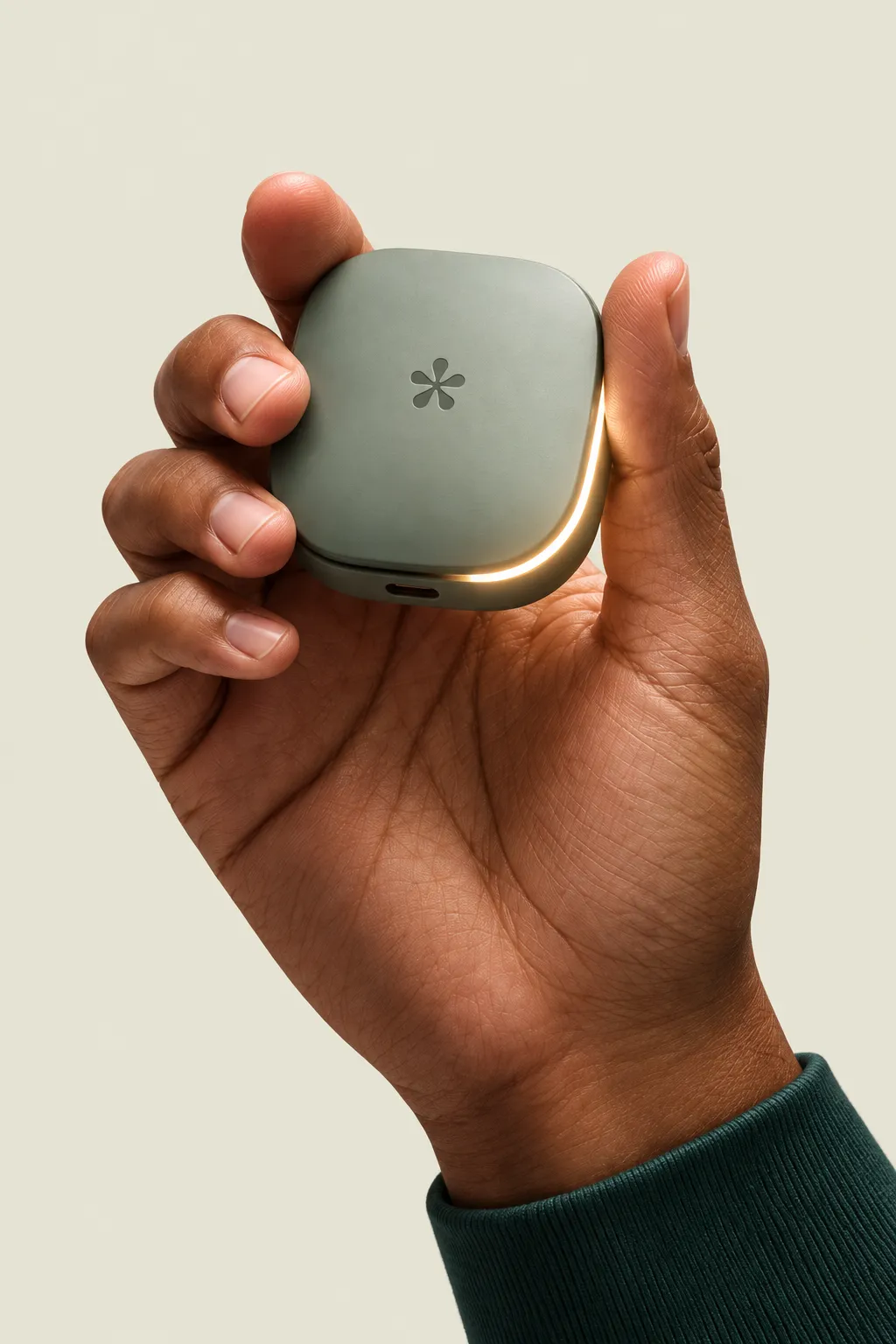
01-hero-hand-device
A deep-brown-skinned hand holding a small soft-cornered sage-green device with an asterisk mark and a glowing amber light strip
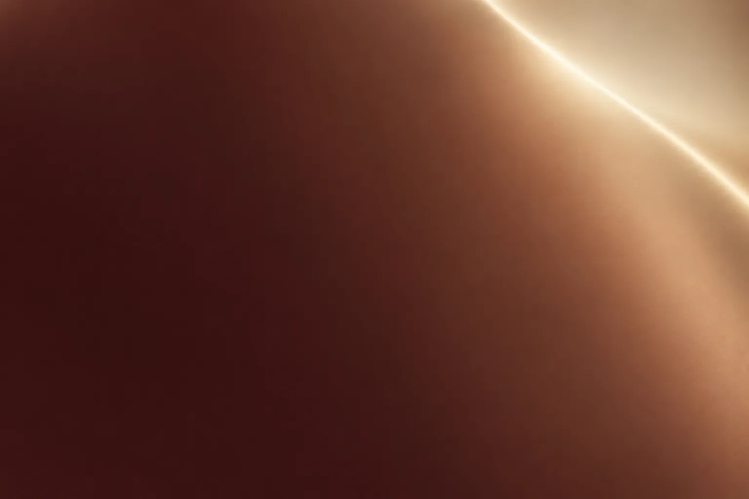
02-closing-bronze-panel
Abstract close-up of a curved satin-bronze surface glowing from deep oxblood to a pale champagne highlight
Prompts
119,868 chars
# Cream and oxblood fintech landing page

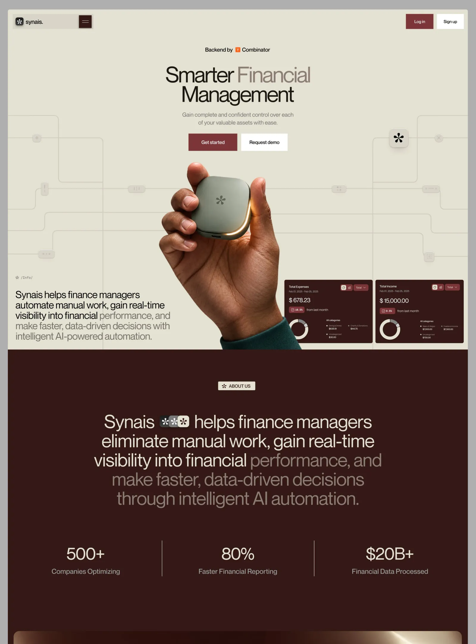
A quiet, high-contrast fintech landing page in two grounds. The top screen is warm parchment cream with faint circuit-board traces. A cut-out photo of a hand holding a small rounded device rises from the bottom edge, between a left-aligned statement paragraph and two small dark dashboard cards. Below it the page turns deep oxblood-brown for a large centred statement, a three-column stats band and a wide, rounded closing photograph that ends the page. The type is a neo-grotesk with very tight tracking. Primary buttons are square-cornered maroon blocks and secondary buttons are white. Motion is minimal.

## Structure

- **Viewport reference:** 1440 × 900. The page is full-bleed with no outer margin, no page-level rounding and nothing behind it.
- **Container:** there is no centred max-width wrapper for the frame. Edge-anchored elements sit 14–24px from the viewport sides. Centred content uses its own max widths: hero stack about 460px, statement 900px. The stats band spans the full 1440 in three equal 480px columns.
- **Columns:** the hero is a three-zone composition over one shared canvas:
  - left zone, x 24–514: the statement paragraph, bottom-anchored
  - centre zone: the product photo
  - right zone, x 865–1425: two dashboard cards side by side, bottom-anchored

  Everything below the hero is a single centred column, except the 3-up stats band.

**Sections, top to bottom:**

1. **Nav bar.** A fixed overlay, 14px from the top. On the left, a 251 × 47 frosted-glass group: logo tile, wordmark, square menu button. On the right, two 47px-tall buttons.
2. **Hero.** 1056px tall, cream. In order:
   - centred credit line
   - two-line display headline
   - two-line subhead
   - two CTAs
   - circuit-trace background layer
   - centred product cut-out whose bottom is cropped by the section's bottom edge
   - bottom-left mono label and statement paragraph
   - bottom-right pair of dashboard cards
3. **About statement.** Oxblood ground. A centred chip label, then a five-line centred statement with an inline three-tile icon stack after its first word.
4. **Stats band.** Oxblood. Three equal columns separated by 1px vertical hairlines, each with a large value and a one-line label.
5. **Closing image.** Oxblood. One wide, rounded photograph panel, inset 18px left, right and bottom. It is the last thing on the page: no footer row or text after it.

## Scroll map

Viewport height = 900px.

1. **Nav bar:** 75px band (0.08 vp), overlaid and fixed. Consumes 0 scroll. Static.
2. **Hero:** 1056px (1.17 vp). Consumes 1056px. Entrance.
3. **About statement:** 544px (0.60 vp), y 1056–1600. Consumes 544px. Entrance.
4. **Stats band:** 250px (0.28 vp), y 1600–1850. Consumes 250px. Entrance.
5. **Closing image:** 820px (0.91 vp), y 1850–2670: 81px gap, 720px panel, 18px bottom inset. Consumes 820px. Entrance.

**Total page height:** about 2670px (2.97 viewports). Nothing pins or stacks.

## Spacing

**§1 Nav**
- The nav group is inset 14px from the top and 15px from the left.
- The right button pair is inset 14px from the top and right; the buttons sit 10px apart.
- Glass group padding: 4px top, right and bottom; 9px left.
- Inside the group: logo tile, then 6px gap, then wordmark; the menu button is pushed to the far right.

**§2 Hero** (y values from the top of the page)
- Credit line: cap-centre at y 125.
- Headline line box: starts at y 172, ends at y 300.
- Subhead: starts at y 316, 16px below the headline, and ends at y 364.
- CTA row: starts at y 386, 22px below the subhead, and ends at y 440. The two buttons sit 10px apart.
- Product cut-out: starts at y 471, 31px below the CTAs, and runs to y 1056, where the section edge crops it.

**§2 Hero, bottom-left block**
- Left inset 24px.
- Mono label at y 826–838.
- Statement paragraph starts 26px below the label and ends 26px above the hero's bottom edge.

**§2 Hero, dashboard cards**
- Each card is 276 × 196.
- 8px gap between the cards.
- Right inset 15px; bottom inset 20px from the hero edge, so the cards span y 840–1036.

**§3 About statement**
- 100px top padding before the chip.
- 72px from the chip to the statement.
- 44px below the statement.

**§4 Stats band**
- 49px from the top of the section to the hairlines.
- The hairlines are 112px tall.
- 89px below the hairlines.
- In each column, the value and label are centred vertically in the 112px band, with 18px between value and label.

**§5 Closing image**
- 81px top gap, so the panel sits 170px below the stats hairlines.
- The panel is 18px from the left, right and bottom edges.

**Rhythm:** the dark sections use generous vertical gaps (100 / 72 / 92 / 170) against a tight hero. Never compress the dark part into even 64px gaps.

## Type

**Families**
- **Main family:** one neo-grotesk family (Helvetica Now Display or Neue Haas class) for everything. It is a variable font: display weight sits near 430, slightly heavier than regular. Free stand-in: **Inter Tight** (variable, Google Fonts) using `font-variation-settings: "wght" 430` for display.
- **Mono:** used only for the small slash label and the percentage badges. Free stand-in: **Geist Mono** or **JetBrains Mono**.

Body anchor: 17px.

| Level | × body | Size | Line-height | Tracking | Weight | Max length |
|---|---|---|---|---|---|---|
| Hero display headline | 3.75× | 64px | 1.0 | −0.055em | 430 | 2 lines, about 18ch |
| About statement | 3.3× | 56px | 1.07 | −0.04em | 400 | 900px (about 42ch), `text-wrap: balance` |
| Stat value | 3.3× | 56px | 1.0 | −0.04em | 400 | one line |
| Hero statement paragraph | 1.7× | 29px | 1.1 | −0.03em | 400 | 490px (about 32ch) |
| Stat label | 1.18× | 20px | 1.3 | −0.01em | 400 | one line |
| Wordmark | 1.06× | 18px | 1.0 | −0.03em | 500 | — |
| Body / subhead | 1× | 17px | 1.41 | −0.01em | 400 | 350px (about 45ch) |
| Credit line | 0.94× | 16px | 1.25 | −0.01em | 500 | one line |
| Hero CTA label | 0.88× | 15px | 1.0 | −0.01em | 500 | — |
| Nav button / chip label | 0.82× | 14px | 1.0 | 0 (chip is uppercase, +0.01em) | 500 | — |
| Mono slash label | 0.71× | 12px | 1.2 | +0.02em | 400 mono | — |

**Two-tone text:** the trailing clause of the hero headline, the hero paragraph and the about statement switches to a muted tone mid-sentence. This is static colour on spans, not opacity on the whole block and not a gradient.
- Headline: word 2 of line 1 is muted.
- Hero paragraph: about the first 14 words are ink; the rest is muted.
- About statement: about the first 15 words are cream; the rest is muted.

**Placeholder copy**

| Element | Copy |
|---|---|
| Credit line | "Backed by" + 14px badge + 1-word partner name |
| Headline | 3 words on two lines: "Word Muted-word / Longword" |
| Subhead | 14–16 words over 2 lines |
| CTAs | 2 words each |
| Mono label | a 4px asterisk glyph + one word wrapped in slashes, `/Word/` |
| Hero paragraph | 28–30 words over 5 lines |
| Chip | 2 uppercase words |
| About statement | about 30 words over 5 lines; word 1 is a brand word followed by the inline icon stack |
| Stats | value 3–5 characters (count with "+", a percentage, a currency amount with "B+"); label 2–3 words |

## Colour

| Hex | Role |
|---|---|
| `#E4E2D3` cream | The hero surface (about 40% of the page). Also text on dark, the chip fill on dark, and the cream parts of the dashboard cards. |
| `#351817` oxblood-brown | The ground of §3–§5 (about 60% of the page), the dashboard card surface and the menu button fill. |
| `#1A1411` ink | Primary text on cream. |
| `#857B71` warm grey | Muted text on cream: headline word 2, subhead, the paragraph's trailing clause. |
| `#8C7A73` muted rose-grey | Muted text on dark: the statement's trailing clause, the donut's minor segment. |
| `rgba(228,226,211,0.75)` | Stat labels. |
| `rgba(228,226,211,0.55)` | Stat hairlines. |
| `#7A3432` maroon | **The single accent.** Allowed only as a fill on: the primary hero CTA, the nav "log in" button, and the dropdown pill and % badges inside the dashboard cards. Never text colour, never a border, never on §3–§5 type. |
| `#FFFFFF` white | Fill of the secondary buttons only (nav "sign up", hero "request demo"), with ink text. |
| `#CFCBBE` trace | Circuit lines. |
| `#DCD9CB` chip | Embossed circuit nodes. |
| `#955D45` copper / `#533C37` umber | Photographic tones only: skin and bronze in the imagery and in the closing image's fallback gradient. Not UI colours. |
| `#F26625` orange | The 14px partner badge in the credit line. The one off-palette hue; it appears nowhere else. |

## Surface

**Radii**
- 0px: all buttons.
- 2px: menu button and chip.
- 3px: glass nav group.
- 4px: dashboard cards and their inner pills.
- 6px: logo tile.
- 8px: circuit chips and inline icon tiles.
- 12px: floating hero tile.
- 20px: closing image panel.

**Borders:** none on buttons, cards or the image. The only lines are the 2px circuit traces and the 1px stat hairlines.

**Shadows:** used on exactly three things:
- **Floating hero tile:** `0 8px 20px rgba(53,24,23,0.14), inset 0 1px 0 rgba(255,255,255,0.7)`.
- **Circuit chips:** emboss, `0 1px 2px rgba(53,24,23,0.10), inset 0 1px 0 rgba(255,255,255,0.7)`.
- **Glass nav group:** `0 1px 2px rgba(53,24,23,0.10), inset 0 0 0 1px rgba(255,255,255,0.35)`.

No shadows on buttons, dashboard cards or the closing image.

**Glass nav group fill:** `linear-gradient(90deg, rgba(196,191,176,0.55), rgba(228,226,211,0.35))` with `backdrop-filter: blur(14px) saturate(120%)`.

**Circuit layer.** One absolutely positioned 1440 × 1056 SVG behind all hero content and behind the product photo, which overlaps it. Strokes are 2px `#CFCBBE` with no fill. Every 90° turn is rounded at 16px. The right side mirrors the left (x′ = 1440 − x) with small irregularities.

Left-side paths:
- (0,328) → (152,328) → (152,536) → (296,536)
- (0,399) → (296,399), then the long vertical x = 296 down to y = 1056. It passes behind the hero paragraph.
- (0,621) → (76,621) → (76,556) → (470,556)
- (0,686) → (106,686) → (106,631) → (470,631)
- (0,761) → (96,761)

On the right, the mirrored vertical x = 1144 stops at y = 840 and lands exactly in the 8px gap between the two dashboard cards.

Nodes along the traces:
- Pill chips 52 × 24 with tiny glyphs in `#B9B4A6` (three dots, three bars, dash-dot), on the left at (400,556) and (120,761), and on the right at (1030,556) and (1316,556).
- A vertical chip 22 × 40 at (114,556).
- A 32px dot-grid chip at (1310,768).
- 26px round nodes at (90,399) and (1350,399).
- A **floating tile**, 60 × 60, fill `#ECEAE0`, centred at (1216,399) on the right trace, holding a 30px black asterisk mark.

## Imagery

1. **Hero product cut-out:** about 445 × 585, roughly 3:4 portrait, with no background (transparent PNG). A deep-brown-skinned hand rises from the bottom edge and holds a small, soft-cornered square device in matte sage green (about `#8E978A`). The device has an embossed six-spoke asterisk mark and a thin amber light strip glowing along its lower front edge. Warm studio light comes from the upper left. A forest-green knit cuff shows at the bottom right. The box's left edge is at x 471 (centre about 27px left of page centre). Its bottom is flush with, and cropped by, the hero's bottom edge, so the wrist runs off-section.
2. **Dashboard cards (×2):** a product shot built as DOM, `aria-hidden`.
   - **Build size and scaling:** author each card at 440 × 314 and scale it with `transform: scale(0.625)`, origin top left, to 276 × 196.
   - **Card:** `#351817` fill, 4px radius, 22px padding.
   - **Top row:**
     - left: title (15px cream, 500) over a date range (12px muted)
     - right: two 24px square icon buttons (the first cream with a dark clock glyph, the second translucent with a chart glyph) and a 64 × 24 maroon "label ⌄" pill
   - **Value:** 28px cream, e.g. "$ 000.00".
   - **Trend row:** a maroon 70 × 24 badge with a trend icon and a 12px mono percentage, then 14px "vs last period" text.
   - **Bottom row:**
     - left: a 100px donut ring with a 14px stroke, cream with a 25% `#8C7A73` segment
     - right: a 12px muted "all categories" label above a two-column legend of three items (6px cream dot, 12px muted name, 13px cream value)
   - **The two cards:** card 1 is an expenses-style card with a small value; card 2 is income-style with a larger value.
3. **Brand mark tile:** a 26px charcoal `#2B2624` tile with a cream 16px six-spoke asterisk glyph. This is a placeholder mark.
4. **Inline icon stack (§3):** three 36px tiles with 8px radius, overlapping by 8px: charcoal `#2A2724`, mid-grey `#8A8784`, cream `#E4E2D3`. Each carries the asterisk glyph in a contrasting tone. The stack sits inline after the statement's first word, vertically centred on the x-height, with 16px space on each side.
5. **Closing image panel (§5):** 1404 × 720 (about 1.95:1), at x 18–1422 and y 1931–2651, 20px radius, `object-fit: cover`. It is a warm abstract macro photograph, like glossy bronze or a satin surface under a single warm light:
   - deep oxblood-umber (`#351817` → `#533C37`) across the left 60%
   - rising through copper `#955D45`
   - to a pale champagne highlight (about `#D9C7A2`) in the upper right
   - one crisp diagonal specular streak running from the top edge at about 75% width down to the right

   No text, logo or overlay on it. If you have no photo, use a CSS mesh fallback: stacked radial gradients in the same stops plus a skewed linear gradient for the streak. The panel must still be there.

## Motion

No measured motion data exists for this page. Every value below is inferred, and the durations were not measured, so they are given as ranges.

**§1 Nav bar**
- **kind:** static (fixed position, inferred).
- **what moves:** nothing. Content scrolls beneath, and the glass group blurs it.
- **from → to:** none.
- **range:** none.
- **reduced motion:** identical.

**§2 Hero**
- **kind:** entrance.
- **what moves:** credit line, headline lines, subhead, CTA row, product cut-out, bottom-left block, dashboard card 1, dashboard card 2. The circuit layer and its chips stay static.
- **from → to:** text and buttons go opacity 0 → 1 and translateY 16px → 0 (12–20px). The product cut-out goes opacity 0 → 1 and translateY 40px → 0 (24–48px). The left block and the cards go opacity 0 → 1 and translateY 16px → 0.
- **range:** once, on page load. Duration not measured: 600–900ms, ease-out `cubic-bezier(0.22,1,0.36,1)`. Stagger 60–100ms in the order listed. All inferred.
- **reduced motion:** everything renders in its final state; at most a 150ms opacity fade.

**§3 About statement**
- **kind:** entrance.
- **what moves:** the chip, then each statement line as a separate block.
- **from → to:** opacity 0 → 1, translateY 20px → 0. The two-tone colour split is static and does not animate.
- **range:** once, when the section's top reaches 80% of the viewport. Duration not measured: 600–800ms, ease-out, 60–90ms stagger per line (inferred).
- **reduced motion:** shown immediately.

**§4 Stats band**
- **kind:** entrance.
- **what moves:** the three columns, each with its value, label and the hairline to its left.
- **from → to:** opacity 0 → 1, translateY 16px → 0. Values appear at their final number, with no counting.
- **range:** once, when the band's top reaches 85% of the viewport. Duration not measured: 500–700ms, ease-out, 80–120ms stagger left to right (inferred).
- **reduced motion:** shown immediately.

**§5 Closing image**
- **kind:** entrance.
- **what moves:** the panel and the photo inside it.
- **from → to:** the panel goes opacity 0 → 1 and translateY 32px → 0. The inner image goes scale 1.06 → 1.0 inside the clipped panel.
- **range:** once, when the panel's top reaches 85% of the viewport. Duration not measured: 900–1200ms, ease-out (inferred).
- **reduced motion:** static, fully visible.

**Interaction transitions** (not part of the scroll choreography). Durations were not measured: 150–200ms ease-out.
- **Primary maroon button hover:** fill `#7A3432` → `#682B29`.
- **White button hover:** fill `#FFFFFF` → `#F3F1E8`.
- **Press:** translateY(1px), no scale bounce.
- **Menu button hover:** the two 16px cream bars (1.5px thick) move from 5px to 7px apart.
- **Menu open:** a panel drops from under the glass group, opacity 0 → 1 and translateY −8px → 0. Close reverses it.
- **Focus:** 2px solid ink outline with a 2px offset on cream; a cream outline on oxblood.

## Responsive (below 640px)

- **§1 Nav:** the glass group shrinks to its content (logo, wordmark, menu). "Log in" moves into the menu. "Sign up" stays, 40px tall. Insets become 12px.
- **§2 Hero:**
  - Height becomes auto, with 96px top padding.
  - Headline 40px (2.35×), line-height 1.02. Subhead 16px, max 320px.
  - The CTAs stay in one row, each `flex: 1`, 48px tall.
  - Product cut-out at 280px wide, centred and no longer cropped. Below it, 20px side insets:
    - the mono label and paragraph (22px, line-height 1.15)
    - then both dashboard cards stacked full width (scaled 440 → 335), 8px apart, with 20px bottom padding
  - The circuit layer keeps only the y-399 trace and its vertical on each side. Chips, round nodes and the floating tile are dropped.
- **§3 About statement:** 72px top padding. Statement 32px (1.9×), line-height 1.12, 20px side insets. Icon-stack tiles become 22px.
- **§4 Stats band:** three stacked rows, each about 120px. The vertical hairlines become 1px horizontal hairlines between rows, inset 20px. Values 44px, labels 18px.
- **§5 Closing image:** inset 12px on the sides and bottom, radius 14px, 4:5 aspect, cropped so the highlight stays in the upper right. 96px above it. It is still the last element on the page.

## Don'ts

- **The page ends at the closing image.** Don't end it at the stats band, and don't follow the stats with a footer, CTA block, newsletter row or text-on-gradient banner. The last element is the 1404 × 720 rounded photograph on the oxblood ground, with 18px of oxblood below it.
- **Buttons are square.** No pill buttons or 8–12px radii. Buttons are 0-radius rectangles: 54px tall in the hero, 47px in the nav.
- **No pure white page or black dark section.** The page is cream `#E4E2D3`. The dark half is warm oxblood `#351817`, not charcoal, navy or `#000`.
- **Maroon is only a fill.** Never use `#7A3432` for links, headings, icons, borders or text on the dark section. White appears only on the two secondary buttons.
- **Headlines stay light and tight.** No bold display weights (keep 400–430) and no default tracking (keep −0.04 to −0.055em). Loose, heavy headlines kill this design.
- **No usual SaaS effects.** No gradient text, glowing blobs, purple/blue fintech gradients or neon accents.
- **The muted clause is static colour on spans.** Don't fade whole paragraphs, don't animate a word-by-word colour scrub, and don't use a gradient.
- **The circuit traces are faint.** Keep them 2px and barely darker than the cream: no dark or thick lines, no glowing pulses racing along them, no animated stroke drawing. They pass behind the product photo and the paragraph.
- **The dashboard cards are small corner details.** Don't enlarge them into a centred hero screenshot or a browser-frame mockup. They stay at 276 × 196 in the hero's bottom-right corner.
- **Hero layout is fixed.** Don't centre the hero paragraph (it is left-aligned at 24px, bottom-anchored). Don't give the product photo a background, card or frame (it is a cut-out cropped by the section edge).
- **Shadows only where listed.** None on buttons, cards or the image panel; only the floating tile, the circuit chips and the glass nav group carry them.
- **No extra sections or effects.** No logo cloud, testimonial carousel, feature-card grid, count-up odometers, parallax headline, spring or bounce easing, or scroll pinning.
- **No grey frame.** No outer margin, grey surround or rounded page corners: the design runs edge to edge.
Captures
1Versions
1Each rebuild is kept. The live one is what the comparison shows. LiveOpus 5.5Extra highfrontend-designemil-design-engtransitions-devgsaphumanizerlast week · 760s · 2 images · 20261010T233759ZBuilt to fix add a new image to the end of the page tooOpen