Halftone statue AI hero
Rebuild
Opus 5.5Highfrontend-designemil-design-engtransitions-devgsaphumanizerView
RebuildReference
Move across the image to wipe between the two. Click to lock the seam; arrow keys nudge it.
Imagery
1/1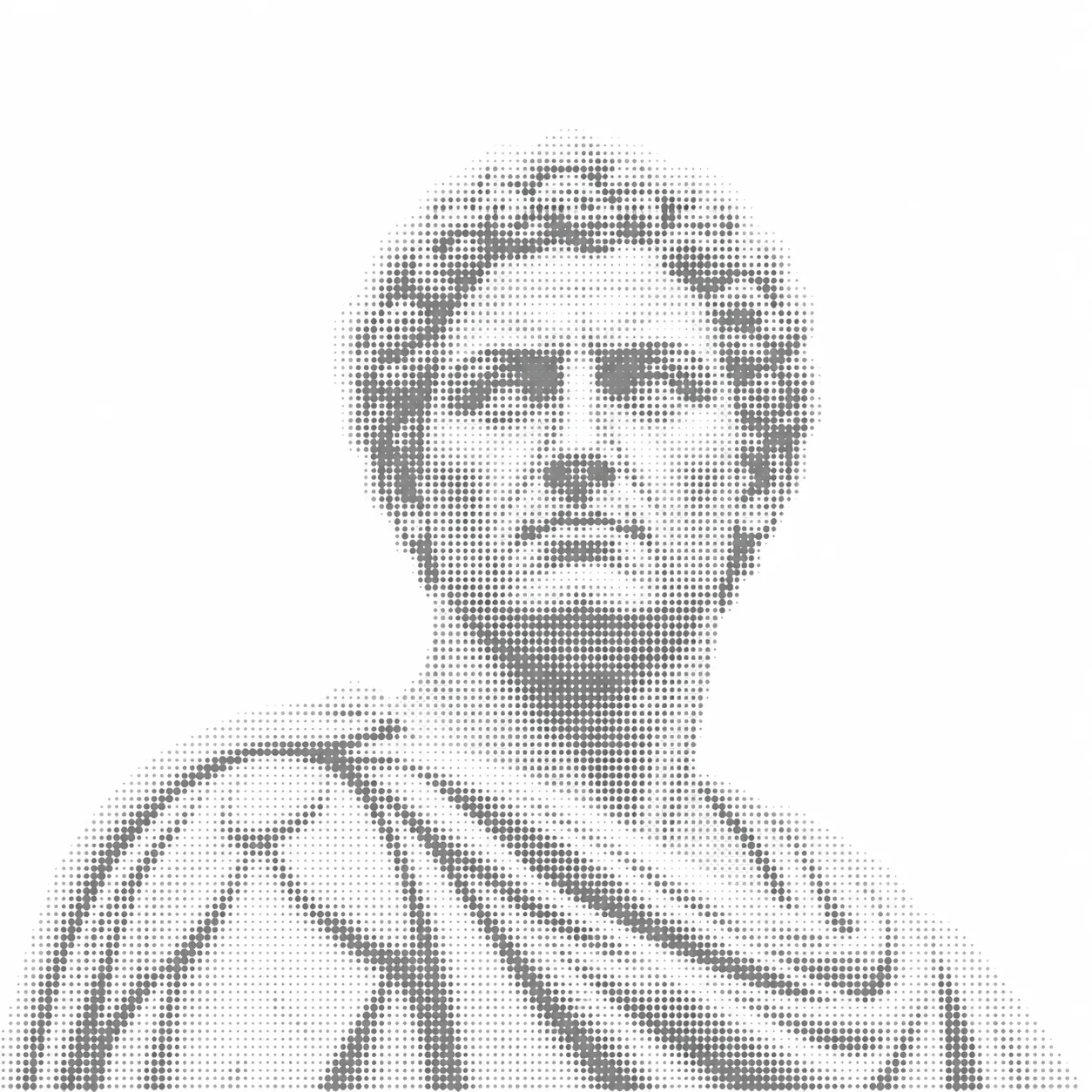
01-halftone-statue-bust
Grey dot-halftone image of a classical Roman marble bust, head and draped shoulders, fading softly into white
Prompts
115,194 chars
# Halftone statue editorial hero: build spec

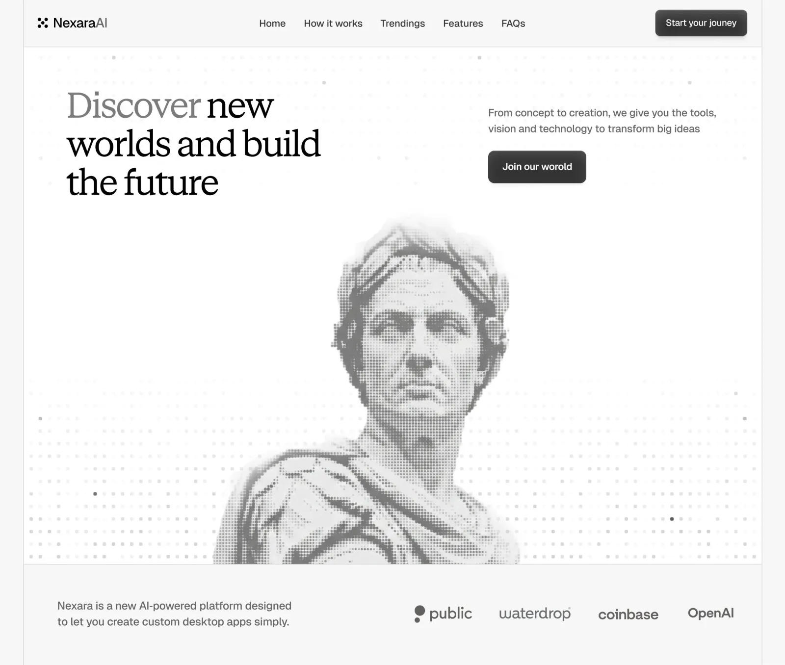
A light, monochrome AI landing hero. A serif display headline sits top-left and a short sans paragraph with a dark button sits top-right. Underneath, a grey halftone photo of a classical marble bust rises from the bottom edge of the hero. A faint field of small square dots fills the background, most visible along the bottom. A slightly darker band with a short statement and a row of grey partner wordmarks closes the section. Grey is the only colour, and everything stays quiet, with a lot of empty space.

## Structure

- Viewport reference: 1440px wide, full-bleed. The page itself has no outer margin, no rounded corners and nothing behind it.
- Content edges: the nav uses 28px side padding. Hero content uses 84px on the left, and the right column starts at x≈907px. The logo band uses 66px on the left and 54px on the right. There is no centred max-width container: everything is placed relative to the 1440 viewport and should scale with it, so use a fluid `max-width: 1440px; margin: 0 auto`.
- Columns: the hero uses a two-column split. The left column (≈84px → ≈600px) holds the headline. The right column (≈907px → ≈1360px, about 450px of text measure) holds the paragraph and button. The large empty gap between them is deliberate.

Sections, top to bottom:

1. **Nav bar.** 90px tall on a tinted band with a 1px bottom hairline. From left to right: a logo glyph with a wordmark, five centred text links, and a dark CTA button on the far right.
2. **Hero.** About 1010px tall on a near-white surface. The headline sits top-left and the paragraph and button top-right. A halftone statue bust is centred horizontally and bleeds off the hero's bottom edge. A masked square-dot grid fills the background. The section ends with a 1px bottom hairline.
3. **Statement and logo wall.** About 200px tall on the same tinted band as the nav. A two-line muted statement sits on the left and four grey partner wordmarks run in a row on the right, all vertically centred.

## Scroll map

The live page was not motion-captured, so these numbers are read from the still. A 900px-tall viewport is assumed.

1. Nav bar: 90px (0.10 vp). Consumes 90px of scroll. Kind: static. It scrolls away and is not sticky (inferred).
2. Hero: 1010px (1.12 vp). Consumes 1010px of scroll. Kind: entrance (on load), plus an ambient loop on the dots (inferred).
3. Statement and logo wall: about 200px (0.22 vp). Consumes about 200px of scroll. Kind: static, with an optional marquee loop on the logos (inferred).

Total page height: about 1300px (≈1.44 viewports). Nothing pins or stacks.

## Spacing

**Nav (1).**
- Height 90px, side padding 28px, with the logo and CTA vertically centred.
- Links sit in one row with a 36px gap. The link group is centred on the page's centre line, not between the logo and the CTA.
- CTA button: 50px tall, about 178px wide, 24px horizontal padding.

**Hero (2).**
- The headline starts 86px below the nav hairline, with its left edge at 84px.
- The right-column paragraph's top sits about 34px lower than the headline's top. It does not align to the headline's cap line.
- The paragraph is followed by a 30px gap, then the button. The button is 62px tall, about 190px wide, with 28px horizontal padding.
- The statue's top (where its feathered edge fades in) sits about 330px below the nav hairline, which leaves about 120px of empty space between the headline's last line and the statue. The statue is about 600px wide by 685px tall and is cut flat by the hero's bottom hairline.
- Dot grid pitch: 18px horizontally and 24px vertically, edge to edge across the hero.

**Logo band (3).**
- The statement text starts about 70px below the band's top, with its left edge at 66px.
- The four wordmarks are right-aligned, ending 54px from the right edge, with about 54px between them. They are vertically centred on the statement's two lines.
- The band has about 70px of padding at the bottom.

**Rhythm.** The page uses two surface tones instead of spacing to separate sections: tinted band, then white hero, then tinted band. Each change of surface also gets a 1px hairline. There are no section titles or eyebrows.

## Type

**Families.**
- Display: a transitional or text serif with moderate contrast, sharp bracketed serifs and a fairly large x-height. Free stand-in: **Newsreader** or **Source Serif 4** (both variable). Use weight 400; do not use bold.
- UI and body: a neo-grotesk sans with slightly rounded, humanist proportions and a single-storey "g". Free stand-in: **Inter** (variable), or Geist.

Body anchor: **17px**.

| Level | Family | Size | Line-height | Letter-spacing | Weight | Notes |
|---|---|---|---|---|---|---|
| Hero headline | Serif | 4.25× → 72px | 1.02 | −0.035em | 400 | 3 lines, max ~520px; tight tracking is essential |
| Hero paragraph | Sans | 1.15× → 20px | 1.55 | −0.005em | 400 | 2 lines, max ~460px (≈55 characters per line) |
| Statement (band 3) | Sans | 1.15× → 20px | 1.55 | −0.005em | 400 | 2 lines, max ~470px |
| Nav links | Sans | 1.06× → 18px | 1.2 | −0.01em | 400 | |
| Buttons | Sans | 1.0× → 17px (nav), 1.06× → 18px (hero) | 1 | −0.005em | 500 | |
| Wordmark (logo) | Sans | 1.6× → 27px | 1 | −0.03em | 500 | Two-part name: first part ink, second part mid-grey |

**Headline treatment.** The first word is set in mid-grey (#7A7A7A) and the rest in near-black ink, all in the same weight and family. Placeholder copy: about 7 words over 3 lines. Line 1 holds 2 words, the first one grey. Line 2 holds 3 words and line 3 holds 2. The text is ragged right and nothing is italic.

**Placeholder copy.**
- Paragraph: one sentence of about 18 words.
- Statement: one sentence of about 15 words.
- Nav links: 1–3 words each.
- Buttons: 2–3 words each.

## Colour

Strictly monochrome. There is no hue anywhere.

| Hex | Role |
|---|---|
| #FDFDFD | Hero surface. The largest area on the page. |
| #F5F5F4 | Nav and logo-band surface, one step darker than the hero. |
| #E6E6E6 | 1px hairlines under the nav and under the hero. |
| #D8D8D8 | Default colour of the background dot grid. |
| #B8B8B7 | Mid dots in the grid and the light tones of the halftone statue. |
| #6E6E6E | Halftone statue dots at full tone. Also the colour of the partner wordmarks (use about #5E5E5E). |
| #7A7A7A | First word of the headline. |
| #5F5F5F | Paragraph, statement and nav link text. Nav links can go a touch darker (#333). |
| #111111 | Headline ink, logo ink and logo glyph. |
| #2A2A2A → #3C3C3C | Button fill, as a subtle vertical gradient (lighter at the top). |
| #FFFFFF | Button label. |

**Accent.** The only accent is the charcoal button fill. It may appear in exactly three places: the nav CTA, the hero CTA, and 4–6 individual dots scattered in the grid (dark #4A4A4A "pixels"). It appears nowhere else.

## Surface

- **Borders.** The page uses only 1px #E6E6E6 hairlines, and only horizontally at section boundaries. Cards, links and logos have no borders.
- **Radii.** The nav CTA uses 8px and the hero CTA 10px. Background dots use 1px, so they read as almost-square. Nothing else on the page is rounded.
- **Buttons.**
  - Fill: the vertical gradient from the Colour section.
  - Highlight: an inset 1px top edge in rgba(255,255,255,0.12).
  - Outer shadow: `0 4px 10px rgba(0,0,0,0.18), 0 1px 2px rgba(0,0,0,0.2)`.
  - This soft, glossy, slightly glassy depth is the page's only skeuomorphic touch.
- **Shadows.** Nothing else on the page has a shadow.

## Imagery

1. **Halftone statue bust.** There is one. Medium: **photo**, a photograph of a classical marble portrait bust that has been halftone-processed.
   - Subject: a Roman-style male head and shoulders in three-quarter view, gazing slightly off-camera to the left, with short curled hair and a toga draped over one shoulder.
   - Treatment: rebuilt as a regular halftone of round dots on about a 4–5px pitch. Dot size carries the tone, from about #B8B8B7 in the highlights to #5A5A5A in the shadows, on a transparent or white ground.
   - Edges: the top and sides feather out softly into white, with no hard silhouette.
   - Size and position: about 600 × 685px (≈0.88:1). Its centre sits about 30px left of the page centre. The bottom is cropped flat by the hero's bottom edge. It sits behind the text layer but above the dot grid.
   - Build: if you are generating it, use a grayscale bust photo, apply a CSS/SVG halftone (or pre-process it to dots), and mask it with a radial plus top linear gradient to feather the edges.
2. **Background dot grid.** There is one field. Medium: **vector**.
   - Dots: 3.5px squares with a 1px radius, on an 18 × 24px pitch, in #D8D8D8. About 15% of grid cells are randomly left empty, and a few dots step up to #B8B8B7 or #4A4A4A.
   - Visibility: masked with a vertical gradient. It is at full strength across the bottom 45% of the hero, almost invisible through the middle band where the text and the statue's face sit, and faint (about 25%) in the top 100px under the nav.
   - Build: an SVG pattern or a `radial`/`conic`-free `background-image` with a `mask-image` linear gradient.
3. **Logo glyph.** There is one, at the start of the nav. Medium: **vector**. Five solid dots in an X arrangement (four corners plus centre), about 20px square, in ink.
4. **Partner wordmarks.** There are four, in band 3. Medium: **vector**. Generic grey wordmarks, each about 26–30px cap height and 110–190px wide, in #5E5E5E. Mix the styles: one has a small pill or dot mark before it, one is a lighter rounded lowercase, one a bold geometric lowercase, one a semibold title case. Use placeholder names; do not use real brands.

## Motion

No motion report exists for this page. Everything below is **(inferred)**, and every timing is not measured.

**1. Nav bar**
- kind: static (inferred)
- what moves: nothing on scroll
- from → to: none
- range: none
- reduced motion: no change

**2. Hero**
- kind: entrance (inferred), plus an ambient loop on the grid
- what moves:
  - (a) Headline lines.
  - (b) Paragraph, then the button.
  - (c) The statue.
  - (d) A few grid dots that twinkle.
- from → to:
  - (a) Opacity 0 → 1, translateY 16px → 0.
  - (b) Opacity 0 → 1, translateY 12px → 0.
  - (c) Opacity 0 → 1 and scale 1.02 → 1. Optionally the halftone resolves from a coarse dot pitch to a fine one.
  - (d) Grid dots: randomly selected dots swap between #D8D8D8 and #4A4A4A, one at a time.
- range:
  - Entrance plays once on page load.
  - Duration not measured; use 600–900ms.
  - Easing: an ease-out curve such as cubic-bezier(0.2, 0.7, 0.2, 1).
  - Stagger not measured; use 60–100ms between headline lines. The right column starts about 200ms in, and the statue about 300ms in.
  - The dot twinkle loops indefinitely. Each dot holds for 1.5–3s (not measured).
- reduced motion: everything appears at its final state with no translate, scale or twinkle. The scattered dark dots stay fixed.

**3. Statement and logo wall**
- kind: static (inferred). An optional marquee may loop the wordmarks horizontally.
- what moves: if you use the marquee, the wordmark row only.
- from → to: translateX 0 → −50% of a duplicated track, linear.
- range: continuous. One cycle takes 30–45s (not measured). The row's left edge is masked with a 60px fade.
- reduced motion: no marquee. Show the four wordmarks static and right-aligned, as described in Spacing.

**Interaction transitions** (not part of the scroll choreography):
- Nav links: on hover, colour goes #5F5F5F → #111 over 150ms. No underline.
- Buttons:
  - Hover: fill lightens one step (#333 → #444) and the shadow grows slightly, over 180ms ease-out.
  - Press: translateY 1px and the shadow tightens.
  - Focus: a visible 2px #111 outline offset by 2px.
- Wordmarks: on hover, opacity 0.7 → 1 over 200ms. Only when they are static.

## Responsive (below 640px)

**Nav**
- Keep the logo and the CTA, and shrink the CTA to 40px tall with 15px text.
- Collapse the five links into a 2-line hamburger icon.
- Nav height becomes 64px and side padding 20px.

**Hero**
- Becomes a single column with 20px side padding.
- The headline drops to 2.5× → about 42px with a 1.05 line-height and keeps its tight tracking. It wraps to 3–4 lines.
- The paragraph (17px) and button follow underneath, with 24px above the paragraph and 20px between the paragraph and the button. The button goes full width or stays inline at 52px tall.
- The statue scales to about 92vw wide, stays centred and still bleeds off the bottom edge. Hero height becomes auto, and the statue takes the bottom about 55% of it.
- The dot grid keeps its 18 × 24px pitch and does not scale down.

**Logo band**
- Stacks: the statement goes on top at 17px, with the wordmarks below as a 2×2 grid or a marquee, at about 22px cap height. Use 48px vertical padding.

## Don'ts

- **Mat.** Don't add the presentation mat. No grey frame around the page, no rounded page corners, no drop shadow around a "browser". The design is edge to edge.
- **Colour.** Don't introduce any hue: no blue links, no purple AI gradient, no glow, no coloured accent. The page works because it is entirely grey.
- **Headline weight and family.** Don't set the headline in bold or in a sans. It is a regular-weight serif with very tight tracking (about −0.035em) and a near-1.0 line-height. Loose tracking or a 1.2 line-height kills the editorial feel.
- **Headline grey word.** Don't colour the whole headline grey, and don't make the grey word italic or a different font. Only the first word is grey, and it is the same face and weight.
- **Statue.** Don't use a regular grayscale photo, a duotone, an outline illustration or an AI-glow render. It must be a visible dot halftone with feathered edges, and it must be cut off by the section's bottom edge. Don't float it with a margin under it, and don't put it in a card or frame.
- **Dot grid.** Don't make the dots round blobs, don't make them dense, and don't run them at even opacity across the hero. They are tiny near-square dots on a slightly non-square pitch (wider vertically), heavily masked so the middle of the hero stays almost clean. Don't animate the whole grid; only a handful of dots change.
- **Centring.** Don't centre the hero text. The headline sits hard left, the paragraph and button sit in the right column, and the space between them stays empty.
- **Buttons.** Don't make them pill-shaped, outlined or flat black. They are charcoal rectangles with an 8–10px radius, a faint top highlight and a soft drop shadow.
- **Extra UI.** Don't add an eyebrow, a badge, a "New" chip, gradient text, card grids, stats or a second CTA. The hero has exactly one headline, one paragraph and one button.
- **Logo wall.** Don't put the logos in boxes, don't give them a "Trusted by" heading, and don't use full-colour brand logos. They are flat mid-grey, bare and right-aligned beside a plain two-line statement.
- **Separators.** Don't separate sections with big padding or shadows. Use the change of surface tone (#FDFDFD vs #F5F5F4) plus a single 1px hairline.
- **Text size.** Don't shrink the body or nav text below 16px to make it look elegant. The paragraph text is 20px, and the elegance comes from the restrained palette and the whitespace.
Captures
1Versions
1Each rebuild is kept. The live one is what the comparison shows. LiveOpus 5.5Highfrontend-designemil-design-engtransitions-devgsaphumanizer19 hours ago · 234s · 1 image · 20261019T183202ZOpen