Red creative agency landing page
Rebuild
Opus 5.5Highfrontend-designemil-design-engtransitions-devgsaphumanizerView
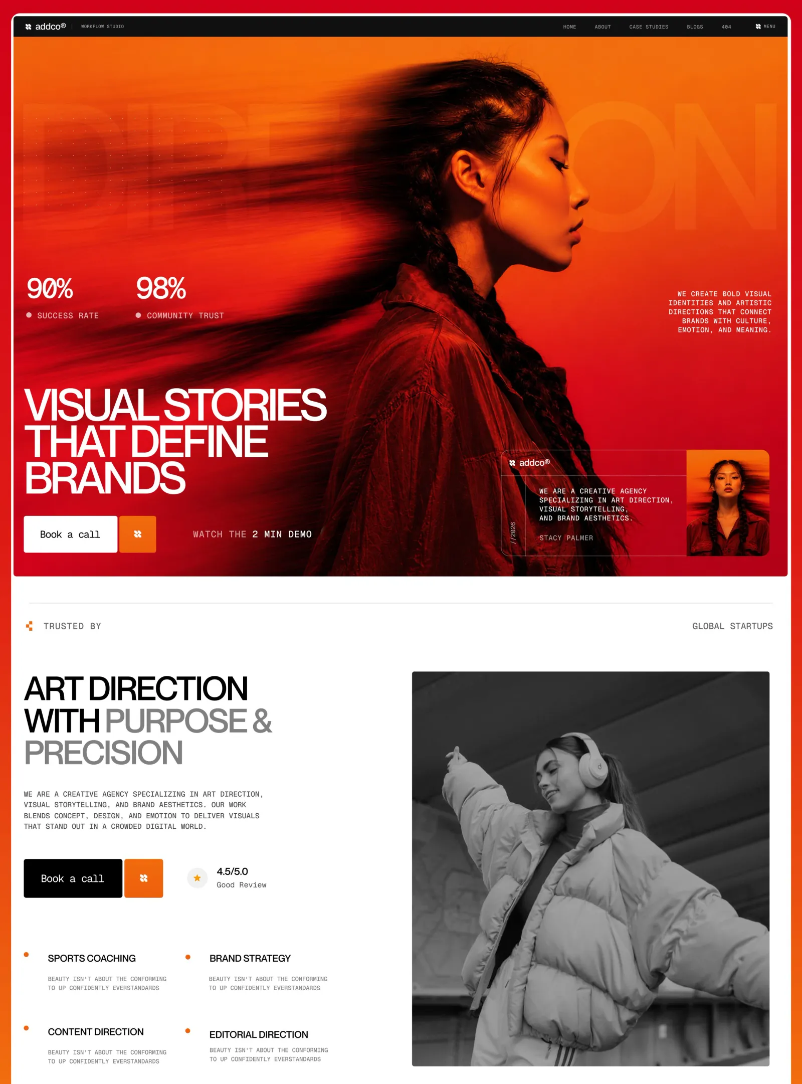
RebuildReference
Move across the image to wipe between the two. Click to lock the seam; arrow keys nudge it.
Imagery
3/3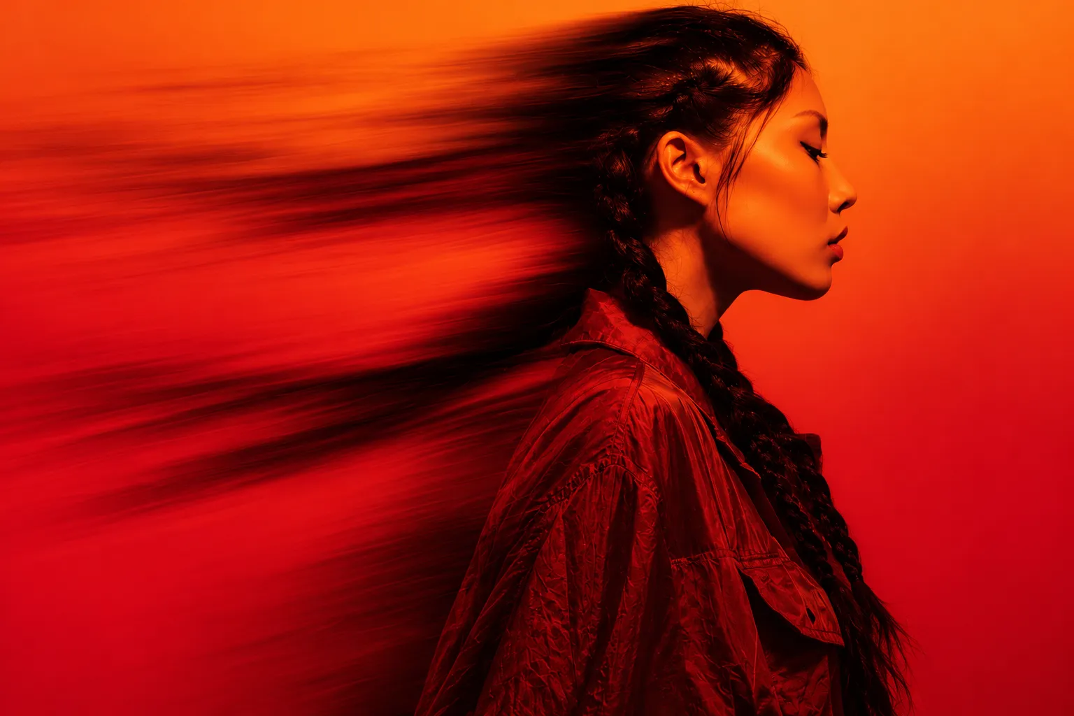
01-hero-motion-portrait
Woman in profile facing right, her braided hair smeared into long horizontal motion streaks, toned entirely in red and orange
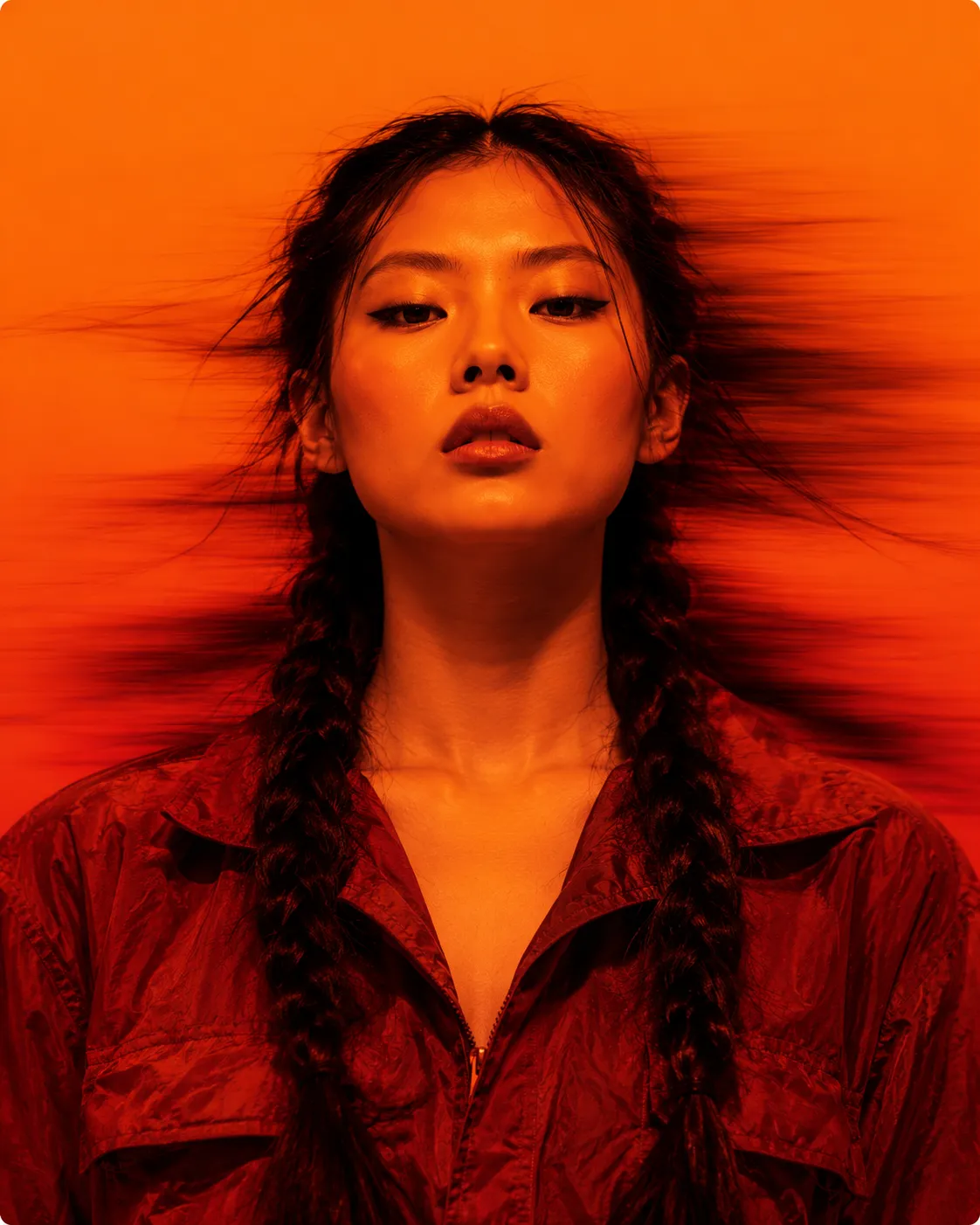
02-card-portrait
Same young woman facing the camera, head and shoulders, hair blurred sideways, toned in orange-red
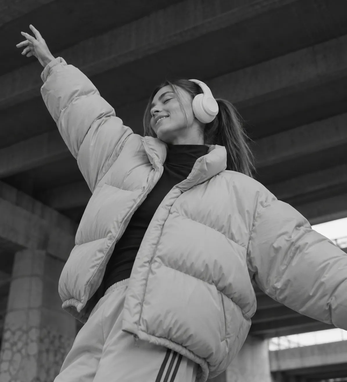
03-about-dance-bw
Black-and-white low-angle photo of a woman in a puffer jacket and headphones dancing with one arm flung up under a concrete ceiling
Prompts
115,178 chars
# Red duotone creative agency landing page

This is a short, editorial landing page for an art-direction studio. It opens with a full-bleed hero photo graded entirely in red-orange. A motion-blurred profile portrait fills it. Across the hero sit huge, very tightly tracked uppercase grotesk headlines, small uppercase mono text, a frosted-glass info card and a pair of big stats. Below the hero the page turns plain white for an "about" split: a two-tone headline, a mono paragraph, a CTA pair and a 2×2 feature list on the left, and one tall black-and-white photo on the right. The look comes from three contrasts: hot duotone against clean white, giant compressed grotesk against small mono, and square hard edges against a single glass card.

## Structure

- **Layout:** full-width, 1440px reference, no centred max-width container. Content sits on a 24px left/right gutter (the right side of the hero reads ~34px). It is a 12-column grid with 24px gutters, used loosely.
- **Sections, top to bottom:**
  1. **Nav bar.** A thin near-black strip across the full width.
     - Left: logo mark and wordmark, a 1px vertical divider, then a tiny mono studio tag (2 words).
     - Right: five mono uppercase links, then a mark icon with "MENU".
  2. **Hero.** A full-bleed duotone photo with these layers:
     - a ghost word the full width of the page behind the subject
     - a dot-grid patch at top-left
     - a stats pair at middle-left
     - a right-aligned mono statement at middle-right
     - a three-line headline at lower-left
     - a CTA row under the headline
     - a glass card at lower-right
  3. **Trust bar.** A white band with a full-width hairline on top.
     - Left: a small orange pixel icon and the mono label "TRUSTED BY" (2 words).
     - Right: a mono grey label (2 words).
     - Between them, a slow logo marquee (inferred from the "Marquee" tag; it isn't visible in the still).
  4. **About and features.** A two-column split.
     - Left column, cols 1–5: two-tone headline, mono paragraph, CTA pair with a rating chip, then a 2×2 feature list.
     - Right column, cols 7–12, ~660px wide: one tall black-and-white photo, its top aligned with the headline top and its bottom aligned with the last feature row.

The capture ends after section 4.

## Scroll map

Heights assume a 900px viewport. No motion report was supplied, so every value here is read off the still.

1. **Nav:** 44px, 0.05 vh. Consumes 44px. Static, sticky at top (inferred).
2. **Hero:** ~995px, 1.1 vh. Consumes 995px. Entrance, plus a light scroll-linked parallax on the ghost word (inferred).
3. **Trust bar:** ~150px, 0.17 vh. Consumes 150px. Static, with a continuous marquee loop (inferred).
4. **About and features:** ~810px, 0.9 vh. Consumes 810px. Entrance (inferred).

**Total page height:** ~2000px, about 2.2 viewports. Nothing pins or stacks.

## Spacing

**1. Nav**
- Height 44px.
- Logo cluster gap 12px; the divider is 1px × 14px.
- Links are spaced 34px apart and end ~150px before the "MENU" item, which sits 24px from the right edge.

**2. Hero**, positions measured from the hero top:
- **Ghost word:** occupies y 120–360.
- **Dot grid:** x 24–390, y 140–320. Dots are 1.5px, on a 16px pitch.
- **Stats:** start at y 440.
  - Two stats are spaced 200px apart, left edge to left edge.
  - Number to label: 18px.
- **Right statement:** top at y 470, right edge 34px in. Five lines, right-aligned.
- **Headline:** occupies y ~645–850.
- **CTA row:** starts 36px below the headline.
  - Primary button: 172×68.
  - Square icon button: 68×68, set 4px from the primary.
  - "Watch demo" text link: 68px further right, vertically centred.
  - Bottom of the CTA row to the hero bottom: ~45px.
- **Glass card:** 495×195, inset 34px from the right and 38px from the bottom.
  - Left rail 46px wide.
  - Header row 46px tall, with a hairline under it.
  - Body padding 24px.
  - Portrait panel 155px wide, flush right.

**3. Trust bar**
- Hairline starts 50px below the hero, inset 32px each side.
- Labels sit 32px below the hairline.
- Bottom padding to section 4: 75px.

**4. About and features**
- Headline to paragraph: 50px.
- Paragraph to CTAs: 52px.
- CTAs: a 182×72 black button and a 72×72 orange square, 4px apart. The rating chip is 44px to the right.
- CTAs to feature grid: 100px.
- Feature grid: 2 columns on a ~300px pitch; 135px from row to row.
  - Each item has a 7px orange dot at the left, with text indented 44px from the dot.
  - Title to description: 22px.
- Bottom padding: ~40px.

**Rhythm:** a dense hero, then tight label bands, then generous ~75–100px pauses inside the white section. Sections share no uniform padding. Space is set by alignment to the photo edges.

## Type

Two families only.

**Display: tight neo-grotesk.** Something close to Neue Haas or Helvetica Now Display.
- Free stand-in: **Inter Tight**, variable, weights 500–650.
- Headlines are always uppercase and always set with heavily negative tracking, so letters nearly touch.

**Text: monospace.** A slightly typewriter-flavoured mono.
- Free stand-in: **Geist Mono** or **IBM Plex Mono**, weight 400.
- Used for all running copy, labels, nav and button text. Mostly uppercase, with positive tracking.

The body anchor is 16px, set in mono uppercase.

| Level | Family | Ratio | Size | Line-height | Tracking | Weight | Notes |
|---|---|---|---|---|---|---|---|
| Ghost word (hero) | grotesk | ~25× | ~400px (fit to ~95vw) | 0.8 | −0.06em | 600 | Single word, uppercase, white at 6–8% opacity |
| Hero H1 | grotesk | 6.5× | 104px | 0.8 | −0.065em | 600 | 3 lines, 2–3 words each, max ~14 chars/line |
| About H2 | grotesk | 4.9× | 78px | 0.9 | −0.06em | 600 | 3 lines; the first ~3 words in ink, the rest in grey |
| Stat number | grotesk | 3.75× | 60px | 1.0 | −0.07em | 500 | e.g. "90%" |
| Feature title | grotesk | 1.4× | 22px | 1.1 | −0.03em | 500 | Uppercase, 2 words |
| Rating value | grotesk | 1.4× | 22px | 1.1 | −0.03em | 500 | "4.5/5.0" format |
| Logo wordmark | grotesk | 1.1× | 18px | 1 | −0.02em | 600 | |
| Button label | mono | 1.25× | 20px | 1 | 0.02em | 400 | Sentence case, 3 words |
| Trust labels | mono | 1.1× | 18px | 1 | 0.12em | 400 | Uppercase |
| Body / about paragraph | mono | 1× | 16px | 1.55 | 0.04em | 400 | Uppercase, max ~48 chars/line, 4 lines |
| Hero statement, glass card text | mono | 1× | 16px | 1.35 | 0.06em | 400 | Uppercase; ~24 chars/line (statement), ~30 chars/line (card) |
| Stat label | mono | 1× | 16px | 1 | 0.1em | 400 | Uppercase, preceded by a 7px white dot |
| Demo link | mono | 1× | 16px | 1 | 0.1em | 400 | Uppercase; the last 3 words in brighter white |
| Nav links | mono | 0.875× | 14px | 1 | 0.08em | 400 | Uppercase |
| Feature description, rating caption | mono | 0.875× | 14px | 1.45 | 0.04em | 400 | Uppercase, grey, 2 lines of ~30 chars |
| Studio tag, card rail "//YEAR" | mono | 0.75× | 12px | 1 | 0.1em | 400 | The rail text is rotated −90° |

If the variable axes allow it, headlines may narrow slightly (wdth ~90). The weight stays at medium–semibold, never black.

## Colour

| Hex | Role |
|---|---|
| `#FEFEFE` | Page surface for sections 3–4, all text on the hero, and the primary button fill on the hero. This covers most of the page below the fold. |
| `#F3680C` | **The single accent (orange).** Allowed only on: the square icon buttons, feature-bullet dots, the trust-bar pixel icon, the rating star, and the bright top-right of the hero grade. Nowhere else, and never as text. |
| `#D30718` | Hero red. It is the mid-tone of the duotone grade and lower-left part of the hero. Appears only inside the hero imagery and grade. |
| `#670707` | Deep maroon, the shadow tone of the duotone (hair, jacket folds, the bottom of the hero). |
| `#2A2A2A` | Ink for body mono on white. |

Values below are inferred, not sampled:
- `#111111`: nav bar background and the black button.
- `#8C8C8C`: grey second half of the H2 and the feature descriptions.
- `#E6E6E6`: hairlines on white.
- `#F1F1F1`: the circle behind the rating star.

**Hero grade.** The photo is mapped to a duotone, shadows `#670707` and highlights `#F3680C`. On top sits a mesh of three radial gradients:
- orange `#F3680C` at the top-right (60% 0%)
- red `#D30718` at the lower-left (10% 80%)
- maroon `#670707` at 85% 100%

Blend the mesh with multiply or soft-light, so the image stays legible while the colour stays saturated. Text on the hero is always white.

## Surface

- **Corners:** square or nearly square everywhere. Buttons 2px, the about photo 4px, the nav 0.
- **Glass card:** the one exception, at 16px radius.
  - Fill: `rgba(255,255,255,0.06)`
  - `backdrop-filter: blur(18px) saturate(140%)`
  - Border: 1px `rgba(255,255,255,0.35)`
  - Internal hairlines (rail divider and header underline): 1px `rgba(255,255,255,0.3)`
  - The portrait panel has 16px radius on its right corners only.
- **Hairlines on white:** 1px `#E6E6E6`.
- **Shadows:** none anywhere. No glows, even though the page is tagged "neon accent". The neon effect comes from saturation alone.

## Imagery

1. **Hero backdrop.** Full-bleed, about 1440×995 (≈1.45:1).
   - Subject: a young woman in profile facing right, placed right of centre so her face sits at ~65% x, 35% y. She has long braids and a work jacket.
   - Treatment: a long horizontal motion blur (shutter drag) smears her hair and the back of her head out to the left, filling the left half with streaks.
   - Grade: red-orange duotone as above.
   - The ghost word sits *behind* her head. Mask it or put it on a layer under a cut-out, so her silhouette overlaps it.
2. **Glass card portrait.** About 155×195 (≈4:5).
   - The same subject facing the camera, framed head and shoulders, with the same blur and the same orange grade.
3. **About photo.** About 660×728 (≈10:11), right column.
   - A black-and-white, low-angle shot of a woman in a puffy jacket and over-ear headphones, mid-dance with one arm flung up. Behind her is a concrete underpass ceiling.
   - High-contrast greyscale with no tint. This is the only neutral image, and it cools the page after the hero.

## Motion

No motion report was supplied. Everything below is inferred, and no timings were measured.

**1. Nav**
- kind: static (sticky to the top, inferred)
- what moves: nothing
- from → to: none
- range: n/a
- reduced motion: same

**2. Hero**
- kind: entrance, plus scroll-linked for the ghost word (inferred)
- what moves:
  - the H1 lines
  - the stats
  - the right statement
  - the CTA row
  - the glass card
  - the ghost word (scroll-linked)
- from → to:
  - H1 lines: each line is clipped in a line mask; the text goes from translateY 100% → 0.
  - Stats, statement and CTA row: opacity 0 → 1, translateY 16px → 0.
  - Glass card: opacity 0 → 1, translateY 24px → 0.
  - Ghost word: translateX 0 → −80px (inferred).
- range:
  - Entrance: plays once on load. Duration not measured; use 600–900ms with a strong ease-out (expo-out-like). H1 lines stagger by 80–120ms, then the other elements follow 100ms apart.
  - Ghost word: scroll-linked from scroll 0 until the hero bottom reaches the viewport top, and it reverses on the way back up.
- reduced motion: everything appears at its final state; no parallax.

**3. Trust bar**
- kind: static, with a continuous marquee (inferred)
- what moves: a row of greyscale logos between the two labels
- from → to: translateX 0 → −50% of the duplicated track, looping linearly
- range: always running, not tied to scroll. Loop speed not measured; keep it slow (30–50s per loop).
- reduced motion: the marquee stops and shows a static row.

**4. About and features**
- kind: entrance (inferred)
- what moves: the H2 lines, paragraph, CTA row, the four feature items and the photo
- from → to:
  - H2 lines: line-mask rise, translateY 100% → 0.
  - Paragraph, CTA row and feature items: opacity 0 → 1, translateY 20px → 0.
  - Photo: clip-path inset(100% 0 0 0) → inset(0), revealing upward, with scale 1.06 → 1 on the image inside.
- range: plays once, when each element's top reaches 80% of the viewport. Duration not measured; use 600–900ms ease-out. The features stagger by 80ms in reading order.
- reduced motion: no transforms; at most a 200ms opacity fade.

**Interaction transitions** (separate from scroll):
- **Primary buttons:** on hover, white ↔ ink fills swap (on the hero the button goes ink with white text; on white the black button goes orange). 200ms ease.
- **Square orange icon button:** on hover the mark rotates 90°, 250ms.
- **Nav links and the demo link:** on hover, opacity 0.6 → 1, or an underline grows from the left, 200ms.
- **Press:** scale 0.98, 100ms.
- **Menu open:** a full-screen near-black panel slides down, 400–500ms ease-out (inferred).
- **Glass card:** on hover the border opacity goes 0.35 → 0.6.

## Responsive (below 640px)

- **1. Nav:** collapses to logo + "MENU" only. Drop the studio tag and the links.
- **2. Hero:**
  - Becomes ~100svh tall or slightly more.
  - Re-crop the photo so the face is centred in the upper half.
  - Scale the ghost word to the viewport width (~22vw).
  - Drop the dot grid.
  - Stack in this order: stats (keep both side by side), H1 at ~48px (2.8× body) with the same tracking, CTA row.
  - The demo link moves under the buttons.
  - The right statement moves above the stats, left-aligned.
- **Glass card:** moves below the hero onto a red `#670707` band, full width minus a 16px gutter. Keep the portrait panel at 110px wide.
- **3. Trust bar:** labels stack, with the marquee below them.
- **4. About and features:**
  - Single column in this order: H2 at ~40px, paragraph, CTAs, then the photo at full width (4:5), then the features in one column.
- **Gutters:** 16px. Mono body stays at 16px; feature descriptions stay at 14px.

## Don'ts

- Don't use pill or rounded-xl buttons, and don't use soft card shadows. Everything is square and flat except the one glass card.
- Don't leave the headlines at default tracking. Without about −0.06em and ~0.8–0.9 line-height they look like a generic SaaS page. Never use a geometric sans (Poppins, Montserrat) or a serif.
- Don't set any body copy in the grotesk, or in sentence-case sans. Running text is uppercase mono; the only sentence-case mono is the button label.
- Don't show the hero photo in natural colour, and don't use a plain red overlay at 50% opacity. It has to be a true duotone (maroon shadows, orange highlights) with visible motion blur.
- Don't spread the orange around. No orange headlines, links, borders or section backgrounds. It lives on small squares, dots and the star.
- Don't add purple, blue or a dark-mode body. Below the hero the page is white with ink text.
- Don't colourise the about photo. It must stay greyscale.
- Don't centre anything in the hero. The headline stays bottom-left, the card bottom-right, the statement right-aligned.
- Don't make the ghost word legible or high-contrast. It's texture at 6–8% opacity, sitting behind the subject.
- Don't stuff the feature list with icons, cards or borders. It's an orange dot, an uppercase title and two grey mono lines.
- Don't add bouncy or springy motion, or big scroll-jacking. Motion is a short line-mask rise and fades, played once.
Captures
1Versions
1Each rebuild is kept. The live one is what the comparison shows. LiveOpus 5.5Highfrontend-designemil-design-engtransitions-devgsaphumanizerlast week · 367s · 3 images · 20261010T235630ZOpen