Salea AI sales landing page
Rebuild
Opus 5.5Extra highfrontend-designemil-design-engtransitions-devgsaphumanizerView
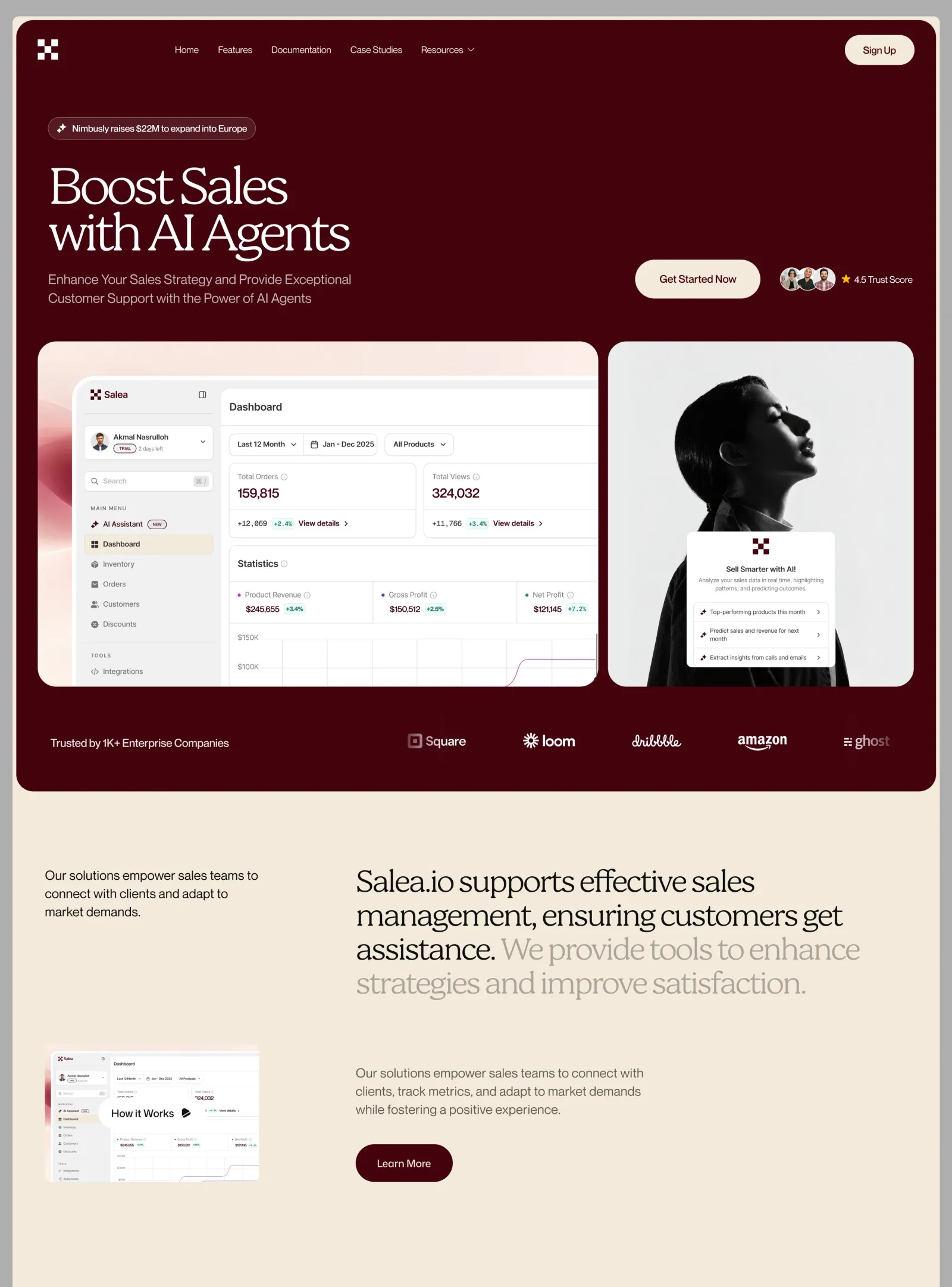
RebuildReference
Move across the image to wipe between the two. Click to lock the seam; arrow keys nudge it.
Imagery
3/3
01-dashboard-satin-backdrop
Soft blush gradient with a glossy crimson satin ribbon folding down the left edge
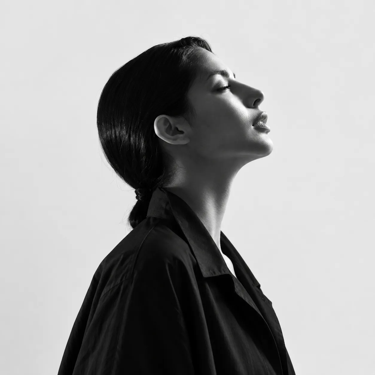
02-hero-portrait
Black-and-white studio profile of a woman with her chin lifted, wearing a dark jacket

03-avatar-sheet
Four small customer headshots arranged in a two-by-two grid
Prompts
119,604 chars
# Oxblood & cream editorial SaaS landing page — build spec

A premium AI-product landing page built from two colours: deep oxblood and warm cream. At the top is a rounded oxblood "shell" holding the nav, a large serif headline, a two-card media row (a light analytics dashboard in a frosted window on a blush gradient, and a black-and-white profile portrait with a floating AI card), and a marquee of client logos. Below the shell is a quiet cream editorial section with a two-tone serif statement and a "how it works" video row. The tone is luxury magazine rather than tech startup: thin high-contrast serif, tight tracking, lots of empty space, pill buttons, and very little motion.

## Structure

- **Viewport:** 1440 CSS px wide. The page background is cream `#F3EADB`, edge to edge. Nothing sits behind it: no outer margin, no page-level rounding, no frame.
- **Hero shell:** a flat oxblood `#44020D` card with radius 32px. It is inset **6px** from the top, left and right of the viewport (x 6→1434, 1428px wide) and is about **1200px tall** (y 6→1205). Below it the cream page continues. The shell holds sections 1–3.
  - Padding: 24px top, 34px left and right, 62px bottom. Inner width is 1360px.
  - Hero copy (badge, headline, subtitle, logo-wall label) gets an extra 16px of left inset, so it starts 50px inside the shell. The nav, media row and right-hand CTA cluster sit on the 34px line.
- **Below the shell:** container 1340px (50px side padding). Two-column grid: `420px 1fr`, column-gap 64px, so the right column starts at x≈534.

Sections, top to bottom:

1. **Nav bar** (inside the shell)
   - Left: a 32px solid-cream geometric placeholder mark (for example a 3×3 grid of squares with the corners and centre filled). No wordmark.
   - Link group starts at x≈252: five links with ~30px gaps. The last link has a 12px down-chevron because it opens a dropdown.
   - Far right: a cream pill button, 1–2 words.
   - All items share one centre line, 46px below the shell top.
2. **Hero** (inside the shell)
   - **Announcement badge**, 152px below the shell top: outlined pill, 34px tall, with a sparkle icon and a 6–8 word news line.
   - **H1**, 32px under the badge: 4–5 words with a forced break onto two lines (~11–14 characters per line).
   - **Subtitle**, 20px under the H1: ~18–20 words over two lines, max-width 480px.
   - The copy block and a right-aligned CTA cluster share one row: `display:flex; justify-content:space-between; align-items:flex-end`.
   - **CTA cluster**, left to right:
     - a large cream pill CTA (3 words), 194×58;
     - 30px gap, then a stack of three overlapping circular headshots (38px, −10px overlap, 2px `#44020D` ring);
     - 8px gap, then a 14px gold star and a rating label ("number + 2 words").
     - The cluster sits ~20px above the row's bottom, so its centre lines up with the subtitle's first line.
   - **Media row**, 56px under the subtitle: grid `1.83fr 1fr` (≈871px | 475px), gap 16px, height 536px, both cards radius 28px.
     - Left card: dashboard composite.
     - Right card: monochrome portrait with a floating AI card (see Imagery).
3. **Logo wall** (bottom of the shell)
   - Placed 68px under the media row, about 32px tall.
   - Left: a single-line label (4–5 words, "trusted by N+ companies" type claim), starting 50px inside the shell.
   - Right: a marquee track running from x≈600 to the 34px right padding line (~800px wide). It holds five monochrome cream wordmarks of mixed construction (icon + word, asterisk-burst + word, a script mark, lowercase with an underline swoosh, stacked-lines icon + word).
   - Each wordmark is 22–28px tall, centres ~167px apart. Both ends of the track fade out over 64px.
4. **Statement** (cream, two columns), padding-top 112px.
   - Left column: a lead paragraph, ~18 words over 3 lines, max-width 340px, in oxblood.
   - Right column: a serif H2 of two sentences over 4 lines, max-width 800px. Sentence one (~11 words) is oxblood. Sentence two (~9 words) is muted stone. The colour change falls exactly at the sentence boundary.
   - Both columns are top-aligned.
5. **How-it-works row** (cream, two columns), 72px below the H2, `align-items:end`.
   - **Left: video thumbnail**, 333×216 (~3:2), radius 12px. It shows a reduced copy of the dashboard UI. A white pill (160×44, radius 999) sits 85px in from the thumbnail's left edge, centred vertically, holding a 3-word label and a 16px solid play icon in oxblood.
   - **Right:** a muted paragraph (~25 words, 3 lines, max-width 470px), then 40px below it a solid oxblood pill button (2 words, 150×58).
   - The button's bottom aligns with the thumbnail's bottom.
   - The section ends with ~160px of empty cream. The capture ends here.

## Scroll map

Assumes a 1440×900 viewport.

1. Nav — 0→104px · 104px · 0.12 vh · consumes 104px · static
2. Hero — 104→1062px · 958px · 1.06 vh · consumes 958px · entrance (on load)
3. Logo wall — 1062→1205px · 143px · 0.16 vh · consumes 143px · entrance + continuous time-based marquee (not scroll-linked)
4. Statement — 1205→1560px · 355px · 0.39 vh · consumes 355px · entrance
5. How-it-works row — 1560→1970px · 410px · 0.46 vh · consumes 410px · entrance

**Total page height ≈ 1970px ≈ 2.2 viewports.** Nothing pins or stacks.

## Spacing

- **Shell:**
  - Inset 6px from the viewport. Padding 24 / 34 / 62 (top / sides / bottom).
  - Nav-row height 46 (the pill height).
- **Hero vertical rhythm:**
  - nav → badge: 82px
  - badge → H1: 32px
  - H1 → subtitle: 20px
  - subtitle → media row: 56px
  - media row → logo wall: 68px
  - logo wall → shell bottom: 62px
- **Horizontal gaps:**
  - nav links: 30px
  - CTA → avatars: 30px
  - avatars → star: 8px
  - star → rating text: 6px
  - media cards: 16px
  - logo wordmarks: ~110px between marks
- **Cream sections:**
  - side padding 50px; column gap 64px
  - padding-top 112px
  - H2 → how-it-works row: 72px
  - paragraph → button: 40px
  - bottom padding ~160px
- **Pills:**
  - large: 58px tall, inline padding 33–38px
  - nav pill: 46px tall, padding 0 28px
  - badge: 34px tall, padding 0 14px 0 12px, 8px icon gap
- **Rhythm:** whitespace alone separates sections, with large 100–160px breaths on cream and denser 16–60px spacing inside the shell. No dividers between sections.

## Type

**Families**
- **Display: high-contrast transitional serif**, weight 400, tight tracking, used for the H1 and H2 only. Free stand-in: **Newsreader** (variable, set `opsz` to its maximum, `wght` 400). Do not use italics.
- **UI/body: neo-grotesk sans**, slightly tight. Free stand-in: **Inter** (variable; Inter Display or optical sizing on).
- **Mono**, only for numeric deltas inside the dashboard mock. Free stand-in: **JetBrains Mono**.

**Scale.** Body anchor is **18px**; every other level is a multiple of it.

| Role | Class | Size | × body | Line-height | Tracking | Weight |
|---|---|---|---|---|---|---|
| H1 (hero) | serif | 84px | 4.67× | 0.90 | −0.045em | 400 |
| H2 (statement) | serif | 54px | 3.0× | 0.98 | −0.035em | 400 |
| Body / subtitle / lead / paragraph | sans | 18px | 1.0× | 1.55 | −0.01em | 400 |
| Logo-wall label | sans | 16px | 0.89× | 1.3 | −0.01em | 400 |
| Buttons (all pills) | sans | 16px | 0.89× | 1 | −0.01em | 500 |
| Nav links | sans | 15px | 0.83× | 1.2 | −0.01em | 400 |
| Badge text, rating label | sans | 14px | 0.78× | 1.2 | −0.005em | 500 / 400 |
| Mock: KPI numbers | sans | 20px | 1.11× | 1.1 | −0.02em | 500 |
| Mock: panel titles | sans | 16px | 0.89× | 1.2 | −0.01em | 600 |
| Mock: UI text, floating-card rows | sans | 13px | 0.72× | 1.35 | 0 | 400/500 |
| Mock: section labels, description | sans | 12px | 0.67× | 1.3 | +0.08em, uppercase (labels only) | 500 |
| Mock: deltas | mono | 12px | 0.67× | 1 | 0 | 500 |

**Line lengths**
- H1: 2 lines, ~11–14 characters each, explicit break.
- H2: ~34–36 characters per line (max 800px), 4 lines.
- Subtitle: ~52 characters per line (max 480px).
- Statement lead: ~36 characters per line (340px).
- How-it-works paragraph: ~50 characters per line (470px).

## Colour

| Hex | Role |
|---|---|
| `#F3EADB` cream | Covers most of the page: the background below the shell and the 6px frame around it. Also every primary text on oxblood (H1, logo label, wordmarks, rating label), the fill of the nav pill and hero CTA, and the active-row highlight inside the dashboard mock. |
| `#44020D` oxblood | The hero shell fill (the largest dark area); all primary text on cream (statement lead, H2 sentence one); the "Learn more" pill fill; KPI numbers and active icons in the mock; label text on cream pills. |
| `#D4CDC6` stone | Secondary text on oxblood: nav links and hero subtitle. |
| `#68343C` dusty maroon | Hairlines on oxblood: badge border (1px), dropdown chevron, the dimmed ends of the logo marquee, hover tints on the shell. |

Values not in the sample (all inferred):
- muted second sentence of the H2: `#B1A79B`. A darker step of stone, because `#D4CDC6` straight on cream disappears.
- how-it-works paragraph: `#6F625C`.
- rating star: `#E9B44C`.
- mock UI: whites `#FFFFFF`, app canvas `#F7F4F1`, borders `#ECE6E1`, grey text `#8A817C`, delta green `#1F8F4E` on `#E2F4E8`, chart line `#7A2A5A`.
- floating card and thumbnail pill: white `#FFFFFF`.

**Accent rule.** The design is a two-colour figure/ground swap: oxblood is the accent on cream, and cream is the accent on oxblood. The only other saturated colours are the gold star (one instance), the green delta pills and the crimson satin ribbon, all confined to the dashboard and rating. Nothing else gets a hue.

## Surface

**Radii**
- hero shell: 32px
- media cards: 28px
- video thumbnail: 12px
- glass window bezel: 20px
- floating AI card: 12px; its inner list group: 8px
- mock cards: 10–12px
- all buttons, badges and tags: fully round (999px)
- avatars: circles

**Borders**
- badge: 1px `#68343C`
- avatars: 2px `#44020D` ring
- mock cards and dividers: 1px `#ECE6E1`
- floating-card list rows: separated by 1px `#EEE9E5`

**Shadows** appear in exactly two places:
- floating AI card: `0 12px 32px rgba(40,10,15,0.14)`
- glass bezel: `0 20px 50px rgba(120,30,45,0.10)`

The shell, media cards, buttons, badge and thumbnail have **no** shadow.

**Glass.** The dashboard window bezel is an 8px frame of `rgba(255,255,255,0.55)` with `backdrop-filter: blur(14px)` and a 1px inner edge of `rgba(255,255,255,0.85)`. Glass is used nowhere else.

## Imagery

**1. Dashboard composite** (hero, left media card, ~1.63:1, 871×536)
- **Background:** a gradient mesh. Blush `#F8E4DF` along the top fades to `#FBF7F5` at the bottom right. A glossy satin ribbon in crimson → rose → pale pink (`#A3122F → #E58C9B → #F6D3D6`) folds vertically down the left edge and is mostly hidden behind the window. Build it with layered radial gradients plus one blurred SVG path.
- **Window:** a frosted glass bezel holds a light-theme sales analytics app. The window starts 54px from the card's left and top edges and **bleeds off the right and bottom edges**.
- **App, left sidebar** (~200px):
  - product mark and name with a collapse icon;
  - an account switcher card: 28px avatar, name, a tiny outlined "trial" tag and "N days left";
  - a search field with a ⌘/ keycap;
  - an uppercase section label;
  - six nav rows with 16px icons. Row 1 has an outlined "new" tag. Row 2 is active, with a cream `#F3EADB` fill and radius 8;
  - a divider, a second uppercase label, and one more row.
- **App, main area:** a white panel with radius 14px.
  - title row;
  - a filter row: a split dropdown ("period ▾ | calendar icon + date range") and a second dropdown;
  - two KPI cards side by side. Each has a grey label with an info icon, a large oxblood number, and a footer with a mono delta, a green % pill and "view details ›";
  - a statistics card: three metric columns, each with a coloured dot, a grey label, a value and a green % pill. Below them is a line chart with y-axis labels, light vertical gridlines and a single thin plum line that jumps up near the right.

**2. Portrait** (hero, right media card, ~0.89:1, 475×536)
- Black-and-white studio photo of a woman in profile facing right, chin lifted, hair pulled back tightly, dark jacket, on a pale grey seamless backdrop (`#ECECEC`). The head is in the upper middle and the crop cuts at the chest.
- **Floating AI card** over the lower centre: white, 252px wide, 30px above the card's bottom, horizontally centred. Contents, top to bottom:
  - a 24px oxblood geometric mark, centred;
  - a 14px semibold title, 3–4 words;
  - a 12px grey description, ~14 words over 2 lines, centred;
  - a bordered list of three rows. Each row has a sparkle icon, a 5–7 word prompt and a "›" chevron, with padding 10px 12px.

**3. Avatars**
- Three small headshots of different people, cropped to 38px circles, overlapping.

**4. How-it-works thumbnail** (section 5, ~3:2, 333×216)
- A reduced copy of the dashboard UI with a hint of the blush ribbon on its left edge, plus the white "play" pill overlay.

## Motion

No motion report was supplied. **Every value below is (inferred)** from the stills and from the "restrained motion" and "marquee" observations. Durations and easings were **not measured**, so ranges are given.

**1. Nav bar**
- kind — static
- what moves — nothing
- from → to — none
- range — none
- reduced motion — same

**2. Hero**
- kind — entrance (once, on page load)
- what moves — badge, H1 lines, subtitle, CTA cluster, then the two media cards
- from → to — copy: opacity 0 → 1, translateY 16px → 0. Media cards: opacity 0 → 1, translateY 24px → 0 (inferred)
- range — triggers on load. Duration not measured (500–800ms), ease-out (cubic or quart). Stagger 60–100ms through badge → H1 line 1 → H1 line 2 → subtitle → CTA cluster. The media cards follow 100–150ms after the CTA, with 80–120ms between them.
- reduced motion — everything is rendered at rest with no translate. At most an opacity fade of ≤200ms.

**3. Logo wall**
- kind — entrance, plus a continuous time-based marquee. The marquee is **not** scroll-linked and does not reverse on scroll.
- what moves — the label and track fade in; the wordmark track loops horizontally
- from → to — entrance: opacity 0 → 1. Marquee: the track (wordmarks duplicated once) moves translateX 0 → −50%, then repeats seamlessly (inferred)
- range — the entrance plays once when the row's top reaches 85% of the viewport, not measured (400–700ms), ease-out. Marquee speed not measured (25–45px/s), linear easing, pause on hover. The edge masks stay fixed while the track moves.
- reduced motion — no marquee. Show the five wordmarks static and evenly spaced across the track, with the edge fades kept.

**4. Statement**
- kind — entrance
- what moves — the left lead paragraph and the H2 (by line)
- from → to — opacity 0 → 1, translateY 20px → 0 (inferred). The two-tone colour split is fixed at rest and does not animate.
- range — once, when the section's top reaches 80% of the viewport. Not measured (600–900ms), ease-out. The lead goes first, then the H2 lines with a 60–80ms stagger.
- reduced motion — render at rest

**5. How-it-works row**
- kind — entrance
- what moves — thumbnail, paragraph, button
- from → to — opacity 0 → 1, translateY 20px → 0 (inferred)
- range — once, when the row's top reaches 80% of the viewport. Not measured (600–900ms), ease-out, 80ms stagger in the order thumbnail → paragraph → button.
- reduced motion — render at rest

**Interaction transitions** (separate from the scroll choreography; all inferred, 150–250ms ease-out):
- **Nav link hover:** colour `#D4CDC6` → `#F3EADB`.
- **"Resources" dropdown open/close:** chevron rotates 180°. The panel (cream, radius 16, no shadow or a very soft one) fades in and moves translateY −6px → 0. It closes in reverse.
- **Cream pills (nav, hero CTA):**
  - hover: background `#F3EADB` → `#FFF8EC`;
  - press: scale 0.98.
- **Oxblood pill:**
  - hover: background `#44020D` → `#5A0816`;
  - press: scale 0.98.
- **Badge hover:** border `#68343C` → `rgba(243,234,219,0.5)`.
- **Video thumbnail:**
  - hover: the image inside scales to 1.03 (clipped by the 12px radius) and the play pill scales to 1.04;
  - click: opens a video modal with a backdrop fade of 200ms.
- **Floating AI card rows hover:** background → `#F7F3EF`, and the chevron nudges 2px right.
- **Marquee:** pauses on hover.

## Responsive (below 640px)

- **Shell:** keeps its 6px inset. Radius drops to 24px and padding to 20px.
- **Nav:** the link group collapses into a 44px cream round menu button. The mark and the "sign up" pill stay.
- **Hero copy:**
  - badge text may wrap to 2 lines;
  - H1 becomes 48px (2.7× a 17px mobile body), line-height 0.95;
  - subtitle 17px with no forced break;
  - the CTA cluster stacks under the subtitle, left-aligned: the CTA pill first, then avatars and rating on one line, 16px below.
- **Media row:** stacks vertically with a 12px gap.
  - Dashboard card goes to 4:3. The window still bleeds off the right and bottom edges, and the sidebar is hidden.
  - Portrait card goes to 4:5, with the floating card at 240px wide.
- **Logo wall:** the label sits above the marquee, and the marquee goes full width with 40px edge fades.
- **Statement:** one column, with the lead above the H2. H2 becomes 34px (2×), line-height 1.02. Padding-top 72px, sides 20px.
- **How-it-works row:** one column. Thumbnail full width (3:2), then paragraph, then button with 32px spacing. Bottom padding 96px.

## Don'ts

- **Hero shell**
  - Don't make the hero full-bleed or square-cornered. It is a rounded oxblood card inset 6px on cream, and cream shows on three sides.
  - Don't put a gradient, glow, noise or vignette on the oxblood. It is one flat colour.
- **Type**
  - Don't bold or italicise the serif, and don't loosen its tracking. Regular weight, tight negative tracking and sub-1.0 leading are the whole look.
  - Don't set headlines in the sans, and don't set nav, buttons or body in the serif.
  - Don't centre the hero copy. It is left-aligned, and the CTA cluster sits far right on the subtitle's line.
- **Colour**
  - Don't add a brand colour (no blue, violet, teal or neon). The only hues outside oxblood and cream are the gold star, the green deltas and the crimson ribbon, all inside the imagery.
  - Don't use pure black text or a pure white page. White exists only inside the UI mocks, the floating card and the play pill.
  - Don't swap the muted H2 sentence for gradient text, a highlight, or an underline.
  - Don't turn the H2 split into a scroll-scrubbed word reveal. The split sits on the sentence boundary.
- **Imagery**
  - Don't use a dark-mode dashboard, and don't fit it neatly inside its card. It is a light UI in a frosted bezel that bleeds off two edges.
  - Don't colourise or duotone the portrait. It stays neutral black-and-white on pale grey.
  - Don't use real company logos, and don't use grey boxes. Use invented monochrome cream wordmarks of mixed construction.
- **Surface**
  - Don't use square or slightly rounded buttons. Every button is a full pill, 46px (nav) or 58px (primary) tall.
  - Don't add drop shadows to the shell, media cards, buttons or thumbnail. Only the floating AI card and the glass bezel get soft shadows.
  - Don't use glassmorphism anywhere except the dashboard bezel. Not on the nav, the badge or the cream section.
- **Layout and motion**
  - Don't add section dividers, borders or tinted bands between sections. Whitespace on one cream field does the separating.
  - Don't over-animate. No parallax, pinning, scroll-jacking, 3D tilt, cursor followers or counting-up numbers. Motion is a single soft fade-up per block plus the logo loop.
Captures
1Versions
1Each rebuild is kept. The live one is what the comparison shows. LiveOpus 5.5Extra highfrontend-designemil-design-engtransitions-devgsaphumanizer2 weeks ago · 954s · 3 images · 20261009T165350ZOpen